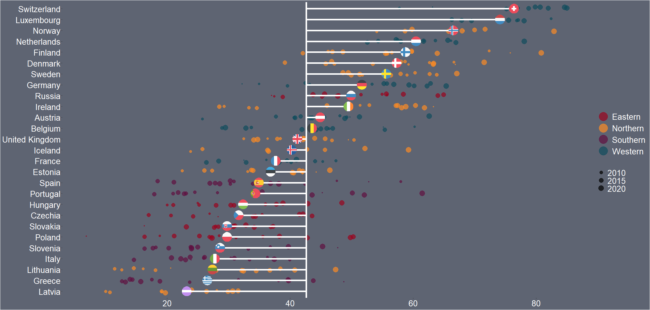
Packages we will need: I came across code for this graph by Tanya Shapiro on her github for #TidyTuesday. Her graph compares Dr. Who actors and their average audience rating across their run as the Doctor on the show. So I have very liberally copied her code for my plot on OECD countries. That is … Continue reading Comparing mean values across OECD countries with ggplot
Copy and paste this URL into your WordPress site to embed