Packages we will need:
library(tidyverse)
library(magrittr) # for pipes
library(ggrepel) # to stop overlapping labels
library(ggflags)
library(countrycode) # if you want create the ISO2C variable
I came across code for this graph by Tanya Shapiro on her github for #TidyTuesday.
Her graph compares Dr. Who actors and their average audience rating across their run as the Doctor on the show. So I have very liberally copied her code for my plot on OECD countries.
That is the beauty of TidyTuesday and the ability to be inspired and taught by other people’s code.
I originally was going to write a blog about how to download data from the OECD R package. However, my attempts to download the data leads to an unpleasant looking error and ends the donwload request.
I will try to work again on that blog in the future when the package is more established.
So, instead, I went to the OECD data website and just directly downloaded data on level of trust that citizens in each of the OECD countries feel about their governments.
Then I cleaned up the data in excel and used countrycode() to add ISO2 and country name data.
Click here to read more about the countrycode() package.

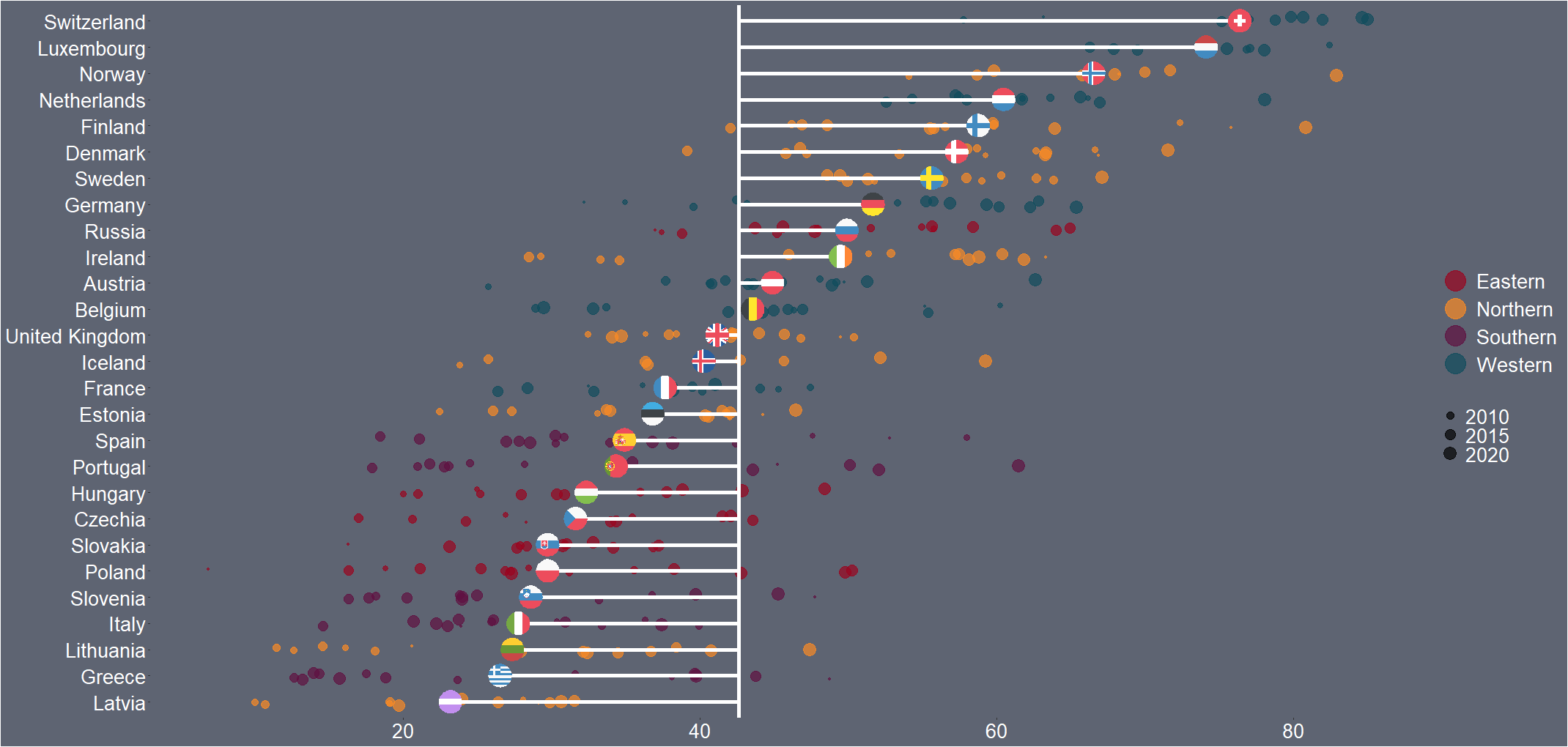
First I will only look at EU countries. I tried with all the countries from the OECD but it was quite crowded and hard to read.
I add region data from another dataset I have. This step is not necessary but I like to colour my graphs according to categories. This time I am choosing geographic regions.
my_df %<>%
  mutate(region = case_when(
    e_regiongeo == 1 ~ "Western",
    e_regiongeo == 2  ~ "Northern",
    e_regiongeo == 3  ~ "Southern",
    e_regiongeo == 4  ~ "Eastern"))
To make the graph, we need two averages:
- The overall average trust level for all countries (
avg_trust) and - The average for each country across the years (
country_avg_trust),
my_df %<>%
  mutate(avg_trust = mean(trust, na.rm = TRUE)) %>%
  group_by(country_name) %>%
  mutate(country_avg_trust = mean(trust, na.rm = TRUE)) %>%
  ungroup()
When we plot the graph, we need a few geom arguments.
Along the x axis we have all the countries, and reorder them from most trusting of their goverments to least trusting.
We will color the points with one of the four geographic regions.
We use geom_jitter() rather than geom_point() for the different yearly trust values to make the graph a little more interesting.
I also make the sizes scaled to the year in the aes() argument. Again, I did this more to look interesting, rather than to convey too much information about the different values for trust across each country. But smaller circles are earlier years and grow larger for each susequent year.
The geom_hline() plots a vertical line to indicate the average trust level for all countries.
We then use the geom_segment() to horizontally connect the country’s individual average (the yend argument) to the total average (the y arguement). We can then easily see which countries are above or below the total average. The x and xend argument, we supply the country_name variable twice.
Next we use the geom_flag(), which comes from the ggflags package. In order to use this package, we need the ISO 2 character code for each country in lower case!
Click here to read more about the ggflags package.
my_df %>%
ggplot(aes(x = reorder(country_name, trust_score), y = trust_score, color = as.factor(region))) +
geom_jitter(aes(color = as.factor(region), size = year), alpha = 0.7, width = 0.15) +
geom_hline(aes(yintercept = avg_trust), color = "white", size = 2)+
geom_segment(aes(x = country_name, xend = country_name, y = country_avg_trust, yend = avg_trust), size = 2, color = "white") +
ggflags::geom_flag(aes(x = country_name, y = country_avg_trust, country = iso2), size = 10) +
  coord_flip() +
  scale_color_manual(values = c("#9a031e","#fb8b24","#5f0f40","#0f4c5c")) -> my_plot
Last we change the aesthetics of the graph with all the theme arguments!
my_plot +
 theme(panel.border = element_blank(),
        legend.position = "right",
        legend.title = element_blank(),
        legend.text = element_text(size = 20),
        legend.background = element_rect(fill = "#5e6472"),
        axis.title = element_blank(),
        axis.text = element_text(color = "white", size = 20),
        text= element_text(size = 15, color = "white"),
        panel.grid.major.y = element_blank(),
        panel.grid.minor.y = element_blank(),
        panel.grid.major.x = element_blank(),
        panel.grid.minor.x = element_blank(),
        legend.key = element_rect(fill = "#5e6472"),
        plot.background = element_rect(fill = "#5e6472"),
        panel.background = element_rect(fill = "#5e6472")) +
guides(colour = guide_legend(override.aes = list(size=10))) 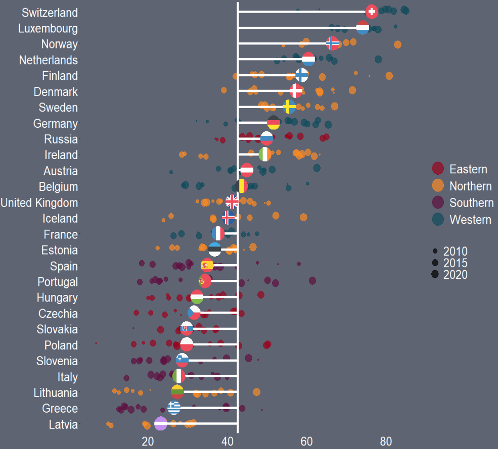
And that is the graph.
We can see that countries in southern Europe are less trusting of their governments than in other regions. Western countries seem to occupy the higher parts of the graph, with France being the least trusting of their government in the West.
There is a large variation in Northern countries. However, if we look at the countries, we can see that the Scandinavian countries are more trusting and the Baltic countries are among the least trusting. This shows they are more similar in their trust levels to other Post-Soviet countries.
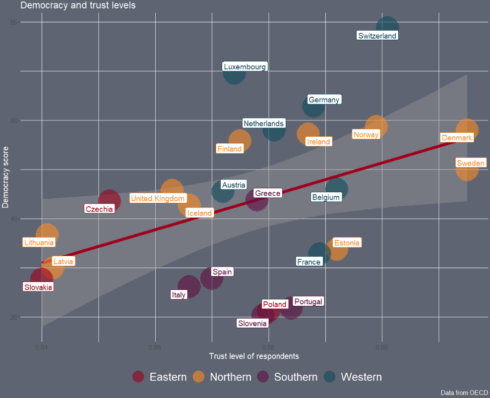
Next we can look into see if there is a relationship between democracy scores and level of trust in the goverment with a geom_point() scatterplot
The geom_smooth() argument plots a linear regression OLS line, with a standard error bar around.
We want the labels for the country to not overlap so we use the geom_label_repel() from the ggrepel package. We don’t want an a in the legend, so we add show.legend = FALSE to the arguments
my_df %>%
  filter(!is.na(trust_score)) %>%
  ggplot(aes(x = democracy_score, y = trust_score)) +
  geom_smooth(method = "lm", color = "#a0001c", size = 3) +
  geom_point(aes(color = as.factor(region)), size = 20, alpha = 0.6) +
 geom_label_repel(aes(label = country_name, color = as.factor(region)), show.legend = FALSE, size = 5) +
scale_color_manual(values = c("#9a031e","#fb8b24","#5f0f40","#0f4c5c")) -> scatter_plot
And we change the theme and add labels to the plot.
scatter_plot + theme(panel.border = element_blank(),
        legend.position = "bottom",
        legend.title = element_blank(),
        legend.text = element_text(size = 20),
        legend.background = element_rect(fill = "#5e6472"),
        text= element_text(size = 15, color = "white"),

        legend.key = element_rect(fill = "#5e6472"),
        plot.background = element_rect(fill = "#5e6472"),
        panel.background = element_rect(fill = "#5e6472")) +
  guides(colour = guide_legend(override.aes = list(size=10)))  +
  labs(title = "Democracy and trust levels",
       y = "Democracy score",
       x = "Trust level of respondents",
caption="Data from OECD") 
We can filter out the two countries with low democracy and examining the consolidated democracies.
Thank you for reading!