Packages we will need:
library(Quandl)
library(forecast) #for time series analysis and graphing
The website Quandl.com is a great resource I came across a while ago, where you can download heaps of datasets for variables such as energy prices, stock prices, World Bank indicators, OECD data other random data.
In order to download the data from the site, you need to first set up an account on the website, and indicate your intended use for the data.
Then you can access your API key, when you go to your “Account Setting” page.
Back on R, you call the API key with Quandl.api_key() function and now you can directly download data!
Quandl.api_key("StRiNgOfNuMbErSaNdLeTtErs")
Now, I click to search only through the free datasets. I have no idea how much a subscription costs but I imagine it is not cheap.
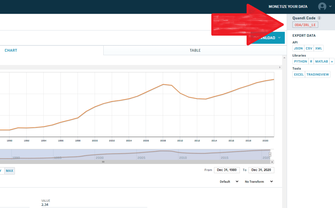
You can browse through the database and when you find the dataset you want, you copy and paste the string code into Quandl() function.

We can choose the class of the time series object we will download with the type = argument.
We also toggle the start_date and end_data of the time series.
So I will download employment data for Ireland from 1980 until 2019 as a zoo object. We can check the Quandl page for the Irish employment data to learn about the data source and the unit of measurement
emp <- Quandl('ODA/IRL_LE', start_date='1980-01-01', end_date='2020-01-01',type="zoo")Click here to check out the Quandl CRAN pdf documentation and learn more about the differen arguments you can use with this function. Here is the generic arguments you can play with when downloading your dataset:
 Quandl(code, type = c("raw", "ts", "zoo", "xts", "timeSeries"),
 transform = c("", "diff", "rdiff", "normalize", "cumul", "rdiff_from"),
 collapse = c("", "daily", "weekly", "monthly", "quarterly", "annual")
Now we can graph the emp data:
autoplot(emp[,"V1"]) +
   ggtitle("Employment level in Ireland") +
   labs("Source: International Monetary Fund data") +
   xlab("Year") +
   ylab("Employed people (in millions)")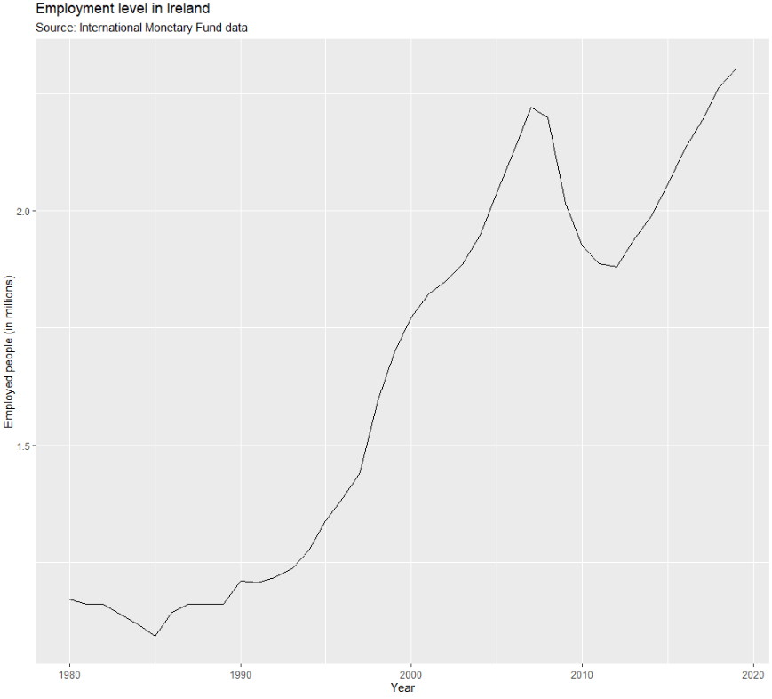
The 1980s were a rough time for unemployment in Ireland. Also the 2008 recession had a sizeable impact on unemployment too. I am afraid how this graph will look with 2020 data.
Next, we can visually examine the autocorrelation plot.
With time series data, it is natural to assume that the value at the current time period is highly related (i.e. serially correlated) to its value in the previous period. This is autocorrelation, and it can be problematic when we want to forecast or run statistics. This is because it violates the assumption that values are independent of each other.
emp_ts <- ts(emp)
forecast::ggAcf(emp_ts)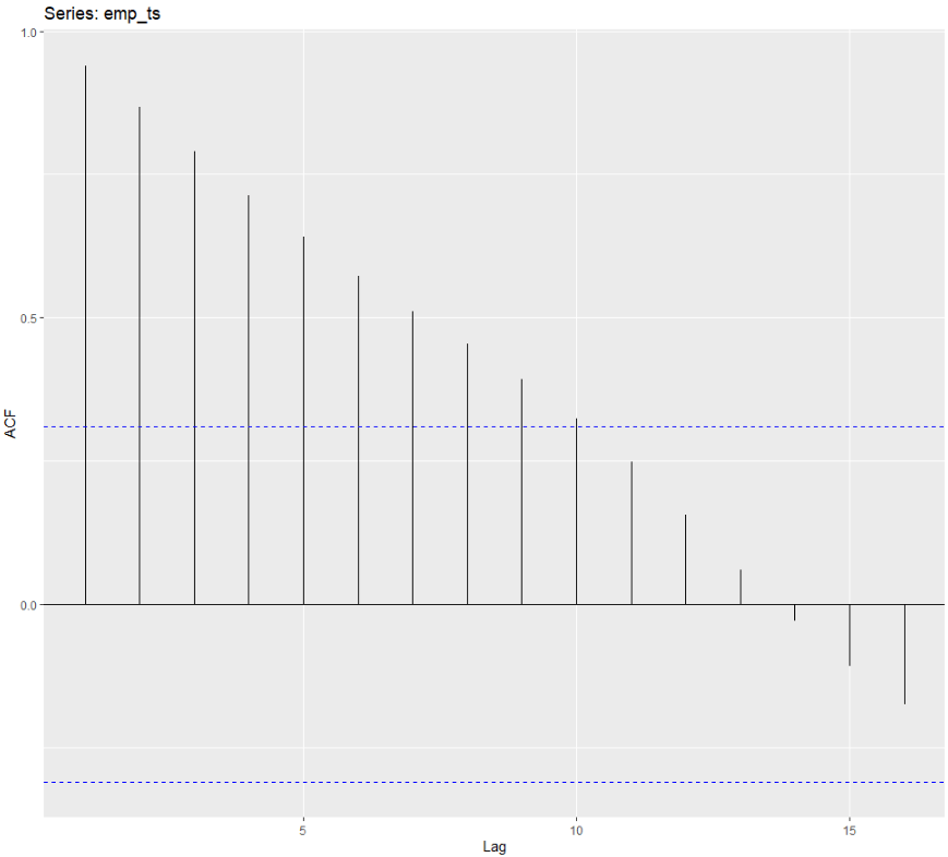
There is very high autocorrelation in employment level in Ireland over the years.
In next blog, we will look at how to correct for autocorrelation in time series data.
