
Well this is just delightful! This package was created by Karthik Ram.

install.packages("wesanderson")
library(wesanderson)
library(hrbrthemes) # for plot themes
library(gapminder) # for data
library(ggbump) # for the bump plot
After you install the wesanderson package, you can
- create a ggplot2 graph object
- choose the Wes Anderson color scheme you want to use and create a palette object
- add the graph object and and the palette object and behold your beautiful data

wes_palette(name, n, type = c("discrete", "continuous"))To generate a vector of colors, the wes_palette() function requires:
name: Name of desired paletten: Number of colors desired (i.e. how many categories so n = 4).
The names of all the palettes you can enter into the wes_anderson() function

Click here to look at more palette and theme packages that are inspired by Studio Ghibli, Dutch Master painters, Google, AirBnB, the Economist and Wall Street Journal aesthetics and appearances.
We can use data from the gapminder package. We will look at the scatterplot between life expectancy and GDP per capita.
We feed the wes_palette() function into the scale_color_manual() with the values = wes_palette() argument.
We indicate that the colours would be the different geographic regions.
If we indicate fill in the geom_point() arguments, we would change the last line to scale_fill_manual()
We can log the gapminder variables with the mutate(across(where(is.numeric), log)). Alternatively, we could scale the axes when we are at the ggplot section of the code with the scale_*_continuous(trans='log10')
gapminder %>%
  filter(continent != "Oceania") %>%
  mutate(across(where(is.numeric), log)) %>%
  ggplot(aes(x = lifeExp, y = gdpPercap)) +
  geom_point(aes(color = continent), size = 3, alpha = 0.8) +
  # facet_wrap(~factor(continent)) +
  hrbrthemes::theme_ft_rc() +
  ggtitle("GDP per capita and life expectancy") +
  theme(legend.title = element_blank(),
        legend.text = element_text(size = 20),
        plot.title = element_text(size = 30)) +
  scale_color_manual(values= wes_palette("FantasticFox1", n = 4)) +

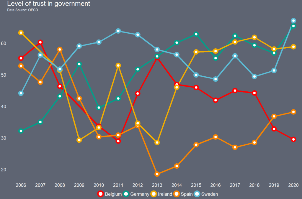
Next looking at bump plot of OECD data with the Royal Tenanbaum’s colour palette.
Click here to read more about the OECD dataset.
trust %>%
  filter(country_name == "Ireland" | country_name == "Sweden" | country_name == "Germany" | country_name == "Spain" | country_name == "Belgium") %>%
  group_by(year) %>%
  mutate(rank_budget = rank(-trust, ties.method = "min"),
         rank_budget = as.factor(rank_budget)) %>%
  ungroup()  %>%
  ggplot(aes(x = year, y  = reorder(rank_budget, desc(rank_budget)),
             group = country_name,
             color = country_name, fill = country_name)) +
  geom_bump(aes(),
            smooth = 7,
            size = 5, alpha = 0.9) +
  geom_point(aes(color = country_name), fill = "white",
             shape = 21, size = 5, stroke = 5) +
  labs(title = "Level of trust in government",
       subtitle = "Data Source: OECD") +
  theme(panel.border = element_blank(),
        legend.position = "bottom",
        plot.title = element_text(size = 30),
        legend.title = element_blank(),
        legend.text = element_text(size = 20, color = "white"),
        axis.text.y = element_text(size = 20),
        axis.text.x = element_text(size = 20),
        legend.background = element_rect(fill = "#5e6472"),
        axis.title = element_blank(),
        axis.text = element_text(color = "white", size = 10),
        text= element_text(size = 15, color = "white"),
        panel.grid.major.y = element_blank(),
        panel.grid.minor.y = element_blank(),
        panel.grid.major.x = element_blank(),
        panel.grid.minor.x = element_blank(),
        legend.key = element_rect(fill = "#5e6472"),
        plot.background = element_rect(fill = "#5e6472"),
        panel.background = element_rect(fill = "#5e6472")) +
  guides(colour = guide_legend(override.aes = list(size=8))) +
  scale_color_manual(values= wes_palette("Royal2", n = 5)) +
  scale_x_continuous(n.breaks = 20)

Click here to read more about the bump plot from the ggbump package.
Last, we can look at Darjeeling colour palette.
trust %>%
  filter(country_name == "Ireland" | country_name == "Germany" | country_name == "Sweden"| country_name == "Spain" | country_name == "Belgium") %>%
  ggplot(aes(x = year,
             y = trust, group = country_name)) +
  geom_line(aes(color = country_name), size = 3) +
  geom_point(aes(color = country_name), fill = "white", shape = 21, size = 5, stroke = 5) +
  labs(title = "Level of trust in government",
       subtitle = "Data Source: OECD") +
  theme(panel.border = element_blank(),
        legend.position = "bottom",
        plot.title = element_text(size = 30),
        legend.title = element_blank(),
        legend.text = element_text(size = 20, color = "white"),
        axis.text.y = element_text(size = 20),
        axis.text.x = element_text(size = 20),
        legend.background = element_rect(fill = "#5e6472"),
        axis.title = element_blank(),
        axis.text = element_text(color = "white", size = 10),
        text= element_text(size = 15, color = "white"),
        panel.grid.major.y = element_blank(),
        panel.grid.minor.y = element_blank(),
        panel.grid.major.x = element_blank(),
        panel.grid.minor.x = element_blank(),
        legend.key = element_rect(fill = "#5e6472"),
        plot.background = element_rect(fill = "#5e6472"),
        panel.background = element_rect(fill = "#5e6472")) +
  guides(colour = guide_legend(override.aes = list(size=8))) +
  scale_color_manual(values= wes_palette("Darjeeling1", n = 5)) +
  scale_x_continuous(n.breaks = 20)
Last we can look at a bar chart counting different regime types in the eighteenth century.
eighteenth_century <- data_1880s %>%
filter(!is.na(regime)) %>%
filter(!is.na(appointment)) %>%
ggplot(aes(appointment)) + geom_bar(aes(fill = factor(regime)), position = position_stack(reverse = TRUE)) + theme(legend.position = "top", text = element_text(size=15), axis.text.x = element_text(angle = -30, vjust = 1, hjust = 0))
Both the regime variable and the appointment variable are discrete categories so we can use the geom_bar() function. When adding the palette to the barplot object, we can use the scale_fill_manual() function.
eighteenth_century + scale_fill_manual(values = wes_palette("Darjeeling1", n = 4)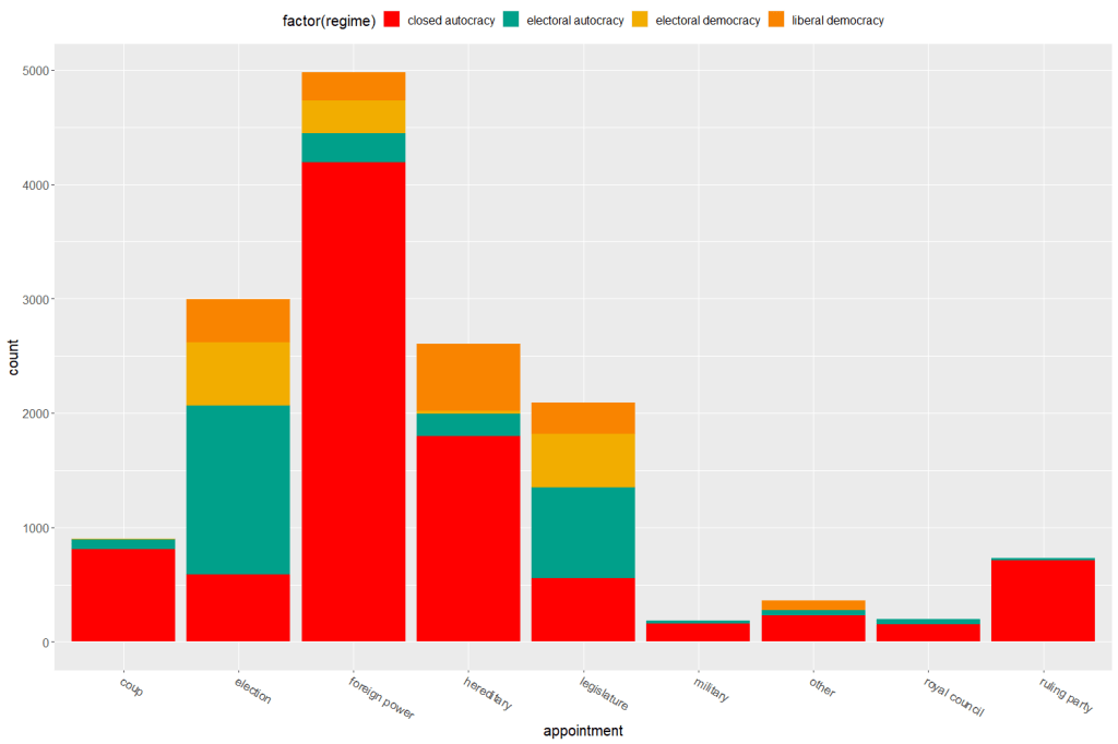
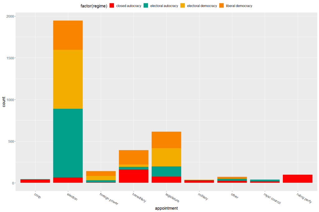
Now to compare the breakdown with countries in the 21st century (2000 to present)


2 thoughts on “Make Wes Anderson themed graphs with wesanderson package in R”