
Packages we will need:
library(democracyData)
library(tidyverse)
library(magrittr)       # for pipes
library(ggstream)       # proportion plots
library(ggthemes)       # nice ggplot themes
library(forcats)        # reorder factor variables
library(ggflags)        # add flags
library(peacesciencer)  # more great polisci data
library(countrycode)    # add ISO codes to countries
This blog will highlight some quick datasets that we can download with this nifty package.
To install the democracyData package, it is best to do this via the github of Xavier Marquez:
remotes::install_github("xmarquez/democracyData", force = TRUE)
library(democracyData)
We can download the dataset from the Democracy and Dictatorship Revisited paper by Cheibub Gandhi and Vreeland (2010) with the redownload_pacl() function. It’s all very simple!
pacl <- redownload_pacl()
This gives us over 80 variables, with information on things such as regime type, geographical data, the name and age of the leaders, and various democracy variables.
We are going to focus on the different regimes across the years.
The six-fold regime classification Cheibub et al (2010) present is rooted in the dichotomous classification of regimes as democracy and dictatorship introduced in Przeworski et al. (2000). They classify according to various metrics, primarily by examining the way in which governments are removed from power and what constitutes the “inner sanctum” of power for a given regime. Dictatorships can be distinguished according to the characteristics of these inner sanctums. Monarchs rely on family and kin networks along with consultative councils; military rulers confine key potential rivals from the armed forces within juntas; and, civilian dictators usually create a smaller body within a regime party—a political bureau—to coopt potential rivals. Democracies highlight their category, depending on how the power of a given leadership ends
We can change the regime variable from numbers to a factor variables, describing the type of regime that the codebook indicates:
pacl %<>%
  mutate(regime_name = ifelse(regime == 0, "Parliamentary democracies",
       ifelse(regime == 1, "Mixed democracies",
       ifelse(regime == 2, "Presidential democracies",
       ifelse(regime == 3, "Civilian autocracies",
       ifelse(regime == 4, "Military dictatorships",
       ifelse(regime ==  5,"Royal dictatorships", regime))))))) %>%
  mutate(regime = as.factor(regime))
Before we make the graph, we can give traffic light hex colours to the types of democracy. This goes from green (full democracy) to more oranges / reds (autocracies):
regime_palette <- c("Military dictatorships" = "#f94144",
                    "Civilian autocracies" = "#f3722c",
                    "Royal dictatorships" =  "#f8961e",
                    "Mixed democracies" = "#f9c74f",
                    "Presidential democracies" = "#90be6d",
                    "Parliamentary democracies" = "#43aa8b")
We will use count() to count the number of countries in each regime type and create a variable n
pacl %>%
  mutate(regime_name = as.factor(regime_name)) %>%
  mutate(regime_name = fct_relevel(regime_name,
 levels = c("Parliamentary democracies",
           "Presidential democracies",
           "Mixed democracies",
           "Royal dictatorships",
           "Civilian autocracies",
           "Military dictatorships"))) %>%
  group_by(year, un_continent_name) %>%
  filter(!is.na(regime_name)) %>%
  count(regime_name) %>%
  ungroup() %>%
  filter(un_continent_name != "") %>%
  filter(un_continent_name != "Oceania") -> pacl_count
We have all the variables we need.
We can now graph the count variables across different regions.
pacl_count %>%
  ggplot(aes(x = year, y = n,
             groups = regime_name,
             fill = regime_name)) +
  ggstream::geom_stream(type = "proportion") +
  facet_wrap(~un_continent_name) +
  scale_fill_manual(values = regime_palette) +
  ggthemes::theme_fivethirtyeight() +
  theme(legend.title = element_blank(),
text = element_text(size = 30)) 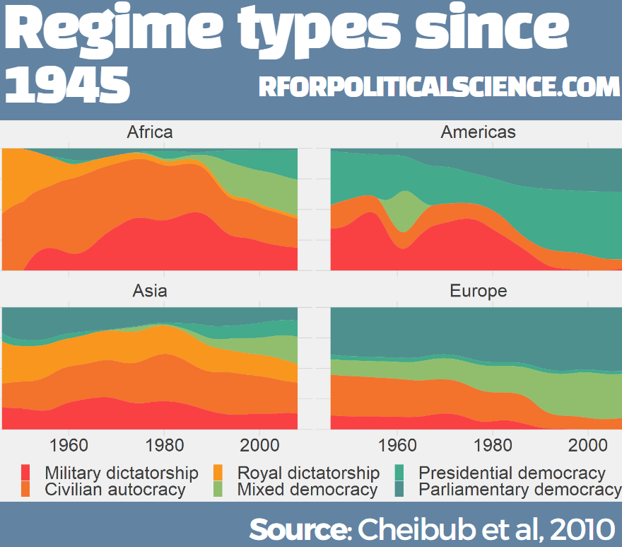
I added the title and source header / footer section on canva.com to finish the graph.
Of course, the Cheibub et al (2010) dataset is not the only one that covers types of regimes.
Curtis Bell in 2016 developed the Rulers, Elections, and Irregular Governance Dataset (REIGN) dataset.
This describes political conditions in every country (including tenures and personal characteristics of world leaders, the types of political institutions and political regimes in effect, election outcomes and election announcements, and irregular events like coups)
Again, to download this dataset with the democracyData package, it is very simple:
reign <- download_reign()
I want to compare North and South Korea since their independence from Japan and see the changes in regimes and democracy scores over the years.
Next, we can easily download Freedom House or Polity 5 scores.
The Freedom House Scores default dataset ranges from 1972 to 2020, covering around 195 countries (depending on the year)
fh <- download_fh()

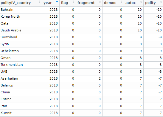
Alternatively, we can look at Polity Scores. This default dataset countains around 190 ish countries (again depending on the year and the number of countries in existance at that time) and covers a far longer range of years; from 1880 to 2018.
polityiv <- redownload_polityIV()
Alternatively, to download democracy scores, we can also use the peacesciencer dataset. Click here to read more about this package:
democracy_scores <- peacesciencer::create_stateyears() %>%
  add_gwcode_to_cow() %>%
  add_democracy()
With inner_join() we can merge these two datasets together:
reign %>%
  select(ccode = cown, everything()) %>%
  inner_join(democracy_scores, by = c("year", "ccode")) -> reign_demo
We next choose the years and countries for our plot.
Also, for the geom_flag() we will need the country name to be lower case ISO code. Click here to read more about the ggflags package.
reign_demo %>%
    filter(year > 1945) %>%
    mutate(gwf_regimetype = str_to_title(gwf_regimetype)) %>%
    mutate(iso2c_lower = tolower(countrycode::countrycode(reign_country, "country.name", "iso2c"))) %>%
filter(reign_country == "Korea North" | reign_country == "Korea South") -> korea_reignWe may to use specific hex colours for our graphs. I always prefer these deeper colours, rather than the pastel defaults that ggplot uses. I take them from coolors.co website!
korea_palette <- c("Military" = "#5f0f40",
                   "Party-Personal" = "#9a031e",
                   "Personal" = "#fb8b24",
                   "Presidential" = "#2a9d8f",
                   "Parliamentary" = "#1e6091")
We will add a flag to the start of the graph, so we create a mini dataset that only has the democracy scores for the first year in the dataset.
  korea_start <- korea_reign %>%
    group_by(reign_country) %>%
    slice(which.min(year)) %>%
    ungroup()
Next we plot the graph
korea_reign %>%
 ggplot(aes(x = year, y = v2x_polyarchy, groups = reign_country))  +
    geom_line(aes(color = gwf_regimetype),
         size = 7, alpha = 0.7, show.legend = FALSE) +
    geom_point(aes(color = gwf_regimetype), size = 7, alpha = 0.7) +
    ggflags::geom_flag(data = korea_start,
       aes(y = v2x_polyarchy, x = 1945, country = iso2c_lower),
           size = 20) -> korea_plot
And then work on the aesthetics of the plot:
korea_plot + ggthemes::theme_fivethirtyeight() +
    ggtitle("Electoral democracy on Korean Peninsula") +
    labs(subtitle = "Sources: Teorell et al. (2019) and Curtis (2016)") +
    xlab("Year") +
    ylab("Democracy Scores") +
    theme(plot.title = element_text(face = "bold"),
      axis.ticks = element_blank(),
      legend.box.background = element_blank(),
      legend.title = element_blank(),
      legend.text = element_text(size = 40),
      text = element_text(size = 30)) +
    scale_color_manual(values = korea_palette) +
    scale_x_continuous(breaks = round(seq(min(korea_reign$year), max(korea_reign$year), by = 5),1))
While North Korea has been consistently ruled by the Kim dynasty, South Korea has gone through various types of government and varying levels of democracy!
References
Cheibub, J. A., Gandhi, J., & Vreeland, J. R. (2010). . Public choice, 143(1), 67-101.
Przeworski, A., Alvarez, R. M., Alvarez, M. E., Cheibub, J. A., Limongi, F., & Neto, F. P. L. (2000). Democracy and development: Political institutions and well-being in the world, 1950-1990 (No. 3). Cambridge University Press.

Many thanks for the beautiful visualization and helpful tips.
Another comprehensive dataset on democracy is the [Global State of Democracy Indicec](https://www.idea.int/gsod/)(GSoD). Inspired by the insightful tips I learned here, I made a [kaggle notebook](https://www.kaggle.com/code/aliaamiri/russio-ukrainian-war) to compare Russia and Ukraine based on GSoD.
LikeLike
Thanks for linking to my package. One note: you do not normally need to use the redownload_pacl function; all you need is pacl, since the pacl dataset (like most of the democracy datasets in the package) is already archived with the package (and doesn’t need to be downloaded again).
LikeLike