How to interpret linear models with the broom package in R

Packages you will need:

library(tidyverse)
library(magrittr)     # for pipes

library(broom)        # add model variables
library(easystats)    # diagnostic graphs

library(WDI)           # World Bank data
library(democracyData) # Freedom House data

library(countrycode)   # add ISO codes
library(bbplot)        # pretty themes
library(ggthemes)      # pretty colours
library(knitr)         # pretty tables
library(kableExtra)    # make pretty tables prettier

This blog will look at the augment() function from the broom package.

After we run a liner model, the augment() function gives us more information about how well our model can accurately preduct the model’s dependent variable.

It also gives us lots of information about how does each observation impact the model. With the augment() function, we can easily find observations with high leverage on the model and outlier observations.

For our model, we are going to use the “women in business and law” index as the dependent variable.

According to the World Bank, this index measures how laws and regulations affect women’s economic opportunity.

Overall scores are calculated by taking the average score of each index (Mobility, Workplace, Pay, Marriage, Parenthood, Entrepreneurship, Assets and Pension), with 100 representing the highest possible score.

Into the right-hand side of the model, our independent variables will be child mortality, military spending by the government as a percentage of GDP and Freedom House (democracy) Scores.

First we download the World Bank data and summarise the variables across the years.

Click here to read more about the WDI package and downloading variables from the World Bank website.

women_business = WDI(indicator = "SG.LAW.INDX")
mortality = WDI(indicator = "SP.DYN.IMRT.IN")
military_spend_gdp <- WDI(indicator = "MS.MIL.XPND.ZS")

We get the average across 60 ish years for three variables. I don’t want to run panel data regression, so I get a single score for each country. In total, there are 160 countries that have all observations. I use the countrycode() function to add Correlates of War codes. This helps us to filter out non-countries and regions that the World Bank provides. And later, we will use COW codes to merge the Freedom House scores.

women_business %>%
  filter(year > 1999) %>% 
  inner_join(mortality) %>% 
  inner_join(military_spend_gdp) %>% 
  select(country, year, iso2c, 
         fem_bus = SG.LAW.INDX, 
         mortality = SP.DYN.IMRT.IN,
         mil_gdp = MS.MIL.XPND.ZS)  %>% 
  mutate_all(~ifelse(is.nan(.), NA, .)) %>% 
  select(-year) %>% 
  group_by(country, iso2c) %>% 
  summarize(across(where(is.numeric), mean,  
   na.rm = TRUE, .names = "mean_{col}")) %>% 
  ungroup() %>% 
  mutate(cown = countrycode::countrycode(iso2c, "iso2c", "cown")) %>% 
  filter(!is.na(cown)) -> wdi_summary

Next we download the Freedom House data with the democracyData package.

Click here to read more about this package.

fh <- download_fh()

fh %>% 
  group_by(fh_country) %>% 
  filter(year > 1999) %>% 
  summarise(mean_fh = mean(fh_total, na.rm = TRUE)) %>% 
  mutate(cown = countrycode::countrycode(fh_country, "country.name", "cown")) %>% 
  mutate_all(~ifelse(is.nan(.), NA, .)) %>% 
  filter(!is.na(cown))  -> fh_summary

We join both the datasets together with the inner_join() functions:

fh_summary %>%
  inner_join(wdi_summary, by = "cown") %>% 
  select (-c(cown, iso2c, fh_country)) -> wdi_fh

Before we model the data, we can look at the correlation matrix with the corrplot package:

wdi_fh %>% 
  drop_na() %>% 
  select(-country)  %>% 
  select(`Females in business` = mean_fem_bus,
        `Mortality rate` = mean_mortality,
        `Freedom House` = mean_fh,
        `Military spending GDP` = mean_mil_gdp)  %>% 
  cor() %>% 
  corrplot(method = 'number',
           type = 'lower',
           number.cex = 2, 
           tl.col = 'black',
           tl.srt = 30,
           diag = FALSE)

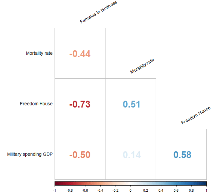
Next, we run a simple OLS linear regression. We don’t want the country variables so omit it from the list of independent variables.

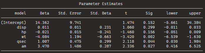
fem_bus_lm <- lm(mean_fem_bus ~ . - country, data = wdi_fh)
Dependent variable:
mean_fem_bus
mean_fh-2.807***
(0.362)
mean_mortality-0.078*
(0.044)
mean_mil_gdp-0.416**
(0.205)
Constant94.684***
(2.024)
Observations160
R20.557
Adjusted R20.549
Residual Std. Error11.964 (df = 156)
F Statistic65.408*** (df = 3; 156)
Note:*p<0.1; **p<0.05; ***p<0.01

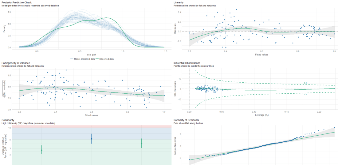
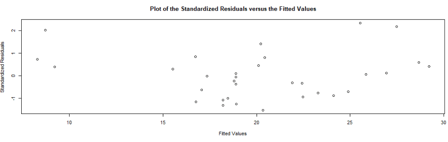
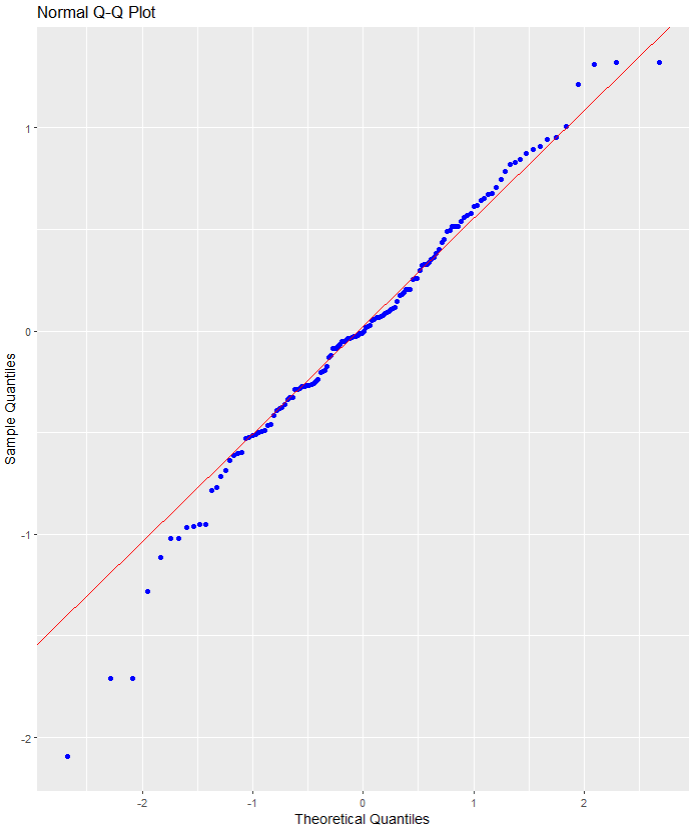
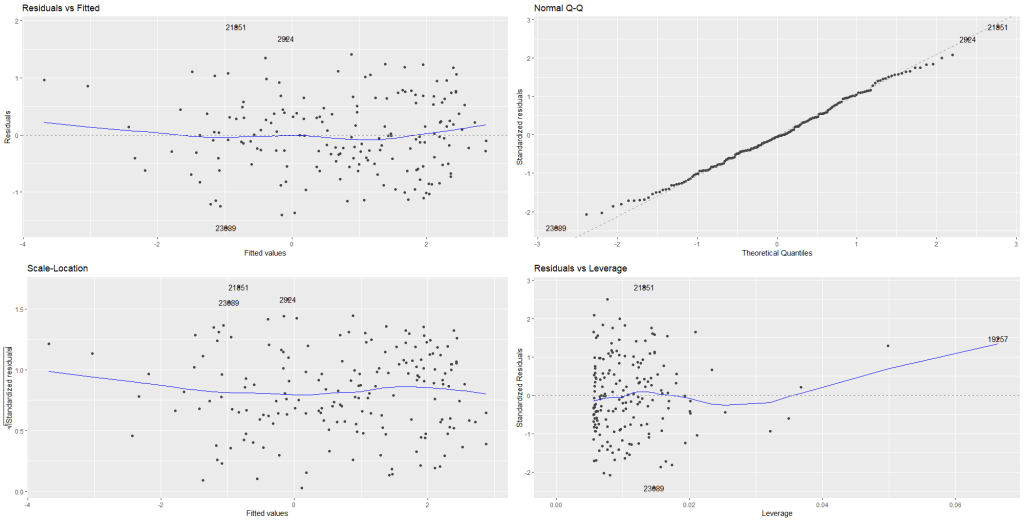
We can look at some preliminary diagnostic plots.

Click here to read more about the easystat package. I found it a bit tricky to download the first time.

performance::check_model(fem_bus_lm)

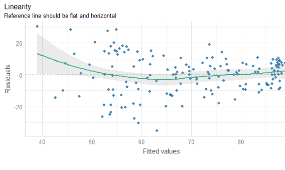
The line is not flat at the beginning so that is not ideal..

We will look more into this later with the variables we create with augment() a bit further down this blog post.

None of our variables have a VIF score above 5, so that is always nice to see!

From the broom package, we can use the augment() function to create a whole heap of new columns about the variables in the model.

fem_bus_pred <- broom::augment(fem_bus_lm)

  • .fitted = this is the model prediction value for each country’s dependent variable score. Ideally we want them to be as close to the actual scores as possible. If they are totally different, this means that our independent variables do not do a good job explaining the variance in our “women in business” index.

  • .resid = this is actual dependent variable value minus the .fitted value.

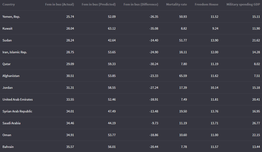
We can look at the fitted values that the model uses to predict the dependent variable – level of women in business – and compare them to the actual values.

The third column in the table is the difference between the predicted and actual values.

fem_bus_pred %>% 
  mutate(across(where(is.numeric), ~round(., 2))) %>%
  arrange(mean_fem_bus) %>% 
  select(Country = country,
    `Fem in bus (Actual)` = mean_fem_bus,
    `Fem in bus (Predicted)` = .fitted,
    `Fem in bus (Difference)` = .resid,
                  `Mortality rate` = mean_mortality,
                  `Freedom House` = mean_fh,
                  `Military spending GDP` = mean_mil_gdp)  %>% 
  kbl(full_width = F) 
Country Leverage of country Fem in bus (Actual) Fem in bus (Predicted)
Austria 0.02 88.92 88.13
Belgium 0.02 92.13 87.65
Costa Rica 0.02 79.80 87.84
Denmark 0.02 96.36 87.74
Finland 0.02 94.23 87.74
Iceland 0.02 96.36 88.90
Ireland 0.02 95.80 88.18
Luxembourg 0.02 94.32 88.33
Sweden 0.02 96.45 87.81
Switzerland 0.02 83.81 87.78

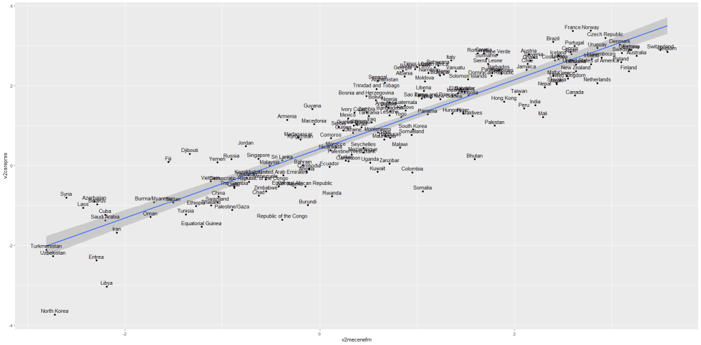
And we can graph them out:

fem_bus_pred %>%
  mutate(fh_category = cut(mean_fh, breaks =  5,
  labels = c("full demo ", "high", "middle", "low", "no demo"))) %>%         ggplot(aes(x = .fitted, y = mean_fem_bus)) + 
  geom_point(aes(color = fh_category), size = 4, alpha = 0.6) + 
  geom_smooth(method = "loess", alpha = 0.2, color = "#20948b") + 
  bbplot::bbc_style() + 
  labs(x = '', y = '', title = "Fitted values versus actual values")

In addition to the predicted values generated by the model, other new columns that the augment function adds include:
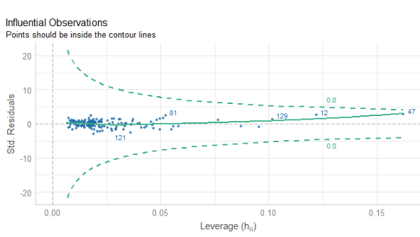
  • .hat = this is a measure of the leverage of each variable.

  • .cooksd = this is the Cook’s Distance. It shows how much actual influence the observation had on the model. Combines information from .residual and .hat.

  • .sigma = this is the estimate of residual standard deviation if that observation is dropped from model

  • .std.resid = standardised residuals

If we look at the .hat observations, we can examine the amount of leverage that each country has on the model.

fem_bus_pred %>% 
  mutate(dplyr::across(where(is.numeric), ~round(., 2))) %>%
  arrange(desc(.hat)) %>% 
  select(Country = country,
         `Leverage of country` = .hat,
         `Fem in bus (Actual)` = mean_fem_bus,
         `Fem in bus (Predicted)` = .fitted)  %>% 
  kbl(full_width = F) %>%
  kable_material_dark()

Next, we can look at Cook’s Distance. This is an estimate of the influence of a data point.  According to statisticshowto website, Cook’s D is a combination of each observation’s leverage and residual values; the higher the leverage and residuals, the higher the Cook’s distance.

  1. If a data point has a Cook’s distance of more than three times the mean, it is a possible outlier
  2. Any point over 4/n, where n is the number of observations, should be examined
  3. To find the potential outlier’s percentile value using the F-distribution. A percentile of over 50 indicates a highly influential point
fem_bus_pred %>% 
  mutate(fh_category = cut(mean_fh, 
breaks =  5,
  labels = c("full demo ", "high", "middle", "low", "no demo"))) %>%  
  mutate(outlier = ifelse(.cooksd > 4/length(fem_bus_pred), 1, 0)) %>% 
  ggplot(aes(x = .fitted, y = .resid)) +
  geom_point(aes(color = fh_category), size = 4, alpha = 0.6) + 
  ggrepel::geom_text_repel(aes(label = ifelse(outlier == 1, country, NA))) + 
  labs(x ='', y = '', title = 'Influential Outliers') + 
  bbplot::bbc_style() 

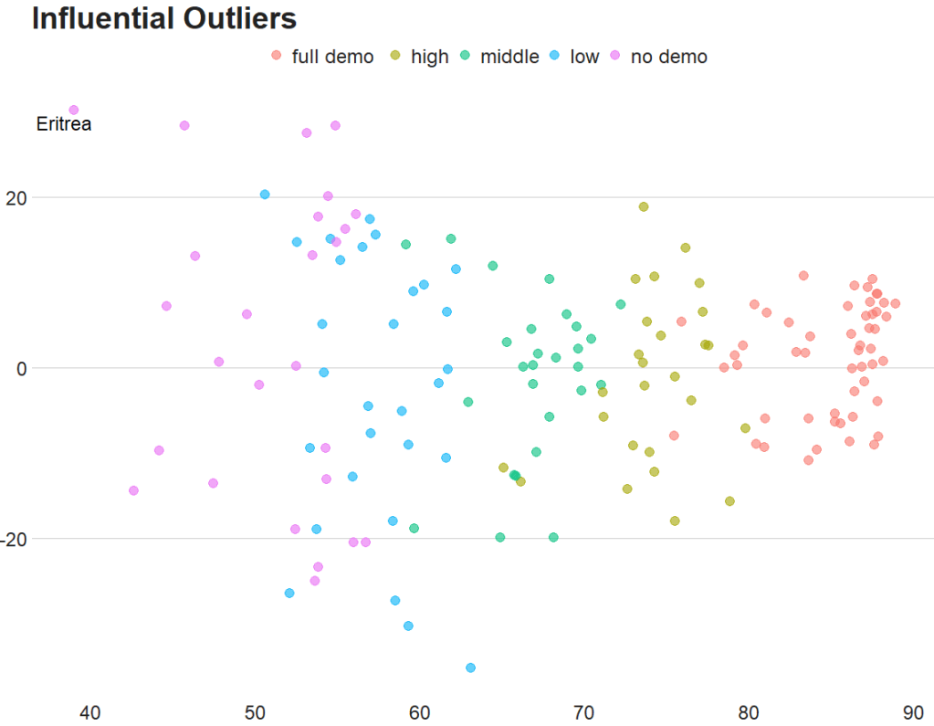
We can decrease from 4 to 0.5 to look at more outliers that are not as influential.

Also we can add a horizontal line at zero to see how the spread is.

fem_bus_pred %>% 
  mutate(fh_category = cut(mean_fh, breaks =  5,
labels = c("full demo ", "high", "middle", "low", "no demo"))) %>%  
  mutate(outlier = ifelse(.cooksd > 0.5/length(fem_bus_pred), 1, 0)) %>% 
  ggplot(aes(x = .fitted, y = .resid)) +
  geom_point(aes(color = fh_category), size = 4, alpha = 0.6) + 
  geom_hline(yintercept = 0, color = "#20948b", size = 2, alpha = 0.5) + 
  ggrepel::geom_text_repel(aes(label = ifelse(outlier == 1, country, NA)), size = 6) + 
  labs(x ='', y = '', title = 'Influential Outliers') + 
  bbplot::bbc_style() 

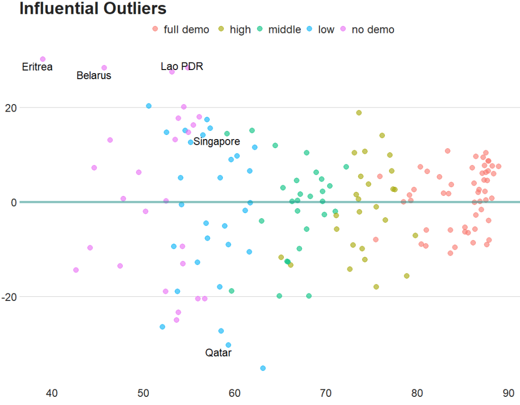
To look at the model-level data, we can use the tidy()function

fem_bus_tidy <- broom::tidy(fem_bus_lm)

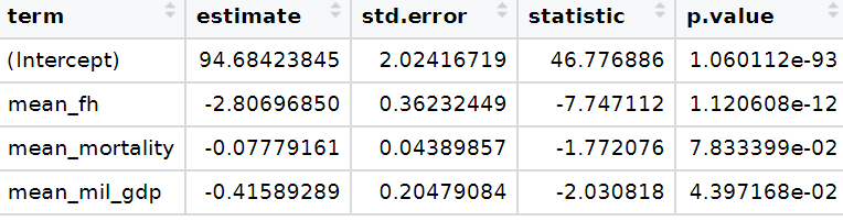
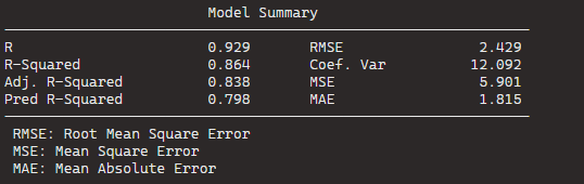
And glance() to examine things such as the R-Squared value, the overall resudial standard deviation of the model (sigma) and the AIC scores.

broom::glance(fem_bus_lm)

An R squared of 0.55 is not that hot ~ so this model needs a fair bit more work.

We can also use the broom packge to graph out the assumptions of the linear model. First, we can check that the residuals are normally distributed!

fem_bus_pred %>% 
  ggplot(aes(x = .resid)) + 
  geom_histogram(bins = 15, fill = "#20948b") + 
  labs(x = '', y = '', title = 'Distribution of Residuals') +
  bbplot::bbc_style()

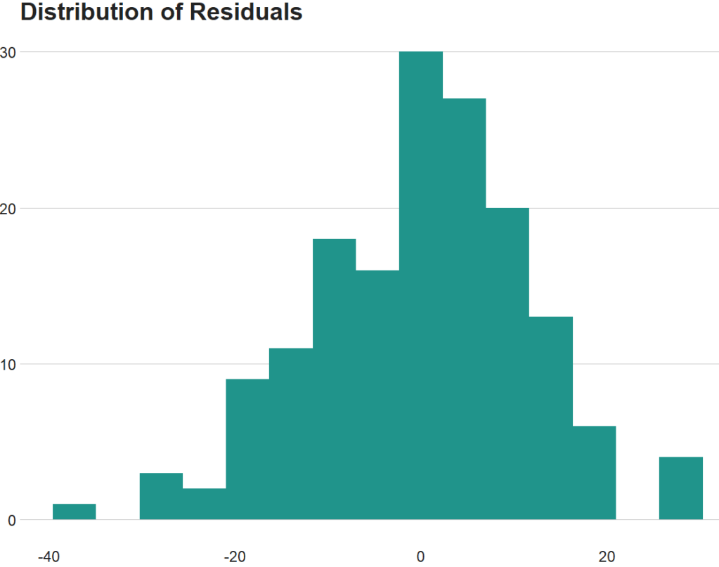
Next we can plot the predicted versus actual values from the model with and without the outliers.

First, all countries, like we did above:

fem_bus_pred %>%
  mutate(fh_category = cut(mean_fh, breaks =  5,
  labels = c("full demo ", "high", "middle", "low", "no demo"))) %>%         ggplot(aes(x = .fitted, y = mean_fem_bus)) + 
  geom_point(aes(color = fh_category), size = 4, alpha = 0.6) + 
  geom_smooth(method = "loess", alpha = 0.2, color = "#20948b") + 
  bbplot::bbc_style() + 
  labs(x = '', y = '', title = "Fitted values versus actual values")

And how to plot looks like if we drop the outliers that we spotted earlier,

fem_bus_pred %>%
  filter(country != "Eritrea") %>% 
   filter(country != "Belarus") %>% 
  mutate(fh_category = cut(mean_fh, breaks =  5,
                           labels = c("full demo ", "high", "middle", "low", "no demo"))) %>%         ggplot(aes(x = .fitted, y = mean_fem_bus)) + 
  geom_point(aes(color = fh_category), size = 4, alpha = 0.6) + 
  geom_smooth(method = "loess", alpha = 0.2, color = "#20948b") + 
  bbplot::bbc_style() + 
  labs(x = '', y = '', title = "Fitted values versus actual values")
Advertisement

Running tidy t-tests with the infer package in R

Packages we will need:

library(tidyverse)
library(tidyr)
library(infer)
library(bbplot)
library(ggthemes)

For this t-test, we will compare US millenials and non-millenials and their views of the UK’s influence in the world.

The data will come from Chicago Council Survey of American Public Opinion on U.S. Foreign Policy

Click here to download 2017 policy survey data

The survey investigates American public opinion on foreign policy. It focuses on respondents’ opinions of the United States’ leadership role in the world and the challenges the country faces domestically and internationally.

The question on the UK’s influence asks how much influence you think the UK has in the world. Please answer on a 0 to 10 scale; with 0 meaning they are not at all influential and 10 meaning they are extremely influential.

First we select and recreate the variables

fp %>%
  select(
    milennial = XMILLENIALSSAMPLEFLAG,
    uk_influence = Q50_10) %>%
  separate(
    col = milennial,
    into = c("milennial_num", "milennial_char"),
    sep = '[)]',
    remove = TRUE) %>% 
  mutate(
     uk_influence = as.character(uk_influence),
     uk_influence = parse_number(uk_influence)) %>% 
  filter(uk_influence != -1) %>% 
  tidyr::drop_na(milennial_char) -> mil_fp

With the infer package, we can run a t-test:

mil_fp %>% 
  t_test(formula = uk_influence ~ milennial_char,
         alternative = "less")%>% 
  kable(format = "html")
statistic t_df p_value alternative estimate lower_ci upper_ci
-3.048249 1329.469 0.0011736 less -0.3274509 -Inf -0.1506332

There is a statistically significant difference between milennials and non-milennials.

We can graph a box plot.

mil_fp %>% 
  ggplot(mapping = aes(x = milennial_char,
                       y = uk_influence,
                       fill = milennial_char)) +
  geom_jitter(aes(color = milennial_char),
              size = 2, alpha = 0.5, width = 0.3) +
  geom_boxplot(alpha = 0.4) +
  coord_flip() + bbplot::bbc_style() +
  scale_fill_manual(values = my_palette) + 
  scale_color_manual(values = my_palette)

And a quick graph to compare UK with other countries: Germany and South Korea

mil_fp %>% 
  select(milennial_char, uk_influence, sk_influence, ger_influence) %>% 
  pivot_longer(!milennial_char, names_to = "survey_question", values_to = "response")  %>% 
  group_by(survey_question, response) %>% 
  summarise(n = n()) %>%
  mutate(freq = n / sum(n)) %>% 
  ungroup() %>% 
  filter(!is.na(response)) %>% 
  mutate(survey_question = case_when(survey_question == "uk_influence" ~ "UK",
survey_question == "ger_influence" ~ "Germany",
survey_question == "sk_influence" ~ "South Korea",
TRUE ~ as.character(survey_question))) %>% 
  ggplot() +
  geom_bar(aes(x = forcats::fct_reorder(survey_question, freq), 
               y = freq, fill = as.factor(response)), 
           color = "#e5e5e5", 
           size = 2, 
           position = "stack",
           stat = "identity") + 
  coord_flip() + 
  scale_fill_brewer(palette = "RdBu") + 
  ggthemes::theme_fivethirtyeight() + 
  ggtitle("View of Influence in the world?") +
  theme(legend.title = element_blank(),
        legend.position = "top",
        legend.key.size = unit(0.78, "cm"),
        text = element_text(size = 25),
        legend.text = element_text(size = 20))

Check model assumptions with easystats package in R

Packages we will need:

install.packages("easystats", repos = "https://easystats.r-universe.dev")
library(easystats)
easystats::install_suggested()

Easystats is a collection of R packages, which aims to provide a framework to tame the scary R statistics and their pesky models, according to their github repo.

Click here to browse the github and here to go to the specific perfomance package CRAN PDF

First run your regression. I will try to explain variance is Civil Society Organization participation (CSOs) with the independent variables in my model with Varieties of Democracy data in 1990.

cso_model <- lm(cso_part ~ education_level + mortality_rate + democracy,data = vdem_90)
Dependent variable:
cso_part
education_level-0.017**
(0.007)
mortality_rate-0.00001
(0.00004)
democracy0.913***
(0.064)
Constant0.288***
(0.054)
Observations134
R20.690
Adjusted R20.682
Residual Std. Error0.154 (df = 130)
F Statistic96.243*** (df = 3; 130)
Note:*p<0.1; **p<0.05; ***p<0.01
Excited Season 2 GIF by The Office - Find & Share on GIPHY

Then we check the assumptions:

performance::check_model(cso_model)

Exploratory Data Analysis and Descriptive Statistics for Political Science Research in R

Packages we will use:

library(tidyverse)      # of course
library(ggridges)       # density plots
library(GGally)         # correlation matrics
library(stargazer)      # tables
library(knitr)          # more tables stuff
library(kableExtra)     # more and more tables
library(ggrepel)        # spread out labels
library(ggstream)       # streamplots
library(bbplot)         # pretty themes
library(ggthemes)       # more pretty themes
library(ggside)         # stack plots side by side
library(forcats)        # reorder factor levels

Before jumping into any inferentional statistical analysis, it is helpful for us to get to know our data. For me, that always means plotting and visualising the data and looking at the spread, the mean, distribution and outliers in the dataset.

Before we plot anything, a simple package that creates tables in the stargazer package. We can examine descriptive statistics of the variables in one table.

Click here to read this practically exhaustive cheat sheet for the stargazer package by Jake Russ. I refer to it at least once a week.

I want to summarise a few of the stats, so I write into the summary.stat() argument the number of observations, the mean, median and standard deviation.

The kbl() and kable_classic() will change the look of the table in R (or if you want to copy and paste the code into latex with the type = "latex" argument).

In HTML, they do not appear.

Seth Meyers Ok GIF by Late Night with Seth Meyers - Find & Share on GIPHY

To find out more about the knitr kable tables, click here to read the cheatsheet by Hao Zhu.

Choose the variables you want, put them into a data.frame and feed them into the stargazer() function

stargazer(my_df_summary, 
          covariate.labels = c("Corruption index",
                               "Civil society strength", 
                               'Rule of Law score',
                               "Physical Integerity Score",
                               "GDP growth"),
          summary.stat = c("n", "mean", "median", "sd"), 
          type = "html") %>% 
  kbl() %>% 
  kable_classic(full_width = F, html_font = "Times", font_size = 25)
StatisticNMeanMedianSt. Dev.
Corruption index1790.4770.5190.304
Civil society strength1790.6700.8050.287
Rule of Law score1737.4517.0004.745
Physical Integerity Score1790.6960.8070.284
GDP growth1630.0190.0200.032

Next, we can create a barchart to look at the different levels of variables across categories. We can look at the different regime types (from complete autocracy to liberal democracy) across the six geographical regions in 2018 with the geom_bar().

my_df %>% 
  filter(year == 2018) %>%
  ggplot() +
  geom_bar(aes(as.factor(region),
               fill = as.factor(regime)),
           color = "white", size = 2.5) -> my_barplot

And we can add more theme changes

my_barplot + bbplot::bbc_style() + 
  theme(legend.key.size = unit(2.5, 'cm'),
        legend.text = element_text(size = 15),
        text = element_text(size = 15)) +
  scale_fill_manual(values = c("#9a031e","#00a896","#e36414","#0f4c5c")) + 
  scale_color_manual(values = c("#9a031e","#00a896","#e36414","#0f4c5c")) 

This type of graph also tells us that Sub-Saharan Africa has the highest number of countries and the Middle East and North African (MENA) has the fewest countries.

However, if we want to look at each group and their absolute percentages, we change one line: we add geom_bar(position = "fill"). For example we can see more clearly that over 50% of Post-Soviet countries are democracies ( orange = electoral and blue = liberal democracy) as of 2018.

We can also check out the density plot of democracy levels (as a numeric level) across the six regions in 2018.

With these types of graphs, we can examine characteristics of the variables, such as whether there is a large spread or normal distribution of democracy across each region.

my_df %>% 
  filter(year == 2018) %>%
  ggplot(aes(x = democracy_score, y = region, fill = regime)) +
  geom_density_ridges(color = "white", size = 2, alpha = 0.9, scale = 2) -> my_density_plot

And change the graph theme:

my_density_plot + bbplot::bbc_style() + 
  theme(legend.key.size = unit(2.5, 'cm')) +
  scale_fill_manual(values = c("#9a031e","#00a896","#e36414","#0f4c5c")) + 
  scale_color_manual(values = c("#9a031e","#00a896","#e36414","#0f4c5c")) 

Click here to read more about the ggridges package and click here to read their CRAN PDF.

Next, we can also check out Pearson’s correlations of some of the variables in our dataset. We can make these plots with the GGally package.

The ggpairs() argument shows a scatterplot, a density plot and correlation matrix.

my_df %>%
  filter(year == 2018) %>%
  select(regime, 
         corruption, 
         civ_soc, 
         rule_law, 
         physical, 
         gdp_growth) %>% 
  ggpairs(columns = 2:5, 
          ggplot2::aes(colour = as.factor(regime), 
          alpha = 0.9)) + 
  bbplot::bbc_style() +
  scale_fill_manual(values = c("#9a031e","#00a896","#e36414","#0f4c5c")) + 
  scale_color_manual(values = c("#9a031e","#00a896","#e36414","#0f4c5c"))

Click here to read more about the GGally package and click here to read their CRAN PDF.

We can use the ggside package to stack graphs together into one plot.

There are a few arguments to add when we choose where we want to place each graph.

For example, geom_xsideboxplot(aes(y = freedom_house), orientation = "y") places a boxplot for the three Freedom House democracy levels on the top of the graph, running across the x axis. If we wanted the boxplot along the y axis we would write geom_ysideboxplot(). We add orientation = "y" to indicate the direction of the boxplots.

Next we indiciate how big we want each graph to be in the panel with theme(ggside.panel.scale = .5) argument. This makes the scatterplot take up half and the boxplot the other half. If we write .3, the scatterplot takes up 70% and the boxplot takes up the remainning 30%. Last we indicade scale_xsidey_discrete() so the graph doesn’t think it is a continuous variable.

We add Darjeeling Limited color palette from the Wes Anderson movie.

Click here to learn about adding Wes Anderson theme colour palettes to graphs and plots.

my_df %>%
 filter(year == 2018) %>% 
 filter(!is.na(fh_number)) %>% 
  mutate(freedom_house = ifelse(fh_number == 1, "Free", 
         ifelse(fh_number == 2, "Partly Free", "Not Free"))) %>%
  mutate(freedom_house = forcats::fct_relevel(freedom_house, "Not Free", "Partly Free", "Free")) %>% 
ggplot(aes(x = freedom_from_torture, y = corruption_level, colour = as.factor(freedom_house))) + 
  geom_point(size = 4.5, alpha = 0.9) +
  geom_smooth(method = "lm", color ="#1d3557", alpha = 0.4) +  
  geom_xsideboxplot(aes(y = freedom_house), orientation = "y", size = 2) +
  theme(ggside.panel.scale = .3) +
  scale_xsidey_discrete() +
  bbplot::bbc_style() + 
  facet_wrap(~region) + 
  scale_color_manual(values= wes_palette("Darjeeling1", n = 3))

The next plot will look how variables change over time.

We can check out if there are changes in the volume and proportion of a variable across time with the geom_stream(type = "ridge") from the ggstream package.

In this instance, we will compare urban populations across regions from 1800s to today.

my_df %>% 
  group_by(region, year) %>% 
  summarise(mean_urbanization = mean(urban_population_percentage, na.rm = TRUE)) %>% 
  ggplot(aes(x = year, y = mean_urbanization, fill = region)) +
  geom_stream(type = "ridge") -> my_streamplot

And add the theme changes

  my_streamplot + ggthemes::theme_pander() + 
  theme(
legend.title = element_blank(),
        legend.position = "bottom",
        legend.text = element_text(size = 25),
        axis.text.x = element_text(size = 25),
        axis.title.y = element_blank(),
        axis.title.x = element_blank()) +
  scale_fill_manual(values = c("#001219",
                               "#0a9396",
                               "#e9d8a6",
                               "#ee9b00", 
                               "#ca6702",
                               "#ae2012")) 

Click here to read more about the ggstream package and click here to read their CRAN PDF.

We can also look at interquartile ranges and spread across variables.

We will look at the urbanization rate across the different regions. The variable is calculated as the ratio of urban population to total country population.

Before, we will create a hex color vector so we are not copying and pasting the colours too many times.

my_palette <- c("#1d3557",
                "#0a9396",
                "#e9d8a6",
                "#ee9b00", 
                "#ca6702",
                "#ae2012")

We use the facet_wrap(~year) so we can separate the three years and compare them.

my_df %>% 
  filter(year == 1980 | year == 1990 | year == 2000)  %>% 
  ggplot(mapping = aes(x = region, 
                       y = urban_population_percentage, 
                       fill = region)) +
  geom_jitter(aes(color = region),
              size = 3, alpha = 0.5, width = 0.15) +
  geom_boxplot(alpha = 0.5) + facet_wrap(~year) + 
  scale_fill_manual(values = my_palette) +
  scale_color_manual(values = my_palette) + 
  coord_flip() + 
  bbplot::bbc_style()

If we want to look more closely at one year and print out the country names for the countries that are outliers in the graph, we can run the following function and find the outliers int he dataset for the year 1990:

is_outlier <- function(x) {
  return(x < quantile(x, 0.25) - 1.5 * IQR(x) | x > quantile(x, 0.75) + 1.5 * IQR(x))
}

We can then choose one year and create a binary variable with the function

my_df_90 <- my_df %>% 
  filter(year == 1990) %>% 
  filter(!is.na(urban_population_percentage))

my_df_90$my_outliers <- is_outlier(my_df_90$urban_population_percentage)

And we plot the graph:

my_df_90 %>% 
  ggplot(mapping = aes(x = region, y = urban_population_percentage, fill = region)) +
  geom_jitter(aes(color = region), size = 3, alpha = 0.5, width = 0.15) +
  geom_boxplot(alpha = 0.5) +
  geom_text_repel(data = my_df_90[which(my_df_90$my_outliers == TRUE),],
            aes(label = country_name), size = 5) + 
  scale_fill_manual(values = my_palette) +
  scale_color_manual(values = my_palette) + 
  coord_flip() + 
  bbplot::bbc_style() 

In the next blog post, we will look at t-tests, ANOVAs (and their non-parametric alternatives) to see if the difference in means / medians is statistically significant and meaningful for the underlying population.

Bo Burnham What GIF - Find & Share on GIPHY

Building a dataset for political science analysis in R, PART 1

When you want to create a dataset for large-n political science analysis from scratch, it can get muddled fast. Some tips I have found helpful to create clean data ready for panel data analysis.

Click here for PART 2 to create dyad-year and state-year variables with conflict, geographic features and alliance data from Correlates of War and Uppsala datasets.

Packages we will need

library(tidyverse)  # of course!
library(states)
library(WDI)
library(countrycode)
library(rnaturalearth)
library(VIM)

The states package by Andreas Beger can provide the skeleton for our panel dataset.

It create a cross-sectional, time-series dataset of independent sovereign countries that stretch back to 1816.

The package includes both the Gleditsch & Ward (G&W) and Correlates of War (COW) lists of independent states.

Click here for a discussion of the difference by Stephen Miller.

With the state_panel function from the states package, we create a data.frame from a start date to an end date, using the following syntax.

state_panel(start, end, by = NULL, partial = "any", useGW = TRUE)

The partial argument indicates how we want to deal with states that is independent for only part of the year. We can indicate “any”, “exact”, “first” or “last”.

For this example, I want to create a dataset starting in 1990 and ending in 2020. I put useGW = FALSE because I want to use the COW list of states.

df <- state_panel(1990, 2020, by = "year", partial = "last", useGW = FALSE)
View(df)

And this is the resulting dataset

So we have our basic data.frame. We can see how many states there have been over the years.

df %>% 
  group_by(year) %>% 
  count() %>%  
  arrange(n) 
# A tibble: 31 x 2
# Groups:   year [31]
    year     n
   <int> <int>
 1  1990   161
 2  1991   177
 3  1992   181
 4  1993   186
 5  1994   187
 6  1995   187
 7  1996   187
 8  1997   187
 9  1998   187
10  1999   190
11  2000   191
12  2001   191
13  2002   192
14  2003   192
15  2004   192
16  2005   192
17  2006   193
18  2007   193
19  2008   194
20  2009   194
# ... with 11 more rows

We can see that the early 1990s saw the creation of many states after the end of the Soviet Union. Since 2011, the dataset levels out at 195 (after the creation of South Sudan)

Next, we can add the country name with the countrycode() function from the countrycode package. We feed in the cowcode variable and add the full country names. Click here to read more about the function in more detail and see other options to add country ISO code, for example.

df$country <- countrycode(df$cowcode, "cown", "country.name")

With our dataset with all states, we can add variables for our analysis

We can use the WDI package to download any World Bank indicator.

Click here for more information about this super easy package.

I’ll first add some basic variables, such as population, GDP per capita and infant mortality. We can do this with the WDI() function. The indicator code for population is SP.POP.TOTL so we add that to the indicator argument. (If we wanted only a few countries, we can add a vector of ISO2 code strings to the country argument).

POP <- WDI(country = "all",
           indicator = 'SP.POP.TOTL',
           start = 1990, 
           end = 2020)

The default variable name for population is the long string, so I’ll quickly change that

POP$population <- POP$SP.POP.TOTL 
POP$SP.POP.TOTL <- NULL

I’ll do the same for GDP and infant mortality

GDP <- WDI(country = "all",
       indicator = 'NY.GDP.MKTP.KD',
       start = 1990, 
       end = 2020)

GDP$gdp <- GD$PNY.GDP.MKTP.KD
GDP$NY.GDP.MKTP.KD <- NULL

INF_MORT <- WDI(country = "all",
       indicator = 'SP.DYN.IMRT.IN',
       start = 1990, 
       end = 2020)

INF_MORT$infant_mortality <- INF_MORT$SP.DYN.IMRT.IN
INF_MORT$SP.DYN.IMRT.IN <- NULL

Next, I’ll bind all the variables them together with cbind()

wb_controls <- cbind(POP, GDP, INF_MORT)

This cbind will copy the country and year variables three times so we can delete any replicated variables:

wb_controls <- wb_controls[, !duplicated(colnames(wb_controls), fromLast = TRUE)] 

When we download World Bank data, it comes with aggregated data for regions and economic groups. If we only want in our dataset the variables for countries, we have to delete the extra rows that we don’t want. We have two options for this.

The first option is to add the cow codes and then filter out all the rows that do not have a cow code (i.e. all non-countries)

wb_controls$cow_code <- countrycode(wb_controls$country, "country.name", 'cown')

Then we re-organise the variables a bit more nicely in the dataset with select() and keep only the countries with filter() and the !is.na argument that will remove any row with NA values in the cow_code column.

df_v2 <- wb_controls %>%
  select(country, iso2c, cow_code, year, everything()) %>%
  filter(!is.na(cow_code))

Alternatively, we can merge the World Bank variables with our states df and it can filter out any row that is not a sovereign, independent state.

In the merge() function, we use by to indicate the columns by which we want to merge the datasets. The all argument indicates which dataset we want to keep and NOT delete rows that do not match. If we typed all = TRUE, it would not delete any rows that do not match.

wb_controls %<>%
  select(cow_code, year, everything()) 

df_v3 <- merge(df, wb_controls, by.x = c("cowcode", "year"), by.y = c("cow_code", "year"), all.x = TRUE)

You can see that df_v2 has 85 more rows that df_v3. So it is up to you which way you want to use, and which countries you want to include each year. The df_v3 contains states that are more likely to be recognised as sovereign. df_v2 contains more territories.

Let’s look at the prevalence of NA values across our dataset.

We can use the plot_missing() function from the states package.

plot_missing(df_v3, ccode = "cowcode")

It is good to see a lot of green!

Let’s add some constant variables, such as geographical information. The rnaturalearth package is great for plotting maps. Click here to see how to plot maps with the package.

For this dataset, we just want the various geography group variables to add to our dataset:

map <- ne_countries(scale = "medium", returnclass = "sf")

We want to take some of the interesting variables from this map object:

map %>% 
  select(admin, economy, income_grp, continent, region_un, subregion, region_wb) -> regions_sf

This regions_sf is not in a data.frame object, it is a simple features dataset. So we delete the variables that make it an sf object and explicitly coerce it to data.frame

regions_sf$geometry<- NULL
regions_df <- as.data.frame(regions_sf)

Finally, we add our COW codes like we did above:

regions_df$cow_code <- countrycode(regions_df$admin, "country.name", "cown")
Warning message:
In countrycode(regions_df$admin, "country.name", "cown") :

Some values were not matched unambiguously: Antarctica, Kashmir, Republic of Serbia, Somaliland, Western Sahara

Sometimes we cannot avoid hand-coding some of our variables. In this case, we don’t want to drop Serbia because the countrycode function couldn’t add the right code.

So we can check what its COW code is and add it to the dataset directly with the mutate function and an ifelse condition:

regions_df %<>% 
  dplyr::mutate(cow_code = ifelse(admin == "Republic of Serbia", 345, cow_code))

If we look at the countries, we can spot a problem. For Cyprus, it was counted twice – due to the control by both Turkish and Greek authorities. We can delete one of the versions because all the other World Bank variables look at Cyprus as one entity so they will be the same across both variables.

regions_df <- regions_df %>% slice(-c(38)) 

Next we merge the new geography variables to our dataset. Note that we only merge by one variable – the COW code – and indicate that we want to merge for every row in the x dataset (i.e. the first dataset in the function). So it will apply to each year row for each country!

df_v4 <- merge(df_v3, regions_df, by.x = "cowcode", by.y = "cow_code", all.x = TRUE)

So far so good! We have some interesting variables all without having to open a single CSV or DTA file!

Let’s look at the NA values in the data.frame

nhanes_miss = VIM::aggr(df_v3,
                   labels = names(df_v3), 
                   sortVars = TRUE,
                   numbers = TRUE)

We with the aggr() function from the VIM package to look at the prevalence of NA values. It’s always good to keep an eye on this and catch badly merged or badly specified datasets!

Click here for PART 2, where we add some Correlates of War data and interesting variables with the peacesciencer package .

Always Sunny Dance GIF by It's Always Sunny in Philadelphia - Find & Share on GIPHY

Create a correlation matrix with GGally package in R

We can create very informative correlation matrix graphs with one function.

Packages we will need:

library(GGally)
library(bbplot) #for pretty themes

First, choose some nice hex colors.

my_palette <- c("#005D8F", "#F2A202")
Happy Friends GIF by netflixlat - Find & Share on GIPHY

Next, we can go create a dichotomous factor variable and divide the continuous “freedom from torture scale” variable into either above the median or below the median score. It’s a crude measurement but it serves to highlight trends.

Blue means the country enjoys high freedom from torture. Yellow means the county suffers from low freedom from torture and people are more likely to be tortured by their government.

Then we feed our variables into the ggpairs() function from the GGally package.

I use the columnLabels to label the graphs with their full names and the mapping argument to choose my own color palette.

I add the bbc_style() format to the corr_matrix object because I like the font and size of this theme. And voila, we have our basic correlation matrix (Figure 1).

corr_matrix <- vdem90 %>% 
  dplyr::mutate(
    freedom_torture = ifelse(torture >= 0.65, "High", "Low"),
    freedom_torture = as.factor(freedom_t))
  dplyr::select(freedom_torture, civil_lib, class_eq) %>% 
  ggpairs(columnLabels = c('Freedom from Torture', 'Civil Liberties', 'Class Equality'), 
    mapping = ggplot2::aes(colour = freedom_torture)) +
  scale_fill_manual(values = my_palette) +
  scale_color_manual(values = my_palette)

corr_matrix + bbplot::bbc_style()
Figure 1.
Excited Season 4 GIF by Friends - Find & Share on GIPHY

First off, in Figure 2 we can see the centre plots in the diagonal are the distribution plots of each variable in the matrix

Figure 2.

In Figure 3, we can look at the box plot for the ‘civil liberties index’ score for both high (blue) and low (yellow) ‘freedom from torture’ categories.

The median civil liberties score for countries in the high ‘freedom from torture’ countries is far higher than in countries with low ‘freedom from torture’ (i.e. citizens in these countries are more likely to suffer from state torture). The spread / variance is also far great in states with more torture.

Figure 3.

In Figur 4, we can focus below the diagonal and see the scatterplot between the two continuous variables – civil liberties index score and class equality index scores.

We see that there is a positive relationship between civil liberties and class equality. It looks like a slightly U shaped, quadratic relationship but a clear relationship trend is not very clear with the countries with higher torture prevalence (yellow) showing more randomness than the countries with high freedom from torture scores (blue).

Saying that, however, there are a few errant blue points as outliers to the trend in the plot.

The correlation score is also provided between the two categorical variables and the correlation score between civil liberties and class equality scores is 0.52.

Examining at the scatterplot, if we looked only at countries with high freedom from torture, this correlation score could be higher!

Figure 4.

Excited Season 4 GIF by Friends - Find & Share on GIPHY

Add weights to survey data with survey package in R: Part 2

Click here to read why need to add pspwght and pweight to the ESS data in Part 1.

Packages we will need:

library(survey)
library(srvy)
library(stargazer)
library(gtsummary)
library(tidyverse)

Click here to learn how to access and download ESS round data for the thirty-ish European countries (depending on the year).

So with the essurvey package, I have downloaded and cleaned up the most recent round of the ESS survey, conducted in 2018.

We will examine the different demographic variables that relate to levels of trust in politicians across 29 European countries (education level, gender, age et cetera).

Before we create the survey weight objects, we can first make a bar chart to look at the different levels of trust in the different countries.

We can use the cut() function to divide the 10-point scale into three groups of “low”, “mid” and “high” levels of trust in politicians.

I also choose traffic light hex colors in color_palette vector and add full country names with countrycode() so it’s easier to read the graph

color_palette <- c("1" = "#f94144", "2" = "#f8961e", "3" = "#43aa8b")

round9$country_name <- countrycode(round9$country, "iso2c", "country.name")

trust_graph <- round9 %>% 
  dplyr::filter(!is.na(trust_pol)) %>% 
  dplyr::mutate(trust_category = cut(trust_pol, 
                                     breaks=c(-Inf, 3, 7, Inf), 
                                     labels=c(1,2,3))) %>% 
  mutate(trust_category = as.numeric(trust_category)) %>% 
  mutate(trust_pol_fac = as.factor(trust_category)) %>%
  ggplot(aes(x = reorder(country_name, trust_category))) +
  geom_bar(aes(fill = trust_pol_fac), 
               position = "fill") +
  bbplot::bbc_style() +
  coord_flip() 

trust_graph <- trust_graph + scale_fill_manual(values= color_palette, 
                                      name="Trust level",
                                      breaks=c(1,2,3),
                                      labels=c("Low", "Mid", "High")) 

The graph lists countries in descending order according to the percentage of sampled participants that indicated they had low trust levels in politicians.

The respondents in Croatia, Bulgaria and Spain have the most distrust towards politicians.

For this example, I want to compare different analyses to see what impact different weights have on the coefficient estimates and standard errors in the regression analyses:

  • with no weights (dEfIniTelYy not recommended by ESS)
  • with post-stratification weights only (not recommended by ESS) and
  • with the combined post-strat AND population weight (the recommended weighting strategy according to ESS)

First we create two special svydesign objects, with the survey package. To create this, we need to add a squiggly ~ symbol in front of the variables (Google tells me it is called a tilde).

The ids argument takes the cluster ID for each participant.

psu is a numeric variable that indicates the primary sampling unit within which the respondent was selected to take part in the survey. For example in Ireland, this refers to the particular electoral division of each participant.

The strata argument takes the numeric variable that codes which stratum each individual is in, according to the type of sample design each country used.

The first svydesign object uses only post-stratification weights: pspwght

Finally we need to specify the nest argument as TRUE. I don’t know why but it throws an error message if we don’t …

post_design <- svydesign(ids = ~psu, 
                         strata = ~stratum, 
                         weights = ~pspwght
                         data = round9, 
                         nest = TRUE)

To combine the two weights, we can multiply them together and store them as full_weight. We can then use that in the svydesign function

r2$full_weight <- r2$pweight*r2$pspwght
 

full_design <- svydesign(ids = ~psu, 
                         strata = ~stratum, 
                         weights = ~full_weight,
                         data = round9, 
                         nest = TRUE)
class(full_design)

With the srvyr package, we can convert a “survey.design” class object into a “tbl_svy” class object, which we can then use with tidyverse functions.

full_tidy_design <- as_survey(full_design)
class(full_tidy_design)

Click here to read the CRAN PDF for the srvyr package.

We can first look at descriptive statistics and see if the values change because of the inclusion of the weighted survey data.

First, we can compare the means of the survey data with and without the weights.

We can use the gtsummary package, which creates tables with tidyverse commands. It also can take a survey object

library(gtsummary)
round9 %>% select(trust_pol, trust_pol, age, edu_years, gender, religious, left_right, rural_urban) %>% 
  tbl_summary(include = c(trust_pol, age, edu_years, gender, religious, left_right, rural_urban),
                 statistic = list(all_continuous() ~"{mean} ({sd})"))

And we look at the descriptive statistics with the full_design weights:

full_design %>% 
  tbl_svysummary(include = c(trust_pol, age, edu_years, gender, religious, left_right),
                 statistic = list(all_continuous() ~"{mean} ({sd})"))
WITHOUT weights AND WITH weights (post-stratification and population weights)

We can see that gender variable is more equally balanced between males (1) and females (2) in the data with weights

Additionally, average trust in politicians is lower in the sample with full weights.

Participants are more left-leaning on average in the sample with full weights than in the sample with no weights.

Next, we can look at a general linear model without survey weights and then with the two survey weights we just created.

Do we see any effect of the weighting design on the standard errors and significance values?

So, we first run a simple general linear model. In this model, R assumes that the data are independent of each other and based on that assumption, calculates coefficients and standard errors.

simple_glm <- glm(trust_pol ~ left_right + edu_years + rural_urban + age, data = round9)

Next, we will look at only post-stratification weights. We use the svyglm function and instead of using the data = r2, we use design = post_design .

post_strat_glm <- svyglm(trust_pol ~ left_right + edu_years + rural_urban  + age, design = post_design) 

And finally, we will run the regression with the combined post-stratification AND population weight with the design = full_design argument.

full_weight_glm <- svyglm(trust_pol ~ left_right + edu_years + rural_urban + age, design = full_design))

With the stargazer package, we can compare the models side-by-side:

library(stargazer)
stargazer(simple_glm, post_strat_glm, full_weight_glm, type = "text")

We can see that the standard errors in brackets were increased for most of the variables in model (3) with both weights when compared to the first model with no weights.

The biggest change is the rural-urban scale variable. With no weights, it is positive correlated with trust in politicians. That is to say, the more urban a location the respondent lives, the more likely the are to trust politicians. However, after we apply both weights, it becomes negative correlated with trust. It is in fact the more rural the location in which the respondent lives, the more trusting they are of politicians.

Additionally, age becomes statistically significant, after we apply weights.

Of course, this model is probably incorrect as I have assumed that all these variables have a simple linear relationship with trust levels. If I really wanted to build a robust demographic model, I would have to consult the existing academic literature and test to see if any of these variables are related to trust levels in a non-linear way. For example, it could be that there is a polynomial relationship between age and trust levels, for example. This model is purely for illustrative purposes only!

Plus, when I examine the R2 score for my models, it is very low; this model of demographic variables accounts for around 6% of variance in level of trust in politicians. Again, I would have to consult the body of research to find other explanatory variables that can account for more variance in my dependent variable of interest!

We can look at the R2 and VIF score of GLM with the summ() function from the jtools package. The summ() function can take a svyglm object. Click here to read more about various functions in the jtools package.

Sarcastic Nancy Pelosi GIF by MOODMAN - Find & Share on GIPHY

Analyse Pseudo-R2, VIF scores and robust standard errors for generalised linear models in R

This blog post will look at a simple function from the jtools package that can give us two different pseudo R2 scores, VIF score and robust standard errors for our GLM models in R

Packages we need:

library(jtools)
library(tidyverse)

From the Varieties of Democracy dataset, we can examine the v2regendtype variable, which codes how a country’s governing regime ends.

It turns out that 1994 was a very coup-prone year. Many regimes ended due to either military or non-military coups.

We can extract all the regimes that end due to a coup d’etat in 1994. Click here to read the VDEM codebook on this variable.

vdem_2 <- vdem %>% 
  dplyr::filter(vdem$year == 1994) %>% 
  dplyr::mutate(regime_end = as.numeric(v2regendtype)) %>% 
  dplyr::mutate(coup_binary = ifelse(regime_end == 0 |regime_end ==1 | regime_end == 2, 1, 0))

First we can quickly graph the distribution of coups across different regions in this year:

palette <- c("#228174","#e24d28")

vdem_2$region <- car::recode(vdem_2$e_regionpol_6C, 
    '1 = "Post-Soviet";
     2 = "Latin America";
     3 = "MENA";
     4 = "Africa";
     5 = "West";
     6 = "Asia"')


dist_coup <- vdem_2 %>%
  dplyr::group_by(as.factor(coup_binary), as.factor(region)) %>% 
  dplyr::mutate(count_conflict = length(coup_binary)) %>% 
  ggplot(aes(x = coup_binary, fill = as.factor(coup_binary))) + 
  facet_wrap(~region) +
  geom_bar(stat = "count") +
  scale_fill_manual(values = palette) + 
  labs(title = "Did a regime end with a coup in 1994?",
       fill = "Coup") +
  stat_count(aes(label = count_conflict),
       geom = "text", 
       colour = "black", 
       size = 10, 
       position = position_fill(vjust = 5)

Okay, next on to the modelling.

Happy Season 9 GIF by The Office - Find & Share on GIPHY

With this new binary variable, we run a straightforward logistic regression in R.

To do this in R, we can run a generalised linear model and specify the family argument to be “binomial” :

summary(model_bin_1 <- glm(coup_binary ~ diagonal_accountability + military_control_score,
 family = "binomial", data = vdem_2) 

However some of the key information we want is not printed in the default R summary table.

Help Me New Girl Quotes GIF - Find & Share on GIPHY

This is where the jtools package comes in. It was created by Jacob Long from the University of South Carolina to help create simple summary tables that we can modify in the function. Click here to read the CRAN package PDF.

The summ() function can give us more information about the fit of the binomial model. This function also works with regular OLS lm() type models.

Set the vifs argument to TRUE for a multicollineary check.

summ(model_bin_1, vifs = TRUE)

And we can see there is no problem with multicollinearity with the model; the VIF scores for the two independent variables in this model are well below 5.

Click here to read more about the Variance Inflation Factor and dealing with pesky multicollinearity.

In the above MODEL FIT section, we can see both the Cragg-Uhler (also known as Nagelkerke) and the McFadden Pseudo R2 scores give a measure for the relative model fit. The Cragg-Uhler is just a modification of the Cox and Snell R2.

There is no agreed equivalent to R2 when we run a logistic regression (or other generalized linear models). These two Pseudo measures are just two of the many ways to calculate a Pseudo R2 for logistic regression. Unfortunately, there is no broad consensus on which one is the best metric for a well-fitting model so we can only look at the trends of both scores relative to similar models. Compared to OLS R2 , which has a general rule of thumb (e.g. an R2 over 0.7 is considered a very good model), comparisons between Pseudo R2 are restricted to the same measure within the same data set in order to be at all meaningful to us. However, a McFadden’s Pseudo R2 ranging from 0.3 to 0.4 can loosely indicate a good model fit. So don’t be disheartened if your Pseudo scores seems to be always low.

If we add another continuous variable – judicial corruption score – we can see how this affects the overall fit of the model.

summary(model_bin_2 <- glm(coup_binary ~
     diagonal_accountability + 
     military_control_score + 
     judicial_corruption,
     family = "binomial", 
     data = vdem_2))

And run the summ() function like above:

summ(model_bin_2, vifs = TRUE)

The AIC of the second model is smaller, so this model is considered better. Additionally, both the Pseudo R2 scores are larger! So we can say that the model with the additional judicial corruption variable is a better fitting model.

Season 9 Thank You GIF by The Office - Find & Share on GIPHY

Click here to learn more about the AIC and choosing model variables with a stepwise algorithm function.

stargazer(model_bin, model_bin_2, type = "text")

One additional thing we can specify in the summ() function is the robust argument, which we can use to specify the type of standard errors that we want to correct for.

The assumption of homoskedasticity is does not need to be met in order to run a logistic regression. So I will run a “gaussian” general linear model (i.e. a linear model) to show the impact of changing the robust argument.

We suffer heteroskedasticity when the variance of errors in our model vary (i.e are not consistently random) across observations. It causes inefficient estimators and we cannot trust our p-values.

Click to learn more about checking for and correcting for heteroskedasticity in OLS.

We can set the robust argument to “HC1” This is the default standard error that Stata gives.

Set it to “HC3” to see the default standard error that we get with the sandwich package in R.

Season 6 Netflix GIF by Gilmore Girls  - Find & Share on GIPHY

So run a simple regression to see the relationship between freedom from torture scale and the three independent variables in the model

summary(model_glm1 <- glm(freedom_torture ~ civil_lib + exec_bribe + judicial_corr, data = vdem90, family = "gaussian"))

Now I run the same summ() function but just change the robust argument:

First with no standard error correction. This means the standard errors are calculated with maximum likelihood estimators (MLE). The main problem with MLE is that is assumes normal distribution of the errors in the model.

summ(model_glm1, vifs = TRUE)

Next with the default STATA robust argument:

summ(model_glm1, vifs = TRUE, robust = "HC1")

And last with the default from R’s sandwich package:

summ(model_glm1, vifs = TRUE, robust = "HC3")

If we compare the standard errors in the three models, they are the highest (i.e. most conservative) with HC3 robust correction. Both robust arguments cause a 0.01 increase in the p-value but this is so small that it do not affect the eventual p-value significance level (both under 0.05!)

Season 7 Reaction GIF by The Office - Find & Share on GIPHY

Interpret multicollinearity tests from the mctest package in R

Packages we will need :

library(mctest)

The mctest package’s functions have many multicollinearity diagnostic tests for overall and individual multicollinearity. Additionally, the package can show which regressors may be the reason of for the collinearity problem in your model.

Click here to read the CRAN PDF for all the function arguments available.

So – as always – we first fit a model.

Given the amount of news we have had about elections in the news recently, let’s look at variables that capture different aspects of elections and see how they relate to scores of democracy. These different election components will probably overlap.

In fact, I suspect multicollinearity will be problematic with the variables I am looking at.

Click here for a previous blog post on Variance Inflation Factor (VIF) score, the easiest and fastest way to test for multicollinearity in R.

The variables in my model are:

  • emb_autonomy – the extent to which the election management body of the country has autonomy from the government to apply election laws and administrative rules impartially in national elections.
  • election_multiparty – the extent to which the elections involved real multiparty competition.
  • election_votebuy – the extent to which there was evidence of vote and/or turnout buying.
  • election_intimidate – the extent to which opposition candidates/parties/campaign workers subjected to repression, intimidation, violence, or harassment by the government, the ruling party, or their agents.
  • election_free – the extent to which the election was judged free and fair.

In this model the dependent variable is democracy score for each of the 178 countries in this dataset. The score measures the extent to which a country ensures responsiveness and accountability between leaders and citizens. This is when suffrage is extensive; political and civil society organizations can operate freely; governmental positions are clean and not marred by fraud, corruption or irregularities; and the chief executive of a country is selected directly or indirectly through elections.

election_model <- lm(democracy ~ ., data = election_df)
stargazer(election_model, type = "text")

However, I suspect these variables suffer from high multicollinearity. Usually your knowledge of the variables – and how they were operationalised – will give you a hunch. But it is good practice to check everytime, regardless.

The eigprop() function can be used to detect the existence of multicollinearity among regressors. The function computes eigenvalues, condition indices and variance decomposition proportions for each of the regression coefficients in my election model.

To check the linear dependencies associated with the corresponding eigenvalue, the eigprop compares variance proportion with threshold value (default is 0.5) and displays the proportions greater than given threshold from each row and column, if any.

So first, let’s run the overall multicollinearity test with the eigprop() function :

mctest::eigprop(election_model)

If many of the Eigenvalues are near to 0, this indicates that there is multicollinearity.

Unfortunately, the phrase “near to” is not a clear numerical threshold. So we can look next door to the Condition Index score in the next column.

This takes the Eigenvalue index and takes a square root of the ratio of the largest eigenvalue (dimension 1) over the eigenvalue of the dimension.

Condition Index values over 10 risk multicollinearity problems.

In our model, we see the last variable – the extent to which an election is free and fair – suffers from high multicollinearity with other regressors in the model. The Eigenvalue is close to zero and the Condition Index (CI) is near 10. Maybe we can consider dropping this variable, if our research theory allows its.

Another battery of tests that the mctest package offers is the imcdiag( ) function. This looks at individual multicollinearity. That is, when we add or subtract individual variables from the model.

mctest::imcdiag(election_model)

A value of 1 means that the predictor is not correlated with other variables.  As in a previous blog post on Variance Inflation Factor (VIF) score, we want low scores. Scores over 5 are moderately multicollinear. Scores over 10 are very problematic.

And, once again, we see the last variable is HIGHLY problematic, with a score of 14.7. However, all of the VIF scores are not very good.

The Tolerance (TOL) score is related to the VIF score; it is the reciprocal of VIF.

The Wi score is calculated by the Farrar Wi, which an F-test for locating the regressors which are collinear with others and it makes use of multiple correlation coefficients among regressors. Higher scores indicate more problematic multicollinearity.

The Leamer score is measured by Leamer’s Method : calculating the square root of the ratio of variances of estimated coefficients when estimated without and with the other regressors. Lower scores indicate more problematic multicollinearity.

The CVIF score is calculated by evaluating the impact of the correlation among regressors in the variance of the OLSEs. Higher scores indicate more problematic multicollinearity.

The Klein score is calculated by Klein’s Rule, which argues that if Rj from any one of the models minus one regressor is greater than the overall R2 (obtained from the regression of y on all the regressors) then multicollinearity may be troublesome. All scores are 0, which means that the R2 score of any model minus one regression is not greater than the R2 with full model.

Click here to read the mctest paper by its authors – Imdadullah et al. (2016) – that discusses all of the mathematics behind all of the tests in the package.

In conclusion, my model suffers from multicollinearity so I will need to drop some variables or rethink what I am trying to measure.

Click here to run Stepwise regression analysis and see which variables we can drop and come up with a more parsimonious model (the first suspect I would drop would be the free and fair elections variable)

Perhaps, I am capturing the same concept in many variables. Therefore I can run Principal Component Analysis (PCA) and create a new index that covers all of these electoral features.

Next blog will look at running PCA in R and examining the components we can extract.

References

Imdadullah, M., Aslam, M., & Altaf, S. (2016). mctest: An R Package for Detection of Collinearity among Regressors. R J.8(2), 495.

Check linear regression assumptions with gvlma package in R

Packages we will need:

library(gvlma)

gvlma stands for Global Validation of Linear Models Assumptions. See Peña and Slate’s (2006) paper on the package if you want to check out the math!

Linear regression analysis rests on many MANY assumptions. If we ignore them, and these assumptions are not met, we will not be able to trust that the regression results are true.

Luckily, R has many packages that can do a lot of the heavy lifting for us. We can check assumptions of our linear regression with a simple function.

So first, fit a simple regression model:

 data(mtcars)
 summary(car_model <- lm(mpg ~ wt, data = mtcars)) 

We then feed our car_model into the gvlma() function:

gvlma_object <- gvlma(car_model)
  • Global Stat checks whether the relationship between the dependent and independent relationship roughly linear. We can see that the assumption is met.
  • Skewness and kurtosis assumptions show that the distribution of the residuals are normal.

  • Link function checks to see if the dependent variable is continuous or categorical. Our variable is continuous.

  • Heteroskedasticity assumption means the error variance is equally random and we have homoskedasticity!

Often the best way to check these assumptions is to plot them out and look at them in graph form.

Next we can plot out the model assumptions:

plot.gvlma(glvma_object)

The relationship is a negative linear relationship between the two variables.

This scatterplot of residuals on the y axis and fitted values (estimated responses) on the x axis. The plot is used to detect non-linearity, unequal error variances, and outliers.

As explained in this Penn State webpage on interpreting residuals versus fitted plots:

  • The residuals “bounce randomly” around the 0 line. This suggests that the assumption that the relationship is linear is reasonable.
  • The residuals roughly form a “horizontal band” around the 0 line. This suggests that the variances of the error terms are equal.
  • No one residual “stands out” from the basic random pattern of residuals. This suggests that there are no outliers.

In this histograpm of standardised residuals, we see they are relatively normal-ish (not too skewed, and there is a single peak).

Next, the normal probability standardized residuals plot, Q-Q plot of sample (y axis) versus theoretical quantiles (x axis). The points do not deviate too far from the line, and so we can visually see how the residuals are normally distributed.

Click here to check out the CRAN pdf for the gvlma package.

References

Peña, E. A., & Slate, E. H. (2006). Global validation of linear model assumptions. Journal of the American Statistical Association101(473), 341-354.

Download economic and financial time series data with Quandl package in R

Packages we will need:

library(Quandl)
library(forecast) #for time series analysis and graphing

The website Quandl.com is a great resource I came across a while ago, where you can download heaps of datasets for variables such as energy prices, stock prices, World Bank indicators, OECD data other random data.

In order to download the data from the site, you need to first set up an account on the website, and indicate your intended use for the data.

Then you can access your API key, when you go to your “Account Setting” page.

Back on R, you call the API key with Quandl.api_key() function and now you can directly download data!

Quandl.api_key("StRiNgOfNuMbErSaNdLeTtErs")

Now, I click to search only through the free datasets. I have no idea how much a subscription costs but I imagine it is not cheap.

You can browse through the database and when you find the dataset you want, you copy and paste the string code into Quandl() function.

We can choose the class of the time series object we will download with the type = argument.

We also toggle the start_date and end_data of the time series.

So I will download employment data for Ireland from 1980 until 2019 as a zoo object. We can check the Quandl page for the Irish employment data to learn about the data source and the unit of measurement

emp <- Quandl('ODA/IRL_LE', start_date='1980-01-01', end_date='2020-01-01',type="zoo")

Click here to check out the Quandl CRAN pdf documentation and learn more about the differen arguments you can use with this function. Here is the generic arguments you can play with when downloading your dataset:

 Quandl(code, type = c("raw", "ts", "zoo", "xts", "timeSeries"),
 transform = c("", "diff", "rdiff", "normalize", "cumul", "rdiff_from"),
 collapse = c("", "daily", "weekly", "monthly", "quarterly", "annual")

Now we can graph the emp data:

autoplot(emp[,"V1"]) +
   ggtitle("Employment level in Ireland") +
   labs("Source: International Monetary Fund data") + 
   xlab("Year") +
   ylab("Employed people (in millions)")

The 1980s were a rough time for unemployment in Ireland. Also the 2008 recession had a sizeable impact on unemployment too. I am afraid how this graph will look with 2020 data.

Next, we can visually examine the autocorrelation plot.

With time series data, it is natural to assume that the value at the current time period is highly related (i.e. serially correlated) to its value in the previous period. This is autocorrelation, and it can be problematic when we want to forecast or run statistics. This is because it violates the assumption that values are independent of each other.

emp_ts <- ts(emp)
forecast::ggAcf(emp_ts)

There is very high autocorrelation in employment level in Ireland over the years.

In next blog, we will look at how to correct for autocorrelation in time series data.

Visualise panel data regression with ExPanDaR package in R

The ExPand package is an example of a shiny app.

What is a shiny app, you ask? Click to look at a quick Youtube explainer. It’s basically a handy GUI for R.

When we feed a panel data.frame into the ExPanD() function, a new screen pops up from R IDE (in my case, RStudio) and we can interactively toggle with various options and settings to run a bunch of statistical and visualisation analyses.

Click here to see how to convert your data.frame to pdata.frame object with the plm package.

Be careful your pdata.frame is not too large with too many variables in the mix. This will make ExPanD upset enough to crash. Which, of course, I learned the hard way.

Also I don’t know why there are random capitalizations in the PaCkaGe name. Whenever I read it, I think of that Sponge Bob meme.

If anyone knows why they capitalised the package this way. please let me know!

So to open up the new window, we just need to feed the pdata.frame into the function:

ExPanD(mil_pdf)

For my computer, I got error messages for the graphing sections, because I had an old version of Cairo package. So to rectify this, I had to first install a source version of Cairo and restart my R session. Then, the error message gods were placated and they went away.

install.packages("Cairo", type="source")

Then press command + shift + F10 to restart R session

library(Cairo)

You may not have this problem, so just ignore if you have an up-to-date version of the necessary packages.

When the new window opens up, the first section allows you to filter subsections of the panel data.frame. Similar to the filter() argument in the dplyr package.

For example, I can look at just the year 1989:

But let’s look at the full sample

We can toggle with variables to look at mean scores for certain variables across different groups. For example, I look at physical integrity scores across regime types.

  • Purple plot: closed autocracy
  • Turquoise plot: electoral autocracy
  • Khaki plot: electoral democracy:
  • Peach plot: liberal democracy

The plots show that there is a high mean score for physical integrity scores for liberal democracies and less variance. However with the closed and electoral autocracies, the variance is greater.

We can look at a visualisation of the correlation matrix between the variables in the dataset.

Next we can look at a scatter plot, with option for loess smoother line, to graph the relationship between democracy score and physical integrity scores. Bigger dots indicate larger GDP level.

Last we can run regression analysis, and add different independent variables to the model.

We can add fixed effects.

And we can subset the model by groups.

The first column, the full sample is for all regions in the dataset.

The second column, column 1 is

Column 2 Post Soviet countries

Column 3: Latin America

Column 4: AFRICA

Column 5: Europe, North America

Column 6: Asia

Choose model variables by AIC in a stepwise algorithm with the MASS package in R

Running a regression model with too many variables – especially irrelevant ones – will lead to a needlessly complex model. Stepwise can help to choose the best variables to add.

Packages you need:

library(MASS)

First, choose a model and throw every variable you think has an impact on your dependent variable!

I hear the voice of my undergrad professor in my ear: ” DO NOT go for the “throw spaghetti at the wall and just see what STICKS” approach. A cardinal sin.

We must choose variables because we have some theoretical rationale for any potential relationship. Or else we could end up stumbling on spurious relationships.

Like the one between Nick Cage movies and incidence of pool drowning.

Awkward Schitts Creek GIF by CBC - Find & Share on GIPHY

However …

… beyond just using our sound theoretical understanding of the complex phenomena we study in order to choose our model variables …

… one additional way to supplement and gauge which variables add to – or more importantly omit from – the model is to choose the one with the smallest amount of error.

We can operationalise this as the model with the lowest Akaike information criterion (AIC).

AIC is an estimator of in-sample prediction error and is similar to the adjusted R-squared measures we see in our regression output summaries.

It effectively penalises us for adding more variables to the model.

Lower scores can indicate a more parsimonious model, relative to a model fit with a higher AIC. It can therefore give an indication of the relative quality of statistical models for a given set of data.

As a caveat, we can only compare AIC scores with models that are fit to explain variance of the same dependent / response variable.

data(mtcars)
summary(car_model <- lm(mpg ~., data = mtcars))

With our model, we can now feed it into the stepwise function. For the direction argument, you can choose between backward and forward stepwise selection,

  • Forward steps: start the model with no predictors, just one intercept and search through all the single-variable models, adding variables, until we find the the best one (the one that results in the lowest residual sum of squares)
  • Backward steps: we start stepwise with all the predictors and removes variable with the least statistically significant (the largest p-value) one by one until we find the lost AIC.

Backward stepwise is generally better because starting with the full model has the advantage of considering the effects of all variables simultaneously.

Unlike backward elimination, forward stepwise selection is more suitable in settings where the number of variables is bigger than the sample size.

So tldr: unless the number of candidate variables is greater than the sample size (such as dealing with genes), using a backward stepwise approach is default choice.

You can also choose direction = "both":

step_car <- stepAIC(car_model, trace = TRUE, direction= "both")

If you add the trace = TRUE, R prints out all the steps.

I’ll show the last step to show you the output.

The goal is to have the combination of variables that has the lowest AIC or lowest residual sum of squares (RSS).

The last line is the final model that we assign to step_car object.

stargazer(car_model, step_car, type = "text")

We can see that the stepwise model has only three variables compared to the ten variables in my original model.

And even with far fewer variables, the R2 has decreased by an insignificant amount. In fact the Adjusted R2 increased because we are not being penalised for throwing so many unnecessary variables.

So we can quickly find a model that loses no explanatory power by is far more parsimonious.

Plus in the original model, only one variable is significant but in the stepwise variable all three of the variables are significant.

From the olsrr package

step_plot <- ols_step_both_aic(car_model)
plot(step_plot)

Check for multicollinearity with the car package in R

Packages we will need:

install.packages("car")
library(car)

When one independent variable is highly correlated with another independent variable (or with a combination of independent variables), the marginal contribution of that independent variable is influenced by other predictor variables in the model.

And so, as a result:

  • Estimates for regression coefficients of the independent variables can be unreliable.
  • Tests of significance for regression coefficients can be misleading.

To check for multicollinearity problem in our model, we need the vif() function from the car package in R. VIF stands for variance inflation factor. It measures how much the variance of any one of the coefficients is inflated due to multicollinearity in the overall model.

As a rule of thumb, a vif score over 5 is a problem. A score over 10 should be remedied and you should consider dropping the problematic variable from the regression model or creating an index of all the closely related variables.

This blog post will look only at the VIF score. Click here to look at how to interpret various other multicollinearity tests in the mctest package in addition to the the VIF score.

Back to our model, I want to know whether countries with high levels of clientelism, high levels of vote buying and low democracy scores lead to executive embezzlement?

So I fit a simple linear regression model (and look at the output with the stargazer package)

summary(embezzlement_model_1 <- lm(executive_embezzlement ~ clientelism_index + vote_buying_score + democracy_score, data = data_2010))

stargazer(embezzlement_model_1, type = "text")

I suspect that clientelism and vote buying variables will be highly correlated. So let’s run a test of multicollinearity to see if there is any problems.

car::vif(embezzlement_model_1)

The VIF score for the three independent variables are :

Both clientelism index and vote buying variables are both very high and the best remedy is to remove one of them from the regression. Since vote buying is considered one aspect of clientelist regime so it is probably overlapping with some of the variance in the embezzlement score that the clientelism index is already explaining in the model

So re-run the regression without the vote buying variable.

summary(embezzlement_model_2 <- lm(v2exembez ~ v2xnp_client  + v2x_api, data = vdem2010))
stargazer(embezzlement_model_2, embezzlement_model_2, type = "text")
car::vif(embezzlement_mode2)

Comparing the two regressions:

And running a VIF test on the second model without the vote buying variable:

car::vif(embezzlement_model_2)

These scores are far below 5 so there is no longer any big problem of multicollinearity in the second model.

Click here to quickly add VIF scores to our regression output table in R with jtools package.

Plus, looking at the adjusted R2, which compares two models, we see that the difference is very small, so we did not lose much predictive power in dropping a variable. Rather we have minimised the issue of highly correlated independent variables and thus an inability to tease out the real relationships with our dependent variable of interest.

tl;dr: As a rule of thumb, a vif score over 5 is a problem. A score over 10 should be remedied (and you should consider dropping the problematic variable from the regression model or creating an index of all the closely related variables).

Click here to run stepwise regression analysis to help decide which problematic variables we can drop from our model (based on AIC scores)

Correct for heteroskedasticity in OLS with sandwich package in R

Packages we will need:

library(sandwich)
library(stargazer)
library(lmtest)

If our OLS model demonstrates high level of heteroskedasticity (i.e. when the error term of our model is not randomly distributed across observations and there is a discernible pattern in the error variance), we run into problems.

Why? Because this means OLS will use sub-optimal estimators based on incorrect assumptions and the standard errors computed using these flawed least square estimators are more likely to be under-valued.

Since standard errors are necessary to compute our t – statistic and arrive at our p – value, these inaccurate standard errors are a problem.

Click here to check for heteroskedasticity in your model with the lmtest package.

To correct for heteroskedastcity in your model, you need the sandwich package and the lmtest package to employ the vcocHC argument.

Gordon Ramsey Idiot GIF - Find & Share on GIPHY

First, let’s fit a simple OLS regression.

summary(free_express_model <- lm(freedom_expression ~ free_elections + deliberative_index, data = data_1990))

We can see that there is a small star beside the main dependent variable of interest! Success!

Happy So Excited GIF - Find & Share on GIPHY

We have significance.

Thus, we could say that the more free and fair the elections a country has, this increases the mean freedom of expression index score for that country.

This ties in with a very minimalist understanding of democracy. If a country has elections and the populace can voice their choice of leadership, this will help set the scene for a more open society.

However, it is naive to look only at the p – value of any given coefficient in a regression output. If we run some diagnostic analyses and look at the relationship graphically, we may need to re-examine this seemingly significant relationship.

Can we trust the 0.087 standard error score that our OLS regression calculated? Is it based on sound assumptions?

Worried Its Always Sunny In Philadelphia GIF by HULU - Find & Share on GIPHY

First let’s look at the residuals. Can we assume that the variance of error is equal across all observations?

If we examine the residuals (the first graph), we see that there is actually a tapered fan-like pattern in the error variance. As we move across the x axis, the variance along the y axis gets continually smaller and smaller.

The error does not look random.

Panicking Oh No GIF by HULU - Find & Share on GIPHY

Let’s run a Breush-Pagan test (from the lmtest package) to check our suspicion of heteroskedasticity.

lmtest::bptest(free_exp_model)

We can reject the null hypothesis that the error variance is homoskedastic.

So the model does suffer from heteroskedasticty. We cannot trust those stars in the regression output!

Season 1 Omg GIF by Friends - Find & Share on GIPHY

In order to fix this and make our p-values more accuarate, we need to install the sandwich package to feed in the vcovHC adjustment into the coeftest() function.

vcovHC stands for variance covariance Heteroskedasticity Consistent.

With the stargazer package (which prints out all the models in one table), we can compare the free_exp_model alone with no adjustment, then four different variations of the vcovHC adjustment using different formulae (as indicated in the type argument below).

stargazer(free_exp_model,
          coeftest(free_exp_model, vcovHC(free_exp_model, type = "HC0")),
          coeftest(free_exp_model, vcovHC(free_exp_model, type = "HC1")),
          coeftest(free_exp_model, vcovHC(free_exp_model, type = "HC2")),
          coeftest(free_exp_model, vcovHC(free_exp_model, type = "HC3")),
          type = "text")

Looking at the standard error in the (brackets) across the OLS and the coeftest models, we can see that the standard error are all almost double the standard error from the original OLS regression.

There is a tiny difference between the different types of Heteroskedastic Consistent (HC) types.

The significant p – value disappears from the free and fair election variable when we correct with the vcovHC correction.

Season 2 Friends GIF - Find & Share on GIPHY

The actual coefficient stays the same regardless of whether we use no correction or any one of the correction arguments.

Which HC estimator should I use in my vcovHC() function?

The default in the sandwich package is HC3.

STATA users will be familiar with HC1, as it is the default robust standard error correction when you add robust at the end of the regression command.

The difference between them is not very large.

The estimator HC0 was suggested in the econometrics literature by White in 1980 and is justified by asymptotic arguments.

For small sample sizes, the standard errors from HC0 are quite biased, usually downward, and this results in overly liberal inferences in regression models (Bera, Suprayitno & Premaratne, 2002). But with HC0, the bias shrinks as your sample size increases.

The estimator types HC1, HC2 and HC3 were put forward by MacKinnon and White (1985) to improve the performance in small samples.

Long and Ervin (2000) furthermore argue that HC3 provides the best performance in small samples as it gives less weight to influential observations in the model

In our freedom of expression regression, the HC3 estimate was the most conservative with the standard error calculations. however the difference between the approaches did not change the conclusion; ultimately the main independent variable of interest in this analysis – free and fair elections – can explain variance in the dependent variable – freedom of expression – does not find evidence in the model.

Click here to read an article by Hayes and Cai (2007) which discusses the matrix formulae and empirical differences between the different calculation approaches taken by the different types. Unfortunately it is all ancient Greek to me.

References

Bera, A. K., Suprayitno, T., & Premaratne, G. (2002). On some heteroskedasticity-robust estimators of variance–covariance matrix of the least-squares estimators. Journal of Statistical Planning and Inference108(1-2), 121-136.

Hayes, A. F., & Cai, L. (2007). Using heteroskedasticity-consistent standard error estimators in OLS regression: An introduction and software implementation. Behavior research methods39(4), 709-722.

Long, J. S., & Ervin, L. H. (2000). Using heteroscedasticity consistent standard errors in the linear regression model. The American Statistician54(3), 217-224.

MacKinnon, J. G., & White, H. (1985). Some heteroskedasticity-consistent covariance matrix estimators with improved finite sample properties. Journal of econometrics29(3), 305-325.

Check for heteroskedasticity in OLS with lmtest package in R

One core assumption when calculating ordinary least squares regressions is that all the random variables in the model have equal variance around the best fitting line.

Essentially, when we run an OLS, we expect that the error terms have no fan pattern.

Example of homoskedasticiy

So let’s look at an example of this assumption being satisfied. I run a simple regression to see whether there is a relationship between and media censorship and civil society repression in 178 countries in 2010.

ggplot(data_010, aes(media_censorship, civil_society_repression)) 
      + geom_point() + geom_smooth(method = "lm") 
      + geom_text(size = 3, nudge_y = 0.1, aes(label = country))

If we run a simple regression

summary(repression_model <- lm(media_censorship ~ civil_society_repression, data = data_2010))
stargazer(repression_model, type = "text")

This is pretty common sense; a country that represses its citizens in one sphere is more likely to repress in other areas. In this case repressing the media correlates with repressing civil society.

We can plot the residuals of the above model with the autoplot() function from the ggfortify package.

library(ggfortify)
autoplot(repression_model)

Nothing unusual appears to jump out at us with regard to evidence for heteroskedasticity!

In the first Residuals vs Fitted plot, we can see that blue line does not drastically diverge from the dotted line (which indicates residual value = 0).

The third plot Scale-Location shows again that there is no drastic instances of heteroskedasticity. We want to see the blue line relatively horizontal. There is no clear pattern in the distribution of the residual points.

In the Residual vs. Leverage plot (plot number 4), the high leverage observation 19257 is North Korea! A usual suspect when we examine model outliers.

While it is helpful to visually see the residuals plotted out, a more objective test can help us find whether the model is indeed free from heteroskedasticity problems.

For this we need the Breusch-Pagan test for heteroskedasticity from the lmtest package.

install.packages("lmtest)
library(lmtest)
bptest(repression_model)

The default in R is the studentized Breusch-Pagan. However if you add the studentize = FALSE argument, you have the non-studentized version

The null hypothesis of the Breusch-Pagan test is that the variance in the model is homoskedastic.

With our repression_model, we cannot reject the null, so we can say with confidence that there is no major heteroskedasticity issue in our model.

The non-studentized Breusch-Pagan test makes a very big assumption that the error term is from Gaussian distribution. Since this assumption is usually hard to verify, the default bptest() in R “studentizes” the test statistic and provide asymptotically correct significance levels for distributions for error.

Why do we care about heteroskedasticity?

If our model demonstrates high level of heteroskedasticity (i.e. the random variables have non-random variation across observations), we run into problems.

Why?

  • OLS uses sub-optimal estimators based on incorrect assumptions and
  • The standard errors computed using these flawed least square estimators are more likely to be under-valued. Since standard errors are necessary to compute our t – statistics and arrive at our p – value, these inaccurate standard errors are a problem.

Example of heteroskedasticity

Let’s look at an example of this homoskedasticity assumption NOT being satisfied.

I run a simple regression to see whether there is a relationship between democracy score and respect for individuals’ private property rights in 178 countries in 2010.

When you are examining democracy as the main dependent variable, heteroskedasticity is a common complaint. This is because all highly democratic countries are all usually quite similar. However, when we look at autocracies, they are all quite different and seem to march to the beat of their own despotic drum. We cannot assume that the random variance across different regime types is equally likely.

First, let’s have a look at the relationship.

prop_graph <- ggplot(vdem2010, aes(v2xcl_prpty, v2x_api)) 
                     + geom_point(size = 3, aes(color = factor(regime_type))) 
                     + geom_smooth(method = "lm")
prop_graph + scale_colour_manual(values = c("#D55E00", "#E69F00", "#009E73", "#56B4E9"))

Next, let’s fit the model to examine the relationship.

summary(property_model <- lm(property_score ~ democracy_score, data = data_2010))
stargazer(property_model, type = "text")

To plot the residuals (and other diagnostic graphs) of the model, we can use the autoplot() function to look at the relationship in the model graphically.

autoplot(property_model)

Graph number 1 plots the residuals against the fitted model and we can see that lower values on the x – axis (fitted values) correspond with greater spread on the y – axis. Lower democracy scores relate to greater error on property rights index scores. Plus the blue line does not lie horizontal and near the dotted line. It appears we have non-random error patterns.

Examining the Scale – Location graph (number 3), we can see that the graph is not horizontal.

Again, interpreting the graph can be an imprecise art. So a more objective approach may be to run the bptest().

bptest(property_model)

Since the p – value is far smaller than 0.05, we can reject the null of homoskedasticity.

Rather, we have evidence that our model suffers from heteroskedasticity. The standard errors in the regression appear smaller than they actually are in reality. This inflates our t – statistic and we cannot trust our p – value.

In the next blog post, we can look at ways to rectify this violation of homoskedasticity and to ensure that our regression output has more accurate standard errors and therefore more accurate p – values.

Click here to use the sandwich package to fix heteroskedasticity in the OLS regression.

Add Correlates of War codes with countrycode package in R

One problem with merging two datasets by country is that the same countries can have different names. Take for example, America. It can be entered into a dataset as any of the following:

  • USA
  • U.S.A.
  • America
  • United States of America
  • United States
  • US
  • U.S.

This can create a big problem because datasets will merge incorrectly if they think that US and America are different countries.

Correlates of War (COW) is a project founded by Peter Singer, and catalogues of all inter-state war since 1963. This project uses a unique code for each country.

For example, America is 2.

When merging two datasets, there is a helpful R package that can convert the various names for a country into the COW code:

install.packages("countrycode")
library(countrycode)

To read more about the countrycode package in the CRAN PDF, click here.

First create a new name for the variable I want to make; I’ll call it COWcode in the dataset.

Then use the countrycode() function. First type in the brackets the name of the original variable that contains the list of countries in the dataset. Then finally add "country.name", "cown". This turns the word name for each country into the numeric COW code.

dataset$COWcode <- countrycode(dataset$countryname, "country.name", "cown")

If you want to turn into a country name, swap the "country.name" and "cown"

dataset$countryname <- countrycode(dataset$COWcode, "country.name", "cown")

Now the dataset is ready to merge more easily with my other dataset on the identical country variable type!

There are many other types of codes that you can add to your dataset.

A very popular one is the ISO-2 and ISO-3 codes. For example, if you want to add flags to your graph, you will need a two digit code for each country (for example, Ireland is IE).

To see the list of all the COW codes, click here.

To check out the COW database website, click here.

Alternative codes than the country.name and the cown options include:

• ccTLD: IANA country code top-level domain
• country.name: country name (English)
• country.name.de: country name (German)
• cowc: Correlates of War character
• cown: Correlates of War numeric
• dhs: Demographic and Health Surveys Program
• ecb: European Central Bank
• eurostat: Eurostat
• fao: Food and Agriculture Organization of the United Nations numerical code
• fips: FIPS 10-4 (Federal Information Processing Standard)
• gaul: Global Administrative Unit Layers
• genc2c: GENC 2-letter code
• genc3c: GENC 3-letter code
• genc3n: GENC numeric code
• gwc: Gleditsch & Ward character
• gwn: Gleditsch & Ward numeric
• imf: International Monetary Fund
• ioc: International Olympic Committee
• iso2c: ISO-2 character
• iso3c: ISO-3 character
• iso3n: ISO-3 numeric
• p4n: Polity IV numeric country code
• p4c: Polity IV character country code
• un: United Nations M49 numeric codes
4 codelist
• unicode.symbol: Region subtag (often displayed as emoji flag)
• unpd: United Nations Procurement Division
• vdem: Varieties of Democracy (V-Dem version 8, April 2018)
• wb: World Bank (very similar but not identical to iso3c)
• wvs: World Values Survey numeric code