All the packages I will be using:
library(rnaturalearth)
library(countrycode)
library(tidyverse)
library(ggplot2)
library(ggthemes)
library(viridis)
First, we access and store a map object from the rnaturalearth package, with all the spatial information in contains. We specify returnclass = "sf", which will return a dataframe with simple features information.
Simple features or simple feature access refers to a formal standard (ISO 19125-1:2004) that describes how objects in the real world can be represented in computers, with emphasis on the spatial geometry of these objects. Our map has these attributes stored in the object.
With the ne_countries() function, we get the borders of all countries.
map <- ne_countries(scale = "medium", returnclass = "sf")
View(map)
This map object comes with lots of information about 241 countries and territories around the world.
In total, it has 65 columns, mostly with different variants of the names / locations of each country / territory. For example, ISO codes for each country. Further in the dataset, there are a few other variables such as GDP and population estimates for each country. So a handy source of data.
However, I want to use values from a different source; I have a freedom_df dataframe with a freedom of association variable.
The freedom of association index broadly captures to what extent are parties, including opposition parties, allowed to form and to participate in elections, and to what extent are civil society organizations able to form and to operate freely in each country.
So, we can merge them into one dataset.
Before that, I want to only use the scores from the most recent year to map out. So, take out only those values in the year 2019 (don’t forget the comma sandwiched between the round bracket and the square bracket):
freedom19 <- freedom_df[which(freedom_df$year == 2019),]My freedom19 dataset uses the Correlates of War codes but no ISO country codes. So let’s add these COW codes to the map dataframe for ease of merging.
I will convert the ISO codes to COW codes with the countrycodes() function:
map$COWcode <- countrycode(map$adm0_a3, "iso3c", "cown") Click here to read more about the countrycode() function in R.
Now, with a universal variable common to both datasets, I can merge the two datasets with the common COW codes:
map19 <- merge(map, freedom19, by.x = "COWcode", by.y = "ccode", all = TRUE)Click here to read more about the merge() function in R.
We’re all ready to graph the map. We can add the freedom of association variable into the aes() argument of the geom_sf() function. Again, the sf refers to simple features with geospatial information we will map out.
assoc_graph <- ggplot(data = map19) +
  geom_sf(aes(fill = freedom_association_index),
          position = "identity") +
  labs(fill='Freedom of Association Index')  +
  scale_fill_viridis_c(option = "viridis")
The scale_fill_viridis_c(option = "viridis") changes the color spectrum of the main variable.
Other options include:
"viridis"

"magma"

"plasma“

And various others. Click here to learn more about this palette package.
Finally we call the new graph stored in the assoc_graph object.
I use the theme_map() function from the ggtheme package to make the background very clean and to move the legend down to the bottom left of the screen where it takes up the otherwise very empty Pacific ocean / Antarctic expanse.
Click here for more information on the ggtheme package.
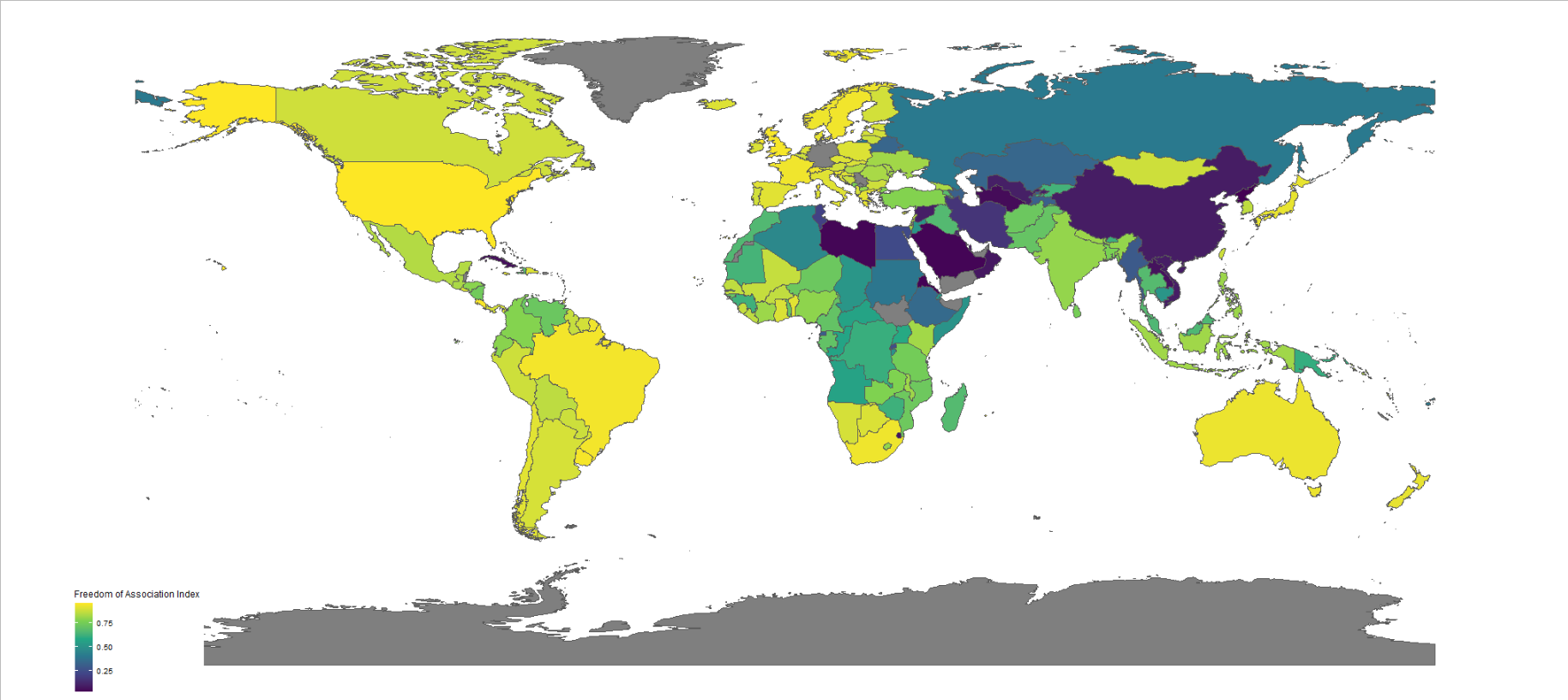
assoc_graph + theme_map()
And there we have it, a map of countries showing the Freedom of Association index across countries.
The index broadly captures to what extent are parties, including opposition parties, allowed to form and to participate in elections, and to what extent are civil society organizations able to form and to operate freely.

Yellow colors indicate more freedom, green colors indicate middle scores and blue colors indicate low levels of freedom.
Some of the countries have missing data, such as Germany and Yemen, for various reasons. A true perfectionist would go and find and fill in the data manually.
