Packages we will be using:
library(gender)
library(tidyverse)
library(stringi)
library(toOrdinal)
library(rvest)
library(janitor)
library(magrittr)
I heard a statistic a while ago that there are more men named Mike than total women in charge of committees in the US Senate.
In this blog, we can whether the number of women in the Irish parliament outnumber any common male name.
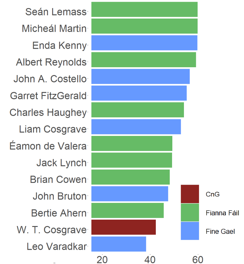
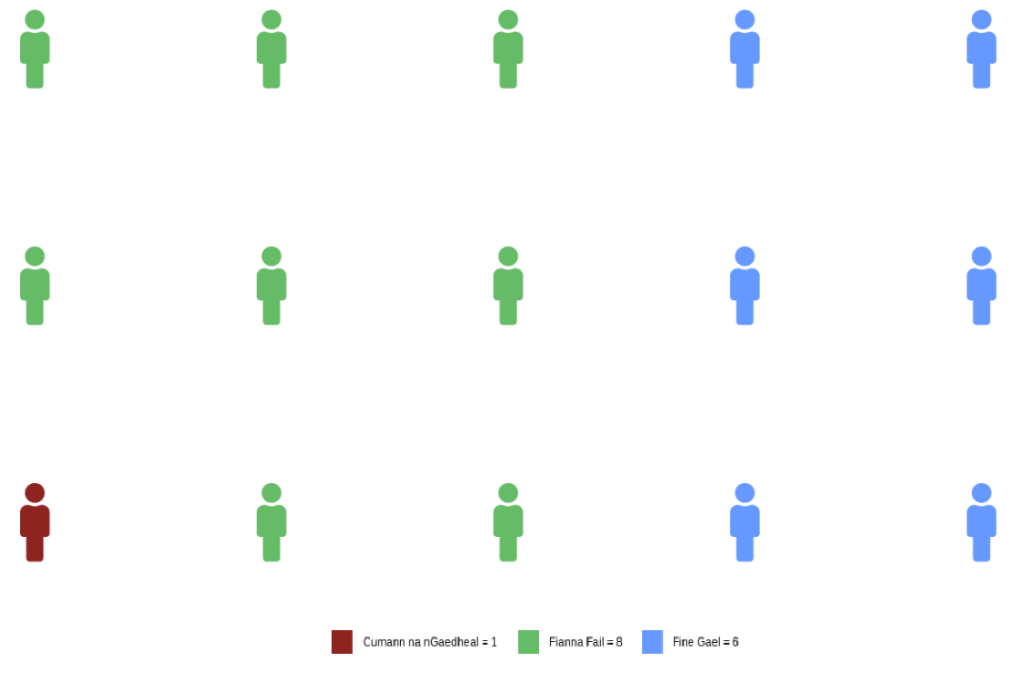
A quick glance on the most common names in the Irish parliament, we can see that from 1921 to 2024, there have been over 600 seats won by someone named John.
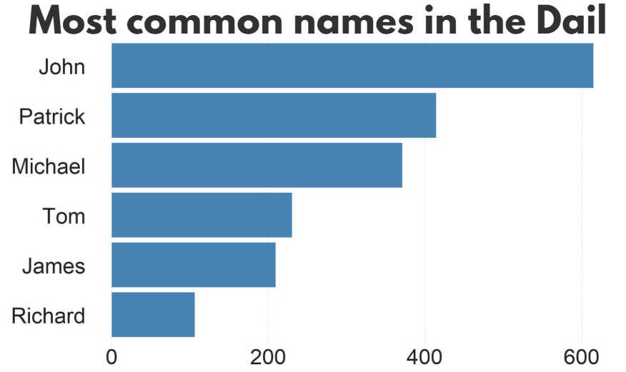
There are a LOT of men in Irish politics with the name Patrick (and variants thereof).
Worldcloud made with wordcloud2() package!

So, in this blog, we will:
- scrape data on Irish TDs,
- predict the gender of each politician and
- graph trends on female TDs in the parliament across the years.
The gender package attempts to infer gender (or more precisely, sex assigned at birth) based on first names using historical data.
Of course, gender is a spectrum. It is not binary.
As of 2025, there are no non-binary or transgender politicians in Irish parliament.
In this package, we can use the following method options to predict gender based on the first name:
1. “ssa” method uses U.S. Social Security Administration (SSA) baby name data from 1880 onwards (based on an implementation by Cameron Blevins)
2. “ipums” (Integrated Public Use Microdata Series) method uses U.S. Census data in the Integrated Public Use Microdata Series (contributed by Ben Schmidt)
3. “napp” uses census microdata from Canada, UK, Denmark, Iceland, Norway, and Sweden from 1801 to 1910 created by the North Atlantic Population Project
4. “kantrowitz” method uses the Kantrowitz corpus of male and female names, based on the SSA data.
5. The “genderize” method uses the Genderize.io API based on user profiles from social networks.
We can also add in a “countries” variable for just the NAPP method
For the “ssa” and “ipums” methods, the only valid option is “United States” which will be assumed if no argument is specified. For the “kantrowitz” and “genderize” methods, no country should be specified.
For the “napp” method, you may specify a character vector with any of the following countries: “Canada”, “United Kingdom”, “Denmark”, “Iceland”, “Norway”, “Sweden”.
We can compare these different method with the true list of the genders that I manually checked.
So let’s look at the 33rd Dail from Wikipedia.
We can create a new variable with separate() so that it only holds the first name of each politician. We will predict the gender based on this.
dail_33 %<>%
  separate(
    col = "name",
    into = c("first_name", "rest_name"),
    sep = " ",
    remove = FALSE,
    extra = "merge",
    fill = "warn")
Irish names often have fadas so we can remove them from the name and make it easier for the prediction function.
remove_fada <- function(x) {
  stri_trans_general(x, id = "Latin-ASCII")
}

dail_33 %<>%
  mutate(first_name = remove_fada(first_name))
Now we’re ready.
We can extract two variables of interest with the gender() function:
gendervariable (prediction of male or female name) andproportion_male(level of certainty about that prediction from 0 to 1).
If the method is confident about predicting male, it will give a higher score.
dail_33 %<>%
  rowwise() %>%
  mutate(
    gender_ssa = gender(first_name, method = "ssa")$gender[1],
    prop_male_ssa = gender(first_name, method ="ssa")$proportion_male[1])
We can add both these to the dail_33 data.frame and check how confident the SSA method is about predicting the gender of all the names.
We can now create a histogram of this level of certainty about the prediction.
Before we graph it out, we
- filter out the NA values,
- remove duplicate first names,
- round up the certainty to three decimal points and
- choose the bin size for the histogram
- find some nice hex colours for the graphs
dail_33 %<>%
  filter(is.finite(prop_male_ssa)) %>%
  distinct(first_name, .keep_all = TRUE) %>%
  mutate(
    prop_male_ssa = round(prop_male_ssa, 3),
    bin_category = cut(prop_male_ssa, breaks = 10, labels = FALSE))

 gender_palette <- c("#f72585","#b5179e","#7209b7","#560bad","#480ca8","#3a0ca3","#3f37c9","#4361ee","#4895ef","#4cc9f0")
We can graph it out with the above palette of hex colours.
We can add label_percent() from the scales package for adding percentage signs on the x axis.
dail_33 %>%
  ggplot(aes(x = prop_male_ssa, fill = prop_male_ssa,
group = prop_male_ssa)) +
  geom_histogram(binwidth = 0.05, color = "white") +
  scale_fill_gradientn(colors = gender_palette) +
 # my_style() +
  scale_x_continuous(labels = scales::label_percent()) +
  theme(legend.position = "none")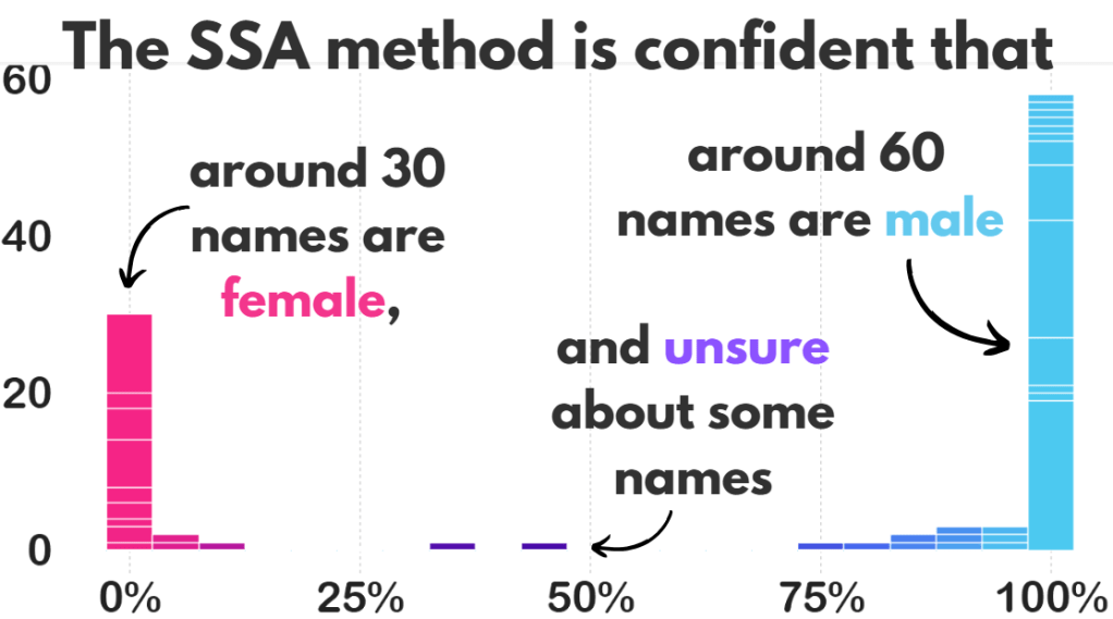
I added the arrows and texts on Canva.
Don’t judge. I just hate the annotate() part of ggplotting.
Two names that the prediction function was unsure about:
  full_name     prop_male_ssa  gender_ssa

Pat Buckley      0.359         female
Jackie Cahill    0.446         female
In these two instances, the politicians are both male, so it was good that the method flagged how unsure it was about labeling them as “female”.
And the names that the function had no idea about so assigned them as NA:
Violet-Anne Wynne
Aindrias Moynihan
Donnchadh Ó Laoghaire
Bríd Smith
Sorca Clarke
Ged Nash
Peadar Tóibín
Which is fair.
We can graph out whether the SSA predicted gender are the same as the actual genders of the TDs.
So first, we create a new variable that classifies whether the predictions were correct or not. We can also call NA results as incorrect. Although god bless any function attempting to guess what Donnchadh is.
dail_33 %>%
    mutate(correct = ifelse(gender == gender_ssa, "Correct", "Incorrect"), correct = ifelse(is.na(gender_ssa), "Incorrect", correct)) -> dail_correct
And graph it out:
dail_correct %>%
  ggplot(aes(x = gender, y = gender_ssa, color = correct )) +
  geom_jitter(width = 0.3, height = 0.3, alpha = 0.5, size = 4) +
  labs(
    x = "Actual Gender",
    y = "Predicted Gender",
    color = "Prediction") +
  scale_color_manual(values = c("Correct" = "#217653", "Incorrect" = "#780000")) +
  # my_style()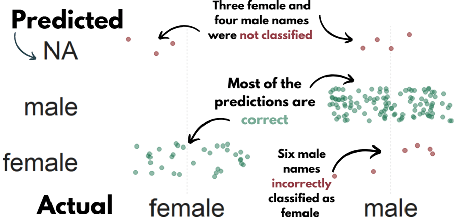
 dail %<>%
   select(first_name, contains("gender")) %>%
   distinct(first_name, .keep_all = TRUE) %>%
   mutate(across(everything(), ~ ifelse(. == "either", NA, .)))
Now, we can compare the SSA method with the other methods in the gender package and see which one is most accurate.
First, we repeat the same steps with the gender() function like above, and change the method arguments.
dail_33 %<>%
  rowwise() %>%
  mutate(
    gender_ipums = gender(first_name, method = "ipums")$gender[1])

dail_33 %<>%
  rowwise() %>%
  mutate(gender_napp = gender(first_name, method = "napp")$gender[1])

dail_33 %<>%
  rowwise() %>%
  mutate(gender_kantro = gender(first_name, method = "kantrowitz" )$gender[1])

dail_33 %<>%
  rowwise() %>%
  mutate(gender_ize = gender(first_name, method = "genderize" )$gender[1])
Or we can remove duplicates with purrr package
dail_33 %<>%
rowwise() %>%
mutate(across(
c("ipums", "napp", "kantrowitz", "genderize"),
~ gender(first_name, method = .x)$gender[1],
.names = "gender_{.col}"
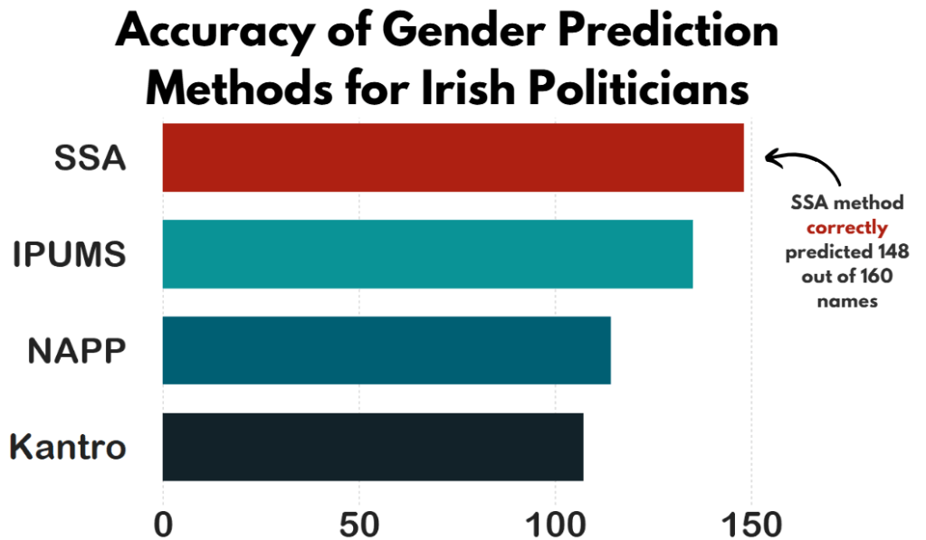
))Then we calculate which one is closest to the actual measures.
dail_33 %>%
summarise(accuracy_ssa = mean(ifelse(is.na(gender == gender_ssa), FALSE, gender == gender_ssa)),

     accuracy_ipums = mean(ifelse(is.na(gender == gender_ipums), FALSE, gender == gender_ipums)),

     accuracy_napp = mean(ifelse(is.na(gender == gender_napp), FALSE, gender == gender_napp)),

     accuracy_kantro = mean(ifelse(is.na(gender == gender_kantro), FALSE, gender == gender_kantro))) -> acc
Or to make it cleaner with across()
acc <- dail_33 %>%
  summarise(across(
    c(gender_ssa, gender_ipums, gender_napp, gender_kantro),
    ~ mean(ifelse(is.na(gender == .x), FALSE, gender == .x)),
    .names = "accuracy_{.col}"
  ))
Pivot the data.frame longer so that each method is in a single variable and each value is in an accuracy method.
acc %<>%
  pivot_longer(cols = everything(), names_to = "method", values_to = "accuracy") %>%
  mutate(method = fct_reorder(method, accuracy, .desc = TRUE)) %>%
  mutate(method = factor(method, levels = c("accuracy_kantro", "accuracy_napp", "accuracy_ipums", "accuracy_ssa")))

my_pal <- c(
  "accuracy_kantro" = "#122229",
  "accuracy_napp" = "#005f73",
  "accuracy_ipums" = "#0a9396",
  "accuracy_ssa" = "#ae2012")
And then graph it all out!
We can use scale_x_discrete() to change the labels of each different method
# Cairo::CairoWin()

acc %>%
  ggplot(aes(x = method, y = accuracy, fill = method)) +
  geom_bar(stat = "identity", width = 0.7) +
  coord_flip() +
  ylim(c(0,160)) +
  theme(legend.position = "none",
        text = element_text(family = "Arial Rounded MT Bold")) +
  scale_fill_manual(values = sample(my_pal)) +
  scale_x_discrete(labels = c("accuracy_ssa" = "SSA",
                              "accuracy_napp" = "NAPP",
                              "accuracy_ipums" = "IPUMS",
                              "accuracy_kantro" = "Kantro")) +
# my_style()
Once again, I added the title and the annotations in Canva. I will never add arrow annotations in R if I have other options.
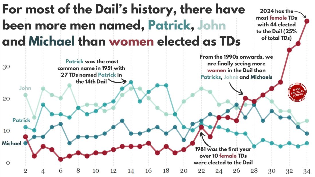
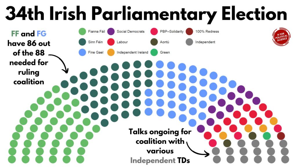
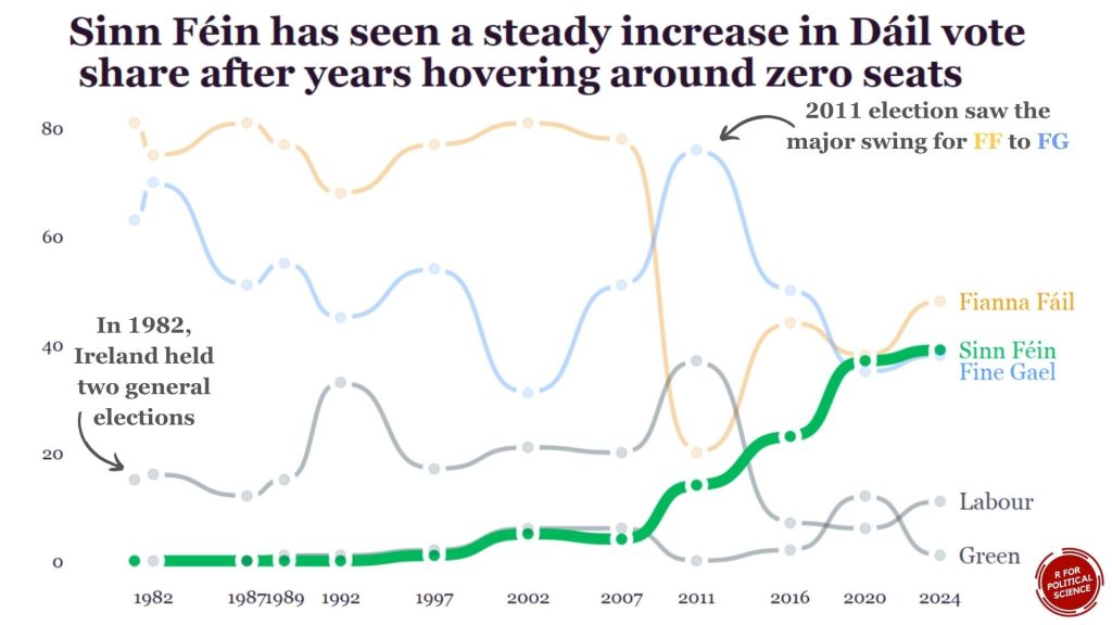
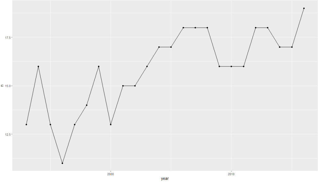
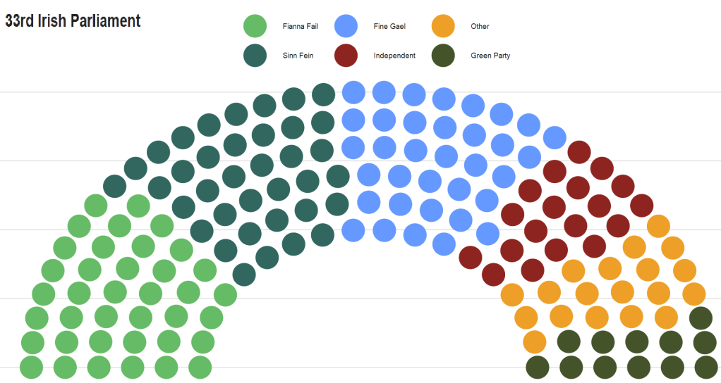
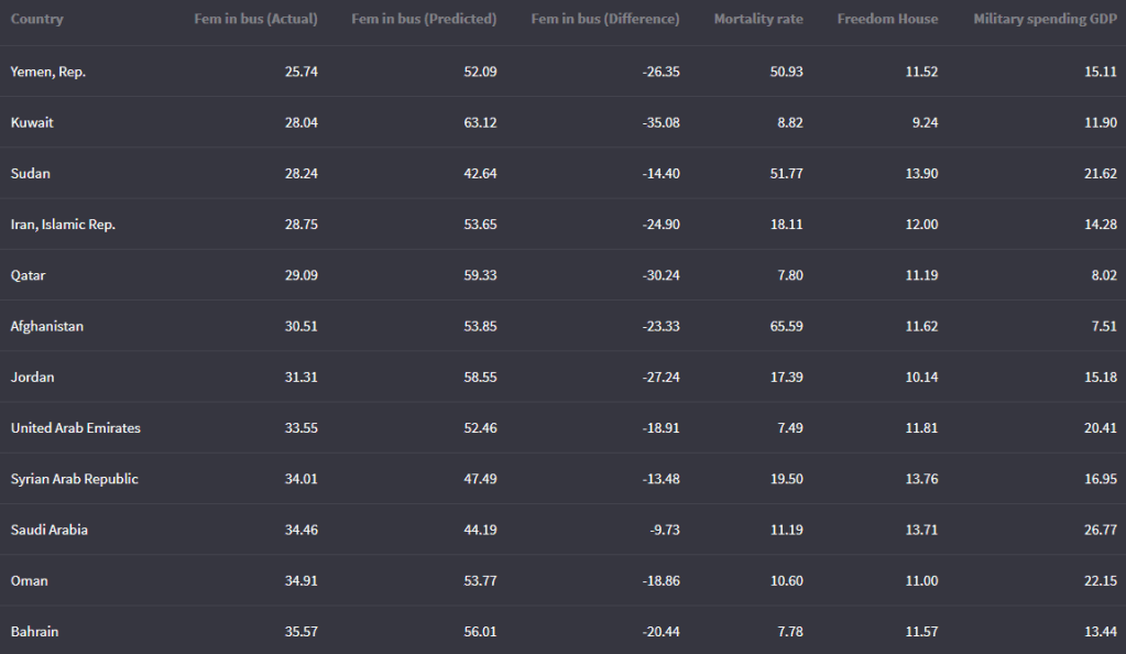
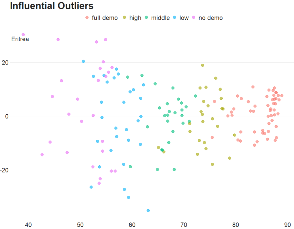
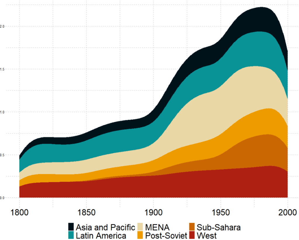
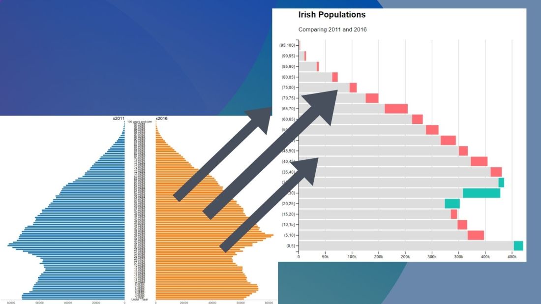
Coming up next, PART 2 on how we can analyse variations on women in the Irish parliament, such as the following graph:


