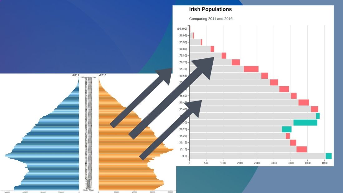
No we can create our pyramid chart with the pyramid_chart() from the ggcharts package. The first argument is the age category for both the 2011 and 2016 data. The second is the actual population counts for each year. Last, enter the group variable that indicates the year.
One problem with the pyramid chart is that it is difficult to discern any differences between the two years without really really examining each year.
One way to more easily see the differences with the compareBars function
The compareBars package created by David Ranzolin can help to simplify comparative bar charts! It’s a super simple function to use that does a lot of visualisation leg work under the hood!
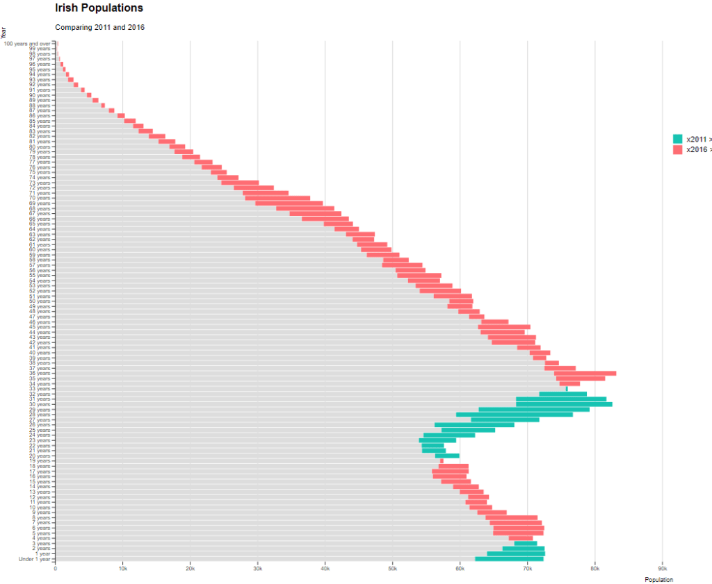
First we need to pivot the data.frame back to wide format and then input the age, and then the two groups – x2011 and x2016 – in the compareBars() function.
We can add more labels and colors to customise the graph also!
We can see that under the age of four-ish, 2011 had more at the time. And again, there were people in their twenties in 2011 compared to 2016.
However, there are more older people in 2016 than in 2011.
Similar to above it is a bit busy! So we can create groups for every five age years categories and examine the broader trends with fewer horizontal bars.
First we want to remove the word “years” from the age variable and convert it to a numeric class variable. We can easily do this with the parse_number() function from the readr package
Next we can group the age years together into five year categories, zero to 5 years, 6 to 10 years et cetera.
We use the cut() function to divide the numeric age_num variable into equal groups. We use the seq() function and input age 0 to 100, in increments of 5.
Next, we can use group_by() to calculate the sum of each population number in each five year category.
And finally, we use the distinct() function to remove the duplicated rows (i.e. we only want to keep the first row that gives us the five year category’s population count for each category.
Click here to learn how to access and download ESS round data for the thirty-ish European countries (depending on the year).
So with the essurvey package, I have downloaded and cleaned up the most recent round of the ESS survey, conducted in 2018.
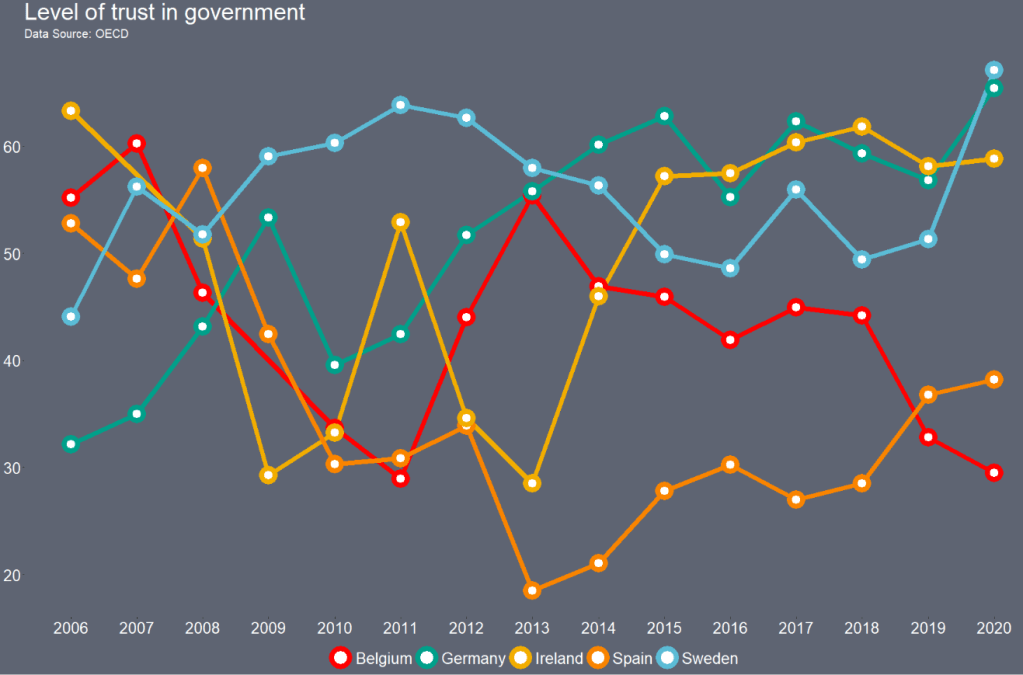
We will examine the different demographic variables that relate to levels of trust in politicians across 29 European countries (education level, gender, age et cetera).
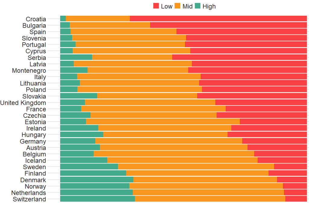
Before we create the survey weight objects, we can first make a bar chart to look at the different levels of trust in the different countries.
We can use the cut() function to divide the 10-point scale into three groups of “low”, “mid” and “high” levels of trust in politicians.
I also choose traffic light hex colors in color_palette vector and add full country names with countrycode() so it’s easier to read the graph
The graph lists countries in descending order according to the percentage of sampled participants that indicated they had low trust levels in politicians.
The respondents in Croatia, Bulgaria and Spain have the most distrust towards politicians.
Croatians when they see politicians
For this example, I want to compare different analyses to see what impact different weights have on the coefficient estimates and standard errors in the regression analyses:
with no weights (dEfIniTelYy not recommended by ESS)
with post-stratification weights only (not recommended by ESS) and
with the combined post-strat AND population weight (the recommended weighting strategy according to ESS)
First we create two special svydesign objects, with the survey package. To create this, we need to add a squiggly ~ symbol in front of the variables (Google tells me it is called a tilde).
The ids argument takes the cluster ID for each participant.
psu is a numeric variable that indicates the primary sampling unit within which the respondent was selected to take part in the survey. For example in Ireland, this refers to the particular electoral division of each participant.
The strata argument takes the numeric variable that codes which stratum each individual is in, according to the type of sample design each country used.
The first svydesign object uses only post-stratification weights: pspwght
Finally we need to specify the nest argument as TRUE. I don’t know why but it throws an error message if we don’t …
WITHOUT weights AND WITH weights (post-stratification and population weights)
We can see that gender variable is more equally balanced between males (1) and females (2) in the data with weights
Additionally, average trust in politicians is lower in the sample with full weights.
Participants are more left-leaning on average in the sample with full weights than in the sample with no weights.
Next, we can look at a general linear model without survey weights and then with the two survey weights we just created.
Do we see any effect of the weighting design on the standard errors and significance values?
So, we first run a simple general linear model. In this model, R assumes that the data are independent of each other and based on that assumption, calculates coefficients and standard errors.
With the stargazer package, we can compare the models side-by-side:
library(stargazer)
stargazer(simple_glm, post_strat_glm, full_weight_glm, type = "text")
We can see that the standard errors in brackets were increased for most of the variables in model (3) with both weights when compared to the first model with no weights.
The biggest change is the rural-urban scale variable. With no weights, it is positive correlated with trust in politicians. That is to say, the more urban a location the respondent lives, the more likely the are to trust politicians. However, after we apply both weights, it becomes negative correlated with trust. It is in fact the more rural the location in which the respondent lives, the more trusting they are of politicians.
Additionally, age becomes statistically significant, after we apply weights.
Of course, this model is probably incorrect as I have assumed that all these variables have a simple linear relationship with trust levels. If I really wanted to build a robust demographic model, I would have to consult the existing academic literature and test to see if any of these variables are related to trust levels in a non-linear way. For example, it could be that there is a polynomial relationship between age and trust levels, for example. This model is purely for illustrative purposes only!
Plus, when I examine the R2 score for my models, it is very low; this model of demographic variables accounts for around 6% of variance in level of trust in politicians. Again, I would have to consult the body of research to find other explanatory variables that can account for more variance in my dependent variable of interest!
We can look at the R2 and VIF score of GLM with the summ() function from the jtools package. The summ() function can take a svyglm object. Click here to read more about various functions in the jtools package.
library(ggflags)
library(bbplot) # for pretty BBC style graphs
library(countrycode) # for ISO2 country codes
library(rvest) # for webscrapping
Click here to add rectangular flags to graphs and click here to add rectangular flags to MAPS!
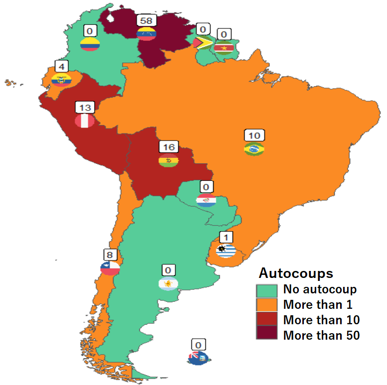
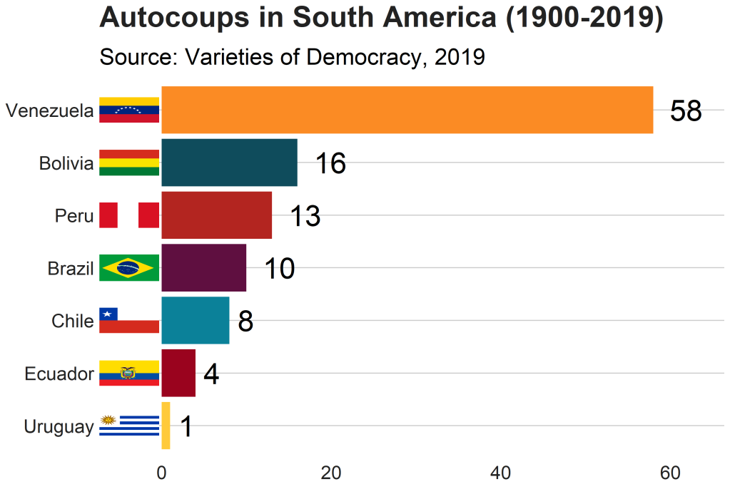
Apropos of this week’s US news, we are going to graph the number of different or autocoups in South America and display that as both maps and bar charts.
According to our pals at the Wikipedia, a self-coup, or autocoup (from the Spanish autogolpe), is a form of putsch or coup d’état in which a nation’s leader, despite having come to power through legal means, dissolves or renders powerless the national legislature and unlawfully assumes extraordinary powers not granted under normal circumstances.
In order to add flags to maps, we need to make sure our dataset has three variables for each country:
Longitude
Latitude
ISO2 code (in lower case)
In order to add longitude and latitude, I will scrape these from a website with the rvest dataset and merge them with my existing dataset.
In this case, a warning message pops up to tell me:
Some values were not matched unambiguously: Kosovo, Somaliland, Zanzibar
One important step is to convert the ISO codes from upper case to lower case. The geom_flag() function from the ggflag package only recognises lower case (e.g Chile is cl, not CL).
Finally we can graph our maps comparing the different types of coups in South America.
Click here to learn how to graph variables onto maps with the rnaturalearth package.
The geom_flag() function requires an x = longitude, y = latitude and a country argument in the form of our lower case ISO2 country codes. You can play around the latitude and longitude flag and also label position by adding or subtracting from them. The size of the flag can be added outside the aes() argument.
We can place the number of coups under the flag with the geom_label() function.
The theme_map() function we add comes from ggthemes package.
autocoup_map <- autocoup_df%>%
  dplyr::filter(subregion == "South America") %>%
  ggplot() +
  geom_sf(aes(fill = coup_cat)) +
  ggflags::geom_flag(aes(x = longitude, y = latitude+0.5, country = iso2_lower), size = 8) +
  geom_label(aes(x = longitude, y = latitude+3, label = auto_coup_sum, color = auto_coup_sum), fill  =  "white", colour = "black") +
  theme_map()


autocoup_map + scale_fill_manual(values = coup_palette, name = "Auto Coups", labels = c("No autocoup", "More than 1", "More than 10", "More than 50"))
Not hard at all.
And we can make a quick barchart to rank the countries. For this I will use square flags from the ggimage package. Click here to read more about the ggimage package
Additionally, I will use the theme from the bbplot pacakge. Click here to read more about the bbplot package.
The mctest package’s functions have many multicollinearity diagnostic tests for overall and individual multicollinearity. Additionally, the package can show which regressors may be the reason of for the collinearity problem in your model.
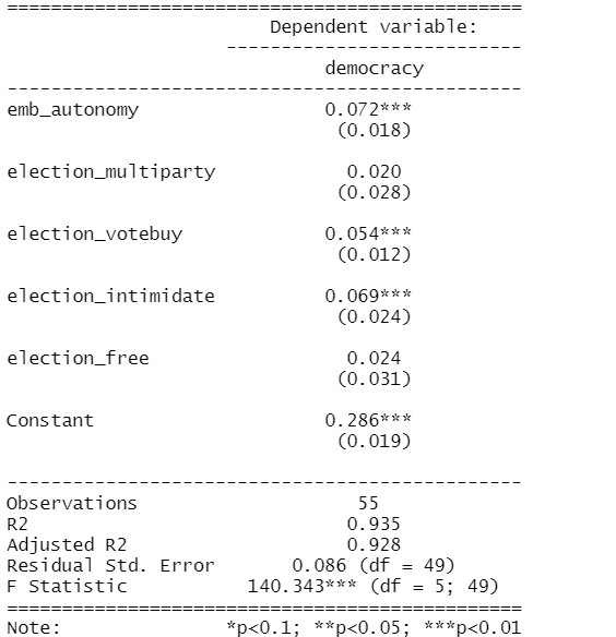
Given the amount of news we have had about elections in the news recently, let’s look at variables that capture different aspects of elections and see how they relate to scores of democracy. These different election components will probably overlap.
In fact, I suspect multicollinearity will be problematic with the variables I am looking at.
emb_autonomy – the extent to which the election management body of the country has autonomy from the government to apply election laws and administrative rules impartially in national elections.
election_multiparty – the extent to which the elections involved real multiparty competition.
election_votebuy – the extent to which there was evidence of vote and/or turnout buying.
election_intimidate – the extent to which opposition candidates/parties/campaign workers subjected to repression, intimidation, violence, or harassment by the government, the ruling party, or their agents.
election_free – the extent to which the election was judged free and fair.
In this model the dependent variable is democracy score for each of the 178 countries in this dataset. The score measures the extent to which a country ensures responsiveness and accountability between leaders and citizens. This is when suffrage is extensive; political and civil society organizations can operate freely; governmental positions are clean and not marred by fraud, corruption or irregularities; and the chief executive of a country is selected directly or indirectly through elections.
election_model <- lm(democracy ~ ., data = election_df)
stargazer(election_model, type = "text")
However, I suspect these variables suffer from high multicollinearity. Usually your knowledge of the variables – and how they were operationalised – will give you a hunch. But it is good practice to check everytime, regardless.
The eigprop() function can be used to detect the existence of multicollinearity among regressors. The function computes eigenvalues, condition indices and variance decomposition proportions for each of the regression coefficients in my election model.
To check the linear dependencies associated with the corresponding eigenvalue, the eigprop compares variance proportion with threshold value (default is 0.5) and displays the proportions greater than given threshold from each row and column, if any.
So first, let’s run the overall multicollinearity test with the eigprop() function :
mctest::eigprop(election_model)
If many of the Eigenvalues are near to 0, this indicates that there is multicollinearity.
Unfortunately, the phrase “near to” is not a clear numerical threshold. So we can look next door to the Condition Index score in the next column.
This takes the Eigenvalue index and takes a square root of the ratio of the largest eigenvalue (dimension 1) over the eigenvalue of the dimension.
Condition Index values over 10 risk multicollinearity problems.
In our model, we see the last variable – the extent to which an election is free and fair – suffers from high multicollinearity with other regressors in the model. The Eigenvalue is close to zero and the Condition Index (CI) is near 10. Maybe we can consider dropping this variable, if our research theory allows its.
Another battery of tests that the mctest package offers is the imcdiag( ) function. This looks at individual multicollinearity. That is, when we add or subtract individual variables from the model.
mctest::imcdiag(election_model)
A value of 1 means that the predictor is not correlated with other variables. As in a previous blog post on Variance Inflation Factor (VIF) score, we want low scores. Scores over 5 are moderately multicollinear. Scores over 10 are very problematic.
And, once again, we see the last variable is HIGHLY problematic, with a score of 14.7. However, all of the VIF scores are not very good.
The Tolerance (TOL) score is related to the VIF score; it is the reciprocal of VIF.
The Wi score is calculated by the Farrar Wi, which an F-test for locating the regressors which are collinear with others and it makes use of multiple correlation coefficients among regressors. Higher scores indicate more problematic multicollinearity.
The Leamer score is measured by Leamer’s Method : calculating the square root of the ratio of variances of estimated coefficients when estimated without and with the other regressors. Lower scores indicate more problematic multicollinearity.
The CVIF score is calculated by evaluating the impact of the correlation among regressors in the variance of the OLSEs. Higher scores indicate more problematic multicollinearity.
The Klein score is calculated by Klein’s Rule, which argues that if Rj from any one of the models minus one regressor is greater than the overall R2 (obtained from the regression of y on all the regressors) then multicollinearity may be troublesome. All scores are 0, which means that the R2 score of any model minus one regression is not greater than the R2 with full model.
Click here to read the mctest paper by its authors – Imdadullah et al. (2016) – that discusses all of the mathematics behind all of the tests in the package.
In conclusion, my model suffers from multicollinearity so I will need to drop some variables or rethink what I am trying to measure.
Click here to run Stepwise regression analysis and see which variables we can drop and come up with a more parsimonious model (the first suspect I would drop would be the free and fair elections variable)
Perhaps, I am capturing the same concept in many variables. Therefore I can run Principal Component Analysis (PCA) and create a new index that covers all of these electoral features.
Next blog will look at running PCA in R and examining the components we can extract.
References
Imdadullah, M., Aslam, M., & Altaf, S. (2016). mctest: An R Package for Detection of Collinearity among Regressors. R J., 8(2), 495.
gvlma stands for Global Validation of Linear Models Assumptions. See Peña and Slate’s (2006) paper on the package if you want to check out the math!
Linear regression analysis rests on many MANY assumptions. If we ignore them, and these assumptions are not met, we will not be able to trust that the regression results are true.
Luckily, R has many packages that can do a lot of the heavy lifting for us. We can check assumptions of our linear regression with a simple function.
So first, fit a simple regression model:
 data(mtcars)
 summary(car_model <- lm(mpg ~ wt, data = mtcars))
We then feed our car_model into the gvlma() function:
gvlma_object <- gvlma(car_model)
Global Stat checks whether the relationship between the dependent and independent relationship roughly linear. We can see that the assumption is met.
Skewness and kurtosis assumptions show that the distribution of the residuals are normal.
Link function checks to see if the dependent variable is continuous or categorical. Our variable is continuous.
Heteroskedasticity assumption means the error variance is equally random and we have homoskedasticity!
Often the best way to check these assumptions is to plot them out and look at them in graph form.
Next we can plot out the model assumptions:
plot.gvlma(glvma_object)
The relationship is a negative linear relationship between the two variables.
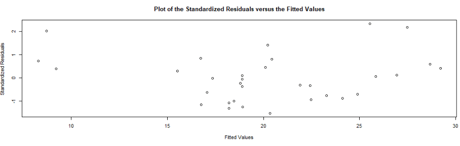
This scatterplot of residuals on the y axis and fitted values (estimated responses) on the x axis. The plot is used to detect non-linearity, unequal error variances, and outliers.
The residuals “bounce randomly” around the 0 line. This suggests that the assumption that the relationship is linear is reasonable.
The residuals roughly form a “horizontal band” around the 0 line. This suggests that the variances of the error terms are equal.
No one residual “stands out” from the basic random pattern of residuals. This suggests that there are no outliers.
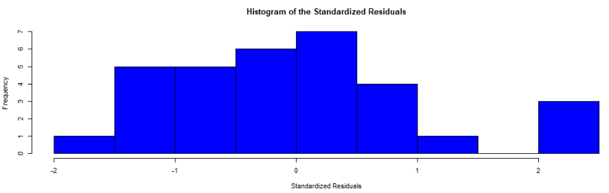
In this histograpm of standardised residuals, we see they are relatively normal-ish (not too skewed, and there is a single peak).
Next, the normal probability standardized residuals plot, Q-Q plot of sample (y axis) versus theoretical quantiles (x axis). The points do not deviate too far from the line, and so we can visually see how the residuals are normally distributed.
Click here to check out the CRAN pdf for the gvlma package.
References
Peña, E. A., & Slate, E. H. (2006). Global validation of linear model assumptions. Journal of the American Statistical Association, 101(473), 341-354.
What is a shiny app, you ask? Click to look at a quick Youtube explainer. It’s basically a handy GUI for R.
When we feed a panel data.frame into the ExPanD() function, a new screen pops up from R IDE (in my case, RStudio) and we can interactively toggle with various options and settings to run a bunch of statistical and visualisation analyses.
Click here to see how to convert your data.frame to pdata.frame object with the plm package.
Be careful your pdata.frame is not too large with too many variables in the mix. This will make ExPanD upset enough to crash. Which, of course, I learned the hard way.
Also I don’t know why there are random capitalizations in the PaCkaGe name. Whenever I read it, I think of that Sponge Bob meme.
If anyone knows why they capitalised the package this way. please let me know!
So to open up the new window, we just need to feed the pdata.frame into the function:
ExPanD(mil_pdf)
For my computer, I got error messages for the graphing sections, because I had an old version of Cairo package. So to rectify this, I had to first install a source version of Cairo and restart my R session. Then, the error message gods were placated and they went away.
install.packages("Cairo", type="source")
Then press command + shift + F10 to restart R session
library(Cairo)
You may not have this problem, so just ignore if you have an up-to-date version of the necessary packages.
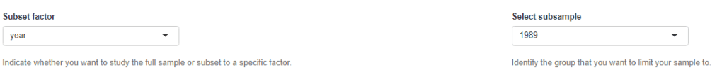
When the new window opens up, the first section allows you to filter subsections of the panel data.frame. Similar to the filter() argument in the dplyr package.
For example, I can look at just the year 1989:
But let’s look at the full sample
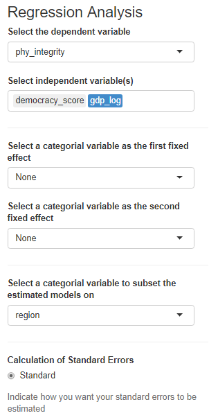
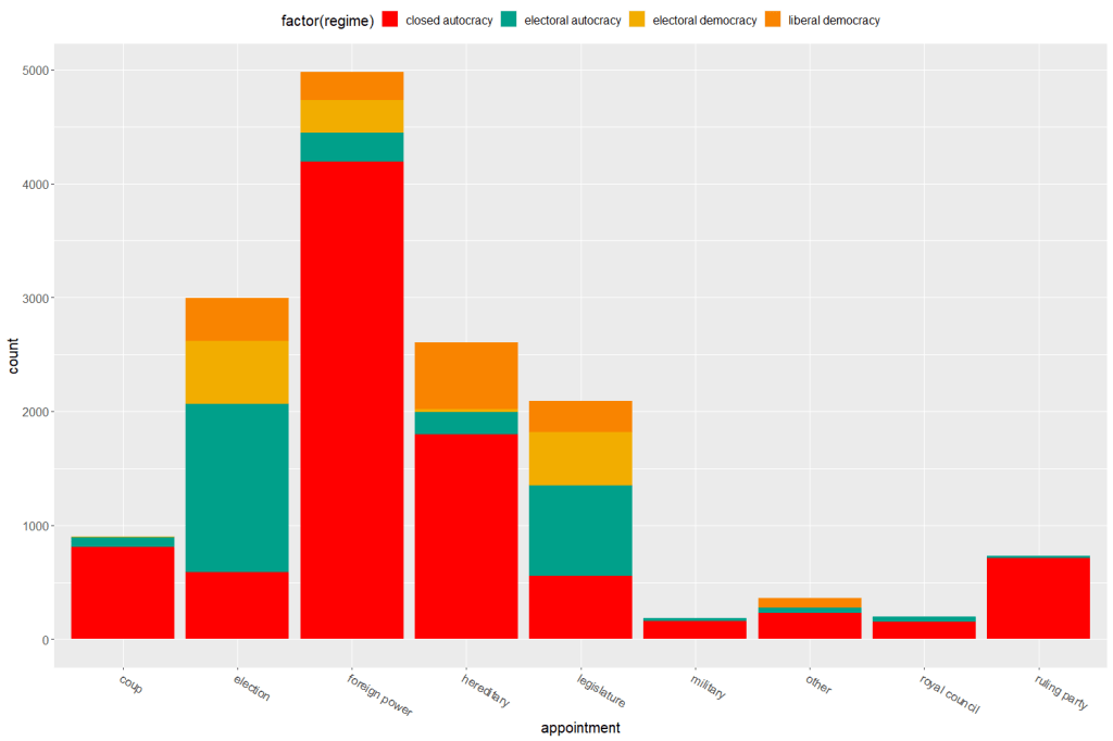
We can toggle with variables to look at mean scores for certain variables across different groups. For example, I look at physical integrity scores across regime types.
Purple plot: closed autocracy
Turquoise plot: electoral autocracy
Khaki plot: electoral democracy:
Peach plot: liberal democracy
The plots show that there is a high mean score for physical integrity scores for liberal democracies and less variance. However with the closed and electoral autocracies, the variance is greater.
We can look at a visualisation of the correlation matrix between the variables in the dataset.
Next we can look at a scatter plot, with option for loess smoother line, to graph the relationship between democracy score and physical integrity scores. Bigger dots indicate larger GDP level.
Last we can run regression analysis, and add different independent variables to the model.
We can add fixed effects.
And we can subset the model by groups.
The first column, the full sample is for all regions in the dataset.
Running a regression model with too many variables – especially irrelevant ones – will lead to a needlessly complex model. Stepwise can help to choose the best variables to add.
Packages you need:
library(olsrr)
library(MASS)
library(stargazer)
First, choose a model and throw every variable you think has an impact on your dependent variable!
I hear the voice of my undergrad professor in my ear: ” DO NOT go for the “throw spaghetti at the wall and just see what STICKS” approach. A cardinal sin.
We must choose variables because we have some theoretical rationale for any potential relationship. Or else we could end up stumbling on spurious relationships.
… beyond just using our sound theoretical understanding of the complex phenomena we study in order to choose our model variables …
… one additional way to supplement and gauge which variables add to – or more importantly omit from – the model is to choose the one with the smallest amount of error.
We can operationalise this as the model with the lowest Akaike information criterion (AIC).
AIC is an estimator of in-sample prediction error and is similar to the adjusted R-squared measures we see in our regression output summaries.
It effectively penalises us for adding more variables to the model.
Lower scores can indicate a more parsimonious model, relative to a model fit with a higher AIC. It can therefore give an indication of the relative quality of statistical models for a given set of data.
As a caveat, we can only compare AIC scores with models that are fit to explain variance of the same dependent / response variable.
data(mtcars)
car_model <- lm(mpg ~., data = mtcars) %>% stargazer
Very many variables and not many stars.
With our model, we can now feed it into the stepwise function. Hopefully, we can remove variables that are not contributing to the model!
For the direction argument, you can choose between backward and forward stepwise selection,
Forward steps: start the model with no predictors, just one intercept and search through all the single-variable models, adding variables, until we find the the best one (the one that results in the lowest residual sum of squares)
Backward steps: we start stepwise with all the predictors and removes variable with the least statistically significant (the largest p-value) one by one until we find the lost AIC.
Backward stepwise is generally better because starting with the full model has the advantage of considering the effects of all variables simultaneously.
Unlike backward elimination, forward stepwise selection is more suitable in settings where the number of variables is bigger than the sample size.
So tldr: unless the number of candidate variables is greater than the sample size (such as dealing with genes), using a backward stepwise approach is default choice.
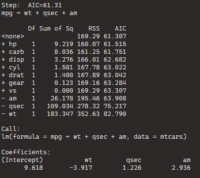
If you add the trace = TRUE, R prints out all the steps.
I’ll show the last step to show you the output.
The goal is to have the combination of variables that has the lowest AIC or lowest residual sum of squares (RSS).
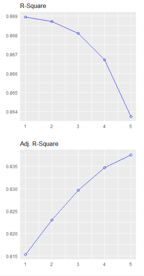
BThe best model, based on the lowest AIC, includes the predictors wt (weight), qsec (quarter-mile time), and am (automatic/manual transmission). The formula is mpg ~ wt + qsec + am.
If we dropped the wt variable, the AIC would shoot up 82.79, so we won’t do that.
Model Comparison:
The initial model (null model) has an AIC of 61.31. Each row in the table corresponds to a different model with additional predictors. For example, adding the predictor hp reduces the AIC to 61.515, and adding carb reduces it further to 61.751.
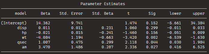
The coefficients for the “best” model are given under “Call.” For the formula mpg ~ wt + qsec + am, the intercept is 9.618, and the coefficients for wt, qsec, and am are -3.917, 1.226, and 2.936, respectively.
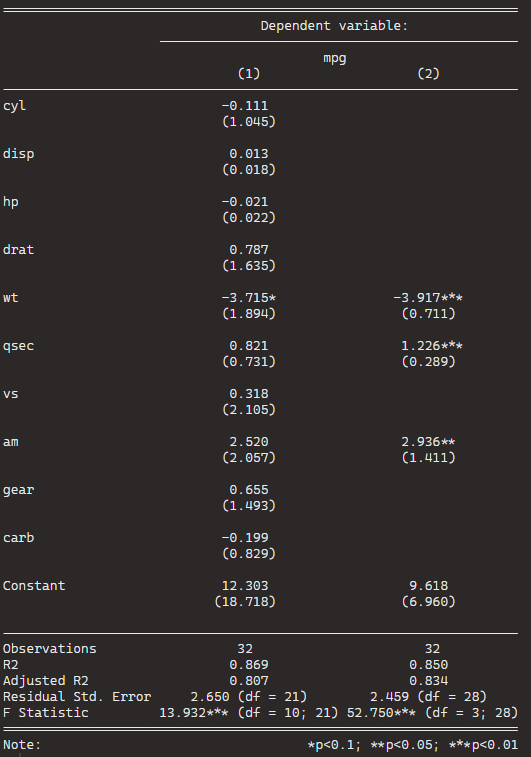
stargazer(car_model, step_car, type = "text")
We can see that the stepwise model has only three variables compared to the ten variables in my original model.
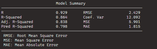
And even with far fewer variables, the R2 has decreased by an insignificant amount. In fact the Adjusted R2 increased because we are not being penalised for throwing so many unnecessary variables.
So we can quickly find a model that loses no explanatory power by is far more parsimonious.
Plus in the original model, only one variable is significant but in the stepwise variable all three of the variables are significant.
We can plot out the stepwise regression with the oslrr package
car_model %>%
   ols_step_backward_p() %>% plot()
car_model %>%
   ols_step_backward_p(details = TRUE)
With this, we can iterate over the steps. First, we can look at the first step:
The removal of cyl suggests that, after evaluating its p-value, it was found to be not statistically significant in predicting the response variable.
The model is iteratively refining itself by removing variables that do not provide significant information.
In total, it runs five steps and we arrive at the final step and the final model.
We can code a new binary variable that indicates if there was a UCDP conflict in the previous 10 years or not.
We could imagine a country that experienced war is more likely to keep investing in their military (as a larger percentage of their GDP) than countries that have only experienced relative peace in their recent past.
wdi_data %>%
  inner_join(peace_data, by = c("cown", "year")) -> wdi_peace
With these data, we can build our linear regression model.
Our dependent variable is military spending as a percentage of GDP (logged)
Our independent varibles are:
GDP per capita (logged) from the World Bank
Demoracy (as measured by the V-DEM polyarchy score)
Binary variable that is 1 if a country had a UCDP conflict in the previous 10 years and 0 if none.
We will also add an interaction term with the GDP and democracy variable.
Given we have cross-sectional longitudinal data, the best option would be panel data analysis with the plm package
plm(log(mil_spend_gdp) ~ log(gdp_percap)*v2x_polyarchy + as.factor(war_past_10_years_no_na), data = wdi_peace,
  index = c("cown", "year"), model = "within") %>%
  stargazer(., type = "text")
Dependent variable:
Military spending (GDP %) (ln)
GDP pc (ln)
-0.288***
(0.029)
Democracy
1.004***
(0.353)
War 10 year dummy
0.146***
(0.021)
GDP pc (ln) x Democracy
-0.199***
(0.046)
Observations
3,686
R2
0.135
Adjusted R2
0.097
F Statistic
137.989*** (df = 4; 3530)
Note:
*p<0.1; **p<0.05; ***p<0.01
However, the olsrr package cannot handle plm.
In future blog posts, we will lok more closely at plm() panel regressions and the diagnostic tests we have to run with these types of models.
lm(log(mil_spend_gdp) ~ log(gdp_percap)*v2x_polyarchy + as.factor(war_past_10_years_no_na), data = subset(wdi_peace, year == 2010)) -> war_model
Dependent variable:
Military spending (GDP %) (ln)
GDP pc (ln)
0.261**
(0.101)
Democracy
1.450
(1.565)
War 10 year dummy
0.592***
(0.159)
GDP pc (ln) x Democracy
-0.343**
(0.168)
Constant
0.183
(0.885)
Observations
136
R2
0.381
Adjusted R2
0.362
Residual Std. Error
0.615 (df = 131)
F Statistic
20.137*** (df = 4; 131)
Note:
*p<0.1; **p<0.05; ***p<0.01
So now we have our OLS model, we can run a heap of linear model diagnostic functions with the olsrr package.
Built by Aravind Hebbali, the description of the package mentions that olsrr has tools designed to make it easier for users, particularly beginner/intermediate R users to build ordinary least squares regression models. Thank you Aravind!
It includes regression output, heteroskedasticity tests, collinearity diagnostics, residual diagnostics, measures of influence, model fit assessment and variable selection procedures. Look through the CRAN PDF below or look at rsquaredacademy website to get a comprehensive overview of the package
We will now check if the residuals in our model (the difference between what our model predicted and what the values actually are) are normally distributed
ols_test_normality(war_model)
Test
Statistic
p-value
Shapiro-Wilk
0.9817
0.0653
Kolmogorov-Smirnov
0.0524
0.8494
Cramer-von Mises
14.1123
0.0000
Anderson-Darling
0.469
0.2447
Let’s look at each test result in turn
Shapiro-Wilk:
The test statistic is 0.9817, and the p-value is 0.0653.
The null hypothesis is that the residuals are normally distributed.
In this case, the p-value is greater than the predefined significance level (typically 0.05), so you cannot reject the null hypothesis.
This suggests that the residuals may follow a normal distribution.
Woo!
Kolmogorov-Smirnov:
The test statistic is 0.0524, and the p-value is 0.8494.
Similar to the Shapiro-Wilk test, the p-value is greater than 0.05, so you cannot reject the null hypothesis of normality.
This suggests that the residuals may follow a normal distribution.
Yay.
Cramer-von Mises:
This test statistic is 14.1123, and the p-value is 0.0000.
The null hypothesis is that the residuals are normally distributed. The very low p-value indicates that you can reject the null hypothesis, suggesting that the residuals are not from a normal distribution.
Oh no.
Anderson-Darling: This is another test of normality. The test statistic is 0.469, and the p-value is 0.2447. Similar to the Shapiro-Wilk and Kolmogorov-Smirnov tests, the p-value is greater than 0.05, so you cannot reject the null hypothesis of normality.
Phew.
Which of the normality tests is the best?
And what is up with Cramer-von Mises?
A paper by Razali and Wah (2011) tested all these formal normality tests with 10,000 Monte Carlo simulation of sample data generated from alternative distributions that follow symmetric and asymmetric distributions.
Their results showed that the Shapiro-Wilk test is the most powerful normality test, followed by Anderson-Darling test, and Kolmogorov-Smirnov test. Their study did not look at the Cramer-Von Mises test.
The results of Razali and Wah’s study echo the previous findings of Mendes and Pala (2003) and Keskin (2006) in support of Shapiro-Wilk test as the most powerful normality test.
According Ahad and colleagues (2011: 641), they find that
“the performances of the normality tests, namely, the Kolmogorov-Smirnov test, Anderson-Darling test, Cramervon Mises test, and Shapiro-Wilk test, were evaluated under various spectrums of non-normal distributions and different sample sizes. The results showed that the ShapiroWilk test is the most sensitive normality test because this test rejects the null hypothesis of normality at the smallest sample sizes compared to the other tests, at all levels of skewness and kurtosis. Thus, when the four normality tests are available in a statistical package, we would recommend practitioners to use the Shapiro-Wilk normality to test the normality of data”
Ahad et al (2001: 641)
We can plot out the residuals distribution in a histogram with olsrr
olsrr::ols_plot_resid_hist(war_model)
Visually, we can confirm that the residuals have a lovely bell curve and are broadly normally distributed! With a few outliers at -2.
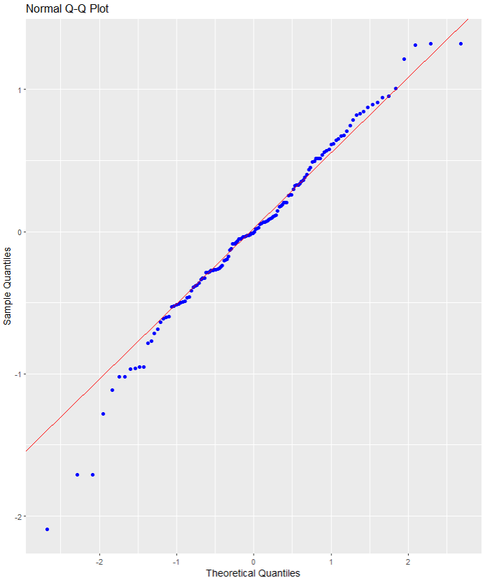
Nest we can check the residuals with a QQ plot.
A QQ plot is used to compare residuals to the normal distribution in linear regression. We can use a normal QQ plot to visually check if our residuals follow a theoretical normal distribution.
In addition to being good at identifying outliers and heavy tails, QQ plots can reveal characteristics such as skewness and bimodality, and can be effective even for small samples (Marden, 2004).
olsrr::ols_plot_resid_qq(war_model)
Again we can see some outliers at -2
Next we can look at a scatter plot of residuals on the y axis and fitted values on the x axis to detect non-linearity, unequal error variances, and outliers.
Each point in the plot is a residual value (i.e. the difference between what the model predicted and what the value actually
When interpreting this plot, there are a few things we want to look out for.
The points does not deviate too far from 0. This indicates the variance is homogeneous (i.e. homescediasticity, one of my favourite words)
The points are random (i.e. show no distinct pattern) around the horizontal red line at 0
ols_plot_resid_fit(war_model)
There are some residual values at the -2, so they might be outliers. We we look at an outlier diagnostic plot in a bit.
There are no discernible pattern in the scatterplot, so there does not seem to be any heteroscedasticity in the variance.
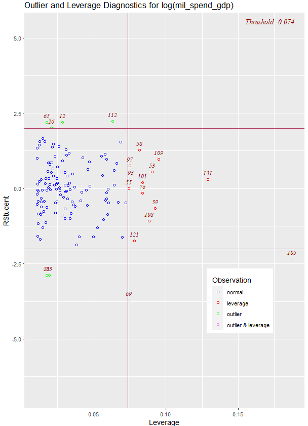
We can run an ols_plot_resid_lev() to graph for detecting outliers and/or observations with high leverage.
ols_plot_resid_lev(war_model)
There are a few outliers with leverage that we need to look more closely and examine how they prove / challenge our given theory / hypotheses.
FINALLLY. for a more complete diagnostics check, we can insert the model into the ols_coll_diag() function to calculate the Variance Inflation Factor (VIF) and Eigenvalues of the variables in the model.
VIF scores highlight if there is multicollinearity between the independent variables. If they are too highly correlated, our model is in trouble.
If the value of VIF is 1< VIF < 5, it specifies that the variables are moderately correlated to each other.
The challenging value of VIF is between 5 to 10 as it specifies the highly correlated variables.
If VIF ≥ 5 to 10, there will be multicollinearity among the predictors in the regression model.
VIF > 10 indicate the regression coefficients are feebly estimated with the presence of multicollinearity
Read more about the issues with multicollinearity in Shrestha (2020)
ols_coll_diag(war_model)
Variables
Tolerance
VIF
GDP per capita (ln)
0.13
7.6
Democracy
0.02
56.2
War 10 years
0.91
1.1
GDP pc (ln) X Democracy
0.01
79.9
Next we look at the Eigenvalues
Eigenvalue
Condition Index
intercept
GDP pc (ln)
Democracy
War 10 years
GDP pc (ln) X Democracy
3.93
1.00
0.00
0.00
0.00
0.01
0.00
0.90
2.09
0.00
0.00
0.00
0.82
0.00
0.16
5.01
0.01
0.00
0.00
0.12
0.01
0.02
15.14
0.04
0.08
0.05
0.02
0.02
0.00
67.74
0.95
0.92
0.94
0.03
0.97
This is not good.
But it is probably due to the interaction term.
If we run the regression agaon without any interaction term , the VIF scores are all around 1!
lm(log(mil_spend_gdp) ~ log(gdp_percap) + v2x_polyarchy + as.factor(war_past_10_years_no_na), data = subset(wdi_peace, year == 2010)) -> war_model_no_interaction
ols_coll_diag(war_model_no_interaction)
There are plenty of other helpful functions in the olsrr package that we can look at with our model.
For example, we can run AIC stepwise regression to see if we need to drop any variables
aic_step <- ols_step_both_p(war_model)
Step
Variable
Added/Removed
R-Square
Adj. R-Square
C(p)
AIC
RMSE
1
v2x_polyarchy
addition
0.298
0.293
16.4970
271.6880
0.6474
2
as.factor(war_past_10_years_no_na)
addition
0.347
0.338
8.0720
263.7888
0.6266
3
log(gdp_percap)
addition
0.361
0.347
7.1600
262.8901
0.6223
4
log(gdp_percap):v2x_polyarchy
addition
0.381
0.362
5.0000
260.6381
0.6150
Lower AIC scores are better, and AIC penalizes models that use more parameters.
That means if two models explain the same amount of variation, the model with a smaller number of variable parameters will have a lower AIC score.
Many would argue that this would be the better-fit model.
We can see in step 4, the AIC is the lowest. So that is good news!
Variables doe not live in a vacuum in the model. When we run a model, we want to have a better understanding of the relationship between military spending and the independent variables conditional on the other independent variables
According to the package, the added variable plot provides information about the marginal importance of a GIVEN independent variable, given the other variables already in the model.
It shows the marginal importance of the variable in reducing the residual variability.
olsrr::ols_plot_added_variable(war_model)
The military spending dependent variable is on the y axis and we look at adding the named variable (given that the other variables are already in the model).
The democracy variable GDP variable interaction slope appears to decrease while all other variables increase.
What do the Y and X residuals represent? The Y residuals represent the part of Y not explained by all the variables other than X. The X residuals represent the part of X not explained by other variables. The slope of the line fitted to the points in the added variable plot is equal to the regression coefficient when Y is regressed on all variables including X.
A strong linear relationship in the added variable plot indicates the increased importance of the contribution of X to the model already containing the other predictors.
We can see, for example, that (with all other variables held constant) higher GDP per capita correlates with higher proportion of military spending. Richer countries seem to dedicate more of this money to building a military.
Thank you for reading !
References
Ahad, N. A., Yin, T. S., Othman, A. R., & Yaacob, C. R. (2011). Sensitivity of normality tests to non-normal data. Sains Malaysiana, 40(6), 637-641.
Marden, J. I. (2004). Positions and QQ plots. Statistical Science, 606-614.
Razali, N. M., & Wah, Y. B. (2011). Power comparisons of Shapiro-Wilk, Kolmogorov-Smirnov, Lilliefors and Anderson-Darling tests. Journal of statistical modeling and analytics, 2(1), 21-33.
Shrestha, N. (2020). Detecting multicollinearity in regression analysis. American Journal of Applied Mathematics and Statistics, 8(2), 39-42.
“Nodes” designate the vertices of a network, and “edges” designate its ties. Vertices are accessed using the V() function while edges are accessed with the E(). This igraph object has 232 edges and 16 vertices over the four years.
Furthermore, the igraph object has a name attribute as one of its vertices properties. To access, type:
V(countries_ig)$name
Which prints off all the countries in the ww1 dataset; this is all the countries that engaged in militarized interstate disputes between the years 1914 to 1918.
Next we can fit an algorithm to modify the graph distances. According to our pal Wikipedia, force-directed graph drawing algorithms are a class of algorithms for drawing graphs in an aesthetically-pleasing way. Their purpose is to position the nodes of a graph in two-dimensional or three-dimensional space so that all the edges are of more or less equal length and there are as few crossing edges as possible, by assigning forces among the set of edges and the set of nodes, based on their relative positions!
We can do this in one simple step by feeding the igraph into the algorithm function.
A nice way to summarise all the variables in a dataset.
install.packages("skimr")
library(skimr)
The data we’ll look at is from the Correlates of War . It provides dyadic records of militarized interstate disputes (MIDs) over the period of 1816-2010.
skim(mid)
n_missing :tells which variables have missing values
complete_rate : the percentage of the variables which are missing
Column 4 – 7 gives the mean, standard deviation, min, 25th percentile, median, 75th percentile and max values.
The last column is a histogram of each variables, so you can easily scan and see if variables are normally distributed, skewed or binary.
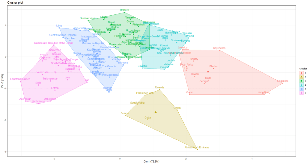
I am looking at 127 non-democracies on seeing how the cluster on measures of state capacity (variables that capture ability of the state to control its territory, collect taxes and avoid corruption in the executive).
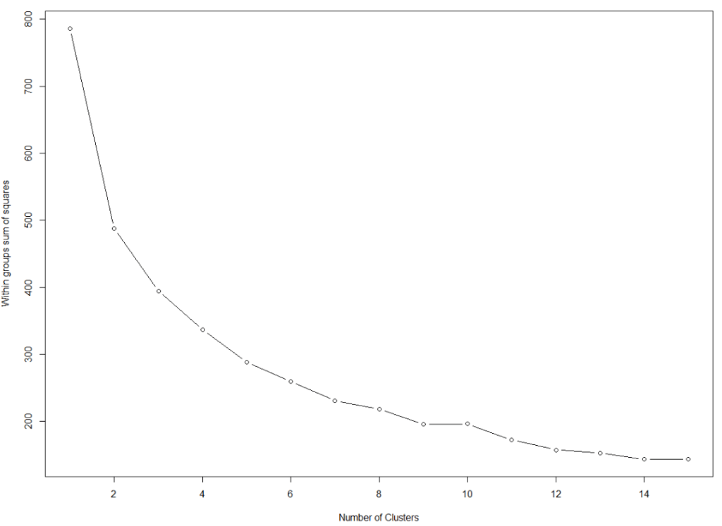
We want to minimise the total within sums of squares error from the cluster mean when determining the clusters.
First, we need to find the optimal number of clusters. We set the max number of clusters at k = 15.
This blog will create dendogram to examine whether Asian countries cluster together when it comes to extent of judicial compliance. I’m examining Asian countries with populations over 1 million and data comes from the year 2019.
Judicial compliance measure how often a government complies with important decisions by courts with which it disagrees.
Higher scores indicate that the government often or always complies, even when they are unhappy with the decision. Lower scores indicate the government rarely or never complies with decisions that it doesn’t like.
It is important to make sure there are no NA values. So I will impute any missing variables.
Next we can scale the dataset. This step is for when you are clustering on more than one variable and the variable units are not necessarily equivalent. The distance value is related to the scale on which the different variables are made.
Therefore, it’s good to scale all to a common unit of analysis before measuring any inter-observation dissimilarities.
asia_scale <- scale(asia_df)
Next we calculate the distance between the countries (i.e. different rows) on the variables of interest and create a dist object.
There are many different methods you can use to calculate the distances. Click here for a description of the main formulae you can use to calculate distances. In the linked article, they provide a helpful table to summarise all the common methods such as “euclidean“, “manhattan” or “canberra” formulae.
I will go with the “euclidean” method. but make sure your method suits the data type (binary, continuous, categorical etc.)
We now have a dist object we can feed into the hclust() function.
With this function, we will need to make another decision regarding the method we will use.
The possible methods we can use are "ward.D", "ward.D2", "single", "complete", "average" (= UPGMA), "mcquitty" (= WPGMA), "median" (= WPGMC) or "centroid" (= UPGMC).
Again I will choose a common "ward.D2" method, which chooses the best clusters based on calculating: at each stage, which two clusters merge that provide the smallest increase in the combined error sum of squares.
When we plot the different clusters, there are many options to change the color, size and dimensions of the dendrogram. To do this we use the set() function.
asia_judicial_dend %>%
set("branches_k_color", k=5) %>%    # five clustered groups of different colors
set("branches_lwd", 2) %>%          # size of the lines (thick or thin)
set("labels_colors", k=5) %>%       # color the country labels, also five groups
plot(horiz = TRUE)                  # plot the dendrogram horizontally
I choose to divide the countries into five clusters by color:
And if I zoom in on the ends of the branches, we can examine the groups.
The top branches appear to be less democratic countries. We can see that North Korea is its own cluster with no other countries sharing similar judicial compliance scores.
The bottom branches appear to be more democratic with more judicial independence. However, when we have our final dendrogram, it is our job now to research and investigate the characteristics that each countries shares regarding the role of the judiciary and its relationship with executive compliance.
Singapore, even though it is not a democratic country in the way that Japan is, shows a highly similar level of respect by the executive for judicial decisions.
Also South Korean executive compliance with the judiciary appears to be more similar to India and Sri Lanka than it does to Japan and Singapore.
So we can see that dendrograms are helpful for exploratory research and show us a starting place to begin grouping different countries together regarding a concept.
A really quick way to complete all steps in one go, is the following code. However, you must use the default methods for the dist and hclust functions. So if you want to fine tune your methods to suit your data, this quicker option may be too brute.
First, we access and store a map object from the rnaturalearth package, with all the spatial information in contains. We specify returnclass = "sf", which will return a dataframe with simple features information.
SF?
Simple features or simple feature access refers to a formal standard (ISO 19125-1:2004) that describes how objects in the real world can be represented in computers, with emphasis on the spatial geometry of these objects. Our map has these attributes stored in the object.
With the ne_countries() function, we get the borders of all countries.
This map object comes with lots of information about 241 countries and territories around the world.
In total, it has 65 columns, mostly with different variants of the names / locations of each country / territory. For example, ISO codes for each country. Further in the dataset, there are a few other variables such as GDP and population estimates for each country. So a handy source of data.
However, I want to use values from a different source; I have a freedom_df dataframe with a freedom of association variable.
The freedom of association index broadly captures to what extent are parties, including opposition parties, allowed to form and to participate in elections, and to what extent are civil society organizations able to form and to operate freely in each country.
So, we can merge them into one dataset.
Before that, I want to only use the scores from the most recent year to map out. So, take out only those values in the year 2019 (don’t forget the comma sandwiched between the round bracket and the square bracket):
We’re all ready to graph the map. We can add the freedom of association variable into the aes() argument of the geom_sf() function. Again, the sf refers to simple features with geospatial information we will map out.
assoc_graph <- ggplot(data = map19) +
  geom_sf(aes(fill = freedom_association_index),
          position = "identity") +
  labs(fill='Freedom of Association Index')  +
  scale_fill_viridis_c(option = "viridis")
The scale_fill_viridis_c(option = "viridis") changes the color spectrum of the main variable.
Other options include:
"viridis"
"magma"
"plasma“
And various others. Click here to learn more about this palette package.
Finally we call the new graph stored in the assoc_graph object.
I use the theme_map() function from the ggtheme package to make the background very clean and to move the legend down to the bottom left of the screen where it takes up the otherwise very empty Pacific ocean / Antarctic expanse.
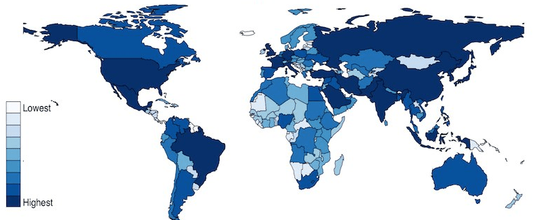
And there we have it, a map of countries showing the Freedom of Association index across countries.
The index broadly captures to what extent are parties, including opposition parties, allowed to form and to participate in elections, and to what extent are civil society organizations able to form and to operate freely.
Yellow colors indicate more freedom, green colors indicate middle scores and blue colors indicate low levels of freedom.
Some of the countries have missing data, such as Germany and Yemen, for various reasons. A true perfectionist would go and find and fill in the data manually.
There is one caveat with this function that we are using from the car package:
recode is also in the dplyr package so R gets confused if you just type in recode on its own; it doesn’t know which package you’re using.
Sometimes R needs some direction.
So, you must write car::recode(). This placates the R gods and they are clear which package to use.
It is useful for all other times you want to explicitly tell R which package you want it to use to avoid any confusion. Just type the package name followed by two :: colons and a list of all the functions in the package drops down. So really, it can also be useful for exploring new packages you’ve installed and loaded!
install.packages("car")
library(car)
First, subset the dataframe, so we are only looking at countries in the year 1990.
data_90 <- data[which(data$year==1990),]
Next look at a frequency of each way that regimes around the world ended.
plyr::count(data_90$regime_end)
To understand these numbers, we look at the codebook.
We want to make a new binary variable to indicate whether a coup occurred in a country in 1990 or not.
To do this we use the car::recode() function.
First we can make a numeric variable. So in the brackets, we indicate our dataframe at the start.
Next bit is important, we put all the original and new variables in ” ” inverted commas.
Also important that we separate each level of the new variable with a ; semicolon.
The punctuation marks in this function are a bit fussy and difficult but it is important.
If you want to convert a continuous variable to discrete factors, we can go to our trusty mutate() function in the dplyr package. And within mutate() we use another function: cut()
So instead of recoding binary variables or factor variables . . . we can turn a numeric variable into a discrete variable with cut()
We specify with the breaks argument to indicate where we want to divide the variable and then we can label the factors with the labels argument:
The Manifesto Project maintains a database of political party manifestos for around 50 countries. It covers free and democratic elections since 1945 in various countries.
Thank you Manifesto Project!
To access the manifestos, we install and load the manifestoR package, which provides an API between R and The Manifesto Project site.
On the website, we can navigate the Manifesto Project database and search for any country for a given time period in the Data Dashboard section on the site. For example, I search for Ireland from 2012 until the present day and I can see the most recent manifestos put forward by the parties.
We can see the number code for each party. (We will need to use these when downloading the texts into R via the API).
In order to download any manifesto text from the database, we need to first set up an account on the website and download an API key. So first step to do is go on the website and sign up.
Then you go to your website profile and click download API Key file (txt).
Then we go back on R and write in:
mp_key <- mp_setapikey(file.choose())
Choose the txt file downloaded from the website … and hopefully you should be all set up to access all the manifesto text data.
Now, we can choose the manifestos we want to download.
Using the mp_corpus() function, we can choose the country and date that we want and download lists of all the texts.
Note that the date I enter into the mp_corpus() function corresponds with the date from the Manifesto Project website. If there is a way to look this up directly through R, please let me know!
If we look at the manifestos_2016 object we just downloaded:
View(manifestos_2016)
We see we have ten lists. Say, for example, the party I want to look at is Fine Gael, I need the party ID code assigned by the Manifesto Project.
Similar to how I got the date, I can look up the Data Dashboard to find the party code for Fine Gael. Or I can search for the ID via this site.
It was funny to see that all the names of the Irish parties are in English, which I never hear! Fine Gael is Irish for Tribes of Ireland and I guess Family is another way to translate that.
The ID code for the party is 53520, which is the seventh list. So index this list and create a new tibble structure for the manifesto text.
With these all ready, there are some really interesting functions we can run with the data and the coding of the texts by the Manifesto Project.
For example, the rile() function. This calculates the Right Left Score.
Essentially, higher RILE scores indicate that the party leans more right on the ideological spectrum, with a maximum score of +100 if the whole manifesto is devoted to ‘right’ categories. Conversely, lower RILE scores indicate that the party leans more left (and a score of -100 would mean the entire manifesto puts forward exclusively ‘left’ categories)
Of course, it is a crude instrument to compress such a variety of social, political and economic positions onto a single dimension. But as long as we keep that caveat in mind, it is a handy shorthanded approach to categorising the different parties.
So take these figures with a grain of salt. But it is interesting to visualise the trends.
I continue subsetting until I have only the largest parties in Ireland and put them into big_parties object. The graph gets a bit hectic when including all the smaller parties in the country since 1949. Like in most other countries, party politics is rarely simple.
Next I can simply create a new rile_index variable and graph it across time.
big_parties$rile_index <- rile(big_parties)
The large chuck in the geom_text() command is to only show the name of the party at the end of the line. Otherwise, the graph is far more busy and far more unreadable.
graph_rile <- big_parties %>%
group_by(partyname) %>%
ggplot(aes(x= as.Date(edate), y = rile_index, color=partyname)) +
geom_point() + geom_line() +
geom_text(data=. %>%
arrange(desc(edate)) %>%
group_by(partyname) %>%
slice(1),
aes(label=partyname), position=position_jitter(height=2), hjust = 0, size = 5, angle=40) +
ggtitle("Relative Left Right Ideological Position of Major Irish Parties 1949 - 2016") +
xlab("Year") + ylab("Right Left (RILE) Index")
While the graph is a bit on the small size, what jumps out immediately is that there has been a convergence of the main political parties toward the ideological centre. In fact, they are all nearing left of centre. The most right-wing a party has ever been in Ireland was Fine Gael in the 1950s, with a RILE score nearing 80. Given their history of its predecessor “Blueshirts” group, this checks out.
The Labour Party has consistently been very left wing, with its most left-leaning RILE score of -40 something in the early 1950s and again in early 1980s.
Ireland joined the European Union in 1978, granted free third level education for all its citizens since the 1990s and in genenral, has seen a consistent trend of secularisation in society, these factors all could account for the constricting lines converging in the graph for various socio-economic reasons.
In recent years Ireland has become more socially liberal (as exemplified by legalisation of abortion, legalisation of same sex marriage) so these lines do not surprise. Additionally, we do not have full control over monetary policy since joining the euro, so again, this mitigates the trends of extreme economic positions laid out in manifestos.
References
Mölder, M. (2016). The validity of the RILE left–right index as a measure of party policy. Party Politics, 22(1), 37-48.
Pelizzo, R. (2003). Party positions or party direction? An analysis of party manifesto data. West European Politics, 26(2), 67-89.
This blog will run through how to make a word cloud with Mill’s “On Liberty”, a treatise which argues that the state should never restrict people’s individual pursuits or choices (unless such choices harm others in society).
First, we install and load the gutenbergr package to access the catalogue of books from Project Gutenburg . This gutenberg_metadata function provides access to the website and its collection of around 60,000 digitised books in the public domain, for which their U.S. copyright has expired. This website is an amazing resource in its own right.
Next we choose a book we want to download. We can search through the Gutenberg Project catalogue (with the help of the dplyr package). In the filter( ) function, we can search for a book in the library by supplying a string search term in “quotations”. Click here to see the CRAN package PDF. For example, we can look for all the books written by John Stuart Mill (search second name, first name) on the website:
mill_all <- gutenberg_metadata %>%
  filter(author = "Mill, John Stuart")
We now have a tibble of all the sentences in the book!
View(mill_liberty)
We see there are two variables in this new datafram and 4,703 string rows.
To extract every word as a unit, we need the unnest_tokens( ) function from the tidytext package:
install.packages("tidytext")
library(tidytext)
We take our mill_liberty object from above and indicate we want the unit to be words from the text. And we create a new mill_liberty_words object to hold the book in this format.
For example, the rot.per argument indicates proportion words we want with 90 degree rotation. In my example, I have 30% of the words being vertical. I reran the code until the main one was horizontal, just so it pops out more.
With the scale option, we can indicate the range of the size of the words (for example from size 4 to size 0.5) in the example below
We can choose how many words we want to include in the wordcloud with the max.words argument
We can see straightaway the most frequent word in the book is opinion. Given that this book forms one of the most rigorous defenses of the idea of freedom of speech, a free press and therefore against the a priori censorship of dissent in society, these words check out.
If we run the code with random.order=TRUE option, the cloud would look like this:
And you can play with proportions, colours, sizes and word placement until you find one you like!
This word cloud highlights the most frequently used words in John Stuart Mill’s “Utilitarianism”:
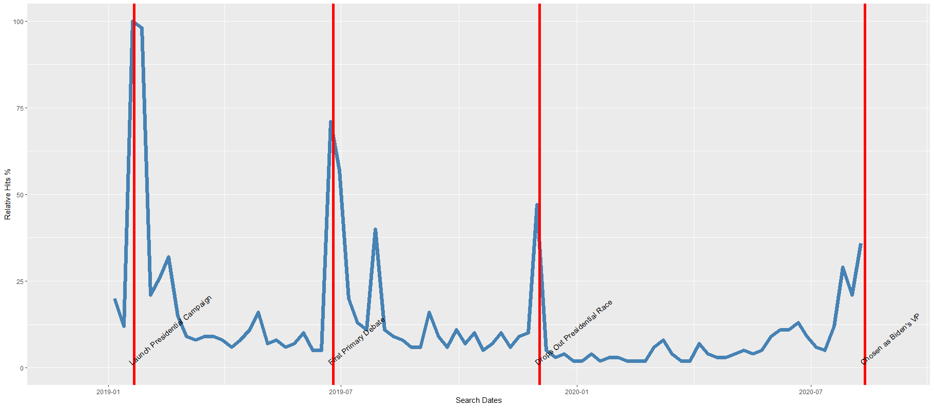
Google Trends is a search trends feature. It shows how frequently a given search term is entered into Google’s search engine, relative to the site’s total search volume over a given period of time.
( So note: because the results are all relative to the other search terms in the time period, the dates you provide to the gtrendsR function will change the shape of your graph and the relative percentage frequencies on the y axis of your plot).
To scrape data from Google Trends, we use the gtrends() function from the gtrendsR package and the get_interest() function from the trendyy package (a handy wrapper package for gtrendsR).
If necessary, also load the tidyverse and ggplot packages.
For the next example, here we search for the term “Kamala Harris” during the period from 1st of January 2019 until today.
If you want to check out more specifications, for the package, you can check out the package PDF here. For example, we can change the geographical region (US state or country for example) with the geo specification.
We can also change the parameters of the time argument, we can specify the time span of the query with any one of the following strings:
“now 1-H” (previous hour)
“now 4-H” (previous four hours)
“today+5-y” last five years (default)
“all” (since the beginning of Google Trends (2004))
If don’t supply a string, the default is five year search data.
We call the get_interest() function to save this data from Google Trends into a data.frame version of the kamala object. If we didn’t execute this last step, the data would be in a form that we cannot use with ggplot().
View(kamala)
In this data.frame, there is a date variable for each week and a hits variable that shows the interest during that week. Remember, this hits figure shows how frequently a given search term is entered into Google’s search engine relative to the site’s total search volume over a given period of time.
We will use these two variables to plot the y and x axis.
To look at the search trends in relation to the events during the Kamala Presidential campaign over 2019, we can add vertical lines along the date axis, with a data.frame, we can call kamala_events.
kamala_events = data.frame(date=as.Date(c("2019-01-21", "2019-06-25", "2019-12-03", "2020-08-12")),
event=c("Launch Presidential Campaign", "First Primary Debate", "Drops Out Presidential Race", "Chosen as Biden's VP"))
Note the very specific order the as.Date() function requires.
Next, we can graph the trends, using the above date and hits variables:
Super easy and a quick way to visualise the ups and downs of Kamala Harris’ political career over the past few months, operationalised as the relative frequency with which people Googled her name.
If I had chosen different dates, the relative hits as shown on the y axis would be different! So play around with it and see how the trends change when you increase or decrease the time period.
Without examining interaction effects in your model, sometimes we are incorrect about the real relationship between variables.
This is particularly evident in political science when we consider, for example, the impact of regime type on the relationship between our dependent and independent variables. The nature of the government can really impact our analysis.
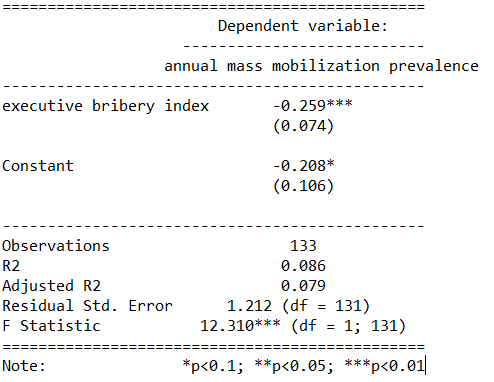
For example, I were to look at the relationship between anti-government protests and executive bribery.
I would expect to see that the higher the bribery score in a country’s government, the higher prevalence of people protesting against this corrupt authority. Basically, people are angry when their government is corrupt. And they make sure they make this very clear to them by protesting on the streets.
First, I will describe the variables I use and their data type.
With the dependent variable democracy_protest being an interval score, based upon the question: In this year, how frequent and large have events of mass mobilization for pro-democratic aims been?
The main independent variable is another interval score on executive_bribery scale and is based upon the question: How clean is the executive (the head of government, and cabinet ministers), and their agents from bribery (granting favors in exchange for bribes, kickbacks, or other material inducements?)
So, let’s run a quick regression to examine this relationship:
summary(protest_model <- lm(democracy_protest ~ executive_bribery, data = data_2010))
Examining the results of the regression model:
We see that there is indeed a negative relationship. The cleaner the government, the less likely people in the country will protest in the year under examination. This confirms our above mentioned hypothesis.
However, examining the R2, we see that less than 1% of the variance in protest prevalence is explained by executive bribery scores.
Not very promising.
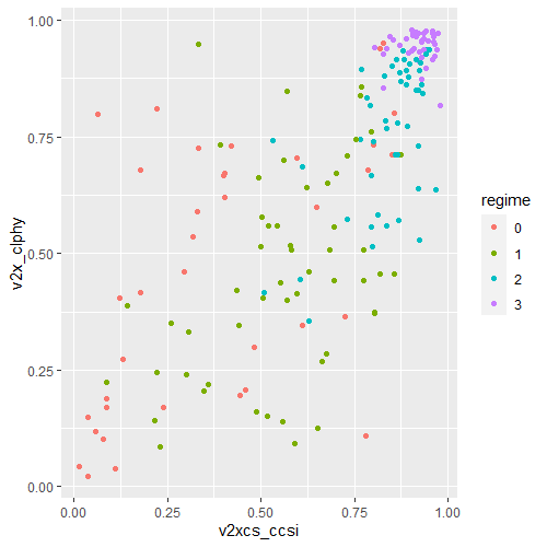
Is there an interaction effect with regime type? We can look at a scatterplot and see if the different regime type categories cluster in distinct patterns.
The four regime type categories are
purple: liberal democracy (such as Sweden or Canada)
teal: electoral democracy (such as Turkey or Mongolia)
khaki green: electoral autocracy (such as Georgia or Ethiopia)
red: closed autocracy (such as Cuba or China)
The color clusters indicate regime type categories do cluster.
Liberal democracies (purple) cluster at the top left hand corner. Higher scores in clean executive index and lower prevalence in pro-democracy protesting.
Electoral autocracies (teal) cluster in the middle.
Electoral democracies (khaki green) cluster at the bottom of the graph.
The closed autocracy countries (red) seem to have a upward trend, opposite to the overall best fitted line.
So let’s examine the interaction effect between regime types and executive corruption with mass pro-democracy protests.
Plot the model and add the * interaction effect:
summary(protest_model_2 <-lm(democracy_protest ~ executive_bribery*regime_type, data = data_2010))
Adding the regime type variable, the R2 shoots up to 27%.
The interaction effect appears to only be significant between clean executive scores and liberal democracies. The cleaner the country’s executive, the prevalence of mass mobilization and protests decreases by -0.98 and this is a statistically significant relationship.
The initial relationship we saw in the first model, the simple relationship between clean executive scores and protests, has disappeared. There appears to be no relationship between bribery and protests in the semi-autocratic countries; (those countries that are not quite democratic but not quite fully despotic).
Let’s graph out these interactions.
In the plot_model() function, first type the name of the model we fitted above, protest_model.
Next, choose the type . For different type arguments, scroll to the bottom of this blog post. We use the type = "pred" argument, which plots the marginal effects.
Marginal effects tells us how a dependent variable changes when a specific independent variable changes, if other covariates are held constant. The two terms typed here are the two variables we added to the model with the * interaction term.
install.packages("sjPlot")
library(sjPlot)

plot_model(protest_model, type = "pred", terms = c("executive_bribery", "regime_type"), title = 'Predicted values of Mass Mobilization Index',

 legend.title = "Regime type")
Looking at the graph, we can see that the relationship changes across regime type. For liberal democracies (purple), there is a negative relationship. Low scores on the clean executive index are related to high prevalence of protests. So, we could say that when people in democracies see corrupt actions, they are more likely to protest against them.
However with closed autocracies (red) there is the opposite trend. Very corrupt countries in closed autocracies appear to not have high levels of protests.
This would make sense from a theoretical perspective: even if you want to protest in a very corrupt country, the risk to your safety or livelihood is often too high and you don’t bother. Also the media is probably not free so you may not even be aware of the extent of government corruption.
It seems that when there are no democratic features available to the people (free media, freedom of assembly, active civil societies, or strong civil rights protections, freedom of expression et cetera) the barriers to protesting are too high. However, as the corruption index improves and executives are seen as “cleaner”, these democratic features may be more accessible to them.
If we only looked at the relationship between the two variables and ignore this important interaction effects, we would incorrectly say that as
Of course, panel data would be better to help separate any potential causation from the correlations we can see in the above graphs.
The blue line is almost vertical. This matches with the regression model which found the coefficient in electoral autocracy is 0.001. Virtually non-existent.
Different Plot Types
type = "std" – Plots standardized estimates.
type = "std2" – Plots standardized estimates, however, standardization follows Gelman’s (2008) suggestion, rescaling the estimates by dividing them by two standard deviations instead of just one. Resulting coefficients are then directly comparable for untransformed binary predictors.
type = "pred" – Plots estimated marginal means (or marginal effects). Simply wraps ggpredict.
type = "eff"– Plots estimated marginal means (or marginal effects). Simply wraps ggeffect.
type = "slope" and type = "resid" – Simple diagnostic-plots, where a linear model for each single predictor is plotted against the response variable, or the model’s residuals. Additionally, a loess-smoothed line is added to the plot. The main purpose of these plots is to check whether the relationship between outcome (or residuals) and a predictor is roughly linear or not. Since the plots are based on a simple linear regression with only one model predictor at the moment, the slopes (i.e. coefficients) may differ from the coefficients of the complete model.
type = "diag" – For Stan-models, plots the prior versus posterior samples. For linear (mixed) models, plots for multicollinearity-check (Variance Inflation Factors), QQ-plots, checks for normal distribution of residuals and homoscedasticity (constant variance of residuals) are shown. For generalized linear mixed models, returns the QQ-plot for random effects.
When one independent variable is highly correlated with another independent variable (or with a combination of independent variables), the marginal contribution of that independent variable is influenced by other predictor variables in the model.
And so, as a result:
Estimates for regression coefficients of the independent variables can be unreliable.
Tests of significance for regression coefficients can be misleading.
To check for multicollinearity problem in our model, we need the vif() function from the car package in R. VIF stands for variance inflation factor. It measures how much the variance of any one of the coefficients is inflated due to multicollinearity in the overall model.
As a rule of thumb, a vif score over 5 is a problem. A score over 10 should be remedied and you should consider dropping the problematic variable from the regression model or creating an index of all the closely related variables.
This blog post will look only at the VIF score. Click here to look at how to interpret various other multicollinearity tests in the mctest package in addition to the the VIF score.
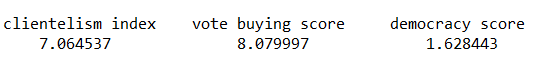
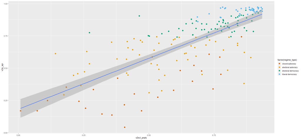
Back to our model, I want to know whether countries with high levels of clientelism, high levels of vote buying and low democracy scores lead to executive embezzlement?
So I fit a simple linear regression model (and look at the output with the stargazer package)
summary(embezzlement_model_1 <- lm(executive_embezzlement ~ clientelism_index + vote_buying_score + democracy_score, data = data_2010))

stargazer(embezzlement_model_1, type = "text")
I suspect that clientelism and vote buying variables will be highly correlated. So let’s run a test of multicollinearity to see if there is any problems.
car::vif(embezzlement_model_1)
The VIF score for the three independent variables are :
Both clientelism index and vote buying variables are both very high and the best remedy is to remove one of them from the regression. Since vote buying is considered one aspect of clientelist regime so it is probably overlapping with some of the variance in the embezzlement score that the clientelism index is already explaining in the model
So re-run the regression without the vote buying variable.
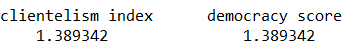
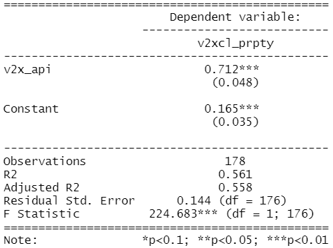
summary(embezzlement_model_2 <- lm(v2exembez ~ v2xnp_client  + v2x_api, data = vdem2010))
stargazer(embezzlement_model_2, embezzlement_model_2, type = "text")
car::vif(embezzlement_mode2)
Comparing the two regressions:
And running a VIF test on the second model without the vote buying variable:
car::vif(embezzlement_model_2)
These scores are far below 5 so there is no longer any big problem of multicollinearity in the second model.
Click here to quickly add VIF scores to our regression output table in R with jtools package.
Plus, looking at the adjusted R2, which compares two models, we see that the difference is very small, so we did not lose much predictive power in dropping a variable. Rather we have minimised the issue of highly correlated independent variables and thus an inability to tease out the real relationships with our dependent variable of interest.
tl;dr: As a rule of thumb, a vif score over 5 is a problem. A score over 10 should be remedied (and you should consider dropping the problematic variable from the regression model or creating an index of all the closely related variables).
If our OLS model demonstrates high level of heteroskedasticity (i.e. when the error term of our model is not randomly distributed across observations and there is a discernible pattern in the error variance), we run into problems.
Why? Because this means OLS will use sub-optimal estimators based on incorrect assumptions and the standard errors computed using these flawed least square estimators are more likely to be under-valued.
Since standard errors are necessary to compute our t – statistic and arrive at our p – value, these inaccurate standard errors are a problem.
Click here to check for heteroskedasticity in your model with the lmtest package.
To correct for heteroskedastcity in your model, you need the sandwich package and the lmtest package to employ the vcocHC argument.
First, let’s fit a simple OLS regression.
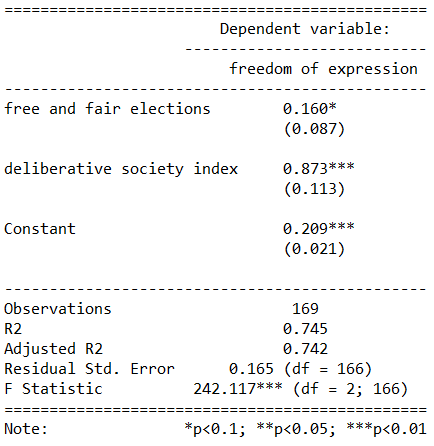
summary(free_express_model <- lm(freedom_expression ~ free_elections + deliberative_index, data = data_1990))
We can see that there is a small star beside the main dependent variable of interest! Success!
We have significance.
Thus, we could say that the more free and fair the elections a country has, this increases the mean freedom of expression index score for that country.
This ties in with a very minimalist understanding of democracy. If a country has elections and the populace can voice their choice of leadership, this will help set the scene for a more open society.
However, it is naive to look only at the p – value of any given coefficient in a regression output. If we run some diagnostic analyses and look at the relationship graphically, we may need to re-examine this seemingly significant relationship.
Can we trust the 0.087 standard error score that our OLS regression calculated? Is it based on sound assumptions?
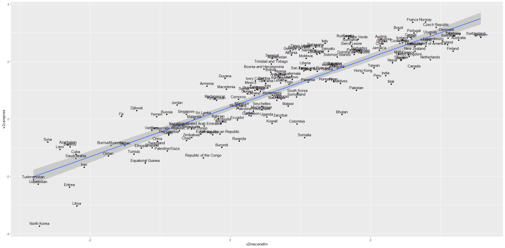
First let’s look at the residuals. Can we assume that the variance of error is equal across all observations?
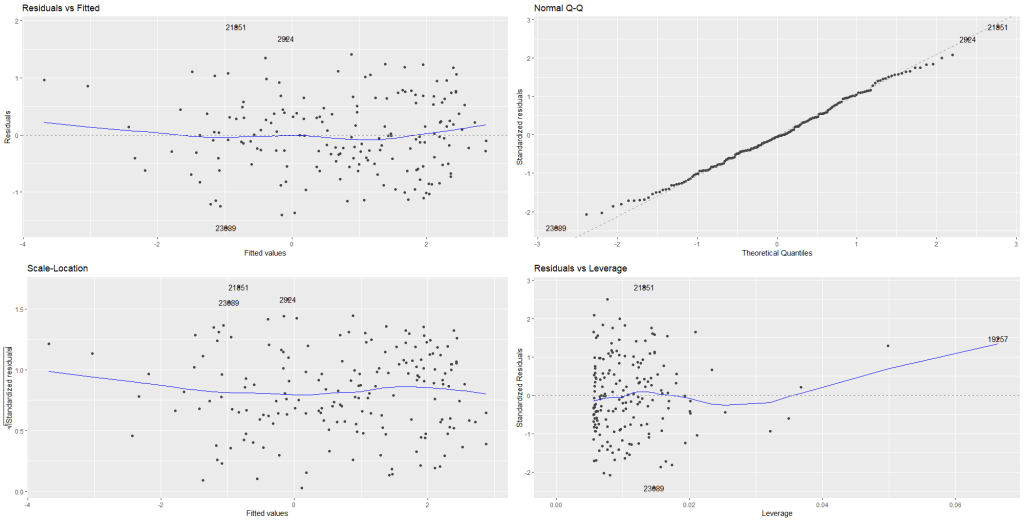
If we examine the residuals (the first graph), we see that there is actually a tapered fan-like pattern in the error variance. As we move across the x axis, the variance along the y axis gets continually smaller and smaller.
The error does not look random.
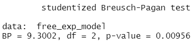
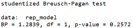
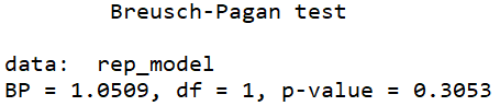
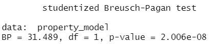
Let’s run a Breush-Pagan test (from the lmtest package) to check our suspicion of heteroskedasticity.
lmtest::bptest(free_exp_model)
We can reject the null hypothesis that the error variance is homoskedastic.
So the model does suffer from heteroskedasticty. We cannot trust those stars in the regression output!
In order to fix this and make our p-values more accuarate, we need to install the sandwich package to feed in the vcovHC adjustment into the coeftest() function.
vcovHC stands for variance covariance Heteroskedasticity Consistent.
With the stargazer package (which prints out all the models in one table), we can compare the free_exp_model alone with no adjustment, then four different variations of the vcovHC adjustment using different formulae (as indicated in the type argument below).
stargazer(free_exp_model,
          coeftest(free_exp_model, vcovHC(free_exp_model, type = "HC0")),
          coeftest(free_exp_model, vcovHC(free_exp_model, type = "HC1")),
          coeftest(free_exp_model, vcovHC(free_exp_model, type = "HC2")),
          coeftest(free_exp_model, vcovHC(free_exp_model, type = "HC3")),
          type = "text")
Looking at the standard error in the (brackets) across the OLS and the coeftest models, we can see that the standard error are all almost double the standard error from the original OLS regression.
There is a tiny difference between the different types of Heteroskedastic Consistent (HC) types.
The significant p – value disappears from the free and fair election variable when we correct with the vcovHC correction.
The actual coefficient stays the same regardless of whether we use no correction or any one of the correction arguments.
Which HC estimator should I use in my vcovHC() function?
The default in the sandwich package is HC3.
STATA users will be familiar with HC1, as it is the default robust standard error correction when you add robust at the end of the regression command.
The difference between them is not very large.
The estimator HC0 was suggested in the econometrics literature by White in 1980 and is justified by asymptotic arguments.
For small sample sizes, the standard errors from HC0 are quite biased, usually downward, and this results in overly liberal inferences in regression models (Bera, Suprayitno & Premaratne, 2002). But with HC0, the bias shrinks as your sample size increases.
The estimator types HC1, HC2 and HC3 were put forward by MacKinnon and White (1985) to improve the performance in small samples.
Long and Ervin (2000) furthermore argue that HC3 provides the best performance in small samples as it gives less weight to influential observations in the model
In our freedom of expression regression, the HC3 estimate was the most conservative with the standard error calculations. however the difference between the approaches did not change the conclusion; ultimately the main independent variable of interest in this analysis – free and fair elections – can explain variance in the dependent variable – freedom of expression – does not find evidence in the model.
Click here to read an article by Hayes and Cai (2007) which discusses the matrix formulae and empirical differences between the different calculation approaches taken by the different types. Unfortunately it is all ancient Greek to me.
References
Bera, A. K., Suprayitno, T., & Premaratne, G. (2002). On some heteroskedasticity-robust estimators of variance–covariance matrix of the least-squares estimators. Journal of Statistical Planning and Inference, 108(1-2), 121-136.
Hayes, A. F., & Cai, L. (2007). Using heteroskedasticity-consistent standard error estimators in OLS regression: An introduction and software implementation. Behavior research methods, 39(4), 709-722.
Long, J. S., & Ervin, L. H. (2000). Using heteroscedasticity consistent standard errors in the linear regression model. The American Statistician, 54(3), 217-224.
MacKinnon, J. G., & White, H. (1985). Some heteroskedasticity-consistent covariance matrix estimators with improved finite sample properties. Journal of econometrics, 29(3), 305-325.
One core assumption when calculating ordinary least squares regressions is that all the random variables in the model have equal variance around the best fitting line.
Essentially, when we run an OLS, we expect that the error terms have no fan pattern.
Example of homoskedasticiy
So let’s look at an example of this assumption being satisfied. I run a simple regression to see whether there is a relationship between and media censorship and civil society repression in 178 countries in 2010.
summary(repression_model <- lm(media_censorship ~ civil_society_repression, data = data_2010))
stargazer(repression_model, type = "text")
This is pretty common sense; a country that represses its citizens in one sphere is more likely to repress in other areas. In this case repressing the media correlates with repressing civil society.
We can plot the residuals of the above model with the autoplot() function from the ggfortify package.
library(ggfortify)
autoplot(repression_model)
Nothing unusual appears to jump out at us with regard to evidence for heteroskedasticity!
In the first Residuals vs Fitted plot, we can see that blue line does not drastically diverge from the dotted line (which indicates residual value = 0).
The third plot Scale-Location shows again that there is no drastic instances of heteroskedasticity. We want to see the blue line relatively horizontal. There is no clear pattern in the distribution of the residual points.
In the Residual vs. Leverage plot (plot number 4), the high leverage observation 19257 is North Korea! A usual suspect when we examine model outliers.
While it is helpful to visually see the residuals plotted out, a more objective test can help us find whether the model is indeed free from heteroskedasticity problems.
For this we need the Breusch-Pagan test for heteroskedasticity from the lmtest package.
The default in R is the studentized Breusch-Pagan. However if you add the studentize = FALSE argument, you have the non-studentized version
The null hypothesis of the Breusch-Pagan test is that the variance in the model is homoskedastic.
With our repression_model, we cannot reject the null, so we can say with confidence that there is no major heteroskedasticity issue in our model.
The non-studentized Breusch-Pagan test makes a very big assumption that the error term is from Gaussian distribution. Since this assumption is usually hard to verify, the default bptest() in R “studentizes” the test statistic and provide asymptotically correct significance levels for distributions for error.
Why do we care about heteroskedasticity?
If our model demonstrates high level of heteroskedasticity (i.e. the random variables have non-random variation across observations), we run into problems.
Why?
OLS uses sub-optimal estimators based on incorrect assumptions and
The standard errors computed using these flawed least square estimators are more likely to be under-valued. Since standard errors are necessary to compute our t – statistics and arrive at our p – value, these inaccurate standard errors are a problem.
Example of heteroskedasticity
Let’s look at an example of this homoskedasticity assumption NOT being satisfied.
I run a simple regression to see whether there is a relationship between democracy score and respect for individuals’ private property rights in 178 countries in 2010.
When you are examining democracy as the main dependent variable, heteroskedasticity is a common complaint. This is because all highly democratic countries are all usually quite similar. However, when we look at autocracies, they are all quite different and seem to march to the beat of their own despotic drum. We cannot assume that the random variance across different regime types is equally likely.
Next, let’s fit the model to examine the relationship.
summary(property_model <- lm(property_score ~ democracy_score, data = data_2010))
stargazer(property_model, type = "text")
To plot the residuals (and other diagnostic graphs) of the model, we can use the autoplot() functionto look at the relationship in the model graphically.
autoplot(property_model)
Graph number 1 plots the residuals against the fitted model and we can see that lower values on the x – axis (fitted values) correspond with greater spread on the y – axis. Lower democracy scores relate to greater error on property rights index scores. Plus the blue line does not lie horizontal and near the dotted line. It appears we have non-random error patterns.
Examining the Scale – Location graph (number 3), we can see that the graph is not horizontal.
Again, interpreting the graph can be an imprecise art. So a more objective approach may be to run the bptest().
bptest(property_model)
Since the p – value is far smaller than 0.05, we can reject the null of homoskedasticity.
Rather, we have evidence that our model suffers from heteroskedasticity. The standard errors in the regression appear smaller than they actually are in reality. This inflates our t – statistic and we cannot trust our p – value.
In the next blog post, we can look at ways to rectify this violation of homoskedasticity and to ensure that our regression output has more accurate standard errors and therefore more accurate p – values.
Click here to use the sandwich package to fix heteroskedasticity in the OLS regression.
Political scientists are beginning to appreciate that multiple imputation represents a better strategy for analysing missing data to the widely used method of listwise deletion.
A very clear demonstration of this was a 2016 article by Ranjit Lall, an political economy professor in LSE. He essentially went back and examined the empirical results of multiple imputation in comparison to the commonplace listwise deletion in political science.
He did this by re-running comparative political economy studies published over a five-year period in International Organization and World Politics.
Shockingly, in almost half of the studies he re-ran, Lall found that most key results “disappeared” (by conventional statistical standards) when reanalyzed with multiple imputations rather than listwise deletion.
This is probably due to the fact that it is erroneous to assume that missing data is random and equally distributed among the overall data.
Listwise deletion involves omitting observations with missing values on any variable. This ultimately produces inefficient inferences as it is difficult to believe the assumption that the pattern of missing data is actually completely random.
This blog post will demonstrate a package for imputing missing data in a few lines of code.
Unlike what I initially thought, the name has nothing to do with the tiny rodent, MICE stands for Multivariate Imputation via Chained Equations.
Rather than abruptly deleting missing values, imputation uses information given from the non-missing predictors to provide an estimate of the missing values.
The mice package imputes in two steps. First, using mice() to build the model and subsequently call complete() to generate the final dataset.
The mice() function produces many complete copies of a dataset, each with different imputations of the missing data. Then the complete() function returns these data sets, with the default being the first.
So first install and load the package:
install.packages("mice")
library(mice)
You can check whether any variables in your potential model have an NAs (i.e. missing values) with anyNA() function.
anyNA(data$clientelism)
If there are missing values, then you can go on ahead with imputing them. First create a new object to store the multiple imputed versions of your dataset.
This iteration process takes a while, depending on how many variables you have in your data.frame. My data data.frame had about six variables so this stage took about three or four minutes to complete. I was distracted by Youtube for a bit, so I am not exactly sure. I imagine a very large dataset with hundreds of variables would make my computer freak out.
All the variables with missing values in my data.frame were continuous numerical values. I chose the method = "cart", which stands for classification and regression trees which appears quite versatile.
imputed_data <- mice(data, method="cart")
A CART is a predictive algorithm that determines how a given variable’s values can be predicted based on other values.
It is composed of decision trees where each fork is a split in a predictor variable and each node at the end has a prediction for the target variable.
After this iterative process is complete and the command has finished running, we then use the complete() function and assign the resulting data.frame to a new object. I call it full_data
full_data <- complete(imputed_data)
I ran a quick regression to see what effect the new fully imputed data.frame had on the relationship. I could have taken a bit longer and found a result that changed as a result of the data imputation step ( as was shown in the above mentioned Lall (2016) paper) but I decided to just stick with my first shot.
We can see that the model with the imputed values have increased the total number of values by about 3,000 or so.
Given that I already have a very large n size, it is not expected that many of thecoefficients would change drastically by adding a small percentage of imputed values. However, we see that the standard error (yay) and the coefficient value decreased (meh). Additionally the R2 (by a tiny amount) decreased (weh).
I chose the cart method but there are many of method options, depending on the characteristics of the data with missing values.
Well this is just delightful! This package was created by Karthik Ram.
install.packages("wesanderson")
library(wesanderson)
library(hrbrthemes) # for plot themes
library(gapminder) # for data
library(ggbump) # for the bump plot
After you install the wesanderson package, you can
create a ggplot2 graph object
choose the Wes Anderson color scheme you want to use and create a palette object
add the graph object and and the palette object and behold your beautiful data
wes_palette(name, n, type = c("discrete", "continuous"))
To generate a vector of colors, the wes_palette() function requires:
name: Name of desired palette
n: Number of colors desired (i.e. how many categories so n = 4).
The names of all the palettes you can enter into the wes_anderson() function
We can use data from the gapminder package. We will look at the scatterplot between life expectancy and GDP per capita.
We feed the wes_palette() function into the scale_color_manual() with the values = wes_palette() argument.
We indicate that the colours would be the different geographic regions.
If we indicate fill in the geom_point() arguments, we would change the last line to scale_fill_manual()
We can log the gapminder variables with the mutate(across(where(is.numeric), log)). Alternatively, we could scale the axes when we are at the ggplot section of the code with the scale_*_continuous(trans='log10')
Both the regime variable and the appointment variable are discrete categories so we can use the geom_bar() function. When adding the palette to the barplot object, we can use the scale_fill_manual() function.
eighteenth_century + scale_fill_manual(values = wes_palette("Darjeeling1", n = 4)
Now to compare the breakdown with countries in the 21st century (2000 to present)
Sometimes the best way to examine the relationship between our variables of interest is to plot it out and give it a good looking over. For me, it’s most helpful to see where different countries are in relation to each other and to see any interesting outliers.
For this, I can use the geom_text() function from the ggplot2 package.
I will look at the relationship between economic globalization and social globalization in OECD countries in the year 2000.
The KOF Globalisation Index, introduced by Dreher (2006) measures globalization along the economic, social and political dimension for most countries in the world
First, as always, we install and load the necessary package. This time, it is the ggplot2 package
install.packages("ggplot2")
library(ggplot2)
Next add the following code:
fin <- ggplot(oecd2000, aes(economic_globalization, social_globalization))
        + ggtitle("Relationship between Globalization Index Scores among OECD countries in 2000")
        + scale_x_continuous("Economic Globalization Index")
        + scale_y_continuous("Social Globalization Index")
        + geom_smooth(method = "lm")
        + geom_point(aes(colour = polity_score), size = 2) + labs(color = "Polity Score")
        + geom_text(hjust = 0, nudge_x = 0.5, size = 4, aes(label = country))

fin
In the aes() function, we enter the two variables we want to plot.
Then I use the next three lines to add titles to axes and graph
I use the geom_smooth() function with the “lm” method to add a best fitting regression line through the points on the plot. Click here to learn more about adding a regression line to a plot.
I add a legend to examine where countries with different democracy scores (taken from the Polity Index) are located on the globalization plane. Click here to learn about adding legends.
The last line is the geom_text() function that I use to specify that I want to label each observation (i.e. each OECD country) with its name, rather than the default dataset number.
Some geom_text() commands to use:
nudge_x (or nudge_y) slightly “nudge” the labels from their corresponding points to help minimise messy overlapping.
hjust and vjust move the text label “left”, “center”, “right”, “bottom”, “middle” or “top” of the point.
Yes, yes! There is a package that uses the color palettes of Wes Anderson movies to make graphs look just beautiful. Click here to use different Wes Anderson aesthetic themed graphs!
zissou_colors <- wes_palette("Zissou1", 100, type = "continuous")

fin + scale_color_gradientn(colours = zissou_colors)
Which outputs:
Interestingly, it seems that at the very bottom left hand corner of the plot (which shows the countries that are both low in economic globalization and low in social globalization), we have two OECD countries that score high on democracy – Japan and South Korea- right next to two countries that score the lowest in the OECD on democracy, Turkey and Mexico.
So it could be interesting to further examine why these countries from opposite ends of the democracy spectrum have similar pattern of low globalization. It puts a spanner in the proverbial works with my working theory that countries higher in democracy are more likely to be more globalized! What is special about these two high democracy countries that gives them such low scores on globalization.
If I want to graphically display the relationship between two variables, the ggplot2 package is a very handy way to produce graphs.
For example, I can use the ggplot2 package to graphically examine the relationship between civil society strength and freedom of citizens from torture. Also I can see whether this relationship is the same across regime types.
aes() indicates how variables are mapped to visual properties or aesthetics. The first variable goes on the x-axis and the second variable goes on the y-axis.
geom_point() creates a scatterplot style graph. Alternatives to this are geom_line(), which creates a line plot and geom_histogram() which creates a histogram plot.
ggplot(data2000, aes(v2xcs_ccsi, v2cltort)) + geom_point() +
xlab("Civil society robustness") +
ylab("Freedom from torture")
Next we can add information on regime types, a categorical variable with four levels.
0 = closed autocracy
1 = electoral autocracy
2 = electoral democracy
3 = liberal democracy
In the aes() function, add colour = regime to differentiate the four categories on the graph
Alternatively we can use the facet_wrap( ~ regime) function to create four separate scatterplots and examine the relationship separately.
ggplot(data2000, aes(v2xcs_ccsi, v2x_clphy, colour = regime)) + geom_point() + facet_wrap(~regime) + xlab("Civil society robustness") + ylab("Freedom from torture")
Lastly, we can add a linear model line (method = "lm") with a grey standard error bar (se = TRUE) in the geom_smooth() function.
ggplot(data2000, aes(v2xcs_ccsi, v2x_clphy, colour = regime)) +
geom_point() +
facet_wrap(~regime) +
geom_smooth(method = "lm", se = TRUE) +
xlab("Civil society robustness") +
ylab("Freedom from torture")
In these graphs, we can see that as civil society robustness score increases, the likelihood of a life free from torture increases! Pretty intuitive result and we could argue that there is a third variable – namely strong democratic institutions – that drives this positive relationship.
The graphs break down this relationship across four different regime types, ranging from the most autocratic in the top left hand side to the most democratic in the bottom right. There is more variety in this relationship with closed autocracies (i.e. the red points), with some points deviating far from the line.
The purple graph – liberal democracies – shows a tiny amount of variance. In liberal democracies, it appears that all countries score highly in both civil society robustness and freedom from torture!
One problem with merging two datasets by country is that the same countries can have different names. Take for example, America. It can be entered into a dataset as any of the following:
USA
U.S.A.
America
United States of America
United States
US
U.S.
This can create a big problem because datasets will merge incorrectly if they think that US and America are different countries.
Correlates of War (COW) is a project founded by Peter Singer, and catalogues of all inter-state war since 1963. This project uses a unique code for each country.
For example, America is 2.
When merging two datasets, there is a helpful R package that can convert the various names for a country into the COW code:
To read more about the countrycode package in the CRAN PDF, click here.
First create a new name for the variable I want to make; I’ll call it COWcode in the dataset.
Then use the countrycode() function. First type in the brackets the name of the original variable that contains the list of countries in the dataset. Then finally add "country.name", "cown". This turns the word name for each country into the numeric COW code.
Now the dataset is ready to merge more easily with my other dataset on the identical country variable type!
There are many other types of codes that you can add to your dataset.
A very popular one is the ISO-2 and ISO-3 codes. For example, if you want to add flags to your graph, you will need a two digit code for each country (for example, Ireland is IE).
To check out the COW database website, click here.
Alternative codes than the country.name and the cown options include:
• ccTLD: IANA country code top-level domain • country.name: country name (English) • country.name.de: country name (German) • cowc: Correlates of War character • cown: Correlates of War numeric • dhs: Demographic and Health Surveys Program • ecb: European Central Bank • eurostat: Eurostat • fao: Food and Agriculture Organization of the United Nations numerical code • fips: FIPS 10-4 (Federal Information Processing Standard) • gaul: Global Administrative Unit Layers • genc2c: GENC 2-letter code • genc3c: GENC 3-letter code • genc3n: GENC numeric code • gwc: Gleditsch & Ward character • gwn: Gleditsch & Ward numeric • imf: International Monetary Fund • ioc: International Olympic Committee • iso2c: ISO-2 character • iso3c: ISO-3 character • iso3n: ISO-3 numeric • p4n: Polity IV numeric country code • p4c: Polity IV character country code • un: United Nations M49 numeric codes 4 codelist • unicode.symbol: Region subtag (often displayed as emoji flag) • unpd: United Nations Procurement Division • vdem: Varieties of Democracy (V-Dem version 8, April 2018) • wb: World Bank (very similar but not identical to iso3c) • wvs: World Values Survey numeric code
# Some of my own manual COW code fixes
manual_cow_codes <- tibble::tribble(
  ~country,                 ~cow_code,
  "Palestinian Authority",   999,
  "Micronesia",              987,
  "Serbia"                   345
)
A simple feature to turn wide format into long format in R.
I have a dataset with the annual per capita military budget for 171 countries.
The problem is that it is in completely wrong format to use for panel data (i.e. cross-sectional time-series analysis).
So here is simple way I found to fix this problem and turn this:
WIDE FORMAT : a separate column for each year
into this:
LONG FORMAT : one single “year” column and one single “value” column
It’s like magic.
First install and load the reshape2 package
install.packages("reshape2")
library(reshape2)
I name my new long form dataframe; in this case, the imaginatively named mil_long.
I use the melt() function and first type in the name of the original I want to change; in this case it is mil_wide
id.vars tells R the unique ID for each new variable. Since I am looking at military budgets for each country, I’ll use Country variable as my ID.
variable.name for me is the year variable which, in wide format, is the name of every column. For me, I want to compress all the year columns into this new variable.
value.name is the new variable I make to hold the value that in my dataset is the per capita military budget amount per country per year. I name this new variable … you guessed it, value.
Looking at my new mil_long dataset, my new long format dataframe has only three columns = “Country”, “year” and “value” and 5,504 rows for each country-year observation across the 32 years.