When we save our plots and graphs in R, we can use the ggsave() function and specify the type, size and look of the file.
We are going to look two features in particular: anti-aliasing lines with the Cairo package and creating transparent backgrounds.
Make your graph background transparent
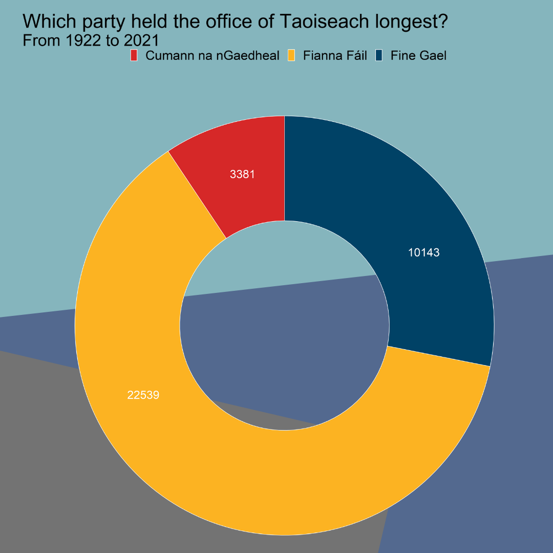
First, let’s create a pie chart with a transparent background. The pie chart will show which party has held the top spot in Irish politics for the longest.
After we prepare and clean our data of Irish Taoisigh start and end dates in office and create a doughnut chart (see bottom of blog for doughnut graph code), we save it to our working directory with ggsave().
To see where we set that to, we can use getwd().
ggsave(pie_chart, filename = 'pie_chart.png', width = 50, height = 50, units = 'cm')
If we want to add our doughnut chart to a power point but we don’t want it to be a white background, we can ask ggsave to save the chart as transparent and then we can add it to our powerpoint or report!
To do this, we specify bg argument to "transparent"
ggsave(pie_chart, filename = 'pie_chart_transparent.png', bg = "transparent", width = 50, height = 50, units = 'cm')
This final picture was made in canva.com
Hex color values come from coolors.co
Remove aliasing lines
Aliasing lines are jagged and pixelated.
When we save our graph in R with ggsave(), we can specify in the type argument that we want type = cairo.
I make a quick graph that looks at the trends in migration and GDP from 1960s to 2018 in Ireland. I made the lines extra large to demonstrate the difference between aliased and anti-aliased lines in the graphs.
library(Cairo)
ggsave(mig_trend, file="mig_alias.png", width = 80, height = 50, units = "cm")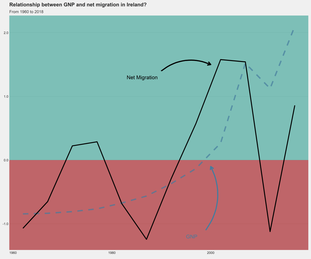
ggsave(mig_trend, file="mig_antialias.png", type="cairo-png", dpi = 300,
 width = 80, height = 50, units = "cm")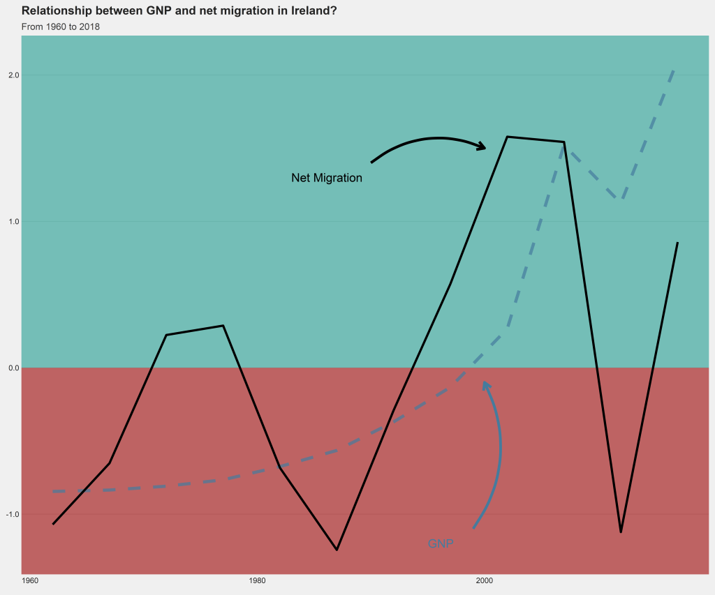
When we zoom in, we can see the difference due to the anti-aliasing.
First, picture 1 appears far more jagged when we zoom in :

And after we add Cairo package adjustment, we can see the lines are smoother in figure 2

Doughnut graph code:
terms$duration <- as.Date(terms$end) - as.Date(terms$start)
terms$duration_number <- as.numeric(terms$duration)

terms %>%
  group_by(party) %>%
  dplyr::summarise(max_count = cumsum(duration_number)) %>%
  slice(which.max(max_count)) %>%
  select(party, max_count) %>%
  arrange(desc(max_count))

counts <- data.frame(party = c("Cumann na nGaedheal", "Fine Gael" ,"Fianna Fáil"),
                     value = c(3381, 10143, 22539))

data <- counts %>%
  arrange(desc(party)) %>%
  dplyr::mutate(proportion = value / sum(counts$value)*100) %>%
  dplyr::mutate(ypos = cumsum(prop)- 0.35*proportion)

data$duration <- as.factor(data$value)
data$party_factor <- as.factor(data$party)


pie_chart <- ggplot(data, aes(x = 2, y = proportion, fill = party)) +
  geom_bar(stat = "identity", width = 1, color = "white") +
  coord_polar("y", start = 0) +
  xlim(0.5, 2.5) +
  theme(legend.position="none") +
  geom_text(aes(y = ypos-1, label = duration), color = "white", size = 10) +
  scale_fill_manual(values = c("Fine Gael" = "#004266", "Fianna Fáil" = "#FCB322", "Cumann na nGaedheal" = "#D62828")) +
  labs(title = "Which party held the office of Taoiseach longest?",
       subtitle = "From 1922 to 2021")

pie_chart <- pie_chart + theme_void() + theme(legend.title = element_blank(),
                                 legend.position = "top",
                                 text = element_text(size = 25))
Migration and GNP trend graph code:
migration_trend <- ire_scale %>%
  dplyr::filter(!is.na(mig_value)) %>%
  ggplot() +
  geom_rect(aes(ymin= 0, ymax = -Inf, xmin =-Inf, xmax =Inf), fill = "#9d0208", colour = NA, alpha = 0.07) +
  geom_rect(aes(ymin= 0, ymax = Inf, xmin =-Inf, xmax =Inf), fill = "#2a9d8f", colour = NA, alpha = 0.07) +
  geom_line(aes(x = year, y = gnp_scale), linetype = "dashed", color = "#457b9d", size = 3.5, alpha = 0.7) +
  geom_line(aes(x = year, y = mig_scale), size = 2.5) +
  labs(title = "Relationship between GNP and net migration in Ireland?",
       subtitle = "From 1960 to 2018")


mig_trend <- migration_trend +
  annotate(geom = "text", x = 1983, y = 1.3, label = "Net Migration", size = 10, hjust = "left") +
  annotate(geom = "curve", x = 1990, y = 1.4, xend = 2000, yend = 1.5, curvature = -0.3, arrow = arrow(length = unit(0.7, "cm")), size = 3) +
  annotate(geom = "text", x = 1995, y = -1.2, label = "GNP", color = "#457b9d", size = 10, hjust = "left") +
  annotate(geom = "curve", x = 1999, y = -1.1, xend = 2000, color = "#457b9d", yend = -0.1, curvature = 0.3, arrow = arrow(length = unit(0.7, "cm")), size = 3)

mig_trend <- mig_trend  +
  theme_fivethirtyeight() +
  scale_y_continuous(name = "Net Migration", labels = comma) +
  bbplot::bbc_style() +
  theme(text = element_text(size = 25))