Packages we will need:
library(tidyverse)
library(magrittr)
library(lubridate)
library(tidyr)
library(rvest)
library(janitor)
In this post, we are going to scrape NATO accession data from Wikipedia and turn it into panel data. This means turning a list of every NATO country and their accession date into a time-series, cross-sectional dataset with information about whether or not a country is a member of NATO in any given year.
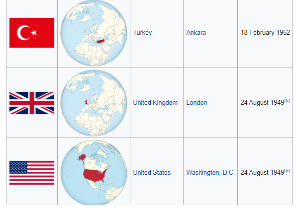
This is helpful for political science analysis because simply a dummy variable indicating whether or not a country is in NATO would lose information about the date they joined. The UK joined NATO in 1948 but North Macedonia only joined in 2020. A simple binary variable would not tell us this if we added it to our panel data.

We will first scrape a table from the Wikipedia page on NATO member states with a few functions form the rvest pacakage.
Click here to read more about the rvest package:
nato_members <- read_html("https://en.wikipedia.org/wiki/Member_states_of_NATO")
nato_tables <- nato_members %>% html_table(header = TRUE, fill = TRUE)
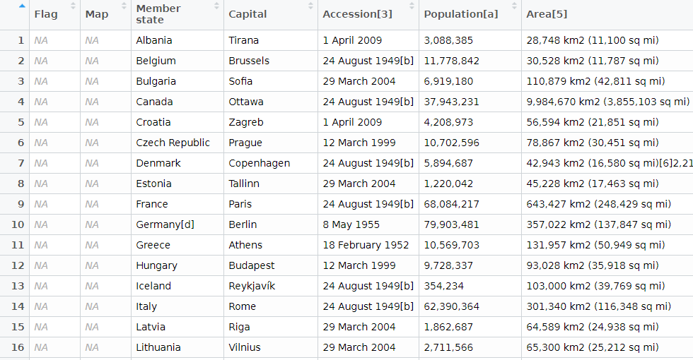
nato_member_joined <- nato_tables[[1]]We have information about each country and the date they joined. In total there are 30 rows, one for each member of NATO.
Next we are going to clean up the data, remove the numbers in the [square brackets], and select the columns that we want.
A very handy function from the janitor package cleans the variable names. They are lower_case_with_underscores rather than how they are on Wikipedia.
Next we remove the square brackets and their contents with sub("\\[.*", "", insert_variable_name)
And the accession date variable is a bit tricky because we want to convert it to date format, extract the year and convert back to an integer.
nato_member_joined %<>%
  clean_names() %>%
  select(country = member_state,
         accession = accession_3) %>%
  mutate(member_2020 = 2020,
         country = sub("\\[.*", "", country),
         accession = sub("\\[.*", "", accession),
         accession = parse_date_time(accession, "dmy"),
         accession = format(as.Date(accession, format = "%d/%m/%Y"),"%Y"),
         accession = as.numeric(as.character(accession)))
When we have our clean data, we will pivot the data to longer form. This will create one event column that has a value of accession or member in 2020.
This gives us the start and end year of our time variable for each country.
nato_member_joined %<>%
pivot_longer(!country, names_to = "event", values_to = "year") 
Our dataset now has 60 observations. We see Albania joined in 2009 and is still a member in 2020, for example.
Next we will use the complete() function from the tidyr package to fill all the dates in between 1948 until 2020 in the dataset. This will increase our dataset to 2,160 observations and a row for each country each year.
Nect we will group the dataset by country and fill the nato_member status variable down until the most recent year.
nato_member_joined %<>%
  mutate(year = as.Date(as.character(year), format = "%Y")) %>%
  mutate(year = ymd(year)) %>%
  complete(country, year = seq.Date(min(year), max(year), by = "year")) %>%
  mutate(nato_member = ifelse(event == "accession", 1,
                              ifelse(event == "member_2020", 1, 0))) %>%
  group_by(country) %>%
  fill(nato_member, .direction = "down") %>%
  ungroup()
Last, we will use the ifelse() function to mutate the event variable into one of three categories: 'accession‘, 'member‘ or ‘not member’.
nato_member_joined %>%
  mutate(nato_member = replace_na(nato_member, 0),
         year = parse_number(as.character(year)),
         event = ifelse(nato_member == 0, "not member", event),
         event = ifelse(nato_member == 1 & is.na(event), "member", event),
         event = ifelse(event == "member_2020", "member", event))  %>%
  distinct(country, year, .keep_all = TRUE) -> nato_panel

Ethnicity Dataset
epr_indo <- read_csv('/mnt/data/epr_indo.csv')

# Expand the data to have a row for each year for each group
epr_indo_expanded <- epr_indo %>%
  rowwise() %>%
  mutate(year = list(seq(from, to))) %>%
  unnest(year) %>%
  select(-from, -to)

# Pivot the data to wide format with separate ethnicity, share, and broad_cat columns
epr_indo_wide <- epr_indo_expanded %>%
  group_by(statename, year) %>%
  mutate(index = row_number()) %>%
  ungroup() %>%
  pivot_wider(
    id_cols = c(statename, year),
    names_from = index,
    values_from = c(group, size, broad_cat),
    names_sep = "_"
  ) %>%
  # Renaming the columns for ethnicity, share, and broad category
  rename_with(~ str_replace(., "group_", "ethnicity_"), starts_with("group_")) %>%
  rename_with(~ str_replace(., "size_", "share_"), starts_with("size_")) %>%
  rename_with(~ str_replace(., "broad_cat_", "broad_cat_"), starts_with("broad_cat_"))