Let’s look at how many speeches took place at the UN Security Council every year from 1995 until 2019.

I want to only look at countries, not organisations. So a quick way to do that is to add a variable to indicate whether the speaker variable has an ISO code.
Only countries have ISO codes, so I can use this variable to filter away all the organisations that made speeches
library(countrycode)

speech$iso2 <- countrycode(speech$country, "country.name", "iso2c")

library(bbplot)

speech %>%
  dplyr::filter(!is.na(iso2)) %>%
  group_by(year) %>%
  count() %>%
  ggplot(aes(x = year, y = n)) +
  geom_line(size = 1.2, alpha = 0.4) +
  geom_label(aes(label = n)) +
  bbplot::bbc_style() +
  theme(plot.title = element_text(hjust = 0.5)) +
  labs(title = "Number of speeches given by countries at UNSC")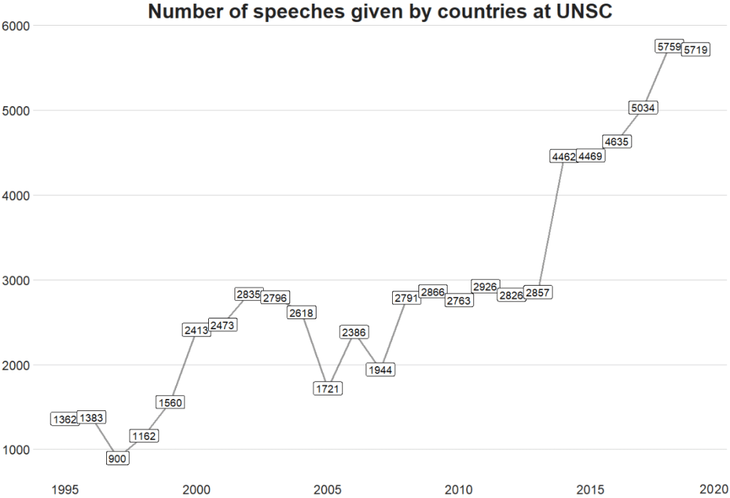
We can see there has been a relatively consistent upward trend in the number of speeches that countries are given at the UN SC. Time will tell what impact COVID will have on these trends.
There was a particularly sharp increase in speeches in 2015.
We can look and see who was talking, and in the next post, we can examine what they were talking about in 2015 with some simple text analytic packages and functions.
First, we will filter only the year 2015 and count the number of observations per group (i.e. the number of speeches per country this year).
To add flags to the graph, add the iso2 code to the dataset (and it must be in lower case).
Click here to read more about adding circular flags to graphs and maps
speech %>%
  dplyr::filter(year == 2015) %>%
  group_by(country) %>%
  dplyr::summarise(speech_count = n()) -> speech_2015

speech_2015$iso2_lower <- tolower(speech_2015$iso2)
We can clean up the names and create a variable that indicates whether the country is one of the five Security Council Permanent Members, a Temporary Member elected or a Non-,ember.
I also clean up the names to make the country’s names in the dataset smaller. For example, “United Kingdom Of Great Britain And Northern Ireland”, will be very cluttered in the graph compared to just “UK” so it will be easier to plot.
library(ggflags)
library(ggthemes)

speech_2015 %>%
# To avoid the graph being too busy, we only look at countries that gave over 20 speeches
  dplyr::filter(speech_count > 20) %>%

# Clean up some names so the graph is not too crowded
  dplyr::mutate(country = ifelse(country == "United Kingdom Of Great Britain And Northern Ireland", "UK", country)) %>%
  dplyr::mutate(country = ifelse(country == "Russian Federation", "Russia", country)) %>%
  dplyr::mutate(country = ifelse(country == "United States Of America", "USA", country)) %>%
  dplyr::mutate(country = ifelse(country == "Republic Of Korea", "South Korea", country)) %>%
  dplyr::mutate(country = ifelse(country == "Venezuela (Bolivarian Republic Of)", "Venezuela", country)) %>%
  dplyr::mutate(country = ifelse(country == "Islamic Republic Of Iran", "Iran", country)) %>%
  dplyr::mutate(country = ifelse(country == "Syrian Arab Republic", "Syria", country)) %>%

# Create a Member status variable:
# China, France, Russia, the United Kingdom, and the United States are UNSC Permanent Members
  dplyr::mutate(Member = ifelse(country == "UK", "Permanent",
  ifelse(country == "USA", "Permanent",
  ifelse(country == "China", "Permanent",
  ifelse(country == "Russia", "Permanent",
  ifelse(country == "France", "Permanent",

# Non-permanent members in their first year (elected October 2014)
  ifelse(country == "Angola", "Temporary (Elected 2014)",
  ifelse(country == "Malaysia", "Temporary (Elected 2014)",
  ifelse(country == "Venezuela", "Temporary (Elected 2014)",
  ifelse(country == "New Zealand", "Temporary (Elected 2014)",
  ifelse(country == "Spain", "Temporary (Elected 2014)",

# Non-permanent members in their second year (elected October 2013)
  ifelse(country == "Chad", "Temporary (Elected 2013)",
  ifelse(country == "Nigeria", "Temporary (Elected 2013)",
  ifelse(country == "Jordan", "Temporary (Elected 2013)",
  ifelse(country == "Chile", "Temporary (Elected 2013)",
  ifelse(country == "Lithuania", "Temporary (Elected 2013)",

# Non members that will join UNSC next year (elected October 2015)
  ifelse(country == "Egypt", "Non-Member (Elected 2015)",
  ifelse(country == "Sengal", "Non-Member (Elected 2015)",
  ifelse(country == "Uruguay", "Non-Member (Elected 2015)",
  ifelse(country == "Japan", "Non-Member (Elected 2015)",
  ifelse(country == "Ukraine", "Non-Member (Elected 2015)",

# Everyone else is a regular non-member
               "Non-Member"))))))))))))))))))))) -> speech_2015
When we have over a dozen nested ifelse() statements, we will need to check that we have all our corresponding closing brackets.
Next choose some colours for each Memberships status. I always take my hex values from https://coolors.co/
membership_palette <- c("Permanent" = "#e63946", "Non-Member" = "#2a9d8f", "Non-Member (Elected 2015)" = "#a8dadc", "Temporary (Elected 2013)" = "#457b9d","Temporary (Elected 2014)" = "#1d3557")
And all that is left to do is create the bar chart.
With geom_bar(), we can indicate stat = "identity" because we are giving the plot the y values and ggplot does not need to do the automatic aggregation on its own.
To make sure the bars are descending from most speeches to fewest speeches, we use the reorder() function. The second argument is the variable according to which we want to order the bars. So for us, we give the speech_count integer variable to order our country bars with x = reorder(country, speech_count).
We can change the bar from vertical to horizontal with coordflip().
I add flags with geom_flag() and feed the lower case ISO code to the country = iso2_lower argument.
I add the bbc_style() again because I like the font, size and sparse lines on the plot.
We can move the title of the plot into the centre with plot.title = element_text(hjust = 0.5))
Finally, we can supply the membership_palette vector to the values = argument in the scale_fill_manual() function to specify the colours we want.
speech_2015 %>%  ggplot(aes(x = reorder(country, speech_count), y = speech_count)) +
  geom_bar(stat = "identity", aes(fill = as.factor(Member))) +
  coord_flip() +
  ggflags::geom_flag(mapping = aes(y = -15, x = country, country = iso2_lower), size = 10) +
  geom_label(mapping = aes( label = speech_count), size = 8) +
  theme(legend.position = "top") +
  labs(title = "UNSC speeches given in 2015", y = "Number of speeches", x = "") +
  bbplot::bbc_style() +
  theme(text = element_text(size = 20),
  plot.title = element_text(hjust = 0.5)) +
  scale_fill_manual(values =  membership_palette)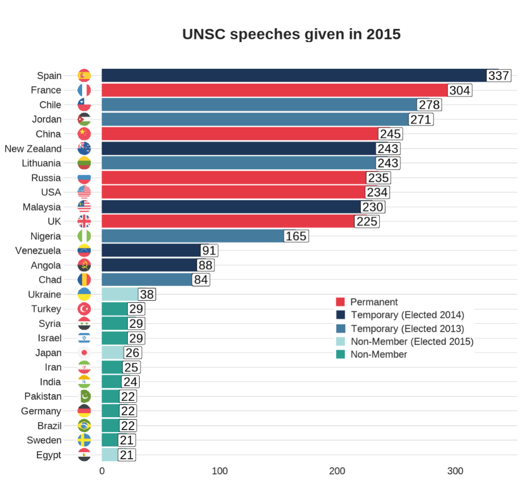
In the next post, we will look at the texts themselves. Here is a quick preview.
library(tidytext)

speech_tokens <- speech %>%
  unnest_tokens(word, text) %>%

  anti_join(stop_words)
We count the number of tokens (i.e. words) for each country in each year. With the distinct() function we take only one observation per year per country. This reduces the number of rows from 16601520 in speech_tokesn to 3142 rows in speech_words_count :
speech_words_count <- speech_tokens %>%
  group_by(year, country) %>%
  mutate(word_count = n_distinct(word)) %>%
  select(country, year, word_count, permanent, iso2_lower) %>%
  distinct()
Subset the data.frame to only plot the five Permanent Members. Now we only have 125 rows (25 years of total annual word counts for 5 countries!)
permanent_words_summary <- speech_words_count %>%
  filter(permanent == 1)
Choose some nice hex colors for my five countries:
five_pal <- c("#ffbc42","#d81159","#8f2d56","#218380","#73d2de")It is a bit convoluted to put the flags ONLY at the start and end of the lines. We need to subset the dataset two times with the geom_flag() sections. First, we subset the data.frame to year == 1995 and the flags appear at the start of the word_count on the y axis. Then we subset to year == 2019 and do the same
ggplot(data = permanent_word_summary) +
  geom_line(aes(x = year, y = word_count, group = as.factor(country), color = as.factor(country)),
size = 2) +
  ggflags::geom_flag(data = subset(permanent_word_summary, year == 1995), aes(x = 1995, y = word_count,  country = iso2_lower), size = 9) +
  ggflags::geom_flag(data = subset(permanent_word_summary,
year == 2019),
aes(x = 2019,
y = word_count,
country = iso2_lower),
size = 12) +
  bbplot::bbc_style() +
 theme(legend.position = "right") + labs(title = "Number of words spoken by Permanent Five in the UN Security Council") +
  scale_color_manual(values = five_pal)
We can see that China has been the least chattiest country if we are measuring chatty with number of words spoken. Translation considerations must also be taken into account. We can see here again at around the 2015 mark, there was a discernible increase in the number of words spoken by most of the countries!