We can create very informative correlation matrix graphs with one function.
Packages we will need:
library(GGally)
library(bbplot) #for pretty themes
First, choose some nice hex colors.
my_palette <- c("#005D8F", "#F2A202")
Next, we can go create a dichotomous factor variable and divide the continuous “freedom from torture scale” variable into either above the median or below the median score. It’s a crude measurement but it serves to highlight trends.
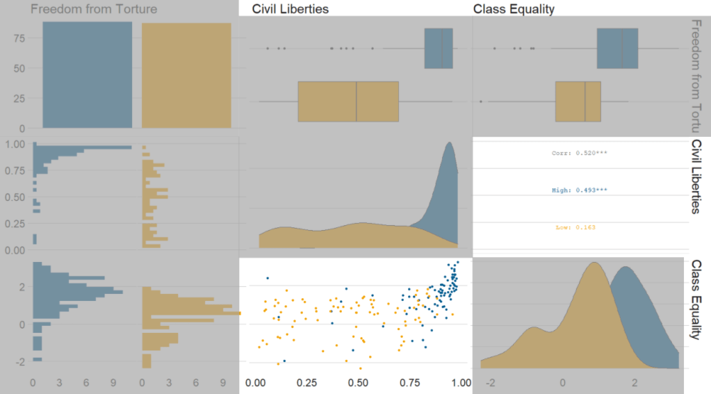
Blue means the country enjoys high freedom from torture. Yellow means the county suffers from low freedom from torture and people are more likely to be tortured by their government.
Then we feed our variables into the ggpairs() function from the GGally package.
I use the columnLabels to label the graphs with their full names and the mapping argument to choose my own color palette.
I add the bbc_style() format to the corr_matrix object because I like the font and size of this theme. And voila, we have our basic correlation matrix (Figure 1).
corr_matrix <- vdem90 %>%
  dplyr::mutate(
    freedom_torture = ifelse(torture >= 0.65, "High", "Low"),
    freedom_torture = as.factor(freedom_t))
  dplyr::select(freedom_torture, civil_lib, class_eq) %>%
  ggpairs(columnLabels = c('Freedom from Torture', 'Civil Liberties', 'Class Equality'),
    mapping = ggplot2::aes(colour = freedom_torture)) +
  scale_fill_manual(values = my_palette) +
  scale_color_manual(values = my_palette)

corr_matrix + bbplot::bbc_style()

First off, in Figure 2 we can see the centre plots in the diagonal are the distribution plots of each variable in the matrix

In Figure 3, we can look at the box plot for the ‘civil liberties index’ score for both high (blue) and low (yellow) ‘freedom from torture’ categories.
The median civil liberties score for countries in the high ‘freedom from torture’ countries is far higher than in countries with low ‘freedom from torture’ (i.e. citizens in these countries are more likely to suffer from state torture). The spread / variance is also far great in states with more torture.

In Figur 4, we can focus below the diagonal and see the scatterplot between the two continuous variables – civil liberties index score and class equality index scores.
We see that there is a positive relationship between civil liberties and class equality. It looks like a slightly U shaped, quadratic relationship but a clear relationship trend is not very clear with the countries with higher torture prevalence (yellow) showing more randomness than the countries with high freedom from torture scores (blue).
Saying that, however, there are a few errant blue points as outliers to the trend in the plot.
The correlation score is also provided between the two categorical variables and the correlation score between civil liberties and class equality scores is 0.52.
Examining at the scatterplot, if we looked only at countries with high freedom from torture, this correlation score could be higher!