Packages we will need:
library(tidyverse)
library(magrittr)
library(waffle)
library(treemapify)
In this blog, we will look at visualising proportions in a few lines.
I have some aid data and I want to see what proportion of the aid does not have a theme category.
This can be useful to visualise incomplete data across years or across categories.
First, we can make a waffle chart with the waffle package.

First, we will create a binary variable that has 1 if the theme is “Other Theme” and 0 if it has a theme value. We will do this for every year.
aid_data %>%
  group_by(start_year) %>%
  mutate(binary_variable = as.numeric(theme_1 == "Other Theme")) %>%
  ungroup() %>% count()
# Groups:   start_year [10]
   start_year     n
        <int> <int>
 1       2012     1
 2       2013     3
 3       2014    17
 4       2015    91
 5       2016   100
 6       2017    94
 7       2018   198
 8       2019   144
 9       2020   199
10       2021   119
Then we will count the number of 0 and 1s for each year with group_by(start_year, binary_variable)
aid_data %>%
  group_by(start_year) %>%
  mutate(binary_variable = as.numeric(theme_1 == "Other Theme")) %>%
  ungroup() %>%
  group_by(start_year, binary_variable) %>%
  count() %>%
# A tibble: 14 × 3
# Groups:   start_year, binary_variable [14]
   start_year binary_variable     n
        <int>           <dbl> <int>
 1       2012               0     1
 2       2013               0     3
 3       2014               0    17
 4       2015               0    90
 5       2015               1     1
 6       2016               0   100
 7       2017               0    94
 8       2018               0   124
 9       2018               1    74
10       2019               0    18
11       2019               1   126
12       2020               1   199
13       2021               0     1
14       2021               1   118
We can do the two steps above together in one step and then create the ggplot object with the geom_waffle() layer.
For the ggplot layers:
We use the binary_variable in the fill argument.
We use the n variable in the values argument.
We will facet_wrap() with the start_year argument.
aid_date %>%
 group_by(start_year) %>%
  mutate(binary_variable = as.numeric(theme_1 == "Other Theme")) %>%
  ungroup() %>%
  group_by(start_year, binary_variable) %>%
  count() %>%
  ggplot(aes(fill = as.factor(binary_variable), values = n)) +
  geom_waffle(color = "white", size = 0.3, n_rows = 10, flip = TRUE) +
  facet_wrap(~start_year, nrow = 1, strip.position = "bottom") +
  bbplot::bbc_style() +
  scale_fill_manual(values =c("#003049", "#bc4749"),
                    name = "No theme?",
                    labels = c("Theme", "No Theme")) +
  theme(axis.text.x.bottom = element_blank(),
        text = element_text(size = 40))
We can see that all the years up to 2018 have most of the row categorised. After 2019, it all goes awry; most of the aid rows are not categorised at all. Messy.
Although, I prefer the waffle charts, because it also shows a quick distribution of aid rows across years (only 1 in 2012 and many in later years), we can also look at pie charts
We can facet_wrap() with pie charts…
… however, there are a few steps to take so that the pie charts do not look like this:
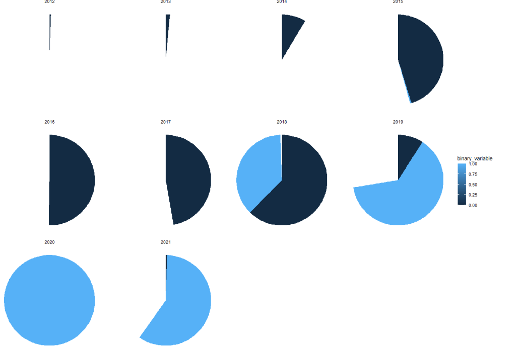

We cannot use the standard coord_polar argument.
Rather, we set a special my_coord_polar to use as a layer in the ggplot.
my_coord_polar <- coord_polar(theta = "y")
my_coord_polar$is_free <- function() TRUE
Then we use the same count variables as above.
We also must change the facet_wrap() to include scales = "free"
aid_data %>%
  group_by(start_year) %>%
  mutate(binary_variable = as.numeric(theme_1 == "Other Theme")) %>%
  ungroup() %>%
  group_by(start_year, binary_variable) %>%
  count() %>%
  ungroup() %>%
  ggplot(aes(x = "", y = n, fill = as.factor(binary_variable))) +
  geom_bar(stat="identity", width=1) +
  my_coord_polar +
  theme_void() +
  facet_wrap(~start_year, scales = "free")+
  scale_fill_manual(values =c("#003049", "#bc4749"),
                    name = "No theme?",
                    labels = c("Theme", "No Theme"))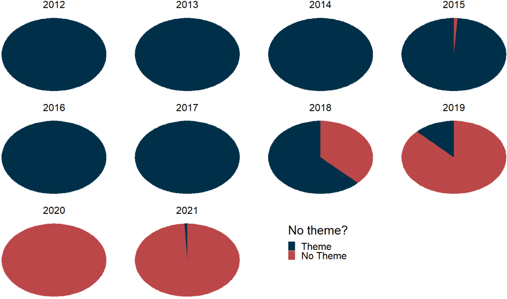
And we can create a treemap to see the relative proportion of regions that receieve an allocation of aid:
First some nice hex colors.
pal <- c("#005f73", "#006f57", "#94d2bd", "#ee9b00", "#ca6702", "#8f2d56", "#ae2012")Then we create characters strings for the numeric region variable and use it for the fill argument in the ggplot.
aid_data %>%
  mutate(region = case_when(
    pol_region_6 == 1 ~ "Post-Soviet",
    pol_region_6 == 2 ~ "Latin America",
    pol_region_6 == 3 ~ "MENA",
    pol_region_6 == 4 ~ "Africa",
    pol_region_6 == 5 ~ "West",
    pol_region_6 == 6 ~ "Asia",
    TRUE ~ "Other"))  %>%
  group_by(region) %>%
  count() %>%
  ggplot(aes(area = n, fill = region,
             label = paste(region, n, sep = "\n"))) +
  geom_treemap(color = "white", size = 3) +
  geom_treemap_text(
    place = "centre",
    size = 20) +
  theme(legend.position = "none")  +
  scale_fill_manual(values = sample(pal))

Could you please share the aid_data so we can reproduce your great work?
LikeLike