
Packages we will need
library(tidyverse)
library(magrittr)
library(waffle)
library(geojsonio)
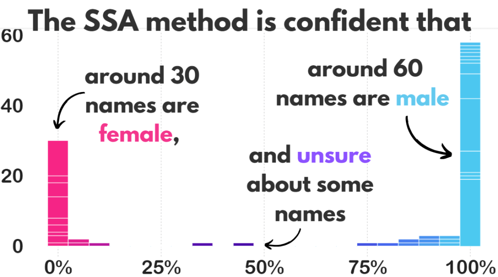
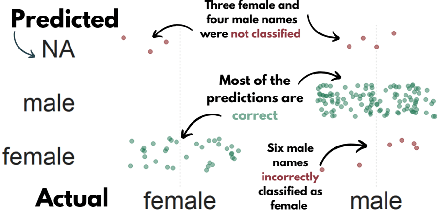
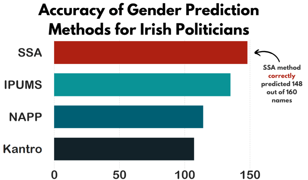
library(sf)In PART 1, we looked at the gender package to help count the number of women in the 33rd Irish Parliament.
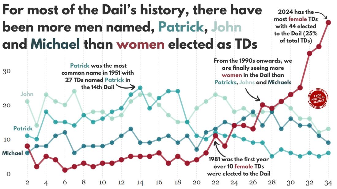
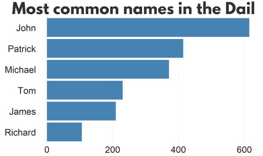
I repeated that for every session since 1921. The first and second Dail are special in Ireland as they are technically pre-partition.
Cleaned up the data aaaand now we have a full dataset with constituencies data.
If anyone wants a copy of the dataset, I can upload it here for those who are curious ~
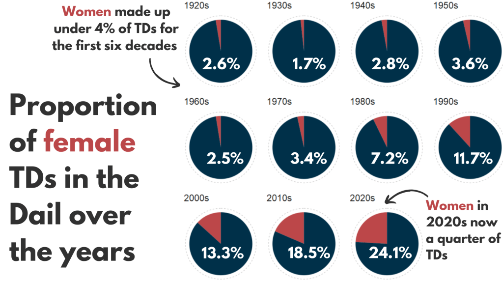
So first… a simple pie chart!
First we calculate proportion of seats held by women
dail %>%
  mutate(decade = substr(year, 1, 3)) %>%
  mutate(decade = paste0(decade, "0s")) %>%
  group_by(decade) %>%
  ungroup() %>%
  group_by(decade, gender) %>%
  count() %>%
  group_by(decade) %>%
  mutate(proportion = n / sum(n)) -> dail_pie
# A tibble: 22 × 4
# Groups:   decade [11]
   decade gender     n proportion
   <chr>  <chr>  <int>      <dbl>
 1 1920s  female    20     0.0261
 2 1920s  male     747     0.974
 3 1930s  female    10     0.0172
 4 1930s  male     572     0.983
 5 1940s  female    12     0.0284
 6 1940s  male     411     0.972
 7 1950s  female    16     0.0363
 8 1950s  male     425     0.964
 9 1960s  female    11     0.0255
10 1960s  male     421     0.975
# 12 more rows
We will be looking at how proportions changed over the decades.
When using facet_wrap() with coord_polar(), it’s a pain in the arse.
This is because coord_polar() does not automatically allow each facet to have a different scale. Instead, coord_polar() treats all facets as having the same axis limits.
This will mess everything up.
If we don’t change the coord_polar(), we will just distort pie charts when the facet groups have different total values. There will be weird gaps and make some phantom pacman non-charts.
function() TRUE is an anonymous function that always returns TRUE.
my_coord_polar$is_free <- function() TRUE forces coord_polar() to allow different scales for each facet.
In our case, we call my_coord_polar$is_free, which means that whenever ggplot2 checks whether the coordinate system allows free scales across facets, it will now always return TRUE!!!
Overriding is_free() to always return TRUE signals to ggplot2 that coord_polar() means that our pie charts NOOWW will respect the "free" scaling specified in facet_wrap(scales = "free").
my_coord_polar <- coord_polar(theta = "y")
my_coord_polar$is_free <- function() TRUE
If you want to look more at this, check out this blog:
And we can go and create the ggplot:
dail_pie %>%
  ggplot(aes(x = "",
         y = proportion,
         fill = as.factor(gender))) +

  geom_bar(stat="identity", width = 1) +

  geom_text(
    data = . %>% filter(gender == "female"), aes(label = scales::percent(proportion,
    accuracy = 0.1)),
    color = "white",
    size = 8) +

  my_coord_polar +

  facet_wrap(~decade, scales = "free") +
  scale_fill_manual(values =c("#bc4749", "#003049")) +
  # my_style() +
  theme(axis.text.x = element_blank(),
        panel.grid.major = element_blank(),
        panel.grid.minor = element_blank(),
        panel.grid = element_blank(),
        panel.background = element_blank(),
        axis.text = element_blank(),
axis.ticks = element_blank()) 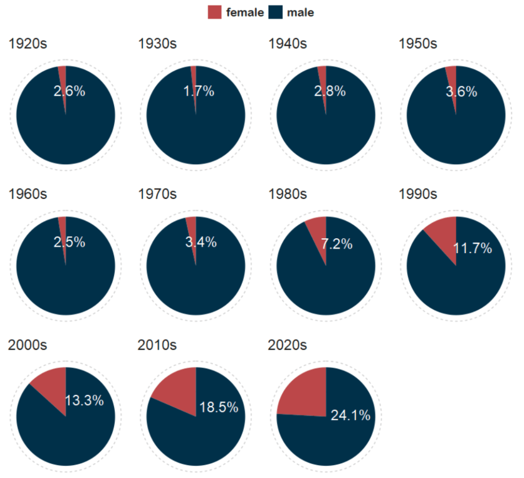
And with Canva, I add the arrows and titles~
Sorry I couldn’t figure it out in R. I just hate all the times I need to re-run graphics to move a text or number by a nano-centimeter. Websites like Canva are just far better for my sanity and short attention span.
Next, we can make a facetted waffle plot!
dail %>%
  group_by(decade) %>%
  ungroup() %>%
  group_by(decade, gender) %>%
  count() %>%
  ggplot(aes(fill = as.factor(gender), values = n)) +
  waffle::geom_waffle(color = "white",
                      size = 0.5,
                      n_rows = 10,
                      flip = TRUE) +
  facet_wrap(~decade, nrow = 1, strip.position = "bottom") +
# my_style  +
  scale_fill_manual(values =c("#003049", "#bc4749")) +
  theme(axis.text.x.bottom = element_blank(),
        text = element_text(size = 40))
And mea culpa, I finished the annotation and titles are with Canva.
Once again, life is too short to be messing with annotation in ggplot.

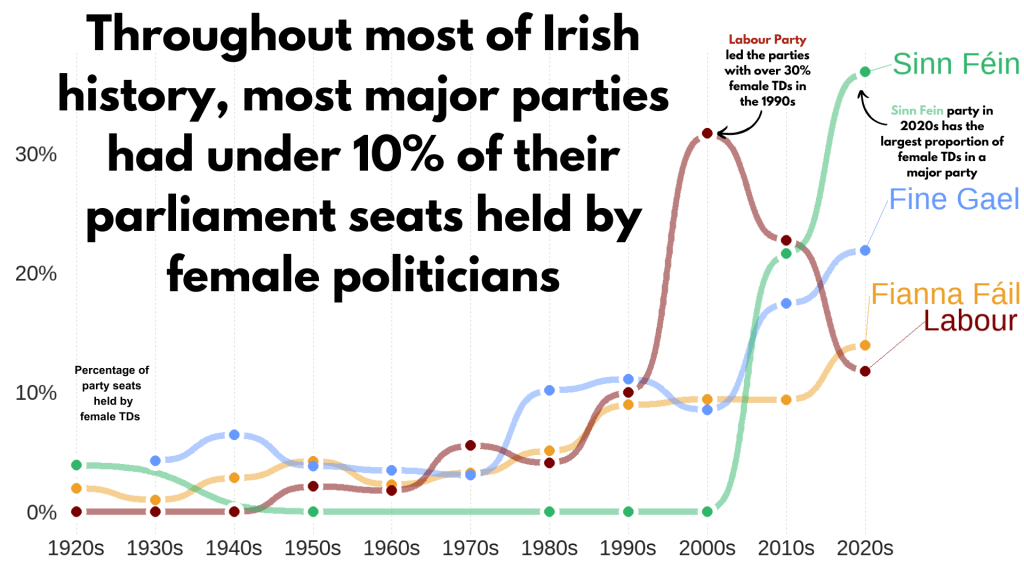
Next, we can make a simple trend line of the top Irish parties and see how they have fared with women TDs.
Let’s get a dataframe with average number of TDs elected to each party over the decades
dail %>%
  filter(constituency != "National University") %>%
  filter(party %in% c("Fianna Fáil", "Fine Gael", "Labour", "Sinn Féin")) %>%
  group_by(party, decade) %>%
  summarise(avg_female = mean(gender == "female")) -> dail_avg
# A tibble: 39 × 3
# Groups:   party [4]
   party       decade avg_female
   <chr>       <chr>       <dbl>
 1 Fianna Fáil 1920s     0.0198
 2 Fianna Fáil 1930s     0.00685
 3 Fianna Fáil 1940s     0.0284
 4 Fianna Fáil 1950s     0.0425
 5 Fianna Fáil 1960s     0.0230
 6 Fianna Fáil 1970s     0.0327
 7 Fianna Fáil 1980s     0.0510
 8 Fianna Fáil 1990s     0.0897
 9 Fianna Fáil 2000s     0.0943
10 Fianna Fáil 2010s     0.0938
# 29 more rows
We create a new mini data.frame of four values so that we can have the geom_text() only at the end of the year (so similar to the final position of the graph).
final_positions <- dail_avg %>%
  group_by(party) %>%
  filter(decade == "2020s")  %>%
  mutate(color = ifelse(party == "Sinn Féin", "#2fb66a",
         ifelse(party == "Fine Gael","#6699ff",
         ifelse(party == "Fianna Fáil","#ee9f27",
         ifelse(party == "Labour", "#780000", "#495051")))))
# A tibble: 4 × 4
# Groups:   party [4]
  party       decade avg_female color
  <chr>       <chr>       <dbl> <chr>
1 Fianna Fáil 2020s       0.140 #ee9f27
2 Fine Gael   2020s       0.219 #6699ff
3 Labour      2020s       0.118 #780000
4 Sinn Féin   2020s       0.368 #2fb66a
A hex colour for each major party
party_pal <- c("Sinn Féin" = "#2fb66a",
                "Fine Gael" = "#6699ff",
                "Fianna Fáil" = "#ee9f27",
                "Labour" = "#780000")
And a geom_bump() layer in the plot using the ggbump() package for more wavy lines.
dail_avg %>%
ggplot(aes(x = decade,
y = avg_female,
group = party,
color = party)) +
ggbump::geom_bump(aes(color = party),
smooth = 5,
alpha = 0.5,
size = 4) +
geom_point(color = "white",
size = 7,
stroke = 4) +
geom_point(size = 6) +
ggrepel::geom_text_repel(data = final_positions,
aes(color = party,
y = avg_female,
x = decade,
label = party),
family = "Arial Rounded MT Bold",
vjust = -2,
hjust = -1,
size = 15) +
# my_style()
scale_color_manual(values = party_pal) +
scale_y_continuous(labels = scales::label_percent()) +
scale_x_discrete(expand = expansion(add = c(0.2, 2))) +
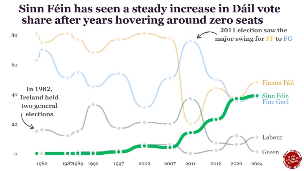
theme(legend.position = "none") This graph looks at major Irish political parties from the 1920s to the 2020s.
For most of Irish history, female representation remained under 10%.
The Labour Party surged ahead like crazy in the 1990s; it got over 30% female TDs!
Now in the 2020s, Sinn Féin has the largest proportion of female TDs and goes way above and beyond the other major parties.
Now, onto constituency maps.
We can go to the Irish government’s website with heaps of data! Yay free data.
This page brings us to the election constituencies GeoJSON map data.
For more information about making GeoJSON and SF maps click here to read about how to create maps in R ~
So we read in the data and convert to SF dataframe.
constituency_map <- geojson_read(file.choose(), what = "sp")

constituency_sf <- st_as_sf(constituency_map)
This constituency_sf has 64 variables but most of them are meta-data info like the dates that each variable was updated. The vaaast majority, we don’t need so we can just pull out the consituency var for our use:
constituency_sf %>%
  select(constituency = ENG_NAME_VALUE,
         geometry) -> mini_constituency_sf
Simple feature collection with 1072 features and 1 field
Geometry type: POLYGON
Dimension:     XY
Bounding box:  xmin: 417437.9 ymin: 516356.4 xmax: 734489.6 ymax: 966899.7
Projected CRS: IRENET95 / Irish Transverse Mercator
First 10 features:
          constituency                       geometry
1  Cork South-West (3) POLYGON ((501759.8 527442.6...
2            Kerry (5) POLYGON ((451686.2 558529.2...
3            Kerry (5) POLYGON ((426695 561869.8, ...
4            Kerry (5) POLYGON ((451103.9 555882.8...
5            Kerry (5) POLYGON ((434925.3 572926.2...
6          Donegal (5) POLYGON ((564480.8 917991.7...
7          Donegal (5) POLYGON ((571201.9 892870.7...
8          Donegal (5) POLYGON ((615249.9 944590.2...
9          Donegal (5) POLYGON ((563593.8 897601, ...
10         Donegal (5) POLYGON ((647306 966899.4, ...
As we see, the number of seats in each constituency is in brackets behind the name of the county. So we can separate them and create a seat variable:
  mini_constituency_sf %<>%
   separate(constituency,
            into = c("constituency", "seats"),
            sep = " \\(", fill = "right") %>%
   mutate(seats = as.numeric(gsub("\\)", "", seats)))
One problem I realised along the way when I was trying to merge the constituency map with the TD politicians data is that one data.frame uses a hyphen and one uses a dash in the constituency variable.
So we can make a quick function to replace en dash (–) with hyphen (-).
 replace_dash <- function(x) {
   if (is.character(x)) {
     gsub("–", "-", x)
   } else {x}
}

 mini_constituency_sf %<>%
   mutate(across(where(is.character), replace_dash))
And now we can merge!
 dail %<>%
   right_join(mini_constituency_sf, by = "constituency")
Now a quick map ~
 dail %<>%
  mutate(n = ifelse(is.na(percentage_women), 0, percentage_women)) %>%
   ggplot(aes(geometry = geometry)) +
   geom_sf(aes(fill = percentage_women),
           color = "black") +  s
   labs(title = "Map of Irish Constituencies") +
   # my_style() +
   scale_fill_viridis_c(option = "plasma")  +

    scale_fill_gradient2(low = "#57cc99",
                         mid = "#38a3a5",
                         high = "#22577a") +

   theme(axis.text = element_blank(),
     axis.text.x.bottom = element_blank(),
     legend.key.width = unit(1.5, "cm"),
     legend.key.height = unit(0.4, "cm"),
     legend.position = "bottom")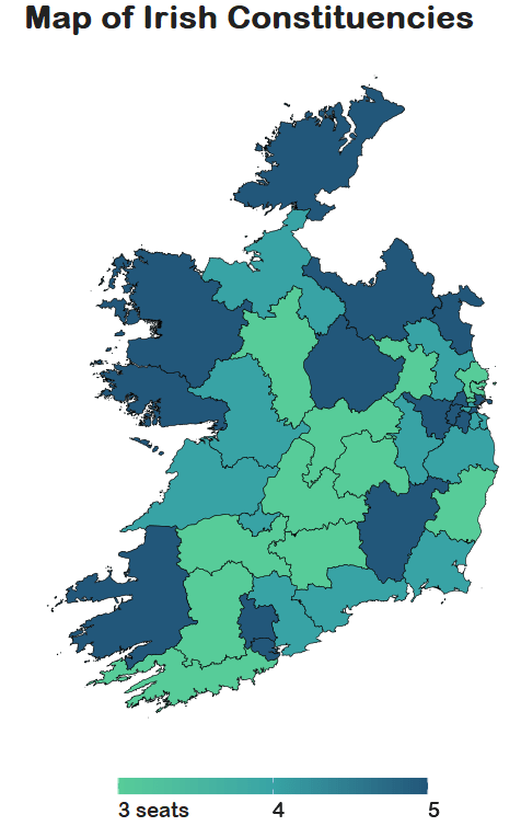
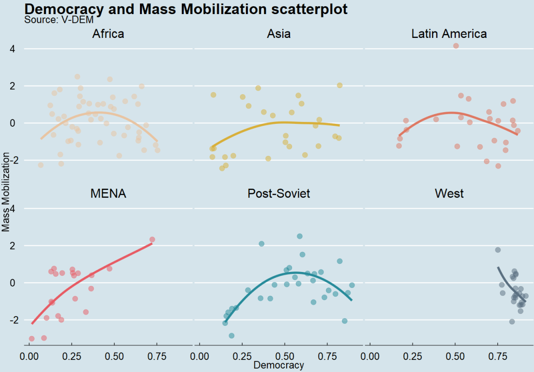
We can see that some constituencies have 3 seats, some 5~
So we cannot directly compare who has more female TDs.
A way to deal with this is scaling the data.
In PART 3, we will look at scaling data and analysing trends across the years!
Yay!


