Download Irish leader dataset

Click here to download the Irish leader datatset. This file details information on all Taoisigh since 1922.

Source: Wikipedia

Tentative Codebook

Variable NameVariable Description
noTaoiseach number
nameName
partyPolitical party
constituencyElectoral constituency
bornDate of birth
diedDate of death
first_electedDate first entered the Dail
entered_officeDate entering office of Taoiseach
left_officeDate leaving office of Taoiseach
left_dailDate left the Dail
cum_daysTotal number of days in Dail
cum_yearsTotal number of years in Dail
second_levelSecondary school Taoiseach attended
third_levelUniversity Taoiseach attended
periodNumber of times the person was Taoiseach
before_after_taoiseachTitle of cabinet positions held by the Taoiseach when he was not holding office of Taoiseach
while_taoiseachTitle of cabinet positions held by the Taoiseach when he was in office as Taoiseach
no_pos_before_afterNumber of cabinet positions the man held when he was not holding office of Taoiseach
no_pos_durNumber of cabinet positions the man held when he was Taoiseach
county_bornThe county the Taoiseach was born in
ageAge of Taoiseach
age_enterAge the man entered office of Taoiseach
genderGender

Packages we will need:

library(tidyverse)
library(ggthemes)
library(readr)
library(sf)
library(tmap)


With the dataset, we can add map data and plot the 26 counties of Ireland.

If you follow this link below, you can download county map data from the following website by Chris Brundson

https://rpubs.com/chrisbrunsdon/part1

Thank you to Chris for the tutorial and data access!

Read in the simple features data with the st_read() from the sf package.

setwd("C:/Users/my_name/Desktop")

county_geom <- sf::st_read("counties.json") %>% 
   clean_names() %>% 
   mutate(county = stringr::str_to_title(county))

Next we count the number of counties that have given Ireland a Taoiseach with the group_by() and count() functions.

One Taoiseach, Eamon DeValera, was born in New York City, so he will not be counted in the graph.

Sorry Dev.

Sad Friends Tv GIF - Find & Share on GIPHY

We can join the Taoisech dataset to the county_geom dataframe by the county variable. The geometric data has the counties in capital letters, so we convert tolower() letters.

Add the geometry variable in the main ggplot() function.

We can play around with the themes arguments and add the theme_map() from the ggthemes package to get the look you want.

I added a few hex colors to indicate the different number of countries.

If you want a transparent background, we save it with the ggsave() function and set the bg argument to “transparent”

full_taois %>% 
  select(county = county_born, everything()) %>% 
  distinct(name, .keep_all = TRUE) %>% 
  group_by(county) %>% 
  count() %>% 
  ungroup() %>% 
  right_join(county_geom, by = c("county" = "county")) %>%
  replace(is.na(.), 0) %>% 
  ggplot(aes(geometry = geometry, fill = factor(n))) +  
  geom_sf(linewidth = 1, color = "white") +
  ggthemes::theme_map() + 
  theme(panel.background = element_rect(fill = 'transparent'),  
    legend.title = element_blank(),
    legend.text = element_text(size = 20) )  + 
scale_fill_manual(values = c("#8d99ae", "#a8dadc", "#457b9d", "#e63946", "#1d3557")) 

ggsave('county_map.png', county_map, bg = 'transparent')

Counties that have given us Taoisigh

Source: Wikipedia

Next we can graph the ages of the Taoiseach when they first entered office. With the reorder() function, we can compare how old they were.

full_taois %>%
  mutate(party = case_when(party == "Cumann na nGaedheal" ~ "CnG",
                           TRUE ~ as.character(party))) %>% 
  distinct(name, .keep_all = TRUE) %>% 
  mutate(age_enter = round(age_enter, digits = 0)) %>% 
  ggplot(aes(x = reorder(name, age_enter),
             y = age_enter,
             fill = party)) + 
  geom_bar(stat = "identity") +
  coord_flip() + 
  scale_fill_manual(values = c( "#8e2420","#66bb66","#6699ff")) + 
  theme(text = element_text(size = 40),
    axis.title.x = element_blank(), 
    axis.title.y = element_blank(), 
    panel.background = element_rect(fill = 'transparent'),  
    plot.background = element_rect(fill = 'transparent', color = NA), 
    panel.grid.major = element_blank(), 
    panel.grid.minor = element_blank(),
    legend.background = element_rect(fill = 'transparent'), #transparent legend bg
    legend.key.size = unit(2, 'cm'),
    legend.key.height = unit(2, 'cm'),
    legend.key.width = unit(2, 'cm'), 
    legend.title = element_blank(),
    legend.text = element_text(size = 20) ) 

ggsave('age_chart.png', age_chart, bg = 'transparent')

Ages of the Taoiseach entering office for the first time

Source: Wikipedia

We can calculate to see which party has held the office of Taoiseach the longest with a special, but slightly mad-looking pie chart

Click here to learn more about creating these plots.

full_taois %>% 
  distinct(name, .keep_all = TRUE) %>% 
  group_by(party) %>% 
  summarise(total_cum = sum(cum_days)) %>% 
    ggplot(aes(reorder(total_cum, party), total_cum, fill = as.factor(party))) + 
  geom_bar(stat = "identity") + 
  coord_polar("x", start = 0, direction = - 1)  + 
  scale_fill_manual(values = c( "#8e2420","#66bb66","#6699ff")) + 
  ggthemes::theme_map()

Number of years each party held the office of Taoiseach

Source: Wikipedia

Fianna Fail has held the office over twice as long as Fine Fail and much more than the one term of W Cosgrove (the only CnG Taoiseach)

Last we can create an icon waffle plots. We can use little man icons to create a waffle plot of all the men (only men) in the office, colored by political party.

I got the code and tutorial for making these waffle plots from the following website:

https://www.listendata.com/2019/06/create-infographics-with-r.html

It was very helpful in walking step by step through how to download the FontAwesome icons into the correct font folder on the PC. I had a heap of issues with the wrong versions of the htmltools.

remotes::install_github("JohnCoene/echarts4r")

remotes::install_github("hrbrmstr/waffle")

devtools::install_github("JohnCoene/echarts4r.assets")

remotes::install_github("hrbrmstr/waffle")

library(echarts4r)
library(extrafont)
library(showtext)
library(magrittr)
library(echarts4r.assets)
library(htmltools)
library(waffle)

extrafont::font_import(path = "C:/Users/my_name/Desktop",  pattern = "fa-", prompt =  FALSE)

extrafont::loadfonts(device="win")

font_add(family = "FontAwesome5Free-Solid", regular = "C:/Users/my_name/Desktop/fa-solid-900.ttf")
font_add(family = "FontAwesome5Free-Regular", regular = "C:/Users/my_name/Desktop/fa-regular-400.ttf")
font_add(family = "FontAwesome5Brands-Regular", regular = "C:/Users/my_name/Desktop/fa-brands-400.ttf")

showtext_auto()

Next we will find out the number of Taoisigh from each party:

And we fill a vector of values into the waffle() function. We can play around with the number of rows. Three seems like a nice fit for the number of icons (glyphs).

Also, we choose the type of glyph image we want with the the use_glyph() argument.

The options are the glyphs that come with the Font Awesome package we downloaded with extrafonts.

waffle(
  c( Cumann na nGaedheal = 1      ` = 1,
      `Fianna Fail = 8    ` = 8, 
      `Fine Gael = 6    ` = 6), 
  rows = 3, 
  colors = c("#8e2420", "#66bb66",  "#6699ff"),
  use_glyph = "male", 
  glyph_size = 25, 
  legend_pos = "bottom")

Click below to download the infographic that was edited and altered with Canva.com.

Jimmy Fallon Dancing GIF by The Tonight Show Starring Jimmy Fallon - Find & Share on GIPHY
Advertisement

How to create semi-circle parliament graphs with the ggparliament package in R

Packages we will need:

library(tidyverse)
library(forcats)
library(ggparliament)

Check out part 1 of this blog where you can follow along how to scrape the data that we will use in this blog. It will create a dataset of the current MPs in the Irish Dail.

In this blog, we will use the ggparliament package, created by Zoe Meers.

The Best Yes GIF - Find & Share on GIPHY

With this dataset of the 33rd Dail, we will reduce it down to get the number of seats that each party holds.

If we don’t want to graph every party, we can lump most of the smaller parties into an “other” category. We can do this with the fct_lump_n() function from the forcats package. I want the top five biggest parties only in the graph. The rest will be colored as “Other”.

Click here to read more about the forcats pacakge and dealing with factors in R.

dail_33 %>% 
  mutate(party_groups  = fct_lump_n(party, n = 5,
         other_level = "Other"))-> dail_lump_count

Next we want to count the number of members per party.

dail_lump_count %>% 
  group_by(party_groups) %>% 
  count() %>%  
  arrange(desc(n)) -> dail_count
  <fct>        <int>
1 Fianna Fail     38
2 Sinn Fein       37
3 Fine Gael       35
4 Independent     19
5 Other           19
6 Green Party     12

Before we graph, I found the hex colors that represent each of the biggest Irish political party. We can create a new party color variables with the case_when() function and add each color.

dail_count %<>% 
  mutate(party_color = case_when(party_groups == "Fianna Fail" ~ "#66bb66",
                                 party_groups == "Fine Gael" ~ "#6699ff",
                                 party_groups == "Green Party" ~ "#44532a",
                                 party_groups == "Independent" ~ "#8e2420",
                                 party_groups == "Sinn Fein" ~ "#326760",
                                 party_groups == "Other" ~ "#ee9f27"))

Now we can dive into the ggparliament package.

We use the parliamenet_data() function to create coordinates for our graph: these are the x and y variables we will plot out.

We feed in the data.frame of all the seat counts into the election_data argument.

We specifiy the type as “semi-circle“. Other options are “horseshoe” and “opposing_benches“.

We can change how many circles we want stacked on top of each other.

I tried it with three and it looked quite strange. So play around with this parl_rows argument to see what suits your data best

And last we feed in the number of seats that each party has with the n we summarised above.

dail_33_coord <- parliament_data(election_data = dail_count,
                                 type = "semicircle", 
                                 parl_rows = 6,  
                                 party_seats = dail_count$n) 

If we view the dail_33_coord data.frame we can see that the parliament_data() function calculated new x and y coordinate variables for the semi-circle graph.

I don’t know what the theta variables is for… But there it is also … maybe to make circular shapes?

We feed the x and y coordinates into the ggplot() function and then add the geom_parliament_seat() layer to produce our graph!

Click here to check out the PDF for the ggparliament package

dail_33_coord %>% 
  ggplot(aes(x = x,
             y = y,
             colour = party_groups)) +
  geom_parliament_seats(size = 20) -> dail_33_plot

And we can make it look more pretty with bbc_style() plot and colors.

Click here to read more about the BBC style graphs.

dail_33_plot +  bbplot::bbc_style() + 
  ggtitle("33rd Irish Parliament") +
  theme(text = element_text(size = 50),
                      legend.title = element_blank(),
                      axis.text.x = element_blank(),
                      axis.text.y = element_blank()) +  
  scale_colour_manual(values = dail_33_coord$party_color,
                    limits = dail_33_coord$party_groups)
Clueless Movie Cherilyn Horowitz GIF - Find & Share on GIPHY

Create a dataset of Irish parliament members

library(rvest)
library(tidyverse)
library(toOrdinal)
library(magrittr)
library(genderizeR)
library(stringi)

This blogpost will walk through how to scrape and clean up data for all the members of parliament in Ireland.

Or we call them in Irish, TDs (or Teachtaí Dála) of the Dáil.

We will start by scraping the Wikipedia pages with all the tables. These tables have information about the name, party and constituency of each TD.

On Wikipedia, these datasets are on different webpages.

This is a pain.

However, we can get around this by creating a list of strings for each number in ordinal form – from1st to 33rd. (because there have been 33 Dáil sessions as of January 2023)

We don’t need to write them all out manually: “1st”, “2nd”, “3rd” … etc.

Instead, we can do this with the toOrdinal() function from the package of the same name.

dail_sessions <- sapply(1:33,toOrdinal)

Next we can feed this vector of strings with the beginning of the HTML web address for Wikipedia as a string.

We paste the HTML string and the ordinal number strings together with the stri_paste() function from the stringi package.

This iterates over the length of the dail_sessions vector (in this case a length of 33) and creates a vector of each Wikipedia page URL.

dail_wikipages <- stri_paste("https://en.wikipedia.org/wiki/Members_of_the_",
           dail_sessions, "_D%C3%A1il")

Now, we can take the most recent Dáil session Wikipedia page and take the fifth table on the webpage using `[[`(5)

We rename the column names with select().

And the last two mutate() lines reomve the footnote numbers in ( ) [ ] brackets from the party and name variables.

dail_wikipages[33] %>%  
  read_html() %>%
  html_table(header = TRUE, fill = TRUE) %>% 
  `[[`(5) %>% 
  rename("ble" = 1, "party" = 2, "name" = 3, "constituency" = 4) %>% 
  select(-ble) %>% 
  mutate(party = gsub(r"{\s*\([^\)]+\)}","",as.character(party))) %>% 
  mutate(name = sub("\\[.*", "", name)) -> dail_33

Last we delete the first row. That just contais a duplicate of the variable names.

dail_33 <- dail_33[-1,]

We want to delete the fadas (long accents on Irish words). We can do this across all the character variables with the across() function.

The stri_trans_general() converts all strings to LATIN ASCII, which turns string to contain only the letters in the English language alphabet.

dail_33 %<>% 
  mutate(across(where(is.character), ~ stri_trans_general(., id = "Latin-ASCII"))) 

We can also separate the first name from the second names of all the TDs and create two variables with mutate() and separate()

dail_33 %<>% 
  mutate(name = str_replace(name, "\\s", "|")) %>% 
  separate(name, into = c("first_name", "last_name"), sep = "\\|") 

With the first_name variable, we can use the new pacakge by Kalimu. This guesses the gender of the name. Later, we can track the number of women have been voted into the Dail over the years.

Of course, this will not be CLOSE to 100% correct … so later we will have to check each person manually and make sure they are accurate.

devtools::install_github("kalimu/genderizeR")

gender = findGivenNames(dail_33$name, progress = TRUE)

gender %>% 
  select(probability, gender)  -> gen_variable

gen_variable %<>% 
  select(name, gender) %>% 
  mutate(name = str_to_sentence(name))

dail_33 %<>% 
  left_join(gen_variable, by = "name") 

Create date variables and decade variables that we can play around with.

dail_df$date_2 <- as.Date(dail_df$date, "%Y-%m-%d")

dail_df$year <- format(dail_df$date_2, "%Y")

dail_df$month <- format(dail_df$date_2, "%b")

dail_df %>% 
  mutate(decade = substr(year, 1, 3)) %>% 
  mutate(decade = paste0(decade, "0s"))

In the next blog, we will graph out the various images to explore these data in more depth. For example, we can make a circle plot with the composition of the current Dail with the ggparliament package.

We can go into more depth with it in the next blog… Stay tuned.

Cleaning up messy World Bank data

Packages we will need:

library(tidyverse)
library(tidyr)
library(janitor)
library(magrittr)
library(democracyData)
library(countrycode)
library(ggimage)

When you come across data from the World Bank, often it is messy.

So this blog will go through how to make it more tidy and more manageable in R

For this blog, we will look at World Bank data on financial aid. Specifically, we will be using values for net ODA received as percentage of each country’s GNI. These figures come from the Development Assistance Committee of the Organisation for Economic Co-operation and Development (DAC OECD).

If we look at the World Bank data downloaded from the website, we have a column for each year and the names are quite messy.

This data is wide form.

Unacceptable.

So we will change the data from wide to long data.

Instead of a column for each year, we will have a row for each country-year.

Before doing that, we can clean up the variable names with the janitor package function: clean_names().

sdg %<>% 
  clean_names() 

ALSO, before we pivot the dataset to longer format, we choose the variables we want to keep (i.e. only country, year and ODA value)

sdg %<>% 
  select(country_name, x1990_yr1990:x2015_yr2015) 

Now we are ready to turn the data from wide to long.

We can use the pivot_longer() function from the tidyr package.

Instead of 286 rows and 27 columns, we will ultimately end up with 6968 rows and only 3 columns.

Source: Garrick Aden-Buie’s (@grrrckTidy Animated Verbs

Thank you to Mr. Aden-Buie for your page visualising all the different ways to transform datasets with dplyr. Click the link to check out more.

Back to the pivoting, we want to create a row for each year, 1990, 1991, 1992 …. up to 2015

And we will have a separate cell for each value of the ODA variable for each country-year value.

In the pivot_longer() function we exclude the country names,

We want a new row for each year, so we make a “year” variable with the names_to() argument.

And we create a separate value for each ODA as a percentage of GNI with the values_to() argument.

sdg %>% 
  pivot_longer(!country_name, names_to = "year", 
               values_to = "oda_gni") -> oda

The year values are character strings, not numbers. So we will convert with parse_number(). This parses the first number it finds, dropping any non-numeric characters before the first number and all characters after the first number.

oda %>% 
     mutate(year = parse_number(year)) -> oda 

Next we will move from the year variable to ODA variable. There are many ODA values that are empty. We can see that there are 145 instances of empty character strings.

oda %>% 
  count(oda_gni) %>% 
  arrange(oda_gni)

So we can replace the empty character strings with NA values using the na_if() function. Then we can use the parse_number() function to turn the character into a string.

oda %>%
  mutate(oda_gni = na_if(oda_gni, "")) %>% 
  mutate(oda_gni = parse_number(oda_gni)) -> oda

Now we need to delete the year variables that have no values.

oda %<>% 
  filter(!is.na(year))

Also we need to delete non-countries.

The dataset has lots of values for regions that are not actual countries. If you only want to look at politically sovereign countries, we can filter out countries that do not have a Correlates of War value.

oda %<>%
  mutate(cow = countrycode(oda$country_name, "country.name", 'cown')) %>% 
  filter(!is.na(cow))

We can also make a variable for each decade (1990s, 2000s etc).

oda %>% 
  mutate(decade = substr(year, 1, 3)) %>% 
  mutate(decade = paste0(decade, "0s"))

And download data for countries’ region, continent and govenment regime. To do this we use the democracyData package and download the PACL dataset.

Click here to read more about this package.

pacl <- democracyData::redownload_pacl()

pacl %>% 
  select(cow = pacl_cowcode,
         year,
         region = un_region_name,
         continent = un_continent_name,
         demo_dummy = democracy,
         regime = regime
         ) -> pacl_subset

We use the left_join() function to join both datasets together with Correlates of War code and year variables.

oda %>% 
  left_join(pacl_subset, by = c("cow", "year")) -> oda_pacl

Now if we look at the dataset, we can see that it is much tidier and we can start analysing.

Below we can create a bar chart of the top ten countries that received the most aid as a percentage of their economic income (gross national income)

First we need to get the average oda per country with the group_by() and summarise() functions

oda_pacl %>%
  mutate(oda_gni = ifelse(is.na(oda_gni), 0, oda_gni)) %>%  
  group_by(country_name,region, continent) %>% 
  summarise(avg_oda = mean(oda_gni, na.rm = TRUE)) -> oda_mean

We use the slice() function to only have the top ten countries

oda_mean %>% 
  arrange(desc(avg_oda)) %>%
  ungroup() %>% 
  slice(1:10) -> oda_slice

We add an ISO code for each country for the flags

Click here to read more about the ggimage package

oda_slice %<>% 
  mutate(iso2 = countrycode(country_name, "country.name", "iso2c"))

And some nice hex colours

my_palette <- c( "#44bec7", "#ffc300", "#fa3c4c")

And finally, plot it out with ggplot()

oda_slice %>%
  ggplot(aes(x = reorder(country_name, avg_oda),
             y = avg_oda, fill = continent)) + 
  geom_bar(stat = "identity") + 
  ggimage::geom_flag(aes(image = iso2), size = 0.1)  +
  coord_flip() +
  scale_fill_manual(values = my_palette) + 
  labs(title = "ODA aid as % GNI ",
       subtitle = "Source: OECD DAC via World Bank",
       x = "Donor Country",
       y = "ODA per capita") + bbplot::bbc_style()

How to interpret linear models with the broom package in R

Packages you will need:

library(tidyverse)
library(magrittr)     # for pipes

library(broom)        # add model variables
library(easystats)    # diagnostic graphs

library(WDI)           # World Bank data
library(democracyData) # Freedom House data

library(countrycode)   # add ISO codes
library(bbplot)        # pretty themes
library(ggthemes)      # pretty colours
library(knitr)         # pretty tables
library(kableExtra)    # make pretty tables prettier

This blog will look at the augment() function from the broom package.

After we run a liner model, the augment() function gives us more information about how well our model can accurately preduct the model’s dependent variable.

It also gives us lots of information about how does each observation impact the model. With the augment() function, we can easily find observations with high leverage on the model and outlier observations.

For our model, we are going to use the “women in business and law” index as the dependent variable.

According to the World Bank, this index measures how laws and regulations affect women’s economic opportunity.

Overall scores are calculated by taking the average score of each index (Mobility, Workplace, Pay, Marriage, Parenthood, Entrepreneurship, Assets and Pension), with 100 representing the highest possible score.

Into the right-hand side of the model, our independent variables will be child mortality, military spending by the government as a percentage of GDP and Freedom House (democracy) Scores.

First we download the World Bank data and summarise the variables across the years.

Click here to read more about the WDI package and downloading variables from the World Bank website.

women_business = WDI(indicator = "SG.LAW.INDX")
mortality = WDI(indicator = "SP.DYN.IMRT.IN")
military_spend_gdp <- WDI(indicator = "MS.MIL.XPND.ZS")

We get the average across 60 ish years for three variables. I don’t want to run panel data regression, so I get a single score for each country. In total, there are 160 countries that have all observations. I use the countrycode() function to add Correlates of War codes. This helps us to filter out non-countries and regions that the World Bank provides. And later, we will use COW codes to merge the Freedom House scores.

women_business %>%
  filter(year > 1999) %>% 
  inner_join(mortality) %>% 
  inner_join(military_spend_gdp) %>% 
  select(country, year, iso2c, 
         fem_bus = SG.LAW.INDX, 
         mortality = SP.DYN.IMRT.IN,
         mil_gdp = MS.MIL.XPND.ZS)  %>% 
  mutate_all(~ifelse(is.nan(.), NA, .)) %>% 
  select(-year) %>% 
  group_by(country, iso2c) %>% 
  summarize(across(where(is.numeric), mean,  
   na.rm = TRUE, .names = "mean_{col}")) %>% 
  ungroup() %>% 
  mutate(cown = countrycode::countrycode(iso2c, "iso2c", "cown")) %>% 
  filter(!is.na(cown)) -> wdi_summary

Next we download the Freedom House data with the democracyData package.

Click here to read more about this package.

fh <- download_fh()

fh %>% 
  group_by(fh_country) %>% 
  filter(year > 1999) %>% 
  summarise(mean_fh = mean(fh_total, na.rm = TRUE)) %>% 
  mutate(cown = countrycode::countrycode(fh_country, "country.name", "cown")) %>% 
  mutate_all(~ifelse(is.nan(.), NA, .)) %>% 
  filter(!is.na(cown))  -> fh_summary

We join both the datasets together with the inner_join() functions:

fh_summary %>%
  inner_join(wdi_summary, by = "cown") %>% 
  select (-c(cown, iso2c, fh_country)) -> wdi_fh

Before we model the data, we can look at the correlation matrix with the corrplot package:

wdi_fh %>% 
  drop_na() %>% 
  select(-country)  %>% 
  select(`Females in business` = mean_fem_bus,
        `Mortality rate` = mean_mortality,
        `Freedom House` = mean_fh,
        `Military spending GDP` = mean_mil_gdp)  %>% 
  cor() %>% 
  corrplot(method = 'number',
           type = 'lower',
           number.cex = 2, 
           tl.col = 'black',
           tl.srt = 30,
           diag = FALSE)

Next, we run a simple OLS linear regression. We don’t want the country variables so omit it from the list of independent variables.

fem_bus_lm <- lm(mean_fem_bus ~ . - country, data = wdi_fh)
Dependent variable:
mean_fem_bus
mean_fh-2.807***
(0.362)
mean_mortality-0.078*
(0.044)
mean_mil_gdp-0.416**
(0.205)
Constant94.684***
(2.024)
Observations160
R20.557
Adjusted R20.549
Residual Std. Error11.964 (df = 156)
F Statistic65.408*** (df = 3; 156)
Note:*p<0.1; **p<0.05; ***p<0.01

We can look at some preliminary diagnostic plots.

Click here to read more about the easystat package. I found it a bit tricky to download the first time.

performance::check_model(fem_bus_lm)

The line is not flat at the beginning so that is not ideal..

We will look more into this later with the variables we create with augment() a bit further down this blog post.

None of our variables have a VIF score above 5, so that is always nice to see!

From the broom package, we can use the augment() function to create a whole heap of new columns about the variables in the model.

fem_bus_pred <- broom::augment(fem_bus_lm)

  • .fitted = this is the model prediction value for each country’s dependent variable score. Ideally we want them to be as close to the actual scores as possible. If they are totally different, this means that our independent variables do not do a good job explaining the variance in our “women in business” index.

  • .resid = this is actual dependent variable value minus the .fitted value.

We can look at the fitted values that the model uses to predict the dependent variable – level of women in business – and compare them to the actual values.

The third column in the table is the difference between the predicted and actual values.

fem_bus_pred %>% 
  mutate(across(where(is.numeric), ~round(., 2))) %>%
  arrange(mean_fem_bus) %>% 
  select(Country = country,
    `Fem in bus (Actual)` = mean_fem_bus,
    `Fem in bus (Predicted)` = .fitted,
    `Fem in bus (Difference)` = .resid,
                  `Mortality rate` = mean_mortality,
                  `Freedom House` = mean_fh,
                  `Military spending GDP` = mean_mil_gdp)  %>% 
  kbl(full_width = F) 
Country Leverage of country Fem in bus (Actual) Fem in bus (Predicted)
Austria 0.02 88.92 88.13
Belgium 0.02 92.13 87.65
Costa Rica 0.02 79.80 87.84
Denmark 0.02 96.36 87.74
Finland 0.02 94.23 87.74
Iceland 0.02 96.36 88.90
Ireland 0.02 95.80 88.18
Luxembourg 0.02 94.32 88.33
Sweden 0.02 96.45 87.81
Switzerland 0.02 83.81 87.78

And we can graph them out:

fem_bus_pred %>%
  mutate(fh_category = cut(mean_fh, breaks =  5,
  labels = c("full demo ", "high", "middle", "low", "no demo"))) %>%         ggplot(aes(x = .fitted, y = mean_fem_bus)) + 
  geom_point(aes(color = fh_category), size = 4, alpha = 0.6) + 
  geom_smooth(method = "loess", alpha = 0.2, color = "#20948b") + 
  bbplot::bbc_style() + 
  labs(x = '', y = '', title = "Fitted values versus actual values")

In addition to the predicted values generated by the model, other new columns that the augment function adds include:

  • .hat = this is a measure of the leverage of each variable.

  • .cooksd = this is the Cook’s Distance. It shows how much actual influence the observation had on the model. Combines information from .residual and .hat.

  • .sigma = this is the estimate of residual standard deviation if that observation is dropped from model

  • .std.resid = standardised residuals

If we look at the .hat observations, we can examine the amount of leverage that each country has on the model.

fem_bus_pred %>% 
  mutate(dplyr::across(where(is.numeric), ~round(., 2))) %>%
  arrange(desc(.hat)) %>% 
  select(Country = country,
         `Leverage of country` = .hat,
         `Fem in bus (Actual)` = mean_fem_bus,
         `Fem in bus (Predicted)` = .fitted)  %>% 
  kbl(full_width = F) %>%
  kable_material_dark()

Next, we can look at Cook’s Distance. This is an estimate of the influence of a data point.  According to statisticshowto website, Cook’s D is a combination of each observation’s leverage and residual values; the higher the leverage and residuals, the higher the Cook’s distance.

  1. If a data point has a Cook’s distance of more than three times the mean, it is a possible outlier
  2. Any point over 4/n, where n is the number of observations, should be examined
  3. To find the potential outlier’s percentile value using the F-distribution. A percentile of over 50 indicates a highly influential point
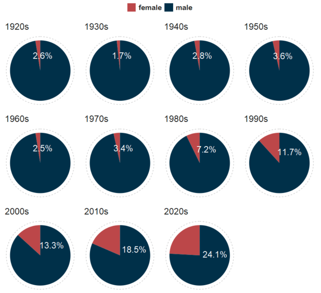
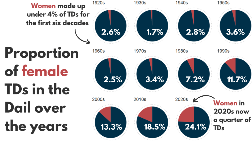
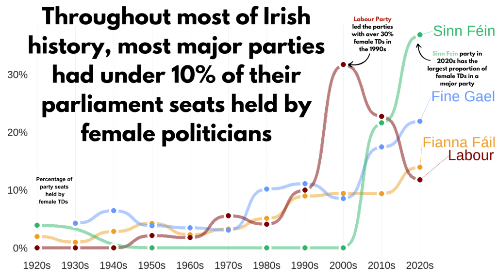
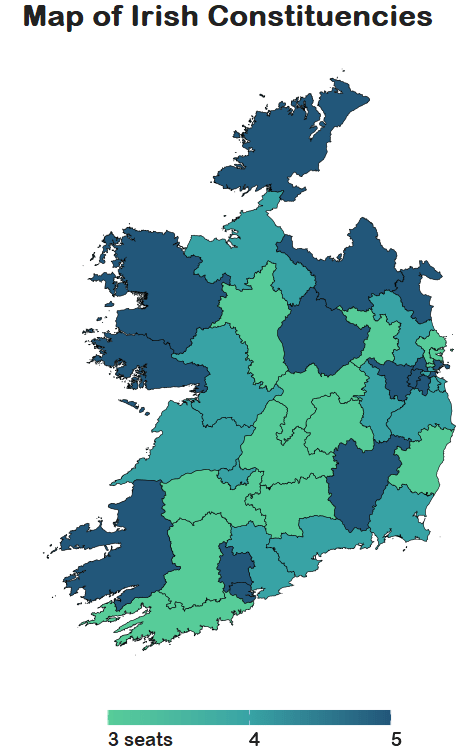
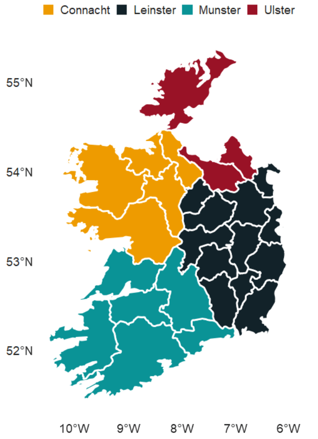
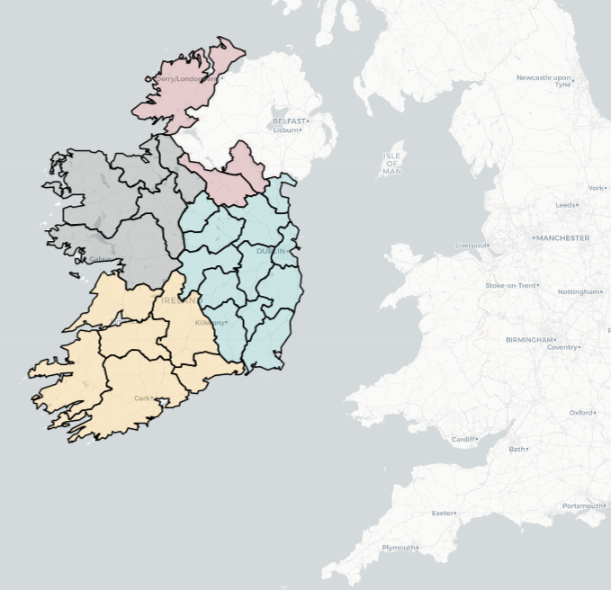
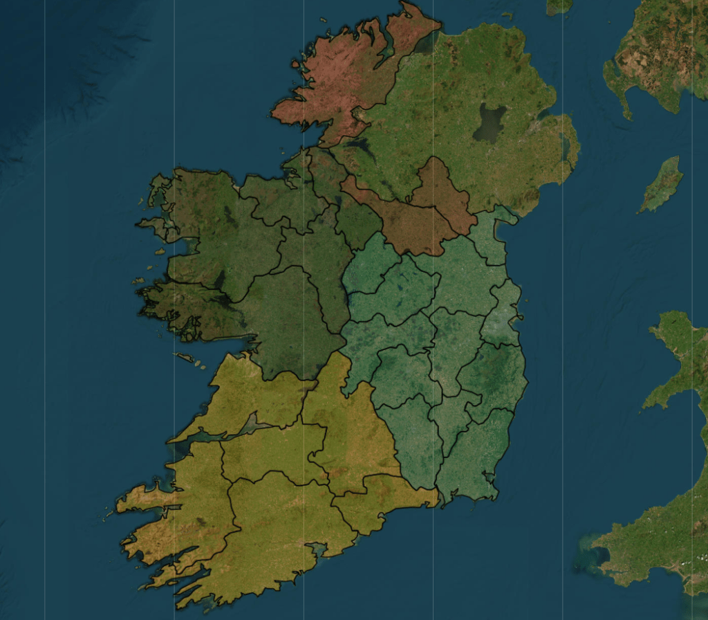
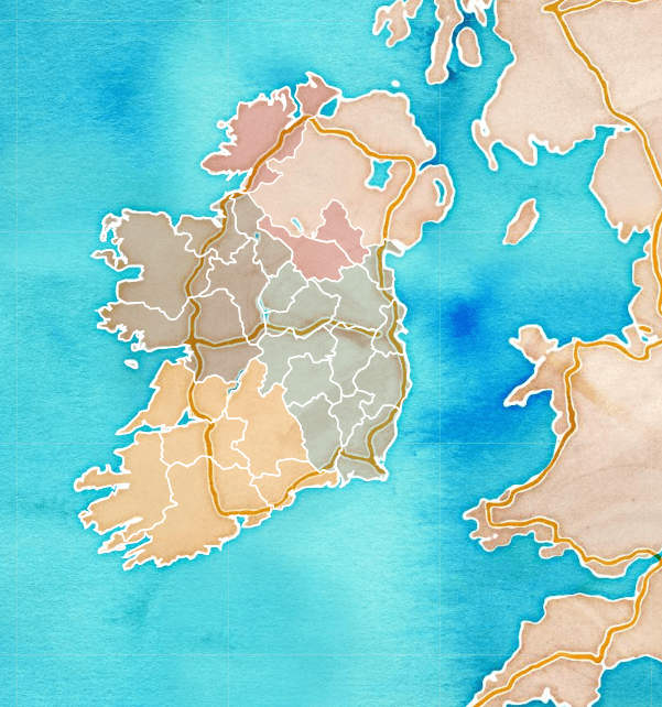
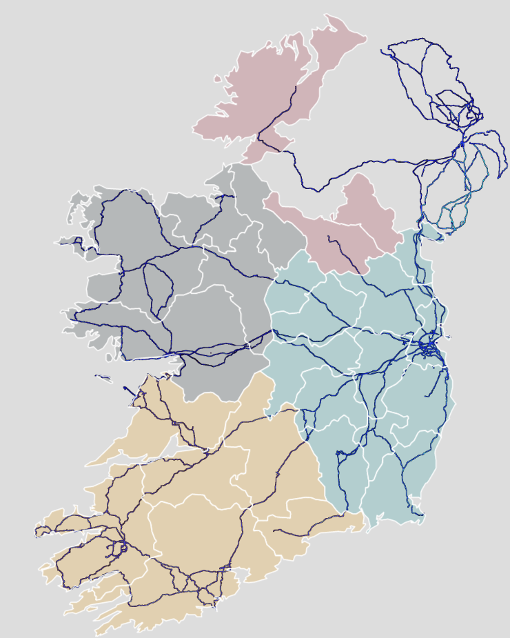
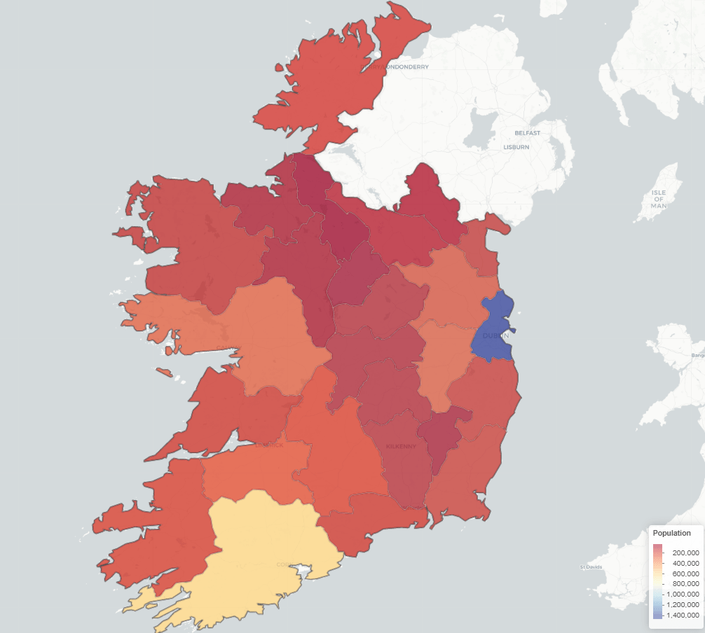
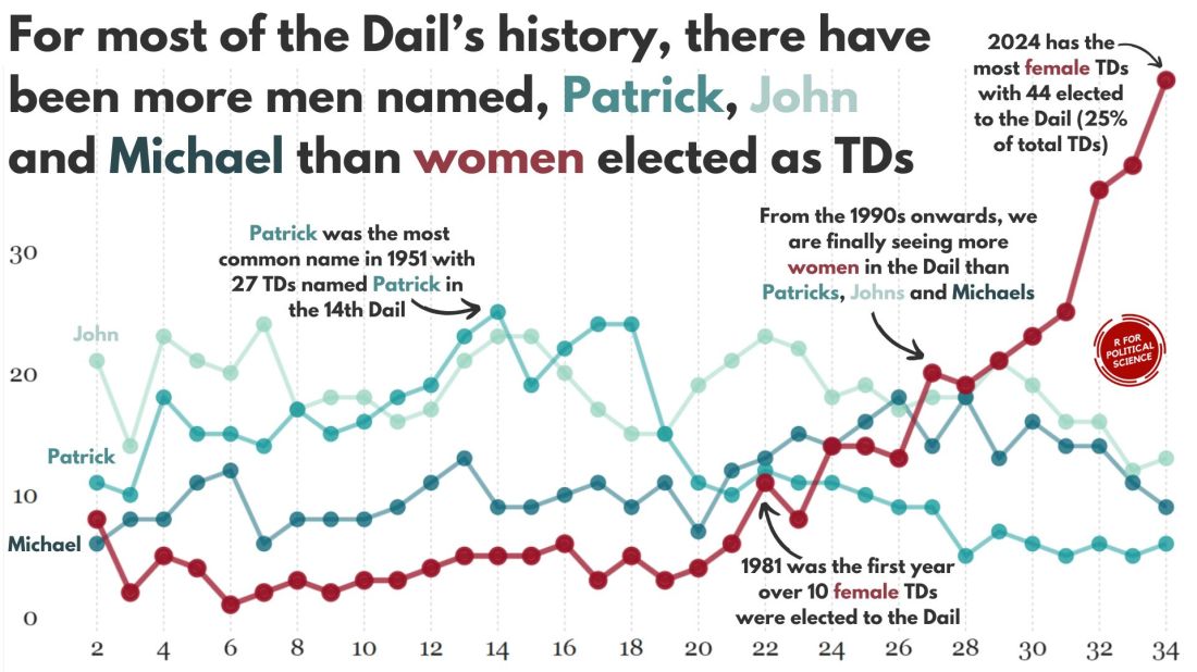
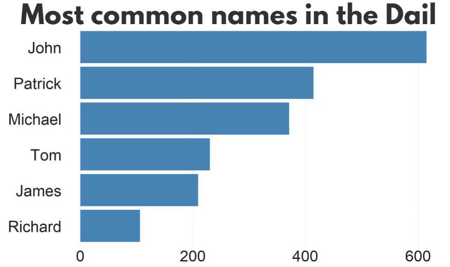
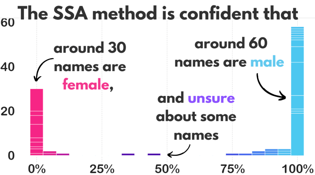
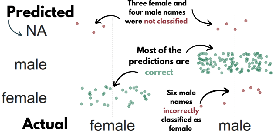
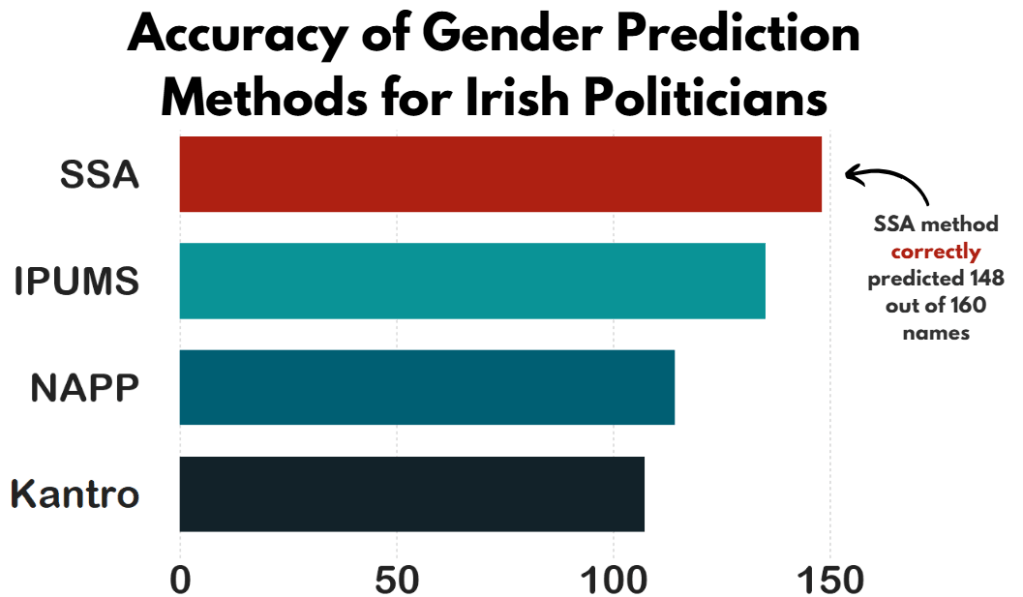
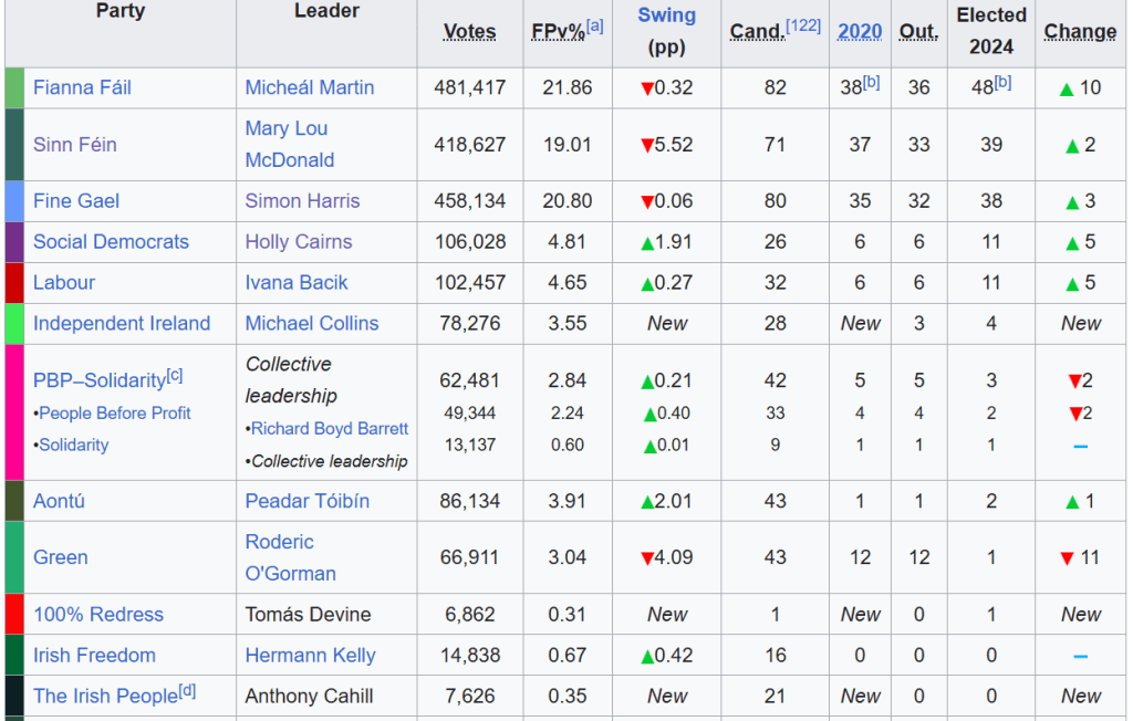
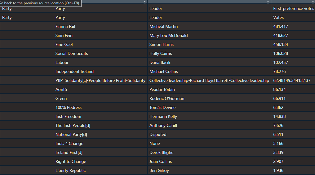
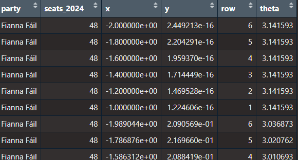
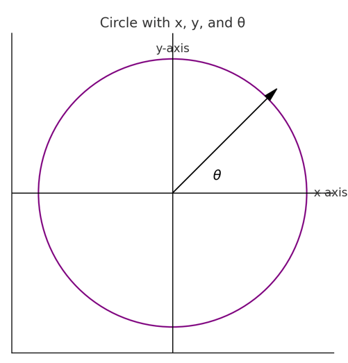
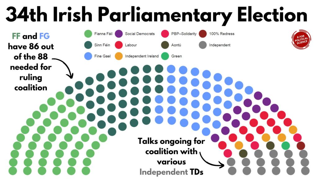
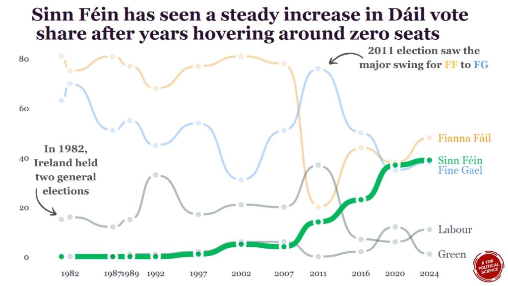
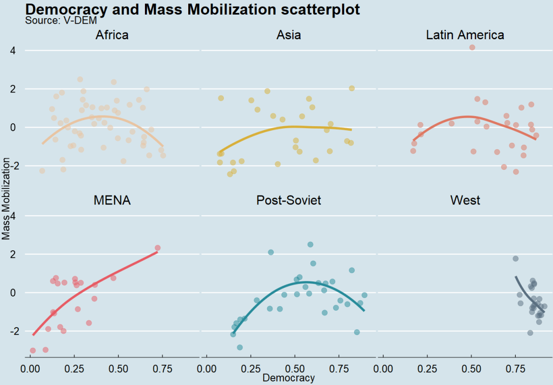
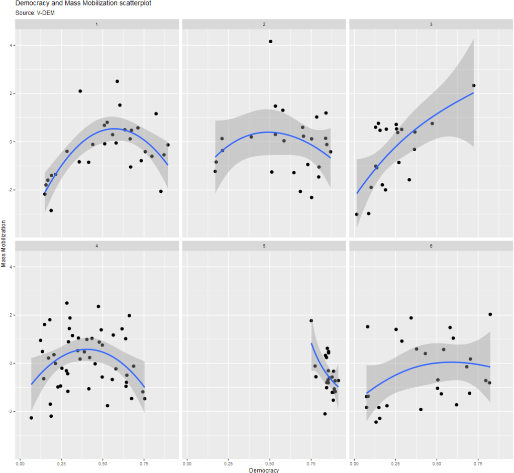
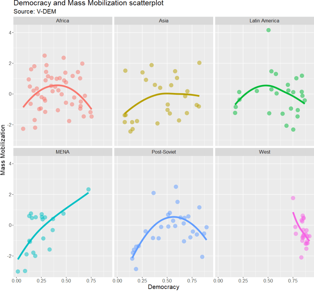
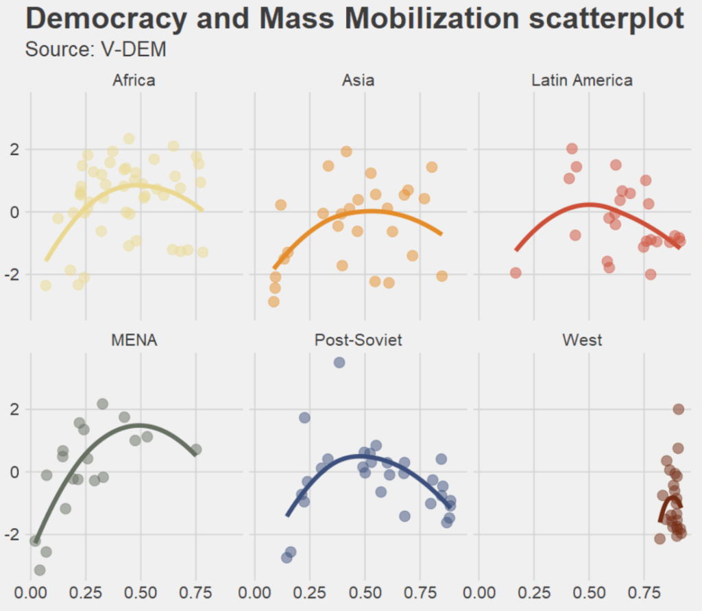
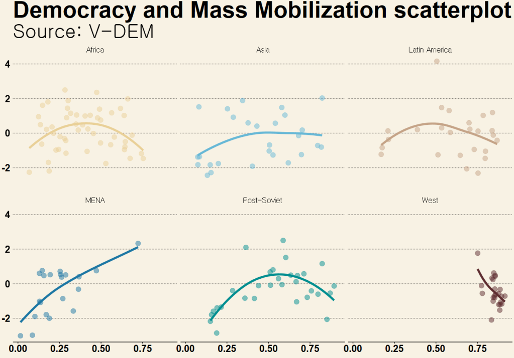
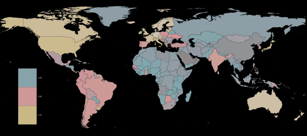
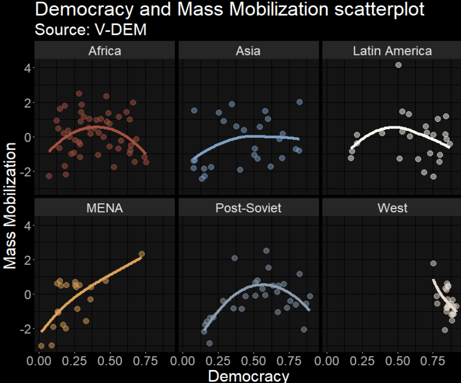
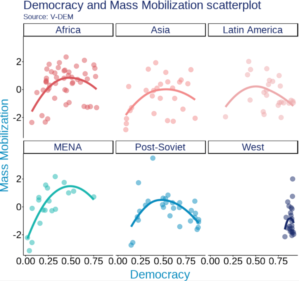
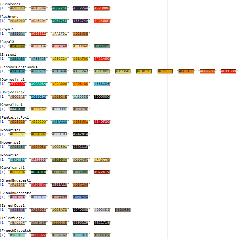
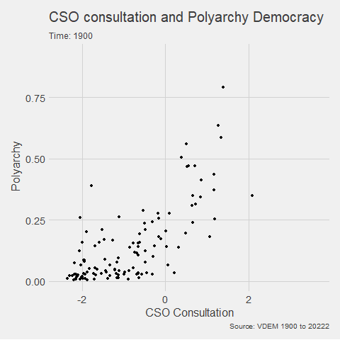
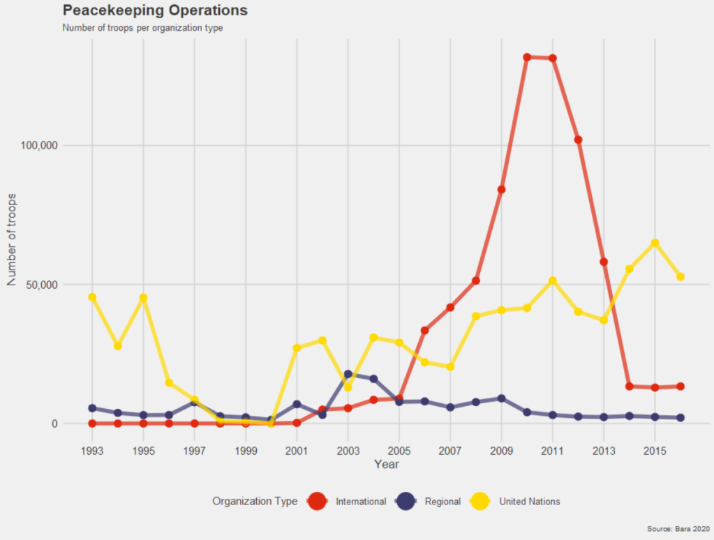
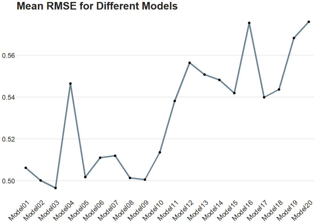
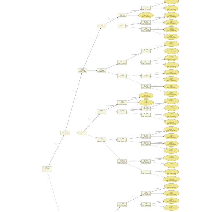
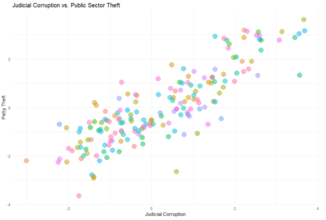
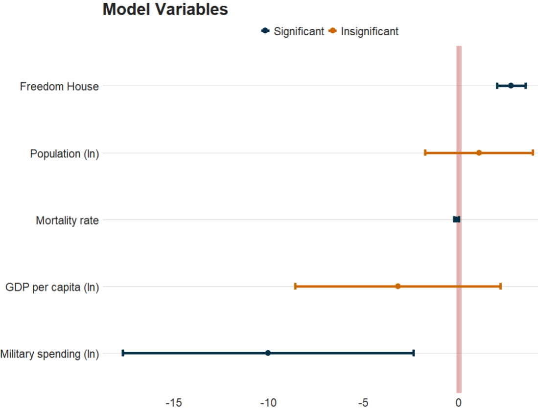
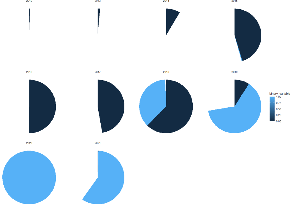
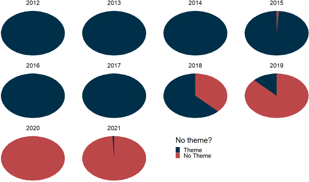
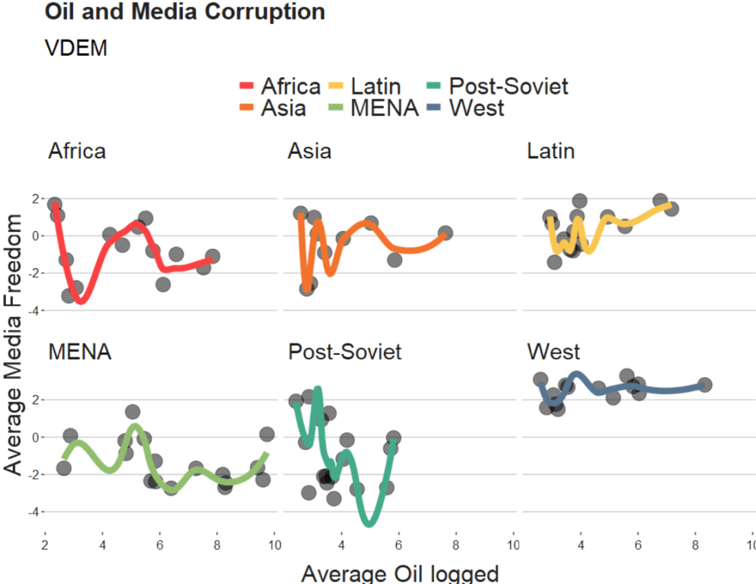
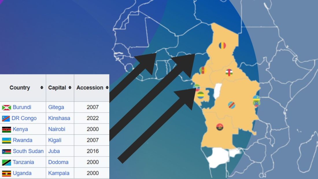
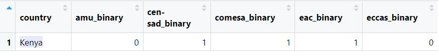
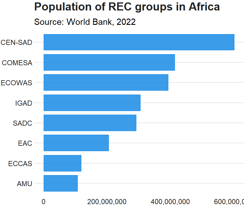
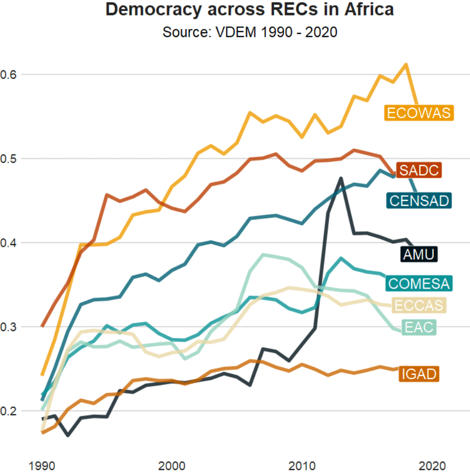
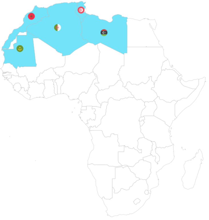
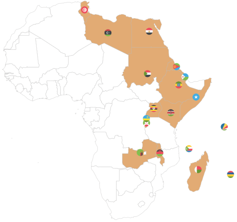
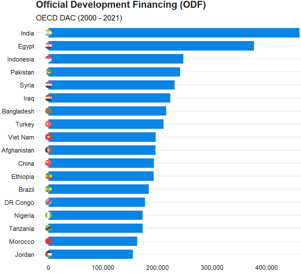
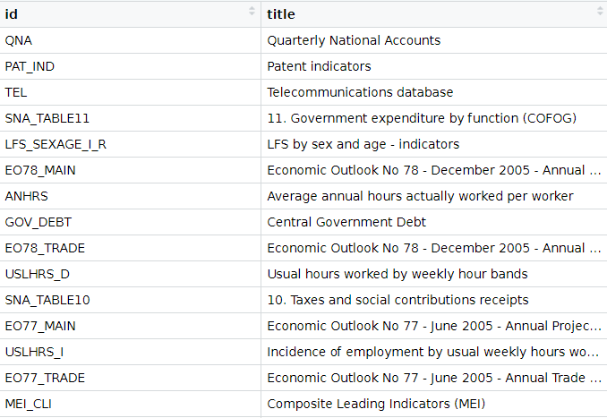
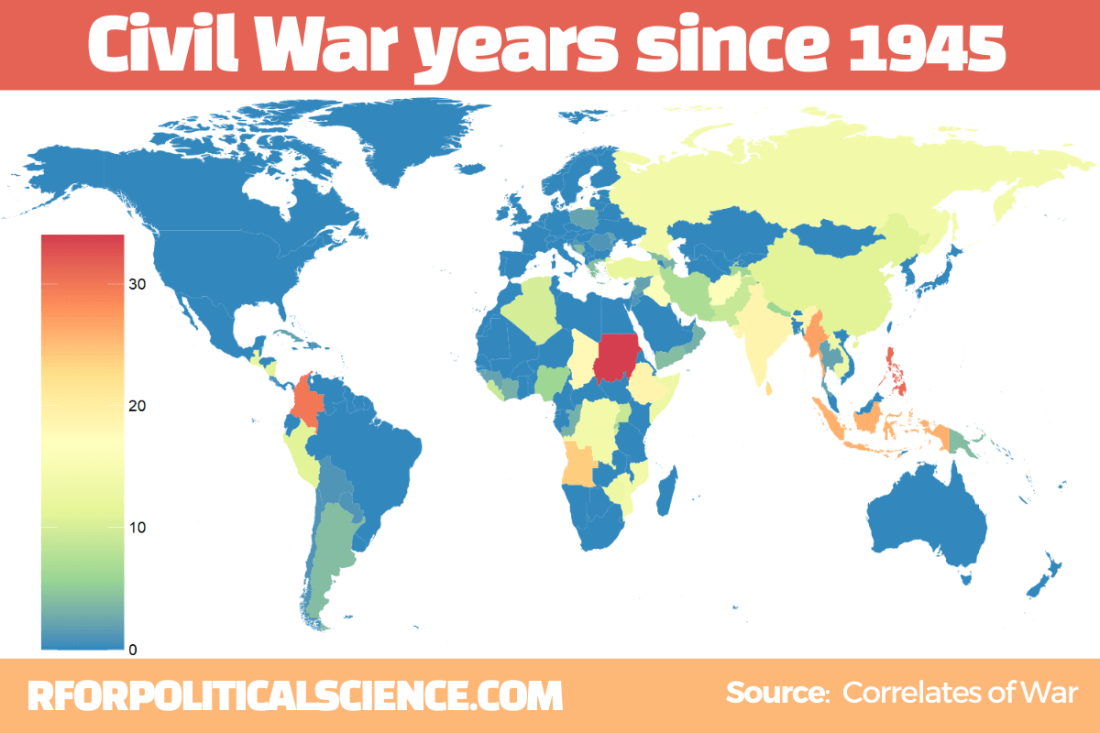
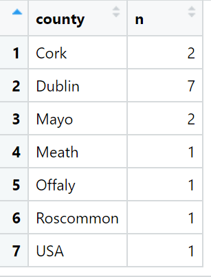
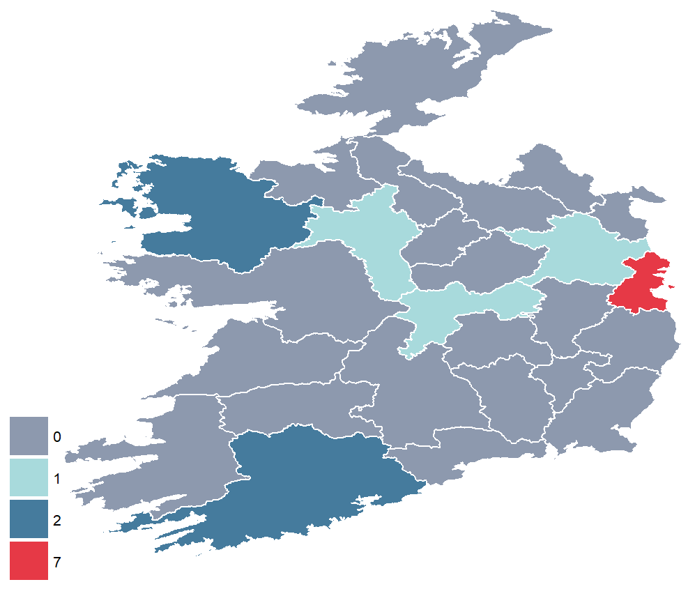
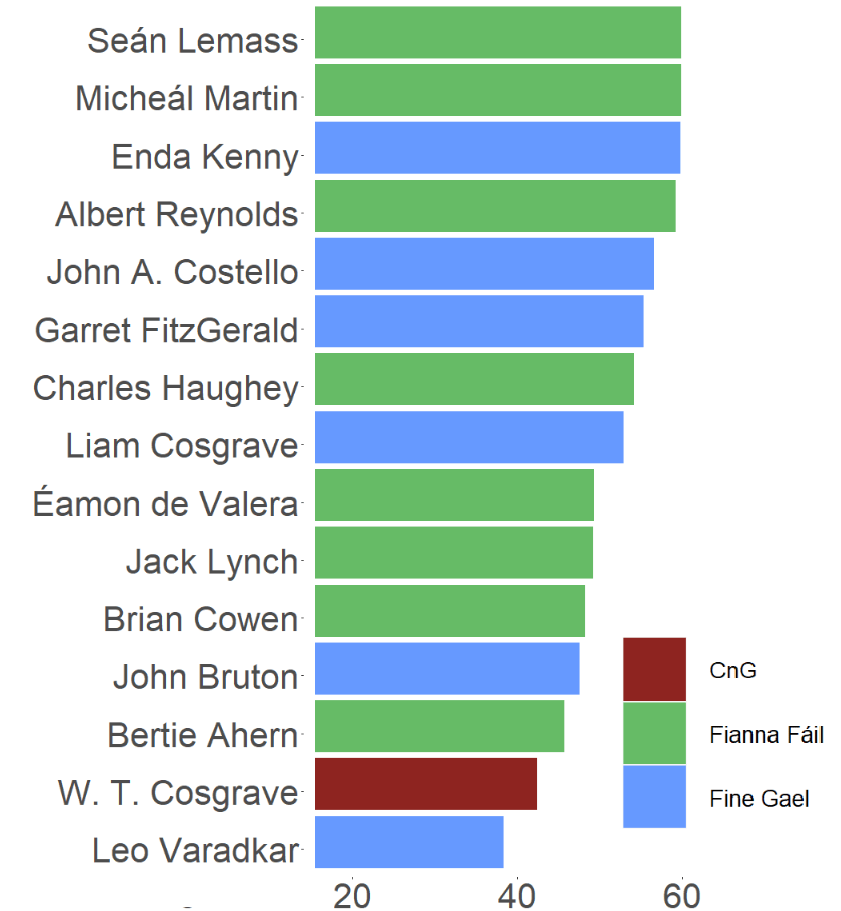
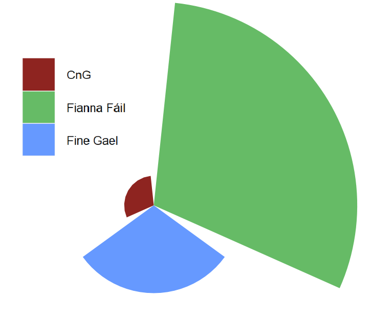
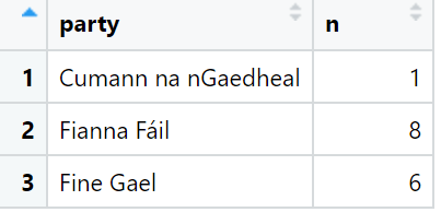
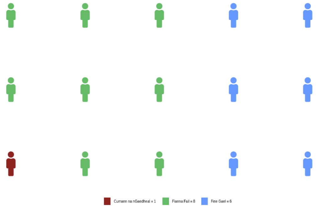
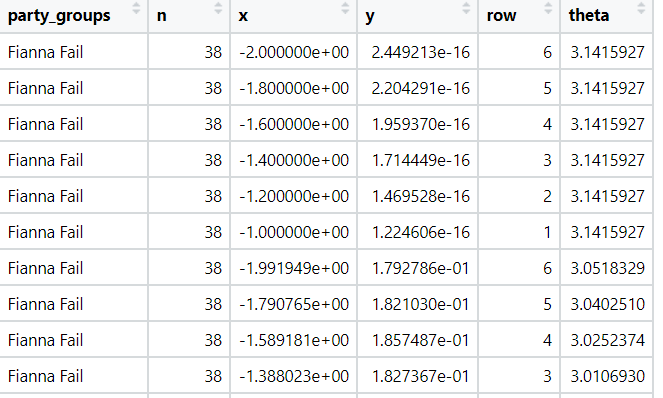
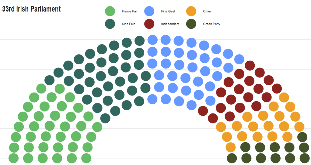
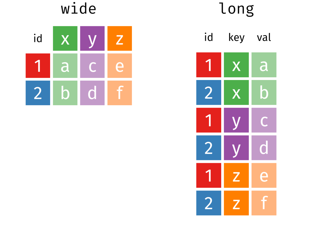
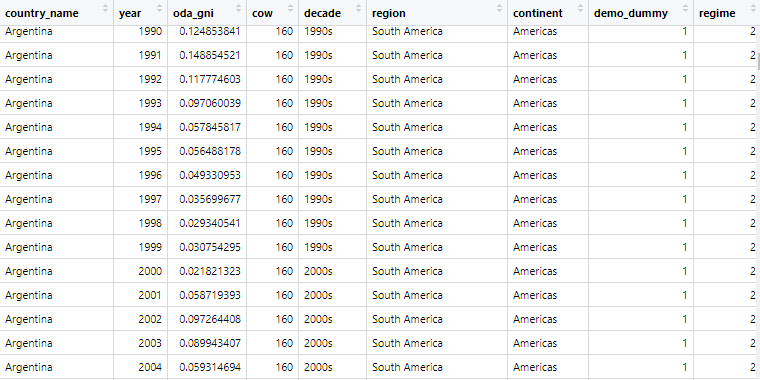
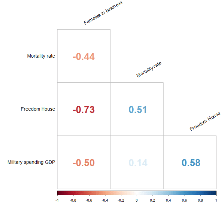
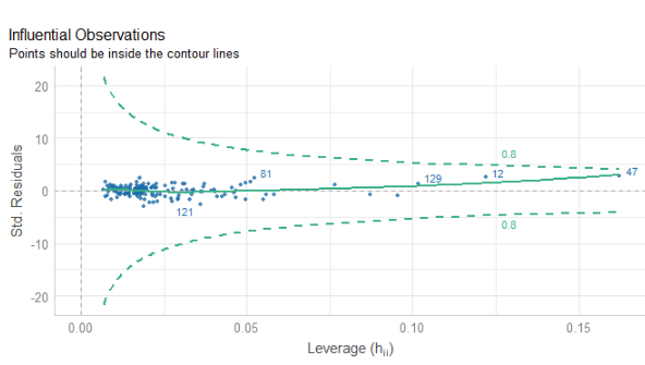
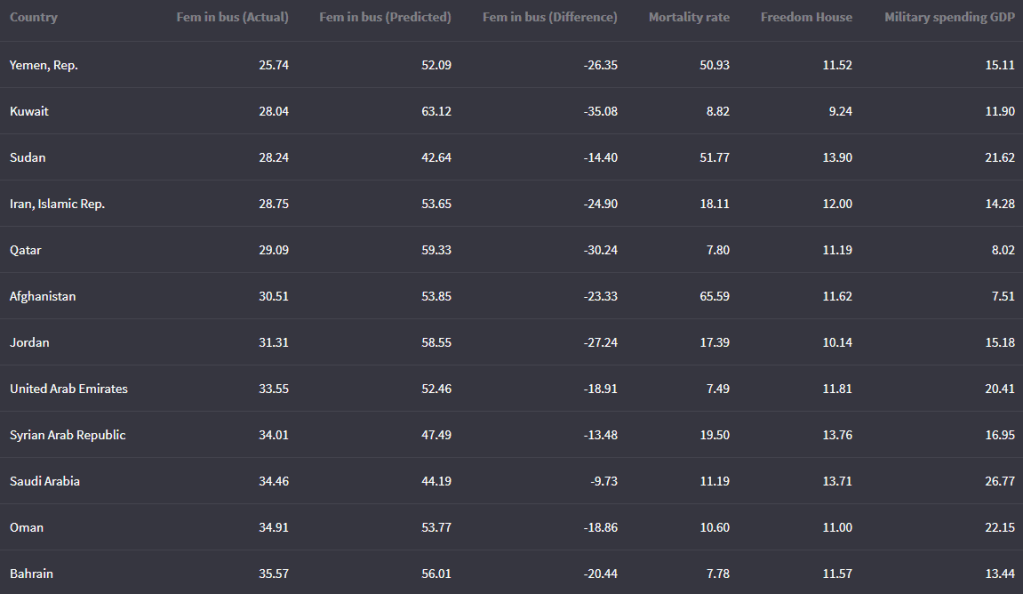
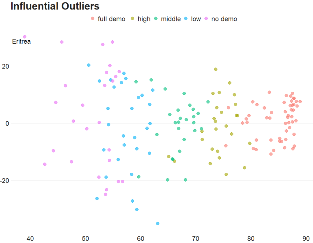
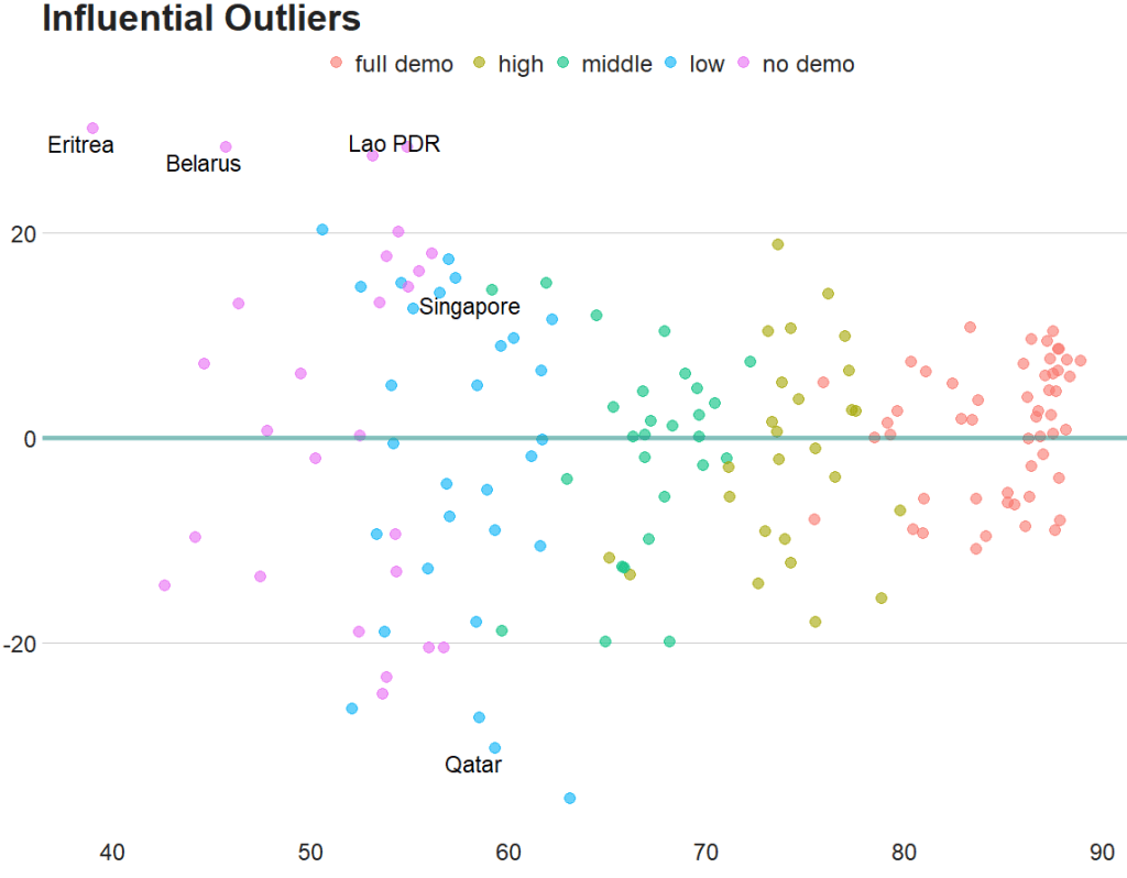
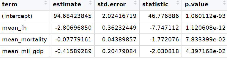
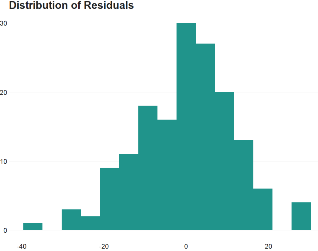
fem_bus_pred %>% 
  mutate(fh_category = cut(mean_fh, 
breaks =  5,
  labels = c("full demo ", "high", "middle", "low", "no demo"))) %>%  
  mutate(outlier = ifelse(.cooksd > 4/length(fem_bus_pred), 1, 0)) %>% 
  ggplot(aes(x = .fitted, y = .resid)) +
  geom_point(aes(color = fh_category), size = 4, alpha = 0.6) + 
  ggrepel::geom_text_repel(aes(label = ifelse(outlier == 1, country, NA))) + 
  labs(x ='', y = '', title = 'Influential Outliers') + 
  bbplot::bbc_style() 

We can decrease from 4 to 0.5 to look at more outliers that are not as influential.

Also we can add a horizontal line at zero to see how the spread is.

fem_bus_pred %>% 
  mutate(fh_category = cut(mean_fh, breaks =  5,
labels = c("full demo ", "high", "middle", "low", "no demo"))) %>%  
  mutate(outlier = ifelse(.cooksd > 0.5/length(fem_bus_pred), 1, 0)) %>% 
  ggplot(aes(x = .fitted, y = .resid)) +
  geom_point(aes(color = fh_category), size = 4, alpha = 0.6) + 
  geom_hline(yintercept = 0, color = "#20948b", size = 2, alpha = 0.5) + 
  ggrepel::geom_text_repel(aes(label = ifelse(outlier == 1, country, NA)), size = 6) + 
  labs(x ='', y = '', title = 'Influential Outliers') + 
  bbplot::bbc_style() 

To look at the model-level data, we can use the tidy()function

fem_bus_tidy <- broom::tidy(fem_bus_lm)

And glance() to examine things such as the R-Squared value, the overall resudial standard deviation of the model (sigma) and the AIC scores.

broom::glance(fem_bus_lm)

An R squared of 0.55 is not that hot ~ so this model needs a fair bit more work.

We can also use the broom packge to graph out the assumptions of the linear model. First, we can check that the residuals are normally distributed!

fem_bus_pred %>% 
  ggplot(aes(x = .resid)) + 
  geom_histogram(bins = 15, fill = "#20948b") + 
  labs(x = '', y = '', title = 'Distribution of Residuals') +
  bbplot::bbc_style()

Next we can plot the predicted versus actual values from the model with and without the outliers.

First, all countries, like we did above:

fem_bus_pred %>%
  mutate(fh_category = cut(mean_fh, breaks =  5,
  labels = c("full demo ", "high", "middle", "low", "no demo"))) %>%         ggplot(aes(x = .fitted, y = mean_fem_bus)) + 
  geom_point(aes(color = fh_category), size = 4, alpha = 0.6) + 
  geom_smooth(method = "loess", alpha = 0.2, color = "#20948b") + 
  bbplot::bbc_style() + 
  labs(x = '', y = '', title = "Fitted values versus actual values")

And how to plot looks like if we drop the outliers that we spotted earlier,

fem_bus_pred %>%
  filter(country != "Eritrea") %>% 
   filter(country != "Belarus") %>% 
  mutate(fh_category = cut(mean_fh, breaks =  5,
                           labels = c("full demo ", "high", "middle", "low", "no demo"))) %>%         ggplot(aes(x = .fitted, y = mean_fem_bus)) + 
  geom_point(aes(color = fh_category), size = 4, alpha = 0.6) + 
  geom_smooth(method = "loess", alpha = 0.2, color = "#20948b") + 
  bbplot::bbc_style() + 
  labs(x = '', y = '', title = "Fitted values versus actual values")

How to recreate Pew opinion graphs with ggplot2 in R

Packages we will need

library(HH)
library(tidyverse)
library(bbplot)
library(haven)

In this blog post, we are going to recreate Pew Opinion poll graphs.

This is the plot we will try to recreate on gun control opinions of Americans:

To do this, we will download the data from the Pew website by following the link below:

atp <- read.csv(file.choose())

We then select the variables related to gun control opinions

atp %>% 
  select(GUNPRIORITY1_b_W87:GUNPRIORITY2_j_W87) -> gun_df

I want to rename the variables so I don’t forget what they are.

Then, we convert them all to factor variables because haven labelled class variables are sometimes difficult to wrangle…

gun_df %<>%
  select(mental_ill = GUNPRIORITY1_b_W87,
         assault_rifle = GUNPRIORITY1_c_W87, 
         gun_database = GUNPRIORITY1_d_W87,
         high_cap_mag = GUNPRIORITY1_e_W87,
         gunshow_bkgd_check = GUNPRIORITY1_f_W87,
         conceal_gun =GUNPRIORITY2_g_W87,
         conceal_gun_no_permit = GUNPRIORITY2_h_W87,
         teacher_gun = GUNPRIORITY2_i_W87,
         shorter_waiting = GUNPRIORITY2_j_W87) %>% 
  mutate(across(everything()), haven::as_factor(.))

Also we can convert the “Refused” to answer variables to NA if we want, so it’s easier to filter out.

gun_df %<>% 
  mutate(across(where(is.factor), ~na_if(., "Refused")))

Next we will pivot the variables to long format. The new names variable will be survey_question and the responses (Strongly agree, Somewhat agree etc) will go to the new response variable!

gun_df %>% 
  pivot_longer(everything(), names_to = "survey_question", values_to = "response") -> gun_long

And next we calculate counts and frequencies for each variable

gun_long %<>% 
  group_by(survey_question, response) %>% 
  summarise(n = n()) %>%
  mutate(freq = n / sum(n)) %>% 
  ungroup() 

Then we want to reorder the levels of the factors so that they are in the same order as the original Pew graph.

gun_long %>% 
  mutate(survey_question = as.factor(survey_question))   %>% 
   mutate(survey_question_reorder = factor(survey_question, 
          levels =  c( 
           "conceal_gun_no_permit",
           "shorter_waiting",
           "teacher_gun",
           "conceal_gun",
           "assault_rifle",
           "high_cap_mag",
           "gun_database",
           "gunshow_bkgd_check",
           "mental_ill"
           ))) -> gun_reordered

And we use the hex colours from the original graph … very brown… I used this hex color picker website to find the right hex numbers: https://imagecolorpicker.com/en

brown_palette <- c("Strongly oppose" = "#8c834b",
                   "Somewhat oppose" = "#beb88f",
                   "Somewhat favor" = "#dfc86c",
                   "Strongly favor" = "#caa31e")

And last, we use the geom_bar() – with position = "stack" and stat = "identity" arguments – to create the bar chart.

To add the numbers, write geom_text() function with label = frequency within aes() and then position = position_stack() with hjust and vjust to make sure you’re happy with where the numbers are

gun_reordered %>% 
  filter(!is.na(response)) %>% 
  mutate(frequency = round(freq * 100), 0) %>% 
  ggplot(aes(x = survey_question_reorder, 
             y = frequency, fill = response)) +
  geom_bar(position = "stack",
           stat = "identity") + 
  coord_flip() + 
  scale_fill_manual(values = brown_palette) +
  geom_text(aes(label = frequency), size = 10, 
            color = "black", 
            position = position_stack(vjust = 0.5)) +
  bbplot::bbc_style() + 
  labs(title = "Broad support for barring people with mental illnesses 
       \n from obtaining guns, expanded background checks",
       subtitle = "% who", 
       caption = "Note: No answer resposes not shown.\n Source: Survey of U.S. adults conducted April 5-11 2021.") + 
  scale_x_discrete(labels = c(
    "Allowing people to carry conealed \n guns without a person",
    "Shortening waiting periods for people \n who want to buy guns leagally",
    "Allowing reachers and school officials \n to carry guns in K-12 school",
    "Allowing people to carry \n concealed guns in more places",
    "Banning assault-style weapons",
    "Banning high capacity ammunition \n magazines that hold more than 10 rounds",
    "Creating a federal government \n database to track all gun sales",
    "Making private gun sales \n subject to background check",
    "Preventing people with mental \n illnesses from purchasing guns"
    ))
Stephen Colbert Waiting GIF - Find & Share on GIPHY

Unfortunately this does not have diverving stacks from the middle of the graph

We can make a diverging stacked bar chart using function likert() from the HH package.

For this we want to turn the dataset back to wider with a column for each of the responses (strongly agree, somewhat agree etc) and find the frequency of each response for each of the questions on different gun control measures.

Then with the likert() function, we take the survey question variable and with the ~tilda~ make it the product of each response. Because they are the every other variable in the dataset we can use the shorthand of the period / fullstop.

We use positive.order = TRUE because we want them in a nice descending order to response, not in alphabetical order or something like that

gun_reordered %<>%
    filter(!is.na(response)) %>%  
  select(survey_question, response, freq) %>%  
  pivot_wider(names_from = response, values_from = freq ) %>%
  ungroup() %>% 
  HH::likert(survey_question ~., positive.order = TRUE,
            main =  "Broad support for barring people with mental illnesses
            \n from obtaining guns, expanded background checks")

With this function, it is difficult to customise … but it is very quick to make a diverging stacked bar chart.

Angry Stephen Colbert GIF by The Late Show With Stephen Colbert - Find & Share on GIPHY

If we return to ggplot2, which is more easy to customise … I found a solution on Stack Overflow! Thanks to this answer! The solution is to put two categories on one side of the centre point and two categories on the other!

gun_reordered %>% 
filter(!is.na(response)) %>% 
  mutate(frequency = round(freq * 100), 0) -> gun_final

And graph out

ggplot(data = gun_final, aes(x = survey_question_reorder, 
            fill = response)) +
  geom_bar(data = subset(gun_final, response %in% c("Strongly favor",
           "Somewhat favor")),
           aes(y = -frequency), position="stack", stat="identity") +
  geom_bar(data = subset(gun_final, !response %in% c("Strongly favor",
            "Somewhat favor")), 
           aes(y = frequency), position="stack", stat="identity") +
  coord_flip() + 
  scale_fill_manual(values = brown_palette) +
  geom_text(data = gun_final, aes(y = frequency, label = frequency), size = 10, color = "black", position = position_stack(vjust = 0.5)) +
  bbplot::bbc_style() + 
  labs(title = "Broad support for barring people with mental illnesses 
       \n from obtaining guns, expanded background checks",
       subtitle = "% who", 
       caption = "Note: No answer resposes not shown.\n Source: Survey of U.S. adults conducted April 5-11 2021.") + 
  scale_x_discrete(labels = c(
    "Allowing people to carry conealed \n guns without a person",
    "Shortening waiting periods for people \n who want to buy guns leagally",
    "Allowing reachers and school officials \n to carry guns in K-12 school",
    "Allowing people to carry \n concealed guns in more places",
    "Banning assault-style weapons",
    "Banning high capacity ammunition \n magazines that hold more than 10 rounds",
    "Creating a federal government \n database to track all gun sales",
    "Making private gun sales \n subject to background check",
    "Preventing people with mental \n illnesses from purchasing guns"
  ))
High Five Stephen Colbert GIF - Find & Share on GIPHY

Next to complete in PART 2 of this graph, I need to figure out how to add lines to graphs and add the frequency in the correct place

How to tidy up messy Wikipedia data with dplyr in R

Packages we will need:

library(rvest)
library(magrittr)
library(tidyverse)
library(waffle)
library(wesanderson)
library(ggthemes)
library(countrycode)
library(forcats)
library(stringr)
library(tidyr)
library(janitor)
library(knitr)

To see another blog post that focuses on cleaning messy strings and dates, click here to read

We are going to look at Irish embassies and missions around the world. Where are the embassies, and which country has the most missions (including embassies, consulates and representational offices)?

Let’s first scrape the embassy data from the Wikipedia page. Here is how it looks on the webpage.

It is a bit confusing because Ireland does not have a mission in every country. Argentina, for example, is the embassy for Bolivia, Paraguay and Uruguay.

Also, there are some consulates-general and other mission types.

Some countries have more than one mission, such as UK, Canada, US etc. So we are going to try and clean up this data.

Click here to read more about scraping data with the rvest package

embassies_html <- read_html("https://en.wikipedia.org/wiki/List_of_diplomatic_missions_of_Ireland")

embassies_tables <- embassies_html %>% html_table(header = TRUE, fill = TRUE)

We will extract the data from the different continent tables and then bind them all together at the end.

africa_emb <- embassies_tables[[1]]

africa_emb %<>% 
  mutate(continent = "Africa")

americas_emb <- embassies_tables[[2]]

americas_emb %<>% 
  mutate(continent = "Americas")

asia_emb <- embassies_tables[[3]]

asia_emb %<>% 
  mutate(continent = "Asia")

europe_emb <- embassies_tables[[4]]

europe_emb %<>% 
  mutate(continent = "Europe")

oceania_emb <- embassies_tables[[5]]

oceania_emb %<>% 
  mutate(continent = "Oceania")

Last, we bind all the tables together by rows, with rbind()

ire_emb <- rbind(africa_emb, 
                 americas_emb,
                 asia_emb,
                 europe_emb,
                 oceania_emb)

And clean up the names with the janitor package

ire_emb %<>% 
  janitor::clean_names() 

There is a small typo with a hypen and so there are separate Consulate General and Consulate-General… so we will clean that up to make one single factor level.

ire_emb %<>% 
  mutate(mission = ifelse(mission == "Consulate General", "Consulate-General", mission))

We can count out how many of each type of mission there are

ire_emb %>% 
  group_by(mission) %>% 
  count() %>% 
  arrange(desc(n)) %>% 
  knitr::kable(format = "html")
mission n
Embassy 69
Consulate-General 17
Liaison office 1
Representative office 1

A quick waffle plot

ire_emb %>% 
  group_by(mission) %>%
  count() %>% 
  arrange(desc(n)) %>% 
  ungroup() %>% 
  ggplot(aes(fill = mission, values = n)) +
  geom_waffle(color = "white", size = 1.5, 
              n_rows = 20, flip = TRUE) + 
  bbplot::bbc_style() +
  scale_fill_manual(values= wes_palette("Darjeeling1", n = 4))

We can remove the notes in brackets with the sub() function.

Square brackets equire a regex code \\[.*

ire_emb %<>% 
  select(!ref) %>%
  mutate(host_country = sub("\\[.*", "", host_country))

We delete the subheadings from the concurrent_accreditation column with the str_remove() function from the stringr package

ire_emb %<>%
  mutate(concurrent_accreditation = stringr::str_remove(concurrent_accreditation, "International Organizations:\n")) %>% 
  mutate(concurrent_accreditation = stringr::str_remove(concurrent_accreditation, "Countries:\n"))

After that, we will tackle the columns with many countries. The many variables in one cell violates the principles of tidy data.

Tonight Show Help GIF by The Tonight Show Starring Jimmy Fallon - Find & Share on GIPHY

For example, we saw above that Argentina is the embassy for three other countries.

We will use the separate() function from the tidyr package to make a column for each country that shares an embassy with the host country.

This separate() function has six arguments:

First we indicate the column with will separate out with the col argument

Next with into, we write the new names of the columns we will create. Nigeria has the most countries for which it is accredited to be the designated embassy with nine. So I create nine accredited countries columns to accommodate this max number.

The point I want to cut up the original column is at the \n which is regex for a large space

I don’t want to remove the original column so I set remove to FALSE

ire_emb %<>%
  separate(
    col = "concurrent_accreditation",
    into = c("acc_1", "acc_2", "acc_3", "acc_4", "acc_5", "acc_6", "acc_7", "acc_8", "acc_9"),
    sep = "\n",
    remove = FALSE,
    extra = "warn",
    fill = "warn") %>% 
  mutate(across(where(is.character), str_trim)) 

Some countries have more than one type of mission, so I want to count each type of mission for each country and create a new variable with the distinct() and pivot_wider() functions

Click here to read more about turning long to wide format data

With the across() function we can replace all numeric variables with NA to zeros

Click here to read more about the across() function

ire_emb %>% 
  group_by(host_country, mission) %>% 
  mutate(number_missions = n())  %>% 
  distinct(host_country, mission, .keep_all = TRUE) %>% 
  ungroup() %>% 
  pivot_wider(!c(host_city, concurrent_accreditation:count_accreditation), 
              names_from = mission, 
              values_from = number_missions) %>% 
  janitor::clean_names() %>% 
  mutate(across(where(is.numeric), ~ replace_na(., 0))) %>% 
  select(!host_country) -> ire_wide

Before we bind the two datasets together, we need to only have one row for each country.

ire_emb %>% 
  distinct(host_country, .keep_all = TRUE) -> ire_dist

And bind them together:

ire_full <- cbind(ire_dist, ire_wide) 
Excited Aubrey Plaza GIF by Film Independent Spirit Awards - Find & Share on GIPHY

We can graph out where the embassies are with the geom_polygon() in ggplot

First we download the map data from dplyr and add correlates of war codes so we can easily join the datasets together with right_join()

First, we add correlates of war codes

Click here to read more about the countrycode package

ire_full %<>%
    mutate(cown = countrycode(host_country, "country.name", "cown")) 
world_map <- map_data("world")

world_map %<>% 
  mutate(cown = countrycode::countrycode(region, "country.name", "cown"))

I reorder the variables with the fct_relevel() function from the forcats package. This is just so they can better match the color palette from wesanderson package. Green means embassy, red for no mission and orange for representative office.

ire_full %>%
  right_join(world_map, by = "cown") %>% 
  filter(region != "Antarctica") %>% 
  mutate(mission = ifelse(is.na(mission), replace_na("No Mission"), mission)) %>% 
  mutate(mission = forcats::fct_relevel(mission,c("No Mission", "Embassy","Representative office"))) %>%
  ggplot(aes(x = long, y = lat, group = group)) + 
  geom_polygon(aes(fill = mission), color = "white", size = 0.5)  -> ire_map

And we can change how the map looks with the ggthemes package and colors from wesanderson package

  ire_map + ggthemes::theme_map() +
  theme(legend.key.size = unit(3, "cm"),
        text = element_text(size = 30),
        legend.title = element_blank()) + 
  scale_fill_manual(values = wes_palette("Darjeeling1", n = 4))

And we can count how many missions there are in each country

US has the hightest number with 8 offices, followed by UK with 4 and China with 3

ire_full %>%
  right_join(world_map, by = "cown") %>% 
  filter(region != "Antarctica") %>% 
  mutate(sum_missions = rowSums(across(embassy:representative_office))) %>% 
  mutate(sum_missions = replace_na(sum_missions, 0)) %>%  
  ggplot(aes(x = long, y = lat, group = group)) + 
  geom_polygon(aes(fill = as.factor(sum_missions)), color = "white", size = 0.5)  +
  ggthemes::theme_map() +
  theme(legend.key.size = unit(3, "cm"),
        text = element_text(size = 30),
        legend.title = element_blank()) + 
scale_fill_brewer(palette = "RdBu") + 
  ggtitle("Number of Irish missions in each country",
          subtitle = "Source: Wikipedia")

Last we can count the number of accredited countries that each embassy has. Nigeria has the most, in charge of 10 other countries across northern and central Africa.

ire_full %>% 
  right_join(world_map, by = "cown") %>% 
  filter(region != "Antarctica") %>%
  mutate(count_accreditation = str_count(concurrent_accreditation, pattern = "\n")) %>% 
  mutate(count_accreditation = replace_na(count_accreditation, -1)) %>%  
  ggplot(aes(x = long, y = lat, group = group)) + 
  geom_polygon(aes(fill = as.factor(count_accreditation)), color = "white", size = 0.5)  +
  ggthemes::theme_fivethirtyeight() +
  theme(legend.key.size = unit(1, "cm"),
        text = element_text(size = 30),
        legend.title = element_blank()) + 
  ggtitle("Number of Irish missions in extra accreditations",
          subtitle = "Source: Wikipedia")
Happy Maya Rudolph GIF - Find & Share on GIPHY

Running tidy t-tests with the infer package in R

Packages we will need:

library(tidyverse)
library(tidyr)
library(infer)
library(bbplot)
library(ggthemes)

For this t-test, we will compare US millenials and non-millenials and their views of the UK’s influence in the world.

The data will come from Chicago Council Survey of American Public Opinion on U.S. Foreign Policy

Click here to download 2017 policy survey data

The survey investigates American public opinion on foreign policy. It focuses on respondents’ opinions of the United States’ leadership role in the world and the challenges the country faces domestically and internationally.

The question on the UK’s influence asks how much influence you think the UK has in the world. Please answer on a 0 to 10 scale; with 0 meaning they are not at all influential and 10 meaning they are extremely influential.

First we select and recreate the variables

fp %>%
  select(
    milennial = XMILLENIALSSAMPLEFLAG,
    uk_influence = Q50_10) %>%
  separate(
    col = milennial,
    into = c("milennial_num", "milennial_char"),
    sep = '[)]',
    remove = TRUE) %>% 
  mutate(
     uk_influence = as.character(uk_influence),
     uk_influence = parse_number(uk_influence)) %>% 
  filter(uk_influence != -1) %>% 
  tidyr::drop_na(milennial_char) -> mil_fp

With the infer package, we can run a t-test:

mil_fp %>% 
  t_test(formula = uk_influence ~ milennial_char,
         alternative = "less")%>% 
  kable(format = "html")
statistic t_df p_value alternative estimate lower_ci upper_ci
-3.048249 1329.469 0.0011736 less -0.3274509 -Inf -0.1506332

There is a statistically significant difference between milennials and non-milennials.

We can graph a box plot.

mil_fp %>% 
  ggplot(mapping = aes(x = milennial_char,
                       y = uk_influence,
                       fill = milennial_char)) +
  geom_jitter(aes(color = milennial_char),
              size = 2, alpha = 0.5, width = 0.3) +
  geom_boxplot(alpha = 0.4) +
  coord_flip() + bbplot::bbc_style() +
  scale_fill_manual(values = my_palette) + 
  scale_color_manual(values = my_palette)

And a quick graph to compare UK with other countries: Germany and South Korea

mil_fp %>% 
  select(milennial_char, uk_influence, sk_influence, ger_influence) %>% 
  pivot_longer(!milennial_char, names_to = "survey_question", values_to = "response")  %>% 
  group_by(survey_question, response) %>% 
  summarise(n = n()) %>%
  mutate(freq = n / sum(n)) %>% 
  ungroup() %>% 
  filter(!is.na(response)) %>% 
  mutate(survey_question = case_when(survey_question == "uk_influence" ~ "UK",
survey_question == "ger_influence" ~ "Germany",
survey_question == "sk_influence" ~ "South Korea",
TRUE ~ as.character(survey_question))) %>% 
  ggplot() +
  geom_bar(aes(x = forcats::fct_reorder(survey_question, freq), 
               y = freq, fill = as.factor(response)), 
           color = "#e5e5e5", 
           size = 2, 
           position = "stack",
           stat = "identity") + 
  coord_flip() + 
  scale_fill_brewer(palette = "RdBu") + 
  ggthemes::theme_fivethirtyeight() + 
  ggtitle("View of Influence in the world?") +
  theme(legend.title = element_blank(),
        legend.position = "top",
        legend.key.size = unit(0.78, "cm"),
        text = element_text(size = 25),
        legend.text = element_text(size = 20))

Check model assumptions with easystats package in R

Packages we will need:

install.packages("easystats", repos = "https://easystats.r-universe.dev")
library(easystats)
easystats::install_suggested()

Easystats is a collection of R packages, which aims to provide a framework to tame the scary R statistics and their pesky models, according to their github repo.

Click here to browse the github and here to go to the specific perfomance package CRAN PDF

First run your regression. I will try to explain variance is Civil Society Organization participation (CSOs) with the independent variables in my model with Varieties of Democracy data in 1990.

cso_model <- lm(cso_part ~ education_level + mortality_rate + democracy,data = vdem_90)
Dependent variable:
cso_part
education_level-0.017**
(0.007)
mortality_rate-0.00001
(0.00004)
democracy0.913***
(0.064)
Constant0.288***
(0.054)
Observations134
R20.690
Adjusted R20.682
Residual Std. Error0.154 (df = 130)
F Statistic96.243*** (df = 3; 130)
Note:*p<0.1; **p<0.05; ***p<0.01
Excited Season 2 GIF by The Office - Find & Share on GIPHY

Then we check the assumptions:

performance::check_model(cso_model)

Comparing North and South Korean UN votes at the General Assembly with unvotes package

Packages we will use

Llibrary(unvotes)
library(lubridate)
library(tidyverse)
library(magrittr)
library(bbplot)
library(waffle)
library(stringr)
library(wordcloud)
library(waffle)
library(wesanderson)

Last September 17th 2021 marked the 30th anniversary of the entry of North Korea and South Korea into full membership in the United Nations. Prior to this, they were only afforded observer status.

keia.org

The Two Koreas Mark 30 Years of UN Membership: The Road to Membership

Let’s look at the types of voting that both countries have done in the General Assembly since 1991.

First we can download the different types of UN votes from the unvotes package

un_votes <- unvotes::un_roll_calls

un_votes_issues <- unvotes::un_roll_call_issues

unvotes::un_votes -> country_votes 

Join them all together and filter out any country that does not have the word “Korea” in its name.

un_votes %>% 
  inner_join(un_votes_issues, by = "rcid") %>% 
  inner_join(country_votes, by = "rcid") %>% 
  mutate(year = format(date, format = "%Y")) %>%
  filter(grepl("Korea", country)) -> korea_un

First we can make a wordcloud of all the different votes for which they voted YES. Is there a discernable difference in the types of votes that each country supported?

First, download the stop words that we can remove (such as the, and, if)

data("stop_words") 

Then I will make a North Korean dataframe of all the votes for which this country voted YES. I remove some of the messy formatting with the gsub argument and count the occurence of each word. I get rid of a few of the procedural words that are more related to the technical wording of the resolutions, rather than related to the tpoic of the vote.

nk_yes_votes <- korea_un %>% 
  filter(country == "North Korea") %>% 
  filter(vote == "yes") %>%  
  select(descr, year) %>% 
  mutate(decade = substr(year, 1, 3)) %>% 
  mutate(decade = paste0(decade, "0s")) %>% 
  # group_by(decade) %>% 
  unnest_tokens(word, descr) %>% 
  mutate(word = gsub(" ", "", word)) %>% 
  mutate(word = gsub('_', '', word)) %>% 
  count(word, sort = TRUE) %>% 
  ungroup() %>% 
  anti_join(stop_words)  %>% 
  mutate(word = case_when(grepl("palestin", word) ~ "Palestine", 
                          grepl("nucl", word) ~ "nuclear",
                          TRUE ~ as.character(word)))  %>%
  filter(word != "resolution") %>% 
  filter(word != "assembly") %>% 
  filter(word != "draft") %>% 
  filter(word != "committee") %>% 
  filter(word != "requested") %>% 
  filter(word != "report") %>% 
  filter(word != "practices") %>% 
  filter(word != "affecting") %>% 
  filter(word != "follow") %>% 
  filter(word != "acting") %>% 
  filter(word != "adopted") 

Next, we count the number of each word


nk_yes_votes %<>% 
  count(word) %>% 
  arrange(desc(n))

We want to also remove the numbers

nums <- nk_yes_votes %>% filter(str_detect(word, "^[0-9]")) %>% select(word) %>% unique()

And remove the stop words

nk_yes_votes %<>%
  anti_join(nums, by = "word")

Choose some nice colours

my_colors <- c("#0450b4", "#046dc8", "#1184a7","#15a2a2", "#6fb1a0", 
               "#b4418e", "#d94a8c", "#ea515f", "#fe7434", "#fea802")

And lastly, plot the wordcloud with the top 50 words

wordcloud(nk_yes_votes$word, 
   nk_yes_votes$n, 
   random.order = FALSE, 
   max.words = 50, 
   colors = my_colors)

If we repeat the above code with South Korea:

There doesn’t seem to be a huge difference. But this is not a very scientfic approach; I just like the look of them!

Next we will compare the two countries how many votes they voted yes, no or abstained from…

korea_un %>% 
  group_by(country, vote) %>% 
  count() %>% 
  mutate(count_ten = n /25) %>% 
  ungroup() %>% 
  ggplot(aes(fill = vote, values = count_ten)) +
  geom_waffle(color = "white",
              size = 2.5,
              n_rows = 10,
              flip = TRUE) +
  facet_wrap(~country) + bbplot::bbc_style() +
  scale_fill_manual(values = wesanderson::wes_palette("Darjeeling1"))

Next we can look more in detail at the votes that they countries abstained from voting in.

We can use the tidytext function that reorders the geom_bar in each country. You can read the blog of Julie Silge to learn more about the functions, it is a bit tricky but it fixes the problem of randomly ordered bars across facets.

https://juliasilge.com/blog/reorder-within/

korea_un %>%
  filter(vote == "abstain") %>% 
  mutate(issue = case_when(issue == "Nuclear weapons and nuclear material" ~ "Nukes",
issue == "Arms control and disarmament" ~ "Arms",
issue == "Palestinian conflict" ~ "Palestine",
TRUE ~ as.character(issue))) %>% 
  select(country, issue, year) %>% 
  group_by(issue, country) %>% 
  count() %>% 
  ungroup() %>% 
  group_by(country) %>% 
  mutate(country = as.factor(country),
         issue = reorder_within(issue, n, country)) %>%
  ggplot(aes(x = reorder(issue, n), y = n)) + 
  geom_bar(stat = "identity", width = 0.7, aes(fill = country)) + 
  labs(title = "Abstaining UN General Assembly Votes by issues",
       subtitle = ("Since 1950s"),
       caption = "         Source: unvotes ") +
  xlab("") + 
  ylab("") +
  facet_wrap(~country, scales = "free_y") +
  scale_x_reordered() +
  coord_flip() + 
  expand_limits(y = 65) + 
  ggthemes::theme_pander() + 
  scale_fill_manual(values = sample(my_colors)) + 
 theme(plot.background = element_rect(color = "#f5f9fc"),
        panel.grid = element_line(colour = "#f5f9fc"),
        # axis.title.x = element_blank(),
        # axis.text.x = element_blank(),
        axis.text.y = element_text(color = "#000500", size = 16),
       legend.position = "none",
        # axis.title.y = element_blank(),
        axis.ticks.x = element_blank(),
        text = element_text(family = "Gadugi"),
        plot.title = element_text(size = 28, color = "#000500"),
        plot.subtitle = element_text(size = 20, color = "#484e4c"),
        plot.caption = element_text(size = 20, color = "#484e4c"))

South Korea was far more likely to abstain from votes that North Korea on all issues

Next we can simply plot out the Human Rights votes that each country voted to support. Even though South Korea has far higher human rights scores, North Korea votes in support of more votes on this topic.

korea_un %>% 
  filter(year < 2019) %>% 
  filter(issue == "Human rights") %>% 
  filter(vote == "yes") %>% 
  group_by(country, year) %>% 
  count() %>% 
  ggplot(aes(x = year, y = n, group = country, color = country)) + 
  geom_line(size = 2) + 
  geom_point(aes(color = country), fill = "white", shape = 21, size = 3, stroke = 2.5) +
  scale_x_discrete(breaks = round(seq(min(korea_un$year), max(korea_un$year), by = 10),1)) +
  scale_y_continuous(expand = c(0, 0), limits = c(0, 22)) + 
  bbplot::bbc_style() + facet_wrap(~country) + 
  theme(legend.position = "none") + 
  scale_color_manual(values = sample(my_colors)) + 
  labs(title = "Human Rights UN General Assembly Yes Votes ",
       subtitle = ("Since 1990s"),
       caption = "         Source: unvotes ")

All together:

Download and graph UN votes data with the unvotes package in R

Packages we will need:

library(unvotes)
library(lubridate)
library(tidyverse)
library(magrittr)
library(bbplot)
library(waffle)

How to download UN votes to R.

This package was created by David Robinson. Click here to read the CRAN PDF.

Pop Tv Congrats GIF by Schitt's Creek - Find & Share on GIPHY

We will download both the votes roll calls and the issues. Then we can use the inner_join() variable to add them together by the ID.

un_votes <- unvotes::un_roll_calls

un_votes_issues <- unvotes::un_roll_call_issues

un_votes %<>% 
  inner_join(un_votes_issues, by = "rcid")

We can create a year variable with the format() function and extract the year with “%Y”

un_votes %<>% 
  mutate(year = format(date, format = "%Y")) 

And graph out the count of each type of UN vote issue

un_votes %>% 
  group_by(year) %>% 
  count(issue) %>% 
  ggplot(aes(x = year, y = n, group = issue, color = issue)) + 
  geom_line(size = 2) + 
  geom_point(aes(color = issue), fill = "white", 
             shape = 21, size = 2, stroke = 1) +
  scale_x_discrete(breaks = round(seq(min(un_votes$year), max(un_votes$year), by = 10),1)) +
  bbplot::bbc_style() + facet_wrap(~issue)

Next we can look at which decade had the most votes across the issues with the waffle package

Click here to read more about the waffle package

un_votes %>% 
  mutate(decade = substr(year, 1, 3)) %>% 
  mutate(decade = paste0(decade, "0s")) %>% 
  
  group_by(decade) %>% 
  count(issue) %>% 
  
  ggplot(aes(fill = issue, values = n)) +
  geom_waffle(color = "white",
              size = 0.3,
              n_rows = 10, 
              flip = TRUE) +
  facet_wrap(~decade, nrow = 1, strip.position = "bottom") + 
  bbplot::bbc_style()  +
  scale_x_discrete(breaks = round(seq(0, 1, by = 0.2),3)) 

The 1980s were a prolific time for the UNGA with voting, with arms control being the largest share of votes. And it has stablised in the decades since.

Well Done Applause GIF by CBC - Find & Share on GIPHY

Next we can look at votes in total

un_votes %>% 
  mutate(issue = case_when(issue == "Nuclear weapons and nuclear material" ~ "Nukes",
                           issue == "Arms control and disarmament" ~ "Arms",
                           issue == "Palestinian conflict" ~ "Palestine",
                           TRUE ~ as.character(issue))) %>% 
  count(issue) %>%  
  ggplot(aes(x = reorder(issue, n), y = n, fill = as.factor(issue))) + 
  geom_bar(stat = "identity") + 
  coord_polar("x", start = 0, direction = -1)  + 
  ggthemes::theme_pander()  +
  bbplot::bbc_style() + 
    theme(axis.text = element_blank(),
          axis.title.x = element_blank(),
          axis.title.y = element_blank(),
          axis.ticks = element_blank(),
          text = element_text(size = 25),
          panel.grid = element_blank()) + 
    ggtitle(label = "UN Votes by issue ", 
            subtitle = "Source: unvotes package")

Grouping, counting words and making wordclouds

library(tidytext)
library(wordcloud)
library(knitr)
library(kableExtra)

How to make wordclouds in R!

First, download stop words (such as and, the, of) to filter out of the dataset

data("stop_words")

Then we will will unnest tokens and count the occurences of each word in each decade.

tokens <- democracy_aid %>%
  select(description, year) %>% 
  mutate(decade = substr(year, 1, 3)) %>% 
  mutate(decade = paste0(decade, "0s")) %>% 
  group_by(decade) %>% 
  unnest_tokens(word, activity_description) %>% 
  count(word, sort = TRUE) %>% 
  ungroup() %>% 
  anti_join(stop_words) 

nums <- tokens %>% filter(str_detect(word, "^[0-9]")) %>% select(word) %>% unique()

tokens %<>%
  anti_join(nums, by = "word") 

And with the kable() function we can make a HTML table that I copy and paste to this blog. Below I rewrite the HTML to change the headings

tokens %>% 
    group_by(decade) %>% 
    top_n(n = 10,
          wt = n)  %>%
    arrange(decade, desc(n)) %>%
    arrange(desc(n)) %>%
    knitr::kable("html")
decade word n
2010s rights 4541
2010s local 3981
2010s youth 3778
2010s promote 3679
2010s democratic 3618
2010s public 3444
2010s national 3060
2010s political 3020
2010s human 3009
2010s organization 2711
2000s rights 2548
2000s human 1745
2000s local 1544
2000s conduct 1381
2000s political 1257
2000s training 1217
2000s promote 1142
2000s public 1121
2000s democratic 1071
2000s national 988

Create a vector of colors:

my_colors <- c("#0450b4", "#046dc8", "#1184a7","#15a2a2", "#6fb1a0", 
               "#b4418e", "#d94a8c", "#ea515f", "#fe7434", "#fea802")
Always Sunny Reaction GIF - Find & Share on GIPHY
tokens %<>% 
  mutate(word = ifelse(grepl("democr", word), "democracy", 
                ifelse(grepl("politi", word), "politics", 
                ifelse(grepl("institut", word), "institution", 
                ifelse(grepl("govern", word), "government", 
                ifelse(grepl("organiz", word), "organization", 
                ifelse(grepl("elect", word), "election", word))))))) 

wordcloud(tokens$word, tokens$n, random.order = FALSE, max.words = 50, colors = my_colors)
2010s Decade Word Count
2010s rights 4541
2010s local 3981
2010s youth 3778
2010s promote 3679
2010s democratic 3618
2010s public 3444
2010s national 3060
2010s political 3020
2010s human 3009
2010s organization 2711
2000s Decade Word Count
2000s rights 2548
2000s human 1745
2000s local 1544
2000s conduct 1381
2000s political 1257
2000s training 1217
2000s promote 1142
2000s public 1121
2000s democratic 1071
2000s national 988

And if we compare civic versus politically-oriented aid, we can see that more money goes towards projects that have political or electoral aims rather than civic or civil society education goals

tokens %>% 
  group_by(year) %>% 
  top_n(n = 20,
        wt = n) %>% 
  mutate(word = case_when(word == "party" ~ "political",
                          word == "parties" ~ "political",
                          word == "election" ~ "political",
                          word == "electoral" ~ "political",
                          word == "civil" ~ "civic", 
                          word == "civic" ~ "civic",
                          word == "social" ~ "civic",
                          word == "education" ~ "civic",
                          word == "society" ~ "civic", 
                          TRUE ~ as.character(word))) %>% 
  filter(word == "political" | word == "civic") %>% 
  ggplot(aes(x = year, y = n, group = word)) + 
  geom_line(aes(color = word ), size = 2.5,alpha = 0.6)  +
  geom_point(aes(color = word ), fill = "white", 
             shape = 21, size = 3, stroke = 2) +
  bbplot::bbc_style() + 
  scale_x_discrete(limits = c(2001:2019)) +
  theme(axis.text.x= element_text(size = 15,
                                  angle = 45)) +
  scale_color_discrete(name = "Aid type", labels = c("Civic grants", "Political grants"))

Scraping and wrangling UN peacekeeping data with tidyr package in R

Packages we will need:

library(tidyverse)
library(rvest)
library(magrittr)
library(tidyr)
library(countrycode)
library(democracyData)
library(janitor)
library(waffle)

For this blog post, we will look at UN peacekeeping missions and compare across regions.

Despite the criticisms about some operations, the empirical record for UN peacekeeping records has been robust in the academic literature

“In short, peacekeeping intervenes in the most difficult
cases, dramatically increases the chances that peace will
last, and does so by altering the incentives of the peacekept,
by alleviating their fear and mistrust of each other, by
preventing and controlling accidents and misbehavior by
hard-line factions, and by encouraging political inclusion”
(Goldstone, 2008: 178).

The data on the current and previous PKOs (peacekeeping operations) will come from the Wikipedia page. But the variables do not really lend themselves to analysis as they are.

Amy Coney Barrett Snl GIF by Saturday Night Live - Find & Share on GIPHY

Once we have the url, we scrape all the tables on the Wikipedia page in a few lines

pko_members <- read_html("https://en.wikipedia.org/wiki/List_of_United_Nations_peacekeeping_missions")
pko_tables <- pko_members %>% html_table(header = TRUE, fill = TRUE)

Click here to read more about the rvest package for scraping data from websites.

pko_complete_africa <- pko_tables[[1]]
pko_complete_americas <- pko_tables[[2]]
pko_complete_asia <- pko_tables[[3]]
pko_complete_europe <- pko_tables[[4]]
pko_complete_mena <- pko_tables[[5]]

And then we bind them together! It’s very handy that they all have the same variable names in each table.

rbind(pko_complete_africa, pko_complete_americas, pko_complete_asia, pko_complete_europe, pko_complete_mena) -> pko_complete

Next, we will add a variable to indicate that all the tables of these missions are completed.

pko_complete %<>% 
  mutate(complete = ifelse(!is.na(pko_complete$Location), "Complete", "Current"))

We do the same with the current missions that are ongoing:

pko_current_africa <- pko_tables[[6]]
pko_current_asia <- pko_tables[[7]]
pko_current_europe <- pko_tables[[8]]
pko_current_mena <- pko_tables[[9]]

rbind(pko_current_europe, pko_current_mena, pko_current_asia, pko_current_africa) -> pko_current

pko_current %<>% 
  mutate(complete = ifelse(!is.na(pko_current$Location), "Current", "Complete"))

We then bind the completed and current mission data.frames

rbind(pko_complete, pko_current) -> pko

Then we clean the variable names with the function from the janitor package.

pko_df <-  pko %>% 
  janitor::clean_names()

Next we’ll want to create some new variables.

We can make a new row for each country that is receiving a peacekeeping mission. We can paste all the countries together and then use the separate function from the tidyr package to create new variables.

 pko_df %>%
  group_by(conflict) %>%
  mutate(location = paste(location, collapse = ', ')) %>% 
  separate(location,  into = c("country_1", "country_2", "country_3", "country_4", "country_5"), sep = ", ")  %>% 
  ungroup() %>% 
  distinct(conflict, .keep_all = TRUE) %>% 

Next we can create a new variable that only keeps the acroynm for the operation name. I took these regex codes from the following stack overflow link

pko_df %<>% 
  mutate(acronym = str_extract_all(name_of_operation, "\\([^()]+\\)")) %>% 
  mutate(acronym = substring(acronym, 2, nchar(acronym)-1)) %>% 
  separate(dates_of_operation, c("start_date", "end_date"), "–")

I will fill in the end data for the current missions that are still ongoing in 2022

pko_df %<>% 
  mutate(end_date = ifelse(complete == "Current", 2022, end_date)) 

And next we can calculate the duration for each operation

pko_df %<>% 
  mutate(end_date = as.integer(end_date)) %>% 
  mutate(start_date = as.integer(start_date)) %>% 
  mutate(duration = ifelse(!is.na(end_date), end_date - start_date, 1)) 

I want to compare regions and graph out the different operations around the world.

We can download region data with democracyData package (best package ever!)

Snl Season 47 GIF by Saturday Night Live - Find & Share on GIPHY
pacl <- redownload_pacl()

pacl %>% 
  select(cown = pacl_cowcode,
        un_region_name, un_continent_name) %>% 
  distinct(cown, .keep_all = TRUE) -> pacl_region

We join the datasets together with the inner_join() and add Correlates of War country codes.

pko_df %<>% 
  mutate(cown = countrycode(country_1, "country.name", "cown")) %>%   mutate(cown = ifelse(country_1 == "Western Sahara", 605, 
                       ifelse(country_1 == "Serbia", 345, cown))) %>% 
  inner_join(pacl_region, by = "cown")

Now we can start graphing our duration data:

pko_df %>% 
  ggplot(mapping = aes(x = forcats::fct_reorder(un_region_name, duration), 
                       y = duration, 
                       fill = un_region_name)) +
  geom_boxplot(alpha = 0.4) +
  geom_jitter(aes(color = un_region_name),
              size = 6, alpha = 0.8, width = 0.15) +
  coord_flip() + 
  bbplot::bbc_style() + ggtitle("Duration of Peacekeeping Missions")
Years

We can see that Asian and “Western Asian” – i.e. Middle East – countries have the longest peacekeeping missions in terns of years.

pko_countries %>% 
  filter(un_continent_name == "Asia") %>%
  unite("country_names", country_1:country_5, remove = TRUE,  na.rm = TRUE, sep = ", ") %>% 
  arrange(desc(duration)) %>% 
  knitr::kable("html")
Start End Duration Region Country
1949 2022 73 Southern Asia India, Pakistan
1964 2022 58 Western Asia Cyprus, Northern Cyprus
1974 2022 48 Western Asia Israel, Syria, Lebanon
1978 2022 44 Western Asia Lebanon
1993 2009 16 Western Asia Georgia
1991 2003 12 Western Asia Iraq, Kuwait
1994 2000 6 Central Asia Tajikistan
2006 2012 6 South-Eastern Asia East Timor
1988 1991 3 Southern Asia Iran, Iraq
1988 1990 2 Southern Asia Afghanistan, Pakistan
1965 1966 1 Southern Asia Pakistan, India
1991 1992 1 South-Eastern Asia Cambodia, Cambodia
1999 NA 1 South-Eastern Asia East Timor, Indonesia, East Timor, Indonesia, East Timor
1958 NA 1 Western Asia Lebanon
1963 1964 1 Western Asia North Yemen
2012 NA 1 Western Asia Syria

Next we can compare the decades

pko_countries %<>% 
  mutate(decade = substr(start_date, 1, 3)) %>% 
  mutate(decade = paste0(decade, "0s")) 

And graph it out:

pko_countries %>% 
  ggplot(mapping = aes(x = decade, 
                       y = duration, 
                       fill = decade)) +
  geom_boxplot(alpha = 0.4) +
  geom_jitter(aes(color = decade),
              size = 6, alpha = 0.8, width = 0.15) +
   coord_flip() + 
  geom_curve(aes(x = "1950s", y = 60, xend = "1940s", yend = 72),
  arrow = arrow(length = unit(0.1, "inch")), size = 0.8, color = "black",
   curvature = -0.4) +
  annotate("text", label = "First Mission to Kashmir",
           x = "1950s", y = 49, size = 8, color = "black") +
  geom_curve(aes(x = "1990s", y = 46, xend = "1990s", yend = 32),
             arrow = arrow(length = unit(0.1, "inch")), size = 0.8, color = "black",curvature = 0.3) +
  annotate("text", label = "Most Missions after the Cold War",
           x = "1990s", y = 60, size = 8, color = "black") +

  bbplot::bbc_style() + ggtitle("Duration of Peacekeeping Missions")
Years

Following the end of the Cold War, there were renewed calls for the UN to become the agency for achieving world peace, and the agency’s peacekeeping dramatically increased, authorizing more missions between 1991 and 1994 than in the previous 45 years combined.

We can use a waffle plot to see which decade had the most operation missions. Waffle plots are often seen as more clear than pie charts.

Click here to read more about waffle charts in R

To get the data ready for a waffle chart, we just need to count the number of peacekeeping missions (i.e. the number of rows) in each decade. Then we fill the groups (i.e. decade) and enter the n variable we created as the value.

pko_countries %>% 
  group_by(decade) %>% 
  count() %>%  
  ggplot(aes(fill = decade, values = n)) + 
  waffle::geom_waffle(color = "white", size= 3, n_rows = 8) +
  scale_x_discrete(expand=c(0,0)) +
  scale_y_discrete(expand=c(0,0)) +
  coord_equal() +
  labs(title = "Number of Peacekeeper Missions") + bbplot::bbc_style() 
Cecily Strong Snl GIF by Saturday Night Live - Find & Share on GIPHY

If we want to add more information, we can go to the UN Peacekeeping website and download more data on peacekeeping troops and operations.

We can graph the number of peacekeepers per country

Click here to learn more about adding flags to graphs!

le_palette <- c("#5f0f40", "#9a031e", "#94d2bd", "#e36414", "#0f4c5c")

pkt %>%
  mutate(contributing_country = ifelse(contributing_country == "United Republic of Tanzania", "Tanzania",ifelse(contributing_country == "Côte d’Ivoire", "Cote d'Ivoire", contributing_country))) %>% 
  mutate(iso2 = tolower(countrycode::countrycode(contributing_country, "country.name", "iso2c"))) %>% 
  mutate(cown = countrycode::countrycode(contributing_country, "country.name", "cown")) %>% 
  inner_join(pacl_region, by = "cown") %>% 
  mutate(un_region_name = case_when(grepl("Africa", un_region_name) ~ "Africa",grepl("Eastern Asia", un_region_name) ~ "South-East Asia",
 un_region_name == "Western Africa" ~ "Middle East",TRUE ~ as.character(un_region_name))) %>% 
  filter(total_uniformed_personnel > 700) %>% 
  ggplot(aes(x = reorder(contributing_country, total_uniformed_personnel),
             y = total_uniformed_personnel)) + 
  geom_bar(stat = "identity", width = 0.7, aes(fill = un_region_name), color = "white") +
  coord_flip() +
  ggflags::geom_flag(aes(x = contributing_country, y = -1, country = iso2), size = 8) +
  # geom_text(aes(label= values), position = position_dodge(width = 0.9), hjust = -0.5, size = 5, color = "#000500") + 
  scale_fill_manual(values = le_palette) +
  labs(title = "Total troops serving as peacekeepers",
       subtitle = ("Across countries"),
       caption = "         Source: UN ") +
  xlab("") + 
  ylab("") + bbplot::bbc_style()

We can see that Bangladesh, Nepal and India have the most peacekeeper troops!

Convert event-level data to panel-level data with tidyr in R

Packages we will need:

library(tidyverse)
library(magrittr)
library(lubridate)
library(tidyr)
library(rvest)
library(janitor)

In this post, we are going to scrape NATO accession data from Wikipedia and turn it into panel data. This means turning a list of every NATO country and their accession date into a time-series, cross-sectional dataset with information about whether or not a country is a member of NATO in any given year.

This is helpful for political science analysis because simply a dummy variable indicating whether or not a country is in NATO would lose information about the date they joined. The UK joined NATO in 1948 but North Macedonia only joined in 2020. A simple binary variable would not tell us this if we added it to our panel data.

Consoling 30 Rock GIF - Find & Share on GIPHY

We will first scrape a table from the Wikipedia page on NATO member states with a few functions form the rvest pacakage.

Click here to read more about the rvest package:

nato_members <- read_html("https://en.wikipedia.org/wiki/Member_states_of_NATO")

nato_tables <- nato_members %>% html_table(header = TRUE, fill = TRUE)

nato_member_joined <- nato_tables[[1]]

We have information about each country and the date they joined. In total there are 30 rows, one for each member of NATO.

Next we are going to clean up the data, remove the numbers in the [square brackets], and select the columns that we want.

A very handy function from the janitor package cleans the variable names. They are lower_case_with_underscores rather than how they are on Wikipedia.

Next we remove the square brackets and their contents with sub("\\[.*", "", insert_variable_name)

And the accession date variable is a bit tricky because we want to convert it to date format, extract the year and convert back to an integer.

nato_member_joined %<>% 
  clean_names() %>% 
  select(country = member_state, 
         accession = accession_3) %>% 
  mutate(member_2020 = 2020,
         country = sub("\\[.*", "", country),
         accession = sub("\\[.*", "", accession),
         accession = parse_date_time(accession, "dmy"),
         accession = format(as.Date(accession, format = "%d/%m/%Y"),"%Y"),
         accession = as.numeric(as.character(accession)))

When we have our clean data, we will pivot the data to longer form. This will create one event column that has a value of accession or member in 2020.

This gives us the start and end year of our time variable for each country.

nato_member_joined %<>% 
  pivot_longer(!country, names_to = "event", values_to = "year") 

Our dataset now has 60 observations. We see Albania joined in 2009 and is still a member in 2020, for example.

Next we will use the complete() function from the tidyr package to fill all the dates in between 1948 until 2020 in the dataset. This will increase our dataset to 2,160 observations and a row for each country each year.

Nect we will group the dataset by country and fill the nato_member status variable down until the most recent year.

nato_member_joined %<>% 
  mutate(year = as.Date(as.character(year), format = "%Y")) %>% 
  mutate(year = ymd(year)) %>% 
  complete(country, year = seq.Date(min(year), max(year), by = "year")) %>% 
  mutate(nato_member = ifelse(event == "accession", 1, 
                              ifelse(event == "member_2020", 1, 0))) %>% 
  group_by(country) %>% 
  fill(nato_member, .direction = "down") %>%
  ungroup()

Last, we will use the ifelse() function to mutate the event variable into one of three categories: 'accession‘, 'member‘ or ‘not member’.

nato_member_joined %>%
  mutate(nato_member = replace_na(nato_member, 0),
         year = parse_number(as.character(year)),
         event = ifelse(nato_member == 0, "not member", event),
         event = ifelse(nato_member == 1 & is.na(event), "member", event),
         event = ifelse(event == "member_2020", "member", event))  %>% 
  distinct(country, year, .keep_all = TRUE) -> nato_panel
High Five 30 Rock GIF - Find & Share on GIPHY

Lump groups together and create “other” category with forcats package

Packages we will need:

library(tidyverse)
library(forcats)
library(tidytext)
library(ggthemes)
library(democracyData)
library(magrittr)

For this blog, we are going to look at the titles of all countries’ heads of state, such as Kings, Presidents, Emirs, Chairman … understandably, there are many many many ways to title the leader of a country.

First, we will download the PACL dataset from the democracyData package.

Click here to read more about this super handy package:

If you want to read more about the variables in this dataset, click the link below to download the codebook by Cheibub et al.

pacl <- redownload_pacl()

We are going to look at the npost variable; this captures the political title of the nominal head of stage. This can be King, President, Sultan et cetera!

pacl %>% 
  count(npost) %>% 
  arrange(desc(n))

If we count the occurence of each title, we can see there are many ways to be called the head of a country!

"president"                         3693
"prime minister"                    2914
"king"                               470
"Chairman of Council of Ministers"   229
"premier"                            169
"chancellor"                         123
"emir"                               117
"chair of Council of Ministers"      111
"head of state"                       90
"sultan"                              67
"chief of government"                 63
"president of the confederation"      63
""                                    44
"chairman of Council of Ministers"    44
"shah"                                33

# ... with 145 more rows

155 groups is a bit difficult to meaningfully compare.

So we can collapse some of the groups together and lump all the titles that occur relatively seldomly – sometimes only once or twice – into an “other” category.

Clueless Movie Tai GIF - Find & Share on GIPHY

First, we use grepl() function to take the word president and chair (chairman, chairwoman, chairperson et cetera) and add them into broader categories.

Also, we use the tolower() function to make all lower case words and there is no confusion over the random capitalisation.

 pacl %<>% 
  mutate(npost = tolower(npost)) %>% 
  mutate(npost = ifelse(grepl("president", npost), "president", npost)) %>% 
  mutate(npost = ifelse(grepl("chair", npost), "chairperson", npost))

Next, we create an "other leader type" with the fct_lump_prop() function.

We specifiy a threshold and if the group appears fewer times in the dataset than this level we set, it is added into the “other” group.

pacl %<>% 
  mutate(regime_prop = fct_lump_prop(npost,
                                   prop = 0.005,
                                   other_level = "Other leader type")) %>% 
  mutate(regime_prop = str_to_title(regime_prop)) 

Now, instead of 155 types of leader titles, we have 10 types and the rest are all bundled into the Other Leader Type category

President            4370
Prime Minister       2945
Chairperson           520
King                  470
Other Leader Type     225
Premier               169
Chancellor            123
Emir                  117
Head Of State          90
Sultan                 67
Chief Of Government    63
The Office Smile GIF - Find & Share on GIPHY

The forcast package has three other ways to lump the variables together.

First, we can quickly look at fct_lump_min().

We can set the min argument to 100 and look at how it condenses the groups together:

pacl %>% 
  mutate(npost = tolower(npost)) %>% 
 
  mutate(post_min = fct_lump_min(npost,
                                   min = 100,
                                   other_level = "Other type")) %>% 
  mutate(post_min = str_to_title(post_min)) %>% 
  count(post_min) %>% 
  arrange(desc(n))
President       4370
Prime Minister  2945
Chairperson      520
King             470
Other Type       445
Premier          169
Chancellor       123
Emir             117

We can see that if the post appears fewer than 100 times, it is now in the Other Type category. In the previous example, Head Of State only appeared 90 times so it didn’t make it.

Next we look at fct_lump_lowfreq().

This function lumps together the least frequent levels. This one makes sure that “other” category remains as the smallest group. We don’t add another numeric argument.

pacl %>% 
  mutate(npost = tolower(npost)) %>% 
  mutate(post_lowfreq  = fct_lump_lowfreq(npost,
                                   other_level = "Other type")) %>% 
  mutate(post_lowfreq = str_to_title(post_lowfreq)) %>% 
  count(post_lowfreq) %>% 
  arrange(desc(n))
President       4370
Prime Minister  2945
Other Type      1844

This one only has three categories and all but president and prime minister are chucked into the Other type category.

Last, we can look at the fct_lump_n() to make sure we have a certain number of groups. We add n = 5 and we create five groups and the rest go to the Other type category.

pacl %>% 
  mutate(npost = tolower(npost)) %>% 
  mutate(post_n  = fct_lump_n(npost,
                                n = 5,
                                other_level = "Other type")) %>% 
  mutate(post_n = str_to_title(post_n)) %>% 
  count(post_n) %>% 
  arrange(desc(n))
President       4370
Prime Minister  2945
Other Type       685
Chairperson      520
King             470
Premier          169
Sums It Up The Office GIF - Find & Share on GIPHY

Next we can make a simple graph counting the different leader titles in free, partly free and not free Freedom House countries. We will use the download_fh() from DemocracyData package again

fh <- download_fh()

We will use the reorder_within() function from tidytext package.

Click here to read the full blog post explaining the function from Julia Silge’s blog.

First we add Freedom House data with the inner_join() function

Then we use the fct_lump_n() and choose the top five categories (plus the Other Type category we make)

pacl %<>% 
  inner_join(fh, by = c("cown", "year")) %>% 
  mutate(npost  = fct_lump_n(npost,
                  n = 5,
                  other_level = "Other type")) %>%
  mutate(npost = str_to_title(npost))

Then we group_by the three Freedom House status levels and count the number of each title:

pacl %<>% 
  group_by(status) %>% 
  count(npost) %>% 
  ungroup() %>% 

Using reorder_within(), we order the titles from most to fewest occurences WITHIN each status group:

pacl %<>%
  mutate(npost = reorder_within(npost, n, status)) 

To plot the columns, we use geom_col() and separate them into each Freedom House group, using facet_wrap(). We add scales = "free y" so that we don’t add every title to each group. Without this we would have empty spaces in the Free group for Emir and King. So this step removes a lot of clutter.

pacl_colplot <- pacl %>%
  ggplot(aes(fct_reorder(npost, n), n)) +
  geom_col(aes(fill = npost), show.legend = FALSE) +
  facet_wrap(~status, scales = "free_y") 

Last, I manually added the colors to each group (which now have longer names to reorder them) so that they are consistent across each group. I am sure there is an easier and less messy way to do this but sometimes finding the easier way takes more effort!

We add the scale_x_reordered() function to clean up the names and remove everything from the underscore in the title label.

pacl_colplot + scale_fill_manual(values = c("Prime Minister___F" = "#005f73",
                                "Prime Minister___NF" = "#005f73",
                                "Prime Minister___PF" = "#005f73",
                                
                               "President___F" = "#94d2bd",
                               "President___NF" = "#94d2bd",
                               "President___PF" = "#94d2bd",
                               
                               "Other Type___F" = "#ee9b00",
                               "Other Type___NF" = "#ee9b00",
                               "Other Type___PF" = "#ee9b00",
                               
                               "Chairperson___F" = "#bb3e03",
                               "Chairperson___NF" = "#bb3e03",
                               "Chairperson___PF" = "#bb3e03",
                               
                               "King___F" = "#9b2226",
                               "King___NF" = "#9b2226",
                               "King___PF" = "#9b2226",
                               
                               "Emir___F" = "#001219", 
                               "Emir___NF" = "#001219",
                               "Emir___PF" = "#001219")) +
  scale_x_reordered() +
  coord_flip() + 
  ggthemes::theme_fivethirtyeight() + 
  themes(text = element_size(size = 30))

In case you were curious about the free country that had a chairperson, Nigeria had one for two years.

pacl %>%
  filter(status == "F") %>% 
  filter(npost == "Chairperson") %>% 
  select(Country = pacl_country) %>% 
  knitr::kable("latex") %>%
  kableExtra::kable_classic(font_size = 30)

References

Cheibub, J. A., Gandhi, J., & Vreeland, J. R. (2010). Democracy and dictatorship revisited. Public choice143(1), 67-101.

Visualise DemocracyData with graphs and maps

Packages we will need:

library(tidyverse)
library(democracyData)
library(magrittr)
library(ggrepel)
library(ggthemes)
library(countrycode)

In this post, we will look at easy ways to graph data from the democracyData package.

The two datasets we will look at are the Anckar-Fredriksson dataset of political regimes and Freedom House Scores.

Regarding democracies, Anckar and Fredriksson (2018) distinguish between republics and monarchies. Republics can be presidential, semi-presidential, or parliamentary systems.

Within the category of monarchies, almost all systems are parliamentary, but a few countries are conferred to the category semi-monarchies.

Bill Murray King GIF - Find & Share on GIPHY

Autocratic countries can be in the following main categories: absolute monarchy, military rule, party-based rule, personalist rule, and oligarchy.

anckar <- democracyData::redownload_anckar()
fh <- download_fh()

We will see which regime types have been free or not since 1970.

We join the fh dataset to the anckar dataset with inner_join(). Luckily, both the datasets have the cown and year variables with which we can merge.

Then we sumamrise the mean Freedom House level for each regime type.

anckar %>% 
  inner_join(fh, by = c("cown", "year")) %>% 
  filter(!is.na(regimebroadcat)) %>%
  group_by(regimebroadcat, year) %>% 
  summarise(mean_fh = mean(fh_total_reversed, na.rm = TRUE)) -> anckar_sum

We want to place a label for each regime line in the graph, so create a small dataframe with regime score information only about the first year.

anckar_start <- anckar_sum %>%
  group_by(regimebroadcat) %>% 
  filter(year == 1972) %>% 
  ungroup() 

And we pick some more jewel toned colours for the graph and put them in a vector.

my_palette <- c("#ca6702", "#bb3e03", "#ae2012", "#9b2226", "#001219", "#005f73", "#0a9396", "#94d2bd", "#ee9b00")

And we graph it out

anckar_sum %>%
  ggplot(aes(x = year, y = mean_fh, groups = as.factor(regimebroadcat))) + 
  geom_point(aes(color = regimebroadcat), alpha = 0.7, size = 2) + 
  geom_line(aes(color = regimebroadcat), alpha = 0.7, size = 2) +
  ggrepel::geom_label_repel(data = anckar_start, hjust = 1.5,
            aes(x = year,
                y = mean_fh,
                color = regimebroadcat,
                label = regimebroadcat),
            alpha = 0.7,
            show.legend = FALSE, 
            size = 9) + 
  scale_color_manual(values = my_palette) +
  expand_limits(x = 1965) +  
  ggthemes::theme_pander() + 
  theme(legend.position = "none",
        axis.text = element_text(size = 30, colour ="grey40")) 

We can also use map data that comes with the tidyverse() package.

To merge the countries easily, I add a cown variable to this data.frame

world_map <- map_data("world")

world_map %<>% 
  mutate(cown = countrycode::countrycode(region, "country.name", "cown"))

I want to only look at regimes types in the final year in the dataset – which is 2018 – so we filter only one year before we merge with the map data.frame.

The geom_polygon() part is where we indiciate the variable we want to plot. In our case it is the regime category

anckar %>% 
 filter(year == max(year)) %>%
  inner_join(world_map, by = c("cown")) %>%
  mutate(regimebroadcat = ifelse(region == "Libya", 'Military rule', regimebroadcat)) %>% 
  ggplot(aes(x = long, y = lat, group = group)) + 
  geom_polygon(aes(fill = regimebroadcat), color = "white", size = 1) 
Bill Murray Laughing GIF - Find & Share on GIPHY

We can next look at the PIPE dataset and see which countries have been uninterrupted republics over time.

pipe <- democracyData::redownload_pipe()

We graph out the max_republic_age variable with geom_bar()


pipe %>% 
  mutate(iso_lower = tolower(countrycode::countrycode(PIPE_cowcodes, "cown", "iso2c"))) %>% 
  mutate(country_name = countrycode::countrycode(PIPE_cowcodes, "cown", "country.name")) %>% 
  filter(year == max(year)) %>% 
  filter(max_republic_age > 100) %>% 
  ggplot(aes(x = reorder(country_name, max_republic_age), y = max_republic_age)) + 
  geom_bar(stat = "identity", width = 0.7, aes(fill = as.factor(europe))) +
  ggflags::geom_flag(aes(y = max_republic_age, x = country_name, 
                         country = iso_lower), size = 15) + 
  coord_flip() +  ggthemes::theme_pander() -> pipe_plot

And fix up some aesthetics:

pipe_plot + 
  theme(axis.text = element_text(size = 30),
        legend.text = element_text(size = 30),
        legend.title = element_blank(),
        axis.title = element_blank(),
        legend.position = "bottom") + 
  labs(y= "", x = "") + 
scale_fill_manual(values =  c("#d62828", "#457b9d"),
 labels = c("Former British Settler Colony", "European Country")) 

I added the header and footer in Canva.com

Bill Murray Ok GIF - Find & Share on GIPHY

Scrape and graph election polling data from Wikipedia

Packages we will need:

library(rvest)
library(tidyverse)
library(magrittr)
library(forcats)
library(janitor)

With the Korean Presidential elections coming up, I wanted to graph the polling data since the beginning of this year.

Happy Paul Rudd GIF by Saturday Night Live - Find & Share on GIPHY

The data we can use is all collated together on Wikipedia.

Click here to read more about using the rvest package for scraping data from websites and click here to read the CRAN PDF for the package.

poll_html <- read_html("https://en.wikipedia.org/wiki/2022_South_Korean_presidential_election")

poll_tables <- poll_html %>% html_table(header = TRUE, fill = TRUE)

There are 22 tables on the page in total.

I count on the page that the polling data is the 16th table on the page, so extract index [[16]] from the list

feb_poll <- poll_tables[[16]]
View(feb_poll)

It is a bit messy, so we will need to do a bit of data cleaning before we can graph.

John Mulaney Snl GIF by Saturday Night Live - Find & Share on GIPHY

First the names of many variables are missing or on row 2 / 3 of the table, due to pictures and split cells in Wikipedia.

 [1] "Polling firm / Client" "Polling firm / Client" "Fieldwork  date"       "Sample  size" "Margin of  error"     
 [6] ""       ""      ""     ""      ""                     
[11] ""  "Others/Undecided"   "Lead"   

The clean_names() function from the janitor package does a lot of the brute force variable name cleaning!

feb_poll %<>% clean_names()

We now have variable names rather than empty column names, at least.

 [1] "polling_firm_client" "polling_firm_client_2" "fieldwork_date"        "sample_size"  "margin_of_error"      
 [6] "x"  "x_2"  "x_3"  "x_4"  "x_5"                  
[11] "x_6"  "others_undecided"   "lead"

We can choose the variables we want and rename the x variables with the names of each candidate, according to Wikipedia.

feb_poll %<>% 
  select(fieldwork_date, 
         Lee = x, 
         Yoon = x_2,
         Shim = x_3,
         Ahn = x_4, 
         Kim = x_5, 
         Heo = x_6,
         others_undecided)

We then delete the rows that contain text not related to the poll number values.

feb_poll = feb_poll[-25,]
feb_poll = feb_poll[-81,]
feb_poll = feb_poll[-1,]

I want to clean up the fieldwork_date variable and convert it from character to Date class.

First I found that very handy function on Stack Overflow that extracts the last n characters from a string variable.

substrRight <- function(x, n){
  substr(x, nchar(x)-n+1, nchar(x))
}

If we look at the table, some of the surveys started in Feb but ended in March. We want to extract the final section (i.e. the March section) and use that.

So we use grepl() to find rows that have both Feb AND March, and just extract the March section. If it only has one of those months, we leave it as it is.

feb_poll %<>% 
  mutate(clean_date = ifelse(grepl("Feb", fieldwork_date) & grepl("Mar", fieldwork_date), substrRight(fieldwork_date, 5), fieldwork_date))

Next want to extract the three letter date from this variables and create a new month variable

feb_poll %<>%
  mutate(month = substrRight(clean_date, 3)) 

Following that, we use the parse_number() function from tidyr package to extract the first number found in the string and create a day_number varible (with integer class now)

 feb_poll %<>%
   mutate(day_number = parse_number(clean_date))   

We want to take these two variables we created and combine them together with the unite() function from tidyr again! We want to delete the variables after we unite them. But often I want to keep the original variables, so usually I change the argument remove to FALSE.

We indicate we want to have nothing separating the vales with the sep = "" argument

 feb_poll %<>%
     unite("date", day_number:month, sep = "", remove = TRUE)

And we convert this new date into Date class with as.Date() function.

Here is a handy cheat sheet to help choose the appropriate % key so the format recognises the dates. I will never memorise these values, so I always need to refer to this site.

We have days as numbers (1, 2, 3) and abbreviated 3 character month (Jan, Feb, Mar), so we choose %d and %b

feb_poll %<>%
  mutate(dates_format = as.Date(date, "%d%b")) %>% 
  select(dates_format, Lee:others_undecided) 

Next, we will use the pivot_longer() function to combine all the poll number values into one column. This will make it far easier to plot later.

feb_poll %<>%
  pivot_longer(!dates_format, names_to = "candidate", values_to = "favour") 

After than, we need to clean the actual numbers, remove the percentage signs and convert from character to number class. We use the str_extract() and the regex code to extract the number and not keep the percentage sign.

feb_poll %<>%
    mutate(candidate = as.factor(candidate),
 favour_percent = str_extract(favour, "\\d+\\.*\\d*")) %>% 
   mutate(favour_percent = as.integer(favour_percent)) 

Some of the different polls took place on the same day. So we will take the average poll favourability value for each candidate on each day with the group_by() function

feb_poll %<>%
  group_by(dates_format, candidate) %>% 
  mutate(favour_percent_mean = mean(favour_percent, na.rm = TRUE)) %>% 
  ungroup() %>% 
  select(candidate, dates_format, favour_percent_mean) 

And this is how the cleaned up data should look!

We repeat for the 17th and 16th tables, which contain data going back to the beginning of January 2022

early_feb_poll <- poll_tables[[17]]
early_feb_poll = early_feb_poll[-37,]
early_feb_poll = early_feb_poll[-1,]

We repeat the steps from above with early Feb in one chunk

early_feb_poll %<>%
  clean_names() %>% 
  mutate(month = substrRight(fieldwork_date, 3))  %>% 
  mutate(day_number = parse_number(fieldwork_date)) %>%
  unite("date", day_number:month, sep = "", remove = FALSE) %>% 
  mutate(dates_format = as.Date(date, "%d%b")) %>% 
  select(dates_format, 
         Lee = lee_jae_myung, 
         Yoon = yoon_seok_youl,
         Shim = sim_sang_jung,
         Ahn = ahn_cheol_soo, 
         Kim = kim_dong_yeon, 
         Heo = huh_kyung_young,
         others_undecided) %>% 
  pivot_longer(!dates_format, names_to = "candidate", values_to = "favour") %>% 
  mutate(candidate = as.factor(candidate),
         favour_percent = str_extract(favour, "\\d+\\.*\\d*")) %>% 
  mutate(favour_percent = as.integer(favour_percent)) %>% 
  group_by(dates_format, candidate) %>% 
  mutate(favour_percent_mean = mean(favour_percent, na.rm = TRUE)) %>% 
  ungroup() %>% 
  select(candidate, dates_format, favour_percent_mean)

And we use rbind() to combine the two data.frames

polls <- rbind(feb_poll, early_feb_poll)

Next we repeat with January data:

jan_poll <- poll_tables[[18]]

jan_poll = jan_poll[-34,]
jan_poll = jan_poll[-1,]

jan_poll %<>% 
  clean_names() %>% 
  mutate(month = substrRight(fieldwork_date, 3))  %>% 
  mutate(day_number = parse_number(fieldwork_date)) %>%   # drops any non-numeric characters before or after the first number. 
  unite("date", day_number:month, sep = "", remove = FALSE) %>% 
  mutate(dates_format = as.Date(date, "%d%b")) %>% 
  select(dates_format, 
         Lee = lee_jae_myung, 
         Yoon = yoon_seok_youl,
         Shim = sim_sang_jung,
         Ahn = ahn_cheol_soo, 
         Kim = kim_dong_yeon, 
         Heo = huh_kyung_young,
         others_undecided) %>% 
  pivot_longer(!dates_format, names_to = "candidate", values_to = "favour") %>% 
  mutate(candidate = as.factor(candidate),
         favour_percent = str_extract(favour, "\\d+\\.*\\d*")) %>% 
  mutate(favour_percent = as.integer(favour_percent)) %>% 
  group_by(dates_format, candidate) %>% 
  mutate(favour_percent_mean = mean(favour_percent, na.rm = TRUE)) %>% 
  ungroup() %>% 
  select(candidate, dates_format, favour_percent_mean)

And bind to our combined data.frame:

polls <- rbind(polls, jan_poll)

We can create variables to help us filter different groups of candidates. If we want to only look at the largest candidates, we can makes an important variable and then filter

We can lump the candidates that do not have data from every poll (i.e. the smaller candidate) and add them into the “other_undecided” category with the fct_lump_min() function from the forcats package

polls %>% 
  mutate(important = ifelse(candidate %in% c("Ahn", "Yoon", "Lee", "Shim"), 1, 0)) %>% 
  mutate(few_candidate = fct_lump_min(candidate, min = 110, other_level = "others_undecided")) %>% 
  group_by(few_candidate, dates_format) %>% 
  filter(important == 1) -> poll_data

I want to only look at the main two candidates from the main parties that have been polling in the 40% range – Lee and Yoon – as well as the data for Ahn (who recently dropped out and endorsed Yoon).

poll_data %>% 
  filter(candidate %in% c("Lee", "Yoon", "Ahn")) -> lee_yoon_data

We take the official party hex colors for the graph and create a vector to use later with the scale_color_manual() function below:

party_palette <- c(
  "Ahn" = "#df550a",
  "Lee" = "#00a0e2",
  "Yoon" = "#e7001f")

And we plot the variables.

lee_yoon_data %>% 
  ggplot(aes(x = dates_format, y = favour_percent_mean,
             groups = candidate, color = candidate)) + 
  geom_line( size = 2, alpha = 0.8) +
  geom_point(fill = "#5e6472", shape = 21, size = 4, stroke = 3) + 
  labs(title = "Polling data for Korean Presidential Election", subtitle = "Source: various polling companies, via Wikipedia") -> poll_graph

The bulk of aesthetics for changing the graph appearance in the theme()

poll_graph + theme(panel.border = element_blank(),
        legend.position = "bottom",        
        text = element_text(size = 15, color = "white"),
        plot.title = element_text(size = 40),
        legend.title = element_blank(),
        legend.text = element_text(size = 50, color = "white"),
        axis.text.y = element_text(size = 20), 
        axis.text.x = element_text(size = 20),
        legend.background = element_rect(fill = "#5e6472"),
        axis.title = element_blank(),
        axis.text = element_text(color = "white", size = 20),
        panel.grid.major.y = element_blank(),
        panel.grid.minor.y = element_blank(),
        panel.grid.major.x = element_blank(),
        panel.grid.minor.x = element_blank(),
        legend.key = element_rect(fill = "#5e6472"),
        plot.background = element_rect(fill = "#5e6472"),
        panel.background = element_rect(fill = "#5e6472")) +
  scale_color_manual(values = party_palette) 

Last, with the annotate() functions, we can also add an annotation arrow and text to add some more information about Ahn Cheol-su the candidate dropping out.

  annotate("text", x = as.Date("2022-02-11"), y = 13, label = "Ahn dropped out just as the polling blackout began", size = 10, color = "white") +
  annotate(geom = "curve", x = as.Date("2022-02-25"), y = 13, xend = as.Date("2022-03-01"), yend = 10, 
    curvature = -.3, arrow = arrow(length = unit(2, "mm")), size = 1, color = "white")

We will just have to wait until next Wednesday / Thursday to see who is the winner ~

Over It Reaction GIF by Saturday Night Live - Find & Share on GIPHY

Graphing Pew survey responses with ggplot in R

Packages we will need:

library(tidyverse)
library(forcats)
library(ggthemes)

We are going to look at a few questions from the 2019 US Pew survey on relations with foreign countries.

Data can be found by following this link:

We are going to make bar charts to plot out responses to the question asked to American participaints: Should the US cooperate more or less with some key countries? The countries asked were China, Russia, Germany, France, Japan and the UK.

Before we dive in, we can find some nice hex colors for the bar chart. There are four possible responses that the participants could give: cooperate more, cooperate less, cooperate the same as before and refuse to answer / don’t know.

pal <- c("Cooperate more" = "#0a9396",
         "Same as before" = "#ee9b00",
         "Don't know" = "#005f73",
         "Cooperate less" ="#ae2012")

We first select the questions we want from the full survey and pivot the dataframe to long form with pivot_longer(). This way we have a single column with all the different survey responses. that we can manipulate more easily with dplyr functions.

Then we summarise the data to count all the survey reponses for each of the four countries and then calculate the frequency of each response as a percentage of all answers.

Then we mutate the variables so that we can add flags. The geom_flag() function from the ggflags packages only recognises ISO2 country codes in lower cases.

After that we change the factors level for the four responses so they from positive to negative views of cooperation

pew %>% 
  select(id = case_id, Q2a:Q2f) %>% 
  pivot_longer(!id, names_to = "survey_question", values_to = "response")  %>% 
  group_by(survey_question, response) %>% 
  summarise(n = n()) %>%
  mutate(freq = n / sum(n)) %>% 
  ungroup() %>% 
  mutate(response_factor = as.factor(response)) %>% 
  mutate(country_question = ifelse(survey_question == "Q2a", "fr",
ifelse(survey_question == "Q2b", "gb",
ifelse(survey_question == "Q2c", "ru",
ifelse(survey_question == "Q2d", "cn",
ifelse(survey_question == "Q2e", "de",
ifelse(survey_question == "Q2f", "jp", survey_question))))))) %>% 
  mutate(response_string = ifelse(response_factor == 1, "Cooperate more",
ifelse(response_factor == 2, "Cooperate less",
ifelse(response_factor == 3, "Same as before",
ifelse(response_factor == 9, "Don't know", response_factor))))) %>% 
  mutate(response_string = fct_relevel(response_string, c("Cooperate less","Same as before","Cooperate more", "Don't know"))) -> pew_clean

We next use ggplot to plot out the responses.

We use the position = "stack" to make all the responses “stack” onto each other for each country. We use stat = "identity" because we are not counting each reponses. Rather we are using the freq variable we calculated above.

pew_clean %>%
  ggplot() +
  geom_bar(aes(x = forcats::fct_reorder(country_question, freq), y = freq, fill = response_string), color = "#e5e5e5", size = 3, position = "stack", stat = "identity") +
  geom_flag(aes(x = country_question, y = -0.05 , country = country_question), color = "black", size = 20) -> pew_graph

And last we change the appearance of the plot with the theme function

pew_graph + 
coord_flip() + 
  scale_fill_manual(values = pal) +
  ggthemes::theme_fivethirtyeight() + 
  ggtitle("Should the US cooperate more or less with the following country?") +
  theme(legend.title = element_blank(),
        legend.position = "top",
        legend.key.size = unit(2, "cm"),
        text = element_text(size = 25),
        legend.text = element_text(size = 20),
        axis.text = element_blank())

Lollipop plots with ggplot2 in R

Packages we will need:

library(tidyverse)
library(rvest)
library(ggflags)
library(countrycode)
library(ggpubr)

We will plot out a lollipop plot to compare EU countries on their level of income inequality, measured by the Gini coefficient.

A Gini coefficient of zero expresses perfect equality, where all values are the same (e.g. where everyone has the same income). A Gini coefficient of one (or 100%) expresses maximal inequality among values (e.g. for a large number of people where only one person has all the income or consumption and all others have none, the Gini coefficient will be nearly one).

To start, we will take data on the EU from Wikipedia. With rvest package, scrape the table about the EU countries from this Wikipedia page.

Click here to read more about the rvest pacakge

With the gsub() function, we can clean up the different variables with some regex. Namely delete the footnotes / square brackets and change the variable classes.

eu_site <- read_html("https://en.wikipedia.org/wiki/Member_state_of_the_European_Union")

eu_tables <- eu_site %>% html_table(header = TRUE, fill = TRUE)

eu_members <- eu_tables[[3]]

eu_members %<>% janitor::clean_names()  %>% 
  filter(!is.na(accession))

eu_members$iso3 <- countrycode::countrycode(eu_members$geo, "country.name", "iso3c")

eu_members$accession <- as.numeric(gsub("([0-9]+).*$", "\\1",eu_members$accession))

eu_members$name_clean <- gsub("\\[.*?\\]", "", eu_members$name)

eu_members$gini_clean <- gsub("\\[.*?\\]", "", eu_members$gini)

Next some data cleaning and grouping the year member groups into different decades. This indicates what year each country joined the EU. If we see clustering of colours on any particular end of the Gini scale, this may indicate that there is a relationship between the length of time that a country was part of the EU and their domestic income inequality level. Are the founding members of the EU more equal than the new countries? Or conversely are the newer countries that joined from former Soviet countries in the 2000s more equal. We can visualise this with the following mutations:

eu_members %>%
  filter(name_clean != "Totals/Averages") %>% 
  mutate(gini_numeric = as.numeric(gini_clean)) %>% 
  mutate(accession_decades = ifelse(accession < 1960, "1957", ifelse(accession > 1960 & accession < 1990, "1960s-1980s", ifelse(accession == 1995, "1990s", ifelse(accession > 2003, "2000s", accession))))) -> eu_clean 

To create the lollipop plot, we will use the geom_segment() functions. This requires an x and xend argument as the country names (with the fct_reorder() function to make sure the countries print out in descending order) and a y and yend argument with the gini number.

All the countries in the EU have a gini score between mid 20s to mid 30s, so I will start the y axis at 20.

We can add the flag for each country when we turn the ISO2 character code to lower case and give it to the country argument.

Click here to read more about the ggflags package

eu_clean %>% 
ggplot(aes(x= name_clean, y= gini_numeric, color = accession_decades)) +
  geom_segment(aes(x = forcats::fct_reorder(name_clean, -gini_numeric), 
                   xend = name_clean, y = 20, yend = gini_numeric, color = accession_decades), size = 4, alpha = 0.8) +
  geom_point(aes(color = accession_decades), size= 10) +
  geom_flag(aes(y = 20, x = name_clean, country = tolower(iso_3166_1_alpha_2)), size = 10) +
  ggtitle("Gini Coefficients of the EU countries") -> eu_plot

Last we add various theme changes to alter the appearance of the graph

eu_plot + 
coord_flip() +
ylim(20, 40) +
  theme(panel.border = element_blank(),
        legend.title = element_blank(),
        axis.title = element_blank(),
        axis.text = element_text(color = "white"),
        text= element_text(size = 35, color = "white"),
        legend.text = element_text(size = 20),
        legend.key = element_rect(colour = "#001219", fill = "#001219"),
        legend.key.width = unit(3, 'cm'),
        legend.position = "bottom",
        panel.grid.major.y = element_line(linetype="dashed"),
        plot.background = element_rect(fill = "#001219"),
        panel.background = element_rect(fill = "#001219"),
        legend.background = element_rect(fill = "#001219") )

We can see there does not seem to be a clear pattern between the year a country joins the EU and their level of domestic income inequality, according to the Gini score.

Of course, the Gini coefficient is not a perfect measurement, so take it with a grain of salt.

Another option for the lolliplot plot comes from the ggpubr package. It does not take the familiar aesthetic arguments like you can do with ggplot2 but it is very quick and the defaults look good!

eu_clean %>% 
  ggdotchart( x = "name_clean", y = "gini_numeric",
              color = "accession_decades",
              sorting = "descending",                      
              rotate = TRUE,                                
              dot.size = 10,   
              y.text.col = TRUE,
              ggtheme = theme_pubr()) + 
  ggtitle("Gini Coefficients of the EU countries") + 
  theme(panel.border = element_blank(),
        legend.title = element_blank(),
        axis.title = element_blank(),
        axis.text = element_text(color = "white"),
        text= element_text(size = 35, color = "white"),
        legend.text = element_text(size = 20),
        legend.key = element_rect(colour = "#001219", fill = "#001219"),
        legend.key.width = unit(3, 'cm'),
        legend.position = "bottom",
        panel.grid.major.y = element_line(linetype="dashed"),
        plot.background = element_rect(fill = "#001219"),
        panel.background = element_rect(fill = "#001219"),
        legend.background = element_rect(fill = "#001219") )

Bump charts for ranking with ggbump package in R

library(eurostat)
library(tidyverse)
library(magrittr)
library(ggthemes)
library(ggpbump)
library(ggflags)
library(countrycode)

Click here for Part 1 and here for Part 2 of the series on Eurostat data – explains how to download and visualise the Eurostat data

In this blog, we will look at government expenditure of the European Union!

Part 1 will go into detail about downloading Eurostat data with their package.

govt <- get_eurostat("gov_10a_main", fix_duplicated = TRUE)

Some quick data cleaning and then we can look at the variables in the dataset.

govt$year <- as.numeric(format(govt$time, format = "%Y"))
View(govt)

The numbers and letters are a bit incomprehensible. We can go to the Eurostat data browser site. It ascts as a codebook for all the variables we downloaded:

https://ec.europa.eu/eurostat/databrowser/product/page/GOV_10A_MAIN

I want to take the EU accession data from Wikipedia. Check out the Part 1 blog post to scrape the data.

govt$iso3 <- countrycode(govt$geo, "iso2c", "iso3c")

govt_df <- merge(govt, eu_members, by.x = "iso3", by.y = "iso_3166_1_alpha_3", all.x = TRUE)

We will look at general government spending of the countries from the 2004 accession.

Also we will choose data is government expenditure as a percentage of GDP.

govt_df %<>%
  filter(sector == "S13") %>%      # General government spending
  filter(accession == 2004) %>%    # For countries that joined 2004
  filter(unit == "PC_GDP") %>%     # Spending as percentage of GDP
  filter(na_item == "TE")          # Total expenditure

A little more data cleaning! To use the ggflags package, the ISO 2 character code needs to be in lower case.

Also we will use some regex to remove the strings in the square brackets from the dataset.

govt_df$iso2_lower <- tolower(govt_df$iso_3166_1_alpha_2)

govt_df$name_clean <- gsub("\\[.*?\\]", "", govt_df$name)

To put the flags at the start of the graph and names of the countries at the end of the lines, create mini dataframes with only information for the last year and first year:

last_time <- govt_df %>%
  group_by(geo) %>% 
  slice(which.max(year)) %>% 
  ungroup()

first_time <- govt_df %>%
  group_by(geo) %>% 
  slice(which.min(year)) %>% 
  ungroup()

I choose some nice hex colours from the coolors website. They need # in the strings to be acknowledged as hex colours by ggplot

add_hashtag <- function(my_vec){
  hash_vec <-  paste0('#', my_vec)
  return(hash_vec)
}

pal <- c("0affc2","ffb8d1","05e6dc","00ccf5","ff7700",
         "fa3c3b","f50076","b766b4","fd9c1e","ffcf00")

pal_hash <- add_hashtag(pal)

Now we can plot:

govt_df %>% 
  filter(geo != "CY" | geo != "MT") %>% 
  filter( year < 2020) %>% 
  ggplot(aes(x = year,
             y = values, group = name)) + 
  geom_text_repel(data = last_time, aes(label = name_clean, 
                                        color = name), 
                  size = 6, hjust = -3) +
  geom_point(aes(color = name)) + 
  geom_line(aes(color = name), size = 3, alpha = 0.8) +
  ggflags::geom_flag(data = first_time,
                     aes(x = year,
                         y = values,
                         country = iso2_lower),
                     size = 8) +
   scale_color_manual(values = pal_hash) +
  xlim(1994, 2021) + 
   ggthemes::theme_fivethirtyeight() +
  theme(panel.background = element_rect(fill = "#284b63"),
        legend.position = "none",
        axis.text.x = element_text(size = 20),
        axis.text.y = element_text(size = 20),
        
        panel.grid.major.y = element_line(color = "#495057",
                                          size = 0.5,
                                          linetype = 2),
        panel.grid.minor.y = element_line(color = "#495057",
                                          size = 0.5,
                                          linetype = 2)) +
  guides(colour = guide_legend(override.aes = list(size=10)))

Sometimes a simple line graph doesn’t easily show us the ranking of the countries over time.

The last graph was a bit cluttered, so we can choose the top average highest government expenditures to compare

govt_rank %>% 
  distinct(geo, mean_rank) %>% 
  top_n(6, mean_rank) %>%
  pull(geo) -> top_rank

We can look at a bump chart that ranks the different positions over time

govt_df %>% 
  filter(geo %in%  top_rank) %>% 
  group_by(year) %>%
  mutate(rank_budget = rank(-values, ties.method = "min")) %>%
  ungroup() %>% 
  group_by(geo) %>% 
  mutate(mean_rank = mean(values)) %>% 
  ungroup()  %>% 
  select(geo, iso2_lower, year, fifth_year, rank_budget, mean_rank) -> govt_rank

We recreate the last and first dataframes for the flags with the new govt_rank dataset.

last_time <- govt_rank %>%
  filter(geo %in% top_rank ) %>% 
  group_by(geo) %>% 
  slice(which.max(year)) %>% 
  ungroup()

first_time <- govt_rank %>%
  filter(geo %in% top_rank ) %>% 
  group_by(geo) %>% 
  slice(which.min(year)) %>% 
  ungroup()

All left to do is code the bump plot to compare the ranking of highest government expenditure as a percentage of GDP

govt_rank %>% 
  ggplot(aes(x = year, y = rank_budget, 
             group = country,
             color = country, fill = country)) +
  geom_point() +
  geom_bump(aes(), 
            size = 3, alpha = 0.8,
            lineend = "round") + 
  geom_flag(data = last_time %>%
              filter(year == max(year)),
            aes(country = iso2_lower ),
            size = 20,
            color = "black") +
  geom_flag(data = first_time %>%
              filter(year == max(year)),
            aes(country = iso2_lower),
            size = 20,
            color = "black") -> govt_bump

Last we change the theme aesthetics of the bump plot

govt_bump + theme(panel.background = element_rect(fill = "#284b63"),
      legend.position = "bottom",
      axis.text.x = element_text(size = 20),
      axis.text.y = element_text(size = 20),
      axis.line = element_line(color='black'),
      axis.title.x = element_blank(), 
      axis.title.y = element_blank(), 
      legend.title = element_blank(),
      legend.text = element_text(size = 20),
      panel.grid.major = element_blank(),
      panel.grid.minor = element_blank()) + 
  guides(colour = guide_legend(override.aes = list(size=10))) + 
  scale_y_reverse(breaks = 1:100)

I added the title and moved the legend with canva.com, rather than attempt it with ggplots! I feel bad for cheating a bit.

Visualize EU data with Eurostat package in R: Part 2 (with maps)

In this post, we will map prison populations as a percentage of total populations in Europe with Eurostat data.

library(eurostat)
library(tidyverse)
library(sf)
library(rnaturalearth)
library(ggthemes)
library(countrycode)
library(ggflags)
library(viridis)
library(rvest)

Click here to read Part 1 about downloading Eurostat data.


prison_pop <- get_eurostat("crim_pris_pop", type = "label")

prison_pop$iso3 <- countrycode::countrycode(prison_pop$geo, "country.name", "iso3c")

prison_pop$year <- as.numeric(format(prison_pop$time, format = "%Y"))

Next we will download map data with the rnaturalearth package. Click here to read more about using this package.

We only want to zoom in on continental EU (and not include islands and territories that EU countries have around the world) so I use the coordinates for a cropped European map from this R-Bloggers post.

map <- rnaturalearth::ne_countries(scale = "medium", returnclass = "sf")

europe_map <- sf::st_crop(map, xmin = -20, xmax = 45,
                          ymin = 30, ymax = 73)

prison_map <- merge(prison_pop, europe_map, by.x = "iso3", by.y = "adm0_a3", all.x = TRUE)

We will look at data from 2000.

prison_map %>% 
  filter(year == 2000) -> map_2000

To add flags to our map, we will need ISO codes in lower case and longitude / latitude.

prison_map$iso2c <- tolower(countrycode(prison_map$geo, "country.name", "iso2c"))

coord <- read_html("https://developers.google.com/public-data/docs/canonical/countries_csv")

coord_tables <- coord %>% html_table(header = TRUE, fill = TRUE)

coord <- coord_tables[[1]]

prison_map <- merge(prison_map, coord, by.x= "iso_a2", by.y = "country", all.y = TRUE)

Nex we will plot it out!

We will focus only on European countries and we will change the variable from total prison populations to prison pop as a percentage of total population. Finally we multiply by 1000 to change the variable to per 1000 people and not have the figures come out with many demical places.

prison_map %>% 
  filter(continent == "Europe") %>% 
  mutate(prison_pc = (values / pop_est)*1000) %>% 
  ggplot() +
  geom_sf(aes(fill = prison_pc, geometry = geometry), 
          position = "identity") + 
  labs(fill='Prison population')  +
  ggflags::geom_flag(aes(x = longitude, 
                         y = latitude+0.5, 
                         country = iso2_lower), 
                     size = 9) +  
  scale_fill_viridis_c(option = "mako", direction = -1) +
  ggthemes::theme_map() -> prison_map

Next we change how it looks, including changing the background of the map to a light blue colour and the legend.

prison_map + 
  theme(legend.title = element_text(size = 20),
        legend.text = element_text(size = 14), 
         legend.position = "bottom",
        legend.background = element_rect(fill = "lightblue",
                                         colour = "lightblue"),
        panel.background = element_rect(fill = "lightblue",
                                        colour = "lightblue"))

I will admit that I did not create the full map in ggplot. I added the final titles and block colours with canva.com because it was just easier! I always find fonts very tricky in R so it is nice to have dozens of different fonts in Canva and I can play around with colours and font sizes without needing to reload the plot each time.

How to download EU data with Eurostat package in R: Part 1 (with pyramid graphs)

library(eurostat)
library(tidyverse)
library(janitor)
library(ggcharts)
library(ggflags)
library(rvest)
library(countrycode)
library(magrittr)

Eurostat is the statistical office of the EU. It publishes statistics and indicators that enable comparisons between countries and regions.

With the eurostat package, we can visualise some data from the EU and compare countries. In this blog, we will create a pyramid graph and a Statista-style bar chart.

First, we use the get_eurostat_toc() function to see what data we can download. We only want to look at datasets.

available_data <- get_eurostat_toc()

available_datasets <- available_data %>% 
  filter(type == "dataset")

A simple dataset that we can download looks at populations. We can browse through the available datasets and choose the code id. We feed this into the get_eurostat() dataset.

demo <- get_eurostat(id = "demo_pjan", 
                     type = "label")

View(demo)

Some quick data cleaning. First changing the date to a numeric variable. Next, extracting the number from the age variable to create a numeric variable.

demo$year <- as.numeric(format(demo$time, format = "%Y"))

demo$age_number <- as.numeric(gsub("([0-9]+).*$", "\\1", demo$age))

Next we filter out the data we don’t need. For this graph, we only want the total columns and two years to compare.


demo %>%
  filter(age != "Total") %>%
  filter(age != "Unknown") %>% 
  filter(sex == "Total") %>% 
  filter(year == 1960 | year == 2019 ) %>% 
  select(geo, iso3, values, age_number) -> demo_two_years

I want to compare the populations of the founding EU countries (in 1957) and those that joined in 2004. I’ll take the data from Wikipedia, using the rvest package. Click here to learn how to scrape data from the Internet.

eu_site <- read_html("https://en.wikipedia.org/wiki/Member_state_of_the_European_Union")

eu_tables <- eu_site %>% html_table(header = TRUE, fill = TRUE)

eu_members <- eu_tables[[3]]

eu_members %<>% janitor::clean_names()  %>% 
filter(!is.na(accession))

Some quick data cleaning to get rid of the square bracket footnotes from the Wikipedia table data.

eu_members$accession <- as.numeric(gsub("([0-9]+).*$", "\\1",eu_members$accession))

eu_members$name_clean <- gsub("\\[.*?\\]", "", eu_members$name)

We merge the two datasets, on the same variable. In this case, I will use the ISO3C country codes (from the countrycode package). Using the names of each country is always tricky (I’m looking at you, Czechia / Czech Republic).

demo_two_years$iso3 <- countrycode::countrycode(demo_two_years$geo, "country.name, "iso3c")

my_pyramid <- merge(demo_two_years, eu_members, by.x = "iso3", by.y = "iso_3166_1_alpha_3", all.x = TRUE)

We will use the pyramid_chart() function from the ggcharts package. Click to read more about this function.

The function takes the age group (we go from 1 to 99 years of age), the number of people in that age group and we add year to compare the ages in 1960 versus in 2019.

The first graph looks at the countries that founded the EU in 1957.

my_pyramid %>%  
  filter(!is.na(age_number)) %>%  
  filter(accession == 1957 ) %>% 
  arrange(age_number) %>% 
  group_by(year, age_number) %>% 
  summarise(mean_age = mean(values, na.rm = TRUE)) %>% 
  ungroup() %>% 
  pyramid_chart(age_number, mean_age, year,
                bar_colors = c("#9a031e", "#0f4c5c")) 
Source: Eurostat

The second graph is the same, but only looks at the those which joined in 2004.

my_pyramid %>%  
  filter(!is.na(age_number)) %>%  
  filter(accession == 2004 ) %>% 
  arrange(age_number) %>% 
  group_by(year, age_number) %>% 
  summarise(mean_age = mean(values, na.rm = TRUE)) %>% 
  ungroup() %>% 
  pyramid_chart(age_number, mean_age, year,
                bar_colors = c("#9a031e", "#0f4c5c")) 

Next we will use the Eurostat data on languages in the EU and compare countries in a bar chart.

I want to try and make this graph approximate the style of Statista graphs. It is far from identical but I like the clean layout that the Statista website uses.

Similar to above, we add the code to the get_eurostat() function and claen the data like above.

lang <- get_eurostat(id = "edat_aes_l22", 
                     type = "label")

lang$year <- as.numeric(format(lang$time, format = "%Y"))

lang$iso2 <- tolower(countrycode(lang$geo, "country.name", "iso2c"))

lang %>% 
  mutate(geo = ifelse(geo == "Germany (until 1990 former territory of the FRG)", "Germany", 
                      ifelse(geo == "European Union - 28 countries (2013-2020)", "EU", geo))) %>% 
  filter(n_lang == "3 languages or more") %>% 
  filter(year == 2016) %>% 
  filter(age == "From 25 to 34 years") %>% 
  filter(!is.na(iso2)) %>% 
  group_by(geo, year) %>% 
  mutate(mean_age = mean(values, na.rm = TRUE)) %>% 
  arrange(mean_age) -> lang_clean

Next we will create bar chart with the stat = "identity" argument.

We need to make sure our ISO2 country code variable is in lower case so that we can add flags to our graph with the ggflags package. Click here to read more about this package

lang_clean %>%
  ggplot(aes(x = reorder(geo, mean_age), y = mean_age)) + 
  geom_bar(stat = "identity", width = 0.7, color = "#0a85e5", fill = "#0a85e5") + 
  ggflags::geom_flag(aes(x = geo, y = -1, country = iso2), size = 8) +
  geom_text(aes(label= values), position = position_dodge(width = 0.9), hjust = -0.5, size = 5, color = "#000500") + 
  labs(title = "Percentage of people that speak 3 or more languages",
       subtitle = ("(% of overall population)"),
       caption = "         Source: Eurostat ") +
  xlab("") + 
  ylab("") -> lang_plot 
  

To try approximate the Statista graphs, we add many arguments to the theme() function for the ggplot graph!

lang_plot + coord_flip() + 
  expand_limits(y = 65) + 
  ggthemes::theme_pander() + 
  theme(plot.background = element_rect(color = "#f5f9fc"),
        panel.grid = element_line(colour = "#f5f9fc"),
        # axis.title.x = element_blank(),
        axis.text.x = element_blank(),
        axis.text.y = element_text(color = "#000500", size = 16),
        # axis.title.y = element_blank(),
        axis.ticks.x = element_blank(),
        text = element_text(family = "Gadugi"),
        plot.title = element_text(size = 28, color = "#000500"),
        plot.subtitle = element_text(size = 20, color = "#484e4c"),
        plot.caption = element_text(size = 20, color = "#484e4c") )

Next, click here to read Part 2 about visualizing Eurostat data with maps

Compare Irish census years with compareBars and csodata package in R

Packages we will need:

library(csodata)
library(janitor)
library(ggcharts)
library(compareBars)
library(tidyverse)

First, let’s download population data from the Irish census with the Central Statistics Office (CSO) API package, developed by Conor Crowley.

You can search for the data you want to analyse via R or you can go to the CSO website and browse around the site.

I prefer looking through the site because sometimes I stumble across a dataset I didn’t even think to look for!

Keep note of the code beside the red dot star symbol if you’re looking around for datasets.

Click here to check out the CRAN PDF for the CSO package.

You can search for keywords with cso_search_toc(). I want total population counts for the whole country.

cso_search_toc("total population")

We can download the variables we want by entering the code into the cso_get_data() function

irish_pop <- cso_get_data("EY007")
View(irish_pop)

The EY007 code downloads population census data in both 2011 and 2016 at every age.

It needs a little bit of tidying to get it ready for graphing.

irish_pop %<>%  
  clean_names()

First, we can be lazy and use the clean_names() function from the janitor package.

GIF by The Good Place - Find & Share on GIPHY

Next we can get rid of the rows that we don’t want with select().

Then we use the pivot_longer() function to turn the data.frame from wide to long and to turn the x2011 and x2016 variables into one year variable.

irish_pop %>% 
  filter(at_each_year_of_age == "Population") %>% 
  filter(sex == 'Both sexes') %>% 
  filter(age_last_birthday != "All ages") %>% 
  select(!statistic) %>% 
  select(!sex) %>% 
  select(!at_each_year_of_age) -> irish_wide

irish_wide %>% 
  pivot_longer(!age_last_birthday,
    names_to = "year", 
    values_to = "pop_count",
    values_drop_na = TRUE) %>% 
    mutate(year = as.factor(year)) -> irish_long

No we can create our pyramid chart with the pyramid_chart() from the ggcharts package. The first argument is the age category for both the 2011 and 2016 data. The second is the actual population counts for each year. Last, enter the group variable that indicates the year.

irish_long %>%   
  pyramid_chart(age_last_birthday, pop_count, year)

One problem with the pyramid chart is that it is difficult to discern any differences between the two years without really really examining each year.

One way to more easily see the differences with the compareBars function

The compareBars package created by David Ranzolin can help to simplify comparative bar charts! It’s a super simple function to use that does a lot of visualisation leg work under the hood!

First we need to pivot the data.frame back to wide format and then input the age, and then the two groups – x2011 and x2016 – in the compareBars() function.

We can add more labels and colors to customise the graph also!

irish_long %>% 
  pivot_wider(names_from = year, values_from = pop_count) %>% 
  compareBars(age_last_birthday, x2011, x2016, orientation = "horizontal",
              xLabel = "Population",
              yLabel = "Year",
              titleLabel = "Irish Populations",
              subtitleLabel = "Comparing 2011 and 2016",
              fontFamily = "Arial",
              compareVarFill1 = "#FE6D73",
              compareVarFill2 = "#17C3B2") 

We can see that under the age of four-ish, 2011 had more at the time. And again, there were people in their twenties in 2011 compared to 2016.

However, there are more older people in 2016 than in 2011.

Similar to above it is a bit busy! So we can create groups for every five age years categories and examine the broader trends with fewer horizontal bars.

First we want to remove the word “years” from the age variable and convert it to a numeric class variable. We can easily do this with the parse_number() function from the readr package

irish_wide %<>% 
mutate(age_num = readr::parse_number(as.character(age_last_birthday))) 

Next we can group the age years together into five year categories, zero to 5 years, 6 to 10 years et cetera.

We use the cut() function to divide the numeric age_num variable into equal groups. We use the seq() function and input age 0 to 100, in increments of 5.

irish_wide$age_group = cut(irish_wide$age_num, seq(0, 100, 5))

Next, we can use group_by() to calculate the sum of each population number in each five year category.

And finally, we use the distinct() function to remove the duplicated rows (i.e. we only want to keep the first row that gives us the five year category’s population count for each category.

irish_wide %<>% 
  group_by(age_group) %>% 
  mutate(five_year_2011 = sum(x2011)) %>% 
  mutate(five_year_2016 = sum(x2016)) %>% 
  distinct(five_year_2011, five_year_2016, .keep_all = TRUE)

Next plot the bar chart with the five year categories

compareBars(irish_wide, age_group, five_year_2011, five_year_2016, orientation = "horizontal",
              xLabel = "Population",
              yLabel = "Year",
              titleLabel = "Irish Populations",
              subtitleLabel = "Comparing 2011 and 2016",
              fontFamily = "Arial",
              compareVarFill1 = "#FE6D73",
              compareVarFill2 = "#17C3B2") 

irish_wide2 %>% 
  select(age_group, five_year_2011, five_year_2016) %>% 
  pivot_longer(!age_group,
             names_to = "year", 
             values_to = "pop_count",
             values_drop_na = TRUE) %>% 
  mutate(year = as.factor(year)) -> irishlong2

irishlong2 %>%   
  pyramid_chart(age_group, pop_count, year)

The Good Place Yes GIF by NBC - Find & Share on GIPHY

Choose model variables by AIC in a stepwise algorithm with the MASS package in R

Running a regression model with too many variables – especially irrelevant ones – will lead to a needlessly complex model. Stepwise can help to choose the best variables to add.

Packages you need:

library(MASS)

First, choose a model and throw every variable you think has an impact on your dependent variable!

I hear the voice of my undergrad professor in my ear: ” DO NOT go for the “throw spaghetti at the wall and just see what STICKS” approach. A cardinal sin.

We must choose variables because we have some theoretical rationale for any potential relationship. Or else we could end up stumbling on spurious relationships.

Like the one between Nick Cage movies and incidence of pool drowning.

Awkward Schitts Creek GIF by CBC - Find & Share on GIPHY

However …

… beyond just using our sound theoretical understanding of the complex phenomena we study in order to choose our model variables …

… one additional way to supplement and gauge which variables add to – or more importantly omit from – the model is to choose the one with the smallest amount of error.

We can operationalise this as the model with the lowest Akaike information criterion (AIC).

AIC is an estimator of in-sample prediction error and is similar to the adjusted R-squared measures we see in our regression output summaries.

It effectively penalises us for adding more variables to the model.

Lower scores can indicate a more parsimonious model, relative to a model fit with a higher AIC. It can therefore give an indication of the relative quality of statistical models for a given set of data.

As a caveat, we can only compare AIC scores with models that are fit to explain variance of the same dependent / response variable.

data(mtcars)
summary(car_model <- lm(mpg ~., data = mtcars))

With our model, we can now feed it into the stepwise function. For the direction argument, you can choose between backward and forward stepwise selection,

  • Forward steps: start the model with no predictors, just one intercept and search through all the single-variable models, adding variables, until we find the the best one (the one that results in the lowest residual sum of squares)
  • Backward steps: we start stepwise with all the predictors and removes variable with the least statistically significant (the largest p-value) one by one until we find the lost AIC.

Backward stepwise is generally better because starting with the full model has the advantage of considering the effects of all variables simultaneously.

Unlike backward elimination, forward stepwise selection is more suitable in settings where the number of variables is bigger than the sample size.

So tldr: unless the number of candidate variables is greater than the sample size (such as dealing with genes), using a backward stepwise approach is default choice.

You can also choose direction = "both":

step_car <- stepAIC(car_model, trace = TRUE, direction= "both")

If you add the trace = TRUE, R prints out all the steps.

I’ll show the last step to show you the output.

The goal is to have the combination of variables that has the lowest AIC or lowest residual sum of squares (RSS).

The last line is the final model that we assign to step_car object.

stargazer(car_model, step_car, type = "text")

We can see that the stepwise model has only three variables compared to the ten variables in my original model.

And even with far fewer variables, the R2 has decreased by an insignificant amount. In fact the Adjusted R2 increased because we are not being penalised for throwing so many unnecessary variables.

So we can quickly find a model that loses no explanatory power by is far more parsimonious.

Plus in the original model, only one variable is significant but in the stepwise variable all three of the variables are significant.

From the olsrr package

step_plot <- ols_step_both_aic(car_model)
plot(step_plot)

Recode variables with car package in R

There is one caveat with this function that we are using from the car package:

recode is also in the dplyr package so R gets confused if you just type in recode on its own; it doesn’t know which package you’re using.

So, you must write car::recode(). This placates the R gods and they are clear which package to use.

It is useful for all other times you want to explicitly tell R which package you want it to use to avoid any confusion. Just type the package name followed by two :: colons and a list of all the functions in the package drops down. So really, it can also be useful for exploring new packages you’ve installed and loaded!

install.packages("car")
library(car)

First, subset the dataframe, so we are only looking at countries in the year 1990.

data_90 <- data[which(data$year==1990),]

Next look at a frequency of each way that regimes around the world ended.

plyr::count(data_90$regime_end)

To understand these numbers, we look at the codebook.

We want to make a new binary variable to indicate whether a coup occurred in a country in 1990 or not.

To do this we use the car::recode() function.

First we can make a numeric variable. So in the brackets, we indicate our dataframe at the start.

Next bit is important, we put all the original and new variables in ” ” inverted commas.

Also important that we separate each level of the new variable with a ; semicolon.

The punctuation marks in this function are a bit fussy and difficult but it is important.

data_90$coup_numeric <- car::recode(data_90$regime_end, "0:2 = 1; 3:13=0; NA=0")

Alternatively, we can recode the variable as a string output when we choose to make the new variable values in ‘ apostrophe marks’.

data_90$coup_string <- car::recode(data_90$regime_end, "0:2 = 'coup'; 3:13= 'no coup'; NA='no coup'")

If you want to convert a continuous variable to discrete factors, we can go to our trusty mutate() function in the dplyr package. And within mutate() we use another function: cut()

So instead of recoding binary variables or factor variables . . . we can turn a numeric variable into a discrete variable with cut()

We specify with the breaks argument to indicate where we want to divide the variable and then we can label the factors with the labels argument:

data_90  <- data_90 %>% 
dplyr::mutate(instability_discrete = cut(instability_continuous, breaks=c(-Inf, 0.3, 0.7, Inf), labels=c("low_instability", "mid_instability", "high_instability")))

Move year variable to first column in dataframe with dplyr package in R

A quick hack to create a year variable from a string variable and place it as column number one in your dataframe.

Initial dataset

First problem with my initial dataset is that the date is a string of numbers and I want the first four characters in the string.

data$year <- substr(data$date, 0, 4)
data$year <- as.numeric(data$year)

Now I want to place it at the beginning to keep things more organised:

data = data %>% 
select(year, everything())

And we are done!

Much better.

Plot marginal effects with sjPlot package in R

Without examining interaction effects in your model, sometimes we are incorrect about the real relationship between variables.

This is particularly evident in political science when we consider, for example, the impact of regime type on the relationship between our dependent and independent variables. The nature of the government can really impact our analysis.

For example, I were to look at the relationship between anti-government protests and executive bribery.

I would expect to see that the higher the bribery score in a country’s government, the higher prevalence of people protesting against this corrupt authority. Basically, people are angry when their government is corrupt. And they make sure they make this very clear to them by protesting on the streets.

First, I will describe the variables I use and their data type.

With the dependent variable democracy_protest being an interval score, based upon the question: In this year, how frequent and large have events of mass mobilization for pro-democratic aims been?

The main independent variable is another interval score on executive_bribery scale and is based upon the question: How clean is the executive (the head of government, and cabinet ministers), and their agents from bribery (granting favors in exchange for bribes, kickbacks, or other material inducements?)

Higher scores indicate cleaner governing executives.

So, let’s run a quick regression to examine this relationship:

summary(protest_model <- lm(democracy_protest ~ executive_bribery, data = data_2010))

Examining the results of the regression model:

We see that there is indeed a negative relationship. The cleaner the government, the less likely people in the country will protest in the year under examination. This confirms our above mentioned hypothesis.

However, examining the R2, we see that less than 1% of the variance in protest prevalence is explained by executive bribery scores.

Not very promising.

Is there an interaction effect with regime type? We can look at a scatterplot and see if the different regime type categories cluster in distinct patterns.

The four regime type categories are

  • purple: liberal democracy (such as Sweden or Canada)
  • teal: electoral democracy (such as Turkey or Mongolia)
  • khaki green: electoral autocracy (such as Georgia or Ethiopia)
  • red: closed autocracy (such as Cuba or China)

The color clusters indicate regime type categories do cluster.

  • Liberal democracies (purple) cluster at the top left hand corner. Higher scores in clean executive index and lower prevalence in pro-democracy protesting.
  • Electoral autocracies (teal) cluster in the middle.
  • Electoral democracies (khaki green) cluster at the bottom of the graph.
  • The closed autocracy countries (red) seem to have a upward trend, opposite to the overall best fitted line.

So let’s examine the interaction effect between regime types and executive corruption with mass pro-democracy protests.

Plot the model and add the * interaction effect:

summary(protest_model_2 <-lm(democracy_protest ~ executive_bribery*regime_type, data = data_2010))

Adding the regime type variable, the R2 shoots up to 27%.

The interaction effect appears to only be significant between clean executive scores and liberal democracies. The cleaner the country’s executive, the prevalence of mass mobilization and protests decreases by -0.98 and this is a statistically significant relationship.

The initial relationship we saw in the first model, the simple relationship between clean executive scores and protests, has disappeared. There appears to be no relationship between bribery and protests in the semi-autocratic countries; (those countries that are not quite democratic but not quite fully despotic).

Let’s graph out these interactions.

In the plot_model() function, first type the name of the model we fitted above, protest_model.

Next, choose the type . For different type arguments, scroll to the bottom of this blog post. We use the type = "pred" argument, which plots the marginal effects.

Marginal effects tells us how a dependent variable changes when a specific independent variable changes, if other covariates are held constant. The two terms typed here are the two variables we added to the model with the * interaction term.

install.packages("sjPlot")
library(sjPlot)

plot_model(protest_model, type = "pred", terms = c("executive_bribery", "regime_type"), title = 'Predicted values of Mass Mobilization Index',

 legend.title = "Regime type")

Looking at the graph, we can see that the relationship changes across regime type. For liberal democracies (purple), there is a negative relationship. Low scores on the clean executive index are related to high prevalence of protests. So, we could say that when people in democracies see corrupt actions, they are more likely to protest against them.

However with closed autocracies (red) there is the opposite trend. Very corrupt countries in closed autocracies appear to not have high levels of protests.

This would make sense from a theoretical perspective: even if you want to protest in a very corrupt country, the risk to your safety or livelihood is often too high and you don’t bother. Also the media is probably not free so you may not even be aware of the extent of government corruption.

It seems that when there are no democratic features available to the people (free media, freedom of assembly, active civil societies, or strong civil rights protections, freedom of expression et cetera) the barriers to protesting are too high. However, as the corruption index improves and executives are seen as “cleaner”, these democratic features may be more accessible to them.

If we only looked at the relationship between the two variables and ignore this important interaction effects, we would incorrectly say that as

Of course, panel data would be better to help separate any potential causation from the correlations we can see in the above graphs.

The blue line is almost vertical. This matches with the regression model which found the coefficient in electoral autocracy is 0.001. Virtually non-existent.

Different Plot Types

type = "std" – Plots standardized estimates.

type = "std2" – Plots standardized estimates, however, standardization follows Gelman’s (2008) suggestion, rescaling the estimates by dividing them by two standard deviations instead of just one. Resulting coefficients are then directly comparable for untransformed binary predictors.

type = "pred" – Plots estimated marginal means (or marginal effects). Simply wraps ggpredict.

type = "eff"– Plots estimated marginal means (or marginal effects). Simply wraps ggeffect.

type = "slope" and type = "resid" – Simple diagnostic-plots, where a linear model for each single predictor is plotted against the response variable, or the model’s residuals. Additionally, a loess-smoothed line is added to the plot. The main purpose of these plots is to check whether the relationship between outcome (or residuals) and a predictor is roughly linear or not. Since the plots are based on a simple linear regression with only one model predictor at the moment, the slopes (i.e. coefficients) may differ from the coefficients of the complete model.

type = "diag" – For Stan-models, plots the prior versus posterior samples. For linear (mixed) models, plots for multicollinearity-check (Variance Inflation Factors), QQ-plots, checks for normal distribution of residuals and homoscedasticity (constant variance of residuals) are shown. For generalized linear mixed models, returns the QQ-plot for random effects.

Check for multicollinearity with the car package in R

Packages we will need:

install.packages("car")
library(car)

When one independent variable is highly correlated with another independent variable (or with a combination of independent variables), the marginal contribution of that independent variable is influenced by other predictor variables in the model.

And so, as a result:

  • Estimates for regression coefficients of the independent variables can be unreliable.
  • Tests of significance for regression coefficients can be misleading.

To check for multicollinearity problem in our model, we need the vif() function from the car package in R. VIF stands for variance inflation factor. It measures how much the variance of any one of the coefficients is inflated due to multicollinearity in the overall model.

As a rule of thumb, a vif score over 5 is a problem. A score over 10 should be remedied and you should consider dropping the problematic variable from the regression model or creating an index of all the closely related variables.

This blog post will look only at the VIF score. Click here to look at how to interpret various other multicollinearity tests in the mctest package in addition to the the VIF score.

Back to our model, I want to know whether countries with high levels of clientelism, high levels of vote buying and low democracy scores lead to executive embezzlement?

So I fit a simple linear regression model (and look at the output with the stargazer package)

summary(embezzlement_model_1 <- lm(executive_embezzlement ~ clientelism_index + vote_buying_score + democracy_score, data = data_2010))

stargazer(embezzlement_model_1, type = "text")

I suspect that clientelism and vote buying variables will be highly correlated. So let’s run a test of multicollinearity to see if there is any problems.

car::vif(embezzlement_model_1)

The VIF score for the three independent variables are :

Both clientelism index and vote buying variables are both very high and the best remedy is to remove one of them from the regression. Since vote buying is considered one aspect of clientelist regime so it is probably overlapping with some of the variance in the embezzlement score that the clientelism index is already explaining in the model

So re-run the regression without the vote buying variable.

summary(embezzlement_model_2 <- lm(v2exembez ~ v2xnp_client  + v2x_api, data = vdem2010))
stargazer(embezzlement_model_2, embezzlement_model_2, type = "text")
car::vif(embezzlement_mode2)

Comparing the two regressions:

And running a VIF test on the second model without the vote buying variable:

car::vif(embezzlement_model_2)

These scores are far below 5 so there is no longer any big problem of multicollinearity in the second model.

Click here to quickly add VIF scores to our regression output table in R with jtools package.

Plus, looking at the adjusted R2, which compares two models, we see that the difference is very small, so we did not lose much predictive power in dropping a variable. Rather we have minimised the issue of highly correlated independent variables and thus an inability to tease out the real relationships with our dependent variable of interest.

tl;dr: As a rule of thumb, a vif score over 5 is a problem. A score over 10 should be remedied (and you should consider dropping the problematic variable from the regression model or creating an index of all the closely related variables).

Click here to run stepwise regression analysis to help decide which problematic variables we can drop from our model (based on AIC scores)

Correct for heteroskedasticity in OLS with sandwich package in R

Packages we will need:

library(sandwich)
library(stargazer)
library(lmtest)

If our OLS model demonstrates high level of heteroskedasticity (i.e. when the error term of our model is not randomly distributed across observations and there is a discernible pattern in the error variance), we run into problems.

Why? Because this means OLS will use sub-optimal estimators based on incorrect assumptions and the standard errors computed using these flawed least square estimators are more likely to be under-valued.

Since standard errors are necessary to compute our t – statistic and arrive at our p – value, these inaccurate standard errors are a problem.

Click here to check for heteroskedasticity in your model with the lmtest package.

To correct for heteroskedastcity in your model, you need the sandwich package and the lmtest package to employ the vcocHC argument.

Gordon Ramsey Idiot GIF - Find & Share on GIPHY

First, let’s fit a simple OLS regression.

summary(free_express_model <- lm(freedom_expression ~ free_elections + deliberative_index, data = data_1990))

We can see that there is a small star beside the main dependent variable of interest! Success!

Happy So Excited GIF - Find & Share on GIPHY

We have significance.

Thus, we could say that the more free and fair the elections a country has, this increases the mean freedom of expression index score for that country.

This ties in with a very minimalist understanding of democracy. If a country has elections and the populace can voice their choice of leadership, this will help set the scene for a more open society.

However, it is naive to look only at the p – value of any given coefficient in a regression output. If we run some diagnostic analyses and look at the relationship graphically, we may need to re-examine this seemingly significant relationship.

Can we trust the 0.087 standard error score that our OLS regression calculated? Is it based on sound assumptions?

Worried Its Always Sunny In Philadelphia GIF by HULU - Find & Share on GIPHY

First let’s look at the residuals. Can we assume that the variance of error is equal across all observations?

If we examine the residuals (the first graph), we see that there is actually a tapered fan-like pattern in the error variance. As we move across the x axis, the variance along the y axis gets continually smaller and smaller.

The error does not look random.

Panicking Oh No GIF by HULU - Find & Share on GIPHY

Let’s run a Breush-Pagan test (from the lmtest package) to check our suspicion of heteroskedasticity.

lmtest::bptest(free_exp_model)

We can reject the null hypothesis that the error variance is homoskedastic.

So the model does suffer from heteroskedasticty. We cannot trust those stars in the regression output!

Season 1 Omg GIF by Friends - Find & Share on GIPHY

In order to fix this and make our p-values more accuarate, we need to install the sandwich package to feed in the vcovHC adjustment into the coeftest() function.

vcovHC stands for variance covariance Heteroskedasticity Consistent.

With the stargazer package (which prints out all the models in one table), we can compare the free_exp_model alone with no adjustment, then four different variations of the vcovHC adjustment using different formulae (as indicated in the type argument below).

stargazer(free_exp_model,
          coeftest(free_exp_model, vcovHC(free_exp_model, type = "HC0")),
          coeftest(free_exp_model, vcovHC(free_exp_model, type = "HC1")),
          coeftest(free_exp_model, vcovHC(free_exp_model, type = "HC2")),
          coeftest(free_exp_model, vcovHC(free_exp_model, type = "HC3")),
          type = "text")

Looking at the standard error in the (brackets) across the OLS and the coeftest models, we can see that the standard error are all almost double the standard error from the original OLS regression.

There is a tiny difference between the different types of Heteroskedastic Consistent (HC) types.

The significant p – value disappears from the free and fair election variable when we correct with the vcovHC correction.

Season 2 Friends GIF - Find & Share on GIPHY

The actual coefficient stays the same regardless of whether we use no correction or any one of the correction arguments.

Which HC estimator should I use in my vcovHC() function?

The default in the sandwich package is HC3.

STATA users will be familiar with HC1, as it is the default robust standard error correction when you add robust at the end of the regression command.

The difference between them is not very large.

The estimator HC0 was suggested in the econometrics literature by White in 1980 and is justified by asymptotic arguments.

For small sample sizes, the standard errors from HC0 are quite biased, usually downward, and this results in overly liberal inferences in regression models (Bera, Suprayitno & Premaratne, 2002). But with HC0, the bias shrinks as your sample size increases.

The estimator types HC1, HC2 and HC3 were put forward by MacKinnon and White (1985) to improve the performance in small samples.

Long and Ervin (2000) furthermore argue that HC3 provides the best performance in small samples as it gives less weight to influential observations in the model

In our freedom of expression regression, the HC3 estimate was the most conservative with the standard error calculations. however the difference between the approaches did not change the conclusion; ultimately the main independent variable of interest in this analysis – free and fair elections – can explain variance in the dependent variable – freedom of expression – does not find evidence in the model.

Click here to read an article by Hayes and Cai (2007) which discusses the matrix formulae and empirical differences between the different calculation approaches taken by the different types. Unfortunately it is all ancient Greek to me.

References

Bera, A. K., Suprayitno, T., & Premaratne, G. (2002). On some heteroskedasticity-robust estimators of variance–covariance matrix of the least-squares estimators. Journal of Statistical Planning and Inference108(1-2), 121-136.

Hayes, A. F., & Cai, L. (2007). Using heteroskedasticity-consistent standard error estimators in OLS regression: An introduction and software implementation. Behavior research methods39(4), 709-722.

Long, J. S., & Ervin, L. H. (2000). Using heteroscedasticity consistent standard errors in the linear regression model. The American Statistician54(3), 217-224.

MacKinnon, J. G., & White, H. (1985). Some heteroskedasticity-consistent covariance matrix estimators with improved finite sample properties. Journal of econometrics29(3), 305-325.

Check for heteroskedasticity in OLS with lmtest package in R

One core assumption when calculating ordinary least squares regressions is that all the random variables in the model have equal variance around the best fitting line.

Essentially, when we run an OLS, we expect that the error terms have no fan pattern.

Example of homoskedasticiy

So let’s look at an example of this assumption being satisfied. I run a simple regression to see whether there is a relationship between and media censorship and civil society repression in 178 countries in 2010.

ggplot(data_010, aes(media_censorship, civil_society_repression)) 
      + geom_point() + geom_smooth(method = "lm") 
      + geom_text(size = 3, nudge_y = 0.1, aes(label = country))

If we run a simple regression

summary(repression_model <- lm(media_censorship ~ civil_society_repression, data = data_2010))
stargazer(repression_model, type = "text")

This is pretty common sense; a country that represses its citizens in one sphere is more likely to repress in other areas. In this case repressing the media correlates with repressing civil society.

We can plot the residuals of the above model with the autoplot() function from the ggfortify package.

library(ggfortify)
autoplot(repression_model)

Nothing unusual appears to jump out at us with regard to evidence for heteroskedasticity!

In the first Residuals vs Fitted plot, we can see that blue line does not drastically diverge from the dotted line (which indicates residual value = 0).

The third plot Scale-Location shows again that there is no drastic instances of heteroskedasticity. We want to see the blue line relatively horizontal. There is no clear pattern in the distribution of the residual points.

In the Residual vs. Leverage plot (plot number 4), the high leverage observation 19257 is North Korea! A usual suspect when we examine model outliers.

While it is helpful to visually see the residuals plotted out, a more objective test can help us find whether the model is indeed free from heteroskedasticity problems.

For this we need the Breusch-Pagan test for heteroskedasticity from the lmtest package.

install.packages("lmtest)
library(lmtest)
bptest(repression_model)

The default in R is the studentized Breusch-Pagan. However if you add the studentize = FALSE argument, you have the non-studentized version

The null hypothesis of the Breusch-Pagan test is that the variance in the model is homoskedastic.

With our repression_model, we cannot reject the null, so we can say with confidence that there is no major heteroskedasticity issue in our model.

The non-studentized Breusch-Pagan test makes a very big assumption that the error term is from Gaussian distribution. Since this assumption is usually hard to verify, the default bptest() in R “studentizes” the test statistic and provide asymptotically correct significance levels for distributions for error.

Why do we care about heteroskedasticity?

If our model demonstrates high level of heteroskedasticity (i.e. the random variables have non-random variation across observations), we run into problems.

Why?

  • OLS uses sub-optimal estimators based on incorrect assumptions and
  • The standard errors computed using these flawed least square estimators are more likely to be under-valued. Since standard errors are necessary to compute our t – statistics and arrive at our p – value, these inaccurate standard errors are a problem.

Example of heteroskedasticity

Let’s look at an example of this homoskedasticity assumption NOT being satisfied.

I run a simple regression to see whether there is a relationship between democracy score and respect for individuals’ private property rights in 178 countries in 2010.

When you are examining democracy as the main dependent variable, heteroskedasticity is a common complaint. This is because all highly democratic countries are all usually quite similar. However, when we look at autocracies, they are all quite different and seem to march to the beat of their own despotic drum. We cannot assume that the random variance across different regime types is equally likely.

First, let’s have a look at the relationship.

prop_graph <- ggplot(vdem2010, aes(v2xcl_prpty, v2x_api)) 
                     + geom_point(size = 3, aes(color = factor(regime_type))) 
                     + geom_smooth(method = "lm")
prop_graph + scale_colour_manual(values = c("#D55E00", "#E69F00", "#009E73", "#56B4E9"))

Next, let’s fit the model to examine the relationship.

summary(property_model <- lm(property_score ~ democracy_score, data = data_2010))
stargazer(property_model, type = "text")

To plot the residuals (and other diagnostic graphs) of the model, we can use the autoplot() function to look at the relationship in the model graphically.

autoplot(property_model)

Graph number 1 plots the residuals against the fitted model and we can see that lower values on the x – axis (fitted values) correspond with greater spread on the y – axis. Lower democracy scores relate to greater error on property rights index scores. Plus the blue line does not lie horizontal and near the dotted line. It appears we have non-random error patterns.

Examining the Scale – Location graph (number 3), we can see that the graph is not horizontal.

Again, interpreting the graph can be an imprecise art. So a more objective approach may be to run the bptest().

bptest(property_model)

Since the p – value is far smaller than 0.05, we can reject the null of homoskedasticity.

Rather, we have evidence that our model suffers from heteroskedasticity. The standard errors in the regression appear smaller than they actually are in reality. This inflates our t – statistic and we cannot trust our p – value.

In the next blog post, we can look at ways to rectify this violation of homoskedasticity and to ensure that our regression output has more accurate standard errors and therefore more accurate p – values.

Click here to use the sandwich package to fix heteroskedasticity in the OLS regression.