In this blog, we can look at ways to make our plots and graphs more appealing to the eye.
- Adding Studio Ghibli palette and ggthemes themes
- Adding Dutch painter palettes and ggdark themes
- Adding LaCroix palettes and ggtech themes
Before we go about working on the aesthetics, let’s build and save a typical political science graph.
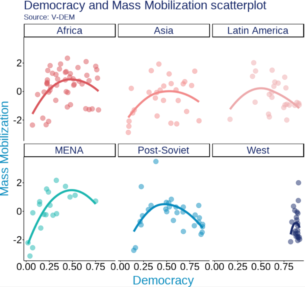
We will examine the inverted U shape between democracy and level of mass mobilization across six different regions.
The data will come from the V-DEM package.
Click here to read more about downloading and animating Varieties of Democracy (V-DEM) variables with the vdemdata package in R.
Packages we will be using to create our initial graph.
library(tidyverse)
library(magrittr) # for the %<>% pipe
library(devtools)
library(vdemdata)
So first, we make a basic plot with all the ggplot defaults:
vdem %>%
  filter(year == 2010) %>%
  ggplot(aes(x = v2x_polyarchy,
             y = v2cademmob)) +
  geom_point() +
  geom_smooth(method = "gam") +
  labs(title = "Democracy and Mass Mobilization scatterplot",
       subtitle = "Source: V-DEM",
       x = "Democracy",
       y = "Mass Mobilization") +
facet_wrap(~e_regionpol_6C) 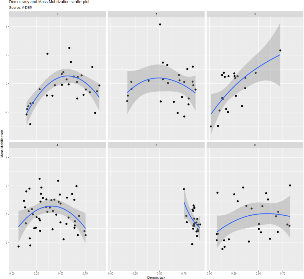
Next, we can add some elements to add color and labels:
vdem %>%
  mutate(
    e_regionpol_6C = case_when(
      e_regionpol_6C == 1 ~ "Post-Soviet",
      e_regionpol_6C == 2 ~ "Latin America",
      e_regionpol_6C == 3 ~ "MENA",
      e_regionpol_6C == 4 ~ "Africa",
      e_regionpol_6C == 5 ~ "West",
      e_regionpol_6C == 6 ~ "Asia",
      TRUE ~ NA)) %>%
  filter(year == 2010) %>%
  ggplot(aes(x = v2x_polyarchy,
             y = v2cademmob)) +
  geom_smooth(aes(color = as.factor(e_regionpol_6C)),
              method = "loess",
              span = 2,
              se = FALSE,
              size = 2,
              alpha = 0.3) +
  geom_point(aes(color = as.factor(e_regionpol_6C)),
                 size = 4, alpha = 0.5) +
  labs(title = "Democracy and Mass Mobilization scatterplot",
       subtitle = "Source: V-DEM",
       x = "Democracy",
       y = "Mass Mobilization") +
  facet_wrap(~e_regionpol_6C) +
  theme(text = element_text(size = 20),
        legend.position = "none") +
  guides(fill = guide_legend(keywidth = 3, keyheight = 3)) -> my_plot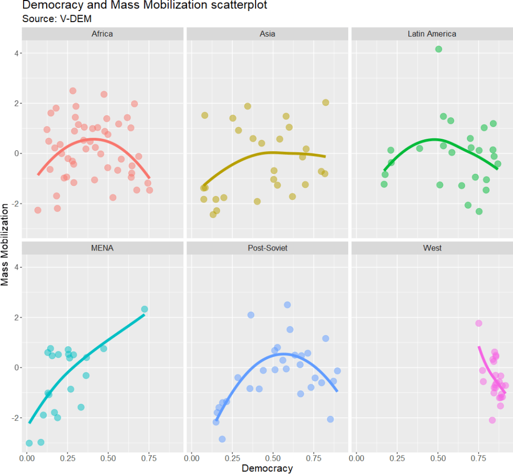
Adding Studio Ghibli palette and ggthemes themes
remotes::install_github("ewenme/ghibli")
library(ghibli)
This package comes from ewenme’s github.
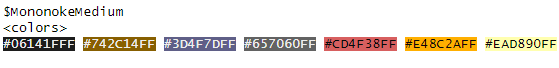
ghibli_palettes -> ghibli_palettes_listThis shows the 27 ghibli colour palettes available in the package! We can print off and browse through the colours to choose what to add to our plot:

To add the colours, we just need to add scale_colour_ghibli_d("MononokeMedium") to the plot object. I choose the pretty Mononoke Medium palette. The d at the end means we are using discrete data.

Additionally, I will add a plot theme from the ggthemes package.
devtools::install_github("jrnold/ggthemes")
library(ggthemes)
This package comes from Jeffrey Arnold’s github.
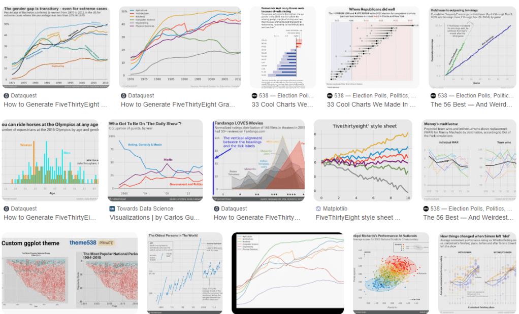
FiveThirtyEight is a polling website with buckets of graphics, such as:
To add this theme, we just need to add theme_fivethirtyeight()
my_plot +
  scale_colour_ghibli_d("MononokeMedium") +
  ggthemes::theme_fivethirtyeight() +
  theme(text = element_text(size = 25),
        legend.position = "none")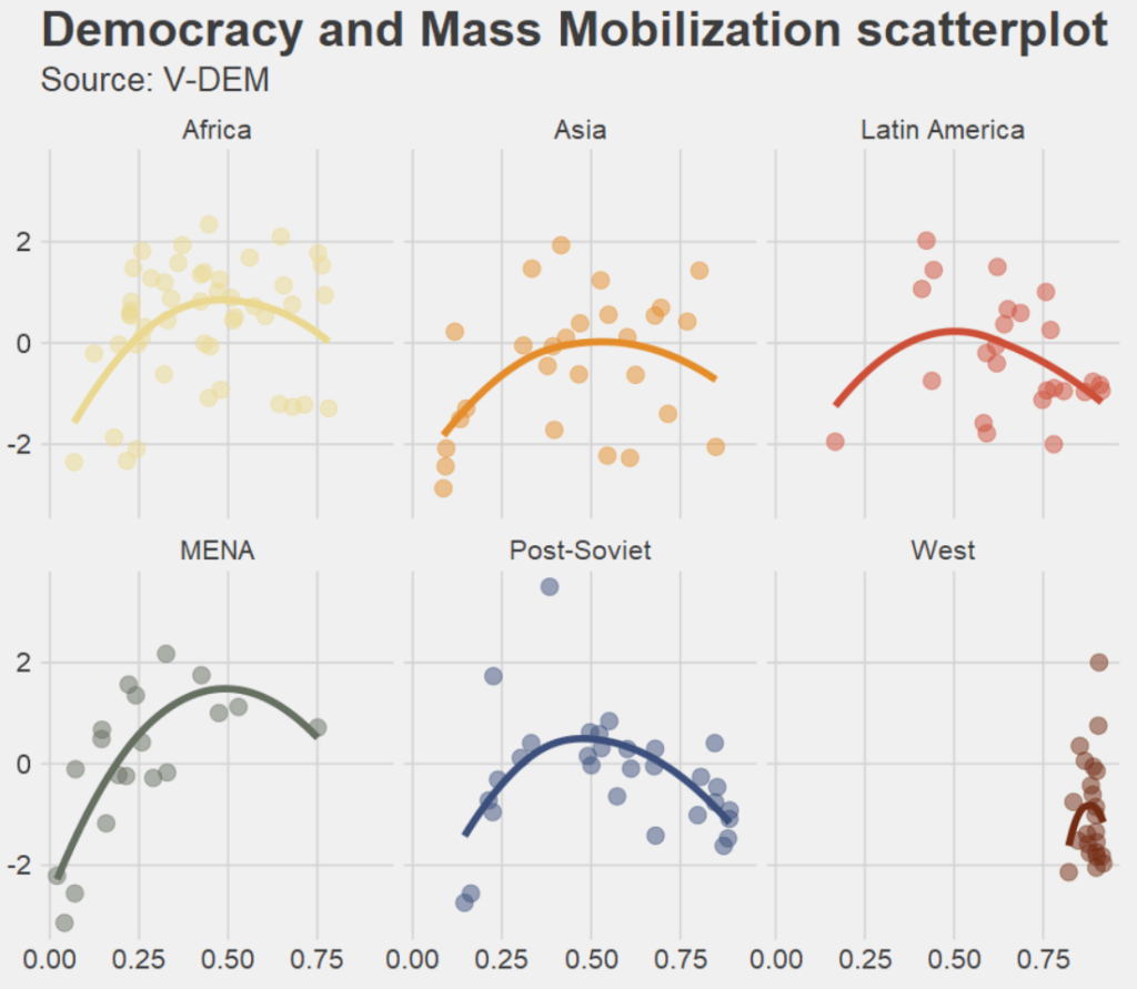
We can mix and match with different palettes and themes.
The following uses a template that resembles the Wall Street Journal graphs and MarnieMedium1 colours!
my_plot +
  scale_colour_ghibli_d("MarnieLight1") +
  ggthemes::theme_wsj() +
  theme(text = element_text(size = 25),
        legend.position = "none")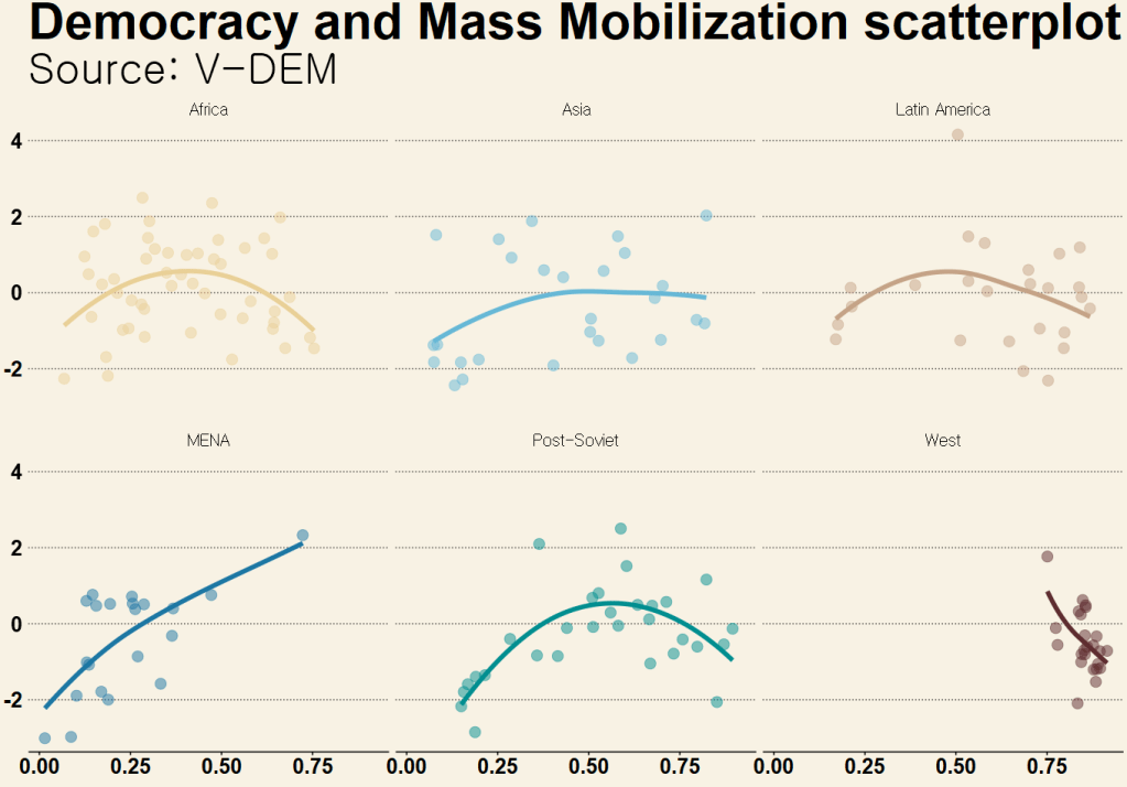
And another mix and match:
Studio Ghibli PonyoMedium palette with the graph style from the Economist magazine
my_plot +
  scale_colour_ghibli_d("PonyoMedium", direction = -1) +
  ggthemes::theme_economist() +
  theme(text = element_text(size = 25),
        legend.position = "none")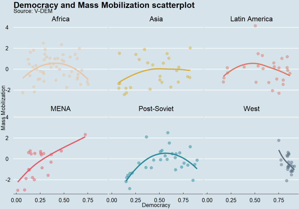
For continous variables, we can use scale_fill_ghibli_c()
We can look at average democracy scores around the world for all countries between 1945 to 2023.
We need to download a map object from the rnaturalearth package and merge it with the V-DEM dataset.
Click here to learn more about making maps in R
my_map <- ne_countries(scale = "medium", returnclass = "sf")

my_map %<>%
  mutate(COWcode = countrycode::countrycode(admin, "country.name", "cown"))

vdem_map <- left_join(vdem, my_map, by = c("COWcode"))

vdem_map %>%
  filter(year %in% c(1945:2023)) %>%
  filter(sovereignt != "Antarctica") %>%
  group_by(admin, geometry) %>%
  summarise(avg_polyarchy = mean(v2x_polyarchy, na.rm = TRUE)) %>%
  ungroup() %>%
  ggplot() +
  geom_sf(aes(geometry = geometry, fill = avg_polyarchy),
          position = "identity", color = "#212529", linewidth = 0.2, alpha = 0.85) +
  ghibli::scale_fill_ghibli_c("PonyoLight") +
  ggdark::dark_theme_void() +
  theme(legend.title = element_blank(),
        legend.position = "left") +
guides(fill = guide_legend(keywidth = 5, keyheight = 5)) 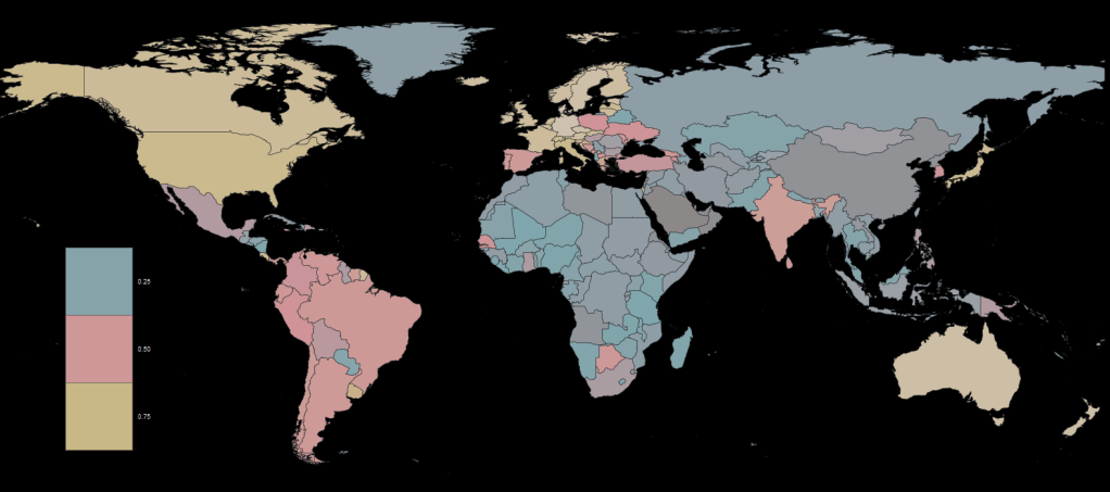
Adding Dutch painter palettes and ggdark themes
The next palette we will look at comes from Edward Theon and takes the colors from Dutch master painters such as Vermeer and Rembrandt.
devtools::install_github("EdwinTh/dutchmasters")
library(dutchmasters)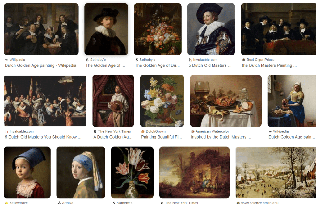
The themes for these plots come from Neal Grantham. They offer dark or black backgrounds; I always think this makes plots and charts look more professional, I don’t know why.
devtools::install_github("nsgrantham/ggdark")
library(ggdark)
So adding this palette and theme, we get:
my_plot +
  dark_theme_gray() +
  scale_color_dutchmasters(palette = "pearl_earring") +
  theme(text = element_text(size = 25),
        legend.position = "none")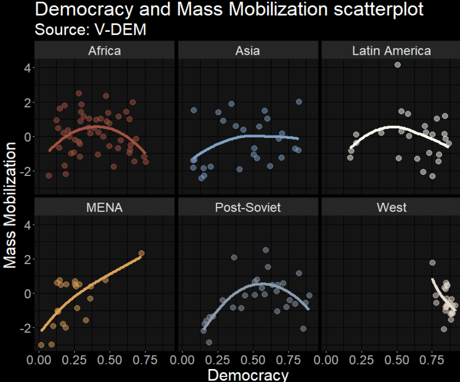
Adding LaCroix palettes and ggtech themes
Next we will look at LaCroixColoRpalettes. I’ll be honest, I have never lived in a country that sells this drink in the store so I’ve never tried it. But it looks pretty.
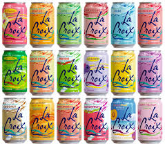
devtools::install_github("johannesbjork/LaCroixColoR")
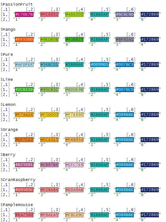
LaCroixColoR::lacroix_palettes -> lacroix_palettes_listThis package comes from the brain of Johannes Bjork
This list contains 21 palettes to choose from such as the following:
For the next few graphs, we will also look at the ggtech package.
They do random tech companies such as Google, AirBnB, Facebook and Etsy.
devtools::install_github("ricardo-bion/ggtech")If we want to change the font, I have always found it tricky like Run DMC, no matter HOW MANY TIMES I do it.
library(extrafont)
Registering fonts with R
For Google fonts, click the following link:
http://social-fonts.com/assets/fonts/product-sans/product-sans.ttf
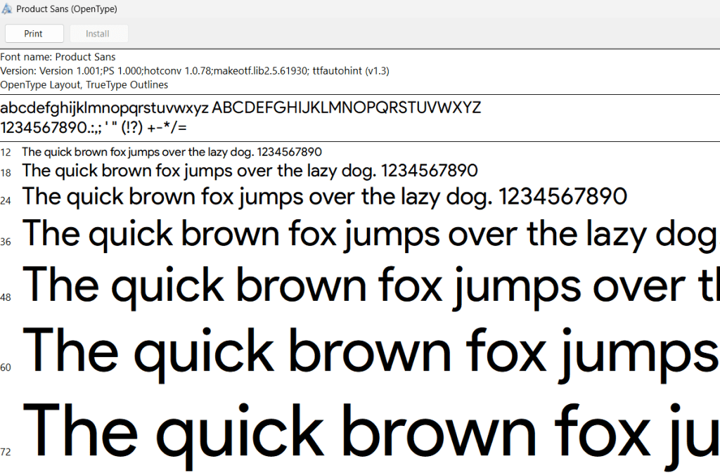
And install the font onto your computer.
font_import(pattern = 'product-sans.ttf', prompt = FALSE)

loadfonts(device = "win")
Now, we can make the plot:
my_plot +
  scale_color_manual(values = LaCroixColoR::lacroix_palette("CranRaspberry")) +
  ggtech::theme_tech(theme = "google") +
  theme(text = element_text(size = 25,
                            family = "Product Sans"),
        legend.position = "none",
        plot.title = element_text(color="#172869"),
        plot.subtitle = element_text(color="#172869"),
        axis.title.x = element_text(color="#088BBE"),
        axis.title.y = element_text(color="#088BBE"),
        strip.text = element_text(color="#172869"))
And finally, two of my favorite packages, bbplot and wesanderson for making pretty plots.
Click here to read more about the bbplot package and here to read more about the ggstream package
vdem %>%
  filter(year %in% c(1800:2020)) %>%
  group_by(year, e_regionpol_6C) %>%
  count() -> country_count

country_count %>%
  mutate(e_regionpol_6C = case_when(
    e_regionpol_6C == 1 ~ "Post-Soviet",
    e_regionpol_6C == 2 ~ "Latin America",
    e_regionpol_6C == 3 ~ "MENA",
    e_regionpol_6C == 4 ~ "Africa",
    e_regionpol_6C == 5 ~ "West",
    e_regionpol_6C == 6 ~ "Asia",
    TRUE ~ NA)) %>%
  ggplot(aes(x = year, y = n, fill = as.factor(e_regionpol_6C))) +
  ggstream::geom_stream() +
  bbplot::bbc_style() +
  scale_fill_manual(values = LaCroixColoR::lacroix_palette("Pamplemousse")) +
  scale_x_continuous(breaks = seq(min(country_count$year, na.rm = TRUE),
                                  max(country_count$year, na.rm = TRUE),
                                  by = 20)) +
  theme(legend.title = element_blank(),
        axis.text.y = element_blank()) +
  labs(title = "Number of Sovererign Countries 1800 - 2020",
       subtitle = "Source: V-DEM")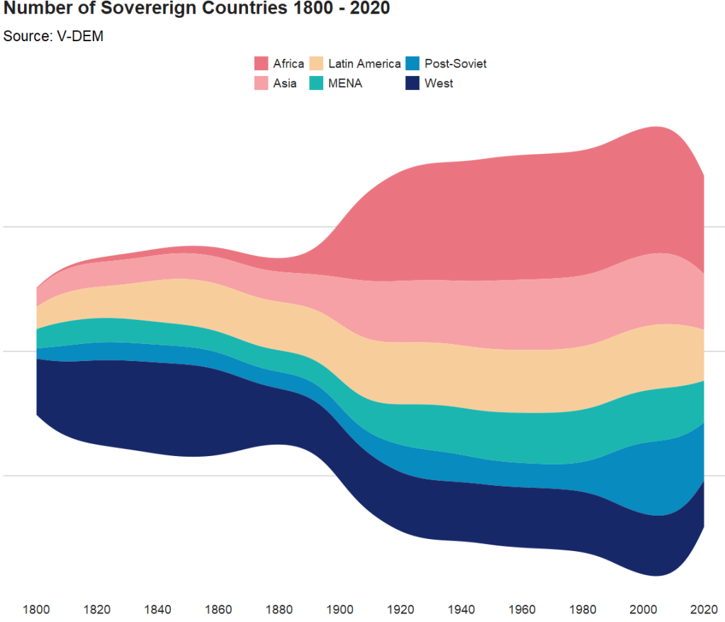
Click here to read more about the wesanderson package and click here to read more about the waffle package in R
country_count %>%
  ggplot(aes(fill = e_regionpol_6C, values = n)) +
  waffle::geom_waffle(n_rows = 15, size = 0.5, colour = "white",
                      flip = TRUE, make_proportional = FALSE) +
  bbplot::bbc_style() +
  scale_fill_manual(values = sample(wesanderson::wes_palette("Zissou1Continuous"))) +
  theme(legend.title = element_blank(),
        axis.text.y = element_blank(),
        plot.title = element_text(hjust = 0.5)) +
  labs(title = "Number of Sovereign Countries 1800 - 2020",
       subtitle = "Source: V-DEM")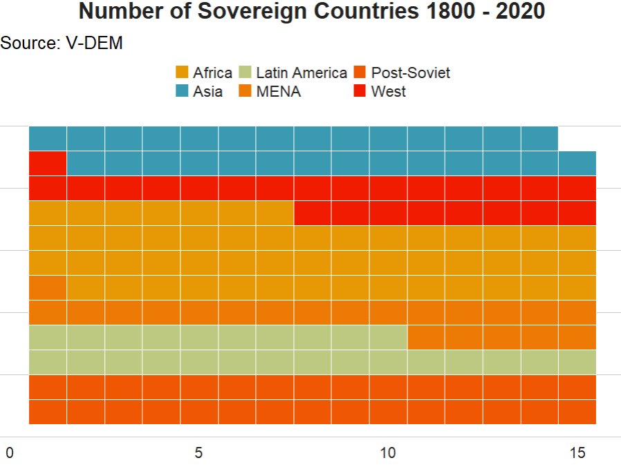
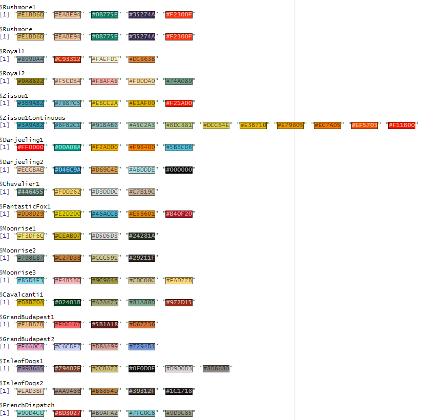
A sample of the 24 wesanderson package options