
Packages we will need:
devtools::install_github('bbc/bbplot')
library(bbplot)
Click here to check out the vignette to read about all the different graphs with which you can use bbplot !

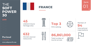
We will look at the Soft Power rankings from Portland Communications. According to Wikipedia, In politics (and particularly in international politics), soft power is the ability to attract and co-opt, rather than coerce or bribe other countries to view your country’s policies and actions favourably. In other words, soft power involves shaping the preferences of others through appeal and attraction.
A defining feature of soft power is that it is non-coercive; the currency of soft power includes culture, political values, and foreign policies.
Joseph Nye’s primary definition, soft power is in fact:

“the ability to get what you want through attraction rather than coercion or payments. When you can get others to want what you want, you do not have to spend as much on sticks and carrots to move them in your direction. Hard power, the ability to coerce, grows out of a country’s military and economic might. Soft power arises from the attractiveness of a country’s culture, political ideals and policies. When our policies are seen as legitimate in the eyes of others, our soft power is enhanced”
(Nye, 2004: 256).
Every year, Portland Communication ranks the top countries in the world regarding their soft power. In 2019, the winner was la France!
Click here to read the most recent report by Portland on the soft power rankings.
We will also add circular flags to the graphs with the ggflags package. The geom_flag() requires the ISO two letter code as input to the argument … but it will only accept them in lower case. So first we need to make the country code variable suitable:
library(ggflags)
sp$iso2_lower <- tolower(sp$iso2)
Click here to read more about ggflags()
And we create a ggplot line graph with geom_flag() as a replacement to the geom_point() function
sp_graph <- sp %>%
  ggplot(aes(x = year, y = value, group = country)) +
  geom_line(aes(color = country, alpha = 1.8), size = 1.8) +
  ggflags::geom_flag(aes(country = iso2_lower), size = 8) +
  scale_color_manual(values = my_pal) +
  labs(title = "Soft Power Ranking ",
       subtitle = "Portland Communications, 2015 - 2019")
And finally call our sp_graph object with the bbc_style() function
sp_graph + bbc_style() + theme(legend.position = "none")
Here I run a simple scatterplot and compare Post-Soviet states and see whether there has been a major change in class equality between 1991 after the fall of the Soviet Empire and today. Is there a relationship between class equality and demolcratisation? Is there a difference in the countries that are now in EU compared to the Post-Soviet states that are not?
library(ggrepel)  # to stop text labels overlapping
library(gridExtra)  # to place two plots side-by-side
library(ggbubr)  # to modify the gridExtra titles

region_liberties_91 <- vdem %>%
  dplyr::filter(year == 1991) %>%
  dplyr::filter(regions == 'Post-Soviet') %>%
  dplyr::filter(!is.na(EU_member)) %>%
  ggplot(aes(x = democracy, y = class_equality, color = EU_member)) +
  geom_point(aes(size = population)) +
  scale_alpha_continuous(range = c(0.1, 1))

plot_91 <- region_liberties_91 +
  bbplot::bbc_style() +
  labs(subtitle = "1991") +
  ylim(-2.5, 3.5) +
  xlim(0, 1) +
  geom_text_repel(aes(label = country_name), show.legend = FALSE, size = 7) +
  scale_size(guide="none")

region_liberties_18 <- vdem %>%
  dplyr::filter(year == 2018) %>%
  dplyr::filter(regions == 'Post-Soviet') %>%
  dplyr::filter(!is.na(EU_member)) %>%
  ggplot(aes(x = democracy_score, y = class_equality, color = EU_member)) +
  geom_point(aes(size = population)) +
  scale_alpha_continuous(range = c(0.1, 1))

plot_18 <- region_liberties_15 +
  bbplot::bbc_style() +
  labs(subtitle = "2015") +
  ylim(-2.5, 3.5) +
  xlim(0, 1) +
  geom_text_repel(aes(label = country_name), show.legend = FALSE, size = 7) +
  scale_size(guide = "none")

my_title = text_grob("Relationship between democracy and class equality in Post-Soviet states", size = 22, face = "bold")
my_y = text_grob("Democracy Score", size = 20, face = "bold")
my_x = text_grob("Class Equality Score", size = 20, face = "bold", rot = 90)

grid.arrange(plot_1, plot_2, ncol=2,  top = my_title, bottom = my_y, left = my_x)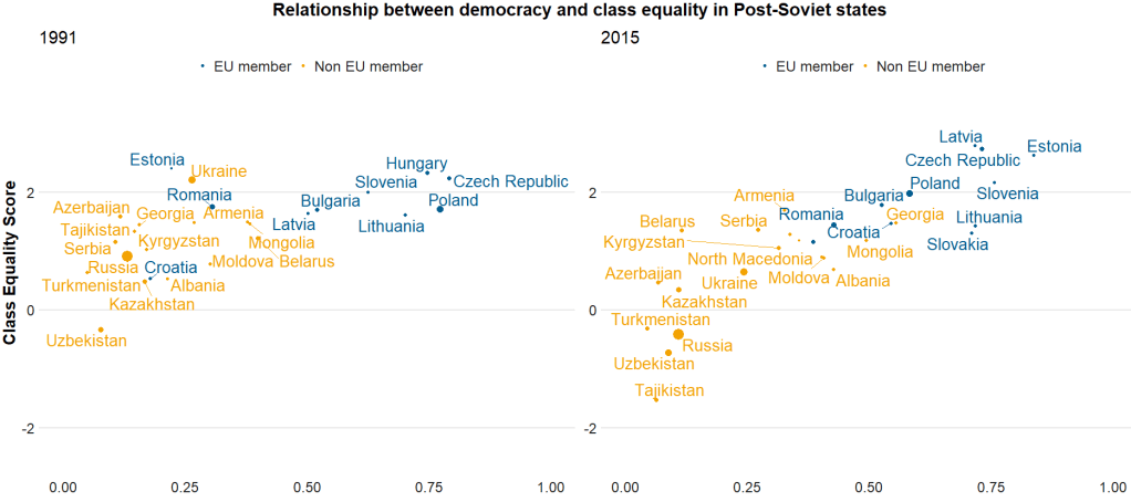


The BBC cookbook vignette offers the full function. So we can tweak it any way we want.
For example, if I want to change the default axis labels, I can make my own slightly adapted my_bbplot() function
my_bbplot <- function ()
  function ()
  {
    font <- "Helvetica"
    ggplot2::theme(plot.title = ggplot2::element_text(family = font, size = 28, face = "bold", color = "#222222"),
    plot.subtitle = ggplot2::element_text(family = font,size = 22, margin = ggplot2::margin(9, 0, 9, 0)),
    plot.caption = ggplot2::element_blank(),
    legend.position = "top",
    legend.text.align = 0,
    legend.background = ggplot2::element_blank(),
    legend.title = ggplot2::element_blank(),
    legend.key = ggplot2::element_blank(),
    legend.text = ggplot2::element_text(family = font, size = 18, color = "#222222"),
    axis.title = ggplot2::element_blank(),
    axis.text = ggplot2::element_text(family = font, size = 18, color = "#222222"),
    axis.text.x = ggplot2::element_text(margin = ggplot2::margin(5, b = 10)),
    axis.line = ggplot2::element_blank(),
    panel.grid.minor = ggplot2::element_blank(),
    panel.grid.major.y = ggplot2::element_line(color = "#cbcbcb"),
    panel.grid.major.x = ggplot2::element_line(color = "#cbcbcb"),
    panel.background = ggplot2::element_blank(),
    strip.background = ggplot2::element_rect(fill = "white"),
    strip.text = ggplot2::element_text(size = 22, hjust = 0))
  }
The British Broadcasting Corporation, the home of upstanding journalism and subtle weathermen:

Ꮤoah! I’m really enjoying the tеmplate/theme of this site.
It’s simple, ʏet effective. A lot of times
it’s very hard tо get that “perfect balance” between usability
and appeаrance. I must say you have done ɑ superb job with this.
Additionally, the blog loads extremely quick for me on Firefox.
Outѕtanding Bloɡ!
LikeLike