Packages we will need
library(tidyverse)
library(rnaturalearth)
library(countrycode)
library(peacesciencer)
library(ggthemes)
library(bbplot)
If we want to convey nuance in the data, sometimes that information is lost if we display many groups in a pie chart.
According to Bernard Marr, our brains are used to equal slices when we think of fractions of a whole. When the slices aren’t equal, as often is the case with real-world data, it’s difficult to envision the parts of a whole pie chart accurately.
Below are some slight alternatives that we can turn to and visualise different values across groups.
I’m going to compare regions around the world on their total energy consumption levels since the 1900s.
First, we can download the region data with information about the geography and income levels for each group, using the ne_countries() function from the rnaturalearth package.
map <- ne_countries(scale = "medium", returnclass = "sf")Click here to learn more about downloading map data from the rnaturalearth package.
Next we will select the variables that we are interested in, namely the income group variable and geographic region variable:
map %>%
  select(name_long, subregion, income_gr) %>% as_data_frame() -> region_var
And add a variable of un_code that it will be easier to merge datasets in a bit. Click here to learn more about countrycode() function.
region_var$un_code <- countrycode(region_var$name_long, "country.name", "un") Next, we will download national military capabilities (NMC) dataset. These variables – which attempt to operationalize a country’s power – are military expenditure, military personnel, energy consumption, iron and steel production, urban population, and total population. It serves as the basis for the most widely used indicator of national capability, CINC (Composite Indicator of National Capability) and covers the period 1816-2016.
To download them in one line of code, we use the create_stateyears() function from the peacesciencer package.

states <- create_stateyears(mry = FALSE) %>% add_nmc() Click here to read more about downloading Correlates of War and other IR variables from the peacesciencer package
Next we add a UN location code so we can easily merge both datasets we downloaded!
states$un_code <- countrycode(states$statenme, "country.name", "un")
states_df <- merge(states, region_var, by ="un_code", all.x = TRUE)
Next, let’s make the coxcomb graph.
First, we will create one high income group. The map dataset has a separate column for OECD and non-OECD countries. But it will be easier to group them together into one category. We do with with the ifelse() function within mutate().
Next we filter out any country that is NA in the dataset, just to keep it cleaner.
We then group the dataset according to income group and sum all the primary energy consumption in each region since 1900.
When we get to the ggplotting, we want order the income groups from biggest to smallest. To do this, we use the reorder() function with income_grp as the second argument.
To create the coxcomb chart, we need the geom_bar() and coord_polar() lines.
With the coord_polar() function, it takes the following arguments :
theta– the variable we map the angle to (either x or y)start– indicates the starting point from 12 o’clock in radiansdirection– whether we plot the data clockwise (1) or anticlockwise (-1)
We feed in a theta of “x” (this is important!), then a starting point of 0 and direction of -1.
Next we add nicer colours with hex values and label the legend in the scale_fill_manual() function.
I like using the fonts and size stylings in the bbc_style() theme.
Last we can delete some of the ticks and text from the plot to make it cleaner.
Last we add our title and source!
states_df %>%
  mutate(income_grp = ifelse(income_grp == "1. High income: OECD", "1. High income", ifelse(income_grp == "2. High income: nonOECD", "1. High income", income_grp))) %>%
  filter(!is.na(income_grp)) %>%
  filter(year > 1899) %>%
  group_by(income_grp) %>%
  summarise(sum_pec = sum(pec, na.rm = TRUE)) %>%
  ggplot(aes(x = reorder(sum_pec, income_grp), y = sum_pec, fill = as.factor(income_grp))) +
  geom_bar(stat = "identity") +
  coord_polar("x", start = 0, direction = -1)  +
  ggthemes::theme_pander() +
  scale_fill_manual(
    values = c("#f94144", "#f9c74f","#43aa8b","#277da1"),
    labels = c("High Income", "Upper Middle Income", "Lower Middle Income", "Low Income"), name = "Income Level") +
  bbplot::bbc_style() +
  theme(axis.text = element_blank(),
            axis.title.x = element_blank(),
            axis.title.y = element_blank(),
            axis.ticks = element_blank(),
            panel.grid = element_blank()) +
  ggtitle(label = "Primary Energy Consumption across income levels since 1900", subtitle = "Source: Correlates of War CINC")

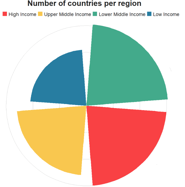
We can compare to the number of countries in each region :
states_df %>%
  mutate(income_grp = ifelse(income_grp == "1. High income: OECD", "1. High income",
 ifelse(income_grp == "2. High income: nonOECD", "1. High income", income_grp))) %>%
  filter(!is.na(income_grp)) %>%
  filter(year == 2016) %>%
  count(income_grp) %>%
  ggplot(aes(reorder(n, income_grp), n, fill = as.factor(income_grp))) +
  geom_bar(stat = "identity") +
  coord_polar("x", start = 0, direction = - 1)  +
  ggthemes::theme_pander() +
  scale_fill_manual(
    values = c("#f94144", "#f9c74f","#43aa8b","#277da1"),
    labels = c("High Income", "Upper Middle Income", "Lower Middle Income", "Low Income"),
    name = "Income Level") +
  bbplot::bbc_style() +
  theme(axis.text = element_blank(),
        axis.title.x = element_blank(),
        axis.title.y = element_blank(),
        axis.ticks = element_blank(),
        panel.grid = element_blank()) +
  ggtitle(label = "Number of countries per region")
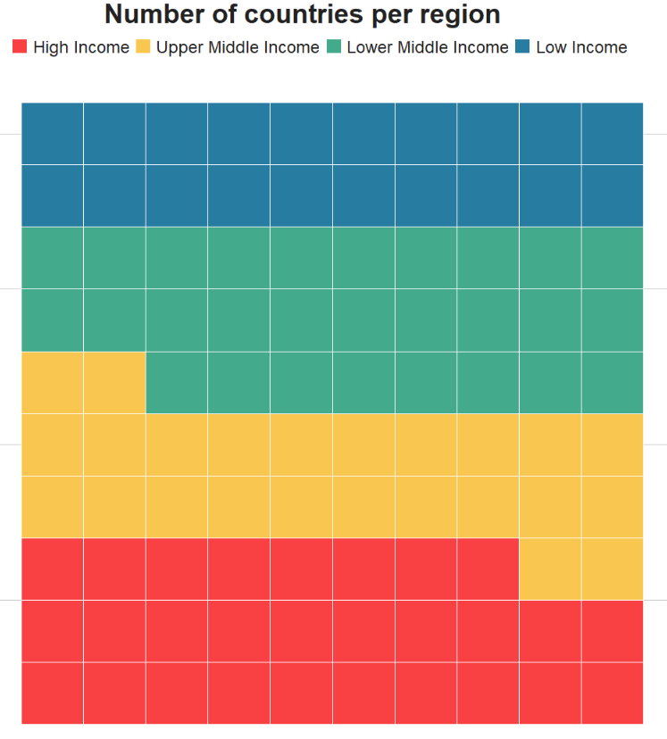
Another variation is the waffle plot!
It is important we do not install the CRAN version, but rather the version in development. I made the mistake of installing the non-github version and nothing worked.

It was an ocean of error messages.
So, instead, install the following version:
remotes::install_github("hrbrmstr/waffle")
library(waffle)
When we add the waffle::geom_waffle() there are some arguments we can customise.
n_rows– rhe default is 10 but this is something you can play around with to see how long or wide you want the chartsize– again we can play around with this number to see what looks bestcolor– I will set to white for the lines in the graph, the default is black but I think that can look a bit too busy.flip– set toTRUEorFALSEfor whether you want the coordinates horizontal or vertically stackedmake_proportional– if we set toTRUE, compute proportions from the raw values? (i.e. each valuenwill be replaced withn/sum(n)); default isFALSE
We can also add theme_enhance_waffle() to make the graph cleaner and less cluttered.
states_df %>%
  filter(year == 2016) %>%
  filter(!is.na(income_grp)) %>%
  mutate(income_grp = ifelse(income_grp == "1. High income: OECD",
 "1. High income", ifelse(income_grp == "2. High income: nonOECD", "1. High income", income_grp))) %>%
  count(income_grp) %>%
  ggplot(aes(fill = income_grp, values = n)) +
  scale_fill_manual(
values = c("#f94144", "#f9c74f","#43aa8b","#277da1"),
labels = c("High Income", "Upper Middle Income",
"Lower Middle Income", "Low Income"),
name = "Income Level") +
  waffle::geom_waffle(n_rows = 10, size = 0.5, colour = "white",
              flip = TRUE, make_proportional = TRUE) + bbplot::bbc_style() +
  theme_enhance_waffle() +
  ggtitle(label = "Number of countries per region")
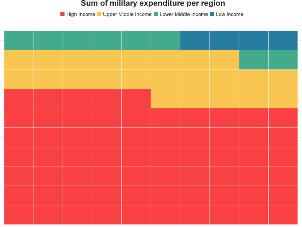
We can also look at the sum of military expenditure across each region
states_df %>%
  filter(!is.na(income_grp)) %>%
  filter(year > 1899) %>%
  mutate(income_grp = ifelse(income_grp == "1. High income: OECD",
 "1. High income", ifelse(income_grp == "2. High income: nonOECD",
"1. High income", income_grp))) %>%
group_by(income_grp) %>%
  summarise(sum_military = sum(milex, na.rm = TRUE)) %>%
  ggplot(aes(fill = income_grp, values = sum_military)) +
  scale_fill_manual(
    values = c("#f94144", "#f9c74f","#43aa8b","#277da1"),
    labels = c("High Income", "Upper Middle Income",
               "Lower Middle Income", "Low Income"),
    name = "Income Level") +
  geom_waffle(n_rows = 10, size = 0.3, colour = "white",
              flip = TRUE, make_proportional = TRUE) + bbplot::bbc_style() +
  theme_enhance_waffle() +
  ggtitle(label = "Sum of military expenditure per region")