
Packages we will need:
library(tidyverse)
library(broom)
We will use the Varieties of Democracy dataset again.

We will use a t-test comparing democracies (boix == 1) and non-democracies (boix == 0) in the years 2000 to 2020.
We need to remove the instances where boix is NA.
I choose three t-tests to run simultaneously. Comparing democracies and non-democracies on:
- the extent to which the country consults religious groups (relig_consult)
- the extent to which the country consults Civil Society Organization (CSO) groups (cso_consult)
- level of freedom from judicial corruption (judic_corruption) – higher scores mean that there are FEWER instances of judicial corruption
vdem %>%
  filter(year %in% c(2000:2020)) %>%
  filter(!is.na(e_boix_regime)) %>%
  group_by(e_boix_regime) %>%
  select(relig_consult = v2csrlgcon,
         cso_consult = v2cscnsult,
         judic_corruption = v2jucorrdc) -> vdem
Next we need to pivot the data from wide to long
  vdem %<>% pivot_longer(!e_boix_regime,
                names_to = "variable",
               values_to = "value")
Now we get to iterating over the three variables and conducting a t-test on each variable across democracies versus non-democracies

vdem %>%
  group_by(variable) %>%
  nest() %>%
  mutate(t_test = map(data, ~t.test(value ~ e_boix_regime, data = .x)),
                tidy = map(t_test, broom::tidy)) %>%
  select(variable, tidy) %>%
  unnest(tidy) -> ttest_results
If we look closely at the line
mutate(t_test = map(data, ~t.test(value ~ e_boix_regime, data = .x))):
Here, mutate() adds a new column named t_test to the grouped and nested data.
map() is used to apply a function to each element of the list-column (here, each nested data frame).
The function applied is t.test(value ~ e_boix_regime, data = .x).
This function performs a t-test comparing the means of value across two groups defined by e_boix_regime within each nested data frame.
.x represents each nested data frame in turn.
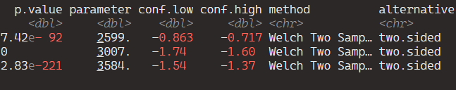
And here are the tidy results:

If we save the above results in a data.frame, we can graph the following:
ttest_results %>%
ggplot(aes(x = variable, y = estimate, ymin = conf.low, ymax = conf.high)) +
  geom_point() +
  geom_errorbar(width = 0.2) +
  coord_flip() +
  labs(title = "T-Test Estimates with Confidence Intervals",
       x = "Variable",
       y = "Estimate Difference") +
  theme_minimal()

Add some colors to highlight magnitude of difference
  ggplot(aes(x = variable, y = estimate, ymin = conf.low, ymax = conf.high, color = color_value)) +
  geom_point() +
  geom_errorbar(width = 0.7, size = 3) +
  scale_color_gradientn(colors = c("#0571b0", "#92c5de", "#f7f7f7", "#f4a582", "#ca0020")) +
  coord_flip() +
  labs(title = "T-Test Estimates with Confidence Intervals",
       x = "Variable",
       y = "Estimate Difference") +
  theme_minimal() +
guides(color = guide_colorbar(title = "")) 
Sometimes vdem variables are reverse scored or on different scales
  # mutate(across(judic_corruption, ~ 1- .x)) %>%
  # mutate(across(everything(), ~(.x - mean(.x, na.rm = TRUE)) / sd(.x, na.rm = TRUE), .names = "z_{.col}")) %>%
# select(contains("z_")) 


