If I want to graphically display the relationship between two variables, the ggplot2 package is a very handy way to produce graphs.
For example, I can use the ggplot2 package to graphically examine the relationship between civil society strength and freedom of citizens from torture. Also I can see whether this relationship is the same across regime types.
I choose one year from my dataframe to examine.
data2000 <- myPanel[which(myPanel$year == "2000"),]Next, I install the ggplot2 package
install.packages("ggplot2")
library(ggplot2)
The grammar of ggplot2 includes:
aes()indicates how variables are mapped to visual properties or aesthetics. The first variable goes on the x-axis and the second variable goes on the y-axis.geom_point()creates a scatterplot style graph. Alternatives to this aregeom_line(), which creates a line plot andgeom_histogram()which creates a histogram plot.
ggplot(data2000, aes(v2xcs_ccsi, v2cltort)) + geom_point() +
xlab("Civil society robustness") +
ylab("Freedom from torture")

Next we can add information on regime types, a categorical variable with four levels.
0 = closed autocracy
1 = electoral autocracy
2 = electoral democracy
3 = liberal democracy
In the aes() function, add colour = regime to differentiate the four categories on the graph
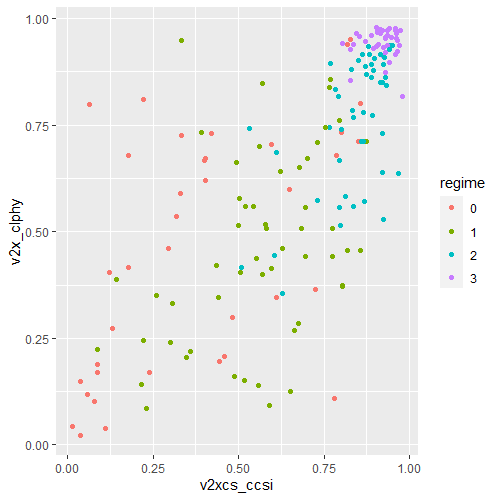
ggplot(data2000, aes(v2xcs_ccsi, v2x_clphy, colour = regime)) +
geom_point()
Alternatively we can use the facet_wrap( ~ regime) function to create four separate scatterplots and examine the relationship separately.
ggplot(data2000, aes(v2xcs_ccsi, v2x_clphy, colour = regime)) +
geom_point() +
facet_wrap(~regime) +
xlab("Civil society robustness") +
ylab("Freedom from torture")

Lastly, we can add a linear model line (method = "lm") with a grey standard error bar (se = TRUE) in the geom_smooth() function.
ggplot(data2000, aes(v2xcs_ccsi, v2x_clphy, colour = regime)) +
geom_point() +
facet_wrap(~regime) +
geom_smooth(method = "lm", se = TRUE) +
xlab("Civil society robustness") +
ylab("Freedom from torture")

In these graphs, we can see that as civil society robustness score increases, the likelihood of a life free from torture increases! Pretty intuitive result and we could argue that there is a third variable – namely strong democratic institutions – that drives this positive relationship.
The graphs break down this relationship across four different regime types, ranging from the most autocratic in the top left hand side to the most democratic in the bottom right. There is more variety in this relationship with closed autocracies (i.e. the red points), with some points deviating far from the line.
The purple graph – liberal democracies – shows a tiny amount of variance. In liberal democracies, it appears that all countries score highly in both civil society robustness and freedom from torture!
