
library(eurostat)
library(tidyverse)
library(magrittr)
library(ggthemes)
library(ggpbump)
library(ggflags)
library(countrycode)
Click here for Part 1 and here for Part 2 of the series on Eurostat data – explains how to download and visualise the Eurostat data
In this blog, we will look at government expenditure of the European Union!
Part 1 will go into detail about downloading Eurostat data with their package.
govt <- get_eurostat("gov_10a_main", fix_duplicated = TRUE)Some quick data cleaning and then we can look at the variables in the dataset.
govt$year <- as.numeric(format(govt$time, format = "%Y"))
View(govt)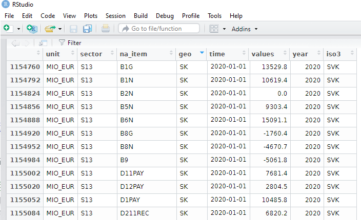
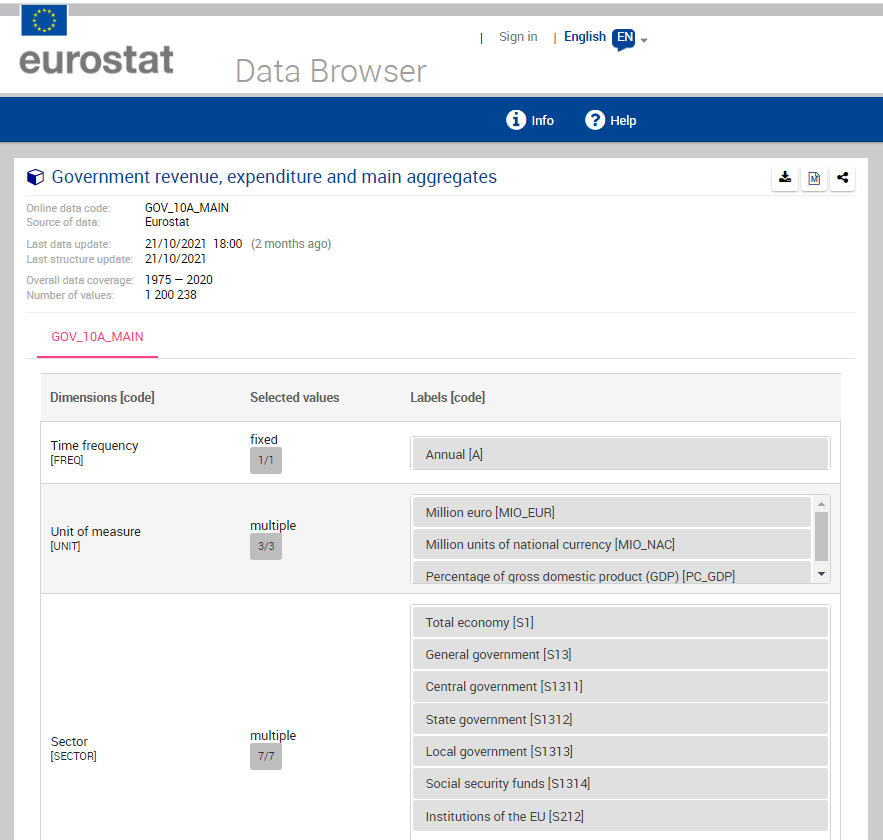
The numbers and letters are a bit incomprehensible. We can go to the Eurostat data browser site. It ascts as a codebook for all the variables we downloaded:
I want to take the EU accession data from Wikipedia. Check out the Part 1 blog post to scrape the data.
govt$iso3 <- countrycode(govt$geo, "iso2c", "iso3c")

govt_df <- merge(govt, eu_members, by.x = "iso3", by.y = "iso_3166_1_alpha_3", all.x = TRUE)
We will look at general government spending of the countries from the 2004 accession.
Also we will choose data is government expenditure as a percentage of GDP.
govt_df %<>%
  filter(sector == "S13") %>%      # General government spending
  filter(accession == 2004) %>%    # For countries that joined 2004
  filter(unit == "PC_GDP") %>%     # Spending as percentage of GDP
  filter(na_item == "TE")          # Total expenditure
A little more data cleaning! To use the ggflags package, the ISO 2 character code needs to be in lower case.
Also we will use some regex to remove the strings in the square brackets from the dataset.
govt_df$iso2_lower <- tolower(govt_df$iso_3166_1_alpha_2)

govt_df$name_clean <- gsub("\\[.*?\\]", "", govt_df$name)
To put the flags at the start of the graph and names of the countries at the end of the lines, create mini dataframes with only information for the last year and first year:
last_time <- govt_df %>%
  group_by(geo) %>%
  slice(which.max(year)) %>%
  ungroup()

first_time <- govt_df %>%
  group_by(geo) %>%
  slice(which.min(year)) %>%
  ungroup()
I choose some nice hex colours from the coolors website. They need # in the strings to be acknowledged as hex colours by ggplot
add_hashtag <- function(my_vec){
  hash_vec <-  paste0('#', my_vec)
  return(hash_vec)
}

pal <- c("0affc2","ffb8d1","05e6dc","00ccf5","ff7700",
         "fa3c3b","f50076","b766b4","fd9c1e","ffcf00")

pal_hash <- add_hashtag(pal)
Now we can plot:
govt_df %>%
  filter(geo != "CY" | geo != "MT") %>%
  filter( year < 2020) %>%
  ggplot(aes(x = year,
             y = values, group = name)) +
  geom_text_repel(data = last_time, aes(label = name_clean,
                                        color = name),
                  size = 6, hjust = -3) +
  geom_point(aes(color = name)) +
  geom_line(aes(color = name), size = 3, alpha = 0.8) +
  ggflags::geom_flag(data = first_time,
                     aes(x = year,
                         y = values,
                         country = iso2_lower),
                     size = 8) +
   scale_color_manual(values = pal_hash) +
  xlim(1994, 2021) +
   ggthemes::theme_fivethirtyeight() +
  theme(panel.background = element_rect(fill = "#284b63"),
        legend.position = "none",
        axis.text.x = element_text(size = 20),
        axis.text.y = element_text(size = 20),

        panel.grid.major.y = element_line(color = "#495057",
                                          size = 0.5,
                                          linetype = 2),
        panel.grid.minor.y = element_line(color = "#495057",
                                          size = 0.5,
                                          linetype = 2)) +
  guides(colour = guide_legend(override.aes = list(size=10)))
Sometimes a simple line graph doesn’t easily show us the ranking of the countries over time.
The last graph was a bit cluttered, so we can choose the top average highest government expenditures to compare
govt_rank %>%
  distinct(geo, mean_rank) %>%
  top_n(6, mean_rank) %>%
  pull(geo) -> top_rank
We can look at a bump chart that ranks the different positions over time
govt_df %>%
  filter(geo %in%  top_rank) %>%
  group_by(year) %>%
  mutate(rank_budget = rank(-values, ties.method = "min")) %>%
  ungroup() %>%
  group_by(geo) %>%
  mutate(mean_rank = mean(values)) %>%
  ungroup()  %>%
  select(geo, iso2_lower, year, fifth_year, rank_budget, mean_rank) -> govt_rank
We recreate the last and first dataframes for the flags with the new govt_rank dataset.
last_time <- govt_rank %>%
  filter(geo %in% top_rank ) %>%
  group_by(geo) %>%
  slice(which.max(year)) %>%
  ungroup()

first_time <- govt_rank %>%
  filter(geo %in% top_rank ) %>%
  group_by(geo) %>%
  slice(which.min(year)) %>%
  ungroup()
All left to do is code the bump plot to compare the ranking of highest government expenditure as a percentage of GDP
govt_rank %>%
  ggplot(aes(x = year, y = rank_budget,
             group = country,
             color = country, fill = country)) +
  geom_point() +
  geom_bump(aes(),
            size = 3, alpha = 0.8,
            lineend = "round") +
  geom_flag(data = last_time %>%
              filter(year == max(year)),
            aes(country = iso2_lower ),
            size = 20,
            color = "black") +
  geom_flag(data = first_time %>%
              filter(year == max(year)),
            aes(country = iso2_lower),
            size = 20,
            color = "black") -> govt_bump
Last we change the theme aesthetics of the bump plot
govt_bump + theme(panel.background = element_rect(fill = "#284b63"),
      legend.position = "bottom",
      axis.text.x = element_text(size = 20),
      axis.text.y = element_text(size = 20),
      axis.line = element_line(color='black'),
      axis.title.x = element_blank(),
      axis.title.y = element_blank(),
      legend.title = element_blank(),
      legend.text = element_text(size = 20),
      panel.grid.major = element_blank(),
      panel.grid.minor = element_blank()) +
  guides(colour = guide_legend(override.aes = list(size=10))) +
  scale_y_reverse(breaks = 1:100)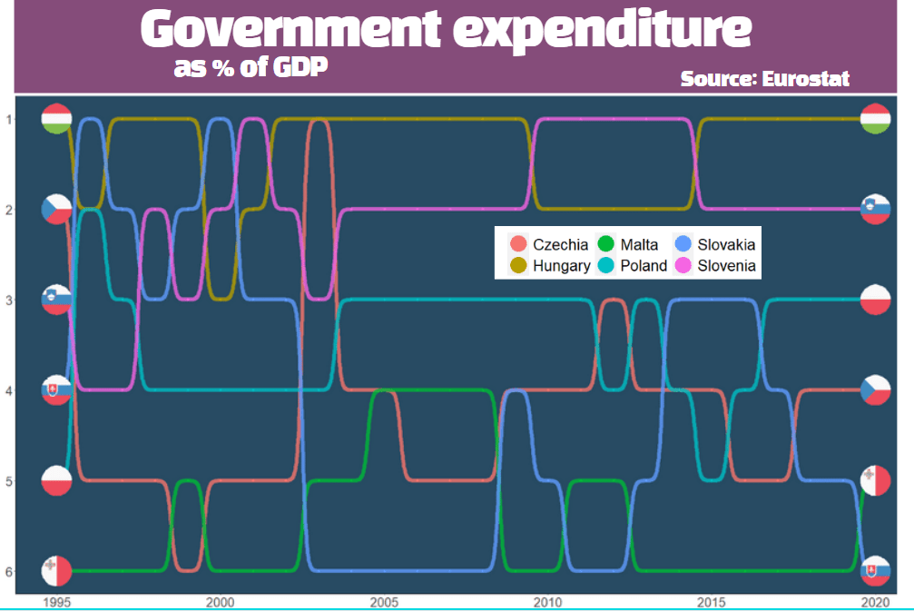
I added the title and moved the legend with canva.com, rather than attempt it with ggplots! I feel bad for cheating a bit.
