
Packages we will need:
library(rvest)
library(magrittr)
library(tidyverse)
library(waffle)
library(wesanderson)
library(ggthemes)
library(countrycode)
library(forcats)
library(stringr)
library(tidyr)
library(janitor)
library(knitr)
To see another blog post that focuses on cleaning messy strings and dates, click here to read
We are going to look at Irish embassies and missions around the world. Where are the embassies, and which country has the most missions (including embassies, consulates and representational offices)?
Let’s first scrape the embassy data from the Wikipedia page. Here is how it looks on the webpage.

It is a bit confusing because Ireland does not have a mission in every country. Argentina, for example, is the embassy for Bolivia, Paraguay and Uruguay.
Also, there are some consulates-general and other mission types.
Some countries have more than one mission, such as UK, Canada, US etc. So we are going to try and clean up this data.
Click here to read more about scraping data with the rvest package
embassies_html <- read_html("https://en.wikipedia.org/wiki/List_of_diplomatic_missions_of_Ireland")

embassies_tables <- embassies_html %>% html_table(header = TRUE, fill = TRUE)
We will extract the data from the different continent tables and then bind them all together at the end.
africa_emb <- embassies_tables[[1]]

africa_emb %<>%
  mutate(continent = "Africa")

americas_emb <- embassies_tables[[2]]

americas_emb %<>%
  mutate(continent = "Americas")

asia_emb <- embassies_tables[[3]]

asia_emb %<>%
  mutate(continent = "Asia")

europe_emb <- embassies_tables[[4]]

europe_emb %<>%
  mutate(continent = "Europe")

oceania_emb <- embassies_tables[[5]]

oceania_emb %<>%
  mutate(continent = "Oceania")
Last, we bind all the tables together by rows, with rbind()
ire_emb <- rbind(africa_emb,
                 americas_emb,
                 asia_emb,
                 europe_emb,
                 oceania_emb)
And clean up the names with the janitor package
ire_emb %<>%
  janitor::clean_names()
There is a small typo with a hypen and so there are separate Consulate General and Consulate-General… so we will clean that up to make one single factor level.
ire_emb %<>%
  mutate(mission = ifelse(mission == "Consulate General", "Consulate-General", mission))
We can count out how many of each type of mission there are
ire_emb %>%
  group_by(mission) %>%
  count() %>%
  arrange(desc(n)) %>%
knitr::kable(format = "html")| mission | n |
|---|---|
| Embassy | 69 |
| Consulate-General | 17 |
| Liaison office | 1 |
| Representative office | 1 |
A quick waffle plot
ire_emb %>%
  group_by(mission) %>%
  count() %>%
  arrange(desc(n)) %>%
  ungroup() %>%
  ggplot(aes(fill = mission, values = n)) +
  geom_waffle(color = "white", size = 1.5,
              n_rows = 20, flip = TRUE) +
  bbplot::bbc_style() +
  scale_fill_manual(values= wes_palette("Darjeeling1", n = 4))
We can remove the notes in brackets with the sub() function.
Square brackets equire a regex code \\[.*
ire_emb %<>%
  select(!ref) %>%
  mutate(host_country = sub("\\[.*", "", host_country))
We delete the subheadings from the concurrent_accreditation column with the str_remove() function from the stringr package
ire_emb %<>%
  mutate(concurrent_accreditation = stringr::str_remove(concurrent_accreditation, "International Organizations:\n")) %>%
  mutate(concurrent_accreditation = stringr::str_remove(concurrent_accreditation, "Countries:\n"))
After that, we will tackle the columns with many countries. The many variables in one cell violates the principles of tidy data.

For example, we saw above that Argentina is the embassy for three other countries.
We will use the separate() function from the tidyr package to make a column for each country that shares an embassy with the host country.
This separate() function has six arguments:
First we indicate the column with will separate out with the col argument
Next with into, we write the new names of the columns we will create. Nigeria has the most countries for which it is accredited to be the designated embassy with nine. So I create nine accredited countries columns to accommodate this max number.
The point I want to cut up the original column is at the \n which is regex for a large space
I don’t want to remove the original column so I set remove to FALSE
ire_emb %<>%
  separate(
    col = "concurrent_accreditation",
    into = c("acc_1", "acc_2", "acc_3", "acc_4", "acc_5", "acc_6", "acc_7", "acc_8", "acc_9"),
    sep = "\n",
    remove = FALSE,
    extra = "warn",
    fill = "warn") %>%
mutate(across(where(is.character), str_trim)) 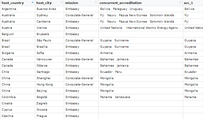
Some countries have more than one type of mission, so I want to count each type of mission for each country and create a new variable with the distinct() and pivot_wider() functions
Click here to read more about turning long to wide format data
With the across() function we can replace all numeric variables with NA to zeros
Click here to read more about the across() function
ire_emb %>%
  group_by(host_country, mission) %>%
  mutate(number_missions = n())  %>%
  distinct(host_country, mission, .keep_all = TRUE) %>%
  ungroup() %>%
  pivot_wider(!c(host_city, concurrent_accreditation:count_accreditation),
              names_from = mission,
              values_from = number_missions) %>%
  janitor::clean_names() %>%
  mutate(across(where(is.numeric), ~ replace_na(., 0))) %>%
  select(!host_country) -> ire_wide
Before we bind the two datasets together, we need to only have one row for each country.
ire_emb %>%
  distinct(host_country, .keep_all = TRUE) -> ire_dist
And bind them together:
ire_full <- cbind(ire_dist, ire_wide) 
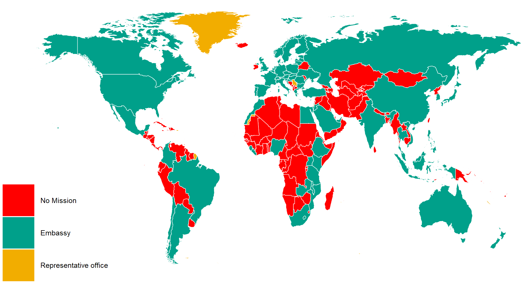
We can graph out where the embassies are with the geom_polygon() in ggplot
First we download the map data from dplyr and add correlates of war codes so we can easily join the datasets together with right_join()
First, we add correlates of war codes
Click here to read more about the countrycode package
ire_full %<>%
    mutate(cown = countrycode(host_country, "country.name", "cown"))
world_map <- map_data("world")
world_map %<>%
mutate(cown = countrycode::countrycode(region, "country.name", "cown"))I reorder the variables with the fct_relevel() function from the forcats package. This is just so they can better match the color palette from wesanderson package. Green means embassy, red for no mission and orange for representative office.
ire_full %>%
  right_join(world_map, by = "cown") %>%
  filter(region != "Antarctica") %>%
  mutate(mission = ifelse(is.na(mission), replace_na("No Mission"), mission)) %>%
  mutate(mission = forcats::fct_relevel(mission,c("No Mission", "Embassy","Representative office"))) %>%
  ggplot(aes(x = long, y = lat, group = group)) +
  geom_polygon(aes(fill = mission), color = "white", size = 0.5)  -> ire_map
And we can change how the map looks with the ggthemes package and colors from wesanderson package
  ire_map + ggthemes::theme_map() +
  theme(legend.key.size = unit(3, "cm"),
        text = element_text(size = 30),
        legend.title = element_blank()) +
  scale_fill_manual(values = wes_palette("Darjeeling1", n = 4))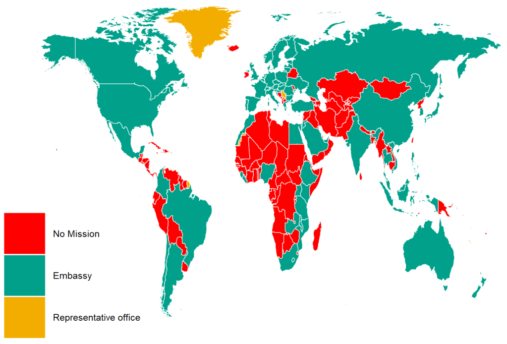
And we can count how many missions there are in each country
US has the hightest number with 8 offices, followed by UK with 4 and China with 3
ire_full %>%
  right_join(world_map, by = "cown") %>%
  filter(region != "Antarctica") %>%
  mutate(sum_missions = rowSums(across(embassy:representative_office))) %>%
  mutate(sum_missions = replace_na(sum_missions, 0)) %>%
  ggplot(aes(x = long, y = lat, group = group)) +
  geom_polygon(aes(fill = as.factor(sum_missions)), color = "white", size = 0.5)  +
  ggthemes::theme_map() +
  theme(legend.key.size = unit(3, "cm"),
        text = element_text(size = 30),
        legend.title = element_blank()) +
scale_fill_brewer(palette = "RdBu") +
  ggtitle("Number of Irish missions in each country",
          subtitle = "Source: Wikipedia")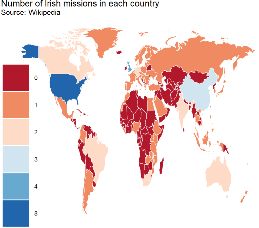
Last we can count the number of accredited countries that each embassy has. Nigeria has the most, in charge of 10 other countries across northern and central Africa.
ire_full %>%
  right_join(world_map, by = "cown") %>%
  filter(region != "Antarctica") %>%
  mutate(count_accreditation = str_count(concurrent_accreditation, pattern = "\n")) %>%
  mutate(count_accreditation = replace_na(count_accreditation, -1)) %>%
  ggplot(aes(x = long, y = lat, group = group)) +
  geom_polygon(aes(fill = as.factor(count_accreditation)), color = "white", size = 0.5)  +
  ggthemes::theme_fivethirtyeight() +
  theme(legend.key.size = unit(1, "cm"),
        text = element_text(size = 30),
        legend.title = element_blank()) +
  ggtitle("Number of Irish missions in extra accreditations",
          subtitle = "Source: Wikipedia")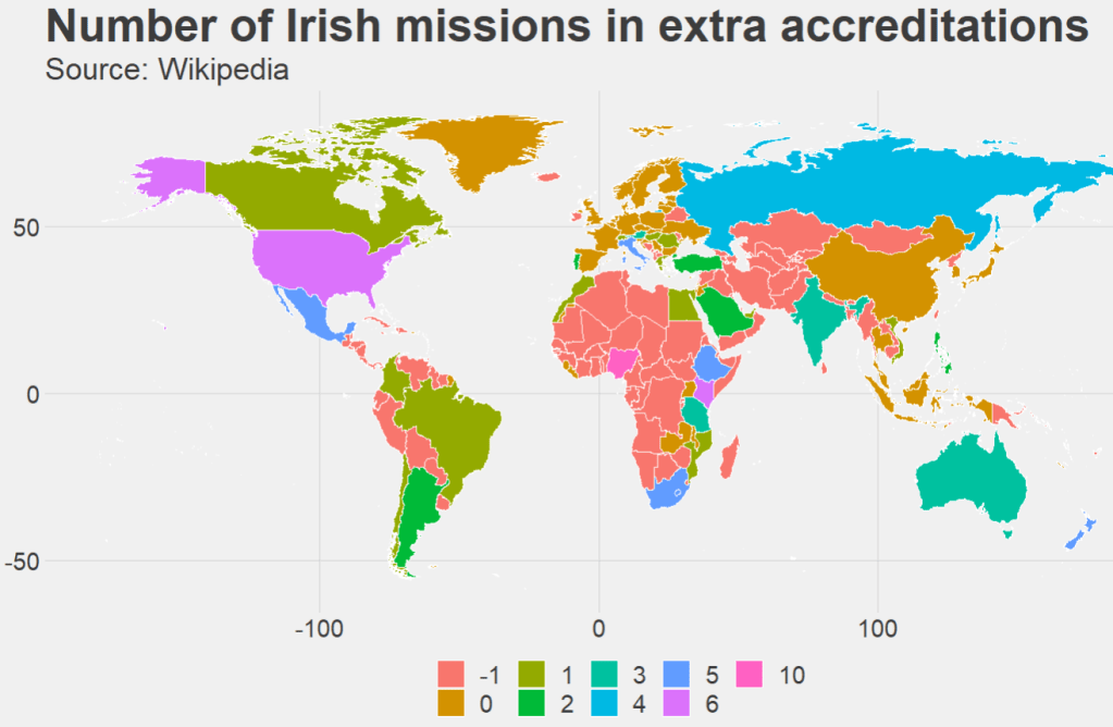


