Without examining interaction effects in your model, sometimes we are incorrect about the real relationship between variables.
This is particularly evident in political science when we consider, for example, the impact of regime type on the relationship between our dependent and independent variables. The nature of the government can really impact our analysis.
For example, I were to look at the relationship between anti-government protests and executive bribery.
I would expect to see that the higher the bribery score in a country’s government, the higher prevalence of people protesting against this corrupt authority. Basically, people are angry when their government is corrupt. And they make sure they make this very clear to them by protesting on the streets.
First, I will describe the variables I use and their data type.
With the dependent variable democracy_protest being an interval score, based upon the question: In this year, how frequent and large have events of mass mobilization for pro-democratic aims been?
The main independent variable is another interval score on executive_bribery scale and is based upon the question: How clean is the executive (the head of government, and cabinet ministers), and their agents from bribery (granting favors in exchange for bribes, kickbacks, or other material inducements?)
Higher scores indicate cleaner governing executives.
So, let’s run a quick regression to examine this relationship:
summary(protest_model <- lm(democracy_protest ~ executive_bribery, data = data_2010))Examining the results of the regression model:
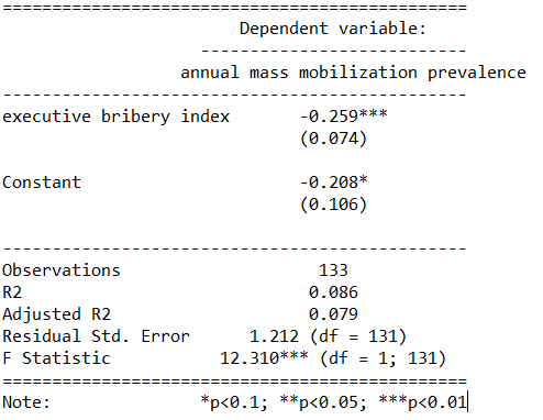
We see that there is indeed a negative relationship. The cleaner the government, the less likely people in the country will protest in the year under examination. This confirms our above mentioned hypothesis.
However, examining the R2, we see that less than 1% of the variance in protest prevalence is explained by executive bribery scores.
Not very promising.
Is there an interaction effect with regime type? We can look at a scatterplot and see if the different regime type categories cluster in distinct patterns.
The four regime type categories are
- purple: liberal democracy (such as Sweden or Canada)
- teal: electoral democracy (such as Turkey or Mongolia)
- khaki green: electoral autocracy (such as Georgia or Ethiopia)
- red: closed autocracy (such as Cuba or China)

The color clusters indicate regime type categories do cluster.
- Liberal democracies (purple) cluster at the top left hand corner. Higher scores in clean executive index and lower prevalence in pro-democracy protesting.
- Electoral autocracies (teal) cluster in the middle.
- Electoral democracies (khaki green) cluster at the bottom of the graph.
- The closed autocracy countries (red) seem to have a upward trend, opposite to the overall best fitted line.
So let’s examine the interaction effect between regime types and executive corruption with mass pro-democracy protests.
Plot the model and add the * interaction effect:
summary(protest_model_2 <-lm(democracy_protest ~ executive_bribery*regime_type, data = data_2010))
Adding the regime type variable, the R2 shoots up to 27%.
The interaction effect appears to only be significant between clean executive scores and liberal democracies. The cleaner the country’s executive, the prevalence of mass mobilization and protests decreases by -0.98 and this is a statistically significant relationship.
The initial relationship we saw in the first model, the simple relationship between clean executive scores and protests, has disappeared. There appears to be no relationship between bribery and protests in the semi-autocratic countries; (those countries that are not quite democratic but not quite fully despotic).
Let’s graph out these interactions.
In the plot_model() function, first type the name of the model we fitted above, protest_model.
Next, choose the type . For different type arguments, scroll to the bottom of this blog post. We use the type = "pred" argument, which plots the marginal effects.
Marginal effects tells us how a dependent variable changes when a specific independent variable changes, if other covariates are held constant. The two terms typed here are the two variables we added to the model with the * interaction term.
install.packages("sjPlot")
library(sjPlot)

plot_model(protest_model, type = "pred", terms = c("executive_bribery", "regime_type"), title = 'Predicted values of Mass Mobilization Index',

 legend.title = "Regime type")
Looking at the graph, we can see that the relationship changes across regime type. For liberal democracies (purple), there is a negative relationship. Low scores on the clean executive index are related to high prevalence of protests. So, we could say that when people in democracies see corrupt actions, they are more likely to protest against them.
However with closed autocracies (red) there is the opposite trend. Very corrupt countries in closed autocracies appear to not have high levels of protests.
This would make sense from a theoretical perspective: even if you want to protest in a very corrupt country, the risk to your safety or livelihood is often too high and you don’t bother. Also the media is probably not free so you may not even be aware of the extent of government corruption.
It seems that when there are no democratic features available to the people (free media, freedom of assembly, active civil societies, or strong civil rights protections, freedom of expression et cetera) the barriers to protesting are too high. However, as the corruption index improves and executives are seen as “cleaner”, these democratic features may be more accessible to them.
If we only looked at the relationship between the two variables and ignore this important interaction effects, we would incorrectly say that as
Of course, panel data would be better to help separate any potential causation from the correlations we can see in the above graphs.
The blue line is almost vertical. This matches with the regression model which found the coefficient in electoral autocracy is 0.001. Virtually non-existent.
Different Plot Types
type = "std" – Plots standardized estimates.
type = "std2" – Plots standardized estimates, however, standardization follows Gelman’s (2008) suggestion, rescaling the estimates by dividing them by two standard deviations instead of just one. Resulting coefficients are then directly comparable for untransformed binary predictors.
type = "pred" – Plots estimated marginal means (or marginal effects). Simply wraps ggpredict.
type = "eff"– Plots estimated marginal means (or marginal effects). Simply wraps ggeffect.
type = "slope" and type = "resid" – Simple diagnostic-plots, where a linear model for each single predictor is plotted against the response variable, or the model’s residuals. Additionally, a loess-smoothed line is added to the plot. The main purpose of these plots is to check whether the relationship between outcome (or residuals) and a predictor is roughly linear or not. Since the plots are based on a simple linear regression with only one model predictor at the moment, the slopes (i.e. coefficients) may differ from the coefficients of the complete model.
type = "diag" – For Stan-models, plots the prior versus posterior samples. For linear (mixed) models, plots for multicollinearity-check (Variance Inflation Factors), QQ-plots, checks for normal distribution of residuals and homoscedasticity (constant variance of residuals) are shown. For generalized linear mixed models, returns the QQ-plot for random effects.
