Add rectangular flags to graphs with ggimage package in R

This quick function can add rectangular flags to graphs.

Click here to add circular flags with the ggflags package.

Latina GIF by Latinx Heritage Month - Find & Share on GIPHY

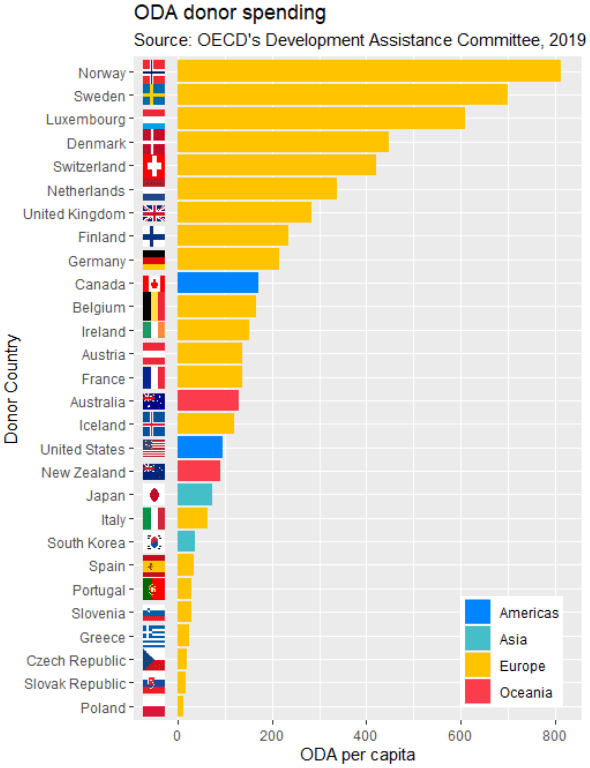
The data comes from a Wikipedia table on a recent report by OECD’s Overseas Development Aid (ODA) from donor countries in 2019.

Click here to read about scraping tables from Wikipedia with the rvest package in R.

library(countrycode)
library(ggimage)

In order to use the geom_flag() function, we need a country’s two-digit ISO code (For example, Ireland is IE!)

To add the ISO code, we can use the countrycode() function. Click here to read about a quick blog about the countrycode() function.

In one function we can quickly add a new variable that converts the country name in our dataset into to ISO codes.

oda$iso2 <- countrycode(oda$donor, "country.name", "iso2c")

Also we can use the countrycode() function to add a continent variable. We will use that to fill the colors of our bars in the graph.

oda$continent <- countrycode(oda$iso2, "iso2c", "continent")

We can now add the the geom_flag() function to the graph. The y = -50 prevents the flags overlapping with the bars and places them beside their name label. The image argument takes the iso2 variable.

Quick tip: with the reorder argument, if we wanted descending order (rather than ascending order of ODA amounts, we would put a minus sign in front of the oda_per_capita in the reorder() function for the x axis value.

oda_bar <- oda %>% 
  ggplot(aes(x = reorder(donor, oda_per_capita), y = oda_per_capita, fill = continent)) + 
  geom_flag(y = -50, aes(image = iso2))  +
       geom_bar(stat = "identity") + 
       labs(title = "ODA donor spending ",
                   subtitle = "Source: OECD's Development Assistance Committee, 2019 ",
                   x = "Donor Country",
                   y = "ODA per capita")

The fill argument categorises the continents of the ODA donors. Sometimes I take my hex colors from https://www.color-hex.com/ website.

my_palette <- c("Americas" = "#0084ff", "Asia" = "#44bec7", "Europe" = "#ffc300", "Oceania" = "#fa3c4c")

Last we print out the bar graph. The expand_limits() function moves the graph to fit the flags to the left of the y-axis.

Seth Meyers Omg GIF by Late Night with Seth Meyers - Find & Share on GIPHY
oda_bar +
  coord_flip() +
  expand_limits(y = -50) + scale_fill_manual(values = my_palette)
Advertisement

Download WorldBank data with WDI package in R

Packages we will need:

library(WDI)
library(tidyverse)
library(magrittr) # for pipes
library(ggthemes)
library(rnaturalearth)
 # to create maps
library(viridis) # for pretty colors

We will use this package to really quickly access all the indicators from the World Bank website.

Below is a screenshot of the World Bank’s data page where you can search through all the data with nice maps and information about their sources, their available years and the unit of measurement et cetera.

You can look at the World Bank website and browse all the indicators available.

In R when we download the WDI package, we can download the datasets directly into our environment.

With the WDIsearch() function we can look for the World Bank indicator.

For this blog, we want to map out how dependent countries are on oil. We will download the dataset that measures oil rents as a percentage of a country’s GDP.

WDIsearch('oil rent')

The output is:

indicator             name 
"NY.GDP.PETR.RT.ZS"   "Oil rents (% of GDP)"

Copy the indicator string and paste it into the WDI() function. The country codes are the iso2 codes, which you can input as many as you want in the c().

If you want all countries that the World Bank has, do not add country argument.

We can compare Iran and Saudi Arabian oil rents from 1970 until the most recent value.

data = WDI(indicator='NY.GDP.PETR.RT.ZS', country=c('IR', 'SA'), start=1970, end=2019)

And graph out the output. All only takes a few steps.

my_palette = c("#DA0000", "#239f40")
 #both the hex colors are from the maps of the countries

oil_graph <- ggplot(oil_data, aes(year, NY.GDP.PETR.RT.ZS, color =  country)) + 
  geom_line(size = 1.4) +
  labs(title = "Oil rents as a percentage of GDP",
       subtitle = "In Iran and Saudi Arabia from 1970 to 2019",
       x = "Year",
       y = "Average oil rent as percentage of GDP",
       color = " ") +
  scale_color_manual(values = my_palette)

oil_graph + 
ggthemes::theme_fivethirtyeight() + 
theme(
plot.title = element_text(size = 30), 
      axis.title.y = element_text(size = 20),
      axis.title.x = element_text(size = 20))

For some reason the World Bank does not have data for Iran for most of the early 1990s. But I would imagine that they broadly follow the trends in Saudi Arabia.

I added the flags myself manually after I got frustrated with geom_flag() . It is something I will need to figure out for a future blog post!

It is really something that in the late 1970s, oil accounted for over 80% of all Saudi Arabia’s Gross Domestic Product.

Now we see both countries rely on a far smaller percentage. Due both to the fact that oil prices are volatile, climate change is a new constant threat and resource exhaustion is on the horizon, both countries have adjusted policies in attempts to diversify their sources of income.

Next we can use the World Bank data to create maps and compare regions on any World Bank scores.

We will compare all Asian and Middle Eastern countries with regard to all natural rents (not just oil) as a percentage of their GDP.

So, first we create a map with the rnaturalearth package. Click here to read a previous tutorial about all the features of this package.

I will choose only the geographical continent of Asia, which covers the majority of Middle East also.

asia_map <- ne_countries(scale = "medium", continent = 'Asia', returnclass = "sf")

Then, once again we use the WDI() function to download our World Bank data.

nat_rents = WDI(indicator='NY.GDP.TOTL.RT.ZS', start=2016, end=2018)

Next I’ll merge the with the asia_map object I created.

asia_rents <- merge(asia_map, nat_rents, by.x = "iso_a2", by.y = "iso2c", all = TRUE)

We only want the value from one year, so we can subset the dataset

map_2017 <- asia_rents [which(asia_rents$year == 2017),]

And finally, graph out the data:

nat_rent_graph <- ggplot(data = map_2017) +
  geom_sf(aes(fill = NY.GDP.TOTL.RT.ZS), 
          position = "identity") + 
  labs(fill ='Natural Resource Rents as % GDP') +
  scale_fill_viridis_c(option = "viridis")

nat_rent_graph + theme_map()