The loess method in ggplot2 fits a smoothing line to our data.
We can do this with the method = "loess" in the geom_smooth() layer.
LOESS stands “Locally Weighted Scatterplot Smoothing.” (I am not sure why it is not called LOWESS … ?)
The loess line can help show non-linear relationships in the scatterplot data, while taking care of stopping the over-influence of outliers.
Loess gives more weight to nearby data points and less weight to distant ones. This means that nearby points have a greater influence on the squiggly-ness of the line.
The degree of smoothing is controlled by the span parameter in the geom_smooth() layer.
When we set the span, we can choose how many nearby data points are considered when estimating the local regression line.
A smaller span (e.g. span = 0.5) results in more local (flexible) smoothing, while a larger span (e.g. span = 1.5) produces more global (smooth) smoothing.
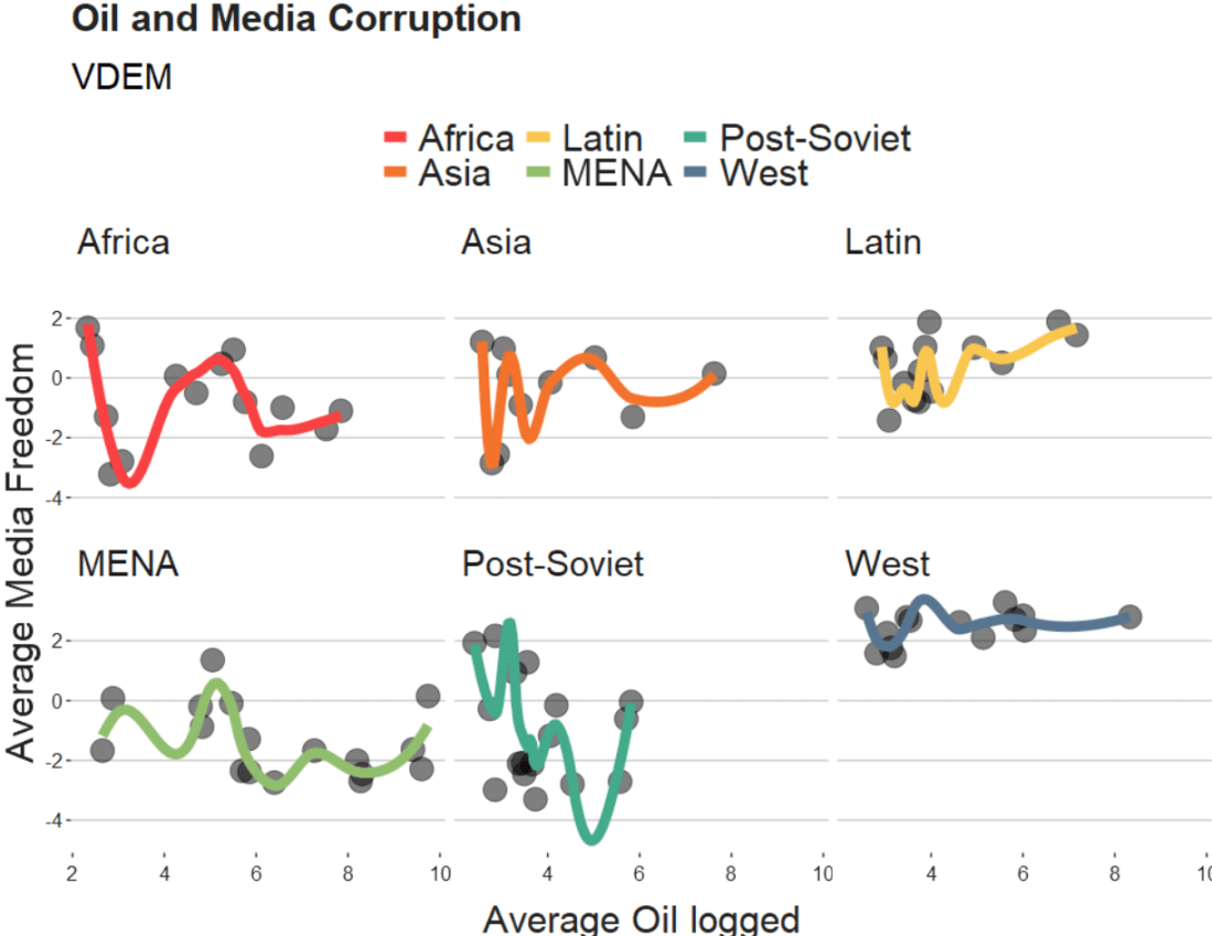
We will take the variables from the Varieties of Democracy dataset and plot the relationship between oil produciton and media freedoms across different regions.
df %>%
  ggplot(aes(x = log_avg_oil,
             y = avg_media)) +
  geom_point(size = 6, alpha = 0.5) +
  geom_smooth(aes(color = region),
              method = "loess",
              span = 2,
              se = FALSE,
              size = 3,
              alpha = 0.6) +
  facet_wrap(~region) +
  labs(title = "Oil and Media Corruption", subtitle = "VDEM",
       x = "Average Oil logged",
       y = "Average Media Freedom") +
  scale_color_manual(values = my_pal) +
  my_theme()
If we change the span to 0.5, we get the following graph:
span = 0.5
When examining the connection between oil production and media freedoms across various regions, there are many ways to draw the line.
If we think the relationship is linear, it is no problem to add method = "lm" to the graph.
However, if outliers might overly distort the linear relationship, method = "rlm" (robust linear model” can help to take away the power from these outliers.
Linear and robust linear models (lm and rlm) can also accommodate parametric non-linear relationships, such as quadratic or cubic, when used with a proper formula specification.
For example, “geom_smooth(method=’lm’, formula = y ~ x + I(x^2))” can be used for estimating a quadratic relationship using lm.
If the outcome variable is binary (such as “is democracy” versus “is not democracy” or “is oil producing” versus “is not oil producing”) we can use method = “glm” (which is generalised linear model). It models the log odds of a oil producing as a linear function of a predictor variable, like age.
If the relationship between age and log odds is non-linear, the gam method is preferred over glm. Both glm and gam can handle outcome variables with more than two categories, count variables, and other complexities.
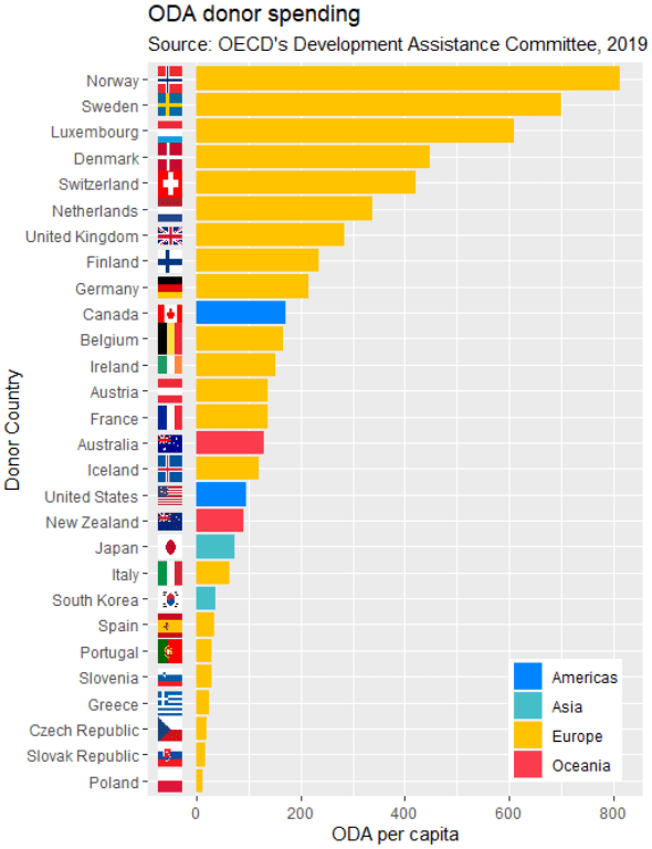
We can now add the the geom_flag() function to the graph. The y = -50 prevents the flags overlapping with the bars and places them beside their name label. The image argument takes the iso2 variable.
Quick tip: with the reorder argument, if we wanted descending order (rather than ascending order of ODA amounts, we would put a minus sign in front of the oda_per_capita in the reorder() function for the x axis value.
oda_bar <- oda %>%
  ggplot(aes(x = reorder(donor, oda_per_capita), y = oda_per_capita, fill = continent)) +
  geom_flag(y = -50, aes(image = iso2))  +
       geom_bar(stat = "identity") +
       labs(title = "ODA donor spending ",
                   subtitle = "Source: OECD's Development Assistance Committee, 2019 ",
                   x = "Donor Country",
                   y = "ODA per capita")
The fill argument categorises the continents of the ODA donors. Sometimes I take my hex colors from https://www.color-hex.com/ website.
We can all agree that Wikipedia is often our go-to site when we want to get information quick. When we’re doing IR or Poli Sci reesarch, Wikipedia will most likely have the most up-to-date data compared to other databases on the web that can quickly become out of date.
So in R, we can scrape a table from Wikipedia and turn into a database with the rvest package .
First, we copy and paste the Wikipedia page we want to scrape into the read_html() function as a string:
Next we save all the tables on the Wikipedia page as a list. Turn the header = TRUE.
nato_tables <- nato_members %>% html_table(header = TRUE, fill = TRUE)
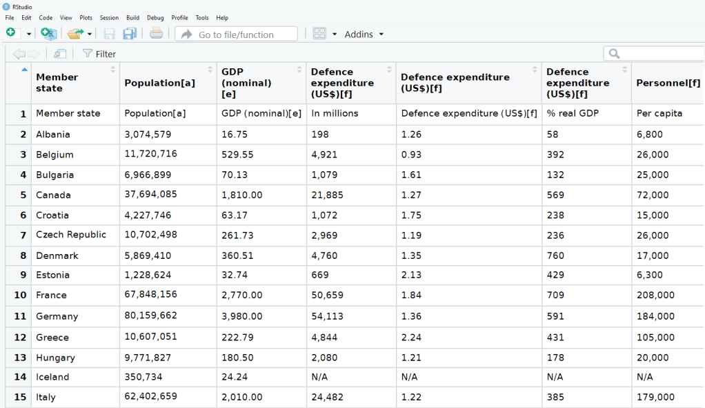
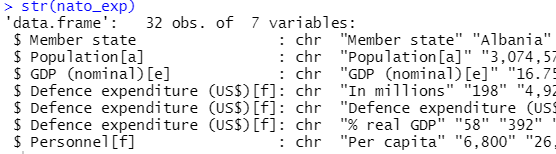
The table that I want is the third table on the page, so use [[two brackets]] to access the third list.
nato_exp <- nato_tables[[3]]
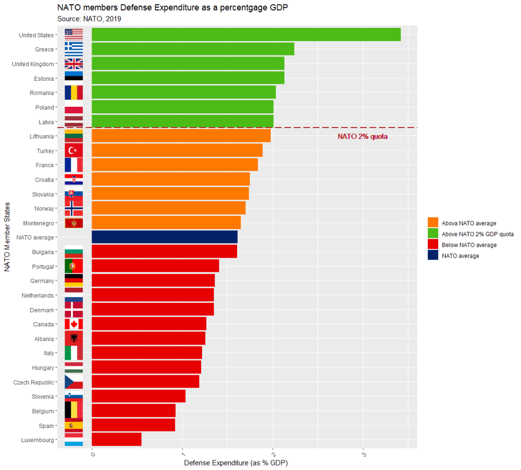
The dataset is not perfect, but it is handy to have access to data this up-to-date. It comes from the most recent NATO report, published in 2019.
Some problems we will have to fix.
The first row is a messy replication of the header / more information across two cells in Wikipedia.
The headers are long and convoluted.
There are a few values in as N/A in the dataset, which R thinks is a string.
All the numbers have commas, so R thinks all the numeric values are all strings.
There are a few NA values that I would not want to impute because they are probably zero. Iceland has no armed forces and manages only a small coast guard. North Macedonia joined NATO in March 2020, so it doesn’t have all the data completely.
So first, let’s do some quick data cleaning:
Clean the variable names to remove symbols and adds underscores with a function from the janitor package
Next turn all the N/A value strings to NULL. The na_strings object we create can be used with other instances of pesky missing data varieties, other than just N/A string.
Remove all the commas from the number columns and convert the character strings to numeric values with a quick function we apply to all numeric columns in the data.frame.
Next, we can calculate the average NATO score of all the countries (excluding the member_state variable, which is a character string).
We’ll exclude the NATO total column (as it is not a member_state but an aggregate of them all) and the data about Iceland and North Macedonia, which have missing values.
library(WDI)
library(tidyverse)
library(magrittr) # for pipes
library(ggthemes)
library(rnaturalearth)
 # to create maps
library(viridis) # for pretty colors
We will use this package to really quickly access all the indicators from the World Bank website.
Below is a screenshot of the World Bank’s data page where you can search through all the data with nice maps and information about their sources, their available years and the unit of measurement et cetera.
In R when we download the WDI package, we can download the datasets directly into our environment.
With the WDIsearch() function we can look for the World Bank indicator.
For this blog, we want to map out how dependent countries are on oil. We will download the dataset that measures oil rents as a percentage of a country’s GDP.
WDIsearch('oil rent')
The output is:
indicator             name
"NY.GDP.PETR.RT.ZS"   "Oil rents (% of GDP)"
Copy the indicator string and paste it into the WDI() function. The country codes are the iso2 codes, which you can input as many as you want in the c().
If you want all countries that the World Bank has, do not add country argument.
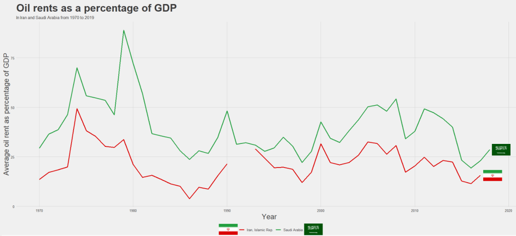
We can compare Iran and Saudi Arabian oil rents from 1970 until the most recent value.
data = WDI(indicator='NY.GDP.PETR.RT.ZS', country=c('IR', 'SA'), start=1970, end=2019)
And graph out the output. All only takes a few steps.
my_palette = c("#DA0000", "#239f40")
 #both the hex colors are from the maps of the countries

oil_graph <- ggplot(oil_data, aes(year, NY.GDP.PETR.RT.ZS, color =  country)) +
  geom_line(size = 1.4) +
  labs(title = "Oil rents as a percentage of GDP",
       subtitle = "In Iran and Saudi Arabia from 1970 to 2019",
       x = "Year",
       y = "Average oil rent as percentage of GDP",
       color = " ") +
  scale_color_manual(values = my_palette)

oil_graph +
ggthemes::theme_fivethirtyeight() +
theme(
plot.title = element_text(size = 30),
      axis.title.y = element_text(size = 20),
      axis.title.x = element_text(size = 20))
For some reason the World Bank does not have data for Iran for most of the early 1990s. But I would imagine that they broadly follow the trends in Saudi Arabia.
I added the flags myself manually after I got frustrated with geom_flag() . It is something I will need to figure out for a future blog post!
It is really something that in the late 1970s, oil accounted for over 80% of all Saudi Arabia’s Gross Domestic Product.
Now we see both countries rely on a far smaller percentage. Due both to the fact that oil prices are volatile, climate change is a new constant threat and resource exhaustion is on the horizon, both countries have adjusted policies in attempts to diversify their sources of income.
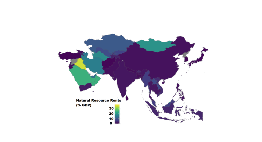
Next we can use the World Bank data to create maps and compare regions on any World Bank scores.
We will compare all Asian and Middle Eastern countries with regard to all natural rents (not just oil) as a percentage of their GDP.
What is a shiny app, you ask? Click to look at a quick Youtube explainer. It’s basically a handy GUI for R.
When we feed a panel data.frame into the ExPanD() function, a new screen pops up from R IDE (in my case, RStudio) and we can interactively toggle with various options and settings to run a bunch of statistical and visualisation analyses.
Click here to see how to convert your data.frame to pdata.frame object with the plm package.
Be careful your pdata.frame is not too large with too many variables in the mix. This will make ExPanD upset enough to crash. Which, of course, I learned the hard way.
Also I don’t know why there are random capitalizations in the PaCkaGe name. Whenever I read it, I think of that Sponge Bob meme.
If anyone knows why they capitalised the package this way. please let me know!
So to open up the new window, we just need to feed the pdata.frame into the function:
ExPanD(mil_pdf)
For my computer, I got error messages for the graphing sections, because I had an old version of Cairo package. So to rectify this, I had to first install a source version of Cairo and restart my R session. Then, the error message gods were placated and they went away.
install.packages("Cairo", type="source")
Then press command + shift + F10 to restart R session
library(Cairo)
You may not have this problem, so just ignore if you have an up-to-date version of the necessary packages.
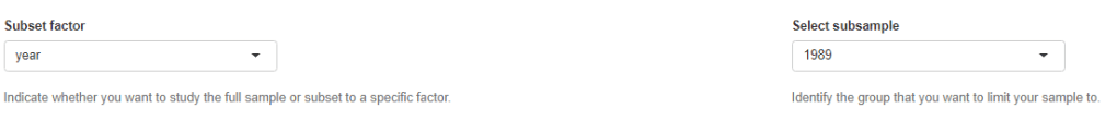
When the new window opens up, the first section allows you to filter subsections of the panel data.frame. Similar to the filter() argument in the dplyr package.
For example, I can look at just the year 1989:
But let’s look at the full sample
We can toggle with variables to look at mean scores for certain variables across different groups. For example, I look at physical integrity scores across regime types.
Purple plot: closed autocracy
Turquoise plot: electoral autocracy
Khaki plot: electoral democracy:
Peach plot: liberal democracy
The plots show that there is a high mean score for physical integrity scores for liberal democracies and less variance. However with the closed and electoral autocracies, the variance is greater.
We can look at a visualisation of the correlation matrix between the variables in the dataset.
Next we can look at a scatter plot, with option for loess smoother line, to graph the relationship between democracy score and physical integrity scores. Bigger dots indicate larger GDP level.
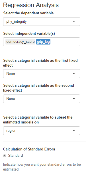
Last we can run regression analysis, and add different independent variables to the model.
We can add fixed effects.
And we can subset the model by groups.
The first column, the full sample is for all regions in the dataset.