rowwise(): This function is used to indicate that operations following it should be applied row by row instead of column by column (which is the default behavior in dplyr).
Within the mutate() function, sum(c_across(contains("totals_"))) computes the sum of all columns for each row that contain the pattern “totals_”.
The na.rm = TRUE argument is used to ignore NA values in the sum. c_across() is used to select columns within rowwise() context.
ungroup(): This function is used to remove the rowwise grouping imposed by rowwise(), returning the dataframe to a standard tbl_df.
Usually I forget to ungroup. Oops. But this is important for performance reasons and because most dplyr functions expect data not to be in a rowwise format.
Create a rowwise binary variable
data <- data %>%
  rowwise() %>%
  mutate(has_ruler = as.integer(any(c_across(starts_with("broad_cat_")) == "ruler"))) %>%
  ungroup()
How do people view the state of the economy in the past, present and future for the country and how they view their own economic situation?
Are they highly related concepts? In fact, are all these questions essentially asking about one thing: how optimistic or pessimistic a person is about the economy?
In this blog we will look at different ways to examine whether the questions answered in a survey are similiar to each other and whether they are capturing an underlying construct or operationalising a broader concept.
In our case, the underlying concept relates to levels of optimism about the economy.
We will use Afrobarometer survey responses in this blog post.
First off, we can run a Chronbach’s alpha to examine whether these variables are capturing an underlying construct.
Do survey respondents have an overall positive or overall negative view of the economy (past, present and future) and is it related to respondents’ views of their own economic condition?
The Cronbach’s alpha statistic is a measure of internal consistency reliability for a number of questions in a survey.
Chronbach’s alpha assesses how well the questions in the survey are correlated with each other.
We can interpret the test output and examine the extent to which they measure the same underlying construct – namely the view that people are more optimistic about the economy or not.
When we interpret the output, the main one is the Raw Alpha score.
raw_alpha:
The raw Cronbach’s alpha coefficient ranges from 0 to 1.
For us, the Chronbach’s Alpha is 0.66. Higher values indicate greater internal consistency among the items. So, our score is a bit crappy.
std.alpha:
Standardized Cronbach’s alpha, which adjusts the raw alpha based on the number of items and their intercorrelations. It is also 0.66 because we only have a handful of variables
G6(smc):
The Guttman’s Lambda 6 is alternative estimate of internal consistency that we can consider. For our economic construct, it is 0.62.
Click this link if you want to go into more detail to discuss the differences between the alpha and the Guttman’s Lambda.
For example, they argue that Guttman’s Lambda is sensitive to the factor structure of a test. It is influenced by the degree of “lumpiness” or correlation among the test items.
For tests with a high degree of intercorrelation among items, G6 can be greater than Cronbach’s Alpha (α), which is a more common measure of reliability. In contrast, for tests with items that have very low intercorrelation, G6 can be lower than α
average_r:
The average inter-item correlation, which shows the average correlation between each item and all other items in the scale.
For us, the correation is 0.33. Again, not great. We can examine the individual correlations later.
S/N:
The Signal-to-Noise ratio, which is a measure of the signal (true score variance) relative to the noise (error variance). A higher value indicates better reliability.
For us, it is 2. This is helpful when we are comparing to different permutations of variables.
ase:
The standard error of measurement, which provides an estimate of the error associated with the test scores. A lower score indicates better reliability.
In our case, it is 0.0026. Again, we can compare with different sets of variables if we add or take away questions from the survey.
mean:
The mean score on the scale is 2.7. This means that out of a possible score of 5 across all the questions on the economy, a respondent usually answers on average in the middle (near to the answer that the economy stays the same)
sd:
The standard deviation is 0.89.
median_r:
The median inter-item correlation between the median item and all other items in the economic optimism scale is 0.32.
Looking at the above eight scores, the most important is the Cronbach’s alpha of 0.66 . This only suggests a moderate level of internal consistency reliability for our four questions.
But there is still room for improvement in terms of internal consistency.
lower
alpha
upper
Feldt
0.66
0.66
0.67
Duhachek
0.66
0.66
0.67
Next we will look to see if we can improve the score and increase the Chronbach’s alpha.
Reliability if an item is dropped:
raw_alpha
std.alpha
G6(smc)
Avg_r
S/N
alpha se
var.r
med.r
Econ now
0.52
0.53
0.43
0.27
1.1
0.004
0.004
0.26
My econ
0.59
0.59
0.49
0.33
1.5
0.003
0.001
0.34
Econ past
0.61
0.61
0.53
0.34
1.5
0.003
0.025
0.29
Future
0.65
0.64
0.57
0.38
1.8
0.003
0.017
0.35
Again, we can focus on the raw Chronbach’s alpha score in the first column if that given variable is removed.
We see that if we cut out any one of the the questions, the score goes down.
We don’t want that, because that would decrease the internal consistency of our underlying “optimism about the economy” type construct.
Item
n
raw.r
std.r
r.cor
r.drop
mean
sd
Now
43,702
0.77
0.76
0.67
0.54
2.4
1.3
My econ
43,702
0.71
0.71
0.57
0.45
2.7
1.3
Past
43,702
0.67
0.69
0.52
0.43
2.5
1.1
Future
43,702
0.66
0.65
0.45
0.36
3.2
1.3
These item statistics provide insights into the characteristics of each individual variable
We will look at the first variable in more detail.
state_econ_now
raw.r: The raw correlation between this item and the total score is 0.77, indicating a strong positive relationship with the overall score.
std.r: The standardized correlation is 0.76, showing that this item contributes significantly to the total score’s variance.
r.cor: This is the corrected item-total correlation and is 0.67, suggesting that the item correlates well with the overall construct even after removing it from the total score.
r.drop: The corrected item-total correlation when the item is dropped is 0.54, indicating that the item still has a reasonable correlation even when not included in the total score.
mean: The average response for this item is 2.4.
sd: The standard deviation of responses for this item is 1.3.
Item
1
2
3
4
5
miss
state_econ_now
0.33
0.27
0.12
0.22
0.07
0
my_econ_now
0.23
0.26
0.17
0.27
0.06
0
state_econ_past
0.22
0.32
0.21
0.21
0.03
0
state_econ_future
0.15
0.17
0.16
0.39
0.13
0
Next we will lok at factor analysis.
Factor analysis can be divided into two main types:
exploratory
confirmatory
Exploratory factor analysis (EFA) is good when we want to check out initial psychometric properties of an unknown scale.
Confirmatory factor analysis borrows many of the same concepts from exploratory factor analysis.
However, instead of letting the data tell us the factor structure, we choose the factor structure beforehand and verify the psychometric structure of a previously developed scale.
For us, we are just exploring whether there is an underlying “optimism” about the economy or not.
For the EFA, we will run as Structural Equation Model with the sem() function from the lavaan package
efa_model <- sem(model, data = ab_econ, fixed.x = FALSE)
When we set fixed.x = FALSE, as in your example, it means we are estimating the factor loadings as part of the EFA model.
With fixed.x = FALSE, the factor loadings are allowed to vary freely and are estimated based on the data
This is typical in an exploratory factor analysis, where we are trying to understand the underlying structure of the data, and we let the factor loadings be determined by the analysis.
When we look at this, we evaluate the goodness of fit of the model.
In this case, the test statistic is 0.015, the degrees of freedom is 1, and the p-value is 0.903.
The high p-value (close to 1) suggests that the model fits the data well. Yay! (A non-significant p-value is generally a good sign for model fit).
Parameter Estimates:
The output provides parameter estimates for the latent variables and covariances between them.
The standardized factor loadings (Std.lv) and standardized factor loadings (Std.all) indicate how strongly each observed variable is associated with the latent factors.
For example, “state_econ_now” has a strong loading on “f1” with Std.lv = 1.098 and Std.all = 0.833.
Similarly, “state_econ_pst” and “state_econ_ftr” load on “f2” with different factor loadings.
Covariances:
The covariance between the two latent factors, “f1” and “f2,” is estimated as 0.529. This implies a relationship between the two factors.
Variances:
The estimated variances for the observed variables and latent factors. These variances help explain the amount of variability in each variable or factor.
For example, “state_econ_now” has a variance estimate of 0.530.
Factor Loadings:
High factor loadings (close to 1) suggest that the variables are capturing the same construct.
For our output, we can say that factor loadings of “state_econ_now” and “my_econ_now” on “f1” are relatively high, which indicates that these variables share a common underlying construct. This captures how the respondent thinks about the current economy
Similarly, “state_econ_past” and “state_econ_future” load highly on “f2.”
This means that comparing to different times is a different variable of interest.
Finally, we can run correlations to visualise the different variables:
Last we print out the correlation between the “state of the economy now” and “my economic condition now” variables for each of the 34 countries
 correlation_matrix_list <- list()
  for (country in country_vector) {
   correlation_matrix_list[[country]] <- correlation_matrices[[country]][2]}

 correlation_matrix_df %>%
   t %>%
  as.data.frame() %>%
  rownames_to_column(var = "country") %>%
  select(country, corr = V1) %>%
  arrange(desc(corr)) -> state_econ_my_econ_corr
Let’s look at the different levels of correlation between the respondents’ answers to how the COUNTRY’S economic situation is doing and how the respondent thinks THEIR OWN economic situation.
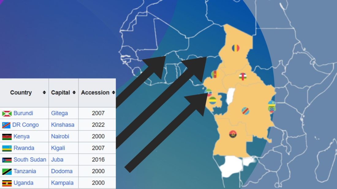
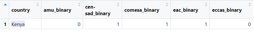
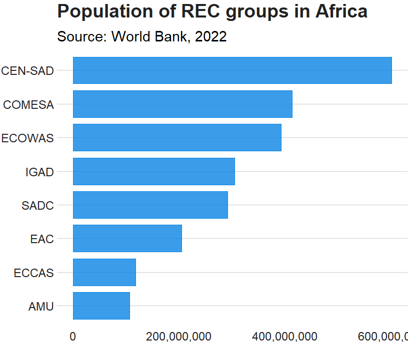
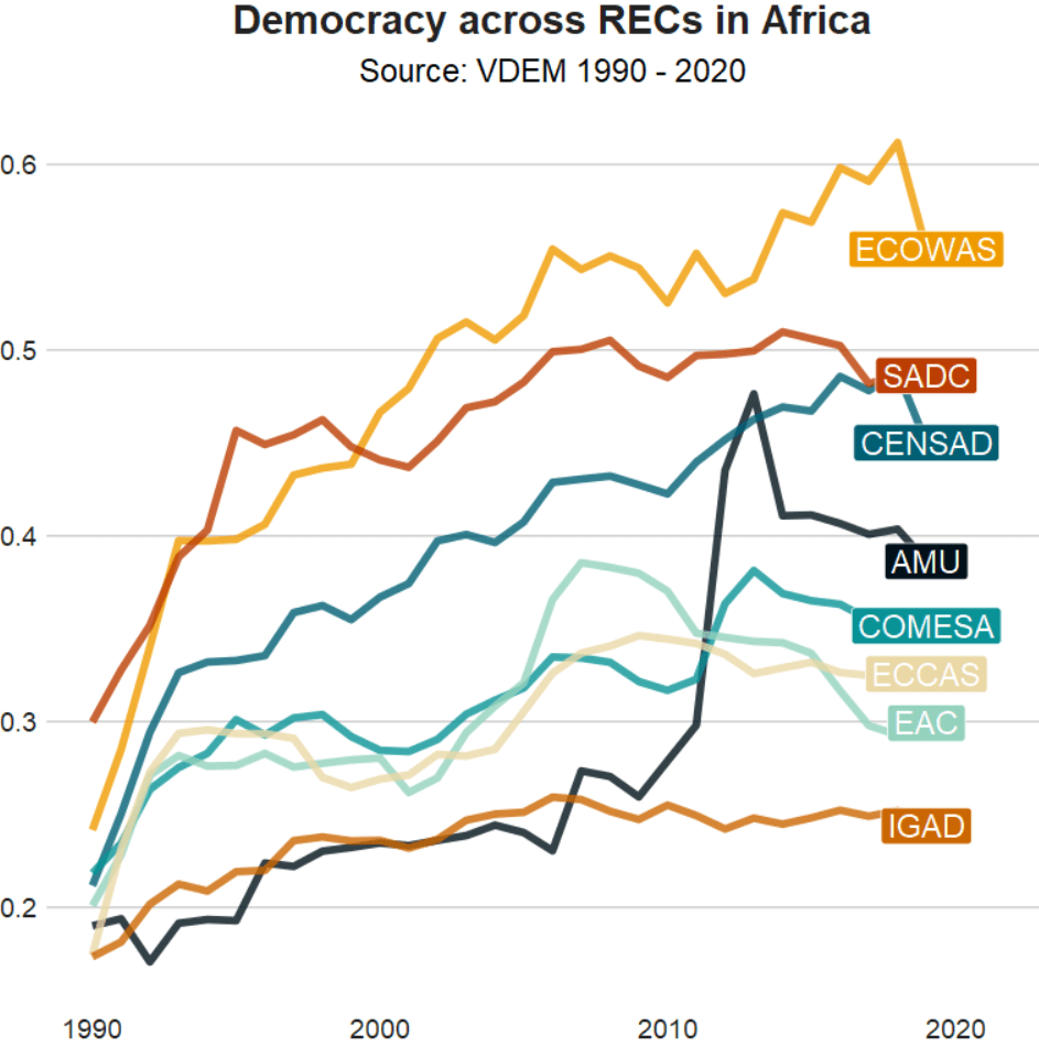
There are eight RECs in Africa. Some countries are only in one of the RECs, some are in many. Kenya is the winner with membership in four RECs: CEN-SAD, COMESA, EAC and IGAD.
In this blog, we will create a consolidated dataset for all 54 countries in Africa that are in a REC (or TWO or THREE or FOUR groups). Instead of a string variable for each group, we will create eight dummy group variables for each country.
To do this, we first make a vector of all the eight RECs.
We put the vector of patterns in a for-loop to create a new binary variable column for each REC group.
We use the str_detect(rec_abbrev, pattern)) to see if the rec_abbrev column MATCHES the one of the above strings in the patterns vector.
The new variable will equal 1 if the variable string matches the pattern in the vector. Otherwise it will be equal to 0.
The double exclamation marks (!!) are used for unquoting, allowing the value of var_name to be treated as a variable name rather than a character string.
Then, we are able to create a variable name that were fed in from the vector dynamically into the for-loop. We can automatically do this for each REC group.
In this case, the iterated !!var_name will be replaced with the value stored in the var_name (AMU, CEN-SAD etc).
We can use the := to assign a new variable to the data frame.
The symbol := is called the “walrus operator” and we use it make or change variables without using quotation marks.
for (pattern in patterns) {
  var_name <- paste0(pattern, "_binary")
  rec <- rec %>%
    mutate(!!var_name := as.integer(str_detect(rec_abbrev, pattern)))
}
This is the dataset now with a binary variables indicating whether or not a country is in any one of the REC groups.
However, we quickly see the headache.
We do not want four rows for Kenya in the dataset. Rather, we only want one entry for each country and a 1 or a 0 for each REC.
We use the following summarise() function to consolidate one row per country.
The first() function extracts the first value in the geo variable for each country. This first() function is typically used with group_by() and summarise() to get the value from the first row of each group.
We use the the across() function to select all columns in the dataset that end with "_binary".
The ~ as.integer(any(. == 1)) checks if there’s any value equal to 1 within the binary variables. If they have a value of 1, the summarised data for each country will be 1; otherwise, it will be 0.
The following code can summarise each filtered group and add them to a new dataset that we can graph:
The Organisation for Economic Co-operation and Development (OECD) provides analysis, and policy recommendations for 38 industrialised countries.
The 38 countries in the OECD are:
Australia
Austria
Belgium
Canada
Chile
Colombia
Czech Republic
Denmark
Estonia
Finland
France
Germany
Hungary
Iceland
Ireland
Israel
Italy
Japan
South Korea
Latvia
Lithuania
Luxembourg
Mexico
Netherland
New Zealand
Norway
Poland
Portugal
Slovakia
Slovenia
Spain
Sweden
Switzerland
Turkey
United Kingdom
United States
European Union
We can download the OCED data package directly from the github repository with install_github()
install_github("expersso/OECD")
library(OECD)
The most comprehensive tutorial for the package comes from this github page. Mostly, it gives a fair bit more information about filtering data
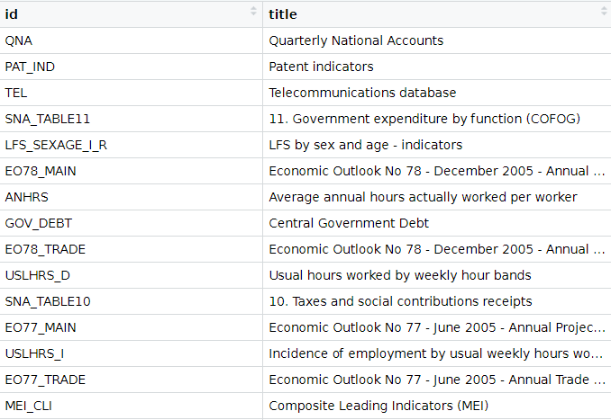
We can look at the all the datasets that we can download from the website via the package with the following get_datasets() function:
titles <- OECD::get_datasets()
This gives us a data.frame with the ID and title for all the OECD datasets we can download into the R console, as we can see below.
In total there are 1662 datasets that we can download.
These datasets all have different variable types, countries, year spans and measurement values. So it is important to check each dataset carefully when we download them.
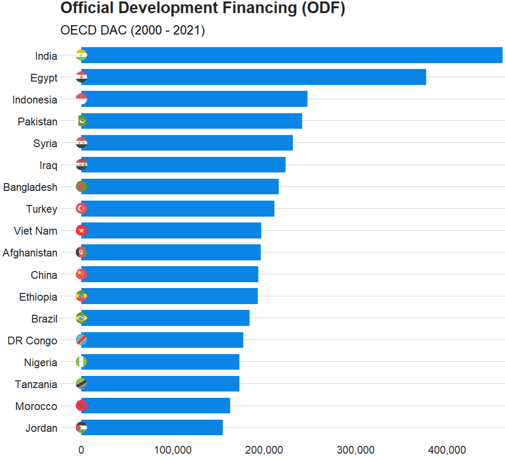
In this blog, we will graph out the Official Development Financing (ODF) for each country.
Official Development Financing measures the sum of RECEIVED (NOT DONATED) aid such as:
bilateral ODA aid
concessional and non-concessional resources from multilateral sources
bilateral other official flows made available for reasons unrelated to trade
Before we can charge into downloading any dataset, it is best to check out the variables it has. We can do that with the get_data_structure() function:
This blogpost will walk through how to scrape and clean up data for all the members of parliament in Ireland.
Or we call them in Irish, TDs (or Teachtaí Dála) of the Dáil.
We will start by scraping the Wikipedia pages with all the tables. These tables have information about the name, party and constituency of each TD.
On Wikipedia, these datasets are on different webpages.
This is a pain.
However, we can get around this by creating a list of strings for each number in ordinal form – from1st to 33rd. (because there have been 33 Dáil sessions as of January 2023)
We don’t need to write them all out manually: “1st”, “2nd”, “3rd” … etc.
Instead, we can do this with the toOrdinal() function from the package of the same name.
dail_sessions <- sapply(1:33,toOrdinal)
Next we can feed this vector of strings with the beginning of the HTML web address for Wikipedia as a string.
We paste the HTML string and the ordinal number strings together with the stri_paste() function from the stringi package.
This iterates over the length of the dail_sessions vector (in this case a length of 33) and creates a vector of each Wikipedia page URL.
With the first_name variable, we can use the new pacakge by Kalimu. This guesses the gender of the name. Later, we can track the number of women have been voted into the Dail over the years.
Of course, this will not be CLOSE to 100% correct … so later we will have to check each person manually and make sure they are accurate.
In the next blog, we will graph out the various images to explore these data in more depth. For example, we can make a circle plot with the composition of the current Dail with the ggparliament package.
We can go into more depth with it in the next blog… Stay tuned.
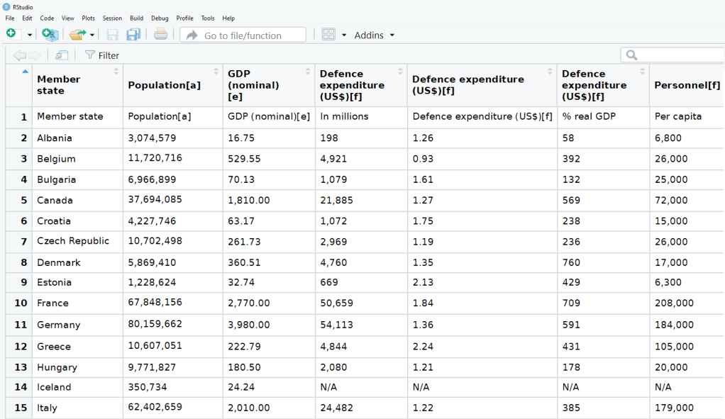
In this post, we are going to scrape NATO accession data from Wikipedia and turn it into panel data. This means turning a list of every NATO country and their accession date into a time-series, cross-sectional dataset with information about whether or not a country is a member of NATO in any given year.
This is helpful for political science analysis because simply a dummy variable indicating whether or not a country is in NATO would lose information about the date they joined. The UK joined NATO in 1948 but North Macedonia only joined in 2020. A simple binary variable would not tell us this if we added it to our panel data.
We will first scrape a table from the Wikipedia page on NATO member states with a few functions form the rvest pacakage.
Our dataset now has 60 observations. We see Albania joined in 2009 and is still a member in 2020, for example.
Next we will use the complete() function from the tidyr package to fill all the dates in between 1948 until 2020 in the dataset. This will increase our dataset to 2,160 observations and a row for each country each year.
Nect we will group the dataset by country and fill the nato_member status variable down until the most recent year.
epr_indo <- read_csv('/mnt/data/epr_indo.csv')

# Expand the data to have a row for each year for each group
epr_indo_expanded <- epr_indo %>%
  rowwise() %>%
  mutate(year = list(seq(from, to))) %>%
  unnest(year) %>%
  select(-from, -to)

# Pivot the data to wide format with separate ethnicity, share, and broad_cat columns
epr_indo_wide <- epr_indo_expanded %>%
  group_by(statename, year) %>%
  mutate(index = row_number()) %>%
  ungroup() %>%
  pivot_wider(
    id_cols = c(statename, year),
    names_from = index,
    values_from = c(group, size, broad_cat),
    names_sep = "_"
  ) %>%
  # Renaming the columns for ethnicity, share, and broad category
  rename_with(~ str_replace(., "group_", "ethnicity_"), starts_with("group_")) %>%
  rename_with(~ str_replace(., "size_", "share_"), starts_with("size_")) %>%
  rename_with(~ str_replace(., "broad_cat_", "broad_cat_"), starts_with("broad_cat_"))
library(tidyverse)      # of course
library(ggridges)       # density plots
library(GGally)         # correlation matrics
library(stargazer)      # tables
library(knitr)          # more tables stuff
library(kableExtra)     # more and more tables
library(ggrepel)        # spread out labels
library(ggstream)       # streamplots
library(bbplot)         # pretty themes
library(ggthemes)       # more pretty themes
library(ggside)         # stack plots side by side
library(forcats)        # reorder factor levels
Before jumping into any inferentional statistical analysis, it is helpful for us to get to know our data.
That always means plotting and visualising the data and looking at the spread, the mean, distribution and outliers in the dataset.
Before we plot anything, a simple package that creates tables in the stargazer package. We can examine descriptive statistics of the variables in one table.
Click here to read this practically exhaustive cheat sheet for the stargazer package by Jake Russ. I refer to it at least once a week. Thank you, Jack.
I want to summarise a few of the stats, so I write into the summary.stat() argument the number of observations, the mean, median and standard deviation.
The kbl() and kable_classic() will change the look of the table in R (or if you want to copy and paste the code into latex with the type = "latex" argument).
In HTML, they do not appear.
To find out more about the knitr kable tables, click here to read the cheatsheet by Hao Zhu.
Choose the variables you want, put them into a data.frame and feed them into the stargazer() function
stargazer(my_df_summary,
          covariate.labels = c("Corruption index",
                               "Civil society strength",
                               'Rule of Law score',
                               "Physical Integerity Score",
                               "GDP growth"),
          summary.stat = c("n", "mean", "median", "sd"),
          type = "html") %>%
  kbl() %>%
  kable_classic(full_width = F, html_font = "Times", font_size = 25)
Statistic
N
Mean
Median
St. Dev.
Corruption index
179
0.477
0.519
0.304
Civil society strength
179
0.670
0.805
0.287
Rule of Law score
173
7.451
7.000
4.745
Physical Integerity Score
179
0.696
0.807
0.284
GDP growth
163
0.019
0.020
0.032
Next, we can create a barchart to look at the different levels of variables across categories. We can look at the different regime types (from complete autocracy to liberal democracy) across the six geographical regions in 2018 with the geom_bar().
my_df %>%
  filter(year == 2018) %>%
  ggplot() +
  geom_bar(aes(as.factor(region),
               fill = as.factor(regime)),
           color = "white", size = 2.5) -> my_barplot
This type of graph also tells us that Sub-Saharan Africa has the highest number of countries and the Middle East and North African (MENA) has the fewest countries.
However, if we want to look at each group and their absolute percentages, we change one line: we add geom_bar(position = "fill"). For example we can see more clearly that over 50% of Post-Soviet countries are democracies ( orange = electoral and blue = liberal democracy) as of 2018.
We can also check out the density plot of democracy levels (as a numeric level) across the six regions in 2018.
With these types of graphs, we can examine characteristics of the variables, such as whether there is a large spread or normal distribution of democracy across each region.
Click here to read more about the GGally package and click here to read their CRAN PDF.
We can use the ggside package to stack graphs together into one plot.
There are a few arguments to add when we choose where we want to place each graph.
For example, geom_xsideboxplot(aes(y = freedom_house), orientation = "y") places a boxplot for the three Freedom House democracy levels on the top of the graph, running across the x axis. If we wanted the boxplot along the y axis we would write geom_ysideboxplot(). We add orientation = "y" to indicate the direction of the boxplots.
Next we indiciate how big we want each graph to be in the panel with theme(ggside.panel.scale = .5) argument. This makes the scatterplot take up half and the boxplot the other half. If we write .3, the scatterplot takes up 70% and the boxplot takes up the remainning 30%. Last we indicade scale_xsidey_discrete() so the graph doesn’t think it is a continuous variable.
We add Darjeeling Limited color palette from the Wes Anderson movie.
Click here to learn about adding Wes Anderson theme colour palettes to graphs and plots.
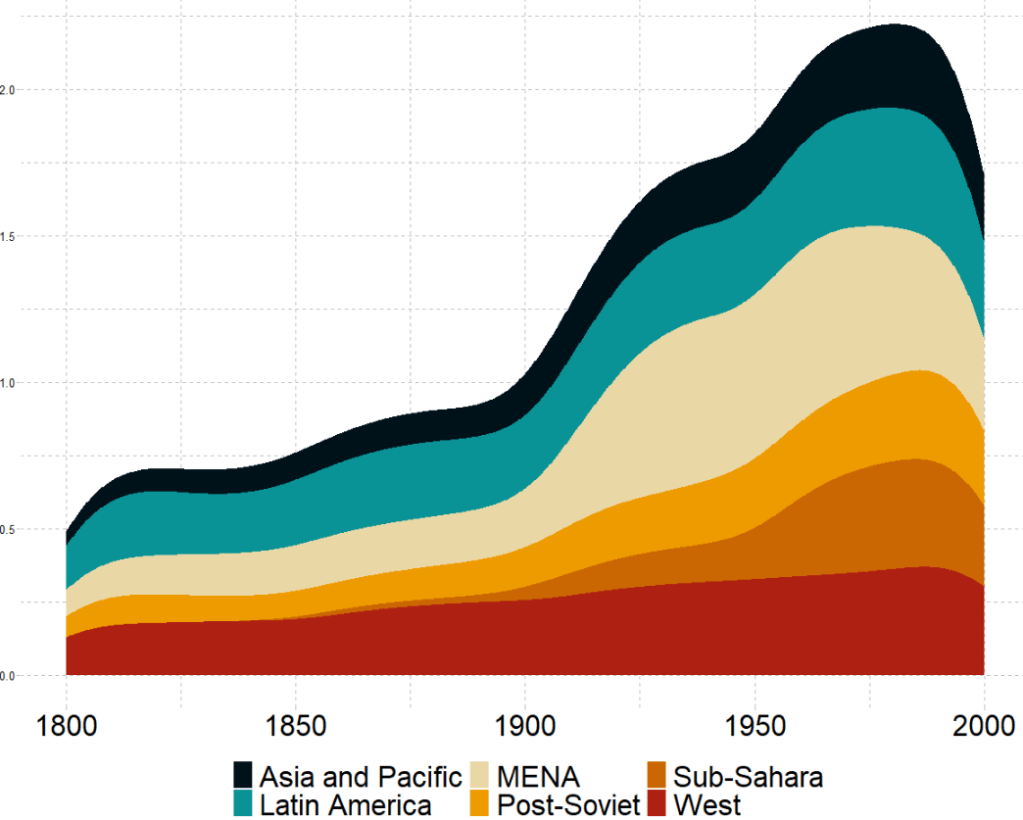
The next plot will look how variables change over time.
We can check out if there are changes in the volume and proportion of a variable across time with the geom_stream(type = "ridge") from the ggstream package.
In this instance, we will compare urban populations across regions from 1800s to today.
Click here to read more about the ggstream package and click here to read their CRAN PDF.
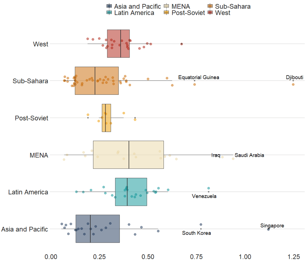
We can also look at interquartile ranges and spread across variables.
We will look at the urbanization rate across the different regions. The variable is calculated as the ratio of urban population to total country population.
Before, we will create a hex color vector so we are not copying and pasting the colours too many times.
If we want to look more closely at one year and print out the country names for the countries that are outliers in the graph, we can run the following function and find the outliers int he dataset for the year 1990:
In the next blog post, we will look at t-tests, ANOVAs (and their non-parametric alternatives) to see if the difference in means / medians is statistically significant and meaningful for the underlying population.
library(tidyverse)
library(magrittr) # for pipes
library(ggrepel) # to stop overlapping labels
library(ggflags)
library(countrycode) # if you want create the ISO2C variable
Her graph compares Dr. Who actors and their average audience rating across their run as the Doctor on the show. So I have very liberally copied her code for my plot on OECD countries.
That is the beauty of TidyTuesday and the ability to be inspired and taught by other people’s code.
I originally was going to write a blog about how to download data from the OECD R package. However, my attempts to download the data leads to an unpleasant looking error and ends the donwload request.
I will try to work again on that blog in the future when the package is more established.
So, instead, I went to the OECD data website and just directly downloaded data on level of trust that citizens in each of the OECD countries feel about their governments.
Then I cleaned up the data in excel and used countrycode() to add ISO2 and country name data.
Click here to read more about the countrycode() package.
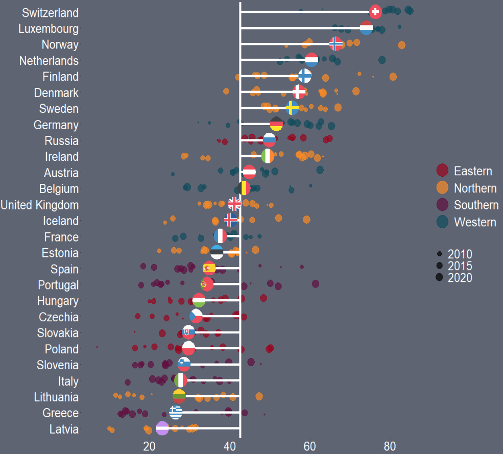
First I will only look at EU countries. I tried with all the countries from the OECD but it was quite crowded and hard to read.
I add region data from another dataset I have. This step is not necessary but I like to colour my graphs according to categories. This time I am choosing geographic regions.
When we plot the graph, we need a few geom arguments.
Along the x axis we have all the countries, and reorder them from most trusting of their goverments to least trusting.
We will color the points with one of the four geographic regions.
We use geom_jitter() rather than geom_point() for the different yearly trust values to make the graph a little more interesting.
I also make the sizes scaled to the year in the aes() argument. Again, I did this more to look interesting, rather than to convey too much information about the different values for trust across each country. But smaller circles are earlier years and grow larger for each susequent year.
The geom_hline() plots a vertical line to indicate the average trust level for all countries.
We then use the geom_segment() to horizontally connect the country’s individual average (the yend argument) to the total average (the y arguement). We can then easily see which countries are above or below the total average. The x and xend argument, we supply the country_name variable twice.
Next we use the geom_flag(), which comes from the ggflags package. In order to use this package, we need the ISO 2 character code for each country in lower case!
Click here to read more about the ggflags package.
We can see that countries in southern Europe are less trusting of their governments than in other regions. Western countries seem to occupy the higher parts of the graph, with France being the least trusting of their government in the West.
There is a large variation in Northern countries. However, if we look at the countries, we can see that the Scandinavian countries are more trusting and the Baltic countries are among the least trusting. This shows they are more similar in their trust levels to other Post-Soviet countries.
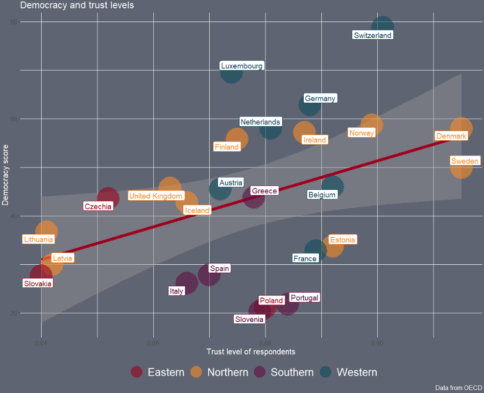
Next we can look into see if there is a relationship between democracy scores and level of trust in the goverment with a geom_point() scatterplot
The geom_smooth() argument plots a linear regression OLS line, with a standard error bar around.
We want the labels for the country to not overlap so we use the geom_label_repel() from the ggrepel package. We don’t want an a in the legend, so we add show.legend = FALSE to the arguments
Here is a short list from the package description of all the key variables that can be quickly added:
We create the dyad dataset with the create_dyadyears() function. A dyad-year dataset focuses on information about the relationship between two countries (such as whether the two countries are at war, how much they trade together, whether they are geographically contiguous et cetera).
In the literature, the study of interstate conflict has adopted a heavy focus on dyads as a unit of analysis.
Alternatively, if we want just state-year data like in the previous blog post, we use the function create_stateyears()
We can add the variables with type D to the create_dyadyears() function and we can add the variables with type S to the create_stateyears() !
Focusing on the create_dyadyears() function, the arguments we can include are directed and mry.
The directed argument indicates whether we want directed or non-directed dyad relationship.
In a directed analysis, data include two observations (i.e. two rows) per dyad per year (such as one for USA – Russia and another row for Russia – USA), but in a nondirected analysis, we include only one observation (one row) per dyad per year.
The mry argument indicates whether they want to extend the data to the most recently concluded calendar year – i.e. 2020 – or not (i.e. until the data was last available).
You can follow these links to check out the codebooks if you want more information about descriptions about each variable and how the data were collected!
The code comes with the COW code but I like adding the actual names also!
With this dataframe, we can plot the CINC data of the top three superpowers, just looking at any variable that has a 1 at the end and only looking at the corresponding country_1!
According to our pals over at le Wikipedia, the Composite Index of National Capability (CINC) is a statistical measure of national power created by J. David Singer for the Correlates of War project in 1963. It uses an average of percentages of world totals in six different components (such as coal consumption, military expenditure and population). The components represent demographic, economic, and military strength
In PART 3, we will merge together our data with our variables from PART 1, look at some descriptive statistics and run some panel data regression analysis with our different variables!
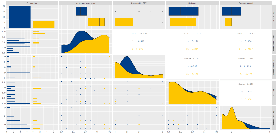
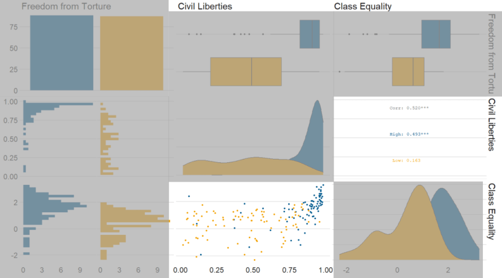
Next, we can go create a dichotomous factor variable and divide the continuous “freedom from torture scale” variable into either above the median or below the median score. It’s a crude measurement but it serves to highlight trends.
Blue means the country enjoys high freedom from torture. Yellow means the county suffers from low freedom from torture and people are more likely to be tortured by their government.
Then we feed our variables into the ggpairs() function from the GGally package.
I use the columnLabels to label the graphs with their full names and the mapping argument to choose my own color palette.
I add the bbc_style() format to the corr_matrix object because I like the font and size of this theme. And voila, we have our basic correlation matrix (Figure 1).
First off, in Figure 2 we can see the centre plots in the diagonal are the distribution plots of each variable in the matrix
Figure 2.
In Figure 3, we can look at the box plot for the ‘civil liberties index’ score for both high (blue) and low (yellow) ‘freedom from torture’ categories.
The median civil liberties score for countries in the high ‘freedom from torture’ countries is far higher than in countries with low ‘freedom from torture’ (i.e. citizens in these countries are more likely to suffer from state torture). The spread / variance is also far great in states with more torture.
Figure 3.
In Figur 4, we can focus below the diagonal and see the scatterplot between the two continuous variables – civil liberties index score and class equality index scores.
We see that there is a positive relationship between civil liberties and class equality. It looks like a slightly U shaped, quadratic relationship but a clear relationship trend is not very clear with the countries with higher torture prevalence (yellow) showing more randomness than the countries with high freedom from torture scores (blue).
Saying that, however, there are a few errant blue points as outliers to the trend in the plot.
The correlation score is also provided between the two categorical variables and the correlation score between civil liberties and class equality scores is 0.52.
Examining at the scatterplot, if we looked only at countries with high freedom from torture, this correlation score could be higher!
Click here to learn how to access and download ESS round data for the thirty-ish European countries (depending on the year).
So with the essurvey package, I have downloaded and cleaned up the most recent round of the ESS survey, conducted in 2018.
We will examine the different demographic variables that relate to levels of trust in politicians across 29 European countries (education level, gender, age et cetera).
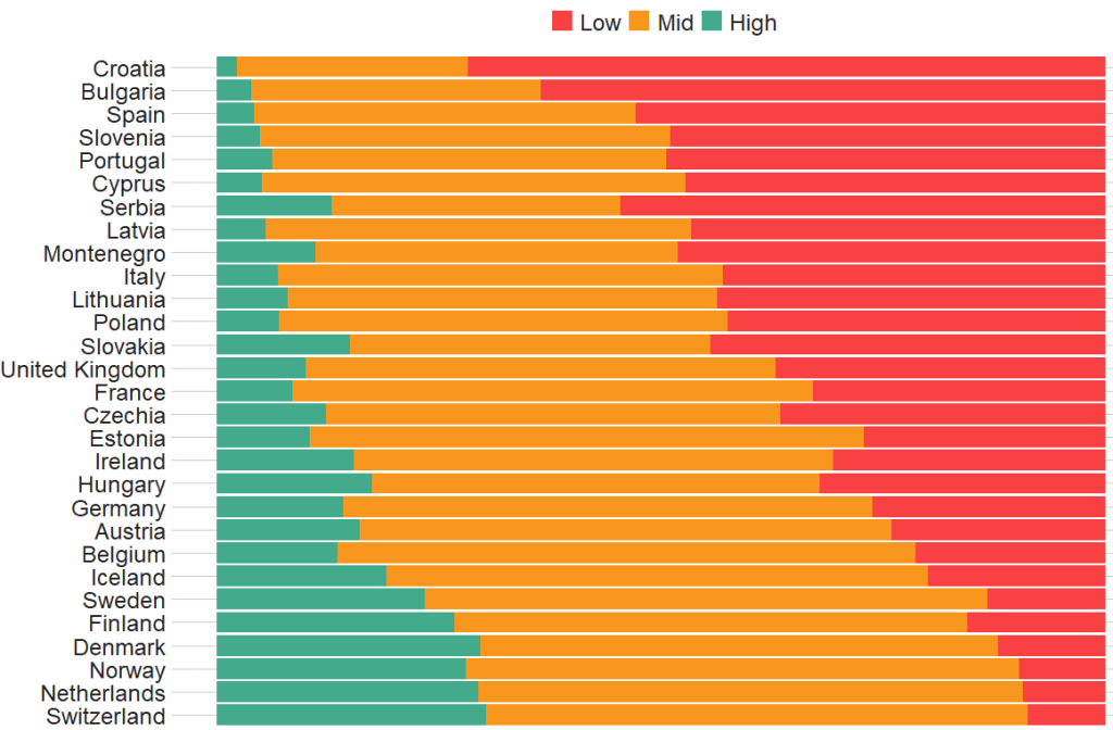
Before we create the survey weight objects, we can first make a bar chart to look at the different levels of trust in the different countries.
We can use the cut() function to divide the 10-point scale into three groups of “low”, “mid” and “high” levels of trust in politicians.
I also choose traffic light hex colors in color_palette vector and add full country names with countrycode() so it’s easier to read the graph
The graph lists countries in descending order according to the percentage of sampled participants that indicated they had low trust levels in politicians.
The respondents in Croatia, Bulgaria and Spain have the most distrust towards politicians.
Croatians when they see politicians
For this example, I want to compare different analyses to see what impact different weights have on the coefficient estimates and standard errors in the regression analyses:
with no weights (dEfIniTelYy not recommended by ESS)
with post-stratification weights only (not recommended by ESS) and
with the combined post-strat AND population weight (the recommended weighting strategy according to ESS)
First we create two special svydesign objects, with the survey package. To create this, we need to add a squiggly ~ symbol in front of the variables (Google tells me it is called a tilde).
The ids argument takes the cluster ID for each participant.
psu is a numeric variable that indicates the primary sampling unit within which the respondent was selected to take part in the survey. For example in Ireland, this refers to the particular electoral division of each participant.
The strata argument takes the numeric variable that codes which stratum each individual is in, according to the type of sample design each country used.
The first svydesign object uses only post-stratification weights: pspwght
Finally we need to specify the nest argument as TRUE. I don’t know why but it throws an error message if we don’t …
WITHOUT weights AND WITH weights (post-stratification and population weights)
We can see that gender variable is more equally balanced between males (1) and females (2) in the data with weights
Additionally, average trust in politicians is lower in the sample with full weights.
Participants are more left-leaning on average in the sample with full weights than in the sample with no weights.
Next, we can look at a general linear model without survey weights and then with the two survey weights we just created.
Do we see any effect of the weighting design on the standard errors and significance values?
So, we first run a simple general linear model. In this model, R assumes that the data are independent of each other and based on that assumption, calculates coefficients and standard errors.
With the stargazer package, we can compare the models side-by-side:
library(stargazer)
stargazer(simple_glm, post_strat_glm, full_weight_glm, type = "text")
We can see that the standard errors in brackets were increased for most of the variables in model (3) with both weights when compared to the first model with no weights.
The biggest change is the rural-urban scale variable. With no weights, it is positive correlated with trust in politicians. That is to say, the more urban a location the respondent lives, the more likely the are to trust politicians. However, after we apply both weights, it becomes negative correlated with trust. It is in fact the more rural the location in which the respondent lives, the more trusting they are of politicians.
Additionally, age becomes statistically significant, after we apply weights.
Of course, this model is probably incorrect as I have assumed that all these variables have a simple linear relationship with trust levels. If I really wanted to build a robust demographic model, I would have to consult the existing academic literature and test to see if any of these variables are related to trust levels in a non-linear way. For example, it could be that there is a polynomial relationship between age and trust levels, for example. This model is purely for illustrative purposes only!
Plus, when I examine the R2 score for my models, it is very low; this model of demographic variables accounts for around 6% of variance in level of trust in politicians. Again, I would have to consult the body of research to find other explanatory variables that can account for more variance in my dependent variable of interest!
We can look at the R2 and VIF score of GLM with the summ() function from the jtools package. The summ() function can take a svyglm object. Click here to read more about various functions in the jtools package.
Click here to check out the vignette to read about all the different graphs with which you can use bbplot !
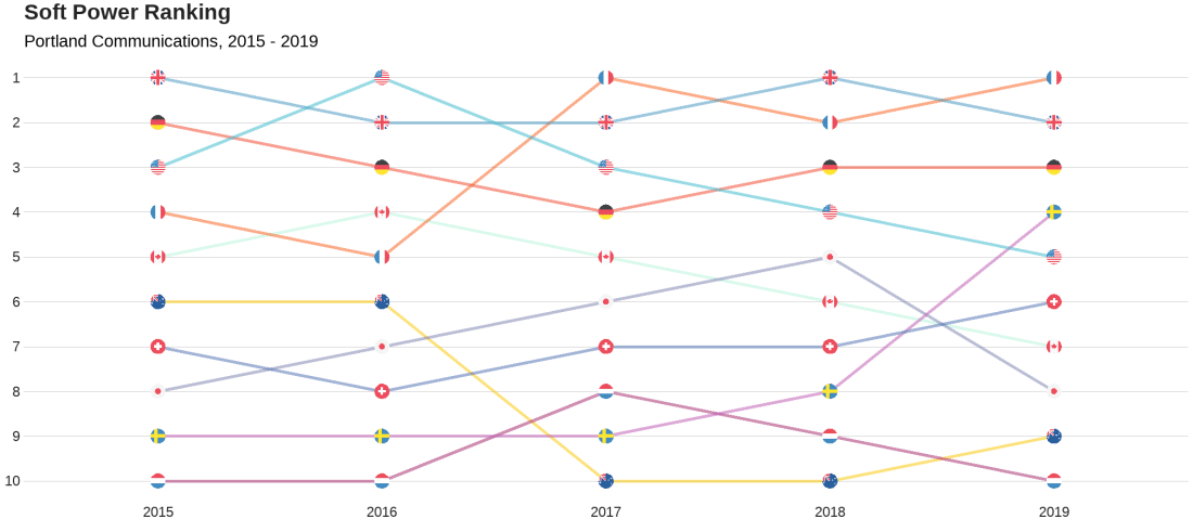
We will look at the Soft Power rankings from Portland Communications. According to Wikipedia, In politics (and particularly in international politics), soft power is the ability to attract and co-opt, rather than coerce or bribe other countries to view your country’s policies and actions favourably. In other words, soft power involves shaping the preferences of others through appeal and attraction.
A defining feature of soft power is that it is non-coercive; the currency of soft power includes culture, political values, and foreign policies.
Joseph Nye’s primary definition, soft power is in fact:
“the ability to get what you want through attraction rather than coercion or payments. When you can get others to want what you want, you do not have to spend as much on sticks and carrots to move them in your direction. Hard power, the ability to coerce, grows out of a country’s military and economic might. Soft power arises from the attractiveness of a country’s culture, political ideals and policies. When our policies are seen as legitimate in the eyes of others, our soft power is enhanced”
(Nye, 2004: 256).
Every year, Portland Communication ranks the top countries in the world regarding their soft power. In 2019, the winner was la France!
Click here to read the most recent report by Portland on the soft power rankings.
We will also add circular flags to the graphs with the ggflags package. The geom_flag() requires the ISO two letter code as input to the argument … but it will only accept them in lower case. So first we need to make the country code variable suitable:
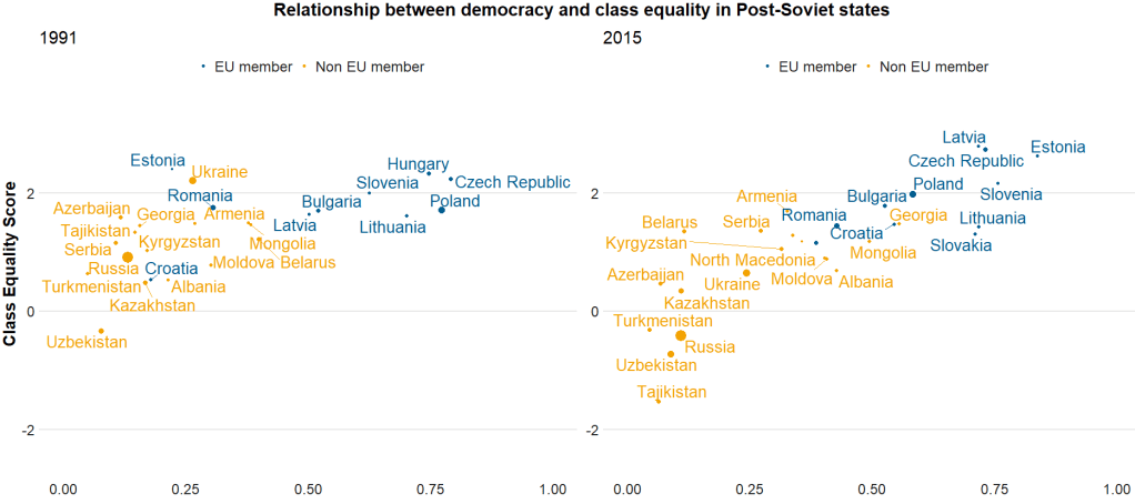
Here I run a simple scatterplot and compare Post-Soviet states and see whether there has been a major change in class equality between 1991 after the fall of the Soviet Empire and today. Is there a relationship between class equality and demolcratisation? Is there a difference in the countries that are now in EU compared to the Post-Soviet states that are not?
library(ggrepel)  # to stop text labels overlapping
library(gridExtra)  # to place two plots side-by-side
library(ggbubr)  # to modify the gridExtra titles

region_liberties_91 <- vdem %>%
  dplyr::filter(year == 1991) %>%
  dplyr::filter(regions == 'Post-Soviet') %>%
  dplyr::filter(!is.na(EU_member)) %>%
  ggplot(aes(x = democracy, y = class_equality, color = EU_member)) +
  geom_point(aes(size = population)) +
  scale_alpha_continuous(range = c(0.1, 1))

plot_91 <- region_liberties_91 +
  bbplot::bbc_style() +
  labs(subtitle = "1991") +
  ylim(-2.5, 3.5) +
  xlim(0, 1) +
  geom_text_repel(aes(label = country_name), show.legend = FALSE, size = 7) +
  scale_size(guide="none")

region_liberties_18 <- vdem %>%
  dplyr::filter(year == 2018) %>%
  dplyr::filter(regions == 'Post-Soviet') %>%
  dplyr::filter(!is.na(EU_member)) %>%
  ggplot(aes(x = democracy_score, y = class_equality, color = EU_member)) +
  geom_point(aes(size = population)) +
  scale_alpha_continuous(range = c(0.1, 1))

plot_18 <- region_liberties_15 +
  bbplot::bbc_style() +
  labs(subtitle = "2015") +
  ylim(-2.5, 3.5) +
  xlim(0, 1) +
  geom_text_repel(aes(label = country_name), show.legend = FALSE, size = 7) +
  scale_size(guide = "none")

my_title = text_grob("Relationship between democracy and class equality in Post-Soviet states", size = 22, face = "bold")
my_y = text_grob("Democracy Score", size = 20, face = "bold")
my_x = text_grob("Class Equality Score", size = 20, face = "bold", rot = 90)

grid.arrange(plot_1, plot_2, ncol=2,  top = my_title, bottom = my_y, left = my_x)
The BBC cookbook vignette offers the full function. So we can tweak it any way we want.
For example, if I want to change the default axis labels, I can make my own slightly adapted my_bbplot() function
With the European Social Survey (ESS), we will examine the different variables that are related to levels of trust in politicians across Europe in the latest round 9 (conducted in 2018).
Click here to learn about downloading ESS data into R with the essurvey package.
Packages we will need:
library(survey)
library(srvyr)
The survey package was created by Thomas Lumley, a professor from Auckland. The srvyr package is a wrapper packages that allows us to use survey functions with tidyverse.
Why do we need to add weights to the data when we analyse surveys?
When we import our survey data file, R will assume the data are independent of each other and will analyse this survey data as if it were collected using simple random sampling.
However, the reality is that almost no surveys use a simple random sample to collect data (the one exception being Iceland in ESS!)
Rather, survey institutions choose complex sampling designs to reduce the time and costs of ultimately getting responses from the public.
Their choice of sampling design can lead to different estimates and the standard errors of the sample they collect.
For example, the sampling weight may affect the sample estimate, and choice of stratification and/or clustering may mean (most likely underestimated) standard errors.
As a result, our analysis of the survey responses will be wrong and not representative to the population we want to understand. The most problematic result is that we would arrive at statistical significance, when in reality there is no significant relationship between our variables of interest.
Therefore it is essential we don’t skip this step of correcting to account for weighting / stratification / clustering and we can make our sample estimates and confidence intervals more reliable.
This table comes from round 8 of the ESS, carried out in 2016. Each of the 23 countries has an institution in charge of carrying out their own survey, but they must do so in a way that meets the ESS standard for scientifically sound survey design (See Table 1).
Sampling weights aim to capture and correct for the differing probabilities that a given individual will be selected and complete the ESS interview.
For example, the population of Lithuania is far smaller than the UK. So the probability of being selected to participate is higher for a random Lithuanian person than it is for a random British person.
Additionally, within each country, if the survey institution chooses households as a sampling element, rather than persons, this will mean that individuals living alone will have a higher probability of being chosen than people in households with many people.
Click here to read in detail the sampling process in each country from round 1 in 2002. For example, if we take my country – Ireland – we can see the many steps involved in the country’s three-stage probability sampling design.
The Primary Sampling Unit (PSU) is electoral districts. The institute then takes addresses from the Irish Electoral Register. From each electoral district, around 20 addresses are chosen (based on how spread out they are from each other). This is the second stage of clustering. Finally, one person is randomly chosen in each house to answer the survey, chosen as the person who will have the next birthday (third cluster stage).
Click here for more information about Design Effects (DEFF) and click here to read how ESS calculates design effects.
DEFF p refers to the design effect due to unequal selection probabilities (e.g. a person is more likely to be chosen to participate if they live alone)
DEFF c refers to the design effect due to clustering
According to Gabler et al. (1999), if we multiply these together, we get the overall design effect. The Irish design that was chosen means that the data’s variance is 1.6 times as large as you would expect with simple random sampling design. This 1.6 design effects figure can then help to decide the optimal sample size for the number of survey participants needed to ensure more accurate standard errors.
So, we can use the functions from the survey package to account for these different probabilities of selection and correct for the biases they can cause to our analysis.
In this example, we will look at demographic variables that are related to levels of trust in politicians. But there are hundreds of variables to choose from in the ESS data.
Click here for a list of all the variables in the European Social Survey and in which rounds they were asked. Not all questions are asked every year and there are a bunch of country-specific questions.
We can look at the last few columns in the data.frame for some of Ireland respondents (since we’ve already looked at the sampling design method above).
The dweight is the design weight and it is essentially the inverse of the probability that person would be included in the survey.
The pspwght is the post-stratification weight and it takes into account the probability of an individual being sampled to answer the survey AND ALSO other factors such as non-response error and sampling error. This post-stratificiation weight can be considered a more sophisticated weight as it contains more additional information about the realities survey design.
The pweight is the population size weight and it is the same for everyone in the Irish population.
When we are considering the appropriate weights, we must know the type of analysis we are carrying out. Different types of analyses require different combinations of weights. According to the ESS weighting documentation:
when analysing data for one country alone – we only need the design weight or the poststratification weight.
when comparing data from two or more countries but without reference to statistics that combine data from more than one country – we only need the design weight or the poststratification weight
when comparing data of two or more countries and with reference to the average (or combined total) of those countries – we need BOTH design or post-stratification weight AND population size weights together.
when combining different countries to describe a group of countries or a region, such as “EU accession countries” or “EU member states” = we need BOTH design or post-stratification weights AND population size weights.
ESS warn that their survey design was not created to make statistically accurate region-level analysis, so they say to carry out this type of analysis with an abundance of caution about the results.
ESS has a table in their documentation that summarises the types of weights that are suitable for different types of analysis:
Since we are comparing the countries, the optimal weight is a combination of post-stratification weights AND population weights together.
Click here to read Part 2 and run the regression on the ESS data with the survey package weighting design
Below is the code I use to graph the differences in mean level of trust in politicians across the different countries.
library(ggimage) # to add flags
library(countrycode) # to add ISO country codes

# r_agg is the aggregated mean of political trust for each countries' respondents.

r_agg %>%
  dplyr::mutate(country, EU_member = ifelse(country == "BE" | country == "BG" | country == "CZ" | country == "DK" | country == "DE" | country == "EE" | country == "IE" | country == "EL" | country == "ES" | country == "FR" | country == "HR" | country == "IT" | country == "CY" | country == "LV" | country == "LT" | country == "LU" | country == "HU" | country == "MT" | country == "NL" | country == "AT" | country == "AT" | country == "PL" | country == "PT" | country == "RO" | country == "SI" | country == "SK" | country == "FI" | country == "SE","EU member", "Non EU member")) -> r_agg


r_agg %>%
  filter(EU_member == "EU member") %>%
  dplyr::summarize(eu_average = mean(mean_trust_pol))


r_agg$country_name <- countrycode(r_agg$country, "iso2c", "country.name")


#eu_average <- r_agg %>%
 # summarise_if(is.numeric, mean, na.rm = TRUE)


eu_avg <- data.frame(country = "EU average",
                     mean_trust_pol = 3.55,
                     EU_member =  "EU average",
                     country_name = "EU average")

r_agg <- rbind(r_agg, eu_avg)


my_palette <- c("EU average" = "#ef476f",
                "Non EU member" = "#06d6a0",
                "EU member" = "#118ab2")

r_agg <- r_agg %>%
  dplyr::mutate(ordered_country = fct_reorder(country, mean_trust_pol))


r_graph <- r_agg %>%
  ggplot(aes(x = ordered_country, y = mean_trust_pol, group = country, fill = EU_member)) +
  geom_col() +
  ggimage::geom_flag(aes(y = -0.4, image = country), size = 0.04) +
  geom_text(aes(y = -0.15 , label = mean_trust_pol)) +
  scale_fill_manual(values = my_palette) + coord_flip()

r_graph
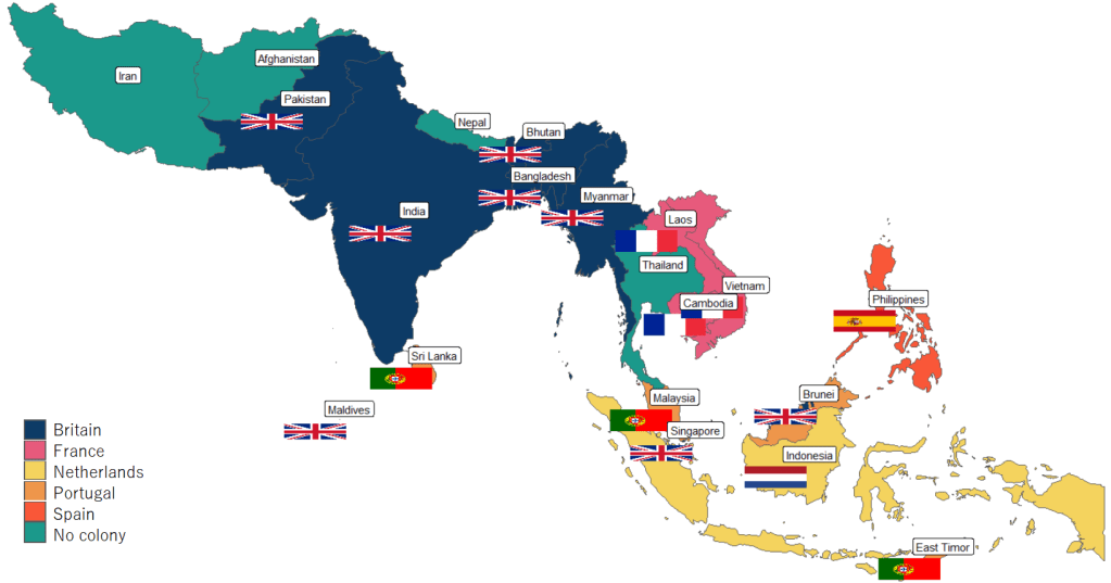
Next, to graph a map to look at colonialism in Asia, we can extract countries according to the subregion variable from the rnaturalearth package and graph.
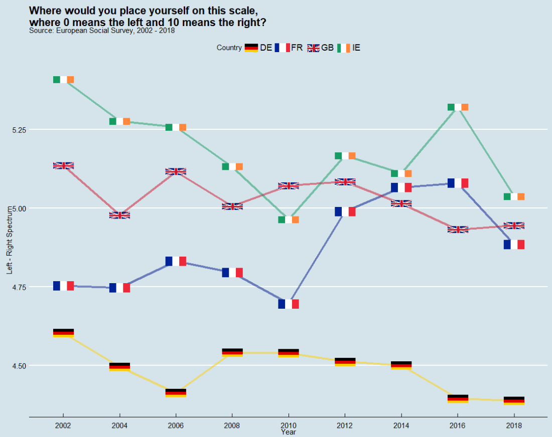
In this post, we can compare countries on the left – right political spectrum and graph the trends.
In the European Social Survey, they ask respondents to indicate where they place themselves on the political spectrum with this question: “In politics people sometimes talk of ‘left’ and ‘right’. Where would you place yourself on this scale, where 0 means the left and 10 means the right?”
library(ggthemes, ggimage)

lrscale_graph <- round_df %>%
  dplyr::filter(country == "IE" | country == "GB" | country == "FR" | country == "DE") %>%
  ggplot(aes(x= round, y = mean_lr, group = country)) +
  geom_line(aes(color = factor(country)), size = 1.5, alpha = 0.5) +
  ggimage::geom_flag(aes(image = country), size = 0.04) +
  scale_color_manual(values = my_palette) +
  scale_x_discrete(name = "Year", limits=c("2002","2004","2006","2008","2010","2012","2014","2016","2018")) +
  labs(title = "Where would you place yourself on this scale,\n where 0 means the left and 10 means the right?",
       subtitle = "Source: European Social Survey, 2002 - 2018",
       fill="Country",
       x = "Year",
       y = "Left - Right Spectrum")

lrscale_graph + guides(color=guide_legend(title="Country")) + theme_economist()
The European Social Survey (ESS) measure attitudes in thirty-ish countries (depending on the year) across the European continent. It has been conducted every two years since 2001.
The survey consists of a core module and two or more ‘rotating’ modules, on social and public trust; political interest and participation; socio-political orientations; media use; moral, political and social values; social exclusion, national, ethnic and religious allegiances; well-being, health and security; demographics and socio-economics.
So lots of fun data for political scientists to look at.
install.packages("essurvey")
library(essurvey)
The very first thing you need to do before you can download any of the data is set your email address.
set_email("rforpoliticalscience@gmail.com")
Don’t forget the email address goes in as a string in “quotations marks”.
Show what countries are in the survey with the show_countries() function.
It’s important to know that country names are case sensitive and you can only use the name printed out by show_countries(). For example, you need to write “Russian Federation” to access Russian survey data; if you write “Russia”…
Using these country names, we can download specific rounds or waves (i.e survey years) with import_country. We have the option to choose the two most recent rounds, 8th (from 2016) and 9th round (from 2018).
ire_data <- import_all_cntrounds("Ireland")
The resulting data comes in the form of nine lists, one for each round
These rounds correspond to the following years:
ESS Round 9 – 2018
ESS Round 8 – 2016
ESS Round 7 – 2014
ESS Round 6 – 2012
ESS Round 5 – 2010
ESS Round 4 – 2008
ESS Round 3 – 2006
ESS Round 2 – 2004
ESS Round 1 – 2002
I want to compare the first round and most recent round to see if Irish people’s views have changed since 2002. In 2002, Ireland was in the middle of an economic boom that we called the “Celtic Tiger”. People did mad things like buy panini presses and second house in Bulgaria to resell. Then the 2008 financial crash hit the country very hard.
Irish people during the Celtic Tiger:
Irish people after the Celtic Tiger crash:
Ireland in 2018 was a very different place. So it will be interesting to see if these social changes translated into attitude changes.
First, we use the import_country() function to download data from ESS. Specify the country and rounds you want to download.
The resulting ire object is a list, so we’ll need to extract the two data.frames from the list:
ire_1 <- ire[[1]]

ire_9 <- ire[[2]]
The exact same questions are not asked every year in ESS; there are rotating modules, sometimes questions are added or dropped. So to merge round 1 and round 9, first we find the common columns with the intersect() function.
All the variables in the dataset are a special class called “haven_labelled“. So we must convert them to numeric variables with a quick function. We exclude the first variable because we want to keep country name as a string character variable.
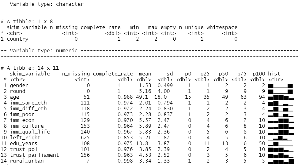
We can look at the distribution of our variables and count how many missing values there are with the skim() function from the skimr package
library(skimr)

skim(att_df)
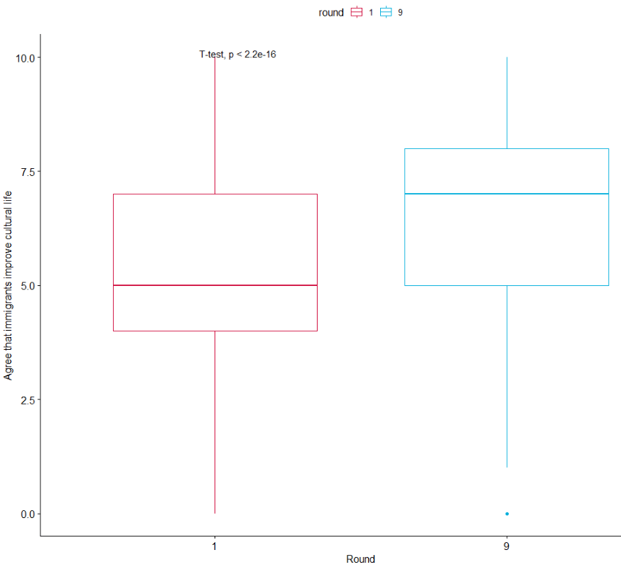
We can run a quick t-test to compare the mean attitudes to immigrants on the statement: “Immigrants make country worse or better place to live” across the two survey rounds.
Lower scores indicate an attitude that immigrants undermine Ireland’ quality of life and higher scores indicate agreement that they enrich it!
t.test(att_df$imm_qual_life ~ att_df$round)
In future blog, I will look at converting the raw output of R into publishable tables.
The results of the independent-sample t-test show that if we compare Ireland in 2002 and Ireland in 2018, there has been a statistically significant increase in positive attitudes towards immigrants and belief that Ireland’s quality of life is more enriched by their presence in the country.
As I am currently an immigrant in a foreign country myself, I am glad to come from a country that sees the benefits of immigrants!
If we load the ggpubr package, we can graphically look at the difference in mean attitude scores.
library(ggpubr)

box1 <- ggpubr::ggboxplot(att_df, x = "round", y = "imm_qual_life", color = "round", palette = c("#d11141", "#00aedb"),
 ylab = "Attitude", xlab = "Round")

box1 + stat_compare_means(method = "t.test")
It’s not the most glamorous graph but it conveys the shift in Ireland to more positive attitudes to immigration!
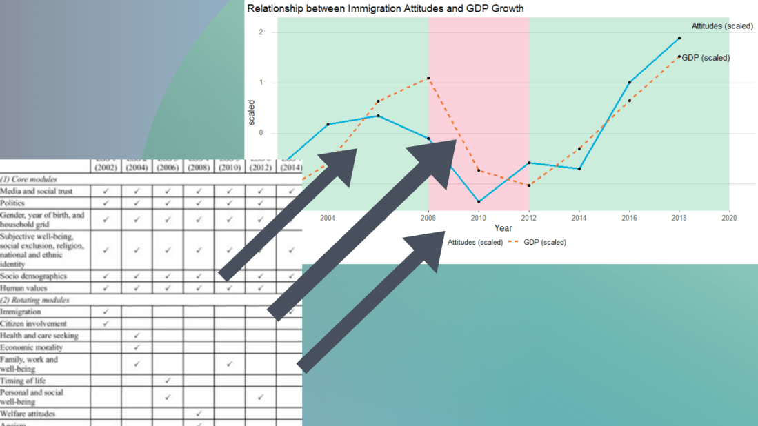
I suspect that a country’s economic growth correlates with attitudes to immigration.
The geom_rect() function graphs the coloured rectangles on the plot. I take colours from this color-hex website; the green rectangle for times of economic growth and red for times of recession. Makes sure the geom-rect() comes before the geom_line().
And we can see that there is a relationship between attitudes to immigrants in Ireland and Irish GDP growth. When GDP is growing, Irish people see that immigrants improve quality of life in Ireland and vice versa. The red section of the graph corresponds to the financial crisis.
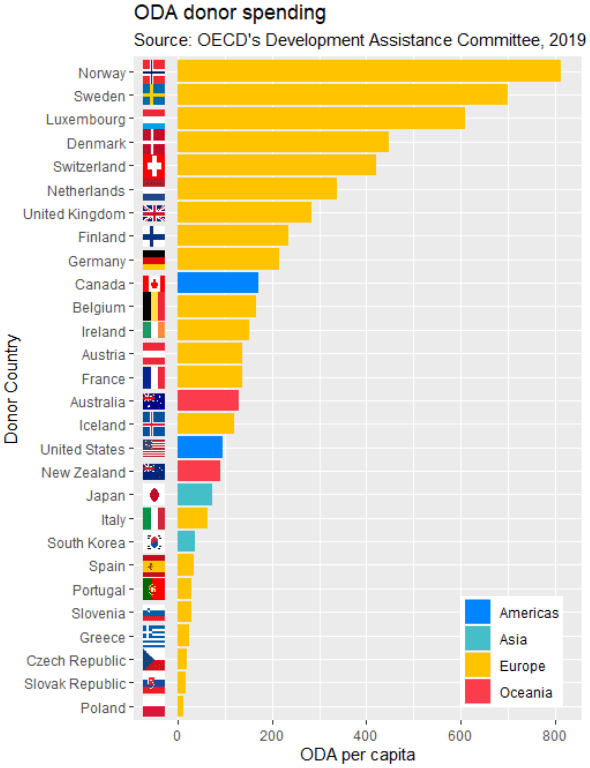
We can now add the the geom_flag() function to the graph. The y = -50 prevents the flags overlapping with the bars and places them beside their name label. The image argument takes the iso2 variable.
Quick tip: with the reorder argument, if we wanted descending order (rather than ascending order of ODA amounts, we would put a minus sign in front of the oda_per_capita in the reorder() function for the x axis value.
oda_bar <- oda %>%
  ggplot(aes(x = reorder(donor, oda_per_capita), y = oda_per_capita, fill = continent)) +
  geom_flag(y = -50, aes(image = iso2))  +
       geom_bar(stat = "identity") +
       labs(title = "ODA donor spending ",
                   subtitle = "Source: OECD's Development Assistance Committee, 2019 ",
                   x = "Donor Country",
                   y = "ODA per capita")
The fill argument categorises the continents of the ODA donors. Sometimes I take my hex colors from https://www.color-hex.com/ website.
We can all agree that Wikipedia is often our go-to site when we want to get information quick. When we’re doing IR or Poli Sci reesarch, Wikipedia will most likely have the most up-to-date data compared to other databases on the web that can quickly become out of date.
So in R, we can scrape a table from Wikipedia and turn into a database with the rvest package .
First, we copy and paste the Wikipedia page we want to scrape into the read_html() function as a string:
Next we save all the tables on the Wikipedia page as a list. Turn the header = TRUE.
nato_tables <- nato_members %>% html_table(header = TRUE, fill = TRUE)
The table that I want is the third table on the page, so use [[two brackets]] to access the third list.
nato_exp <- nato_tables[[3]]
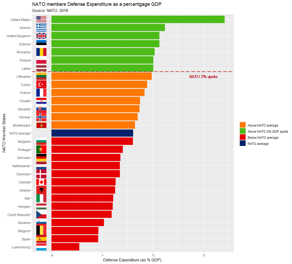
The dataset is not perfect, but it is handy to have access to data this up-to-date. It comes from the most recent NATO report, published in 2019.
Some problems we will have to fix.
The first row is a messy replication of the header / more information across two cells in Wikipedia.
The headers are long and convoluted.
There are a few values in as N/A in the dataset, which R thinks is a string.
All the numbers have commas, so R thinks all the numeric values are all strings.
There are a few NA values that I would not want to impute because they are probably zero. Iceland has no armed forces and manages only a small coast guard. North Macedonia joined NATO in March 2020, so it doesn’t have all the data completely.
So first, let’s do some quick data cleaning:
Clean the variable names to remove symbols and adds underscores with a function from the janitor package
Next turn all the N/A value strings to NULL. The na_strings object we create can be used with other instances of pesky missing data varieties, other than just N/A string.
Remove all the commas from the number columns and convert the character strings to numeric values with a quick function we apply to all numeric columns in the data.frame.
Next, we can calculate the average NATO score of all the countries (excluding the member_state variable, which is a character string).
We’ll exclude the NATO total column (as it is not a member_state but an aggregate of them all) and the data about Iceland and North Macedonia, which have missing values.
The mctest package’s functions have many multicollinearity diagnostic tests for overall and individual multicollinearity. Additionally, the package can show which regressors may be the reason of for the collinearity problem in your model.
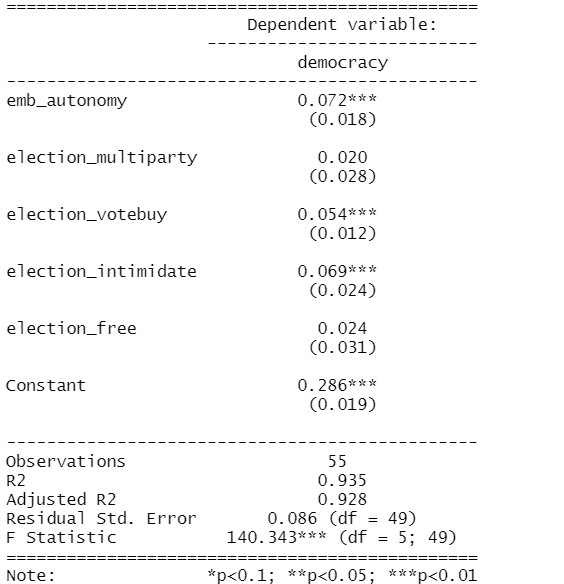
Given the amount of news we have had about elections in the news recently, let’s look at variables that capture different aspects of elections and see how they relate to scores of democracy. These different election components will probably overlap.
In fact, I suspect multicollinearity will be problematic with the variables I am looking at.
emb_autonomy – the extent to which the election management body of the country has autonomy from the government to apply election laws and administrative rules impartially in national elections.
election_multiparty – the extent to which the elections involved real multiparty competition.
election_votebuy – the extent to which there was evidence of vote and/or turnout buying.
election_intimidate – the extent to which opposition candidates/parties/campaign workers subjected to repression, intimidation, violence, or harassment by the government, the ruling party, or their agents.
election_free – the extent to which the election was judged free and fair.
In this model the dependent variable is democracy score for each of the 178 countries in this dataset. The score measures the extent to which a country ensures responsiveness and accountability between leaders and citizens. This is when suffrage is extensive; political and civil society organizations can operate freely; governmental positions are clean and not marred by fraud, corruption or irregularities; and the chief executive of a country is selected directly or indirectly through elections.
election_model <- lm(democracy ~ ., data = election_df)
stargazer(election_model, type = "text")
However, I suspect these variables suffer from high multicollinearity. Usually your knowledge of the variables – and how they were operationalised – will give you a hunch. But it is good practice to check everytime, regardless.
The eigprop() function can be used to detect the existence of multicollinearity among regressors. The function computes eigenvalues, condition indices and variance decomposition proportions for each of the regression coefficients in my election model.
To check the linear dependencies associated with the corresponding eigenvalue, the eigprop compares variance proportion with threshold value (default is 0.5) and displays the proportions greater than given threshold from each row and column, if any.
So first, let’s run the overall multicollinearity test with the eigprop() function :
mctest::eigprop(election_model)
If many of the Eigenvalues are near to 0, this indicates that there is multicollinearity.
Unfortunately, the phrase “near to” is not a clear numerical threshold. So we can look next door to the Condition Index score in the next column.
This takes the Eigenvalue index and takes a square root of the ratio of the largest eigenvalue (dimension 1) over the eigenvalue of the dimension.
Condition Index values over 10 risk multicollinearity problems.
In our model, we see the last variable – the extent to which an election is free and fair – suffers from high multicollinearity with other regressors in the model. The Eigenvalue is close to zero and the Condition Index (CI) is near 10. Maybe we can consider dropping this variable, if our research theory allows its.
Another battery of tests that the mctest package offers is the imcdiag( ) function. This looks at individual multicollinearity. That is, when we add or subtract individual variables from the model.
mctest::imcdiag(election_model)
A value of 1 means that the predictor is not correlated with other variables. As in a previous blog post on Variance Inflation Factor (VIF) score, we want low scores. Scores over 5 are moderately multicollinear. Scores over 10 are very problematic.
And, once again, we see the last variable is HIGHLY problematic, with a score of 14.7. However, all of the VIF scores are not very good.
The Tolerance (TOL) score is related to the VIF score; it is the reciprocal of VIF.
The Wi score is calculated by the Farrar Wi, which an F-test for locating the regressors which are collinear with others and it makes use of multiple correlation coefficients among regressors. Higher scores indicate more problematic multicollinearity.
The Leamer score is measured by Leamer’s Method : calculating the square root of the ratio of variances of estimated coefficients when estimated without and with the other regressors. Lower scores indicate more problematic multicollinearity.
The CVIF score is calculated by evaluating the impact of the correlation among regressors in the variance of the OLSEs. Higher scores indicate more problematic multicollinearity.
The Klein score is calculated by Klein’s Rule, which argues that if Rj from any one of the models minus one regressor is greater than the overall R2 (obtained from the regression of y on all the regressors) then multicollinearity may be troublesome. All scores are 0, which means that the R2 score of any model minus one regression is not greater than the R2 with full model.
Click here to read the mctest paper by its authors – Imdadullah et al. (2016) – that discusses all of the mathematics behind all of the tests in the package.
In conclusion, my model suffers from multicollinearity so I will need to drop some variables or rethink what I am trying to measure.
Click here to run Stepwise regression analysis and see which variables we can drop and come up with a more parsimonious model (the first suspect I would drop would be the free and fair elections variable)
Perhaps, I am capturing the same concept in many variables. Therefore I can run Principal Component Analysis (PCA) and create a new index that covers all of these electoral features.
Next blog will look at running PCA in R and examining the components we can extract.
References
Imdadullah, M., Aslam, M., & Altaf, S. (2016). mctest: An R Package for Detection of Collinearity among Regressors. R J., 8(2), 495.
gvlma stands for Global Validation of Linear Models Assumptions. See Peña and Slate’s (2006) paper on the package if you want to check out the math!
Linear regression analysis rests on many MANY assumptions. If we ignore them, and these assumptions are not met, we will not be able to trust that the regression results are true.
Luckily, R has many packages that can do a lot of the heavy lifting for us. We can check assumptions of our linear regression with a simple function.
So first, fit a simple regression model:
 data(mtcars)
 summary(car_model <- lm(mpg ~ wt, data = mtcars))
We then feed our car_model into the gvlma() function:
gvlma_object <- gvlma(car_model)
Global Stat checks whether the relationship between the dependent and independent relationship roughly linear. We can see that the assumption is met.
Skewness and kurtosis assumptions show that the distribution of the residuals are normal.
Link function checks to see if the dependent variable is continuous or categorical. Our variable is continuous.
Heteroskedasticity assumption means the error variance is equally random and we have homoskedasticity!
Often the best way to check these assumptions is to plot them out and look at them in graph form.
Next we can plot out the model assumptions:
plot.gvlma(glvma_object)
The relationship is a negative linear relationship between the two variables.
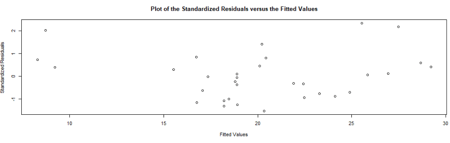
This scatterplot of residuals on the y axis and fitted values (estimated responses) on the x axis. The plot is used to detect non-linearity, unequal error variances, and outliers.
The residuals “bounce randomly” around the 0 line. This suggests that the assumption that the relationship is linear is reasonable.
The residuals roughly form a “horizontal band” around the 0 line. This suggests that the variances of the error terms are equal.
No one residual “stands out” from the basic random pattern of residuals. This suggests that there are no outliers.
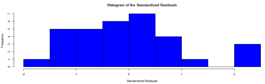
In this histograpm of standardised residuals, we see they are relatively normal-ish (not too skewed, and there is a single peak).
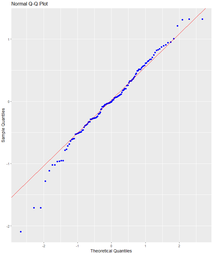
Next, the normal probability standardized residuals plot, Q-Q plot of sample (y axis) versus theoretical quantiles (x axis). The points do not deviate too far from the line, and so we can visually see how the residuals are normally distributed.
Click here to check out the CRAN pdf for the gvlma package.
References
Peña, E. A., & Slate, E. H. (2006). Global validation of linear model assumptions. Journal of the American Statistical Association, 101(473), 341-354.
What is a shiny app, you ask? Click to look at a quick Youtube explainer. It’s basically a handy GUI for R.
When we feed a panel data.frame into the ExPanD() function, a new screen pops up from R IDE (in my case, RStudio) and we can interactively toggle with various options and settings to run a bunch of statistical and visualisation analyses.
Click here to see how to convert your data.frame to pdata.frame object with the plm package.
Be careful your pdata.frame is not too large with too many variables in the mix. This will make ExPanD upset enough to crash. Which, of course, I learned the hard way.
Also I don’t know why there are random capitalizations in the PaCkaGe name. Whenever I read it, I think of that Sponge Bob meme.
If anyone knows why they capitalised the package this way. please let me know!
So to open up the new window, we just need to feed the pdata.frame into the function:
ExPanD(mil_pdf)
For my computer, I got error messages for the graphing sections, because I had an old version of Cairo package. So to rectify this, I had to first install a source version of Cairo and restart my R session. Then, the error message gods were placated and they went away.
install.packages("Cairo", type="source")
Then press command + shift + F10 to restart R session
library(Cairo)
You may not have this problem, so just ignore if you have an up-to-date version of the necessary packages.
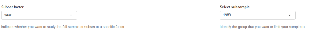
When the new window opens up, the first section allows you to filter subsections of the panel data.frame. Similar to the filter() argument in the dplyr package.
For example, I can look at just the year 1989:
But let’s look at the full sample
We can toggle with variables to look at mean scores for certain variables across different groups. For example, I look at physical integrity scores across regime types.
Purple plot: closed autocracy
Turquoise plot: electoral autocracy
Khaki plot: electoral democracy:
Peach plot: liberal democracy
The plots show that there is a high mean score for physical integrity scores for liberal democracies and less variance. However with the closed and electoral autocracies, the variance is greater.
We can look at a visualisation of the correlation matrix between the variables in the dataset.
Next we can look at a scatter plot, with option for loess smoother line, to graph the relationship between democracy score and physical integrity scores. Bigger dots indicate larger GDP level.
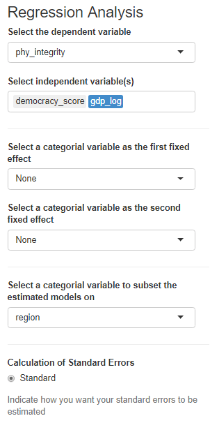
Last we can run regression analysis, and add different independent variables to the model.
We can add fixed effects.
And we can subset the model by groups.
The first column, the full sample is for all regions in the dataset.
We can code a new binary variable that indicates if there was a UCDP conflict in the previous 10 years or not.
We could imagine a country that experienced war is more likely to keep investing in their military (as a larger percentage of their GDP) than countries that have only experienced relative peace in their recent past.
wdi_data %>%
  inner_join(peace_data, by = c("cown", "year")) -> wdi_peace
With these data, we can build our linear regression model.
Our dependent variable is military spending as a percentage of GDP (logged)
Our independent varibles are:
GDP per capita (logged) from the World Bank
Demoracy (as measured by the V-DEM polyarchy score)
Binary variable that is 1 if a country had a UCDP conflict in the previous 10 years and 0 if none.
We will also add an interaction term with the GDP and democracy variable.
Given we have cross-sectional longitudinal data, the best option would be panel data analysis with the plm package
plm(log(mil_spend_gdp) ~ log(gdp_percap)*v2x_polyarchy + as.factor(war_past_10_years_no_na), data = wdi_peace,
  index = c("cown", "year"), model = "within") %>%
  stargazer(., type = "text")
Dependent variable:
Military spending (GDP %) (ln)
GDP pc (ln)
-0.288***
(0.029)
Democracy
1.004***
(0.353)
War 10 year dummy
0.146***
(0.021)
GDP pc (ln) x Democracy
-0.199***
(0.046)
Observations
3,686
R2
0.135
Adjusted R2
0.097
F Statistic
137.989*** (df = 4; 3530)
Note:
*p<0.1; **p<0.05; ***p<0.01
However, the olsrr package cannot handle plm.
In future blog posts, we will lok more closely at plm() panel regressions and the diagnostic tests we have to run with these types of models.
lm(log(mil_spend_gdp) ~ log(gdp_percap)*v2x_polyarchy + as.factor(war_past_10_years_no_na), data = subset(wdi_peace, year == 2010)) -> war_model
Dependent variable:
Military spending (GDP %) (ln)
GDP pc (ln)
0.261**
(0.101)
Democracy
1.450
(1.565)
War 10 year dummy
0.592***
(0.159)
GDP pc (ln) x Democracy
-0.343**
(0.168)
Constant
0.183
(0.885)
Observations
136
R2
0.381
Adjusted R2
0.362
Residual Std. Error
0.615 (df = 131)
F Statistic
20.137*** (df = 4; 131)
Note:
*p<0.1; **p<0.05; ***p<0.01
So now we have our OLS model, we can run a heap of linear model diagnostic functions with the olsrr package.
Built by Aravind Hebbali, the description of the package mentions that olsrr has tools designed to make it easier for users, particularly beginner/intermediate R users to build ordinary least squares regression models. Thank you Aravind!
It includes regression output, heteroskedasticity tests, collinearity diagnostics, residual diagnostics, measures of influence, model fit assessment and variable selection procedures. Look through the CRAN PDF below or look at rsquaredacademy website to get a comprehensive overview of the package
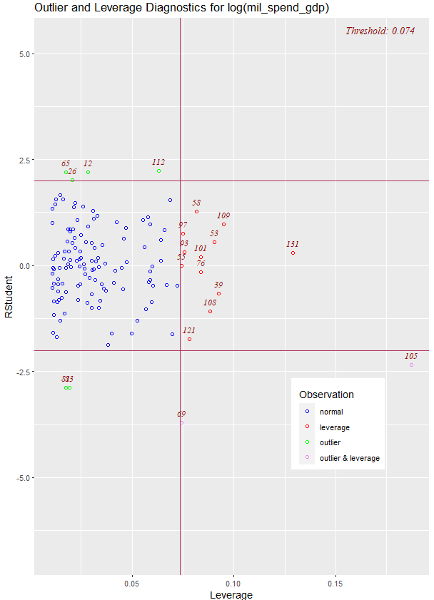
We will now check if the residuals in our model (the difference between what our model predicted and what the values actually are) are normally distributed
ols_test_normality(war_model)
Test
Statistic
p-value
Shapiro-Wilk
0.9817
0.0653
Kolmogorov-Smirnov
0.0524
0.8494
Cramer-von Mises
14.1123
0.0000
Anderson-Darling
0.469
0.2447
Let’s look at each test result in turn
Shapiro-Wilk:
The test statistic is 0.9817, and the p-value is 0.0653.
The null hypothesis is that the residuals are normally distributed.
In this case, the p-value is greater than the predefined significance level (typically 0.05), so you cannot reject the null hypothesis.
This suggests that the residuals may follow a normal distribution.
Woo!
Kolmogorov-Smirnov:
The test statistic is 0.0524, and the p-value is 0.8494.
Similar to the Shapiro-Wilk test, the p-value is greater than 0.05, so you cannot reject the null hypothesis of normality.
This suggests that the residuals may follow a normal distribution.
Yay.
Cramer-von Mises:
This test statistic is 14.1123, and the p-value is 0.0000.
The null hypothesis is that the residuals are normally distributed. The very low p-value indicates that you can reject the null hypothesis, suggesting that the residuals are not from a normal distribution.
Oh no.
Anderson-Darling: This is another test of normality. The test statistic is 0.469, and the p-value is 0.2447. Similar to the Shapiro-Wilk and Kolmogorov-Smirnov tests, the p-value is greater than 0.05, so you cannot reject the null hypothesis of normality.
Phew.
Which of the normality tests is the best?
And what is up with Cramer-von Mises?
A paper by Razali and Wah (2011) tested all these formal normality tests with 10,000 Monte Carlo simulation of sample data generated from alternative distributions that follow symmetric and asymmetric distributions.
Their results showed that the Shapiro-Wilk test is the most powerful normality test, followed by Anderson-Darling test, and Kolmogorov-Smirnov test. Their study did not look at the Cramer-Von Mises test.
The results of Razali and Wah’s study echo the previous findings of Mendes and Pala (2003) and Keskin (2006) in support of Shapiro-Wilk test as the most powerful normality test.
According Ahad and colleagues (2011: 641), they find that
“the performances of the normality tests, namely, the Kolmogorov-Smirnov test, Anderson-Darling test, Cramervon Mises test, and Shapiro-Wilk test, were evaluated under various spectrums of non-normal distributions and different sample sizes. The results showed that the ShapiroWilk test is the most sensitive normality test because this test rejects the null hypothesis of normality at the smallest sample sizes compared to the other tests, at all levels of skewness and kurtosis. Thus, when the four normality tests are available in a statistical package, we would recommend practitioners to use the Shapiro-Wilk normality to test the normality of data”
Ahad et al (2001: 641)
We can plot out the residuals distribution in a histogram with olsrr
olsrr::ols_plot_resid_hist(war_model)
Visually, we can confirm that the residuals have a lovely bell curve and are broadly normally distributed! With a few outliers at -2.
Nest we can check the residuals with a QQ plot.
A QQ plot is used to compare residuals to the normal distribution in linear regression. We can use a normal QQ plot to visually check if our residuals follow a theoretical normal distribution.
In addition to being good at identifying outliers and heavy tails, QQ plots can reveal characteristics such as skewness and bimodality, and can be effective even for small samples (Marden, 2004).
olsrr::ols_plot_resid_qq(war_model)
Again we can see some outliers at -2
Next we can look at a scatter plot of residuals on the y axis and fitted values on the x axis to detect non-linearity, unequal error variances, and outliers.
Each point in the plot is a residual value (i.e. the difference between what the model predicted and what the value actually
When interpreting this plot, there are a few things we want to look out for.
The points does not deviate too far from 0. This indicates the variance is homogeneous (i.e. homescediasticity, one of my favourite words)
The points are random (i.e. show no distinct pattern) around the horizontal red line at 0
ols_plot_resid_fit(war_model)
There are some residual values at the -2, so they might be outliers. We we look at an outlier diagnostic plot in a bit.
There are no discernible pattern in the scatterplot, so there does not seem to be any heteroscedasticity in the variance.
We can run an ols_plot_resid_lev() to graph for detecting outliers and/or observations with high leverage.
ols_plot_resid_lev(war_model)
There are a few outliers with leverage that we need to look more closely and examine how they prove / challenge our given theory / hypotheses.
FINALLLY. for a more complete diagnostics check, we can insert the model into the ols_coll_diag() function to calculate the Variance Inflation Factor (VIF) and Eigenvalues of the variables in the model.
VIF scores highlight if there is multicollinearity between the independent variables. If they are too highly correlated, our model is in trouble.
If the value of VIF is 1< VIF < 5, it specifies that the variables are moderately correlated to each other.
The challenging value of VIF is between 5 to 10 as it specifies the highly correlated variables.
If VIF ≥ 5 to 10, there will be multicollinearity among the predictors in the regression model.
VIF > 10 indicate the regression coefficients are feebly estimated with the presence of multicollinearity
Read more about the issues with multicollinearity in Shrestha (2020)
ols_coll_diag(war_model)
Variables
Tolerance
VIF
GDP per capita (ln)
0.13
7.6
Democracy
0.02
56.2
War 10 years
0.91
1.1
GDP pc (ln) X Democracy
0.01
79.9
Next we look at the Eigenvalues
Eigenvalue
Condition Index
intercept
GDP pc (ln)
Democracy
War 10 years
GDP pc (ln) X Democracy
3.93
1.00
0.00
0.00
0.00
0.01
0.00
0.90
2.09
0.00
0.00
0.00
0.82
0.00
0.16
5.01
0.01
0.00
0.00
0.12
0.01
0.02
15.14
0.04
0.08
0.05
0.02
0.02
0.00
67.74
0.95
0.92
0.94
0.03
0.97
This is not good.
But it is probably due to the interaction term.
If we run the regression agaon without any interaction term , the VIF scores are all around 1!
lm(log(mil_spend_gdp) ~ log(gdp_percap) + v2x_polyarchy + as.factor(war_past_10_years_no_na), data = subset(wdi_peace, year == 2010)) -> war_model_no_interaction
ols_coll_diag(war_model_no_interaction)
There are plenty of other helpful functions in the olsrr package that we can look at with our model.
For example, we can run AIC stepwise regression to see if we need to drop any variables
aic_step <- ols_step_both_p(war_model)
Step
Variable
Added/Removed
R-Square
Adj. R-Square
C(p)
AIC
RMSE
1
v2x_polyarchy
addition
0.298
0.293
16.4970
271.6880
0.6474
2
as.factor(war_past_10_years_no_na)
addition
0.347
0.338
8.0720
263.7888
0.6266
3
log(gdp_percap)
addition
0.361
0.347
7.1600
262.8901
0.6223
4
log(gdp_percap):v2x_polyarchy
addition
0.381
0.362
5.0000
260.6381
0.6150
Lower AIC scores are better, and AIC penalizes models that use more parameters.
That means if two models explain the same amount of variation, the model with a smaller number of variable parameters will have a lower AIC score.
Many would argue that this would be the better-fit model.
We can see in step 4, the AIC is the lowest. So that is good news!
Variables doe not live in a vacuum in the model. When we run a model, we want to have a better understanding of the relationship between military spending and the independent variables conditional on the other independent variables
According to the package, the added variable plot provides information about the marginal importance of a GIVEN independent variable, given the other variables already in the model.
It shows the marginal importance of the variable in reducing the residual variability.
olsrr::ols_plot_added_variable(war_model)
The military spending dependent variable is on the y axis and we look at adding the named variable (given that the other variables are already in the model).
The democracy variable GDP variable interaction slope appears to decrease while all other variables increase.
What do the Y and X residuals represent? The Y residuals represent the part of Y not explained by all the variables other than X. The X residuals represent the part of X not explained by other variables. The slope of the line fitted to the points in the added variable plot is equal to the regression coefficient when Y is regressed on all variables including X.
A strong linear relationship in the added variable plot indicates the increased importance of the contribution of X to the model already containing the other predictors.
We can see, for example, that (with all other variables held constant) higher GDP per capita correlates with higher proportion of military spending. Richer countries seem to dedicate more of this money to building a military.
Thank you for reading !
References
Ahad, N. A., Yin, T. S., Othman, A. R., & Yaacob, C. R. (2011). Sensitivity of normality tests to non-normal data. Sains Malaysiana, 40(6), 637-641.
Marden, J. I. (2004). Positions and QQ plots. Statistical Science, 606-614.
Razali, N. M., & Wah, Y. B. (2011). Power comparisons of Shapiro-Wilk, Kolmogorov-Smirnov, Lilliefors and Anderson-Darling tests. Journal of statistical modeling and analytics, 2(1), 21-33.
Shrestha, N. (2020). Detecting multicollinearity in regression analysis. American Journal of Applied Mathematics and Statistics, 8(2), 39-42.
A nice way to summarise all the variables in a dataset.
install.packages("skimr")
library(skimr)
The data we’ll look at is from the Correlates of War . It provides dyadic records of militarized interstate disputes (MIDs) over the period of 1816-2010.
skim(mid)
n_missing :tells which variables have missing values
complete_rate : the percentage of the variables which are missing
Column 4 – 7 gives the mean, standard deviation, min, 25th percentile, median, 75th percentile and max values.
The last column is a histogram of each variables, so you can easily scan and see if variables are normally distributed, skewed or binary.
This blog will create dendogram to examine whether Asian countries cluster together when it comes to extent of judicial compliance. I’m examining Asian countries with populations over 1 million and data comes from the year 2019.
Judicial compliance measure how often a government complies with important decisions by courts with which it disagrees.
Higher scores indicate that the government often or always complies, even when they are unhappy with the decision. Lower scores indicate the government rarely or never complies with decisions that it doesn’t like.
It is important to make sure there are no NA values. So I will impute any missing variables.
Next we can scale the dataset. This step is for when you are clustering on more than one variable and the variable units are not necessarily equivalent. The distance value is related to the scale on which the different variables are made.
Therefore, it’s good to scale all to a common unit of analysis before measuring any inter-observation dissimilarities.
asia_scale <- scale(asia_df)
Next we calculate the distance between the countries (i.e. different rows) on the variables of interest and create a dist object.
There are many different methods you can use to calculate the distances. Click here for a description of the main formulae you can use to calculate distances. In the linked article, they provide a helpful table to summarise all the common methods such as “euclidean“, “manhattan” or “canberra” formulae.
I will go with the “euclidean” method. but make sure your method suits the data type (binary, continuous, categorical etc.)
We now have a dist object we can feed into the hclust() function.
With this function, we will need to make another decision regarding the method we will use.
The possible methods we can use are "ward.D", "ward.D2", "single", "complete", "average" (= UPGMA), "mcquitty" (= WPGMA), "median" (= WPGMC) or "centroid" (= UPGMC).
Again I will choose a common "ward.D2" method, which chooses the best clusters based on calculating: at each stage, which two clusters merge that provide the smallest increase in the combined error sum of squares.
When we plot the different clusters, there are many options to change the color, size and dimensions of the dendrogram. To do this we use the set() function.
asia_judicial_dend %>%
set("branches_k_color", k=5) %>%    # five clustered groups of different colors
set("branches_lwd", 2) %>%          # size of the lines (thick or thin)
set("labels_colors", k=5) %>%       # color the country labels, also five groups
plot(horiz = TRUE)                  # plot the dendrogram horizontally
I choose to divide the countries into five clusters by color:
And if I zoom in on the ends of the branches, we can examine the groups.
The top branches appear to be less democratic countries. We can see that North Korea is its own cluster with no other countries sharing similar judicial compliance scores.
The bottom branches appear to be more democratic with more judicial independence. However, when we have our final dendrogram, it is our job now to research and investigate the characteristics that each countries shares regarding the role of the judiciary and its relationship with executive compliance.
Singapore, even though it is not a democratic country in the way that Japan is, shows a highly similar level of respect by the executive for judicial decisions.
Also South Korean executive compliance with the judiciary appears to be more similar to India and Sri Lanka than it does to Japan and Singapore.
So we can see that dendrograms are helpful for exploratory research and show us a starting place to begin grouping different countries together regarding a concept.
A really quick way to complete all steps in one go, is the following code. However, you must use the default methods for the dist and hclust functions. So if you want to fine tune your methods to suit your data, this quicker option may be too brute.
There is one caveat with this function that we are using from the car package:
recode is also in the dplyr package so R gets confused if you just type in recode on its own; it doesn’t know which package you’re using.
Sometimes R needs some direction.
So, you must write car::recode(). This placates the R gods and they are clear which package to use.
It is useful for all other times you want to explicitly tell R which package you want it to use to avoid any confusion. Just type the package name followed by two :: colons and a list of all the functions in the package drops down. So really, it can also be useful for exploring new packages you’ve installed and loaded!
install.packages("car")
library(car)
First, subset the dataframe, so we are only looking at countries in the year 1990.
data_90 <- data[which(data$year==1990),]
Next look at a frequency of each way that regimes around the world ended.
plyr::count(data_90$regime_end)
To understand these numbers, we look at the codebook.
We want to make a new binary variable to indicate whether a coup occurred in a country in 1990 or not.
To do this we use the car::recode() function.
First we can make a numeric variable. So in the brackets, we indicate our dataframe at the start.
Next bit is important, we put all the original and new variables in ” ” inverted commas.
Also important that we separate each level of the new variable with a ; semicolon.
The punctuation marks in this function are a bit fussy and difficult but it is important.
If you want to convert a continuous variable to discrete factors, we can go to our trusty mutate() function in the dplyr package. And within mutate() we use another function: cut()
So instead of recoding binary variables or factor variables . . . we can turn a numeric variable into a discrete variable with cut()
We specify with the breaks argument to indicate where we want to divide the variable and then we can label the factors with the labels argument:
This blog will run through how to make a word cloud with Mill’s “On Liberty”, a treatise which argues that the state should never restrict people’s individual pursuits or choices (unless such choices harm others in society).
First, we install and load the gutenbergr package to access the catalogue of books from Project Gutenburg . This gutenberg_metadata function provides access to the website and its collection of around 60,000 digitised books in the public domain, for which their U.S. copyright has expired. This website is an amazing resource in its own right.
Next we choose a book we want to download. We can search through the Gutenberg Project catalogue (with the help of the dplyr package). In the filter( ) function, we can search for a book in the library by supplying a string search term in “quotations”. Click here to see the CRAN package PDF. For example, we can look for all the books written by John Stuart Mill (search second name, first name) on the website:
mill_all <- gutenberg_metadata %>%
  filter(author = "Mill, John Stuart")
We now have a tibble of all the sentences in the book!
View(mill_liberty)
We see there are two variables in this new datafram and 4,703 string rows.
To extract every word as a unit, we need the unnest_tokens( ) function from the tidytext package:
install.packages("tidytext")
library(tidytext)
We take our mill_liberty object from above and indicate we want the unit to be words from the text. And we create a new mill_liberty_words object to hold the book in this format.
For example, the rot.per argument indicates proportion words we want with 90 degree rotation. In my example, I have 30% of the words being vertical. I reran the code until the main one was horizontal, just so it pops out more.
With the scale option, we can indicate the range of the size of the words (for example from size 4 to size 0.5) in the example below
We can choose how many words we want to include in the wordcloud with the max.words argument
We can see straightaway the most frequent word in the book is opinion. Given that this book forms one of the most rigorous defenses of the idea of freedom of speech, a free press and therefore against the a priori censorship of dissent in society, these words check out.
If we run the code with random.order=TRUE option, the cloud would look like this:
And you can play with proportions, colours, sizes and word placement until you find one you like!
This word cloud highlights the most frequently used words in John Stuart Mill’s “Utilitarianism”:
Google Trends is a search trends feature. It shows how frequently a given search term is entered into Google’s search engine, relative to the site’s total search volume over a given period of time.
( So note: because the results are all relative to the other search terms in the time period, the dates you provide to the gtrendsR function will change the shape of your graph and the relative percentage frequencies on the y axis of your plot).
To scrape data from Google Trends, we use the gtrends() function from the gtrendsR package and the get_interest() function from the trendyy package (a handy wrapper package for gtrendsR).
If necessary, also load the tidyverse and ggplot packages.
For the next example, here we search for the term “Kamala Harris” during the period from 1st of January 2019 until today.
If you want to check out more specifications, for the package, you can check out the package PDF here. For example, we can change the geographical region (US state or country for example) with the geo specification.
We can also change the parameters of the time argument, we can specify the time span of the query with any one of the following strings:
“now 1-H” (previous hour)
“now 4-H” (previous four hours)
“today+5-y” last five years (default)
“all” (since the beginning of Google Trends (2004))
If don’t supply a string, the default is five year search data.
We call the get_interest() function to save this data from Google Trends into a data.frame version of the kamala object. If we didn’t execute this last step, the data would be in a form that we cannot use with ggplot().
View(kamala)
In this data.frame, there is a date variable for each week and a hits variable that shows the interest during that week. Remember, this hits figure shows how frequently a given search term is entered into Google’s search engine relative to the site’s total search volume over a given period of time.
We will use these two variables to plot the y and x axis.
To look at the search trends in relation to the events during the Kamala Presidential campaign over 2019, we can add vertical lines along the date axis, with a data.frame, we can call kamala_events.
kamala_events = data.frame(date=as.Date(c("2019-01-21", "2019-06-25", "2019-12-03", "2020-08-12")),
event=c("Launch Presidential Campaign", "First Primary Debate", "Drops Out Presidential Race", "Chosen as Biden's VP"))
Note the very specific order the as.Date() function requires.
Next, we can graph the trends, using the above date and hits variables:
Super easy and a quick way to visualise the ups and downs of Kamala Harris’ political career over the past few months, operationalised as the relative frequency with which people Googled her name.
If I had chosen different dates, the relative hits as shown on the y axis would be different! So play around with it and see how the trends change when you increase or decrease the time period.
When one independent variable is highly correlated with another independent variable (or with a combination of independent variables), the marginal contribution of that independent variable is influenced by other predictor variables in the model.
And so, as a result:
Estimates for regression coefficients of the independent variables can be unreliable.
Tests of significance for regression coefficients can be misleading.
To check for multicollinearity problem in our model, we need the vif() function from the car package in R. VIF stands for variance inflation factor. It measures how much the variance of any one of the coefficients is inflated due to multicollinearity in the overall model.
As a rule of thumb, a vif score over 5 is a problem. A score over 10 should be remedied and you should consider dropping the problematic variable from the regression model or creating an index of all the closely related variables.
This blog post will look only at the VIF score. Click here to look at how to interpret various other multicollinearity tests in the mctest package in addition to the the VIF score.
Back to our model, I want to know whether countries with high levels of clientelism, high levels of vote buying and low democracy scores lead to executive embezzlement?
So I fit a simple linear regression model (and look at the output with the stargazer package)
summary(embezzlement_model_1 <- lm(executive_embezzlement ~ clientelism_index + vote_buying_score + democracy_score, data = data_2010))

stargazer(embezzlement_model_1, type = "text")
I suspect that clientelism and vote buying variables will be highly correlated. So let’s run a test of multicollinearity to see if there is any problems.
car::vif(embezzlement_model_1)
The VIF score for the three independent variables are :
Both clientelism index and vote buying variables are both very high and the best remedy is to remove one of them from the regression. Since vote buying is considered one aspect of clientelist regime so it is probably overlapping with some of the variance in the embezzlement score that the clientelism index is already explaining in the model
So re-run the regression without the vote buying variable.
summary(embezzlement_model_2 <- lm(v2exembez ~ v2xnp_client  + v2x_api, data = vdem2010))
stargazer(embezzlement_model_2, embezzlement_model_2, type = "text")
car::vif(embezzlement_mode2)
Comparing the two regressions:
And running a VIF test on the second model without the vote buying variable:
car::vif(embezzlement_model_2)
These scores are far below 5 so there is no longer any big problem of multicollinearity in the second model.
Click here to quickly add VIF scores to our regression output table in R with jtools package.
Plus, looking at the adjusted R2, which compares two models, we see that the difference is very small, so we did not lose much predictive power in dropping a variable. Rather we have minimised the issue of highly correlated independent variables and thus an inability to tease out the real relationships with our dependent variable of interest.
tl;dr: As a rule of thumb, a vif score over 5 is a problem. A score over 10 should be remedied (and you should consider dropping the problematic variable from the regression model or creating an index of all the closely related variables).
Political scientists are beginning to appreciate that multiple imputation represents a better strategy for analysing missing data to the widely used method of listwise deletion.
A very clear demonstration of this was a 2016 article by Ranjit Lall, an political economy professor in LSE. He essentially went back and examined the empirical results of multiple imputation in comparison to the commonplace listwise deletion in political science.
He did this by re-running comparative political economy studies published over a five-year period in International Organization and World Politics.
Shockingly, in almost half of the studies he re-ran, Lall found that most key results “disappeared” (by conventional statistical standards) when reanalyzed with multiple imputations rather than listwise deletion.
This is probably due to the fact that it is erroneous to assume that missing data is random and equally distributed among the overall data.
Listwise deletion involves omitting observations with missing values on any variable. This ultimately produces inefficient inferences as it is difficult to believe the assumption that the pattern of missing data is actually completely random.
This blog post will demonstrate a package for imputing missing data in a few lines of code.
Unlike what I initially thought, the name has nothing to do with the tiny rodent, MICE stands for Multivariate Imputation via Chained Equations.
Rather than abruptly deleting missing values, imputation uses information given from the non-missing predictors to provide an estimate of the missing values.
The mice package imputes in two steps. First, using mice() to build the model and subsequently call complete() to generate the final dataset.
The mice() function produces many complete copies of a dataset, each with different imputations of the missing data. Then the complete() function returns these data sets, with the default being the first.
So first install and load the package:
install.packages("mice")
library(mice)
You can check whether any variables in your potential model have an NAs (i.e. missing values) with anyNA() function.
anyNA(data$clientelism)
If there are missing values, then you can go on ahead with imputing them. First create a new object to store the multiple imputed versions of your dataset.
This iteration process takes a while, depending on how many variables you have in your data.frame. My data data.frame had about six variables so this stage took about three or four minutes to complete. I was distracted by Youtube for a bit, so I am not exactly sure. I imagine a very large dataset with hundreds of variables would make my computer freak out.
All the variables with missing values in my data.frame were continuous numerical values. I chose the method = "cart", which stands for classification and regression trees which appears quite versatile.
imputed_data <- mice(data, method="cart")
A CART is a predictive algorithm that determines how a given variable’s values can be predicted based on other values.
It is composed of decision trees where each fork is a split in a predictor variable and each node at the end has a prediction for the target variable.
After this iterative process is complete and the command has finished running, we then use the complete() function and assign the resulting data.frame to a new object. I call it full_data
full_data <- complete(imputed_data)
I ran a quick regression to see what effect the new fully imputed data.frame had on the relationship. I could have taken a bit longer and found a result that changed as a result of the data imputation step ( as was shown in the above mentioned Lall (2016) paper) but I decided to just stick with my first shot.
We can see that the model with the imputed values have increased the total number of values by about 3,000 or so.
Given that I already have a very large n size, it is not expected that many of thecoefficients would change drastically by adding a small percentage of imputed values. However, we see that the standard error (yay) and the coefficient value decreased (meh). Additionally the R2 (by a tiny amount) decreased (weh).
I chose the cart method but there are many of method options, depending on the characteristics of the data with missing values.