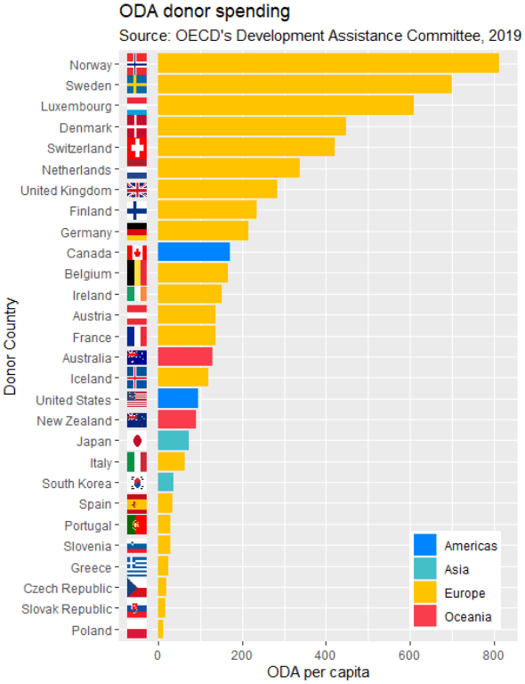
This quick function can add rectangular flags to graphs.
Click here to add circular flags with the ggflags package.
The data comes from a Wikipedia table on a recent report by OECD’s Overseas Development Aid (ODA) from donor countries in 2019.
Click here to read about scraping tables from Wikipedia with the rvest package in R.
library(countrycode)
library(ggimage)
In order to use the geom_flag() function, we need a country’s two-digit ISO code (For example, Ireland is IE!)
To add the ISO code, we can use the countrycode() function. Click here to read about a quick blog about the countrycode() function.
In one function we can quickly add a new variable that converts the country name in our dataset into to ISO codes.
oda$iso2 <- countrycode(oda$donor, "country.name", "iso2c")Also we can use the countrycode() function to add a continent variable. We will use that to fill the colors of our bars in the graph.
oda$continent <- countrycode(oda$iso2, "iso2c", "continent")We can now add the the geom_flag() function to the graph. The y = -50 prevents the flags overlapping with the bars and places them beside their name label. The image argument takes the iso2 variable.
Quick tip: with the reorder argument, if we wanted descending order (rather than ascending order of ODA amounts, we would put a minus sign in front of the oda_per_capita in the reorder() function for the x axis value.
oda_bar <- oda %>%
  ggplot(aes(x = reorder(donor, oda_per_capita), y = oda_per_capita, fill = continent)) +
  geom_flag(y = -50, aes(image = iso2))  +
       geom_bar(stat = "identity") +
       labs(title = "ODA donor spending ",
                   subtitle = "Source: OECD's Development Assistance Committee, 2019 ",
                   x = "Donor Country",
                   y = "ODA per capita")
The fill argument categorises the continents of the ODA donors. Sometimes I take my hex colors from https://www.color-hex.com/ website.
my_palette <- c("Americas" = "#0084ff", "Asia" = "#44bec7", "Europe" = "#ffc300", "Oceania" = "#fa3c4c")Last we print out the bar graph. The expand_limits() function moves the graph to fit the flags to the left of the y-axis.
oda_bar +
  coord_flip() +
  expand_limits(y = -50) + scale_fill_manual(values = my_palette)

