Exploratory Data Analysis and Descriptive Statistics for Political Science Research in R

Packages we will use:

library(tidyverse)      # of course
library(ggridges)       # density plots
library(GGally)         # correlation matrics
library(stargazer)      # tables
library(knitr)          # more tables stuff
library(kableExtra)     # more and more tables
library(ggrepel)        # spread out labels
library(ggstream)       # streamplots
library(bbplot)         # pretty themes
library(ggthemes)       # more pretty themes
library(ggside)         # stack plots side by side
library(forcats)        # reorder factor levels

Before jumping into any inferentional statistical analysis, it is helpful for us to get to know our data. For me, that always means plotting and visualising the data and looking at the spread, the mean, distribution and outliers in the dataset.

Before we plot anything, a simple package that creates tables in the stargazer package. We can examine descriptive statistics of the variables in one table.

Click here to read this practically exhaustive cheat sheet for the stargazer package by Jake Russ. I refer to it at least once a week.

I want to summarise a few of the stats, so I write into the summary.stat() argument the number of observations, the mean, median and standard deviation.

The kbl() and kable_classic() will change the look of the table in R (or if you want to copy and paste the code into latex with the type = "latex" argument).

In HTML, they do not appear.

Seth Meyers Ok GIF by Late Night with Seth Meyers - Find & Share on GIPHY

To find out more about the knitr kable tables, click here to read the cheatsheet by Hao Zhu.

Choose the variables you want, put them into a data.frame and feed them into the stargazer() function

stargazer(my_df_summary, 
          covariate.labels = c("Corruption index",
                               "Civil society strength", 
                               'Rule of Law score',
                               "Physical Integerity Score",
                               "GDP growth"),
          summary.stat = c("n", "mean", "median", "sd"), 
          type = "html") %>% 
  kbl() %>% 
  kable_classic(full_width = F, html_font = "Times", font_size = 25)
StatisticNMeanMedianSt. Dev.
Corruption index1790.4770.5190.304
Civil society strength1790.6700.8050.287
Rule of Law score1737.4517.0004.745
Physical Integerity Score1790.6960.8070.284
GDP growth1630.0190.0200.032

Next, we can create a barchart to look at the different levels of variables across categories. We can look at the different regime types (from complete autocracy to liberal democracy) across the six geographical regions in 2018 with the geom_bar().

my_df %>% 
  filter(year == 2018) %>%
  ggplot() +
  geom_bar(aes(as.factor(region),
               fill = as.factor(regime)),
           color = "white", size = 2.5) -> my_barplot

And we can add more theme changes

my_barplot + bbplot::bbc_style() + 
  theme(legend.key.size = unit(2.5, 'cm'),
        legend.text = element_text(size = 15),
        text = element_text(size = 15)) +
  scale_fill_manual(values = c("#9a031e","#00a896","#e36414","#0f4c5c")) + 
  scale_color_manual(values = c("#9a031e","#00a896","#e36414","#0f4c5c")) 

This type of graph also tells us that Sub-Saharan Africa has the highest number of countries and the Middle East and North African (MENA) has the fewest countries.

However, if we want to look at each group and their absolute percentages, we change one line: we add geom_bar(position = "fill"). For example we can see more clearly that over 50% of Post-Soviet countries are democracies ( orange = electoral and blue = liberal democracy) as of 2018.

We can also check out the density plot of democracy levels (as a numeric level) across the six regions in 2018.

With these types of graphs, we can examine characteristics of the variables, such as whether there is a large spread or normal distribution of democracy across each region.

my_df %>% 
  filter(year == 2018) %>%
  ggplot(aes(x = democracy_score, y = region, fill = regime)) +
  geom_density_ridges(color = "white", size = 2, alpha = 0.9, scale = 2) -> my_density_plot

And change the graph theme:

my_density_plot + bbplot::bbc_style() + 
  theme(legend.key.size = unit(2.5, 'cm')) +
  scale_fill_manual(values = c("#9a031e","#00a896","#e36414","#0f4c5c")) + 
  scale_color_manual(values = c("#9a031e","#00a896","#e36414","#0f4c5c")) 

Click here to read more about the ggridges package and click here to read their CRAN PDF.

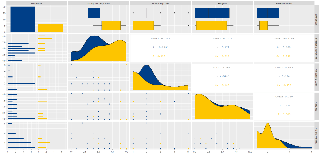
Next, we can also check out Pearson’s correlations of some of the variables in our dataset. We can make these plots with the GGally package.

The ggpairs() argument shows a scatterplot, a density plot and correlation matrix.

my_df %>%
  filter(year == 2018) %>%
  select(regime, 
         corruption, 
         civ_soc, 
         rule_law, 
         physical, 
         gdp_growth) %>% 
  ggpairs(columns = 2:5, 
          ggplot2::aes(colour = as.factor(regime), 
          alpha = 0.9)) + 
  bbplot::bbc_style() +
  scale_fill_manual(values = c("#9a031e","#00a896","#e36414","#0f4c5c")) + 
  scale_color_manual(values = c("#9a031e","#00a896","#e36414","#0f4c5c"))

Click here to read more about the GGally package and click here to read their CRAN PDF.

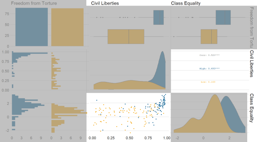
We can use the ggside package to stack graphs together into one plot.

There are a few arguments to add when we choose where we want to place each graph.

For example, geom_xsideboxplot(aes(y = freedom_house), orientation = "y") places a boxplot for the three Freedom House democracy levels on the top of the graph, running across the x axis. If we wanted the boxplot along the y axis we would write geom_ysideboxplot(). We add orientation = "y" to indicate the direction of the boxplots.

Next we indiciate how big we want each graph to be in the panel with theme(ggside.panel.scale = .5) argument. This makes the scatterplot take up half and the boxplot the other half. If we write .3, the scatterplot takes up 70% and the boxplot takes up the remainning 30%. Last we indicade scale_xsidey_discrete() so the graph doesn’t think it is a continuous variable.

We add Darjeeling Limited color palette from the Wes Anderson movie.

Click here to learn about adding Wes Anderson theme colour palettes to graphs and plots.

my_df %>%
 filter(year == 2018) %>% 
 filter(!is.na(fh_number)) %>% 
  mutate(freedom_house = ifelse(fh_number == 1, "Free", 
         ifelse(fh_number == 2, "Partly Free", "Not Free"))) %>%
  mutate(freedom_house = forcats::fct_relevel(freedom_house, "Not Free", "Partly Free", "Free")) %>% 
ggplot(aes(x = freedom_from_torture, y = corruption_level, colour = as.factor(freedom_house))) + 
  geom_point(size = 4.5, alpha = 0.9) +
  geom_smooth(method = "lm", color ="#1d3557", alpha = 0.4) +  
  geom_xsideboxplot(aes(y = freedom_house), orientation = "y", size = 2) +
  theme(ggside.panel.scale = .3) +
  scale_xsidey_discrete() +
  bbplot::bbc_style() + 
  facet_wrap(~region) + 
  scale_color_manual(values= wes_palette("Darjeeling1", n = 3))

The next plot will look how variables change over time.

We can check out if there are changes in the volume and proportion of a variable across time with the geom_stream(type = "ridge") from the ggstream package.

In this instance, we will compare urban populations across regions from 1800s to today.

my_df %>% 
  group_by(region, year) %>% 
  summarise(mean_urbanization = mean(urban_population_percentage, na.rm = TRUE)) %>% 
  ggplot(aes(x = year, y = mean_urbanization, fill = region)) +
  geom_stream(type = "ridge") -> my_streamplot

And add the theme changes

  my_streamplot + ggthemes::theme_pander() + 
  theme(
legend.title = element_blank(),
        legend.position = "bottom",
        legend.text = element_text(size = 25),
        axis.text.x = element_text(size = 25),
        axis.title.y = element_blank(),
        axis.title.x = element_blank()) +
  scale_fill_manual(values = c("#001219",
                               "#0a9396",
                               "#e9d8a6",
                               "#ee9b00", 
                               "#ca6702",
                               "#ae2012")) 

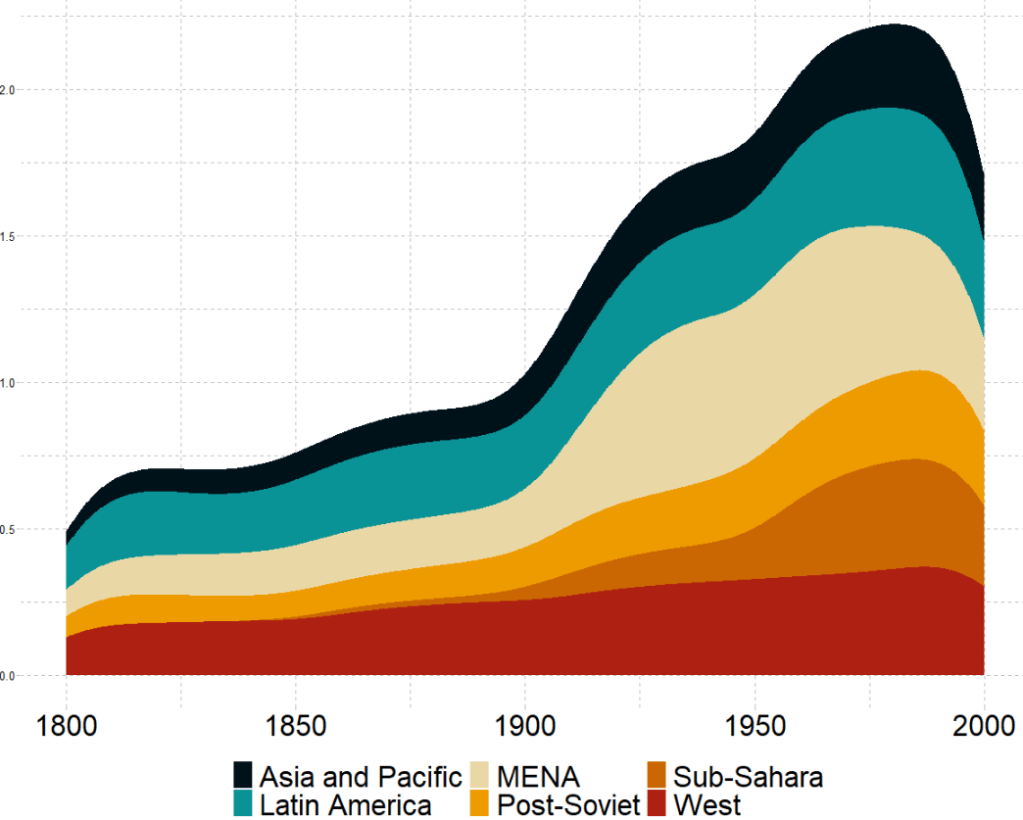
Click here to read more about the ggstream package and click here to read their CRAN PDF.

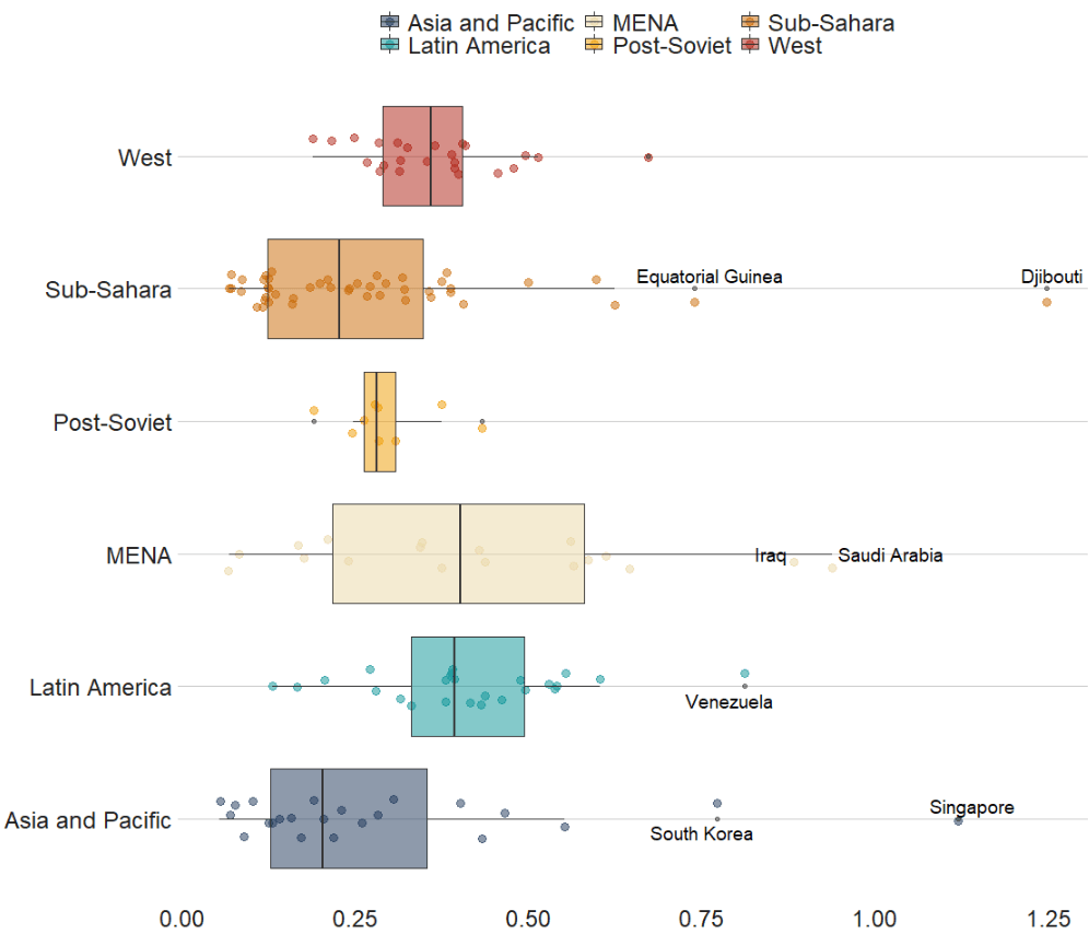
We can also look at interquartile ranges and spread across variables.

We will look at the urbanization rate across the different regions. The variable is calculated as the ratio of urban population to total country population.

Before, we will create a hex color vector so we are not copying and pasting the colours too many times.

my_palette <- c("#1d3557",
                "#0a9396",
                "#e9d8a6",
                "#ee9b00", 
                "#ca6702",
                "#ae2012")

We use the facet_wrap(~year) so we can separate the three years and compare them.

my_df %>% 
  filter(year == 1980 | year == 1990 | year == 2000)  %>% 
  ggplot(mapping = aes(x = region, 
                       y = urban_population_percentage, 
                       fill = region)) +
  geom_jitter(aes(color = region),
              size = 3, alpha = 0.5, width = 0.15) +
  geom_boxplot(alpha = 0.5) + facet_wrap(~year) + 
  scale_fill_manual(values = my_palette) +
  scale_color_manual(values = my_palette) + 
  coord_flip() + 
  bbplot::bbc_style()

If we want to look more closely at one year and print out the country names for the countries that are outliers in the graph, we can run the following function and find the outliers int he dataset for the year 1990:

is_outlier <- function(x) {
  return(x < quantile(x, 0.25) - 1.5 * IQR(x) | x > quantile(x, 0.75) + 1.5 * IQR(x))
}

We can then choose one year and create a binary variable with the function

my_df_90 <- my_df %>% 
  filter(year == 1990) %>% 
  filter(!is.na(urban_population_percentage))

my_df_90$my_outliers <- is_outlier(my_df_90$urban_population_percentage)

And we plot the graph:

my_df_90 %>% 
  ggplot(mapping = aes(x = region, y = urban_population_percentage, fill = region)) +
  geom_jitter(aes(color = region), size = 3, alpha = 0.5, width = 0.15) +
  geom_boxplot(alpha = 0.5) +
  geom_text_repel(data = my_df_90[which(my_df_90$my_outliers == TRUE),],
            aes(label = country_name), size = 5) + 
  scale_fill_manual(values = my_palette) +
  scale_color_manual(values = my_palette) + 
  coord_flip() + 
  bbplot::bbc_style() 

In the next blog post, we will look at t-tests, ANOVAs (and their non-parametric alternatives) to see if the difference in means / medians is statistically significant and meaningful for the underlying population.

Bo Burnham What GIF - Find & Share on GIPHY
Advertisement

Graph linear model plots with sjPlots in R

This blog post will look at the plot_model() function from the sjPlot package. This plot can help simply visualise the coefficients in a model.

Packages we need:

library(sjPlot)
library(kable)

We can look at variables that are related to citizens’ access to public services.

This dependent variable measures equal access access to basic public services, such as access to security, primary education, clean water, and healthcare and whether they are distributed equally or unequally according to socioeconomic position.

Higher scores indicate a more equal society.

I will throw some variables into the model and see what relationships are statistically significant.

The variables in the model are

  • level of judicial constraint on the executive branch,
  • freedom of information (such as freedom of speech and uncensored media),
  • level of democracy,
  • level of regime corruption and
  • strength of civil society.

So first, we run a simple linear regression model with the lm() function:

summary(my_model <- lm(social_access ~ judicial_constraint +
        freedom_information +
        democracy_score + 
        regime_corruption +
        civil_society_strength, 
        data = df))

We can use knitr package to produce a nice table or the regression coefficients with kable().

I write out the independent variable names in the caption argument

I also choose the four number columns in the col.names argument. These numbers are:

  • beta coefficient,
  • standard error,
  • t-score
  • p-value

I can choose how many decimals I want for each number columns with the digits argument.

And lastly, to make the table, I can set the type to "html". This way, I can copy and paste it into my blog post directly.

my_model %>% 
tidy() %>%
kable(caption = "Access to public services by socio-economic position.", 
col.names = c("Predictor", "B", "SE", "t", "p"),
digits = c(0, 2, 3, 2, 3), "html")
Access to public services by socio-economic position
Predictor B SE t p
(Intercept) 1.98 0.380 5.21 0.000
Judicial constraints -0.03 0.485 -0.06 0.956
Freedom information -0.60 0.860 -0.70 0.485
Democracy Score 2.61 0.807 3.24 0.001
Regime Corruption -2.75 0.381 -7.22 0.000
Civil Society Strength -1.67 0.771 -2.17 0.032
Kristin Cavallari GIF by E! - Find & Share on GIPHY

Higher democracy scores are significantly and positively related to equal access to public services for different socio-economic groups.

There is no statistically significant relationship between judicial constraint on the executive.

But we can also graphically show the coefficients in a plot with the sjPlot package.

There are many different arguments you can add to change the colors of bars, the size of the font or the thickness of the lines.

p <-  plot_model(my_model, 
      line.size = 8, 
      show.values = TRUE,
      colors = "Set1",
      vline.color = "#d62828",
      axis.labels = c("Civil Society Strength",  "Regime Corruption", "Democracy Score", "Freedom information", "Judicial constraints"), title = "Equal access to public services distributed by socio-economic position")

p + theme_sjplot(base_size = 20)

So how can we interpret this graph?

If a bar goes across the vertical red line, the coefficient is not significant. The further the bar is from the line, the higher the t-score and the more significant the coefficient!

Create a correlation matrix with GGally package in R

We can create very informative correlation matrix graphs with one function.

Packages we will need:

library(GGally)
library(bbplot) #for pretty themes

First, choose some nice hex colors.

my_palette <- c("#005D8F", "#F2A202")
Happy Friends GIF by netflixlat - Find & Share on GIPHY

Next, we can go create a dichotomous factor variable and divide the continuous “freedom from torture scale” variable into either above the median or below the median score. It’s a crude measurement but it serves to highlight trends.

Blue means the country enjoys high freedom from torture. Yellow means the county suffers from low freedom from torture and people are more likely to be tortured by their government.

Then we feed our variables into the ggpairs() function from the GGally package.

I use the columnLabels to label the graphs with their full names and the mapping argument to choose my own color palette.

I add the bbc_style() format to the corr_matrix object because I like the font and size of this theme. And voila, we have our basic correlation matrix (Figure 1).

corr_matrix <- vdem90 %>% 
  dplyr::mutate(
    freedom_torture = ifelse(torture >= 0.65, "High", "Low"),
    freedom_torture = as.factor(freedom_t))
  dplyr::select(freedom_torture, civil_lib, class_eq) %>% 
  ggpairs(columnLabels = c('Freedom from Torture', 'Civil Liberties', 'Class Equality'), 
    mapping = ggplot2::aes(colour = freedom_torture)) +
  scale_fill_manual(values = my_palette) +
  scale_color_manual(values = my_palette)

corr_matrix + bbplot::bbc_style()
Figure 1.
Excited Season 4 GIF by Friends - Find & Share on GIPHY

First off, in Figure 2 we can see the centre plots in the diagonal are the distribution plots of each variable in the matrix

Figure 2.

In Figure 3, we can look at the box plot for the ‘civil liberties index’ score for both high (blue) and low (yellow) ‘freedom from torture’ categories.

The median civil liberties score for countries in the high ‘freedom from torture’ countries is far higher than in countries with low ‘freedom from torture’ (i.e. citizens in these countries are more likely to suffer from state torture). The spread / variance is also far great in states with more torture.

Figure 3.

In Figur 4, we can focus below the diagonal and see the scatterplot between the two continuous variables – civil liberties index score and class equality index scores.

We see that there is a positive relationship between civil liberties and class equality. It looks like a slightly U shaped, quadratic relationship but a clear relationship trend is not very clear with the countries with higher torture prevalence (yellow) showing more randomness than the countries with high freedom from torture scores (blue).

Saying that, however, there are a few errant blue points as outliers to the trend in the plot.

The correlation score is also provided between the two categorical variables and the correlation score between civil liberties and class equality scores is 0.52.

Examining at the scatterplot, if we looked only at countries with high freedom from torture, this correlation score could be higher!

Figure 4.

Excited Season 4 GIF by Friends - Find & Share on GIPHY

Add rectangular flags to maps in R

We will make a graph to map the different colonial histories of countries in South-East Asia!

Click here to add circular flags.

Packages we will need:

library(ggimage)
library(rnaturalearth)
library(countrycode)
library(ggthemes)
library(reshape2)

I use the COLDAT Colonial Dates Dataset by Bastien Becker (2020). We will only need the first nine columns in the dataset:

col_df <- data.frame(col_df[1:9])

Next we will need to turn the dataset from wide to long with the reshape2 package:

long_col <- melt(col_df, id.vars=c("country"), 
                 measure.vars = c("col.belgium","col.britain", "col.france", "col.germany", 
"col.italy", "col.netherlands",  "col.portugal", "col.spain"),
                 variable.name = "colony", 
                 value.name = "value")

We drop all the 0 values from the dataset:

long_col <- long_col[which(long_col$value == 1),]

Next we use ne_countries() function from the rnaturalearth package to create the map!

map <- ne_countries(scale = "medium", returnclass = "sf")

Click here to read more about the rnaturalearth package.

Next we merge the two datasets together:

col_map <- merge(map, long_col, by.x = "iso_a3", by.y = "iso3", all.x = TRUE)

We can change the class and factors of the colony variable:

library(plyr)
col_map$colony_factor <- as.factor(col_map$colony)
col_map$colony_factor <- revalue(col_map$colony_factor, c("col.belgium"="Belgium", "col.britain" = "Britain",
 "col.france" = "France",
"col.germany" = "Germany",
 "col.italy" = "Italy",
 "col.netherlands" = "Netherlands", "col.portugal" = "Portugal",
 "col.spain" = "Spain",
 "No colony" = "No colony"))

Nearly there.

Next we will need to add the longitude and latitude of the countries. The data comes from the web and I can scrape the table with the rvest package

library(rvest)

coord <- read_html("https://developers.google.com/public-data/docs/canonical/countries_csv")

coord_tables <- coord %>% html_table(header = TRUE, fill = TRUE)

coord <- coord_tables[[1]]

col_map <- merge(col_map, coord, by.x= "iso_a2", by.y = "country", all.y = TRUE)

Click here to read more about the rvest package.

And we can make a vector with some hex colors for each of the European colonial countries.

my_palette <- c("#0d3b66","#e75a7c","#f4d35e","#ee964b","#f95738","#1b998b","#5d22aa","#85f5ff", "#19381F")

Next, to graph a map to look at colonialism in Asia, we can extract countries according to the subregion variable from the rnaturalearth package and graph.

asia_map <- col_map[which(col_map$subregion == "South-Eastern Asia" | col_map$subregion == "Southern Asia"),]

Click here to read more about the geom_flag function.

colony_asia_graph <- asia_map %>%
  ggplot() + geom_sf(aes(fill = colony_factor), 
                     position = "identity") +
  ggimage::geom_flag(aes(longitude-2, latitude-1, image = col_iso), size = 0.04) +
  geom_label(aes(longitude+1, latitude+1, label = factor(sovereignt))) +
  scale_fill_manual(values = my_palette)

And finally call the graph with the theme_map() from ggthemes package

colony_asia_graph + theme_map()

References

Becker, B. (2020). Introducing COLDAT: The Colonial Dates Dataset.

Add rectangular flags to graphs with ggimage package in R

This quick function can add rectangular flags to graphs.

Click here to add circular flags with the ggflags package.

Latina GIF by Latinx Heritage Month - Find & Share on GIPHY

The data comes from a Wikipedia table on a recent report by OECD’s Overseas Development Aid (ODA) from donor countries in 2019.

Click here to read about scraping tables from Wikipedia with the rvest package in R.

library(countrycode)
library(ggimage)

In order to use the geom_flag() function, we need a country’s two-digit ISO code (For example, Ireland is IE!)

To add the ISO code, we can use the countrycode() function. Click here to read about a quick blog about the countrycode() function.

In one function we can quickly add a new variable that converts the country name in our dataset into to ISO codes.

oda$iso2 <- countrycode(oda$donor, "country.name", "iso2c")

Also we can use the countrycode() function to add a continent variable. We will use that to fill the colors of our bars in the graph.

oda$continent <- countrycode(oda$iso2, "iso2c", "continent")

We can now add the the geom_flag() function to the graph. The y = -50 prevents the flags overlapping with the bars and places them beside their name label. The image argument takes the iso2 variable.

Quick tip: with the reorder argument, if we wanted descending order (rather than ascending order of ODA amounts, we would put a minus sign in front of the oda_per_capita in the reorder() function for the x axis value.

oda_bar <- oda %>% 
  ggplot(aes(x = reorder(donor, oda_per_capita), y = oda_per_capita, fill = continent)) + 
  geom_flag(y = -50, aes(image = iso2))  +
       geom_bar(stat = "identity") + 
       labs(title = "ODA donor spending ",
                   subtitle = "Source: OECD's Development Assistance Committee, 2019 ",
                   x = "Donor Country",
                   y = "ODA per capita")

The fill argument categorises the continents of the ODA donors. Sometimes I take my hex colors from https://www.color-hex.com/ website.

my_palette <- c("Americas" = "#0084ff", "Asia" = "#44bec7", "Europe" = "#ffc300", "Oceania" = "#fa3c4c")

Last we print out the bar graph. The expand_limits() function moves the graph to fit the flags to the left of the y-axis.

Seth Meyers Omg GIF by Late Night with Seth Meyers - Find & Share on GIPHY
oda_bar +
  coord_flip() +
  expand_limits(y = -50) + scale_fill_manual(values = my_palette)