How to run multiple t-tests in a function with the broom package in R

Packages we will need:

library(tidyverse)
library(broom)

We will use the Varieties of Democracy dataset again.

Excited Will Ferrell GIF - Find & Share on GIPHY

We will use a t-test comparing democracies (boix == 1) and non-democracies (boix == 0) in the years 2000 to 2020.

We need to remove the instances where boix is NA.

I choose three t-tests to run simultaneously. Comparing democracies and non-democracies on:

  1. the extent to which the country consults religious groups (relig_consult)
  2. the extent to which the country consults Civil Society Organization (CSO) groups (cso_consult)
  3. level of freedom from judicial corruption (judic_corruption) – higher scores mean that there are FEWER instances of judicial corruption
vdem %>% 
filter(year %in% c(2000:2020)) %>%
filter(!is.na(e_boix_regime)) %>%
group_by(e_boix_regime) %>%
select(relig_consult = v2csrlgcon,
cso_consult = v2cscnsult,
judic_corruption = v2jucorrdc) -> vdem

Next we need to pivot the data from wide to long

  vdem %<>% pivot_longer(!e_boix_regime, 
names_to = "variable",
values_to = "value")

Now we get to iterating over the three variables and conducting a t-test on each variable across democracies versus non-democracies

Excited Elf GIF - Find & Share on GIPHY
vdem %>%
group_by(variable) %>%
nest() %>%
mutate(t_test = map(data, ~t.test(value ~ e_boix_regime, data = .x)),
tidy = map(t_test, broom::tidy)) %>%
select(variable, tidy) %>%
unnest(tidy) -> ttest_results

If we look closely at the line

mutate(t_test = map(data, ~t.test(value ~ e_boix_regime, data = .x))):

Here, mutate() adds a new column named t_test to the grouped and nested data.

map() is used to apply a function to each element of the list-column (here, each nested data frame).

The function applied is t.test(value ~ e_boix_regime, data = .x).

This function performs a t-test comparing the means of value across two groups defined by e_boix_regime within each nested data frame.

.x represents each nested data frame in turn.

And here are the tidy results:

If we save the above results in a data.frame, we can graph the following:

ttest_results %>%
ggplot(aes(x = variable, y = estimate, ymin = conf.low, ymax = conf.high)) +
geom_point() +
geom_errorbar(width = 0.2) +
coord_flip() +
labs(title = "T-Test Estimates with Confidence Intervals",
x = "Variable",
y = "Estimate Difference") +
theme_minimal()

Add some colors to highlight magnitude of difference

  ggplot(aes(x = variable, y = estimate, ymin = conf.low, ymax = conf.high, color = color_value)) +
geom_point() +
geom_errorbar(width = 0.7, size = 3) +
scale_color_gradientn(colors = c("#0571b0", "#92c5de", "#f7f7f7", "#f4a582", "#ca0020")) +
coord_flip() +
labs(title = "T-Test Estimates with Confidence Intervals",
x = "Variable",
y = "Estimate Difference") +
theme_minimal() +
guides(color = guide_colorbar(title = ""))

Sometimes vdem variables are reverse scored or on different scales

  # mutate(across(judic_corruption, ~ 1- .x)) %>% 
# mutate(across(everything(), ~(.x - mean(.x, na.rm = TRUE)) / sd(.x, na.rm = TRUE), .names = "z_{.col}")) %>%
# select(contains("z_"))

How to run linear regression analysis with tidymodels in R for temporal prediction (Tidymodels Series PART 2)

Packages we will need:

library(tidyverse)
library(tidymodels)
library(magrittr)

We will look at Varieties of Democracy dataset

vdem %>% 
select(judic_corruption = v2jucorrdc,
corruption = v2xnp_regcorr,
freedom_kill= v2clkill,
freedom_torture = v2cltort,
freedom_religion = v2clrelig,
ps_theft = v2exthftps,
country_name,
year) -> vdem

We will create two datasets: one for all years EXCEPT 2020 and one for only 2020

vdem %>% 
filter(year > 1989 & year < 2020) -> vdem_1990_2019

vdem %>%
filter(year == 2020) -> vdem_2020

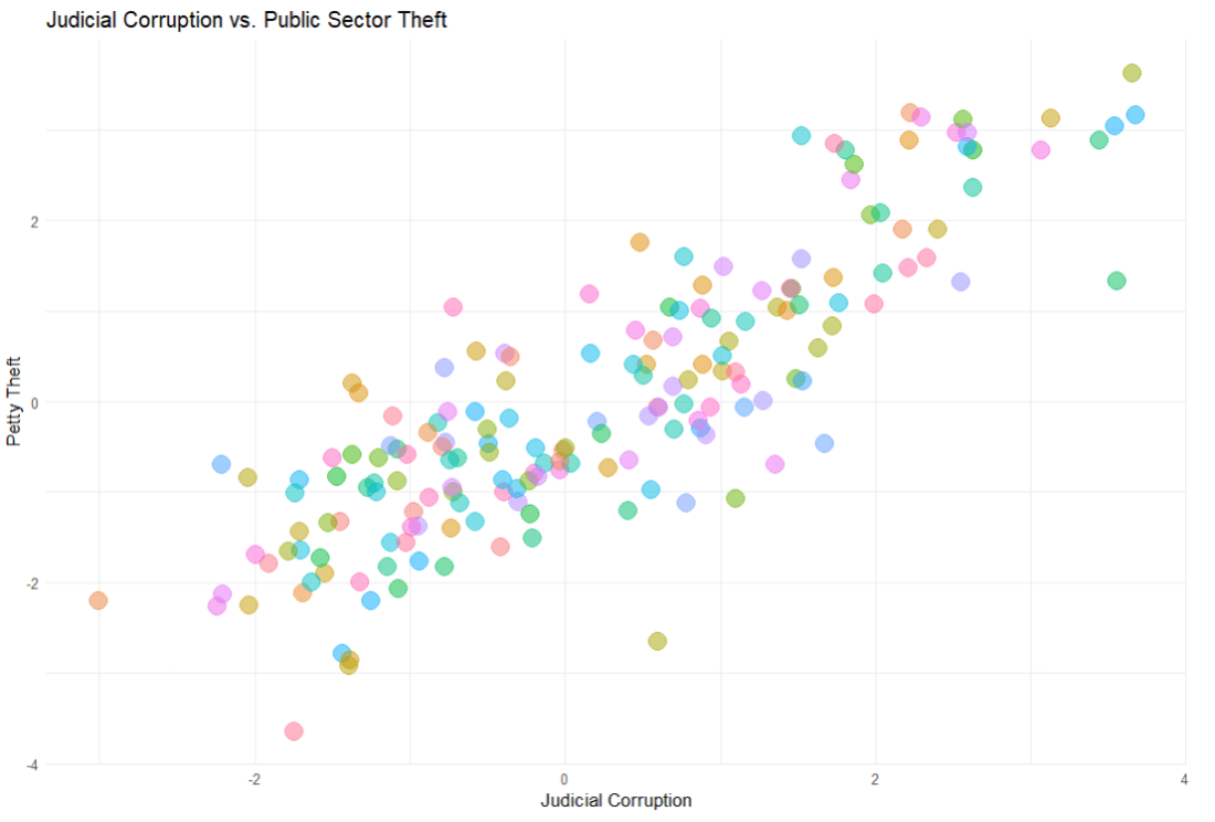
First we build the model. We will look at whether level of public sector theft can predict the judicial corruption levels.

The model will have three parts

linear_reg() : This is the foundational step indicating the type of regression we want to run

set_engine() : This is used to specify which package or system will be used to fit the model, along with any arguments specific to that software. With a linear regression, we don’t really need any special package.

set_mode("regression") : In our regression model, the model predicts continuous outcomes. If we wanted to use a categorical variable, we would choose “classification

linear_spec <- linear_reg() %>%
set_engine("lm") %>%
set_mode("regression")

If we print out the linear_spec object, it gives us information about the model specifications we had just fed in!

> linear_spec
Linear Regression Model Specification (regression)

Computational engine: lm 

class(linear_spec)
[1] "linear_reg" "model_spec"

Now we create a “recipe” with our model formula and any steps we take to change the variables.

recipe_spec <- recipe(judic_corruption ~ ps_theft, data = vdem_1990_2019) %>%
step_normalize(all_predictors(), -all_outcomes())

Click here to look at all the possible steps we can add to the regression recipe

https://recipes.tidymodels.org/reference

When we print this out, it shows us the stages in our lm “recipe”

── Recipe 

── Inputs 
Number of variables by role
outcome:   1
predictor: 2

── Operations 
• Centering and scaling for: all_predictors(), 

Finally, we are going to feed the recipe and the model specification into the workflow “oven”, if we want to keep the cooking metaphor going.

linear_workflow <- workflow() %>%
add_recipe(recipe_spec) %>%
add_model(linear_spec) %>%
fit(data = vdem_1990_2019)

We can tidy up the results of the linear regression with the tidy() function

linear_workflow %>% tidy()

Printing out a tidy version of the data

linear_workflow %>% tidy()
# A tibble: 31 × 5
   term                   estimate std.error statistic p.value
   <chr>                     <dbl>     <dbl>     <dbl>   <dbl>
 1 (Intercept)            0.0822      0.0584   1.41      0.160
 2 ps_theft                    1.29        0.0105 123.        0    
 3 year-1.57179471038752 -0.0175      0.0825  -0.212     0.832
 4 year-1.45612480773099 -0.0119      0.0824  -0.144     0.885
 5 year-1.34045490507446 -0.0321      0.0823  -0.390     0.697
 6 year-1.22478500241793  0.00679     0.0823   0.0825    0.934
 7 year-1.1091150997614   0.000206    0.0823   0.00250   0.998
 8 year-0.99344519710487 -0.00175     0.0823  -0.0213    0.983
 9 year-0.87777529444834  0.00339     0.0823   0.0412    0.967
10 year-0.76210539179181 -0.00774     0.0822  -0.0942    0.925
# ℹ 21 more rows
# ℹ Use `print(n = ...)` to see more rows

Now we can see does the model from 1990 to 2019 predict the values in 2020?

Natasha Lyonne GIF by Golden Globes - Find & Share on GIPHY
predictions <- predict(linear_workflow, new_data = vdem_2020) %>%
bind_cols(vdem_2020)
> predictions
# A tibble: 179 × 6
    .pred judic_corruption ps_theft country_name   year  diff
    <dbl>            <dbl>    <dbl> <chr>         <int> <dbl>
 1 -0.447           -2.21    -0.693 Pakistan       2020  1.77
 2  1.03            -0.722    1.04  Tunisia        2020  1.76
 3  0.319           -1.38     0.205 Burkina Faso   2020  1.70
 4  0.228           -1.33     0.098 Bolivia        2020  1.56
 5 -0.569           -2.05    -0.837 Comoros        2020  1.48
 6 -1.73            -3.01    -2.19  Azerbaijan     2020  1.28
 7  0.469           -0.781    0.381 Peru           2020  1.25
 8  0.623           -0.578    0.562 Burma/Myanmar  2020  1.20
 9  1.64             0.478    1.76  Benin          2020  1.16
10  2.65             1.52     2.94  Luxembourg     2020  1.13
# ℹ 169 more rows
# ℹ Use `print(n = ...)` to see more rows

We can look at the RMSE, R square and MAE scores

In regression analysis, Root Mean Square Error (RMSE), R-squared (R²), and Mean Absolute Error (MAE) are metrics used to evaluate the performance and accuracy of regression models.

We use the metrics function from the yardstick package.

predictions represents the predicted values generated by your model. These are typically the values your model predicts for the outcome variable based on the input data.

truth is the actual or true values of the outcome variable. It is what you are trying to predict with your model. In the context of your code, judic_corruption is likely the true values of judicial corruption, against which the predictions are being compared.

The estimate argument is optional. It is used when the predictions are stored under a different name or within a different object.

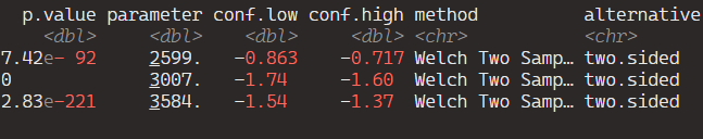
metrics <- yardstick::metrics(predictions, truth = judic_corruption, estimate = .pred)

And here are the three metrics to judge how “good” our predictions are~

> metrics
# A tibble: 3 × 3
  .metric .estimator .estimate
  <chr>   <chr>          <dbl>
1 rmse    standard       0.774
2 rsq     standard       0.718
3 mae     standard       0.622

Determining whether RMSE, R-squared (R2), and MAE values are “good” depends on several factors, including the context of your specific problem, the scale of the outcome variable, and the performance of other models in the same domain.

RMSE (Root mean square deviation)

rmse <- sqrt(mean(predictions$diff^2))
  • RMSE measures the average magnitude of the errors between predicted and actual values.
  • Lower RMSE values indicate better model performance, with 0 representing a perfect fit.
  • Lower RMSE values indicate better model performance.
  • It’s common to compare the RMSE of your model to the RMSE of a baseline model or other competing models in the same domain.
  • The interpretation of “good” RMSE depends on the scale of your outcome variable. A small RMSE relative to the range of the outcome variable suggests better predictive accuracy.

R-squared

  • Higher R-squared values indicate a better fit of the model to the data.
  • However, R-squared alone does not indicate whether the model is “good” or “bad” – it should be interpreted in conjunction with other factors.
  • A high R-squared does not necessarily mean that the model makes accurate predictions.
  • This is especially if it is overfitting the data.
  • R-squared represents the proportion of the variance in the dependent variable that is predictable from the independent variables.
  • Values closer to 1 indicate a better fit, with 1 representing a perfect fit.

MAE (Mean Absolute Error):

  • Similar to RMSE, lower MAE values indicate better model performance.
  • MAE is less sensitive to outliers compared to RMSE, which may be advantageous depending on the characteristics of your data.
  • MAE measures the average absolute difference between predicted and actual values.
  • Like RMSE, lower MAE values indicate better model performance, with 0 representing a perfect fit.

And now we can plot out the differences between predicted values and actual values for judicial corruption scores

We can add labels for the countries that have the biggest difference between the predicted values and the actual values – i.e. the countries that our model does not predict well. These countries can be examined in more detail.

First we add a variable that calculates the absolute difference between the actual judicial corruption variable and the value that our model predicted.

Then we use filter to choose the top ten countries

And finally in the geom_repel() layer, we use this data to add the labels to the plot

predictions <- predictions %>%
mutate(difference = abs(judic_corruption - .pred),
rank = rank(-difference))

top_countries <- predictions %>%
filter(rank <= 10)

predictions %>%
ggplot(aes(x = judic_corruption, y = .pred)) +
geom_point(color = "#1d3557", alpha = 0.6, size = 4) +
ggrepel::geom_label_repel(data = top_countries, aes(label = country_name),
nudge_y = 0.15, color = "#14213d", size = 3.5, alpha = 0.7) +
geom_abline(intercept = 0, slope = 1, linetype = "dashed",
color = "#6a040f", size = 3, alpha = 0.75) +
ggtitle("Actual vs. Predicted Judicial Corruption Scores") +
xlab("Actual Scores") +
ylab("Predicted Scores") +
xlim(c(-3, 3)) +
ylim(c(-3, 3)) +
bbplot::bbc_style() +
theme(plot.title = element_text(hjust = 0.5))

Turn wide to long format with reshape2 package in R

A simple feature to turn wide format into long format in R.

I have a dataset with the annual per capita military budget for 171 countries.

The problem is that it is in completely wrong format to use for panel data (i.e. cross-sectional time-series analysis).

So here is simple way I found to fix this problem and turn this:

WIDE FORMAT : a separate column for each year

into this:

LONG FORMAT : one single “year” column and one single “value” column

It’s like magic.

First install and load the reshape2 package

install.packages("reshape2")
library(reshape2)

I name my new long form dataframe; in this case, the imaginatively named mil_long.

I use the melt() function and first type in the name of the original I want to change; in this case it is mil_wide

id.vars tells R the unique ID for each new variable. Since I am looking at military budgets for each country, I’ll use Country variable as my ID.

variable.name for me is the year variable which, in wide format, is the name of every column. For me, I want to compress all the year columns into this new variable.

value.name is the new variable I make to hold the value that in my dataset is the per capita military budget amount per country per year. I name this new variable … you guessed it, value.

mil_long <- melt(mil_wide, id.vars= "Country", variable.name = "year", value.name = "value"))

So simple, it’s hard to believe.

Looking at my new mil_long dataset, my new long format dataframe has only three columns = “Country”, “year” and “value” and 5,504 rows for each country-year observation across the 32 years.

Now, my dataframe is ready to be transformed into a panel data frame!

reshape2 has two main functions which I think have quite memorable names:  melt and cast.

melt is for wide-format dataframes that you want to “melt” into long-format.

cast for dataframes in long-format data which you figuratively “cast” into a wide-format dataframe.

As a poli-sci person, I have so far only turned my dataframe in long form, for eventual panel data analysis with "plm" package.

Click here to see how to transform dataframes into panel dataframes with the plm package.

Click here to read the full reshape2 package documentation on CRAN