Packages we need:
library(tidyverse)
library(ggstream)
library(magrittr)
library(bbplot)
library(janitor)
We can look at proportions of energy sources across 10 years in Ireland. Data source comes from: https://www.seai.ie/data-and-insights/seai-statistics/monthly-energy-data/electricity/
Before we graph the energy sources, we can tidy up the variable names with the janitor package. We next select column 2 to 12 which looks at the sources for electricity generation. Other rows are aggregates and not the energy-related categories we want to look at.
Next we pivot the dataset longer to make it more suitable for graphing.
We can extract the last two digits from the month dataset to add the year variable.
elec %<>%
janitor::clean_names()
elec[2:12,] -> elec
el <- elec %>%
pivot_longer(!electricity_generation_g_wh,
names_to = "month", values_to = "value") %>%
substrRight <- function(x, n){
substr(x, nchar(x) - n + 1, nchar(x))}
el$year <- substrRight(el$month, 2)
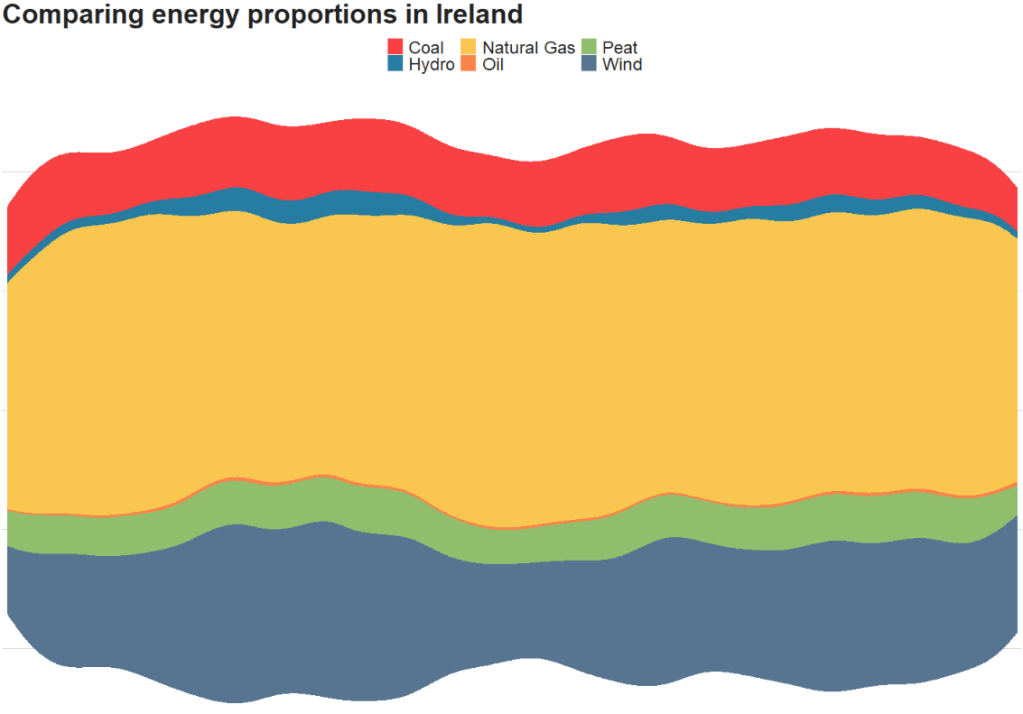
el %<>% select(year, month, elec_type = electricity_generation_g_wh, elec_value = value) First we can use the geom_stream from the ggstream package. There are three types of plots: mirror, ridge and proportion.
First we will plot the proportion graph.
Select the different types of energy we want to compare, we can take the annual values, rather than monthly with the tried and trusted group_by() and summarise().
Optionally, we can add the bbc_style() theme for the plot and different hex colors with scale_fill_manual() and feed a vector of hex values into the values argument.
el %>%
  filter(elec_type == "Oil" |
           elec_type == "Coal" |
           elec_type == "Peat" |
           elec_type == "Hydro" |
           elec_type == "Wind" |
           elec_type == "Natural Gas") %>%
  group_by(year, elec_type) %>%
  summarise(annual_value = sum(elec_value, na.rm = TRUE)) %>%
  ggplot(aes(x = year,
             y = annual_value,
             group = elec_type,
             fill = elec_type)) +
  ggstream::geom_stream(type = "proportion") +
  bbplot::bbc_style() +
  labs(title = "Comparing energy proportions in Ireland") +
  scale_fill_manual(values = c("#f94144",
                               "#277da1",
                               "#f9c74f",
                               "#f9844a",
                               "#90be6d",
                               "#577590"))
With ggstream::geom_stream(type = "mirror")
With ggstream::geom_stream(type = "ridge")

Without the ggstream package, we can recreate the proportion graph with slightly different looks
https://giphy.com/gifs/filmeditor-clueless-movie-l0ErMA0xAS1Urd4e4
el %>%
  filter(elec_type == "Oil" |
           elec_type == "Coal" |
           elec_type == "Peat" |
           elec_type == "Hydro" |
           elec_type == "Wind" |
           elec_type == "Natural Gas") %>%
  group_by(year, elec_type) %>%
  summarise(annual_value = sum(elec_value, na.rm = TRUE)) %>%
  ggplot(aes(x = year,
             y = annual_value,
             group = elec_type,
             fill = elec_type)) +
  geom_area(alpha=0.8 , size=1.5, colour="white") +
  bbplot::bbc_style() +
  labs(title = "Comparing energy proportions in Ireland") +
  theme(legend.key.size = unit(2, "cm")) +
  scale_fill_manual(values = c("#f94144",
                               "#277da1",
                               "#f9c74f",
                               "#f9844a",
                               "#90be6d",
                               "#577590"))