The ExPand package is an example of a shiny app.
What is a shiny app, you ask? Click to look at a quick Youtube explainer. It’s basically a handy GUI for R.
When we feed a panel data.frame into the ExPanD() function, a new screen pops up from R IDE (in my case, RStudio) and we can interactively toggle with various options and settings to run a bunch of statistical and visualisation analyses.
Click here to see how to convert your data.frame to pdata.frame object with the plm package.
Be careful your pdata.frame is not too large with too many variables in the mix. This will make ExPanD upset enough to crash. Which, of course, I learned the hard way.
Also I don’t know why there are random capitalizations in the PaCkaGe name. Whenever I read it, I think of that Sponge Bob meme.

If anyone knows why they capitalised the package this way. please let me know!
So to open up the new window, we just need to feed the pdata.frame into the function:
ExPanD(mil_pdf)For my computer, I got error messages for the graphing sections, because I had an old version of Cairo package. So to rectify this, I had to first install a source version of Cairo and restart my R session. Then, the error message gods were placated and they went away.
install.packages("Cairo", type="source")Then press command + shift + F10 to restart R session
library(Cairo)You may not have this problem, so just ignore if you have an up-to-date version of the necessary packages.
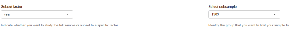
When the new window opens up, the first section allows you to filter subsections of the panel data.frame. Similar to the filter() argument in the dplyr package.

For example, I can look at just the year 1989:
But let’s look at the full sample
We can toggle with variables to look at mean scores for certain variables across different groups. For example, I look at physical integrity scores across regime types.
- Purple plot: closed autocracy
- Turquoise plot: electoral autocracy
- Khaki plot: electoral democracy:
- Peach plot: liberal democracy
The plots show that there is a high mean score for physical integrity scores for liberal democracies and less variance. However with the closed and electoral autocracies, the variance is greater.

We can look at a visualisation of the correlation matrix between the variables in the dataset.

Next we can look at a scatter plot, with option for loess smoother line, to graph the relationship between democracy score and physical integrity scores. Bigger dots indicate larger GDP level.

Last we can run regression analysis, and add different independent variables to the model.
We can add fixed effects.
And we can subset the model by groups.
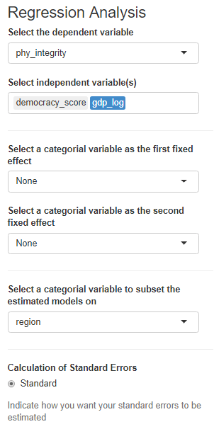

The first column, the full sample is for all regions in the dataset.
The second column, column 1 is
Column 2 Post Soviet countries
Column 3: Latin America
Column 4: AFRICA
Column 5: Europe, North America
Column 6: Asia
