The European Social Survey (ESS) measure attitudes in thirty-ish countries (depending on the year) across the European continent. It has been conducted every two years since 2001.
The survey consists of a core module and two or more ‘rotating’ modules, on social and public trust; political interest and participation; socio-political orientations; media use; moral, political and social values; social exclusion, national, ethnic and religious allegiances; well-being, health and security; demographics and socio-economics.
So lots of fun data for political scientists to look at.
install.packages("essurvey")
library(essurvey)
The very first thing you need to do before you can download any of the data is set your email address.
set_email("rforpoliticalscience@gmail.com")Don’t forget the email address goes in as a string in “quotations marks”.
Show what countries are in the survey with the show_countries() function.
show_countries()
[1] "Albania"     "Austria"    "Belgium"
[4] "Bulgaria"    "Croatia"     "Cyprus"
[7] "Czechia"     "Denmark"     "Estonia"
[10] "Finland"    "France"      "Germany"
[13] "Greece"     "Hungary"     "Iceland"
[16] "Ireland"    "Israel"      "Italy"
[19] "Kosovo"     "Latvia"      "Lithuania"
[22] "Luxembourg" "Montenegro"  "Netherlands"
[25] "Norway"     "Poland"      "Portugal"
[28] "Romania" "Russian Federation" "Serbia"
[31] "Slovakia"   "Slovenia"     "Spain"
[34] "Sweden"     "Switzerland"  "Turkey"
[37] "Ukraine"    "United Kingdom"
It’s important to know that country names are case sensitive and you can only use the name printed out by show_countries(). For example, you need to write “Russian Federation” to access Russian survey data; if you write “Russia”…

Using these country names, we can download specific rounds or waves (i.e survey years) with import_country. We have the option to choose the two most recent rounds, 8th (from 2016) and 9th round (from 2018).
ire_data <- import_all_cntrounds("Ireland")The resulting data comes in the form of nine lists, one for each round

These rounds correspond to the following years:
- ESS Round 9 – 2018
- ESS Round 8 – 2016
- ESS Round 7 – 2014
- ESS Round 6 – 2012
- ESS Round 5 – 2010
- ESS Round 4 – 2008
- ESS Round 3 – 2006
- ESS Round 2 – 2004
- ESS Round 1 – 2002
I want to compare the first round and most recent round to see if Irish people’s views have changed since 2002. In 2002, Ireland was in the middle of an economic boom that we called the “Celtic Tiger”. People did mad things like buy panini presses and second house in Bulgaria to resell. Then the 2008 financial crash hit the country very hard.
Irish people during the Celtic Tiger:

Irish people after the Celtic Tiger crash:

Ireland in 2018 was a very different place. So it will be interesting to see if these social changes translated into attitude changes.
First, we use the import_country() function to download data from ESS. Specify the country and rounds you want to download.
ire <-import_country(country = "Ireland", rounds = c(1, 9))The resulting ire object is a list, so we’ll need to extract the two data.frames from the list:
ire_1 <- ire[[1]]

ire_9 <- ire[[2]]
The exact same questions are not asked every year in ESS; there are rotating modules, sometimes questions are added or dropped. So to merge round 1 and round 9, first we find the common columns with the intersect() function.
common_cols <- intersect(colnames(ire_1), colnames(ire_9))And then bind subsets of the two data.frames together that have the same columns with rbind() function.
ire_df <- rbind(subset(ire_1, select = common_cols),
                subset(ire_9, select = common_cols))
Now with my merged data.frame, I only want to look at a few of the variables and clean up the dataset for the analysis.
Click here to look at all the variables in the different rounds of the survey.
att9 <- data.frame(country = data9$cntry,
                   round = data9$essround,
                   imm_same_eth = data9$imsmetn,
                   imm_diff_eth = data9$imdfetn,
                   imm_poor = data9$impcntr,
                   imm_econ = data9$imbgeco,
                   imm_culture = data9$imueclt,
                   imm_qual_life = data9$imwbcnt,
                   left_right = data9$lrscale)

class(att9$imm_same_eth)
All the variables in the dataset are a special class called “haven_labelled“. So we must convert them to numeric variables with a quick function. We exclude the first variable because we want to keep country name as a string character variable.
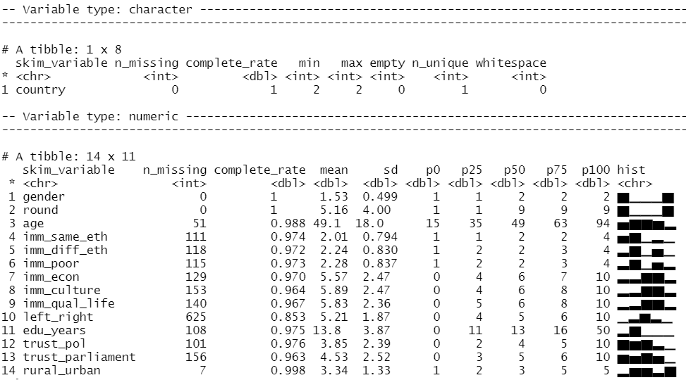
att_df[2:15] <- lapply(att_df[2:15], function(x) as.numeric(as.character(x)))We can look at the distribution of our variables and count how many missing values there are with the skim() function from the skimr package
library(skimr)

skim(att_df)
We can run a quick t-test to compare the mean attitudes to immigrants on the statement: “Immigrants make country worse or better place to live” across the two survey rounds.
Lower scores indicate an attitude that immigrants undermine Ireland’ quality of life and higher scores indicate agreement that they enrich it!
t.test(att_df$imm_qual_life ~ att_df$round)
In future blog, I will look at converting the raw output of R into publishable tables.
The results of the independent-sample t-test show that if we compare Ireland in 2002 and Ireland in 2018, there has been a statistically significant increase in positive attitudes towards immigrants and belief that Ireland’s quality of life is more enriched by their presence in the country.
As I am currently an immigrant in a foreign country myself, I am glad to come from a country that sees the benefits of immigrants!

If we load the ggpubr package, we can graphically look at the difference in mean attitude scores.
library(ggpubr)

box1 <- ggpubr::ggboxplot(att_df, x = "round", y = "imm_qual_life", color = "round", palette = c("#d11141", "#00aedb"),
 ylab = "Attitude", xlab = "Round")

box1 + stat_compare_means(method = "t.test")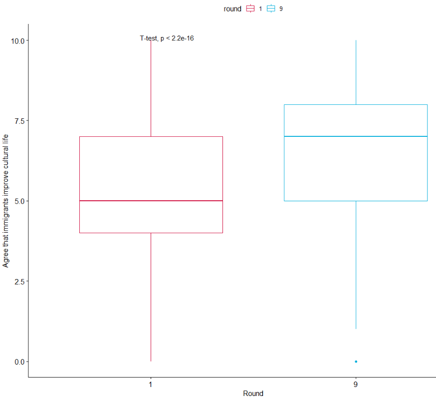
It’s not the most glamorous graph but it conveys the shift in Ireland to more positive attitudes to immigration!
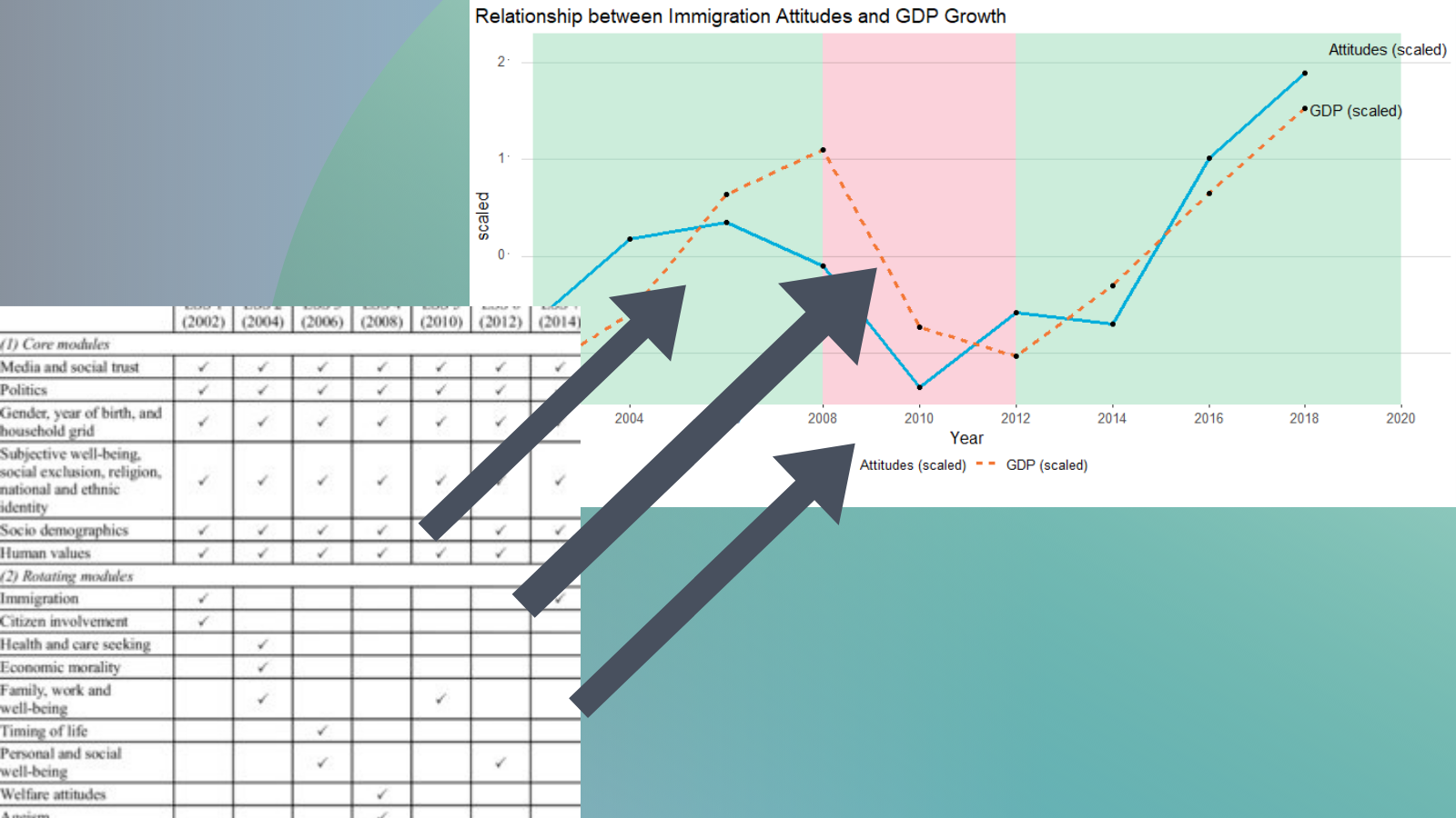
I suspect that a country’s economic growth correlates with attitudes to immigration.
So let’s take the mean annual score values
ire_agg <- ireland[!duplicated(ireland$mean_imm_qual_life),]
ire_agg <- ire_agg %>%
select(year, everything())
Next we can take data from Quandl website on annual Irish GDP growth (click here to learn how to access economic data via a Quandl API on R.)
gdp <- Quandl('ODA/IRL_LE', start_date='2002-01-01', end_date='2020-01-01',type="raw")
Create a year variable from the date variable
gdp$year <- substr(gdp$Date, start = 1, stop = 4)
Add year variable to the ire_agg data.frame that correspond to the ESS survey rounds.
year =c("2002","2004","2006","2008","2010","2012","2014","2016","2018")
year <- data.frame(year)
ire_agg <- cbind(ire_agg, year)
Merge the GDP and ESS datasets
ire_agg <- merge(ire_agg, gdp, by.x = "year", by.y = "year", all.x = TRUE)
Scale the GDP and immigrant attitudes variables so we can put them on the same plot.
ire_agg$scaled_gdp <- scale(ire_agg$Value)

ire_agg$scaled_imm_attitude <- scale(ire_agg$mean_imm_qual_life)
In order to graph both variables on the same graph, we turn the two scaled variables into two factors of a single variable.
ire_agg <- ire_agg %>%
  select(year, scaled_imm_attitude, scaled_gdp) %>%
  gather(key = "variable", value = "value", -year)
Next, we can change the names of the factors
ire_agg$variable <- revalue(ire_agg$variable, c("scaled_gdp"="GDP (scaled)", "scaled_imm_attitude" = "Attitudes (scaled)"))
And finally, we can graph the plot.
The geom_rect() function graphs the coloured rectangles on the plot. I take colours from this color-hex website; the green rectangle for times of economic growth and red for times of recession. Makes sure the geom-rect() comes before the geom_line().
library(ggpthemes)

ggplot(ire_agg, aes(x = year, y = value, group = variable)) + geom_rect(aes(xmin= "2008",xmax= "2012",ymin=-Inf, ymax=Inf),fill="#d11141",colour=NA, alpha=0.01) +
  geom_rect(aes(xmin= "2002" ,xmax= "2008",ymin=-Inf, ymax=Inf),fill="#00b159",colour=NA, alpha=0.01) +
  geom_rect(aes(xmin= "2012" ,xmax= "2020",ymin=-Inf, ymax=Inf),fill="#00b159",colour=NA, alpha=0.01) +
  geom_line(aes(color = as.factor(variable), linetype = as.factor(variable)), size = 1.3) +
  scale_color_manual(values = c("#00aedb", "#f37735")) +
  geom_point() +
  geom_text(data=. %>%
              arrange(desc(year)) %>%
              group_by(variable) %>%
              slice(1), aes(label=variable), position= position_jitter(height = 0.3), vjust =0.3, hjust = 0.1,
              size = 4, angle= 0) + ggtitle("Relationship between Immigration Attitudes and GDP Growth") + labs(value = " ") + xlab("Year") + ylab("scaled") + theme_hc()
And we can see that there is a relationship between attitudes to immigrants in Ireland and Irish GDP growth. When GDP is growing, Irish people see that immigrants improve quality of life in Ireland and vice versa. The red section of the graph corresponds to the financial crisis.

Greetings! Trying to use R to analyse data in the ESS and I’m wondering when to apply weights? Basically, I’m just trying to get tables showing attitudes to immigration from one round for Ireland but the code provided by the ESS for R is not working (what the hell does ” :=” and “keyby” mean in R???). Do you have any tips on how to do this?
Big fan of your work by the way!
LikeLike