Packages we will need:
library(ggflags)
library(bbplot) # for pretty BBC style graphs
library(countrycode) # for ISO2 country codes
library(rvest) # for webscrapping
Click here to add rectangular flags to graphs and click here to add rectangular flags to MAPS!

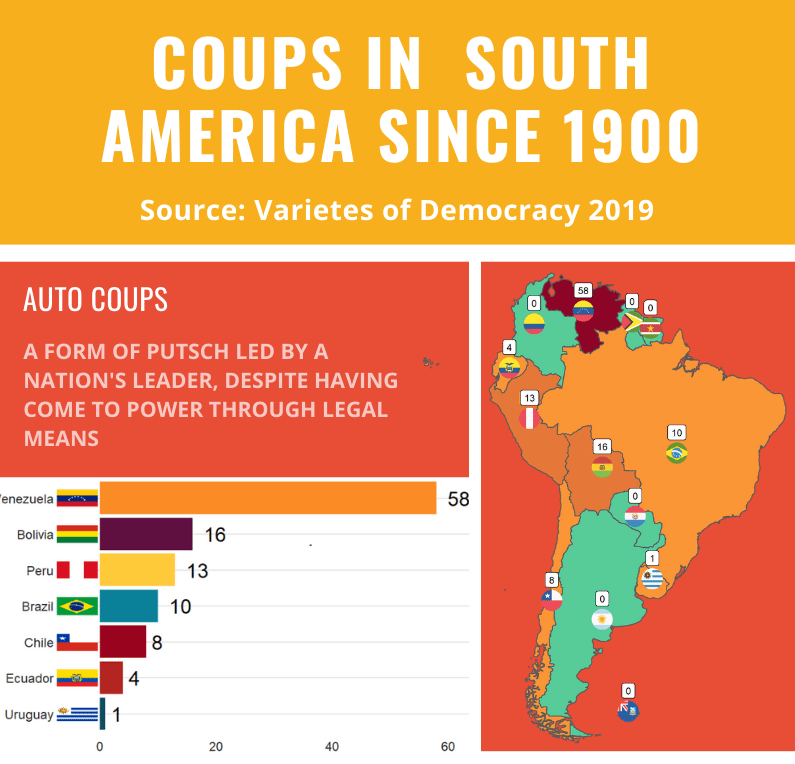
Apropos of this week’s US news, we are going to graph the number of different or autocoups in South America and display that as both maps and bar charts.
According to our pals at the Wikipedia, a self-coup, or autocoup (from the Spanish autogolpe), is a form of putsch or coup d’état in which a nation’s leader, despite having come to power through legal means, dissolves or renders powerless the national legislature and unlawfully assumes extraordinary powers not granted under normal circumstances.
In order to add flags to maps, we need to make sure our dataset has three variables for each country:

- Longitude
- Latitude
- ISO2 code (in lower case)
In order to add longitude and latitude, I will scrape these from a website with the rvest dataset and merge them with my existing dataset.
Click here to learn more about the rvest pacakge.
library(rvest)

coord <- read_html("https://developers.google.com/public-data/docs/canonical/countries_csv")

coord_tables <- coord %>% html_table(header = TRUE, fill = TRUE)

coord <- coord_tables[[1]]

map_df2 <- merge(map_df, coord, by.x= "iso_a2", by.y = "country", all.y = TRUE)
Click here to learn more about the merge() function
Next we need to add a variable with each country’s ISO code with the countrycode() function
Click here to learn more about the countrycode package.
autocoup_df$iso2c <- countrycode(autocoup_df$country_name, "country.name", "iso2c")In this case, a warning message pops up to tell me:
Some values were not matched unambiguously: Kosovo, Somaliland, Zanzibar
One important step is to convert the ISO codes from upper case to lower case. The geom_flag() function from the ggflag package only recognises lower case (e.g Chile is cl, not CL).
autocoup_df$iso2_lower <- tolower(autocoup_df$iso_a2)We have all the variables we will need for our geom_flag() function:
Add some hex colors as a vector that we can add to the graph:
coup_palette <- c("#7d092f", "#b32520", "#fb8b24", "#57cc99")
Finally we can graph our maps comparing the different types of coups in South America.
Click here to learn how to graph variables onto maps with the rnaturalearth package.
The geom_flag() function requires an x = longitude, y = latitude and a country argument in the form of our lower case ISO2 country codes. You can play around the latitude and longitude flag and also label position by adding or subtracting from them. The size of the flag can be added outside the aes() argument.
We can place the number of coups under the flag with the geom_label() function.
The theme_map() function we add comes from ggthemes package.
autocoup_map <- autocoup_df%>%
  dplyr::filter(subregion == "South America") %>%
  ggplot() +
  geom_sf(aes(fill = coup_cat)) +
  ggflags::geom_flag(aes(x = longitude, y = latitude+0.5, country = iso2_lower), size = 8) +
  geom_label(aes(x = longitude, y = latitude+3, label = auto_coup_sum, color = auto_coup_sum), fill  =  "white", colour = "black") +
  theme_map()


autocoup_map + scale_fill_manual(values = coup_palette, name = "Auto Coups", labels = c("No autocoup", "More than 1", "More than 10", "More than 50"))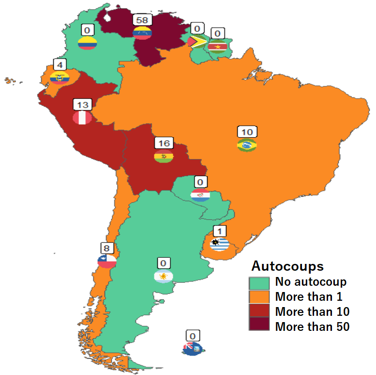
Not hard at all.
And we can make a quick barchart to rank the countries. For this I will use square flags from the ggimage package. Click here to read more about the ggimage package
Additionally, I will use the theme from the bbplot pacakge. Click here to read more about the bbplot package.
library(ggimage)
library(bbplot)

pretty_colors <- c("#0f4c5c", "#5f0f40","#0b8199","#9a031e","#b32520","#ffca3a", "#fb8b24")

autocoup_df %>%
  dplyr::filter(auto_coup_sum !=0) %>%
  dplyr::filter(subregion == "South America") %>%
  ggplot(aes(x = reorder(country_name, auto_coup_sum),
             y = auto_coup_sum,
             group = country_name,
             fill = country_name)) +
  geom_col() +
  coord_flip() +
  bbplot::bbc_style() +
  geom_text(aes(label = auto_coup_sum),
            hjust = -0.5, size = 10,
            position = position_dodge(width = 1),
            inherit.aes = TRUE) +
  expand_limits(y = 63) +
  labs(title = "Autocoups in South America (1900-2019)",
       subtitle = "Source: Varieties of Democracy, 2019") +
  theme(legend.position = "none") +
  scale_fill_manual(values = pretty_colors) +
  ggimage::geom_flag(aes(y = -4,
                         image = iso2_lower),
size = 0.1) 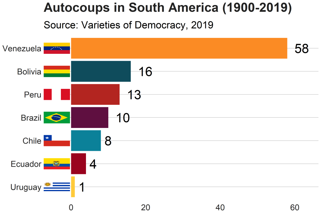
And after a bit of playing around with all three different types of coup data, I created an infographic with canva.com