Packages we will need:
library(tidyverse)
library(ggridges)
library(ggimage) # to add png images
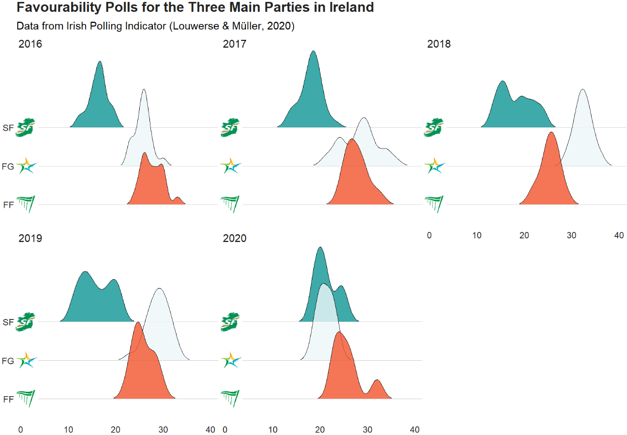
library(bbplot) # for pretty graph themesWe will plot out the favourability opinion polls for the three main political parties in Ireland from 2016 to 2020. Data comes from Louwerse and Müller (2020)

Before we dive into the ggridges plotting, we have a little data cleaning to do. First, we extract the last four “characters” from the date string to create a year variable.
I took this quick function from a StackOverflow response:
substrRight <- function(x, n){
  substr(x, nchar(x)-n+1, nchar(x))}

polls_csv$year <- substrRight(polls_csv$Date, 4)
Next, pivot the data from wide to long format.
More information of pivoting data with dplyr can be found here. I tend to check it at least once a month as the arguments refuse to stay in my head.
I only want to take the main parties in Ireland to compare in the plot.
polls <- polls_csv %>%
  select(year, FG:SF) %>%
  pivot_longer(!year, names_to = "party", values_to = "opinion_poll")
I went online and found the logos for the three main parties (sorry, Labour) and saved them in the working directory I have for my RStudio. That way I can call the file with the prefix “~/**.png” rather than find the exact location they are saved on the computer.
polls %>%
  filter(party == "FF" | party == "FG" | party == "SF" ) %>%
  mutate(image = ifelse(party=="FF","~/ff.png",
 ifelse(party=="FG","~/fg.png", "~/sf.png"))) -> polls_three
Now we are ready to plot out the density plots for each party with the geom_density_ridges() function from the ggridges package.
We will add a few arguments into this function.
We add an alpha = 0.8 to make each density plot a little transparent and we can see the plots behind.
The scale = 2 argument pushes all three plots togheter so they are slightly overlapping. If scale =1, they would be totally separate and 3 would have them overlapping far more.
The rel_min_height = 0.01 argument removes the trailing tails from the plots that are under 0.01 density. This is again for aesthetics and just makes the plot look slightly less busy for relatively normally distributed densities
The geom_image takes the images and we place them at the beginning of the x axis beside the labels for each party.
Last, we use the bbplot package BBC style ggplot theme, which I really like as it makes the overall graph look streamlined with large font defaults.
polls_three %>%
  ggplot(aes(x = opinion_poll, y = as.factor(party))) +
  geom_density_ridges(aes(fill = party),
                      alpha = 0.8,
                      scale = 2,
                      rel_min_height = 0.01) +
  ggimage::geom_image(aes(y = party, x= 1, image = image), asp = 0.9, size = 0.12) +
  facet_wrap(~year) +
  bbplot::bbc_style() +
  scale_fill_manual(values = c("#f2542d", "#edf6f9", "#0e9594")) +
  theme(legend.position = "none") +
  labs(title = "Favourability Polls for the Three Main Parties in Ireland", subtitle = "Data from Irish Polling Indicator (Louwerse & Müller, 2020)")