The loess method in ggplot2 fits a smoothing line to our data.
We can do this with the method = "loess" in the geom_smooth() layer.
LOESS stands “Locally Weighted Scatterplot Smoothing.” (I am not sure why it is not called LOWESS … ?)
The loess line can help show non-linear relationships in the scatterplot data, while taking care of stopping the over-influence of outliers.
Loess gives more weight to nearby data points and less weight to distant ones. This means that nearby points have a greater influence on the squiggly-ness of the line.
The degree of smoothing is controlled by the span parameter in the geom_smooth() layer.
When we set the span, we can choose how many nearby data points are considered when estimating the local regression line.
A smaller span (e.g. span = 0.5) results in more local (flexible) smoothing, while a larger span (e.g. span = 1.5) produces more global (smooth) smoothing.
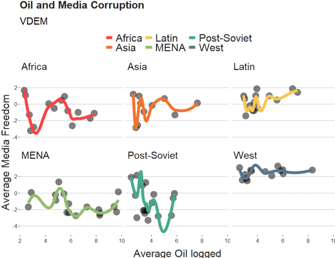
We will take the variables from the Varieties of Democracy dataset and plot the relationship between oil produciton and media freedoms across different regions.
df %>%
  ggplot(aes(x = log_avg_oil,
             y = avg_media)) +
  geom_point(size = 6, alpha = 0.5) +
  geom_smooth(aes(color = region),
              method = "loess",
              span = 2,
              se = FALSE,
              size = 3,
              alpha = 0.6) +
  facet_wrap(~region) +
  labs(title = "Oil and Media Corruption", subtitle = "VDEM",
       x = "Average Oil logged",
       y = "Average Media Freedom") +
  scale_color_manual(values = my_pal) +
  my_theme()
If we change the span to 0.5, we get the following graph:
span = 0.5
When examining the connection between oil production and media freedoms across various regions, there are many ways to draw the line.
If we think the relationship is linear, it is no problem to add method = "lm" to the graph.
However, if outliers might overly distort the linear relationship, method = "rlm" (robust linear model” can help to take away the power from these outliers.
Linear and robust linear models (lm and rlm) can also accommodate parametric non-linear relationships, such as quadratic or cubic, when used with a proper formula specification.
For example, “geom_smooth(method=’lm’, formula = y ~ x + I(x^2))” can be used for estimating a quadratic relationship using lm.
If the outcome variable is binary (such as “is democracy” versus “is not democracy” or “is oil producing” versus “is not oil producing”) we can use method = “glm” (which is generalised linear model). It models the log odds of a oil producing as a linear function of a predictor variable, like age.
If the relationship between age and log odds is non-linear, the gam method is preferred over glm. Both glm and gam can handle outcome variables with more than two categories, count variables, and other complexities.
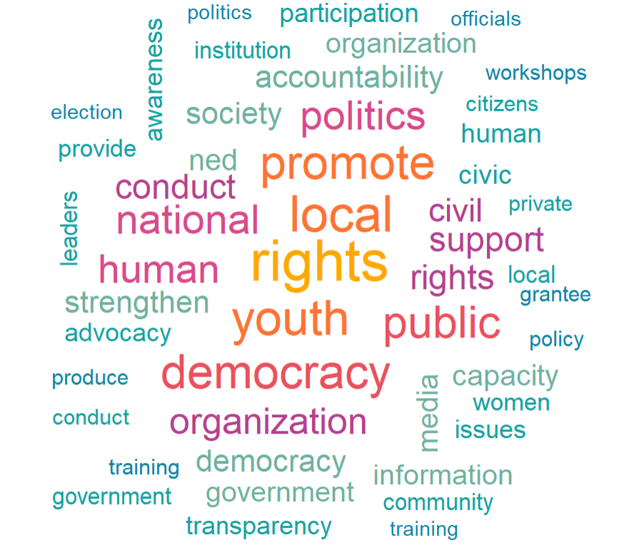
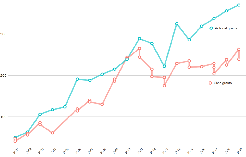
And if we compare civic versus politically-oriented aid, we can see that more money goes towards projects that have political or electoral aims rather than civic or civil society education goals
tokens %>%
  group_by(year) %>%
  top_n(n = 20,
        wt = n) %>%
  mutate(word = case_when(word == "party" ~ "political",
                          word == "parties" ~ "political",
                          word == "election" ~ "political",
                          word == "electoral" ~ "political",
                          word == "civil" ~ "civic",
                          word == "civic" ~ "civic",
                          word == "social" ~ "civic",
                          word == "education" ~ "civic",
                          word == "society" ~ "civic",
                          TRUE ~ as.character(word))) %>%
  filter(word == "political" | word == "civic") %>%
  ggplot(aes(x = year, y = n, group = word)) +
  geom_line(aes(color = word ), size = 2.5,alpha = 0.6)  +
  geom_point(aes(color = word ), fill = "white",
             shape = 21, size = 3, stroke = 2) +
  bbplot::bbc_style() +
  scale_x_discrete(limits = c(2001:2019)) +
  theme(axis.text.x= element_text(size = 15,
                                  angle = 45)) +
  scale_color_discrete(name = "Aid type", labels = c("Civic grants", "Political grants"))
library(tidyverse)      # of course
library(ggridges)       # density plots
library(GGally)         # correlation matrics
library(stargazer)      # tables
library(knitr)          # more tables stuff
library(kableExtra)     # more and more tables
library(ggrepel)        # spread out labels
library(ggstream)       # streamplots
library(bbplot)         # pretty themes
library(ggthemes)       # more pretty themes
library(ggside)         # stack plots side by side
library(forcats)        # reorder factor levels
Before jumping into any inferentional statistical analysis, it is helpful for us to get to know our data.
That always means plotting and visualising the data and looking at the spread, the mean, distribution and outliers in the dataset.
Before we plot anything, a simple package that creates tables in the stargazer package. We can examine descriptive statistics of the variables in one table.
Click here to read this practically exhaustive cheat sheet for the stargazer package by Jake Russ. I refer to it at least once a week. Thank you, Jack.
I want to summarise a few of the stats, so I write into the summary.stat() argument the number of observations, the mean, median and standard deviation.
The kbl() and kable_classic() will change the look of the table in R (or if you want to copy and paste the code into latex with the type = "latex" argument).
In HTML, they do not appear.
To find out more about the knitr kable tables, click here to read the cheatsheet by Hao Zhu.
Choose the variables you want, put them into a data.frame and feed them into the stargazer() function
stargazer(my_df_summary,
          covariate.labels = c("Corruption index",
                               "Civil society strength",
                               'Rule of Law score',
                               "Physical Integerity Score",
                               "GDP growth"),
          summary.stat = c("n", "mean", "median", "sd"),
          type = "html") %>%
  kbl() %>%
  kable_classic(full_width = F, html_font = "Times", font_size = 25)
Statistic
N
Mean
Median
St. Dev.
Corruption index
179
0.477
0.519
0.304
Civil society strength
179
0.670
0.805
0.287
Rule of Law score
173
7.451
7.000
4.745
Physical Integerity Score
179
0.696
0.807
0.284
GDP growth
163
0.019
0.020
0.032
Next, we can create a barchart to look at the different levels of variables across categories. We can look at the different regime types (from complete autocracy to liberal democracy) across the six geographical regions in 2018 with the geom_bar().
my_df %>%
  filter(year == 2018) %>%
  ggplot() +
  geom_bar(aes(as.factor(region),
               fill = as.factor(regime)),
           color = "white", size = 2.5) -> my_barplot
This type of graph also tells us that Sub-Saharan Africa has the highest number of countries and the Middle East and North African (MENA) has the fewest countries.
However, if we want to look at each group and their absolute percentages, we change one line: we add geom_bar(position = "fill"). For example we can see more clearly that over 50% of Post-Soviet countries are democracies ( orange = electoral and blue = liberal democracy) as of 2018.
We can also check out the density plot of democracy levels (as a numeric level) across the six regions in 2018.
With these types of graphs, we can examine characteristics of the variables, such as whether there is a large spread or normal distribution of democracy across each region.
Click here to read more about the GGally package and click here to read their CRAN PDF.
We can use the ggside package to stack graphs together into one plot.
There are a few arguments to add when we choose where we want to place each graph.
For example, geom_xsideboxplot(aes(y = freedom_house), orientation = "y") places a boxplot for the three Freedom House democracy levels on the top of the graph, running across the x axis. If we wanted the boxplot along the y axis we would write geom_ysideboxplot(). We add orientation = "y" to indicate the direction of the boxplots.
Next we indiciate how big we want each graph to be in the panel with theme(ggside.panel.scale = .5) argument. This makes the scatterplot take up half and the boxplot the other half. If we write .3, the scatterplot takes up 70% and the boxplot takes up the remainning 30%. Last we indicade scale_xsidey_discrete() so the graph doesn’t think it is a continuous variable.
We add Darjeeling Limited color palette from the Wes Anderson movie.
Click here to learn about adding Wes Anderson theme colour palettes to graphs and plots.
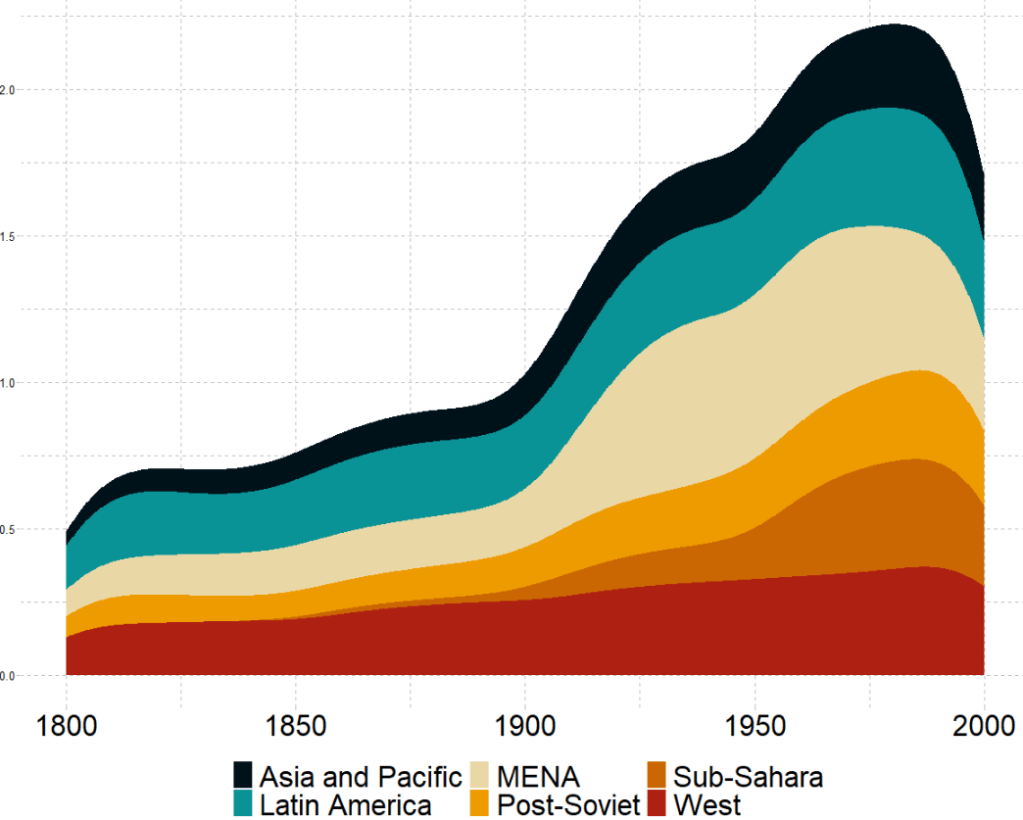
The next plot will look how variables change over time.
We can check out if there are changes in the volume and proportion of a variable across time with the geom_stream(type = "ridge") from the ggstream package.
In this instance, we will compare urban populations across regions from 1800s to today.
Click here to read more about the ggstream package and click here to read their CRAN PDF.
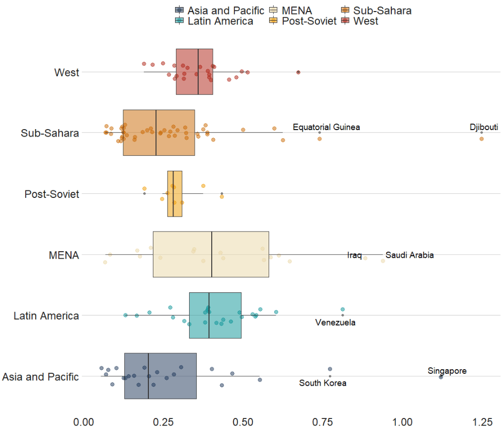
We can also look at interquartile ranges and spread across variables.
We will look at the urbanization rate across the different regions. The variable is calculated as the ratio of urban population to total country population.
Before, we will create a hex color vector so we are not copying and pasting the colours too many times.
If we want to look more closely at one year and print out the country names for the countries that are outliers in the graph, we can run the following function and find the outliers int he dataset for the year 1990:
In the next blog post, we will look at t-tests, ANOVAs (and their non-parametric alternatives) to see if the difference in means / medians is statistically significant and meaningful for the underlying population.
library(tidyverse)
library(ggridges)
library(ggimage)  # to add png images
library(bbplot)   # for pretty graph themes
We will plot out the favourability opinion polls for the three main political parties in Ireland from 2016 to 2020. Data comes from Louwerse and Müller (2020)
Before we dive into the ggridges plotting, we have a little data cleaning to do. First, we extract the last four “characters” from the date string to create a year variable.
I went online and found the logos for the three main parties (sorry, Labour) and saved them in the working directory I have for my RStudio. That way I can call the file with the prefix “~/**.png” rather than find the exact location they are saved on the computer.
Now we are ready to plot out the density plots for each party with the geom_density_ridges() function from the ggridges package.
We will add a few arguments into this function.
We add an alpha = 0.8 to make each density plot a little transparent and we can see the plots behind.
The scale = 2 argument pushes all three plots togheter so they are slightly overlapping. If scale =1, they would be totally separate and 3 would have them overlapping far more.
The rel_min_height = 0.01 argument removes the trailing tails from the plots that are under 0.01 density. This is again for aesthetics and just makes the plot look slightly less busy for relatively normally distributed densities
The geom_image takes the images and we place them at the beginning of the x axis beside the labels for each party.
Last, we use the bbplot package BBC style ggplot theme, which I really like as it makes the overall graph look streamlined with large font defaults.
polls_three %>%
  ggplot(aes(x = opinion_poll, y = as.factor(party))) +
  geom_density_ridges(aes(fill = party),
                      alpha = 0.8,
                      scale = 2,
                      rel_min_height = 0.01) +
  ggimage::geom_image(aes(y = party, x= 1, image = image), asp = 0.9, size = 0.12) +
  facet_wrap(~year) +
  bbplot::bbc_style() +
  scale_fill_manual(values = c("#f2542d", "#edf6f9", "#0e9594")) +
  theme(legend.position = "none") +
  labs(title = "Favourability Polls for the Three Main Parties in Ireland", subtitle = "Data from Irish Polling Indicator (Louwerse & Müller, 2020)")
library(tidyverse)
library(magrittr) # for pipes
library(ggrepel) # to stop overlapping labels
library(ggflags)
library(countrycode) # if you want create the ISO2C variable
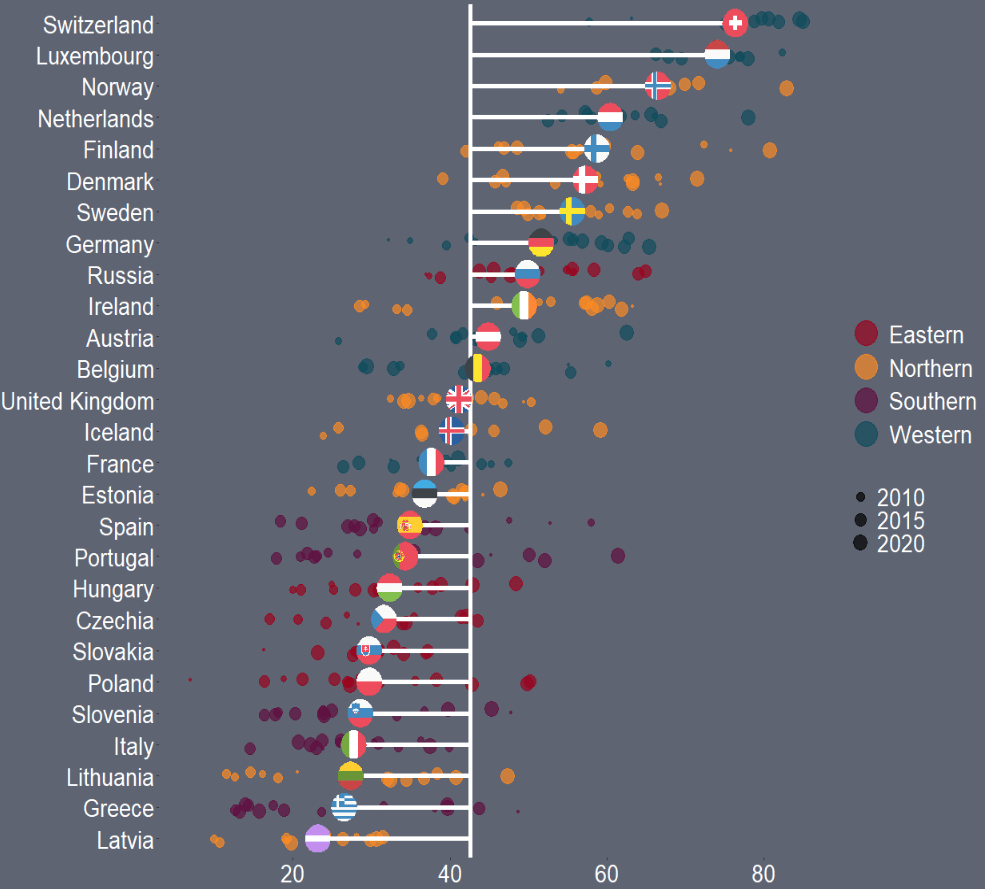
Her graph compares Dr. Who actors and their average audience rating across their run as the Doctor on the show. So I have very liberally copied her code for my plot on OECD countries.
That is the beauty of TidyTuesday and the ability to be inspired and taught by other people’s code.
I originally was going to write a blog about how to download data from the OECD R package. However, my attempts to download the data leads to an unpleasant looking error and ends the donwload request.
I will try to work again on that blog in the future when the package is more established.
So, instead, I went to the OECD data website and just directly downloaded data on level of trust that citizens in each of the OECD countries feel about their governments.
Then I cleaned up the data in excel and used countrycode() to add ISO2 and country name data.
Click here to read more about the countrycode() package.
First I will only look at EU countries. I tried with all the countries from the OECD but it was quite crowded and hard to read.
I add region data from another dataset I have. This step is not necessary but I like to colour my graphs according to categories. This time I am choosing geographic regions.
When we plot the graph, we need a few geom arguments.
Along the x axis we have all the countries, and reorder them from most trusting of their goverments to least trusting.
We will color the points with one of the four geographic regions.
We use geom_jitter() rather than geom_point() for the different yearly trust values to make the graph a little more interesting.
I also make the sizes scaled to the year in the aes() argument. Again, I did this more to look interesting, rather than to convey too much information about the different values for trust across each country. But smaller circles are earlier years and grow larger for each susequent year.
The geom_hline() plots a vertical line to indicate the average trust level for all countries.
We then use the geom_segment() to horizontally connect the country’s individual average (the yend argument) to the total average (the y arguement). We can then easily see which countries are above or below the total average. The x and xend argument, we supply the country_name variable twice.
Next we use the geom_flag(), which comes from the ggflags package. In order to use this package, we need the ISO 2 character code for each country in lower case!
Click here to read more about the ggflags package.
We can see that countries in southern Europe are less trusting of their governments than in other regions. Western countries seem to occupy the higher parts of the graph, with France being the least trusting of their government in the West.
There is a large variation in Northern countries. However, if we look at the countries, we can see that the Scandinavian countries are more trusting and the Baltic countries are among the least trusting. This shows they are more similar in their trust levels to other Post-Soviet countries.
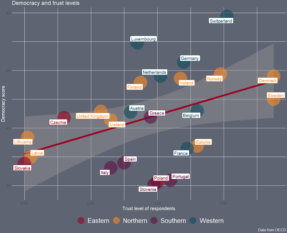
Next we can look into see if there is a relationship between democracy scores and level of trust in the goverment with a geom_point() scatterplot
The geom_smooth() argument plots a linear regression OLS line, with a standard error bar around.
We want the labels for the country to not overlap so we use the geom_label_repel() from the ggrepel package. We don’t want an a in the legend, so we add show.legend = FALSE to the arguments
We will plot out a lollipop plot to compare EU countries on their level of income inequality, measured by the Gini coefficient.
A Gini coefficient of zero expresses perfect equality, where all values are the same (e.g. where everyone has the same income). A Gini coefficient of one (or 100%) expresses maximal inequality among values (e.g. for a large number of people where only one person has all the income or consumption and all others have none, the Gini coefficient will be nearly one).
To start, we will take data on the EU from Wikipedia. With rvest package, scrape the table about the EU countries from this Wikipedia page.
With the gsub() function, we can clean up the different variables with some regex. Namely delete the footnotes / square brackets and change the variable classes.
Next some data cleaning and grouping the year member groups into different decades. This indicates what year each country joined the EU. If we see clustering of colours on any particular end of the Gini scale, this may indicate that there is a relationship between the length of time that a country was part of the EU and their domestic income inequality level. Are the founding members of the EU more equal than the new countries? Or conversely are the newer countries that joined from former Soviet countries in the 2000s more equal. We can visualise this with the following mutations:
To create the lollipop plot, we will use the geom_segment() functions. This requires an x and xend argument as the country names (with the fct_reorder() function to make sure the countries print out in descending order) and a y and yend argument with the gini number.
All the countries in the EU have a gini score between mid 20s to mid 30s, so I will start the y axis at 20.
We can add the flag for each country when we turn the ISO2 character code to lower case and give it to the country argument.
We can see there does not seem to be a clear pattern between the year a country joins the EU and their level of domestic income inequality, according to the Gini score.
Another option for the lolliplot plot comes from the ggpubr package. It does not take the familiar aesthetic arguments like you can do with ggplot2 but it is very quick and the defaults look good!