How to download and animate the Varieties of Democracy (V-DEM) dataset in R

In this blog post, we will download the V-DEM datasets with their vdemdata package. It is still in development, so we will use the install_github() function from the devtools package

devtools::install_github("vdeminstitute/vdemdata")

library(vdemdata)

And really quickly we can download the dataset with one line of code

vdemdata::vdem -> vdem

We can use the find_var function to get information on variables based on keywords.

For example, we can look up variables that are concerned with protest mobilization.

vdemdata::find_var("mobilization") -> mob
 mob %>% names
 [1] "question_id"              "question_number"          "metasection"             
 [4] "name"                     "vartype"                  "cb_section"              
 [7] "tag"                      "projectmanager"           "question"                
[10] "clarification"            "responses"                "ordering"                
[13] "scale"                    "answertype"               "sources"                 
[16] "notes"                    "datarelease"              "citation"                
[19] "coverage"                 "subsetof"                 "crosscoder_aggregation"  
[22] "aggregation"              "ccp_tag"                  "clean_tag"               
[25] "survey_id"                "vignettes_used"           "old_tag"                 
[28] "compiler"                 "clarification_historical" "codebook_id"             
[31] "conthistmerge"            "histmerged"               "years"                   
[34] "hist_outside_coding"      "additional_versions"      "cleaning"                
[37] "date_specific"            "available_versions"       "cont_outside_coding"     
[40] "overlap_use_hist"         "is_party"                 "cb_section_type"         
[43] "defaultdate"              "convergence"              "cy_aggregation"          
[46] "no_update" 

Or download the entire codebook:

vdemdata::codebook -> vdem_codebook

And we can look at information for a specific variable

vdemdata::var_info("e_regionpol_6C") -> region_info 
region_info$responses
1: Eastern Europe and Central Asia (including Mongolia and German Democratic Republic)
2: Latin America and the Caribbean
3: The Middle East and North Africa (including Israel and Türkiye, excluding Cyprus)
4: Sub-Saharan Africa
5: Western Europe and North America (including Cyprus, Australia and New Zealand, but excluding German Democratic Republic)
6: Asia and Pacific (excluding Australia and New Zealand; see 5)"

For our analysis, we can focus on the years 1900 to 2022.

vdem %<>% 
  filter(year %in% c(1900:2022))

And we will create a ggplot() object that also uses the Five Thirty Eight theme from the ggthemes package.

Click here to read more about the ggthemes options.

Source: https://yutannihilation.github.io/allYourFigureAreBelongToUs/ggthemes/

In the V-DEM package, we will look at a scatterplot of CSO consultation (v2cscnsult) and democracy score (v2x_polyarchy).

  • v2cscnsult asks are major civil society organizations (CSOs) routinely consulted by policymakers on policies relevant to their members?
  • v2x_polyarchy examines to what extent is the ideal of electoral democracy in its fullest sense achieved?

First, find below the packages we will need to install and load

install.packages("gganimate")
install.packages("transformr")  # sometimes needed as a dependency

library(gganimate)

And we plot our graph:

my_graph <- ggplot(vdem, aes(x = v2cscnsult, 
                      y = v2x_polyarchy, 
                      group = year)) +
  geom_point()  +
  ggthemes::theme_fivethirtyeight() +
  theme(text = element_text(size = 12),  # Default text size for all text elements
        plot.title = element_text(size = 20, face="bold"),  
        axis.title = element_text(size = 16), 
        axis.text = element_text(size = 14), 
        legend.title = element_text(size = 14),  
        legend.text = element_text(size = 12))  

In the themes argument, we can change the size of the text for the various parts of the ggplot (legends, axes etc.)

To make the ggplot object animated, we use the transition_time(year) function from the gganimate package.

Also we can add a subtitle the displays the year and time frame in the graph.

animated_graph <- my_graph +
  transition_time(year) +
  labs(title = "CSO consultation and Polyarchy Democracy",
       subtitle = "Time: {frame_time}",
       caption = "Source: VDEM 1900 to 2022",
       x = "CSO Consultation",
       y = "Polyarchy")

And we can change how we render the graph with the animate() function.

We choose duration = 15 so that the gif lasts 15 seconds

We set frames per second to 20 fps (the higher the number, the smoother the gif changes, but the longer it takes to load)

And finally we can choose a special renderer that makes the gif more smooth too.

Finally we can save the gif to our computer (so I can upload it here on this blog)

animate(animated_plot, duration = 15, fps = 20, renderer = gifski_renderer()) -> CSO_poly_gif

anim_save("animated_plot.gif", animation = CSO_poly_gif)

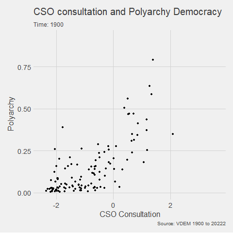
We can make a few changes so that it is divided by region and adds colors:

Notice the change to subtitle = "Year: {as.integer(frame_time)}" so it only uses the year, not the year and frame rate.

ggplot(vdem, aes(x = v2cscnsult, 
                      y = v2x_polyarchy, 
                      group = year,
                 size = e_pop, 
                 colour = as.factor(e_regionpol_6C))) +
  geom_point(alpha = 0.7, show.legend = FALSE) +
  ggthemes::theme_fivethirtyeight() +
  theme(text = element_text(size = 12),  
        plot.title = element_text(size = 20, face="bold"), 
        axis.title = element_text(size = 16),  
        axis.text = element_text(size = 14),  
        legend.title = element_text(size = 14),  
        legend.text = element_text(size = 12)) +
  facet_wrap(~e_regionpol_6C) +
  transition_time(year) +
  labs(title = "CSO consultation and Polyarchy Democracy",
       subtitle = "Year: {as.integer(frame_time)}",
       caption = "Source: VDEM 1900 to 2022",
       x = "CSO Consultation",
       y = "Polyarchy")  

Next, we can animate a map

library(sf)
library(rnaturalearth)

First we download a world object with the longitude and latitude data we need.

Click here to read more about the rnaturalearth package

my_map <- ne_countries(scale = "medium", returnclass = "sf")

And we merge the two data.frames together

my_map %<>% 
  mutate(COWcode = countrycode::countrycode(sovereignt, "country.name", "cown"))

vdem_map <- left_join(vdem, my_map, by = c("COWcode"))

Set up some colors for the map

colors <- c("#001427", "#708d81", "#f4d58d", "#bf0603", "#8d0801")

Next we draw the map:

vdem_map %>% 
  filter(year %in% c(1945:2023)) %>% 
  filter(sovereignt != "Antarctica") %>% 
  group_by(country_name, geometry) %>% 
  summarise(avg_polyarchy = mean(v2x_polyarchy, na.rm = TRUE)) %>% 
  ungroup() %>% 
  ggplot() +
  geom_sf(aes(geometry = geometry, fill = avg_polyarchy),  
          position = "identity", color = "#212529", linewidth = 0.2, alpha = 0.85) +
  geom_tile(data = data.frame(value = seq(0, 1, length.out = length(colors))), 
            aes(x = 1, y = value, fill = value), 
            show.legend = FALSE) +
  scale_fill_gradientn(colors = colors, 
                       breaks = scales::pretty_breaks(n = length(colors)),
                       labels = scales::number_format(accuracy = 1)) +
  theme_minimal()

When I made the first attempt to animate the polyarchy democracy data on the map, it was a bit of an affront to the senses:

So attempt number two involved a bit more wrangling!

vdem_map %>% 
  filter(year %in% c(1945:2023)) %>% 
  filter(sovereignt != "Antarctica") %>% 
  ggplot() +
  geom_sf(aes(geometry = geometry, fill = v2x_polyarchy, group = year),  
          position = "identity", color = "#212529", linewidth = 0.2, alpha = 0.85) +
  theme_minimal() +
  scale_fill_gradientn(colors = colors,
                       breaks = scales::pretty_breaks(n = length(colors)),
                       labels = scales::number_format(accuracy = 3)) +
  transition_time(year) + 
  labs(title = "Polyarchy Democracy annual global changes",
       subtitle = "Year: {as.integer(frame_time)}",
       caption = "Source: VDEM 1900 to 2023",
       x = " ",
       y = " ",
       fill = "Democracy Score")  -> my_plot

animate(my_plot, duration = 40, fps = 40,
        renderer = gifski_renderer()) -> map_gif

anim_save("animated_plot_3.gif", animation = map_gif)

Tips and code snippets to improve ggplot graphs and plots in R

Some code snippets to improve graph appearance and readability!

Compare the first basic graph with the second more informative graph.

Happy Birthday Reaction GIF - Find & Share on GIPHY
pko %>% 
  group_by(year) %>% 
  count() -> ya

ya %>% 
  ggplot(aes(x = year,
             y = n)) +
  geom_point() + geom_line()

Dealing with the z and y axes can be a pain.

yo %>% 
  ggplot(aes(x = year, y = n)) + 
  geom_point() + 
  geom_line() +
  scale_x_continuous(breaks = seq(min(yo$year, na.rm = TRUE), 
                                  max(yo$year, na.rm = TRUE), 
                                  by = 1)) + 
  scale_y_continuous(limits = c(0, max(yo$n, na.rm = TRUE)),
                     breaks = function(limits) seq(floor(limits[1]), ceiling(limits[2]), by = 1)
  )

In this code:

The breaks argument of scale_y_continuous() is set using a custom function that takes limits as input (which represents the range of the y-axis determined by ggplot2 based on your data).

seq() generates a sequence from the floor (rounded down) of the minimum limit to the ceiling (rounded up) of the maximum limit, with a step size of 1.

This ensures that the sequence includes only whole integers.

Using floor() for the start of the sequence ensures you start at a whole number not greater than the smallest data point, and ceiling() for the end of the sequence ensures you end at a whole number not less than the largest data point.

This approach allows the y-axis to dynamically adapt to your data’s range while ensuring that only whole integers are used as ticks, suitable for counts or other integer-valued data.

pko %>% 
  pivot_longer(!c(cown, year),
               names_to = "organization",
               values_to = "troops") %>% 
  group_by(year, organization) %>% 
  summarise(sum_troops = sum(troops, na.rm = TRUE)) %>% 
  ungroup() -> yo


pal <- c("totals_intl" = "#DE2910",
         "totals_reg" = "#3C3B6E", 
         "totals_un" = "#FFD900")

yo %>% 
  ggplot(aes(x = year, y = sum_troops,
             group = organization,
             color = organization)) + 
  geom_point(size = 3) +
  geom_line(size = 2, alpha = 0.7)  + 
  scale_y_continuous(labels = scales::label_comma()) + 
  # scale_y_continuous(limits = c(0, max(yo$n, na.rm = TRUE))) +
  scale_x_continuous(breaks = seq(min(yo$year, na.rm = TRUE), 
                                  max(yo$year, na.rm = TRUE), 
                                  by = 2)) +
  ggthemes::theme_fivethirtyeight() +
  scale_color_manual(values =  pal,
                     name = "Organization Type",  
                     labels = c("International",
                                "Regional",
                                "United Nations")) +
  labs(title = "Peacekeeping Operations",
       subtitle = "Number of troops per organization type",
       caption = "Source: Bara 2020",
       x = "Year",
       y = "Number of troops") +
  
  guides(color = guide_legend(override.aes = list(size = 8))) + 
  theme(text = element_text(size = 12),  # Default text size for all text elements
        plot.title = element_text(size = 20, face="bold"),  # Plot title
        axis.title = element_text(size = 16),  # Axis titles (both x and y)
        axis.text = element_text(size = 14),  # Axis text (both x and y)
        legend.title = element_text(size = 14),  # Legend title
        legend.text = element_text(size = 12))  # Legend items

Cairo::CairoWin()    
Happy Season 5 GIF by The Office - Find & Share on GIPHY

Next, we will look at changing colors in our maps.

We have a map and we want to make the colors pop more.

Click here to read about downloading the V-DEM and map data:

   geom_tile(data = data.frame(value = seq(0, 1, length.out = length(colors))), 
             aes(x = 1, y = value, fill = value), 
             show.legend = FALSE) +
   scale_fill_gradientn(colors = colors, 
                        breaks = scales::pretty_breaks(n = length(colors)),
                        labels = scales::number_format(accuracy = 1)) +

Creation of data for geom_tile():

data = data.frame(value = seq(0, 1, length.out = length(colors))) 

This line creates a data.frame with a single column named value. The column contains a sequence of values from 0 to 1. The length.out parameter is set to the length of the colors vector, meaning the sequence will be of the same length as the number of colors you have defined. This ensures that the gradient will have the same number of distinct colors as are in your colors vector.

geom_tile()

geom_tile(aes(x = 1, y = value, fill = value), show.legend = FALSE)

geom_tile() is used here to create a series of rectangles (tiles). Each tile will have its y position set to the corresponding value from the sequence created earlier. The x position is fixed at 1, so all tiles will be in a straight line. The fill aesthetic is mapped to the value, so each tile’s fill color will be determined by its y value. The show.legend = FALSE parameter hides the legend for this layer, which is typically used when you want to create a custom legend.

scale_fill_gradientn()

scale_fill_gradientn(colors = colors, breaks = scales::pretty_breaks(n = length(colors)), labels = scales::number_format(accuracy = 1)) 

scale_fill_gradientn() creates a color scale for the fill aesthetic based on the colors vector that we supplied.

The breaks argument is set with scales::pretty_breaks(n = length(colors)), which calculates ‘pretty’ breaks for the scale, basically nice round numbers within the range of your data, and it is set to create as many breaks as there are colors.

The labels argument is set with scales::number_format(accuracy = 2), which specifies how the labels on the legend should be formatted. The accuracy = 2 parameter means that the labels will be formatted to one decimal place

How to run multiple t-tests in a function with the broom package in R

Packages we will need:

library(tidyverse)
library(broom)

We will use the Varieties of Democracy dataset again.

Excited Will Ferrell GIF - Find & Share on GIPHY

We will use a t-test comparing democracies (boix == 1) and non-democracies (boix == 0) in the years 2000 to 2020.

We need to remove the instances where boix is NA.

I choose three t-tests to run simultaneously. Comparing democracies and non-democracies on:

  1. the extent to which the country consults religious groups (relig_consult)
  2. the extent to which the country consults Civil Society Organization (CSO) groups (cso_consult)
  3. level of freedom from judicial corruption (judic_corruption) – higher scores mean that there are FEWER instances of judicial corruption
vdem %>% 
filter(year %in% c(2000:2020)) %>%
filter(!is.na(e_boix_regime)) %>%
group_by(e_boix_regime) %>%
select(relig_consult = v2csrlgcon,
cso_consult = v2cscnsult,
judic_corruption = v2jucorrdc) -> vdem

Next we need to pivot the data from wide to long

  vdem %<>% pivot_longer(!e_boix_regime, 
names_to = "variable",
values_to = "value")

Now we get to iterating over the three variables and conducting a t-test on each variable across democracies versus non-democracies

Excited Elf GIF - Find & Share on GIPHY
vdem %>%
group_by(variable) %>%
nest() %>%
mutate(t_test = map(data, ~t.test(value ~ e_boix_regime, data = .x)),
tidy = map(t_test, broom::tidy)) %>%
select(variable, tidy) %>%
unnest(tidy) -> ttest_results

If we look closely at the line

mutate(t_test = map(data, ~t.test(value ~ e_boix_regime, data = .x))):

Here, mutate() adds a new column named t_test to the grouped and nested data.

map() is used to apply a function to each element of the list-column (here, each nested data frame).

The function applied is t.test(value ~ e_boix_regime, data = .x).

This function performs a t-test comparing the means of value across two groups defined by e_boix_regime within each nested data frame.

.x represents each nested data frame in turn.

And here are the tidy results:

If we save the above results in a data.frame, we can graph the following:

ttest_results %>%
ggplot(aes(x = variable, y = estimate, ymin = conf.low, ymax = conf.high)) +
geom_point() +
geom_errorbar(width = 0.2) +
coord_flip() +
labs(title = "T-Test Estimates with Confidence Intervals",
x = "Variable",
y = "Estimate Difference") +
theme_minimal()

Add some colors to highlight magnitude of difference

  ggplot(aes(x = variable, y = estimate, ymin = conf.low, ymax = conf.high, color = color_value)) +
geom_point() +
geom_errorbar(width = 0.7, size = 3) +
scale_color_gradientn(colors = c("#0571b0", "#92c5de", "#f7f7f7", "#f4a582", "#ca0020")) +
coord_flip() +
labs(title = "T-Test Estimates with Confidence Intervals",
x = "Variable",
y = "Estimate Difference") +
theme_minimal() +
guides(color = guide_colorbar(title = ""))

Sometimes vdem variables are reverse scored or on different scales

  # mutate(across(judic_corruption, ~ 1- .x)) %>% 
# mutate(across(everything(), ~(.x - mean(.x, na.rm = TRUE)) / sd(.x, na.rm = TRUE), .names = "z_{.col}")) %>%
# select(contains("z_"))

How to run cross-validation of decision-tree models with xgboost in R (PART 4 Tidymodels series)

In this blog post, we will cross-validate different boosted tree models and find the one with best root mean square error (RMSE).

Specifically, part 2 goes into more detail about RMSE as a way to choose the best model

Click here to read part 1, part 2 or part 3 of this series on tidymodel package stuff.

Packages we will need:

library(tidymodels)
library(tidyverse)

Our resampling method will be 10-fold cross-validation.

Click here to watch a Youtube explainer by StatQuest on the fundamentals of cross validation. StatQuest is the cat’s pyjamas.

We can use the vfold_cv() function to create a set of “V-fold” cross-validation with 11 splits.

My favorite number is 11 so I’ll set that as the seed too.

set.seed(11) 
cross_folds <- vfold_cv(vdem_1990_2019, v = 11)

We put our formula into the recipe function and run the pre-processing steps: in this instance, we are just normalizing the variables.

my_recipe <- recipe(judic_corruption ~ freedom_religion + polarization, 
data = vdem_1990_2019) %>%
step_normalize(all_predictors(), -all_outcomes())

Here, we will initially define a boost_tree() model without setting any hyperparameters.

This is our baseline model with defaults.

With the vfolds, we be tuning them and choosing the best parameters.

For us, our mode is “regression” (not categorical “classification”)

my_tree <- boost_tree(
mode = "regression",
engine = "xgboost") %>%
set_engine("xgboost") %>%
set_mode("regression")

Next we will set up a grid to explore a range of hyperparameters.

my_grid <- grid_latin_hypercube(
trees(range = c(500, 1500)),
tree_depth(range = c(3, 10)),
learn_rate(range = c(0.01, 0.1)),
size = 20)

We use the grid_latin_hypercube() function from the dials package in R is used to generate a sampling grid for tuning hyperparameters using a Latin hypercube sampling method.

Latin hypercube sampling (LHS) is a way to generate a sample of plausible, semi-random collections of parameter values from a distribution.

This method is used to ensure that each parameter is uniformly sampled across its range of values. LHS is systematic and stratified, but within each stratum, it employs randomness.

Source: https://www.youtube.com/watch?app=desktop&v=Evua529dAgc

Inside the grid_latin_hypercube() function,we can set the ranges for the model parameters,

trees(range = c(500, 1500))

This parameter specifies the number of trees in the model

We can set a sampling range from 500 to 1500 trees.

tree_depth(range = c(3, 10))

This defines the maximum depth of each tree

We set values ranging from 3 to 10.

learn_rate(range = c(0.01, 0.1))

This parameter controls the learning rate, or the step size at each iteration while moving toward a minimum of a loss function.

It’s specified to vary between 0.01 and 0.1.

size = 20

We want the Latin Hypercube Sampling to generate 20 unique combinations of the specified parameters. Each of these combinations will be used to train a model, allowing for a systematic exploration of how different parameter settings impact model performance.

> my_grid

# A tibble: 20 × 3
   trees tree_depth learn_rate
   <int>      <int>      <dbl>
 1   803          7       1.03
 2   981          7       1.18
 3   862          6       1.09
 4  1185          9       1.06
 5   763          8       1.13
 6   593          4       1.11
 7   524          7       1.22
 8   743          3       1.17
 9  1347          5       1.07
10  1010          5       1.15
11   677          3       1.25
12  1482          5       1.05
13  1446          8       1.12
14   917          4       1.23
15  1296          6       1.04
16  1391          8       1.23
17  1106          9       1.18
18  1203          5       1.14
19   606         10       1.20
20  1088          9       1.10

So next, we will combine our recipe, model specification, and resampling method in a workflow, and use tune_grid() to find the best hyperparameters based on RMSE.

my_workflow <- workflow() %>%
add_recipe(my_recipe) %>%
add_model(my_tree)

The tune_grid() function does the hyperparameter tuning. We will make different combinations of hyperparameters specified in grid using cross-validation.

tuning_results <- my_workflow %>%
tune_grid(
resamples = cv_folds,
grid = my_grid,
metrics = metric_set(rmse))
# Tuning results
# 10-fold cross-validation 
# A tibble: 10 × 4
   splits             id     .metrics         .notes          
   <list>             <chr>  <list>           <list>          
 1 <split [3200/356]> Fold01 <tibble [1 × 4]> <tibble [0 × 3]>
 2 <split [3200/356]> Fold02 <tibble [1 × 4]> <tibble [0 × 3]>
 3 <split [3200/356]> Fold03 <tibble [1 × 4]> <tibble [0 × 3]>
 4 <split [3200/356]> Fold04 <tibble [1 × 4]> <tibble [0 × 3]>
 5 <split [3200/356]> Fold05 <tibble [1 × 4]> <tibble [0 × 3]>
 6 <split [3200/356]> Fold06 <tibble [1 × 4]> <tibble [0 × 3]>
 7 <split [3201/355]> Fold07 <tibble [1 × 4]> <tibble [0 × 3]>
 8 <split [3201/355]> Fold08 <tibble [1 × 4]> <tibble [0 × 3]>
 9 <split [3201/355]> Fold09 <tibble [1 × 4]> <tibble [0 × 3]>
10 <split [3201/355]> Fold10 <tibble [1 × 4]> <tibble [0 × 3]>

After tuning, we can extract and examine the best models.

show_best(tuning_results, metric = "rmse")
  trees tree_depth learn_rate .metric .estimator  mean     n std_err .config              
  <int>      <int>      <dbl> <chr>   <chr>      <dbl> <int>   <dbl> <chr>                
1   593          4       1.11 rmse    standard   0.496    10  0.0189 Preprocessor1_Model03
2   677          3       1.25 rmse    standard   0.500    10  0.0216 Preprocessor1_Model02
3  1296          6       1.04 rmse    standard   0.501    10  0.0238 Preprocessor1_Model09
4  1010          5       1.15 rmse    standard   0.501    10  0.0282 Preprocessor1_Model08
5  1482          5       1.05 rmse    standard   0.502    10  0.0210 Preprocessor1_Model05

The best model is model number 3!

The Fresh Prince Of Bel Air Reaction GIF - Find & Share on GIPHY

Finally, we can plot it out.

We use collect_metrics() to pull out the RMSE and other metrics from our samples.

It automatically aggregates the results across all resampling iterations for each unique combination of model hyperparameters, providing mean performance metrics (e.g., mean accuracy, mean RMSE) and their standard errors.

rmse_results <- tuning_results %>%
collect_metrics() %>%
filter(.metric == "rmse")
rmse_results %>%
mutate(.config = str_replace(.config, "^Preprocessor1_", "")) %>%
ggplot(aes(x = .config, y = mean)) +
geom_line(aes(group = 1), color = "#023047", size = 2, alpha = 0.6) +
geom_point(size = 3) +
bbplot::bbc_style() +
labs(title = "Mean RMSE for Different Models") +
theme(axis.text.x = element_text(angle = 45, hjust = 1))

How to run linear regression analysis with tidymodels in R for temporal prediction (Tidymodels Series PART 2)

Packages we will need:

library(tidyverse)
library(tidymodels)
library(magrittr)

We will look at Varieties of Democracy dataset

vdem %>% 
select(judic_corruption = v2jucorrdc,
corruption = v2xnp_regcorr,
freedom_kill= v2clkill,
freedom_torture = v2cltort,
freedom_religion = v2clrelig,
ps_theft = v2exthftps,
country_name,
year) -> vdem

We will create two datasets: one for all years EXCEPT 2020 and one for only 2020

vdem %>% 
filter(year > 1989 & year < 2020) -> vdem_1990_2019

vdem %>%
filter(year == 2020) -> vdem_2020

First we build the model. We will look at whether level of public sector theft can predict the judicial corruption levels.

The model will have three parts

linear_reg() : This is the foundational step indicating the type of regression we want to run

set_engine() : This is used to specify which package or system will be used to fit the model, along with any arguments specific to that software. With a linear regression, we don’t really need any special package.

set_mode("regression") : In our regression model, the model predicts continuous outcomes. If we wanted to use a categorical variable, we would choose “classification

linear_spec <- linear_reg() %>%
set_engine("lm") %>%
set_mode("regression")

If we print out the linear_spec object, it gives us information about the model specifications we had just fed in!

> linear_spec
Linear Regression Model Specification (regression)

Computational engine: lm 

class(linear_spec)
[1] "linear_reg" "model_spec"

Now we create a “recipe” with our model formula and any steps we take to change the variables.

recipe_spec <- recipe(judic_corruption ~ ps_theft, data = vdem_1990_2019) %>%
step_normalize(all_predictors(), -all_outcomes())

Click here to look at all the possible steps we can add to the regression recipe

https://recipes.tidymodels.org/reference

When we print this out, it shows us the stages in our lm “recipe”

── Recipe 

── Inputs 
Number of variables by role
outcome:   1
predictor: 2

── Operations 
• Centering and scaling for: all_predictors(), 

Finally, we are going to feed the recipe and the model specification into the workflow “oven”, if we want to keep the cooking metaphor going.

linear_workflow <- workflow() %>%
add_recipe(recipe_spec) %>%
add_model(linear_spec) %>%
fit(data = vdem_1990_2019)

We can tidy up the results of the linear regression with the tidy() function

linear_workflow %>% tidy()

Printing out a tidy version of the data

linear_workflow %>% tidy()
# A tibble: 31 × 5
   term                   estimate std.error statistic p.value
   <chr>                     <dbl>     <dbl>     <dbl>   <dbl>
 1 (Intercept)            0.0822      0.0584   1.41      0.160
 2 ps_theft                    1.29        0.0105 123.        0    
 3 year-1.57179471038752 -0.0175      0.0825  -0.212     0.832
 4 year-1.45612480773099 -0.0119      0.0824  -0.144     0.885
 5 year-1.34045490507446 -0.0321      0.0823  -0.390     0.697
 6 year-1.22478500241793  0.00679     0.0823   0.0825    0.934
 7 year-1.1091150997614   0.000206    0.0823   0.00250   0.998
 8 year-0.99344519710487 -0.00175     0.0823  -0.0213    0.983
 9 year-0.87777529444834  0.00339     0.0823   0.0412    0.967
10 year-0.76210539179181 -0.00774     0.0822  -0.0942    0.925
# ℹ 21 more rows
# ℹ Use `print(n = ...)` to see more rows

Now we can see does the model from 1990 to 2019 predict the values in 2020?

Natasha Lyonne GIF by Golden Globes - Find & Share on GIPHY
predictions <- predict(linear_workflow, new_data = vdem_2020) %>%
bind_cols(vdem_2020)
> predictions
# A tibble: 179 × 6
    .pred judic_corruption ps_theft country_name   year  diff
    <dbl>            <dbl>    <dbl> <chr>         <int> <dbl>
 1 -0.447           -2.21    -0.693 Pakistan       2020  1.77
 2  1.03            -0.722    1.04  Tunisia        2020  1.76
 3  0.319           -1.38     0.205 Burkina Faso   2020  1.70
 4  0.228           -1.33     0.098 Bolivia        2020  1.56
 5 -0.569           -2.05    -0.837 Comoros        2020  1.48
 6 -1.73            -3.01    -2.19  Azerbaijan     2020  1.28
 7  0.469           -0.781    0.381 Peru           2020  1.25
 8  0.623           -0.578    0.562 Burma/Myanmar  2020  1.20
 9  1.64             0.478    1.76  Benin          2020  1.16
10  2.65             1.52     2.94  Luxembourg     2020  1.13
# ℹ 169 more rows
# ℹ Use `print(n = ...)` to see more rows

We can look at the RMSE, R square and MAE scores

In regression analysis, Root Mean Square Error (RMSE), R-squared (R²), and Mean Absolute Error (MAE) are metrics used to evaluate the performance and accuracy of regression models.

We use the metrics function from the yardstick package.

predictions represents the predicted values generated by your model. These are typically the values your model predicts for the outcome variable based on the input data.

truth is the actual or true values of the outcome variable. It is what you are trying to predict with your model. In the context of your code, judic_corruption is likely the true values of judicial corruption, against which the predictions are being compared.

The estimate argument is optional. It is used when the predictions are stored under a different name or within a different object.

metrics <- yardstick::metrics(predictions, truth = judic_corruption, estimate = .pred)

And here are the three metrics to judge how “good” our predictions are~

> metrics
# A tibble: 3 × 3
  .metric .estimator .estimate
  <chr>   <chr>          <dbl>
1 rmse    standard       0.774
2 rsq     standard       0.718
3 mae     standard       0.622

Determining whether RMSE, R-squared (R2), and MAE values are “good” depends on several factors, including the context of your specific problem, the scale of the outcome variable, and the performance of other models in the same domain.

RMSE (Root mean square deviation)

rmse <- sqrt(mean(predictions$diff^2))
  • RMSE measures the average magnitude of the errors between predicted and actual values.
  • Lower RMSE values indicate better model performance, with 0 representing a perfect fit.
  • Lower RMSE values indicate better model performance.
  • It’s common to compare the RMSE of your model to the RMSE of a baseline model or other competing models in the same domain.
  • The interpretation of “good” RMSE depends on the scale of your outcome variable. A small RMSE relative to the range of the outcome variable suggests better predictive accuracy.

R-squared

  • Higher R-squared values indicate a better fit of the model to the data.
  • However, R-squared alone does not indicate whether the model is “good” or “bad” – it should be interpreted in conjunction with other factors.
  • A high R-squared does not necessarily mean that the model makes accurate predictions.
  • This is especially if it is overfitting the data.
  • R-squared represents the proportion of the variance in the dependent variable that is predictable from the independent variables.
  • Values closer to 1 indicate a better fit, with 1 representing a perfect fit.

MAE (Mean Absolute Error):

  • Similar to RMSE, lower MAE values indicate better model performance.
  • MAE is less sensitive to outliers compared to RMSE, which may be advantageous depending on the characteristics of your data.
  • MAE measures the average absolute difference between predicted and actual values.
  • Like RMSE, lower MAE values indicate better model performance, with 0 representing a perfect fit.

And now we can plot out the differences between predicted values and actual values for judicial corruption scores

We can add labels for the countries that have the biggest difference between the predicted values and the actual values – i.e. the countries that our model does not predict well. These countries can be examined in more detail.

First we add a variable that calculates the absolute difference between the actual judicial corruption variable and the value that our model predicted.

Then we use filter to choose the top ten countries

And finally in the geom_repel() layer, we use this data to add the labels to the plot

predictions <- predictions %>%
mutate(difference = abs(judic_corruption - .pred),
rank = rank(-difference))

top_countries <- predictions %>%
filter(rank <= 10)

predictions %>%
ggplot(aes(x = judic_corruption, y = .pred)) +
geom_point(color = "#1d3557", alpha = 0.6, size = 4) +
ggrepel::geom_label_repel(data = top_countries, aes(label = country_name),
nudge_y = 0.15, color = "#14213d", size = 3.5, alpha = 0.7) +
geom_abline(intercept = 0, slope = 1, linetype = "dashed",
color = "#6a040f", size = 3, alpha = 0.75) +
ggtitle("Actual vs. Predicted Judicial Corruption Scores") +
xlab("Actual Scores") +
ylab("Predicted Scores") +
xlim(c(-3, 3)) +
ylim(c(-3, 3)) +
bbplot::bbc_style() +
theme(plot.title = element_text(hjust = 0.5))

How to run regressions with the tidymodels package in R: PART 1


The tidymodels framework in R is a collection of packages for modeling.

Within tidymodels, the parsnip package is primarily responsible for specifying models in a way that is independent of the underlying modeling engines. The set_engine() function in parsnip allows users to specify which computational engine to use for modeling, enabling the same model specification to be used across different packages and implementations.

 - Find & Share on GIPHY

In this blog series, we will look at some commonly used models and engines within the tidymodels package

  1. Linear Regression (lm): The classic linear regression model, with the default engine being stats, referring to the base R stats package.
  2. Logistic Regression (logistic_reg): Used for binary classification problems, with engines like stats for the base R implementation and glmnet for regularized regression.
  3. Random Forest (rand_forest): A popular ensemble method for classification and regression tasks, with engines like ranger and randomForest.
  4. Boosted Trees (boost_tree): Used for boosting tasks, with engines such as xgboost, lightgbm, and catboost.
  5. Decision Trees (decision_tree): A base model for classification and regression, with engines like rpart and C5.0.
  6. K-Nearest Neighbors (nearest_neighbor): A simple yet effective non-parametric method, with engines like kknn and caret.
  7. Principal Component Analysis (pca): For dimensionality reduction, with the stats engine.
  8. Lasso and Ridge Regression (linear_reg): For regression with regularization, specifying the penalty parameter and using engines like glmnet.

Click here for some resources I found:

  1. https://rviews.rstudio.com/2019/06/19/a-gentle-intro-to-tidymodels
  2. https://rpubs.com/chenx/tidymodels_tutorial
  3. https://bookdown.org/paul/ai_ml_for_social_scientists/06_01_ml_with_tidymodels.html

How to graph model variables with the tidy package in R

Packages we will need:

library(tidyverse)
library(broom)
library(stargazer)
library(janitor)
library(democracyData)
library(WDI)

We will make a linear regression model and graph the coefficients to show which variables are statistically significant in the regression with ggplot.

First we will download some variables from the World Bank Indicators package.

Click here to read more about the WDI package.

We will use Women Business and the Law Index Score as our dependent variable.

The index measures how laws and regulations affect women’s economic opportunity. Overall scores are calculated by taking the average score of each index (Mobility, Workplace, Pay, Marriage, Parenthood, Entrepreneurship, Assets and Pension), with 100 representing the highest possible score.

And then a few independent variables for the model

women_business = WDI(indicator = "SG.LAW.INDX")

gdp_percap = WDI(indicator = "NY.GDP.PCAP.KD")
pop <- WDI(indicator = "SP.POP.TOTL")
mil_spend_gdp = WDI(indicator = "MS.MIL.XPND.ZS")
mortality = WDI(indicator = "SP.DYN.IMRT.IN")

We will merge them all together and rename the columns with inner_join()

women_business %>%
filter(year > 1999) %>%
inner_join(mortality) %>%
inner_join(mil_spend_gdp) %>%
inner_join(gdp_percap) %>%
inner_join(pop) %>%
inner_join(mortality) %>%
select(country, year, iso2c,
pop = SP.POP.TOTL,
fem_bus = SG.LAW.INDX,
mortality = SP.DYN.IMRT.IN,
gdp_percap = NY.GDP.PCAP.KD,
mil_gdp = MS.MIL.XPND.ZS) -> wdi

We will remove all NA values and take a summary of all the variables.

Finally, we will filter out al the variables that are not countries according to the Correlates of War project.

  wdi %>%  mutate_all(~ifelse(is.nan(.), NA, .)) %>% 
select(-year) %>%
group_by(country, iso2c) %>%
summarize(across(where(is.numeric), mean,
na.rm = TRUE, .names = "mean_{col}")) %>%
ungroup() %>%
mutate(cown = countrycode::countrycode(iso2c, "iso2c", "cown")) %>%
filter(!is.na(cown)) -> wdi_summary

Next we will also download Freedom House values from the democracyData package.

fh <- download_fh()

fh %>%
group_by(fh_country) %>%
filter(year > 1999) %>%
summarise(mean_fh = mean(fh_total, na.rm = TRUE)) %>%
mutate(cown = countrycode::countrycode(fh_country, "country.name", "cown")) %>%
mutate_all(~ifelse(is.nan(.), NA, .)) %>%
filter(!is.na(cown)) -> fh_summary

If you want to find resources for more data packages, click here.

We merge the Freedom House and World Bank data

fh_summary %>%
inner_join(wdi_summary, by = "cown") %>%
select (-c(cown, iso2c, fh_country)) -> wdi_fh

We can look at the summarise of all the variables with the skimr package.

wdi_fh %>% 
skim()

And we will take the log of some of the following variables:

wdi_fh %<>% 
mutate(log_mean_pop = log10(mean_pop),
log_mean_gdp_percap = log10(mean_gdp_percap),
log_mean_mil_gdp = log10(mean_mil_gdp)) %>%
select(!c(country, mean_pop, mean_gdp_percap, mean_mil_gdp))

Next, we run a quick linear regression model

wdi_fh %>% 
lm(mean_fem_bus ~ ., data = .) -> my_model

We can print the model output with the stargazer package

my_model %>% 
stargazer(type = "html")
Dependent variable:
mean_fem_bus
mean_fh2.762***
(0.381)
mean_mortality-0.131**
(0.065)
log_mean_pop1.065
(1.434)
log_mean_gdp_percap-3.201
(2.735)
log_mean_mil_gdp-10.038**
(3.870)
Constant61.030***
(16.263)
Observations154
R20.566
Adjusted R20.551
Residual Std. Error11.912 (df = 148)
F Statistic38.544*** (df = 5; 148)
Note:*p<0.1; **p<0.05; ***p<0.01

And we will use the tidy() function from the broom package to extract the estimates and confidence intervals from the model

my_model %>%
tidy(., conf.int = TRUE) %>%
filter(term != "(Intercept)") %>%
janitor::clean_names() %>%
mutate(term = ifelse(term == "log_mean_mil_gdp", "Military spending (ln)",
ifelse(term == "log_mean_gdp_percap", "GDP per capita (ln)",
ifelse(term == "log_mean_pop", "Population (ln)",
ifelse(term == "mean_mortality", "Mortality rate",
ifelse(term == "mean_fh", "Freedom House", "Other")))))) -> tidy_model

And we can plot the tidy values

tidy_model %>% 
ggplot(aes(x = reorder(term, estimate), y = estimate)) +
geom_hline(yintercept = 0, color = "#bc4749", size = 4, alpha = 0.4) +
geom_errorbar(aes(ymin = conf_low, ymax = conf_high,
color = ifelse(conf_low * conf_high > 0, "#023047",
ifelse(term == "Mortality rate", "#ca6702", "#ca6702"))), width = 0.1, size = 2) +
geom_point(aes(color = ifelse(conf_low * conf_high > 0, "#023047",
ifelse(term == "Mortality rate", "#ca6702", "#ca6702"))), size = 4) +
coord_flip() +
scale_color_manual(labels = c("Significant", "Insignificant"), values = c("#023047", "#ca6702")) +
labs(title = "Model Variables", x = "", y = "", caption = "Source: Your Data Source") + bbplot::bbc_style()