Scrape and graph election polling data from Wikipedia

Packages we will need:

library(rvest)
library(tidyverse)
library(magrittr)
library(forcats)
library(janitor)

With the Korean Presidential elections coming up, I wanted to graph the polling data since the beginning of this year.

Happy Paul Rudd GIF by Saturday Night Live - Find & Share on GIPHY

The data we can use is all collated together on Wikipedia.

Click here to read more about using the rvest package for scraping data from websites and click here to read the CRAN PDF for the package.

poll_html <- read_html("https://en.wikipedia.org/wiki/2022_South_Korean_presidential_election")

poll_tables <- poll_html %>% html_table(header = TRUE, fill = TRUE)

There are 22 tables on the page in total.

I count on the page that the polling data is the 16th table on the page, so extract index [[16]] from the list

feb_poll <- poll_tables[[16]]
View(feb_poll)

It is a bit messy, so we will need to do a bit of data cleaning before we can graph.

John Mulaney Snl GIF by Saturday Night Live - Find & Share on GIPHY

First the names of many variables are missing or on row 2 / 3 of the table, due to pictures and split cells in Wikipedia.

 [1] "Polling firm / Client" "Polling firm / Client" "Fieldwork  date"       "Sample  size" "Margin of  error"     
 [6] ""       ""      ""     ""      ""                     
[11] ""  "Others/Undecided"   "Lead"   

The clean_names() function from the janitor package does a lot of the brute force variable name cleaning!

feb_poll %<>% clean_names()

We now have variable names rather than empty column names, at least.

 [1] "polling_firm_client" "polling_firm_client_2" "fieldwork_date"        "sample_size"  "margin_of_error"      
 [6] "x"  "x_2"  "x_3"  "x_4"  "x_5"                  
[11] "x_6"  "others_undecided"   "lead"

We can choose the variables we want and rename the x variables with the names of each candidate, according to Wikipedia.

feb_poll %<>% 
  select(fieldwork_date, 
         Lee = x, 
         Yoon = x_2,
         Shim = x_3,
         Ahn = x_4, 
         Kim = x_5, 
         Heo = x_6,
         others_undecided)

We then delete the rows that contain text not related to the poll number values.

feb_poll = feb_poll[-25,]
feb_poll = feb_poll[-81,]
feb_poll = feb_poll[-1,]

I want to clean up the fieldwork_date variable and convert it from character to Date class.

First I found that very handy function on Stack Overflow that extracts the last n characters from a string variable.

substrRight <- function(x, n){
  substr(x, nchar(x)-n+1, nchar(x))
}

If we look at the table, some of the surveys started in Feb but ended in March. We want to extract the final section (i.e. the March section) and use that.

So we use grepl() to find rows that have both Feb AND March, and just extract the March section. If it only has one of those months, we leave it as it is.

feb_poll %<>% 
  mutate(clean_date = ifelse(grepl("Feb", fieldwork_date) & grepl("Mar", fieldwork_date), substrRight(fieldwork_date, 5), fieldwork_date))

Next want to extract the three letter date from this variables and create a new month variable

feb_poll %<>%
  mutate(month = substrRight(clean_date, 3)) 

Following that, we use the parse_number() function from tidyr package to extract the first number found in the string and create a day_number varible (with integer class now)

 feb_poll %<>%
   mutate(day_number = parse_number(clean_date))   

We want to take these two variables we created and combine them together with the unite() function from tidyr again! We want to delete the variables after we unite them. But often I want to keep the original variables, so usually I change the argument remove to FALSE.

We indicate we want to have nothing separating the vales with the sep = "" argument

 feb_poll %<>%
     unite("date", day_number:month, sep = "", remove = TRUE)

And we convert this new date into Date class with as.Date() function.

Here is a handy cheat sheet to help choose the appropriate % key so the format recognises the dates. I will never memorise these values, so I always need to refer to this site.

We have days as numbers (1, 2, 3) and abbreviated 3 character month (Jan, Feb, Mar), so we choose %d and %b

feb_poll %<>%
  mutate(dates_format = as.Date(date, "%d%b")) %>% 
  select(dates_format, Lee:others_undecided) 

Next, we will use the pivot_longer() function to combine all the poll number values into one column. This will make it far easier to plot later.

feb_poll %<>%
  pivot_longer(!dates_format, names_to = "candidate", values_to = "favour") 

After than, we need to clean the actual numbers, remove the percentage signs and convert from character to number class. We use the str_extract() and the regex code to extract the number and not keep the percentage sign.

feb_poll %<>%
    mutate(candidate = as.factor(candidate),
 favour_percent = str_extract(favour, "\\d+\\.*\\d*")) %>% 
   mutate(favour_percent = as.integer(favour_percent)) 

Some of the different polls took place on the same day. So we will take the average poll favourability value for each candidate on each day with the group_by() function

feb_poll %<>%
  group_by(dates_format, candidate) %>% 
  mutate(favour_percent_mean = mean(favour_percent, na.rm = TRUE)) %>% 
  ungroup() %>% 
  select(candidate, dates_format, favour_percent_mean) 

And this is how the cleaned up data should look!

We repeat for the 17th and 16th tables, which contain data going back to the beginning of January 2022

early_feb_poll <- poll_tables[[17]]
early_feb_poll = early_feb_poll[-37,]
early_feb_poll = early_feb_poll[-1,]

We repeat the steps from above with early Feb in one chunk

early_feb_poll %<>%
  clean_names() %>% 
  mutate(month = substrRight(fieldwork_date, 3))  %>% 
  mutate(day_number = parse_number(fieldwork_date)) %>%
  unite("date", day_number:month, sep = "", remove = FALSE) %>% 
  mutate(dates_format = as.Date(date, "%d%b")) %>% 
  select(dates_format, 
         Lee = lee_jae_myung, 
         Yoon = yoon_seok_youl,
         Shim = sim_sang_jung,
         Ahn = ahn_cheol_soo, 
         Kim = kim_dong_yeon, 
         Heo = huh_kyung_young,
         others_undecided) %>% 
  pivot_longer(!dates_format, names_to = "candidate", values_to = "favour") %>% 
  mutate(candidate = as.factor(candidate),
         favour_percent = str_extract(favour, "\\d+\\.*\\d*")) %>% 
  mutate(favour_percent = as.integer(favour_percent)) %>% 
  group_by(dates_format, candidate) %>% 
  mutate(favour_percent_mean = mean(favour_percent, na.rm = TRUE)) %>% 
  ungroup() %>% 
  select(candidate, dates_format, favour_percent_mean)

And we use rbind() to combine the two data.frames

polls <- rbind(feb_poll, early_feb_poll)

Next we repeat with January data:

jan_poll <- poll_tables[[18]]

jan_poll = jan_poll[-34,]
jan_poll = jan_poll[-1,]

jan_poll %<>% 
  clean_names() %>% 
  mutate(month = substrRight(fieldwork_date, 3))  %>% 
  mutate(day_number = parse_number(fieldwork_date)) %>%   # drops any non-numeric characters before or after the first number. 
  unite("date", day_number:month, sep = "", remove = FALSE) %>% 
  mutate(dates_format = as.Date(date, "%d%b")) %>% 
  select(dates_format, 
         Lee = lee_jae_myung, 
         Yoon = yoon_seok_youl,
         Shim = sim_sang_jung,
         Ahn = ahn_cheol_soo, 
         Kim = kim_dong_yeon, 
         Heo = huh_kyung_young,
         others_undecided) %>% 
  pivot_longer(!dates_format, names_to = "candidate", values_to = "favour") %>% 
  mutate(candidate = as.factor(candidate),
         favour_percent = str_extract(favour, "\\d+\\.*\\d*")) %>% 
  mutate(favour_percent = as.integer(favour_percent)) %>% 
  group_by(dates_format, candidate) %>% 
  mutate(favour_percent_mean = mean(favour_percent, na.rm = TRUE)) %>% 
  ungroup() %>% 
  select(candidate, dates_format, favour_percent_mean)

And bind to our combined data.frame:

polls <- rbind(polls, jan_poll)

We can create variables to help us filter different groups of candidates. If we want to only look at the largest candidates, we can makes an important variable and then filter

We can lump the candidates that do not have data from every poll (i.e. the smaller candidate) and add them into the “other_undecided” category with the fct_lump_min() function from the forcats package

polls %>% 
  mutate(important = ifelse(candidate %in% c("Ahn", "Yoon", "Lee", "Shim"), 1, 0)) %>% 
  mutate(few_candidate = fct_lump_min(candidate, min = 110, other_level = "others_undecided")) %>% 
  group_by(few_candidate, dates_format) %>% 
  filter(important == 1) -> poll_data

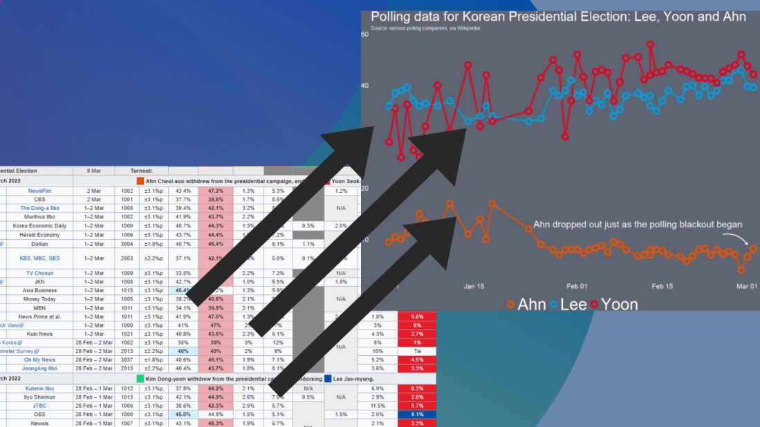
I want to only look at the main two candidates from the main parties that have been polling in the 40% range – Lee and Yoon – as well as the data for Ahn (who recently dropped out and endorsed Yoon).

poll_data %>% 
  filter(candidate %in% c("Lee", "Yoon", "Ahn")) -> lee_yoon_data

We take the official party hex colors for the graph and create a vector to use later with the scale_color_manual() function below:

party_palette <- c(
  "Ahn" = "#df550a",
  "Lee" = "#00a0e2",
  "Yoon" = "#e7001f")

And we plot the variables.

lee_yoon_data %>% 
  ggplot(aes(x = dates_format, y = favour_percent_mean,
             groups = candidate, color = candidate)) + 
  geom_line( size = 2, alpha = 0.8) +
  geom_point(fill = "#5e6472", shape = 21, size = 4, stroke = 3) + 
  labs(title = "Polling data for Korean Presidential Election", subtitle = "Source: various polling companies, via Wikipedia") -> poll_graph

The bulk of aesthetics for changing the graph appearance in the theme()

poll_graph + theme(panel.border = element_blank(),
        legend.position = "bottom",        
        text = element_text(size = 15, color = "white"),
        plot.title = element_text(size = 40),
        legend.title = element_blank(),
        legend.text = element_text(size = 50, color = "white"),
        axis.text.y = element_text(size = 20), 
        axis.text.x = element_text(size = 20),
        legend.background = element_rect(fill = "#5e6472"),
        axis.title = element_blank(),
        axis.text = element_text(color = "white", size = 20),
        panel.grid.major.y = element_blank(),
        panel.grid.minor.y = element_blank(),
        panel.grid.major.x = element_blank(),
        panel.grid.minor.x = element_blank(),
        legend.key = element_rect(fill = "#5e6472"),
        plot.background = element_rect(fill = "#5e6472"),
        panel.background = element_rect(fill = "#5e6472")) +
  scale_color_manual(values = party_palette) 

Last, with the annotate() functions, we can also add an annotation arrow and text to add some more information about Ahn Cheol-su the candidate dropping out.

  annotate("text", x = as.Date("2022-02-11"), y = 13, label = "Ahn dropped out just as the polling blackout began", size = 10, color = "white") +
  annotate(geom = "curve", x = as.Date("2022-02-25"), y = 13, xend = as.Date("2022-03-01"), yend = 10, 
    curvature = -.3, arrow = arrow(length = unit(2, "mm")), size = 1, color = "white")

We will just have to wait until next Wednesday / Thursday to see who is the winner ~

Over It Reaction GIF by Saturday Night Live - Find & Share on GIPHY

Advertisement

Compare Irish census years with compareBars and csodata package in R

Packages we will need:

library(csodata)
library(janitor)
library(ggcharts)
library(compareBars)
library(tidyverse)

First, let’s download population data from the Irish census with the Central Statistics Office (CSO) API package, developed by Conor Crowley.

You can search for the data you want to analyse via R or you can go to the CSO website and browse around the site.

I prefer looking through the site because sometimes I stumble across a dataset I didn’t even think to look for!

Keep note of the code beside the red dot star symbol if you’re looking around for datasets.

Click here to check out the CRAN PDF for the CSO package.

You can search for keywords with cso_search_toc(). I want total population counts for the whole country.

cso_search_toc("total population")

We can download the variables we want by entering the code into the cso_get_data() function

irish_pop <- cso_get_data("EY007")
View(irish_pop)

The EY007 code downloads population census data in both 2011 and 2016 at every age.

It needs a little bit of tidying to get it ready for graphing.

irish_pop %<>%  
  clean_names()

First, we can be lazy and use the clean_names() function from the janitor package.

GIF by The Good Place - Find & Share on GIPHY

Next we can get rid of the rows that we don’t want with select().

Then we use the pivot_longer() function to turn the data.frame from wide to long and to turn the x2011 and x2016 variables into one year variable.

irish_pop %>% 
  filter(at_each_year_of_age == "Population") %>% 
  filter(sex == 'Both sexes') %>% 
  filter(age_last_birthday != "All ages") %>% 
  select(!statistic) %>% 
  select(!sex) %>% 
  select(!at_each_year_of_age) -> irish_wide

irish_wide %>% 
  pivot_longer(!age_last_birthday,
    names_to = "year", 
    values_to = "pop_count",
    values_drop_na = TRUE) %>% 
    mutate(year = as.factor(year)) -> irish_long

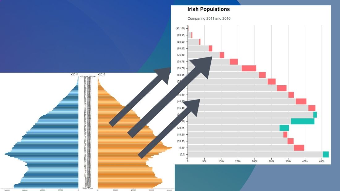
No we can create our pyramid chart with the pyramid_chart() from the ggcharts package. The first argument is the age category for both the 2011 and 2016 data. The second is the actual population counts for each year. Last, enter the group variable that indicates the year.

irish_long %>%   
  pyramid_chart(age_last_birthday, pop_count, year)

One problem with the pyramid chart is that it is difficult to discern any differences between the two years without really really examining each year.

One way to more easily see the differences with the compareBars function

The compareBars package created by David Ranzolin can help to simplify comparative bar charts! It’s a super simple function to use that does a lot of visualisation leg work under the hood!

First we need to pivot the data.frame back to wide format and then input the age, and then the two groups – x2011 and x2016 – in the compareBars() function.

We can add more labels and colors to customise the graph also!

irish_long %>% 
  pivot_wider(names_from = year, values_from = pop_count) %>% 
  compareBars(age_last_birthday, x2011, x2016, orientation = "horizontal",
              xLabel = "Population",
              yLabel = "Year",
              titleLabel = "Irish Populations",
              subtitleLabel = "Comparing 2011 and 2016",
              fontFamily = "Arial",
              compareVarFill1 = "#FE6D73",
              compareVarFill2 = "#17C3B2") 

We can see that under the age of four-ish, 2011 had more at the time. And again, there were people in their twenties in 2011 compared to 2016.

However, there are more older people in 2016 than in 2011.

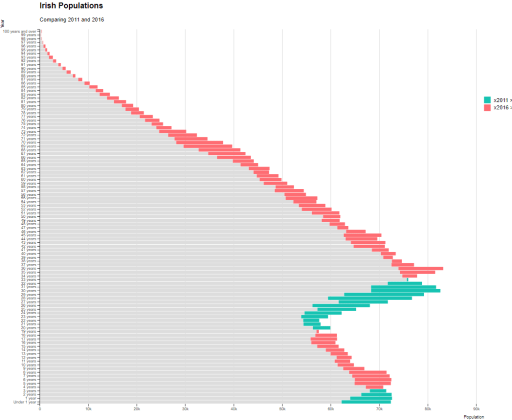
Similar to above it is a bit busy! So we can create groups for every five age years categories and examine the broader trends with fewer horizontal bars.

First we want to remove the word “years” from the age variable and convert it to a numeric class variable. We can easily do this with the parse_number() function from the readr package

irish_wide %<>% 
mutate(age_num = readr::parse_number(as.character(age_last_birthday))) 

Next we can group the age years together into five year categories, zero to 5 years, 6 to 10 years et cetera.

We use the cut() function to divide the numeric age_num variable into equal groups. We use the seq() function and input age 0 to 100, in increments of 5.

irish_wide$age_group = cut(irish_wide$age_num, seq(0, 100, 5))

Next, we can use group_by() to calculate the sum of each population number in each five year category.

And finally, we use the distinct() function to remove the duplicated rows (i.e. we only want to keep the first row that gives us the five year category’s population count for each category.

irish_wide %<>% 
  group_by(age_group) %>% 
  mutate(five_year_2011 = sum(x2011)) %>% 
  mutate(five_year_2016 = sum(x2016)) %>% 
  distinct(five_year_2011, five_year_2016, .keep_all = TRUE)

Next plot the bar chart with the five year categories

compareBars(irish_wide, age_group, five_year_2011, five_year_2016, orientation = "horizontal",
              xLabel = "Population",
              yLabel = "Year",
              titleLabel = "Irish Populations",
              subtitleLabel = "Comparing 2011 and 2016",
              fontFamily = "Arial",
              compareVarFill1 = "#FE6D73",
              compareVarFill2 = "#17C3B2") 

irish_wide2 %>% 
  select(age_group, five_year_2011, five_year_2016) %>% 
  pivot_longer(!age_group,
             names_to = "year", 
             values_to = "pop_count",
             values_drop_na = TRUE) %>% 
  mutate(year = as.factor(year)) -> irishlong2

irishlong2 %>%   
  pyramid_chart(age_group, pop_count, year)

The Good Place Yes GIF by NBC - Find & Share on GIPHY