The tidymodels framework in R is a collection of packages for modeling.
Within tidymodels, the parsnip package is primarily responsible for specifying models in a way that is independent of the underlying modeling engines. The set_engine() function in parsnip allows users to specify which computational engine to use for modeling, enabling the same model specification to be used across different packages and implementations.
In this blog series, we will look at some commonly used models and engines within the tidymodels package
Linear Regression (lm): The classic linear regression model, with the default engine being stats, referring to the base R stats package.
Logistic Regression (logistic_reg): Used for binary classification problems, with engines like stats for the base R implementation and glmnet for regularized regression.
Random Forest (rand_forest): A popular ensemble method for classification and regression tasks, with engines like ranger and randomForest.
Boosted Trees (boost_tree): Used for boosting tasks, with engines such as xgboost, lightgbm, and catboost.
Decision Trees (decision_tree): A base model for classification and regression, with engines like rpart and C5.0.
K-Nearest Neighbors (nearest_neighbor): A simple yet effective non-parametric method, with engines like kknn and caret.
Principal Component Analysis (pca): For dimensionality reduction, with the stats engine.
Lasso and Ridge Regression (linear_reg): For regression with regularization, specifying the penalty parameter and using engines like glmnet.
library(tidyverse)      # of course
library(ggridges)       # density plots
library(GGally)         # correlation matrics
library(stargazer)      # tables
library(knitr)          # more tables stuff
library(kableExtra)     # more and more tables
library(ggrepel)        # spread out labels
library(ggstream)       # streamplots
library(bbplot)         # pretty themes
library(ggthemes)       # more pretty themes
library(ggside)         # stack plots side by side
library(forcats)        # reorder factor levels
Before jumping into any inferentional statistical analysis, it is helpful for us to get to know our data.
That always means plotting and visualising the data and looking at the spread, the mean, distribution and outliers in the dataset.
Before we plot anything, a simple package that creates tables in the stargazer package. We can examine descriptive statistics of the variables in one table.
Click here to read this practically exhaustive cheat sheet for the stargazer package by Jake Russ. I refer to it at least once a week. Thank you, Jack.
I want to summarise a few of the stats, so I write into the summary.stat() argument the number of observations, the mean, median and standard deviation.
The kbl() and kable_classic() will change the look of the table in R (or if you want to copy and paste the code into latex with the type = "latex" argument).
In HTML, they do not appear.
To find out more about the knitr kable tables, click here to read the cheatsheet by Hao Zhu.
Choose the variables you want, put them into a data.frame and feed them into the stargazer() function
stargazer(my_df_summary,
          covariate.labels = c("Corruption index",
                               "Civil society strength",
                               'Rule of Law score',
                               "Physical Integerity Score",
                               "GDP growth"),
          summary.stat = c("n", "mean", "median", "sd"),
          type = "html") %>%
  kbl() %>%
  kable_classic(full_width = F, html_font = "Times", font_size = 25)
Statistic
N
Mean
Median
St. Dev.
Corruption index
179
0.477
0.519
0.304
Civil society strength
179
0.670
0.805
0.287
Rule of Law score
173
7.451
7.000
4.745
Physical Integerity Score
179
0.696
0.807
0.284
GDP growth
163
0.019
0.020
0.032
Next, we can create a barchart to look at the different levels of variables across categories. We can look at the different regime types (from complete autocracy to liberal democracy) across the six geographical regions in 2018 with the geom_bar().
my_df %>%
  filter(year == 2018) %>%
  ggplot() +
  geom_bar(aes(as.factor(region),
               fill = as.factor(regime)),
           color = "white", size = 2.5) -> my_barplot
This type of graph also tells us that Sub-Saharan Africa has the highest number of countries and the Middle East and North African (MENA) has the fewest countries.
However, if we want to look at each group and their absolute percentages, we change one line: we add geom_bar(position = "fill"). For example we can see more clearly that over 50% of Post-Soviet countries are democracies ( orange = electoral and blue = liberal democracy) as of 2018.
We can also check out the density plot of democracy levels (as a numeric level) across the six regions in 2018.
With these types of graphs, we can examine characteristics of the variables, such as whether there is a large spread or normal distribution of democracy across each region.
Click here to read more about the GGally package and click here to read their CRAN PDF.
We can use the ggside package to stack graphs together into one plot.
There are a few arguments to add when we choose where we want to place each graph.
For example, geom_xsideboxplot(aes(y = freedom_house), orientation = "y") places a boxplot for the three Freedom House democracy levels on the top of the graph, running across the x axis. If we wanted the boxplot along the y axis we would write geom_ysideboxplot(). We add orientation = "y" to indicate the direction of the boxplots.
Next we indiciate how big we want each graph to be in the panel with theme(ggside.panel.scale = .5) argument. This makes the scatterplot take up half and the boxplot the other half. If we write .3, the scatterplot takes up 70% and the boxplot takes up the remainning 30%. Last we indicade scale_xsidey_discrete() so the graph doesn’t think it is a continuous variable.
We add Darjeeling Limited color palette from the Wes Anderson movie.
Click here to learn about adding Wes Anderson theme colour palettes to graphs and plots.
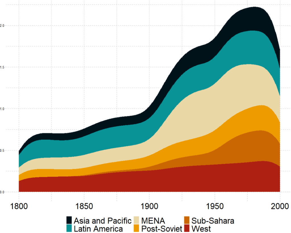
The next plot will look how variables change over time.
We can check out if there are changes in the volume and proportion of a variable across time with the geom_stream(type = "ridge") from the ggstream package.
In this instance, we will compare urban populations across regions from 1800s to today.
Click here to read more about the ggstream package and click here to read their CRAN PDF.
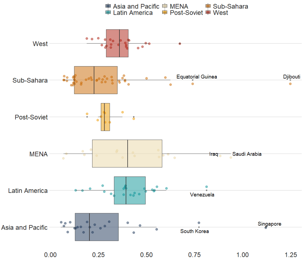
We can also look at interquartile ranges and spread across variables.
We will look at the urbanization rate across the different regions. The variable is calculated as the ratio of urban population to total country population.
Before, we will create a hex color vector so we are not copying and pasting the colours too many times.
If we want to look more closely at one year and print out the country names for the countries that are outliers in the graph, we can run the following function and find the outliers int he dataset for the year 1990:
In the next blog post, we will look at t-tests, ANOVAs (and their non-parametric alternatives) to see if the difference in means / medians is statistically significant and meaningful for the underlying population.
We will plot out a lollipop plot to compare EU countries on their level of income inequality, measured by the Gini coefficient.
A Gini coefficient of zero expresses perfect equality, where all values are the same (e.g. where everyone has the same income). A Gini coefficient of one (or 100%) expresses maximal inequality among values (e.g. for a large number of people where only one person has all the income or consumption and all others have none, the Gini coefficient will be nearly one).
To start, we will take data on the EU from Wikipedia. With rvest package, scrape the table about the EU countries from this Wikipedia page.
With the gsub() function, we can clean up the different variables with some regex. Namely delete the footnotes / square brackets and change the variable classes.
Next some data cleaning and grouping the year member groups into different decades. This indicates what year each country joined the EU. If we see clustering of colours on any particular end of the Gini scale, this may indicate that there is a relationship between the length of time that a country was part of the EU and their domestic income inequality level. Are the founding members of the EU more equal than the new countries? Or conversely are the newer countries that joined from former Soviet countries in the 2000s more equal. We can visualise this with the following mutations:
To create the lollipop plot, we will use the geom_segment() functions. This requires an x and xend argument as the country names (with the fct_reorder() function to make sure the countries print out in descending order) and a y and yend argument with the gini number.
All the countries in the EU have a gini score between mid 20s to mid 30s, so I will start the y axis at 20.
We can add the flag for each country when we turn the ISO2 character code to lower case and give it to the country argument.
We can see there does not seem to be a clear pattern between the year a country joins the EU and their level of domestic income inequality, according to the Gini score.
Another option for the lolliplot plot comes from the ggpubr package. It does not take the familiar aesthetic arguments like you can do with ggplot2 but it is very quick and the defaults look good!
This blog post will look at the plot_model() function from the sjPlot package. This plot can help simply visualise the coefficients in a model.
Packages we need:
library(sjPlot)
library(kable)
We can look at variables that are related to citizens’ access to public services.
This dependent variable measures equal access access to basic public services, such as access to security, primary education, clean water, and healthcare and whether they are distributed equally or unequally according to socioeconomic position.
Higher scores indicate a more equal society.
I will throw some variables into the model and see what relationships are statistically significant.
The variables in the model are
level of judicial constraint on the executive branch,
freedom of information (such as freedom of speech and uncensored media),
level of democracy,
level of regime corruption and
strength of civil society.
So first, we run a simple linear regression model with the lm() function:
We can use knitr package to produce a nice table or the regression coefficients with kable().
I write out the independent variable names in the caption argument
I also choose the four number columns in the col.names argument. These numbers are:
beta coefficient,
standard error,
t-score
p-value
I can choose how many decimals I want for each number columns with the digits argument.
And lastly, to make the table, I can set the type to "html". This way, I can copy and paste it into my blog post directly.
my_model %>%
tidy() %>%
kable(caption = "Access to public services by socio-economic position.",
col.names = c("Predictor", "B", "SE", "t", "p"),
digits = c(0, 2, 3, 2, 3), "html")
Access to public services by socio-economic position
Predictor
B
SE
t
p
(Intercept)
1.98
0.380
5.21
0.000
Judicial constraints
-0.03
0.485
-0.06
0.956
Freedom information
-0.60
0.860
-0.70
0.485
Democracy Score
2.61
0.807
3.24
0.001
Regime Corruption
-2.75
0.381
-7.22
0.000
Civil Society Strength
-1.67
0.771
-2.17
0.032
Higher democracy scores are significantly and positively related to equal access to public services for different socio-economic groups.
There is no statistically significant relationship between judicial constraint on the executive.
But we can also graphically show the coefficients in a plot with the sjPlot package.
There are many different arguments you can add to change the colors of bars, the size of the font or the thickness of the lines.
p <-  plot_model(my_model,
      line.size = 8,
      show.values = TRUE,
      colors = "Set1",
      vline.color = "#d62828",
      axis.labels = c("Civil Society Strength",  "Regime Corruption", "Democracy Score", "Freedom information", "Judicial constraints"), title = "Equal access to public services distributed by socio-economic position")

p + theme_sjplot(base_size = 20)
So how can we interpret this graph?
If a bar goes across the vertical red line, the coefficient is not significant. The further the bar is from the line, the higher the t-score and the more significant the coefficient!
Click here to learn how to access and download ESS round data for the thirty-ish European countries (depending on the year).
So with the essurvey package, I have downloaded and cleaned up the most recent round of the ESS survey, conducted in 2018.
We will examine the different demographic variables that relate to levels of trust in politicians across 29 European countries (education level, gender, age et cetera).
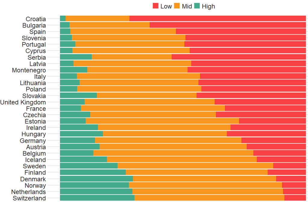
Before we create the survey weight objects, we can first make a bar chart to look at the different levels of trust in the different countries.
We can use the cut() function to divide the 10-point scale into three groups of “low”, “mid” and “high” levels of trust in politicians.
I also choose traffic light hex colors in color_palette vector and add full country names with countrycode() so it’s easier to read the graph
The graph lists countries in descending order according to the percentage of sampled participants that indicated they had low trust levels in politicians.
The respondents in Croatia, Bulgaria and Spain have the most distrust towards politicians.
Croatians when they see politicians
For this example, I want to compare different analyses to see what impact different weights have on the coefficient estimates and standard errors in the regression analyses:
with no weights (dEfIniTelYy not recommended by ESS)
with post-stratification weights only (not recommended by ESS) and
with the combined post-strat AND population weight (the recommended weighting strategy according to ESS)
First we create two special svydesign objects, with the survey package. To create this, we need to add a squiggly ~ symbol in front of the variables (Google tells me it is called a tilde).
The ids argument takes the cluster ID for each participant.
psu is a numeric variable that indicates the primary sampling unit within which the respondent was selected to take part in the survey. For example in Ireland, this refers to the particular electoral division of each participant.
The strata argument takes the numeric variable that codes which stratum each individual is in, according to the type of sample design each country used.
The first svydesign object uses only post-stratification weights: pspwght
Finally we need to specify the nest argument as TRUE. I don’t know why but it throws an error message if we don’t …
WITHOUT weights AND WITH weights (post-stratification and population weights)
We can see that gender variable is more equally balanced between males (1) and females (2) in the data with weights
Additionally, average trust in politicians is lower in the sample with full weights.
Participants are more left-leaning on average in the sample with full weights than in the sample with no weights.
Next, we can look at a general linear model without survey weights and then with the two survey weights we just created.
Do we see any effect of the weighting design on the standard errors and significance values?
So, we first run a simple general linear model. In this model, R assumes that the data are independent of each other and based on that assumption, calculates coefficients and standard errors.
With the stargazer package, we can compare the models side-by-side:
library(stargazer)
stargazer(simple_glm, post_strat_glm, full_weight_glm, type = "text")
We can see that the standard errors in brackets were increased for most of the variables in model (3) with both weights when compared to the first model with no weights.
The biggest change is the rural-urban scale variable. With no weights, it is positive correlated with trust in politicians. That is to say, the more urban a location the respondent lives, the more likely the are to trust politicians. However, after we apply both weights, it becomes negative correlated with trust. It is in fact the more rural the location in which the respondent lives, the more trusting they are of politicians.
Additionally, age becomes statistically significant, after we apply weights.
Of course, this model is probably incorrect as I have assumed that all these variables have a simple linear relationship with trust levels. If I really wanted to build a robust demographic model, I would have to consult the existing academic literature and test to see if any of these variables are related to trust levels in a non-linear way. For example, it could be that there is a polynomial relationship between age and trust levels, for example. This model is purely for illustrative purposes only!
Plus, when I examine the R2 score for my models, it is very low; this model of demographic variables accounts for around 6% of variance in level of trust in politicians. Again, I would have to consult the body of research to find other explanatory variables that can account for more variance in my dependent variable of interest!
We can look at the R2 and VIF score of GLM with the summ() function from the jtools package. The summ() function can take a svyglm object. Click here to read more about various functions in the jtools package.
With the European Social Survey (ESS), we will examine the different variables that are related to levels of trust in politicians across Europe in the latest round 9 (conducted in 2018).
Click here to learn about downloading ESS data into R with the essurvey package.
Packages we will need:
library(survey)
library(srvyr)
The survey package was created by Thomas Lumley, a professor from Auckland. The srvyr package is a wrapper packages that allows us to use survey functions with tidyverse.
Why do we need to add weights to the data when we analyse surveys?
When we import our survey data file, R will assume the data are independent of each other and will analyse this survey data as if it were collected using simple random sampling.
However, the reality is that almost no surveys use a simple random sample to collect data (the one exception being Iceland in ESS!)
Rather, survey institutions choose complex sampling designs to reduce the time and costs of ultimately getting responses from the public.
Their choice of sampling design can lead to different estimates and the standard errors of the sample they collect.
For example, the sampling weight may affect the sample estimate, and choice of stratification and/or clustering may mean (most likely underestimated) standard errors.
As a result, our analysis of the survey responses will be wrong and not representative to the population we want to understand. The most problematic result is that we would arrive at statistical significance, when in reality there is no significant relationship between our variables of interest.
Therefore it is essential we don’t skip this step of correcting to account for weighting / stratification / clustering and we can make our sample estimates and confidence intervals more reliable.
This table comes from round 8 of the ESS, carried out in 2016. Each of the 23 countries has an institution in charge of carrying out their own survey, but they must do so in a way that meets the ESS standard for scientifically sound survey design (See Table 1).
Sampling weights aim to capture and correct for the differing probabilities that a given individual will be selected and complete the ESS interview.
For example, the population of Lithuania is far smaller than the UK. So the probability of being selected to participate is higher for a random Lithuanian person than it is for a random British person.
Additionally, within each country, if the survey institution chooses households as a sampling element, rather than persons, this will mean that individuals living alone will have a higher probability of being chosen than people in households with many people.
Click here to read in detail the sampling process in each country from round 1 in 2002. For example, if we take my country – Ireland – we can see the many steps involved in the country’s three-stage probability sampling design.
The Primary Sampling Unit (PSU) is electoral districts. The institute then takes addresses from the Irish Electoral Register. From each electoral district, around 20 addresses are chosen (based on how spread out they are from each other). This is the second stage of clustering. Finally, one person is randomly chosen in each house to answer the survey, chosen as the person who will have the next birthday (third cluster stage).
Click here for more information about Design Effects (DEFF) and click here to read how ESS calculates design effects.
DEFF p refers to the design effect due to unequal selection probabilities (e.g. a person is more likely to be chosen to participate if they live alone)
DEFF c refers to the design effect due to clustering
According to Gabler et al. (1999), if we multiply these together, we get the overall design effect. The Irish design that was chosen means that the data’s variance is 1.6 times as large as you would expect with simple random sampling design. This 1.6 design effects figure can then help to decide the optimal sample size for the number of survey participants needed to ensure more accurate standard errors.
So, we can use the functions from the survey package to account for these different probabilities of selection and correct for the biases they can cause to our analysis.
In this example, we will look at demographic variables that are related to levels of trust in politicians. But there are hundreds of variables to choose from in the ESS data.
Click here for a list of all the variables in the European Social Survey and in which rounds they were asked. Not all questions are asked every year and there are a bunch of country-specific questions.
We can look at the last few columns in the data.frame for some of Ireland respondents (since we’ve already looked at the sampling design method above).
The dweight is the design weight and it is essentially the inverse of the probability that person would be included in the survey.
The pspwght is the post-stratification weight and it takes into account the probability of an individual being sampled to answer the survey AND ALSO other factors such as non-response error and sampling error. This post-stratificiation weight can be considered a more sophisticated weight as it contains more additional information about the realities survey design.
The pweight is the population size weight and it is the same for everyone in the Irish population.
When we are considering the appropriate weights, we must know the type of analysis we are carrying out. Different types of analyses require different combinations of weights. According to the ESS weighting documentation:
when analysing data for one country alone – we only need the design weight or the poststratification weight.
when comparing data from two or more countries but without reference to statistics that combine data from more than one country – we only need the design weight or the poststratification weight
when comparing data of two or more countries and with reference to the average (or combined total) of those countries – we need BOTH design or post-stratification weight AND population size weights together.
when combining different countries to describe a group of countries or a region, such as “EU accession countries” or “EU member states” = we need BOTH design or post-stratification weights AND population size weights.
ESS warn that their survey design was not created to make statistically accurate region-level analysis, so they say to carry out this type of analysis with an abundance of caution about the results.
ESS has a table in their documentation that summarises the types of weights that are suitable for different types of analysis:
Since we are comparing the countries, the optimal weight is a combination of post-stratification weights AND population weights together.
Click here to read Part 2 and run the regression on the ESS data with the survey package weighting design
Below is the code I use to graph the differences in mean level of trust in politicians across the different countries.
library(ggimage) # to add flags
library(countrycode) # to add ISO country codes

# r_agg is the aggregated mean of political trust for each countries' respondents.

r_agg %>%
  dplyr::mutate(country, EU_member = ifelse(country == "BE" | country == "BG" | country == "CZ" | country == "DK" | country == "DE" | country == "EE" | country == "IE" | country == "EL" | country == "ES" | country == "FR" | country == "HR" | country == "IT" | country == "CY" | country == "LV" | country == "LT" | country == "LU" | country == "HU" | country == "MT" | country == "NL" | country == "AT" | country == "AT" | country == "PL" | country == "PT" | country == "RO" | country == "SI" | country == "SK" | country == "FI" | country == "SE","EU member", "Non EU member")) -> r_agg


r_agg %>%
  filter(EU_member == "EU member") %>%
  dplyr::summarize(eu_average = mean(mean_trust_pol))


r_agg$country_name <- countrycode(r_agg$country, "iso2c", "country.name")


#eu_average <- r_agg %>%
 # summarise_if(is.numeric, mean, na.rm = TRUE)


eu_avg <- data.frame(country = "EU average",
                     mean_trust_pol = 3.55,
                     EU_member =  "EU average",
                     country_name = "EU average")

r_agg <- rbind(r_agg, eu_avg)


my_palette <- c("EU average" = "#ef476f",
                "Non EU member" = "#06d6a0",
                "EU member" = "#118ab2")

r_agg <- r_agg %>%
  dplyr::mutate(ordered_country = fct_reorder(country, mean_trust_pol))


r_graph <- r_agg %>%
  ggplot(aes(x = ordered_country, y = mean_trust_pol, group = country, fill = EU_member)) +
  geom_col() +
  ggimage::geom_flag(aes(y = -0.4, image = country), size = 0.04) +
  geom_text(aes(y = -0.15 , label = mean_trust_pol)) +
  scale_fill_manual(values = my_palette) + coord_flip()

r_graph
The mctest package’s functions have many multicollinearity diagnostic tests for overall and individual multicollinearity. Additionally, the package can show which regressors may be the reason of for the collinearity problem in your model.
Given the amount of news we have had about elections in the news recently, let’s look at variables that capture different aspects of elections and see how they relate to scores of democracy. These different election components will probably overlap.
In fact, I suspect multicollinearity will be problematic with the variables I am looking at.
emb_autonomy – the extent to which the election management body of the country has autonomy from the government to apply election laws and administrative rules impartially in national elections.
election_multiparty – the extent to which the elections involved real multiparty competition.
election_votebuy – the extent to which there was evidence of vote and/or turnout buying.
election_intimidate – the extent to which opposition candidates/parties/campaign workers subjected to repression, intimidation, violence, or harassment by the government, the ruling party, or their agents.
election_free – the extent to which the election was judged free and fair.
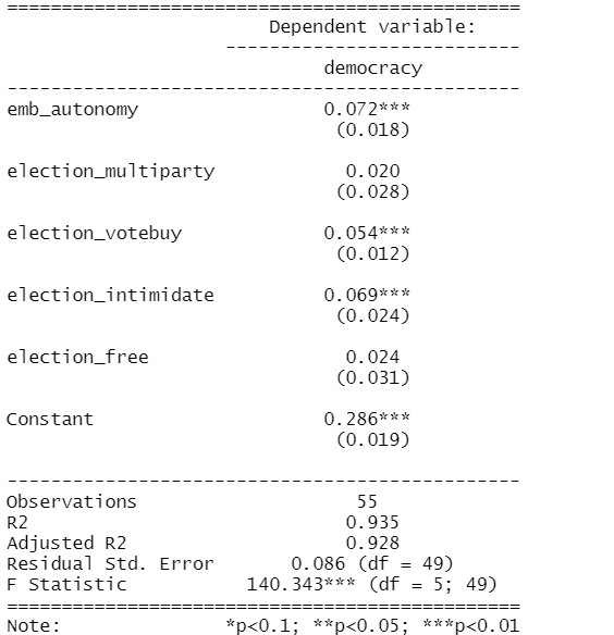
In this model the dependent variable is democracy score for each of the 178 countries in this dataset. The score measures the extent to which a country ensures responsiveness and accountability between leaders and citizens. This is when suffrage is extensive; political and civil society organizations can operate freely; governmental positions are clean and not marred by fraud, corruption or irregularities; and the chief executive of a country is selected directly or indirectly through elections.
election_model <- lm(democracy ~ ., data = election_df)
stargazer(election_model, type = "text")
However, I suspect these variables suffer from high multicollinearity. Usually your knowledge of the variables – and how they were operationalised – will give you a hunch. But it is good practice to check everytime, regardless.
The eigprop() function can be used to detect the existence of multicollinearity among regressors. The function computes eigenvalues, condition indices and variance decomposition proportions for each of the regression coefficients in my election model.
To check the linear dependencies associated with the corresponding eigenvalue, the eigprop compares variance proportion with threshold value (default is 0.5) and displays the proportions greater than given threshold from each row and column, if any.
So first, let’s run the overall multicollinearity test with the eigprop() function :
mctest::eigprop(election_model)
If many of the Eigenvalues are near to 0, this indicates that there is multicollinearity.
Unfortunately, the phrase “near to” is not a clear numerical threshold. So we can look next door to the Condition Index score in the next column.
This takes the Eigenvalue index and takes a square root of the ratio of the largest eigenvalue (dimension 1) over the eigenvalue of the dimension.
Condition Index values over 10 risk multicollinearity problems.
In our model, we see the last variable – the extent to which an election is free and fair – suffers from high multicollinearity with other regressors in the model. The Eigenvalue is close to zero and the Condition Index (CI) is near 10. Maybe we can consider dropping this variable, if our research theory allows its.
Another battery of tests that the mctest package offers is the imcdiag( ) function. This looks at individual multicollinearity. That is, when we add or subtract individual variables from the model.
mctest::imcdiag(election_model)
A value of 1 means that the predictor is not correlated with other variables. As in a previous blog post on Variance Inflation Factor (VIF) score, we want low scores. Scores over 5 are moderately multicollinear. Scores over 10 are very problematic.
And, once again, we see the last variable is HIGHLY problematic, with a score of 14.7. However, all of the VIF scores are not very good.
The Tolerance (TOL) score is related to the VIF score; it is the reciprocal of VIF.
The Wi score is calculated by the Farrar Wi, which an F-test for locating the regressors which are collinear with others and it makes use of multiple correlation coefficients among regressors. Higher scores indicate more problematic multicollinearity.
The Leamer score is measured by Leamer’s Method : calculating the square root of the ratio of variances of estimated coefficients when estimated without and with the other regressors. Lower scores indicate more problematic multicollinearity.
The CVIF score is calculated by evaluating the impact of the correlation among regressors in the variance of the OLSEs. Higher scores indicate more problematic multicollinearity.
The Klein score is calculated by Klein’s Rule, which argues that if Rj from any one of the models minus one regressor is greater than the overall R2 (obtained from the regression of y on all the regressors) then multicollinearity may be troublesome. All scores are 0, which means that the R2 score of any model minus one regression is not greater than the R2 with full model.
Click here to read the mctest paper by its authors – Imdadullah et al. (2016) – that discusses all of the mathematics behind all of the tests in the package.
In conclusion, my model suffers from multicollinearity so I will need to drop some variables or rethink what I am trying to measure.
Click here to run Stepwise regression analysis and see which variables we can drop and come up with a more parsimonious model (the first suspect I would drop would be the free and fair elections variable)
Perhaps, I am capturing the same concept in many variables. Therefore I can run Principal Component Analysis (PCA) and create a new index that covers all of these electoral features.
Next blog will look at running PCA in R and examining the components we can extract.
References
Imdadullah, M., Aslam, M., & Altaf, S. (2016). mctest: An R Package for Detection of Collinearity among Regressors. R J., 8(2), 495.
Running a regression model with too many variables – especially irrelevant ones – will lead to a needlessly complex model. Stepwise can help to choose the best variables to add.
Packages you need:
library(olsrr)
library(MASS)
library(stargazer)
First, choose a model and throw every variable you think has an impact on your dependent variable!
I hear the voice of my undergrad professor in my ear: ” DO NOT go for the “throw spaghetti at the wall and just see what STICKS” approach. A cardinal sin.
We must choose variables because we have some theoretical rationale for any potential relationship. Or else we could end up stumbling on spurious relationships.
… beyond just using our sound theoretical understanding of the complex phenomena we study in order to choose our model variables …
… one additional way to supplement and gauge which variables add to – or more importantly omit from – the model is to choose the one with the smallest amount of error.
We can operationalise this as the model with the lowest Akaike information criterion (AIC).
AIC is an estimator of in-sample prediction error and is similar to the adjusted R-squared measures we see in our regression output summaries.
It effectively penalises us for adding more variables to the model.
Lower scores can indicate a more parsimonious model, relative to a model fit with a higher AIC. It can therefore give an indication of the relative quality of statistical models for a given set of data.
As a caveat, we can only compare AIC scores with models that are fit to explain variance of the same dependent / response variable.
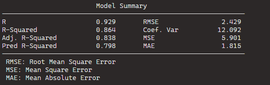
data(mtcars)
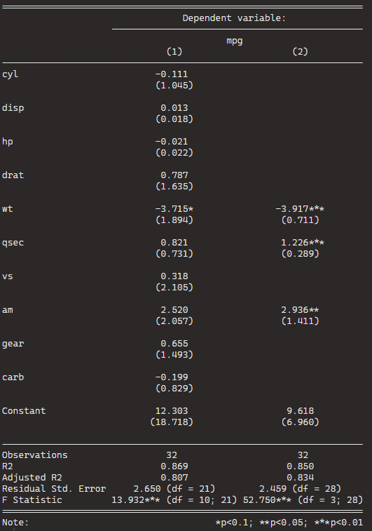
car_model <- lm(mpg ~., data = mtcars) %>% stargazer
Very many variables and not many stars.
With our model, we can now feed it into the stepwise function. Hopefully, we can remove variables that are not contributing to the model!
For the direction argument, you can choose between backward and forward stepwise selection,
Forward steps: start the model with no predictors, just one intercept and search through all the single-variable models, adding variables, until we find the the best one (the one that results in the lowest residual sum of squares)
Backward steps: we start stepwise with all the predictors and removes variable with the least statistically significant (the largest p-value) one by one until we find the lost AIC.
Backward stepwise is generally better because starting with the full model has the advantage of considering the effects of all variables simultaneously.
Unlike backward elimination, forward stepwise selection is more suitable in settings where the number of variables is bigger than the sample size.
So tldr: unless the number of candidate variables is greater than the sample size (such as dealing with genes), using a backward stepwise approach is default choice.
If you add the trace = TRUE, R prints out all the steps.
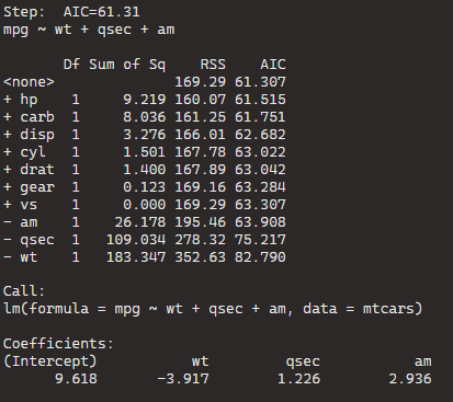
I’ll show the last step to show you the output.
The goal is to have the combination of variables that has the lowest AIC or lowest residual sum of squares (RSS).
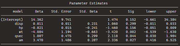
BThe best model, based on the lowest AIC, includes the predictors wt (weight), qsec (quarter-mile time), and am (automatic/manual transmission). The formula is mpg ~ wt + qsec + am.
If we dropped the wt variable, the AIC would shoot up 82.79, so we won’t do that.
Model Comparison:
The initial model (null model) has an AIC of 61.31. Each row in the table corresponds to a different model with additional predictors. For example, adding the predictor hp reduces the AIC to 61.515, and adding carb reduces it further to 61.751.
The coefficients for the “best” model are given under “Call.” For the formula mpg ~ wt + qsec + am, the intercept is 9.618, and the coefficients for wt, qsec, and am are -3.917, 1.226, and 2.936, respectively.
stargazer(car_model, step_car, type = "text")
We can see that the stepwise model has only three variables compared to the ten variables in my original model.
And even with far fewer variables, the R2 has decreased by an insignificant amount. In fact the Adjusted R2 increased because we are not being penalised for throwing so many unnecessary variables.
So we can quickly find a model that loses no explanatory power by is far more parsimonious.
Plus in the original model, only one variable is significant but in the stepwise variable all three of the variables are significant.
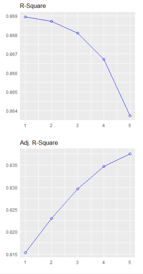
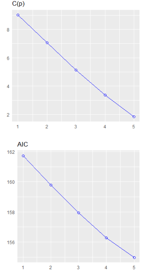
We can plot out the stepwise regression with the oslrr package
car_model %>%
   ols_step_backward_p() %>% plot()
car_model %>%
   ols_step_backward_p(details = TRUE)
With this, we can iterate over the steps. First, we can look at the first step:
The removal of cyl suggests that, after evaluating its p-value, it was found to be not statistically significant in predicting the response variable.
The model is iteratively refining itself by removing variables that do not provide significant information.
In total, it runs five steps and we arrive at the final step and the final model.