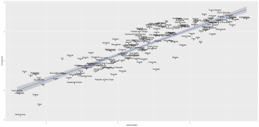
Google Trends is a search trends feature. It shows how frequently a given search term is entered into Google’s search engine, relative to the site’s total search volume over a given period of time.
( So note: because the results are all relative to the other search terms in the time period, the dates you provide to the gtrendsR function will change the shape of your graph and the relative percentage frequencies on the y axis of your plot).
To scrape data from Google Trends, we use the gtrends() function from the gtrendsR package and the get_interest() function from the trendyy package (a handy wrapper package for gtrendsR).
If necessary, also load the tidyverse and ggplot packages.
library(tidyverse)
library(gtrendsR)
library(trendyy)
To scrape the Google trend data, call the trendy() function and write in the search terms.
We can look at relative search hits for Yevgeny Prigozhin, leader of Russian mercenary army, Wagner Group.
prig <- trendy("Prigozhin", "2022-08-25", "2023-08-26") %>%
  get_interest()

ggplot(data = prig, aes(x = as.Date(date),
                          y = hits)) +
  geom_line(colour = "#005f73",
            size = 6.5, alpha = 0.1)  +
  geom_line(colour = "#005f73",
            size = 4, alpha = 0.3) +
  geom_line(colour = "#005f73",
            size = 3, alpha = 0.5) +
  geom_line(colour = "#005f73",
            size = 2) +
  ylab(label = 'Relative Hits %') +
  bbplot::bbc_style() +
  xlab(label = "Search Dates") +
  ylab(label = 'Relative Hits %') +
  labs(title = "Relative hits for `Prigozhin` on Google",
       subtitle = "Data from Google search hits") +
  geom_curve(aes(x = as.Date("2021-10-01"),
                   y = 45,
                   xend = as.Date("2022-02-01"),
                   yend = 30),
             size = 2, alpha = 0.8,
               color = "#001219",
               arrow = arrow(type = "closed"))
For the next example, here we search for the term “Kamala Harris” during the period from 1st of January 2019 until today.
If you want to check out more specifications, for the package, you can check out the package PDF here. For example, we can change the geographical region (US state or country for example) with the geo specification.
We can also change the parameters of the time argument, we can specify the time span of the query with any one of the following strings:
- “now 1-H” (previous hour)
- “now 4-H” (previous four hours)
- “today+5-y” last five years (default)
- “all” (since the beginning of Google Trends (2004))
If don’t supply a string, the default is five year search data.
kamala <- trendy("Kamala Harris", "2019-01-01", "2020-08-13") %>% get_interest()We call the get_interest() function to save this data from Google Trends into a data.frame version of the kamala object. If we didn’t execute this last step, the data would be in a form that we cannot use with ggplot().
View(kamala)
In this data.frame, there is a date variable for each week and a hits variable that shows the interest during that week. Remember, this hits figure shows how frequently a given search term is entered into Google’s search engine relative to the site’s total search volume over a given period of time.
We will use these two variables to plot the y and x axis.
To look at the search trends in relation to the events during the Kamala Presidential campaign over 2019, we can add vertical lines along the date axis, with a data.frame, we can call kamala_events.
kamala_events = data.frame(date=as.Date(c("2019-01-21", "2019-06-25", "2019-12-03", "2020-08-12")),
event=c("Launch Presidential Campaign", "First Primary Debate", "Drops Out Presidential Race", "Chosen as Biden's VP"))
Note the very specific order the as.Date() function requires.
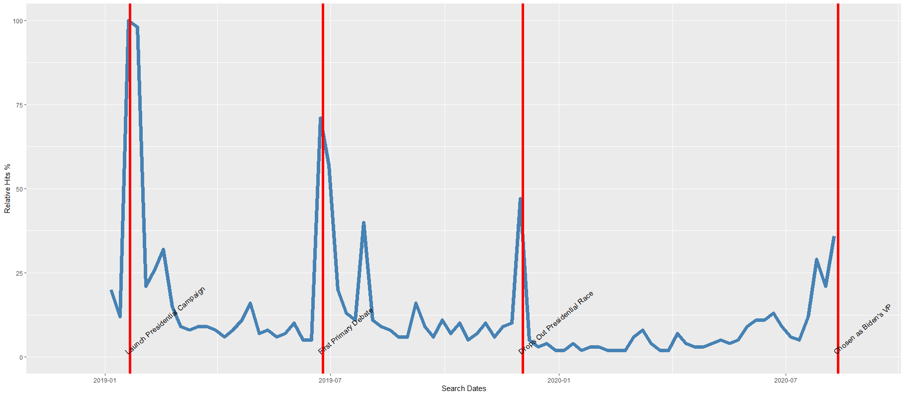
Next, we can graph the trends, using the above date and hits variables:
ggplot(kamala, aes(x = as.Date(date), y = hits)) +
  geom_line(colour = "steelblue", size = 2.5) +
  geom_vline(data=kamala_events, mapping=aes(xintercept=date), color="red") +
    geom_text(data=kamala_events, mapping=aes(x=date, y=0, label=event), size=4, angle=40, vjust=-0.5, hjust=0) +
    xlab(label = "Search Dates") +
    ylab(label = 'Relative Hits %')
Which produces:
I can update the graph
Cairo::CairoWin()
ggplot(data = kamala, aes(x = as.Date(date),
y = hits)) +
geom_vline(data = kamala_events,
mapping = aes(xintercept = date),
size = 11,
alpha = 0.1,
color = "#9b2226") +
geom_vline(data = kamala_events,
mapping = aes(xintercept = date),
size = 8,
alpha = 0.2,
color = "#9b2226") +
geom_vline(data = kamala_events,
mapping = aes(xintercept = date),
size = 7,
alpha = 0.3,
color = "#9b2226") +
geom_vline(data = kamala_events,
mapping = aes(xintercept = date),
size = 4,
alpha = 0.4,
color = "#9b2226") +
geom_line(colour = "#005f73",
size = 5.5, alpha = 0.4) +
geom_line(colour = "#005f73",
size = 5, alpha = 0.5) +
geom_line(colour = "#005f73",
size = 4, alpha = 0.6) +
geom_line(colour = "#005f73",
size = 3) +
geom_text(data = kamala_events,
mapping = aes(x = date,
y = 0,
label = event),
size = 9,
angle = 10,
vjust = -4.6,
hjust = 0.7) +
bbplot::bbc_style() +
xlab(label = "Search Dates") +
ylab(label = 'Relative Hits %') +
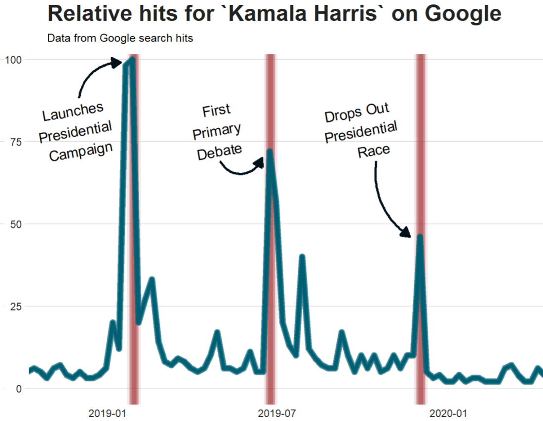
labs(title = "Relative hits for `Kamala Harris` on Google",
subtitle = "Data from Google search hits") +
theme(plot.title = element_text(size = 40),
plot.subtitle = element_text(size = 20)) +
geom_curve(aes(x = as.Date("2018-12-01"),
y = 88,
xend = as.Date("2019-01-15"),
yend = 99),
size = 2, alpha = 0.8,
color = "#001219",
curvature = -0.4,
angle = 90,
arrow = arrow(type = "closed")) +
geom_curve(aes(x = as.Date("2019-05-01"),
y = 69,
xend = as.Date("2019-06-15"),
yend = 70),
size = 2,
alpha = 0.8,
color = "#001219",
curvature = 0.7,
angle = 90,
arrow = arrow(type = "closed")) +
geom_curve(aes(x = as.Date("2019-10-15"),
y = 69,
xend = as.Date("2019-11-20"),
yend = 46),
size = 2,
alpha = 0.8,
color = "#001219",
curvature = 0.3,
angle = 90,
arrow = arrow(type = "closed")) 
Super easy and a quick way to visualise the ups and downs of Kamala Harris’ political career over the past few months, operationalised as the relative frequency with which people Googled her name.
If I had chosen different dates, the relative hits as shown on the y axis would be different! So play around with it and see how the trends change when you increase or decrease the time period.