Comparing North and South Korean UN votes at the General Assembly with unvotes package

Packages we will use

Llibrary(unvotes)
library(lubridate)
library(tidyverse)
library(magrittr)
library(bbplot)
library(waffle)
library(stringr)
library(wordcloud)
library(waffle)
library(wesanderson)

Last September 17th 2021 marked the 30th anniversary of the entry of North Korea and South Korea into full membership in the United Nations. Prior to this, they were only afforded observer status.

keia.org

The Two Koreas Mark 30 Years of UN Membership: The Road to Membership

Let’s look at the types of voting that both countries have done in the General Assembly since 1991.

First we can download the different types of UN votes from the unvotes package

un_votes <- unvotes::un_roll_calls

un_votes_issues <- unvotes::un_roll_call_issues

unvotes::un_votes -> country_votes 

Join them all together and filter out any country that does not have the word “Korea” in its name.

un_votes %>% 
  inner_join(un_votes_issues, by = "rcid") %>% 
  inner_join(country_votes, by = "rcid") %>% 
  mutate(year = format(date, format = "%Y")) %>%
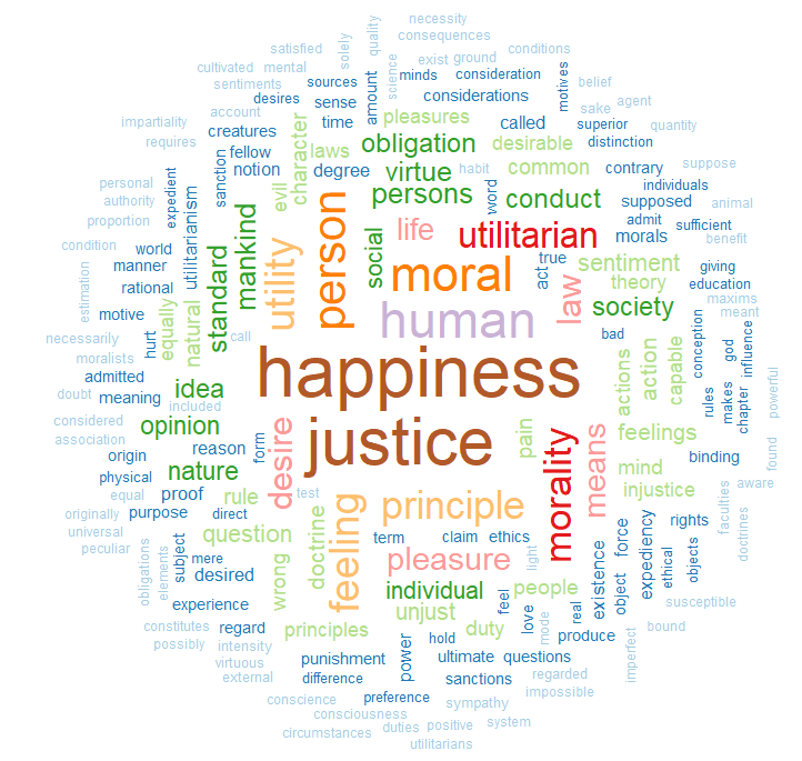
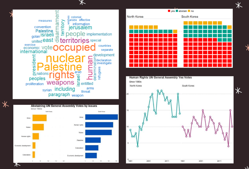
  filter(grepl("Korea", country)) -> korea_un

First we can make a wordcloud of all the different votes for which they voted YES. Is there a discernable difference in the types of votes that each country supported?

First, download the stop words that we can remove (such as the, and, if)

data("stop_words") 

Then I will make a North Korean dataframe of all the votes for which this country voted YES. I remove some of the messy formatting with the gsub argument and count the occurence of each word. I get rid of a few of the procedural words that are more related to the technical wording of the resolutions, rather than related to the tpoic of the vote.

nk_yes_votes <- korea_un %>% 
  filter(country == "North Korea") %>% 
  filter(vote == "yes") %>%  
  select(descr, year) %>% 
  mutate(decade = substr(year, 1, 3)) %>% 
  mutate(decade = paste0(decade, "0s")) %>% 
  # group_by(decade) %>% 
  unnest_tokens(word, descr) %>% 
  mutate(word = gsub(" ", "", word)) %>% 
  mutate(word = gsub('_', '', word)) %>% 
  count(word, sort = TRUE) %>% 
  ungroup() %>% 
  anti_join(stop_words)  %>% 
  mutate(word = case_when(grepl("palestin", word) ~ "Palestine", 
                          grepl("nucl", word) ~ "nuclear",
                          TRUE ~ as.character(word)))  %>%
  filter(word != "resolution") %>% 
  filter(word != "assembly") %>% 
  filter(word != "draft") %>% 
  filter(word != "committee") %>% 
  filter(word != "requested") %>% 
  filter(word != "report") %>% 
  filter(word != "practices") %>% 
  filter(word != "affecting") %>% 
  filter(word != "follow") %>% 
  filter(word != "acting") %>% 
  filter(word != "adopted") 

Next, we count the number of each word


nk_yes_votes %<>% 
  count(word) %>% 
  arrange(desc(n))

We want to also remove the numbers

nums <- nk_yes_votes %>% filter(str_detect(word, "^[0-9]")) %>% select(word) %>% unique()

And remove the stop words

nk_yes_votes %<>%
  anti_join(nums, by = "word")

Choose some nice colours

my_colors <- c("#0450b4", "#046dc8", "#1184a7","#15a2a2", "#6fb1a0", 
               "#b4418e", "#d94a8c", "#ea515f", "#fe7434", "#fea802")

And lastly, plot the wordcloud with the top 50 words

wordcloud(nk_yes_votes$word, 
   nk_yes_votes$n, 
   random.order = FALSE, 
   max.words = 50, 
   colors = my_colors)

If we repeat the above code with South Korea:

There doesn’t seem to be a huge difference. But this is not a very scientfic approach; I just like the look of them!

Next we will compare the two countries how many votes they voted yes, no or abstained from…

korea_un %>% 
  group_by(country, vote) %>% 
  count() %>% 
  mutate(count_ten = n /25) %>% 
  ungroup() %>% 
  ggplot(aes(fill = vote, values = count_ten)) +
  geom_waffle(color = "white",
              size = 2.5,
              n_rows = 10,
              flip = TRUE) +
  facet_wrap(~country) + bbplot::bbc_style() +
  scale_fill_manual(values = wesanderson::wes_palette("Darjeeling1"))

Next we can look more in detail at the votes that they countries abstained from voting in.

We can use the tidytext function that reorders the geom_bar in each country. You can read the blog of Julie Silge to learn more about the functions, it is a bit tricky but it fixes the problem of randomly ordered bars across facets.

https://juliasilge.com/blog/reorder-within/

korea_un %>%
  filter(vote == "abstain") %>% 
  mutate(issue = case_when(issue == "Nuclear weapons and nuclear material" ~ "Nukes",
issue == "Arms control and disarmament" ~ "Arms",
issue == "Palestinian conflict" ~ "Palestine",
TRUE ~ as.character(issue))) %>% 
  select(country, issue, year) %>% 
  group_by(issue, country) %>% 
  count() %>% 
  ungroup() %>% 
  group_by(country) %>% 
  mutate(country = as.factor(country),
         issue = reorder_within(issue, n, country)) %>%
  ggplot(aes(x = reorder(issue, n), y = n)) + 
  geom_bar(stat = "identity", width = 0.7, aes(fill = country)) + 
  labs(title = "Abstaining UN General Assembly Votes by issues",
       subtitle = ("Since 1950s"),
       caption = "         Source: unvotes ") +
  xlab("") + 
  ylab("") +
  facet_wrap(~country, scales = "free_y") +
  scale_x_reordered() +
  coord_flip() + 
  expand_limits(y = 65) + 
  ggthemes::theme_pander() + 
  scale_fill_manual(values = sample(my_colors)) + 
 theme(plot.background = element_rect(color = "#f5f9fc"),
        panel.grid = element_line(colour = "#f5f9fc"),
        # axis.title.x = element_blank(),
        # axis.text.x = element_blank(),
        axis.text.y = element_text(color = "#000500", size = 16),
       legend.position = "none",
        # axis.title.y = element_blank(),
        axis.ticks.x = element_blank(),
        text = element_text(family = "Gadugi"),
        plot.title = element_text(size = 28, color = "#000500"),
        plot.subtitle = element_text(size = 20, color = "#484e4c"),
        plot.caption = element_text(size = 20, color = "#484e4c"))

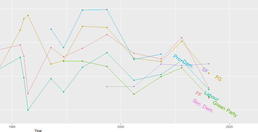
South Korea was far more likely to abstain from votes that North Korea on all issues

Next we can simply plot out the Human Rights votes that each country voted to support. Even though South Korea has far higher human rights scores, North Korea votes in support of more votes on this topic.

korea_un %>% 
  filter(year < 2019) %>% 
  filter(issue == "Human rights") %>% 
  filter(vote == "yes") %>% 
  group_by(country, year) %>% 
  count() %>% 
  ggplot(aes(x = year, y = n, group = country, color = country)) + 
  geom_line(size = 2) + 
  geom_point(aes(color = country), fill = "white", shape = 21, size = 3, stroke = 2.5) +
  scale_x_discrete(breaks = round(seq(min(korea_un$year), max(korea_un$year), by = 10),1)) +
  scale_y_continuous(expand = c(0, 0), limits = c(0, 22)) + 
  bbplot::bbc_style() + facet_wrap(~country) + 
  theme(legend.position = "none") + 
  scale_color_manual(values = sample(my_colors)) + 
  labs(title = "Human Rights UN General Assembly Yes Votes ",
       subtitle = ("Since 1990s"),
       caption = "         Source: unvotes ")

All together:

Advertisement

Examining speeches from the UN Security Council Part 1

Let’s look at how many speeches took place at the UN Security Council every year from 1995 until 2019.

Hesitate Episode 16 GIF by The Simpsons - Find & Share on GIPHY

I want to only look at countries, not organisations. So a quick way to do that is to add a variable to indicate whether the speaker variable has an ISO code.

Only countries have ISO codes, so I can use this variable to filter away all the organisations that made speeches

library(countrycode)

speech$iso2 <- countrycode(speech$country, "country.name", "iso2c")

library(bbplot)

speech %>% 
  dplyr::filter(!is.na(iso2)) %>% 
  group_by(year) %>% 
  count() %>% 
  ggplot(aes(x = year, y = n)) + 
  geom_line(size = 1.2, alpha = 0.4) +
  geom_label(aes(label = n)) +
  bbplot::bbc_style() +
  theme(plot.title = element_text(hjust = 0.5)) +
  labs(title = "Number of speeches given by countries at UNSC")

We can see there has been a relatively consistent upward trend in the number of speeches that countries are given at the UN SC. Time will tell what impact COVID will have on these trends.

There was a particularly sharp increase in speeches in 2015.

We can look and see who was talking, and in the next post, we can examine what they were talking about in 2015 with some simple text analytic packages and functions.

First, we will filter only the year 2015 and count the number of observations per group (i.e. the number of speeches per country this year).

To add flags to the graph, add the iso2 code to the dataset (and it must be in lower case).

Click here to read more about adding circular flags to graphs and maps

speech %>% 
  dplyr::filter(year == 2015) %>% 
  group_by(country) %>% 
  dplyr::summarise(speech_count = n()) -> speech_2015

speech_2015$iso2_lower <- tolower(speech_2015$iso2)

We can clean up the names and create a variable that indicates whether the country is one of the five Security Council Permanent Members, a Temporary Member elected or a Non-,ember.

I also clean up the names to make the country’s names in the dataset smaller. For example, “United Kingdom Of Great Britain And Northern Ireland”, will be very cluttered in the graph compared to just “UK” so it will be easier to plot.

library(ggflags)
library(ggthemes)

speech_2015 %>% 
# To avoid the graph being too busy, we only look at countries that gave over 20 speeches
  dplyr::filter(speech_count > 20) %>% 

# Clean up some names so the graph is not too crowded
  dplyr::mutate(country = ifelse(country == "United Kingdom Of Great Britain And Northern Ireland", "UK", country)) %>%
  dplyr::mutate(country = ifelse(country == "Russian Federation", "Russia", country)) %>%
  dplyr::mutate(country = ifelse(country == "United States Of America", "USA", country)) %>%
  dplyr::mutate(country = ifelse(country == "Republic Of Korea", "South Korea", country)) %>%
  dplyr::mutate(country = ifelse(country == "Venezuela (Bolivarian Republic Of)", "Venezuela", country)) %>% 
  dplyr::mutate(country = ifelse(country == "Islamic Republic Of Iran", "Iran", country)) %>% 
  dplyr::mutate(country = ifelse(country == "Syrian Arab Republic", "Syria", country)) %>% 
 
# Create a Member status variable:
# China, France, Russia, the United Kingdom, and the United States are UNSC Permanent Members
  dplyr::mutate(Member = ifelse(country == "UK", "Permanent", 
  ifelse(country == "USA", "Permanent",
  ifelse(country == "China", "Permanent",
  ifelse(country == "Russia", "Permanent",
  ifelse(country == "France", "Permanent",

# Non-permanent members in their first year (elected October 2014)
  ifelse(country == "Angola", "Temporary (Elected 2014)",
  ifelse(country == "Malaysia", "Temporary (Elected 2014)",              
  ifelse(country == "Venezuela", "Temporary (Elected 2014)",       
  ifelse(country == "New Zealand", "Temporary (Elected 2014)",
  ifelse(country == "Spain", "Temporary (Elected 2014)",                 

# Non-permanent members in their second year (elected October 2013)        
  ifelse(country == "Chad", "Temporary (Elected 2013)",                                                               
  ifelse(country == "Nigeria", "Temporary (Elected 2013)",
  ifelse(country == "Jordan", "Temporary (Elected 2013)",
  ifelse(country == "Chile", "Temporary (Elected 2013)",
  ifelse(country == "Lithuania", "Temporary (Elected 2013)", 
 
# Non members that will join UNSC next year (elected October 2015)          
  ifelse(country == "Egypt", "Non-Member (Elected 2015)",                                                               
  ifelse(country == "Sengal", "Non-Member (Elected 2015)",
  ifelse(country == "Uruguay", "Non-Member (Elected 2015)",
  ifelse(country == "Japan", "Non-Member (Elected 2015)",
  ifelse(country == "Ukraine", "Non-Member (Elected 2015)", 

# Everyone else is a regular non-member           
               "Non-Member"))))))))))))))))))))) -> speech_2015

When we have over a dozen nested ifelse() statements, we will need to check that we have all our corresponding closing brackets.

Next choose some colours for each Memberships status. I always take my hex values from https://coolors.co/

membership_palette <- c("Permanent" = "#e63946", "Non-Member" = "#2a9d8f", "Non-Member (Elected 2015)" = "#a8dadc", "Temporary (Elected 2013)" = "#457b9d","Temporary (Elected 2014)" = "#1d3557")
Season 4 Applause GIF by The Simpsons - Find & Share on GIPHY

And all that is left to do is create the bar chart.

With geom_bar(), we can indicate stat = "identity" because we are giving the plot the y values and ggplot does not need to do the automatic aggregation on its own.

To make sure the bars are descending from most speeches to fewest speeches, we use the reorder() function. The second argument is the variable according to which we want to order the bars. So for us, we give the speech_count integer variable to order our country bars with x = reorder(country, speech_count).

We can change the bar from vertical to horizontal with coordflip().

I add flags with geom_flag() and feed the lower case ISO code to the country = iso2_lower argument.

I add the bbc_style() again because I like the font, size and sparse lines on the plot.

We can move the title of the plot into the centre with plot.title = element_text(hjust = 0.5))

Finally, we can supply the membership_palette vector to the values = argument in the scale_fill_manual() function to specify the colours we want.

speech_2015 %>%  ggplot(aes(x = reorder(country, speech_count), y = speech_count)) + 
  geom_bar(stat = "identity", aes(fill = as.factor(Member))) +
  coord_flip() +
  ggflags::geom_flag(mapping = aes(y = -15, x = country, country = iso2_lower), size = 10) +
  geom_label(mapping = aes( label = speech_count), size = 8) +
  theme(legend.position = "top") + 
  labs(title = "UNSC speeches given in 2015", y = "Number of speeches", x = "") +
  bbplot::bbc_style() +
  theme(text = element_text(size = 20),
  plot.title = element_text(hjust = 0.5)) +
  scale_fill_manual(values =  membership_palette)

In the next post, we will look at the texts themselves. Here is a quick preview.

library(tidytext)

speech_tokens <- speech %>%
  unnest_tokens(word, text) %>% 

  anti_join(stop_words)

We count the number of tokens (i.e. words) for each country in each year. With the distinct() function we take only one observation per year per country. This reduces the number of rows from 16601520 in speech_tokesn to 3142 rows in speech_words_count :

speech_words_count <- speech_tokens %>%
  group_by(year, country) %>%
  mutate(word_count = n_distinct(word)) %>%
  select(country, year, word_count, permanent, iso2_lower) %>%
  distinct() 

Subset the data.frame to only plot the five Permanent Members. Now we only have 125 rows (25 years of total annual word counts for 5 countries!)

permanent_words_summary <- speech_words_count %>% 
  filter(permanent == 1) 

Choose some nice hex colors for my five countries:

five_pal <- c("#ffbc42","#d81159","#8f2d56","#218380","#73d2de")

It is a bit convoluted to put the flags ONLY at the start and end of the lines. We need to subset the dataset two times with the geom_flag() sections. First, we subset the data.frame to year == 1995 and the flags appear at the start of the word_count on the y axis. Then we subset to year == 2019 and do the same

ggplot(data = permanent_word_summary) +
  geom_line(aes(x = year, y = word_count, group = as.factor(country), color = as.factor(country)), 
size = 2) +
  ggflags::geom_flag(data = subset(permanent_word_summary, year == 1995), aes(x = 1995, y = word_count,  country = iso2_lower), size = 9) +
  ggflags::geom_flag(data = subset(permanent_word_summary, 
year == 2019), 
aes(x = 2019, 
y = word_count, 
country = iso2_lower), 
size = 12) + 
  bbplot::bbc_style() +
 theme(legend.position = "right") + labs(title = "Number of words spoken by Permanent Five in the UN Security Council") + 
  scale_color_manual(values = five_pal)

We can see that China has been the least chattiest country if we are measuring chatty with number of words spoken. Translation considerations must also be taken into account. We can see here again at around the 2015 mark, there was a discernible increase in the number of words spoken by most of the countries!

Episode 16 GIF by The Simpsons - Find & Share on GIPHY

Graph political party manifestos on ideological spectrum with manifestoR package in R

The Manifesto Project maintains a database of political party manifestos for around 50 countries. It covers free and democratic elections since 1945 in various countries.

To access the manifestos, we install and load the manifestoR package, which provides an API between R and The Manifesto Project site.

(What’s an API?)

On the website, we can navigate the Manifesto Project database and search for any country for a given time period in the Data Dashboard section on the site. For example, I search for Ireland from 2012 until the present day and I can see the most recent manifestos put forward by the parties.

We can see the number code for each party. (We will need to use these when downloading the texts into R via the API).

Click here for the full CRAN PDF which gives more information for the manifestoR package.

So first, install the packages.

install.packages("manifestoR")
library(manifestoR)

But we cannot just access the data right away.

In order to download any manifesto text from the database, we need to first set up an account on the website and download an API key. So first step to do is go on the website and sign up.

Then you go to your website profile and click download API Key file (txt).

Then we go back on R and write in:

mp_key <- mp_setapikey(file.choose())

Choose the txt file downloaded from the website … and hopefully you should be all set up to access all the manifesto text data.

Now, we can choose the manifestos we want to download.

Using the mp_corpus() function, we can choose the country and date that we want and download lists of all the texts.

manifestos_2016 <- mp_corpus(countryname == "Ireland" & edate > as.Date("2016-02-01"))

Note that the date I enter into the mp_corpus() function corresponds with the date from the Manifesto Project website. If there is a way to look this up directly through R, please let me know!

If we look at the manifestos_2016 object we just downloaded:

View(manifestos_2016)

We see we have ten lists. Say, for example, the party I want to look at is Fine Gael, I need the party ID code assigned by the Manifesto Project.

Similar to how I got the date, I can look up the Data Dashboard to find the party code for Fine Gael. Or I can search for the ID via this site.

It was funny to see that all the names of the Irish parties are in English, which I never hear! Fine Gael is Irish for Tribes of Ireland and I guess Family is another way to translate that.

The ID code for the party is 53520, which is the seventh list. So index this list and create a new tibble structure for the manifesto text.

fg_2016 <- as_tibble(manifestos_2016[7])
View(fg_2016)

The cmp_code refers to the value that coders from the Manifesto Project have assigned to each topic or policy position that the party puts forward in their text.

For example 104 means that the party speaks positively of the military, whereas 105 means that the party speaks of the military in a negative way.

I don’t know what the eu_code is in reference to, but it is all blank in the 2016 coding…

In another post, I hope to write about text mining and sentiment analysis with manifestos. But I’ll leave that to another day.

An alternative way to download and store the manifestos is to download everything from the database:

all_manifestos <- mp_maindataset()

And I want to subset all Irish parties only:

ireland_manifestos <- all_manifestos[which(all_manifestos$countryname == "Ireland"),]

With these all ready, there are some really interesting functions we can run with the data and the coding of the texts by the Manifesto Project.

For example, the rile() function. This calculates the Right Left Score.

Essentially, higher RILE scores indicate that the party leans more right on the ideological spectrum, with a maximum score of +100 if the whole manifesto is devoted to ‘right’ categories. Conversely, lower RILE scores indicate that the party leans more left (and a score of -100 would mean the entire manifesto puts forward exclusively ‘left’ categories)

Of course, it is a crude instrument to compress such a variety of social, political and economic positions onto a single dimension. But as long as we keep that caveat in mind, it is a handy shorthanded approach to categorising the different parties.

Additionally, Molder (2016) in his paper, “The validity of the RILE left–right index as a measure of party policy” argues that the index is not very valid. Additional researchers have also found that RILE index inaccurately places political parties in policy space as manifestos are not actual binding policies but rather directional signals and aspriations (see Pelizzo’s (2003) paper, “Party positions or party direction? An analysis of Party Manifesto Data” for more on this)

So take these figures with a grain of salt. But it is interesting to visualise the trends.

I continue subsetting until I have only the largest parties in Ireland and put them into big_parties object. The graph gets a bit hectic when including all the smaller parties in the country since 1949. Like in most other countries, party politics is rarely simple.

Next I can simply create a new rile_index variable and graph it across time.

big_parties$rile_index <- rile(big_parties)

The large chuck in the geom_text() command is to only show the name of the party at the end of the line. Otherwise, the graph is far more busy and far more unreadable.

graph_rile <- big_parties %>%
group_by(partyname) %>%
ggplot(aes(x= as.Date(edate), y = rile_index, color=partyname)) +
geom_point() + geom_line() +
geom_text(data=. %>%
arrange(desc(edate)) %>%
group_by(partyname) %>%
slice(1),
aes(label=partyname), position=position_jitter(height=2), hjust = 0, size = 5, angle=40) +
ggtitle("Relative Left Right Ideological Position of Major Irish Parties 1949 - 2016") +
xlab("Year") + ylab("Right Left (RILE) Index")

While the graph is a bit on the small size, what jumps out immediately is that there has been a convergence of the main political parties toward the ideological centre. In fact, they are all nearing left of centre. The most right-wing a party has ever been in Ireland was Fine Gael in the 1950s, with a RILE score nearing 80. Given their history of its predecessor “Blueshirts” group, this checks out.

The Labour Party has consistently been very left wing, with its most left-leaning RILE score of -40 something in the early 1950s and again in early 1980s.

Ireland joined the European Union in 1978, granted free third level education for all its citizens since the 1990s and in genenral, has seen a consistent trend of secularisation in society, these factors all could account for the constricting lines converging in the graph for various socio-economic reasons.

In recent years Ireland has become more socially liberal (as exemplified by legalisation of abortion, legalisation of same sex marriage) so these lines do not surprise. Additionally, we do not have full control over monetary policy since joining the euro, so again, this mitigates the trends of extreme economic positions laid out in manifestos.

References

Mölder, M. (2016). The validity of the RILE left–right index as a measure of party policy. Party Politics22(1), 37-48.

Pelizzo, R. (2003). Party positions or party direction? An analysis of party manifesto data. West European Politics26(2), 67-89.

Make word clouds with tidytext and gutenbergr in R

This blog will run through how to make a word cloud with Mill’s “On Liberty”, a treatise which argues that the state should never restrict people’s individual pursuits or choices (unless such choices harm others in society).

First, we install and load the gutenbergr package to access the catalogue of books from Project Gutenburg . This gutenberg_metadata function provides access to the website and its collection of around 60,000 digitised books in the public domain, for which their U.S. copyright has expired. This website is an amazing resource in its own right.

install.packages("gutenbergr")
library(gutenbergr)

Next we choose a book we want to download. We can search through the Gutenberg Project catalogue (with the help of the dplyr package). In the filter( ) function, we can search for a book in the library by supplying a string search term in “quotations”. Click here to see the CRAN package PDF. For example, we can look for all the books written by John Stuart Mill (search second name, first name) on the website:

mill_all <- gutenberg_metadata %>%
  filter(author = "Mill, John Stuart")

Or we can search for the title of the book:

mill_liberty <- gutenberg_metadata %>%
  filter(title = "On Liberty")

We now have a tibble of all the sentences in the book!

View(mill_liberty)

We see there are two variables in this new datafram and 4,703 string rows.

To extract every word as a unit, we need the unnest_tokens( ) function from the tidytext package:

install.packages("tidytext")
library(tidytext)

We take our mill_liberty object from above and indicate we want the unit to be words from the text. And we create a new mill_liberty_words object to hold the book in this format.

mill_liberty_words <- mill_liberty %>%
    unnest_tokens(word, text) %>%
    anti_join(stop_words)

We now have a row for each word, totalling to 17,576 words! This excludes words such as “the”, “of”, “to” and all those small sentence builder words.

Now we have every word from “On Liberty”, we can see what words appear most frequently! We can either create a list with the count( ) function:

count_word <- mill_liberty_words %>%
   count(word, sort = TRUE)

The default for a tibble object is printing off the first ten observations. If we want to see more, we can increase the n in our print argument.

print(liberty_words, n=30)

An alternative to this is making a word cloud to visualise the relative frequencies of these terms in the text.

For this, we need to install the wordcloud package.

install.packages("wordcloud")
library(wordcloud)

To get some nice colour palettes, we can also install the RColorBrewer package also:

install.packages("RColorBrewer")
library(RColorBrewer)

Check out the CRAN PDF on the wordcloud package to tailor your specifications.

For example, the rot.per argument indicates proportion words we want with 90 degree rotation. In my example, I have 30% of the words being vertical. I reran the code until the main one was horizontal, just so it pops out more.

With the scale option, we can indicate the range of the size of the words (for example from size 4 to size 0.5) in the example below

We can choose how many words we want to include in the wordcloud with the max.words argument

color_number <- 20
color_palette <- colorRampPalette(brewer.pal(8, "Paired"))(color_number)

wordcloud(words = mill_liberty_words$word, min.freq = 2,
 scale = c(4, 0.5)
          max.words=200, random.order=FALSE, rot.per=0.3, 
          colors=color_palette)

We can see straightaway the most frequent word in the book is opinion. Given that this book forms one of the most rigorous defenses of the idea of freedom of speech, a free press and therefore against the a priori censorship of dissent in society, these words check out.

If we run the code with random.order=TRUE option, the cloud would look like this:

And you can play with proportions, colours, sizes and word placement until you find one you like!

This word cloud highlights the most frequently used words in John Stuart Mill’s “Utilitarianism”: