
library(eurostat)
library(tidyverse)
library(janitor)
library(ggcharts)
library(ggflags)
library(rvest)
library(countrycode)
library(magrittr)
Eurostat is the statistical office of the EU. It publishes statistics and indicators that enable comparisons between countries and regions.
With the eurostat package, we can visualise some data from the EU and compare countries. In this blog, we will create a pyramid graph and a Statista-style bar chart.
First, we use the get_eurostat_toc() function to see what data we can download. We only want to look at datasets.
available_data <- get_eurostat_toc()

available_datasets <- available_data %>%
  filter(type == "dataset")
A simple dataset that we can download looks at populations. We can browse through the available datasets and choose the code id. We feed this into the get_eurostat() dataset.

demo <- get_eurostat(id = "demo_pjan",
                     type = "label")

View(demo)
Some quick data cleaning. First changing the date to a numeric variable. Next, extracting the number from the age variable to create a numeric variable.
demo$year <- as.numeric(format(demo$time, format = "%Y"))

demo$age_number <- as.numeric(gsub("([0-9]+).*$", "\\1", demo$age))
Next we filter out the data we don’t need. For this graph, we only want the total columns and two years to compare.
demo %>%
  filter(age != "Total") %>%
  filter(age != "Unknown") %>%
  filter(sex == "Total") %>%
  filter(year == 1960 | year == 2019 ) %>%
  select(geo, iso3, values, age_number) -> demo_two_years
I want to compare the populations of the founding EU countries (in 1957) and those that joined in 2004. I’ll take the data from Wikipedia, using the rvest package. Click here to learn how to scrape data from the Internet.
eu_site <- read_html("https://en.wikipedia.org/wiki/Member_state_of_the_European_Union")

eu_tables <- eu_site %>% html_table(header = TRUE, fill = TRUE)

eu_members <- eu_tables[[3]]

eu_members %<>% janitor::clean_names()  %>%
filter(!is.na(accession))
Some quick data cleaning to get rid of the square bracket footnotes from the Wikipedia table data.
eu_members$accession <- as.numeric(gsub("([0-9]+).*$", "\\1",eu_members$accession))

eu_members$name_clean <- gsub("\\[.*?\\]", "", eu_members$name)
We merge the two datasets, on the same variable. In this case, I will use the ISO3C country codes (from the countrycode package). Using the names of each country is always tricky (I’m looking at you, Czechia / Czech Republic).
demo_two_years$iso3 <- countrycode::countrycode(demo_two_years$geo, "country.name, "iso3c")

my_pyramid <- merge(demo_two_years, eu_members, by.x = "iso3", by.y = "iso_3166_1_alpha_3", all.x = TRUE)
We will use the pyramid_chart() function from the ggcharts package. Click to read more about this function.
The function takes the age group (we go from 1 to 99 years of age), the number of people in that age group and we add year to compare the ages in 1960 versus in 2019.
The first graph looks at the countries that founded the EU in 1957.
my_pyramid %>%
  filter(!is.na(age_number)) %>%
  filter(accession == 1957 ) %>%
  arrange(age_number) %>%
  group_by(year, age_number) %>%
  summarise(mean_age = mean(values, na.rm = TRUE)) %>%
  ungroup() %>%
  pyramid_chart(age_number, mean_age, year,
                bar_colors = c("#9a031e", "#0f4c5c"))

The second graph is the same, but only looks at the those which joined in 2004.
my_pyramid %>%
  filter(!is.na(age_number)) %>%
  filter(accession == 2004 ) %>%
  arrange(age_number) %>%
  group_by(year, age_number) %>%
  summarise(mean_age = mean(values, na.rm = TRUE)) %>%
  ungroup() %>%
  pyramid_chart(age_number, mean_age, year,
bar_colors = c("#9a031e", "#0f4c5c")) 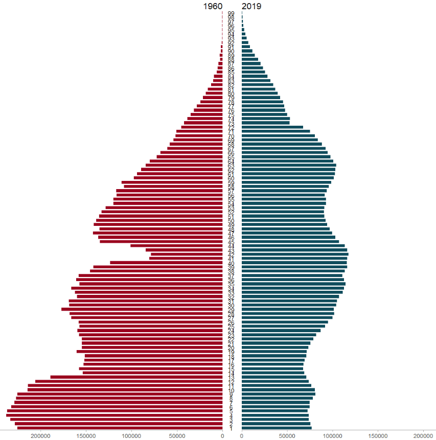
Next we will use the Eurostat data on languages in the EU and compare countries in a bar chart.
I want to try and make this graph approximate the style of Statista graphs. It is far from identical but I like the clean layout that the Statista website uses.
Similar to above, we add the code to the get_eurostat() function and claen the data like above.
lang <- get_eurostat(id = "edat_aes_l22",
                     type = "label")

lang$year <- as.numeric(format(lang$time, format = "%Y"))

lang$iso2 <- tolower(countrycode(lang$geo, "country.name", "iso2c"))

lang %>%
  mutate(geo = ifelse(geo == "Germany (until 1990 former territory of the FRG)", "Germany",
                      ifelse(geo == "European Union - 28 countries (2013-2020)", "EU", geo))) %>%
  filter(n_lang == "3 languages or more") %>%
  filter(year == 2016) %>%
  filter(age == "From 25 to 34 years") %>%
  filter(!is.na(iso2)) %>%
  group_by(geo, year) %>%
  mutate(mean_age = mean(values, na.rm = TRUE)) %>%
  arrange(mean_age) -> lang_clean
Next we will create bar chart with the stat = "identity" argument.
We need to make sure our ISO2 country code variable is in lower case so that we can add flags to our graph with the ggflags package. Click here to read more about this package
lang_clean %>%
  ggplot(aes(x = reorder(geo, mean_age), y = mean_age)) +
  geom_bar(stat = "identity", width = 0.7, color = "#0a85e5", fill = "#0a85e5") +
  ggflags::geom_flag(aes(x = geo, y = -1, country = iso2), size = 8) +
  geom_text(aes(label= values), position = position_dodge(width = 0.9), hjust = -0.5, size = 5, color = "#000500") +
  labs(title = "Percentage of people that speak 3 or more languages",
       subtitle = ("(% of overall population)"),
       caption = "         Source: Eurostat ") +
  xlab("") +
  ylab("") -> lang_plot
To try approximate the Statista graphs, we add many arguments to the theme() function for the ggplot graph!
lang_plot + coord_flip() +
  expand_limits(y = 65) +
  ggthemes::theme_pander() +
  theme(plot.background = element_rect(color = "#f5f9fc"),
        panel.grid = element_line(colour = "#f5f9fc"),
        # axis.title.x = element_blank(),
        axis.text.x = element_blank(),
        axis.text.y = element_text(color = "#000500", size = 16),
        # axis.title.y = element_blank(),
        axis.ticks.x = element_blank(),
        text = element_text(family = "Gadugi"),
        plot.title = element_text(size = 28, color = "#000500"),
        plot.subtitle = element_text(size = 20, color = "#484e4c"),
        plot.caption = element_text(size = 20, color = "#484e4c") )

Next, click here to read Part 2 about visualizing Eurostat data with maps

Great Tutorial ! i’ve been find a hard time to make the flags round instead of rectangular, Have been any change to the “ggflags” package ?
LikeLike