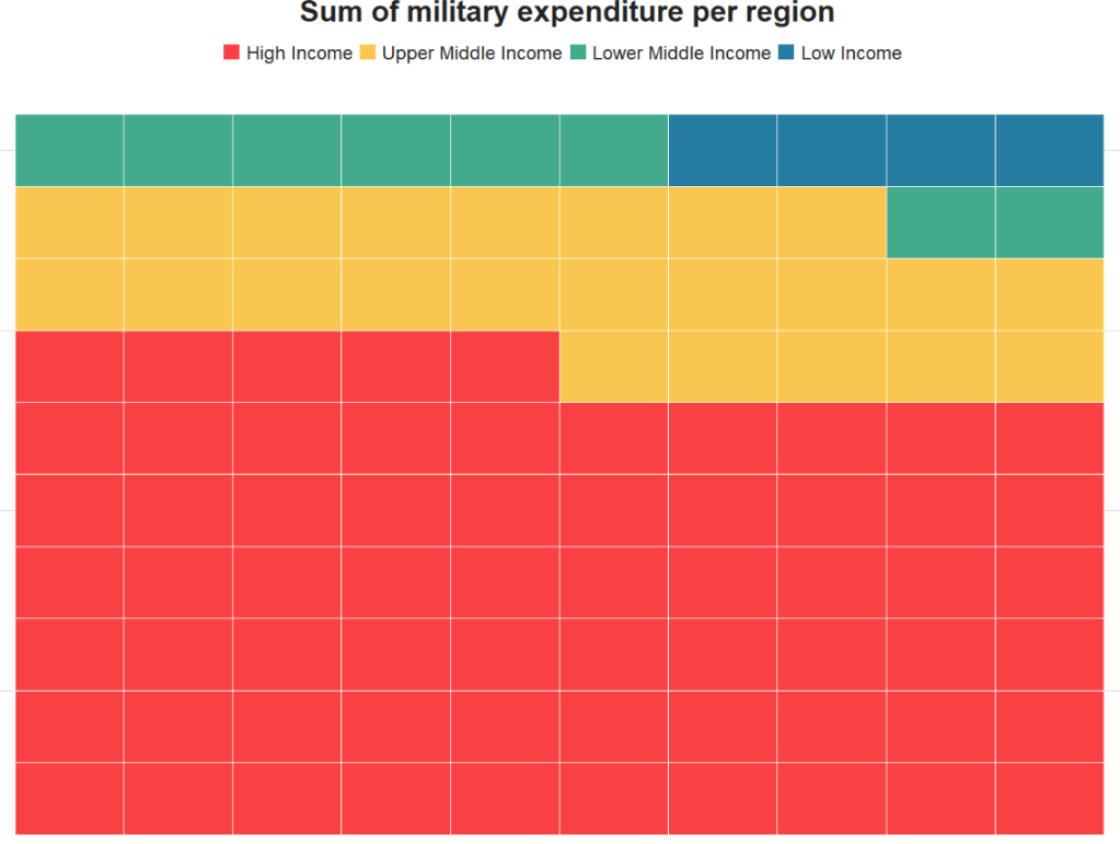
Top R packages for downloading political science and economics datasets

  1. WDI
  2. peacesciencer
  3. eurostat
  4. vdem
  5. democracyData
  6. icpsrdata
  7. Quandl
  8. essurvey
  9. manifestoR
  10. unvotes
  11. gravity

1. WDI

The World Development Indicators (WDI) package by Vincent Arel-Bundock provides access to a database of hundreds of economic development indicators from the World Bank.

Examples of variables include population, GDP, education, health, and poverty, school attendance rates.ee

Reference: Arel-Bundock, V. (2017). WDI: World Development Indicators (R Package Version 2.7.1).
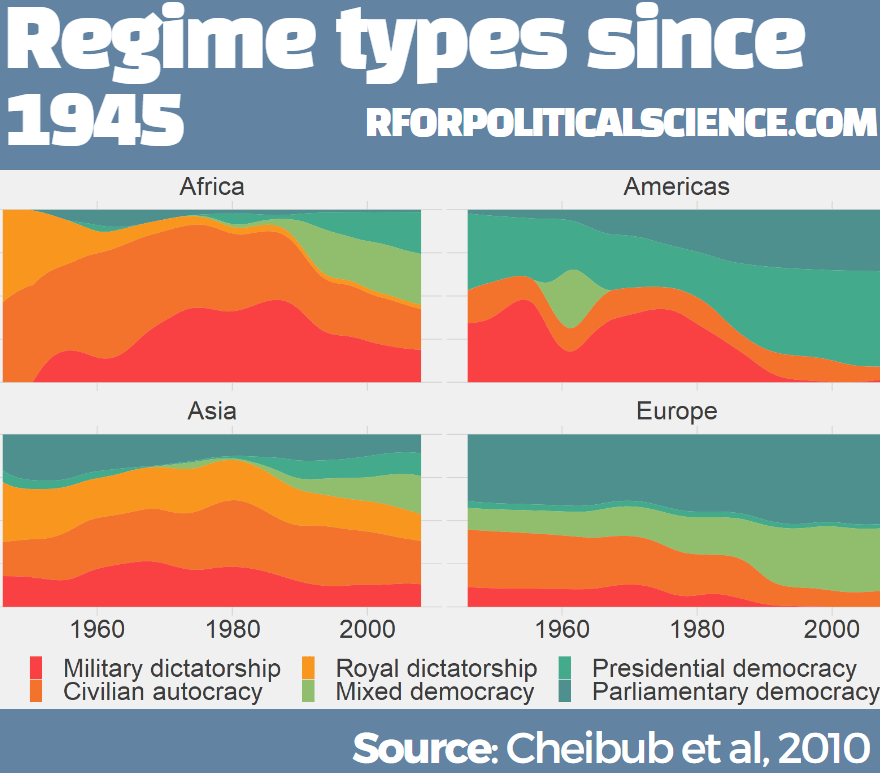
2. peacesciencer

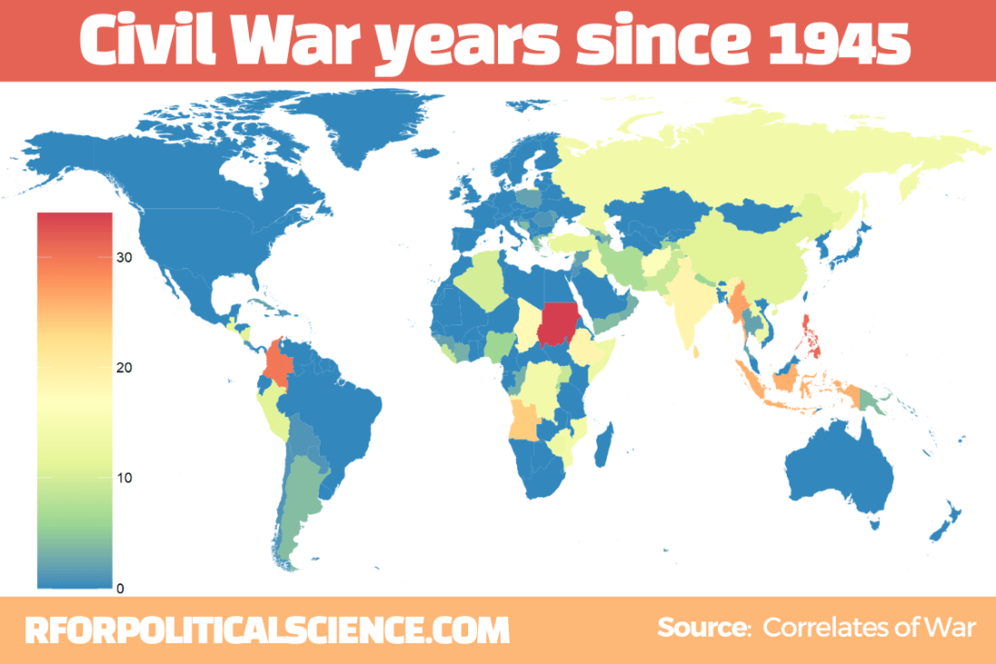
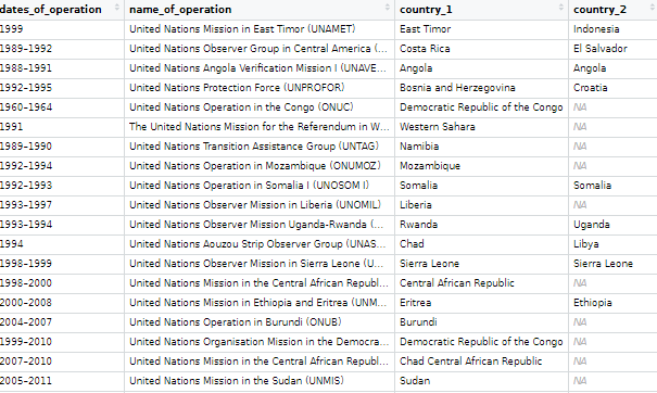
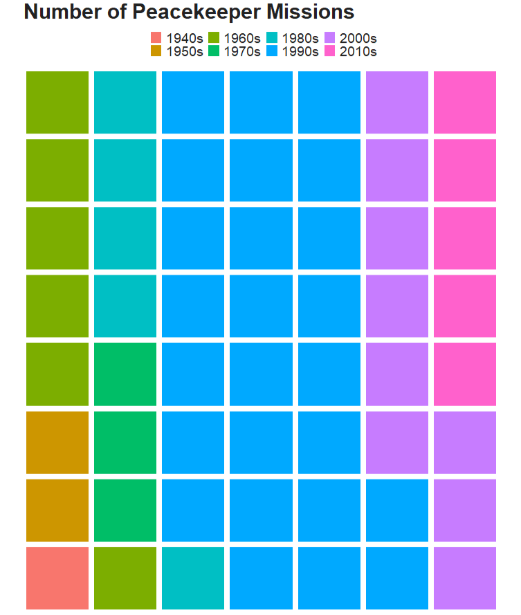
This package by Steve Miller helps you download data related to peace and conflict studies, including the Correlates of War project.

Examples of variables include Alliance Treaty Obligations and Provisions (ATOP), Thompson and Dreyer’s (2012) strategic rivalry data, fractionalization/polarization estimates from the Composition of Religious and Ethnic Groups (CREG) Project, and Uppsala Conflict Data Program (UCDP) data on civil and inter-state conflicts.

Data can come in either country-year, event-level dyadic-level.

Reference: Hewitt, J. J. (2020). peacesciencer: Tools for Peace Scientists (R Package Version 0.2.2).

3. eurostat

eurostat provides access to a wide range of statistics and data on the European Union and its member states, covering topics such as population, economics, society, and the environment.

Examples of variables include employment, inflation, education, crime, and air pollution. The package was authored by Leo Lahti.

Reference: eurostat (2018). eurostat: Eurostat Open Data (R Package Version 3.6.0), CRAN PDF retrieved at https://cran.r-project.org/web/packages/eurostat/eurostat.pdf
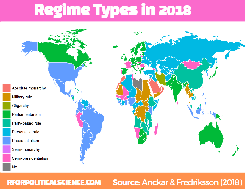
4. vdem

The Varieties of Democracy package by Staffan I. Lindberg et al. provides data on a range of indicators related to democracy and governance in countries around the world, including measures of electoral democracy, civil liberties, and human rights.

Examples of variables include freedom of speech, rule of law, corruption, government transparency, and voter turnout.

Reference: Lindberg, S. I., & Stepanova, N. (2020). vdem: Varieties of Democracy Project (R Package Version 1.6).
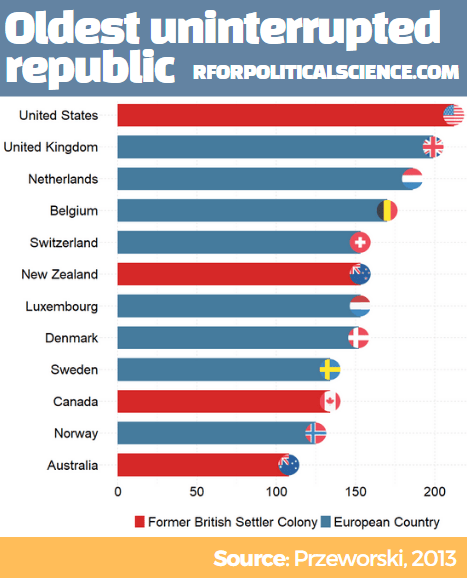
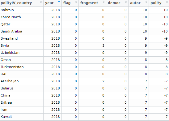
5. democracyData

This package by Xavier Marquez: provides data on a range of variables related to democracy, including elections, political parties, and civil liberties.

Examples of variables include regime type, democracy scores (Freedom House, PolityIV etc,  Geddes, Wright, and Frantz’ autocratic regimes dataset, the Lexical Index of Electoral Democracy, the DD/ACLP/PACL/CGV dataset), axxording to the Github page

6. icpsrdata

This package by Frederick Solt provides a simple way to download and import data from the Inter-university Consortium for Political and Social Research (ICPSR) archive into R. This is for easy replication and sharing of data. The package includes datasets from different fields of study, including sociology, political science, and economics.

Reference: Solt, F. (2020). icpsrdata: Reproducible Data Retrieval from the ICPSR Archive (R Package Version 0.5.0).

7. Quandl

This R package by Quandl provides an interface to access financial and economic data from over 20 different sources. Examples of variables include stock prices, futures, options, and macroeconomic indicators. The package includes functions to easily download data directly into R and perform tasks such as plotting, transforming, and aggregating data. Additional functions for managing and exploring data, such as search tools and data caching features, are also available.

Here are five examples of variables in the Quandl package:

  • “AAPL” (Apple Inc. stock price)
  • “CHRIS/CME_CL1” (Crude Oil Futures)
  • “FRED/GDP” (US GDP)
  • “BCHAIN/MKPRU” (Bitcoin Market Price)
  • “USTREASURY/YIELD” (US Treasury Yield Curve Rates)

Reference: Quandl. (2021). Quandl: A library of economic and financial data. Retrieved from https://www.quandl.com/tools/r.

8. essurvey

The essurvey package is an R package that provides access to data from the European Social Survey (ESS), which is a large-scale survey that collects data on attitudes, values, and behavior across Europe. The package includes functions to easily download, read, and analyze data from the ESS, and also includes documentation and sample code to help users get started.

Examples of variables in the ESS dataset include political interest, trust in political institutions, social class, education level, and income. The package was authored by David Winter and includes a variety of useful functions for working with ESS data.

Reference: Winter, D. (2021). essurvey: Download Data from the European Social Survey on the Fly. R package version 3.4.4. Retrieved from https://cran.r-project.org/package=essurvey.

9. manifestoR

manifestoR is an R package that provides access to data from the Comparative Manifesto Project (CMP), which is a cross-national research project that analyzes political party manifestos. The package allows users to easily download and analyze data from the CMP, including party positions on various policy issues and the salience of those issues across time and space.

Examples of variables in the CMP dataset include party positions on taxation, immigration, the environment, healthcare, and education. The package was authored by Jörg Matthes, Marcelo Jenny, and Carsten Schwemmer.

Reference: Matthes, J., Jenny, M., & Schwemmer, C. (2018). manifestoR: Access and Process Data and Documents of the Manifesto Project. R package version 1.2.1. Retrieved from https://cran.r-project.org/package=manifestoR.
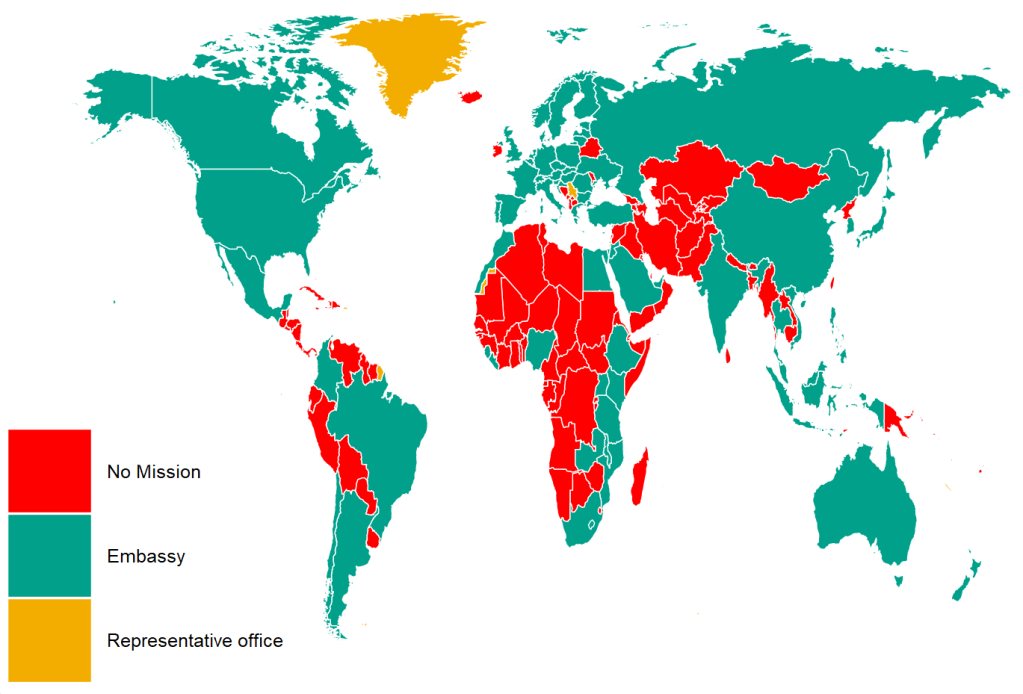
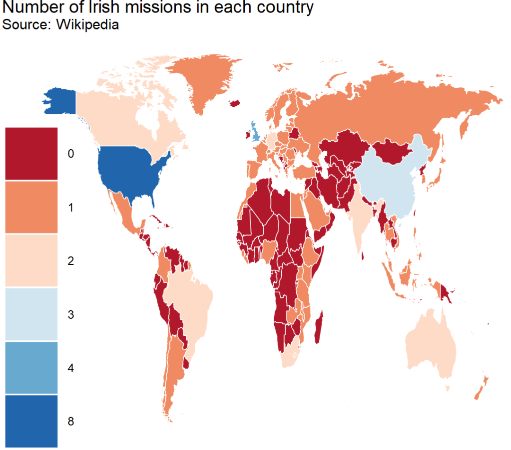
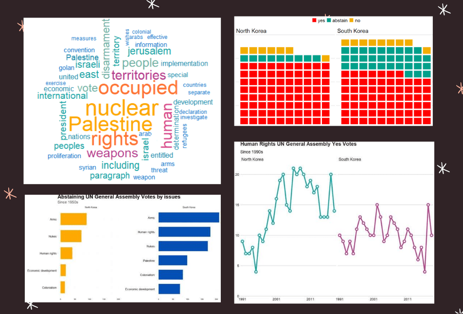
10. unvotes

The unvotes data package provides historical voting data of the United Nations General Assembly, including votes for each country in each roll call, as well as descriptions and topic classifications for each vote.

The classifications included in the dataset cover a wide range of issues, including human rights, disarmament, decolonization, and Middle East-related issues.

The package was created by David Robinson and Nicholas Goguen-Compagnoni and is available on the Comprehensive R Archive Network (CRAN) at https://cran.r-project.org/web/packages/unvotes/unvotes.pdf.

11. gravity

The gravity package in R, created by Anna-Lena Woelwer, provides a set of functions for estimating gravity models, which are used to analyze bilateral trade flows between countries. The package includes the gravity_data dataset, which contains information on trade flows between pairs of countries.

Examples of variables that may affect trade in the dataset are GDP, distance, and the presence of regional trade agreements, contiguity, common official language, and common currency.

iso_o: ISO-Code of country of origin
iso_d: ISO-Code of country of destination
distw: weighted distance
gdp_o: GDP of country of origin
gdp_d: GDP of country of destination
rta: regional trade agreement
flow: trade flow
contig: contiguity
comlang_off: common official language
comcur: common currency

The package PDF CRAN is available at http://cran.nexr.com/web/packages/gravity/gravity.pdf

Advertisement

Cleaning up messy World Bank data

Packages we will need:

library(tidyverse)
library(tidyr)
library(janitor)
library(magrittr)
library(democracyData)
library(countrycode)
library(ggimage)

When you come across data from the World Bank, often it is messy.

So this blog will go through how to make it more tidy and more manageable in R

For this blog, we will look at World Bank data on financial aid. Specifically, we will be using values for net ODA received as percentage of each country’s GNI. These figures come from the Development Assistance Committee of the Organisation for Economic Co-operation and Development (DAC OECD).

If we look at the World Bank data downloaded from the website, we have a column for each year and the names are quite messy.

This data is wide form.

Unacceptable.

So we will change the data from wide to long data.

Instead of a column for each year, we will have a row for each country-year.

Before doing that, we can clean up the variable names with the janitor package function: clean_names().

sdg %<>% 
  clean_names() 

ALSO, before we pivot the dataset to longer format, we choose the variables we want to keep (i.e. only country, year and ODA value)

sdg %<>% 
  select(country_name, x1990_yr1990:x2015_yr2015) 

Now we are ready to turn the data from wide to long.

We can use the pivot_longer() function from the tidyr package.

Instead of 286 rows and 27 columns, we will ultimately end up with 6968 rows and only 3 columns.

Source: Garrick Aden-Buie’s (@grrrckTidy Animated Verbs

Thank you to Mr. Aden-Buie for your page visualising all the different ways to transform datasets with dplyr. Click the link to check out more.

Back to the pivoting, we want to create a row for each year, 1990, 1991, 1992 …. up to 2015

And we will have a separate cell for each value of the ODA variable for each country-year value.

In the pivot_longer() function we exclude the country names,

We want a new row for each year, so we make a “year” variable with the names_to() argument.

And we create a separate value for each ODA as a percentage of GNI with the values_to() argument.

sdg %>% 
  pivot_longer(!country_name, names_to = "year", 
               values_to = "oda_gni") -> oda

The year values are character strings, not numbers. So we will convert with parse_number(). This parses the first number it finds, dropping any non-numeric characters before the first number and all characters after the first number.

oda %>% 
     mutate(year = parse_number(year)) -> oda 

Next we will move from the year variable to ODA variable. There are many ODA values that are empty. We can see that there are 145 instances of empty character strings.

oda %>% 
  count(oda_gni) %>% 
  arrange(oda_gni)

So we can replace the empty character strings with NA values using the na_if() function. Then we can use the parse_number() function to turn the character into a string.

oda %>%
  mutate(oda_gni = na_if(oda_gni, "")) %>% 
  mutate(oda_gni = parse_number(oda_gni)) -> oda

Now we need to delete the year variables that have no values.

oda %<>% 
  filter(!is.na(year))

Also we need to delete non-countries.

The dataset has lots of values for regions that are not actual countries. If you only want to look at politically sovereign countries, we can filter out countries that do not have a Correlates of War value.

oda %<>%
  mutate(cow = countrycode(oda$country_name, "country.name", 'cown')) %>% 
  filter(!is.na(cow))

We can also make a variable for each decade (1990s, 2000s etc).

oda %>% 
  mutate(decade = substr(year, 1, 3)) %>% 
  mutate(decade = paste0(decade, "0s"))

And download data for countries’ region, continent and govenment regime. To do this we use the democracyData package and download the PACL dataset.

Click here to read more about this package.

pacl <- democracyData::redownload_pacl()

pacl %>% 
  select(cow = pacl_cowcode,
         year,
         region = un_region_name,
         continent = un_continent_name,
         demo_dummy = democracy,
         regime = regime
         ) -> pacl_subset

We use the left_join() function to join both datasets together with Correlates of War code and year variables.

oda %>% 
  left_join(pacl_subset, by = c("cow", "year")) -> oda_pacl

Now if we look at the dataset, we can see that it is much tidier and we can start analysing.

Below we can create a bar chart of the top ten countries that received the most aid as a percentage of their economic income (gross national income)

First we need to get the average oda per country with the group_by() and summarise() functions

oda_pacl %>%
  mutate(oda_gni = ifelse(is.na(oda_gni), 0, oda_gni)) %>%  
  group_by(country_name,region, continent) %>% 
  summarise(avg_oda = mean(oda_gni, na.rm = TRUE)) -> oda_mean

We use the slice() function to only have the top ten countries

oda_mean %>% 
  arrange(desc(avg_oda)) %>%
  ungroup() %>% 
  slice(1:10) -> oda_slice

We add an ISO code for each country for the flags

Click here to read more about the ggimage package

oda_slice %<>% 
  mutate(iso2 = countrycode(country_name, "country.name", "iso2c"))

And some nice hex colours

my_palette <- c( "#44bec7", "#ffc300", "#fa3c4c")

And finally, plot it out with ggplot()

oda_slice %>%
  ggplot(aes(x = reorder(country_name, avg_oda),
             y = avg_oda, fill = continent)) + 
  geom_bar(stat = "identity") + 
  ggimage::geom_flag(aes(image = iso2), size = 0.1)  +
  coord_flip() +
  scale_fill_manual(values = my_palette) + 
  labs(title = "ODA aid as % GNI ",
       subtitle = "Source: OECD DAC via World Bank",
       x = "Donor Country",
       y = "ODA per capita") + bbplot::bbc_style()

How to interpret linear models with the broom package in R

Packages you will need:

library(tidyverse)
library(magrittr)     # for pipes

library(broom)        # add model variables
library(easystats)    # diagnostic graphs

library(WDI)           # World Bank data
library(democracyData) # Freedom House data

library(countrycode)   # add ISO codes
library(bbplot)        # pretty themes
library(ggthemes)      # pretty colours
library(knitr)         # pretty tables
library(kableExtra)    # make pretty tables prettier

This blog will look at the augment() function from the broom package.

After we run a liner model, the augment() function gives us more information about how well our model can accurately preduct the model’s dependent variable.

It also gives us lots of information about how does each observation impact the model. With the augment() function, we can easily find observations with high leverage on the model and outlier observations.

For our model, we are going to use the “women in business and law” index as the dependent variable.

According to the World Bank, this index measures how laws and regulations affect women’s economic opportunity.

Overall scores are calculated by taking the average score of each index (Mobility, Workplace, Pay, Marriage, Parenthood, Entrepreneurship, Assets and Pension), with 100 representing the highest possible score.

Into the right-hand side of the model, our independent variables will be child mortality, military spending by the government as a percentage of GDP and Freedom House (democracy) Scores.

First we download the World Bank data and summarise the variables across the years.

Click here to read more about the WDI package and downloading variables from the World Bank website.

women_business = WDI(indicator = "SG.LAW.INDX")
mortality = WDI(indicator = "SP.DYN.IMRT.IN")
military_spend_gdp <- WDI(indicator = "MS.MIL.XPND.ZS")

We get the average across 60 ish years for three variables. I don’t want to run panel data regression, so I get a single score for each country. In total, there are 160 countries that have all observations. I use the countrycode() function to add Correlates of War codes. This helps us to filter out non-countries and regions that the World Bank provides. And later, we will use COW codes to merge the Freedom House scores.

women_business %>%
  filter(year > 1999) %>% 
  inner_join(mortality) %>% 
  inner_join(military_spend_gdp) %>% 
  select(country, year, iso2c, 
         fem_bus = SG.LAW.INDX, 
         mortality = SP.DYN.IMRT.IN,
         mil_gdp = MS.MIL.XPND.ZS)  %>% 
  mutate_all(~ifelse(is.nan(.), NA, .)) %>% 
  select(-year) %>% 
  group_by(country, iso2c) %>% 
  summarize(across(where(is.numeric), mean,  
   na.rm = TRUE, .names = "mean_{col}")) %>% 
  ungroup() %>% 
  mutate(cown = countrycode::countrycode(iso2c, "iso2c", "cown")) %>% 
  filter(!is.na(cown)) -> wdi_summary

Next we download the Freedom House data with the democracyData package.

Click here to read more about this package.

fh <- download_fh()

fh %>% 
  group_by(fh_country) %>% 
  filter(year > 1999) %>% 
  summarise(mean_fh = mean(fh_total, na.rm = TRUE)) %>% 
  mutate(cown = countrycode::countrycode(fh_country, "country.name", "cown")) %>% 
  mutate_all(~ifelse(is.nan(.), NA, .)) %>% 
  filter(!is.na(cown))  -> fh_summary

We join both the datasets together with the inner_join() functions:

fh_summary %>%
  inner_join(wdi_summary, by = "cown") %>% 
  select (-c(cown, iso2c, fh_country)) -> wdi_fh

Before we model the data, we can look at the correlation matrix with the corrplot package:

wdi_fh %>% 
  drop_na() %>% 
  select(-country)  %>% 
  select(`Females in business` = mean_fem_bus,
        `Mortality rate` = mean_mortality,
        `Freedom House` = mean_fh,
        `Military spending GDP` = mean_mil_gdp)  %>% 
  cor() %>% 
  corrplot(method = 'number',
           type = 'lower',
           number.cex = 2, 
           tl.col = 'black',
           tl.srt = 30,
           diag = FALSE)

Next, we run a simple OLS linear regression. We don’t want the country variables so omit it from the list of independent variables.

fem_bus_lm <- lm(mean_fem_bus ~ . - country, data = wdi_fh)
Dependent variable:
mean_fem_bus
mean_fh-2.807***
(0.362)
mean_mortality-0.078*
(0.044)
mean_mil_gdp-0.416**
(0.205)
Constant94.684***
(2.024)
Observations160
R20.557
Adjusted R20.549
Residual Std. Error11.964 (df = 156)
F Statistic65.408*** (df = 3; 156)
Note:*p<0.1; **p<0.05; ***p<0.01

We can look at some preliminary diagnostic plots.

Click here to read more about the easystat package. I found it a bit tricky to download the first time.

performance::check_model(fem_bus_lm)

The line is not flat at the beginning so that is not ideal..

We will look more into this later with the variables we create with augment() a bit further down this blog post.

None of our variables have a VIF score above 5, so that is always nice to see!

From the broom package, we can use the augment() function to create a whole heap of new columns about the variables in the model.

fem_bus_pred <- broom::augment(fem_bus_lm)

  • .fitted = this is the model prediction value for each country’s dependent variable score. Ideally we want them to be as close to the actual scores as possible. If they are totally different, this means that our independent variables do not do a good job explaining the variance in our “women in business” index.

  • .resid = this is actual dependent variable value minus the .fitted value.

We can look at the fitted values that the model uses to predict the dependent variable – level of women in business – and compare them to the actual values.

The third column in the table is the difference between the predicted and actual values.

fem_bus_pred %>% 
  mutate(across(where(is.numeric), ~round(., 2))) %>%
  arrange(mean_fem_bus) %>% 
  select(Country = country,
    `Fem in bus (Actual)` = mean_fem_bus,
    `Fem in bus (Predicted)` = .fitted,
    `Fem in bus (Difference)` = .resid,
                  `Mortality rate` = mean_mortality,
                  `Freedom House` = mean_fh,
                  `Military spending GDP` = mean_mil_gdp)  %>% 
  kbl(full_width = F) 
Country Leverage of country Fem in bus (Actual) Fem in bus (Predicted)
Austria 0.02 88.92 88.13
Belgium 0.02 92.13 87.65
Costa Rica 0.02 79.80 87.84
Denmark 0.02 96.36 87.74
Finland 0.02 94.23 87.74
Iceland 0.02 96.36 88.90
Ireland 0.02 95.80 88.18
Luxembourg 0.02 94.32 88.33
Sweden 0.02 96.45 87.81
Switzerland 0.02 83.81 87.78

And we can graph them out:

fem_bus_pred %>%
  mutate(fh_category = cut(mean_fh, breaks =  5,
  labels = c("full demo ", "high", "middle", "low", "no demo"))) %>%         ggplot(aes(x = .fitted, y = mean_fem_bus)) + 
  geom_point(aes(color = fh_category), size = 4, alpha = 0.6) + 
  geom_smooth(method = "loess", alpha = 0.2, color = "#20948b") + 
  bbplot::bbc_style() + 
  labs(x = '', y = '', title = "Fitted values versus actual values")

In addition to the predicted values generated by the model, other new columns that the augment function adds include:

  • .hat = this is a measure of the leverage of each variable.

  • .cooksd = this is the Cook’s Distance. It shows how much actual influence the observation had on the model. Combines information from .residual and .hat.

  • .sigma = this is the estimate of residual standard deviation if that observation is dropped from model

  • .std.resid = standardised residuals

If we look at the .hat observations, we can examine the amount of leverage that each country has on the model.

fem_bus_pred %>% 
  mutate(dplyr::across(where(is.numeric), ~round(., 2))) %>%
  arrange(desc(.hat)) %>% 
  select(Country = country,
         `Leverage of country` = .hat,
         `Fem in bus (Actual)` = mean_fem_bus,
         `Fem in bus (Predicted)` = .fitted)  %>% 
  kbl(full_width = F) %>%
  kable_material_dark()

Next, we can look at Cook’s Distance. This is an estimate of the influence of a data point.  According to statisticshowto website, Cook’s D is a combination of each observation’s leverage and residual values; the higher the leverage and residuals, the higher the Cook’s distance.

  1. If a data point has a Cook’s distance of more than three times the mean, it is a possible outlier
  2. Any point over 4/n, where n is the number of observations, should be examined
  3. To find the potential outlier’s percentile value using the F-distribution. A percentile of over 50 indicates a highly influential point
fem_bus_pred %>% 
  mutate(fh_category = cut(mean_fh, 
breaks =  5,
  labels = c("full demo ", "high", "middle", "low", "no demo"))) %>%  
  mutate(outlier = ifelse(.cooksd > 4/length(fem_bus_pred), 1, 0)) %>% 
  ggplot(aes(x = .fitted, y = .resid)) +
  geom_point(aes(color = fh_category), size = 4, alpha = 0.6) + 
  ggrepel::geom_text_repel(aes(label = ifelse(outlier == 1, country, NA))) + 
  labs(x ='', y = '', title = 'Influential Outliers') + 
  bbplot::bbc_style() 

We can decrease from 4 to 0.5 to look at more outliers that are not as influential.

Also we can add a horizontal line at zero to see how the spread is.

fem_bus_pred %>% 
  mutate(fh_category = cut(mean_fh, breaks =  5,
labels = c("full demo ", "high", "middle", "low", "no demo"))) %>%  
  mutate(outlier = ifelse(.cooksd > 0.5/length(fem_bus_pred), 1, 0)) %>% 
  ggplot(aes(x = .fitted, y = .resid)) +
  geom_point(aes(color = fh_category), size = 4, alpha = 0.6) + 
  geom_hline(yintercept = 0, color = "#20948b", size = 2, alpha = 0.5) + 
  ggrepel::geom_text_repel(aes(label = ifelse(outlier == 1, country, NA)), size = 6) + 
  labs(x ='', y = '', title = 'Influential Outliers') + 
  bbplot::bbc_style() 

To look at the model-level data, we can use the tidy()function

fem_bus_tidy <- broom::tidy(fem_bus_lm)

And glance() to examine things such as the R-Squared value, the overall resudial standard deviation of the model (sigma) and the AIC scores.

broom::glance(fem_bus_lm)

An R squared of 0.55 is not that hot ~ so this model needs a fair bit more work.

We can also use the broom packge to graph out the assumptions of the linear model. First, we can check that the residuals are normally distributed!

fem_bus_pred %>% 
  ggplot(aes(x = .resid)) + 
  geom_histogram(bins = 15, fill = "#20948b") + 
  labs(x = '', y = '', title = 'Distribution of Residuals') +
  bbplot::bbc_style()

Next we can plot the predicted versus actual values from the model with and without the outliers.

First, all countries, like we did above:

fem_bus_pred %>%
  mutate(fh_category = cut(mean_fh, breaks =  5,
  labels = c("full demo ", "high", "middle", "low", "no demo"))) %>%         ggplot(aes(x = .fitted, y = mean_fem_bus)) + 
  geom_point(aes(color = fh_category), size = 4, alpha = 0.6) + 
  geom_smooth(method = "loess", alpha = 0.2, color = "#20948b") + 
  bbplot::bbc_style() + 
  labs(x = '', y = '', title = "Fitted values versus actual values")

And how to plot looks like if we drop the outliers that we spotted earlier,

fem_bus_pred %>%
  filter(country != "Eritrea") %>% 
   filter(country != "Belarus") %>% 
  mutate(fh_category = cut(mean_fh, breaks =  5,
                           labels = c("full demo ", "high", "middle", "low", "no demo"))) %>%         ggplot(aes(x = .fitted, y = mean_fem_bus)) + 
  geom_point(aes(color = fh_category), size = 4, alpha = 0.6) + 
  geom_smooth(method = "loess", alpha = 0.2, color = "#20948b") + 
  bbplot::bbc_style() + 
  labs(x = '', y = '', title = "Fitted values versus actual values")

How to tidy up messy Wikipedia data with dplyr in R

Packages we will need:

library(rvest)
library(magrittr)
library(tidyverse)
library(waffle)
library(wesanderson)
library(ggthemes)
library(countrycode)
library(forcats)
library(stringr)
library(tidyr)
library(janitor)
library(knitr)

To see another blog post that focuses on cleaning messy strings and dates, click here to read

We are going to look at Irish embassies and missions around the world. Where are the embassies, and which country has the most missions (including embassies, consulates and representational offices)?

Let’s first scrape the embassy data from the Wikipedia page. Here is how it looks on the webpage.

It is a bit confusing because Ireland does not have a mission in every country. Argentina, for example, is the embassy for Bolivia, Paraguay and Uruguay.

Also, there are some consulates-general and other mission types.

Some countries have more than one mission, such as UK, Canada, US etc. So we are going to try and clean up this data.

Click here to read more about scraping data with the rvest package

embassies_html <- read_html("https://en.wikipedia.org/wiki/List_of_diplomatic_missions_of_Ireland")

embassies_tables <- embassies_html %>% html_table(header = TRUE, fill = TRUE)

We will extract the data from the different continent tables and then bind them all together at the end.

africa_emb <- embassies_tables[[1]]

africa_emb %<>% 
  mutate(continent = "Africa")

americas_emb <- embassies_tables[[2]]

americas_emb %<>% 
  mutate(continent = "Americas")

asia_emb <- embassies_tables[[3]]

asia_emb %<>% 
  mutate(continent = "Asia")

europe_emb <- embassies_tables[[4]]

europe_emb %<>% 
  mutate(continent = "Europe")

oceania_emb <- embassies_tables[[5]]

oceania_emb %<>% 
  mutate(continent = "Oceania")

Last, we bind all the tables together by rows, with rbind()

ire_emb <- rbind(africa_emb, 
                 americas_emb,
                 asia_emb,
                 europe_emb,
                 oceania_emb)

And clean up the names with the janitor package

ire_emb %<>% 
  janitor::clean_names() 

There is a small typo with a hypen and so there are separate Consulate General and Consulate-General… so we will clean that up to make one single factor level.

ire_emb %<>% 
  mutate(mission = ifelse(mission == "Consulate General", "Consulate-General", mission))

We can count out how many of each type of mission there are

ire_emb %>% 
  group_by(mission) %>% 
  count() %>% 
  arrange(desc(n)) %>% 
  knitr::kable(format = "html")
mission n
Embassy 69
Consulate-General 17
Liaison office 1
Representative office 1

A quick waffle plot

ire_emb %>% 
  group_by(mission) %>%
  count() %>% 
  arrange(desc(n)) %>% 
  ungroup() %>% 
  ggplot(aes(fill = mission, values = n)) +
  geom_waffle(color = "white", size = 1.5, 
              n_rows = 20, flip = TRUE) + 
  bbplot::bbc_style() +
  scale_fill_manual(values= wes_palette("Darjeeling1", n = 4))

We can remove the notes in brackets with the sub() function.

Square brackets equire a regex code \\[.*

ire_emb %<>% 
  select(!ref) %>%
  mutate(host_country = sub("\\[.*", "", host_country))

We delete the subheadings from the concurrent_accreditation column with the str_remove() function from the stringr package

ire_emb %<>%
  mutate(concurrent_accreditation = stringr::str_remove(concurrent_accreditation, "International Organizations:\n")) %>% 
  mutate(concurrent_accreditation = stringr::str_remove(concurrent_accreditation, "Countries:\n"))

After that, we will tackle the columns with many countries. The many variables in one cell violates the principles of tidy data.

Tonight Show Help GIF by The Tonight Show Starring Jimmy Fallon - Find & Share on GIPHY

For example, we saw above that Argentina is the embassy for three other countries.

We will use the separate() function from the tidyr package to make a column for each country that shares an embassy with the host country.

This separate() function has six arguments:

First we indicate the column with will separate out with the col argument

Next with into, we write the new names of the columns we will create. Nigeria has the most countries for which it is accredited to be the designated embassy with nine. So I create nine accredited countries columns to accommodate this max number.

The point I want to cut up the original column is at the \n which is regex for a large space

I don’t want to remove the original column so I set remove to FALSE

ire_emb %<>%
  separate(
    col = "concurrent_accreditation",
    into = c("acc_1", "acc_2", "acc_3", "acc_4", "acc_5", "acc_6", "acc_7", "acc_8", "acc_9"),
    sep = "\n",
    remove = FALSE,
    extra = "warn",
    fill = "warn") %>% 
  mutate(across(where(is.character), str_trim)) 

Some countries have more than one type of mission, so I want to count each type of mission for each country and create a new variable with the distinct() and pivot_wider() functions

Click here to read more about turning long to wide format data

With the across() function we can replace all numeric variables with NA to zeros

Click here to read more about the across() function

ire_emb %>% 
  group_by(host_country, mission) %>% 
  mutate(number_missions = n())  %>% 
  distinct(host_country, mission, .keep_all = TRUE) %>% 
  ungroup() %>% 
  pivot_wider(!c(host_city, concurrent_accreditation:count_accreditation), 
              names_from = mission, 
              values_from = number_missions) %>% 
  janitor::clean_names() %>% 
  mutate(across(where(is.numeric), ~ replace_na(., 0))) %>% 
  select(!host_country) -> ire_wide

Before we bind the two datasets together, we need to only have one row for each country.

ire_emb %>% 
  distinct(host_country, .keep_all = TRUE) -> ire_dist

And bind them together:

ire_full <- cbind(ire_dist, ire_wide) 
Excited Aubrey Plaza GIF by Film Independent Spirit Awards - Find & Share on GIPHY

We can graph out where the embassies are with the geom_polygon() in ggplot

First we download the map data from dplyr and add correlates of war codes so we can easily join the datasets together with right_join()

First, we add correlates of war codes

Click here to read more about the countrycode package

ire_full %<>%
    mutate(cown = countrycode(host_country, "country.name", "cown")) 
world_map <- map_data("world")

world_map %<>% 
  mutate(cown = countrycode::countrycode(region, "country.name", "cown"))

I reorder the variables with the fct_relevel() function from the forcats package. This is just so they can better match the color palette from wesanderson package. Green means embassy, red for no mission and orange for representative office.

ire_full %>%
  right_join(world_map, by = "cown") %>% 
  filter(region != "Antarctica") %>% 
  mutate(mission = ifelse(is.na(mission), replace_na("No Mission"), mission)) %>% 
  mutate(mission = forcats::fct_relevel(mission,c("No Mission", "Embassy","Representative office"))) %>%
  ggplot(aes(x = long, y = lat, group = group)) + 
  geom_polygon(aes(fill = mission), color = "white", size = 0.5)  -> ire_map

And we can change how the map looks with the ggthemes package and colors from wesanderson package

  ire_map + ggthemes::theme_map() +
  theme(legend.key.size = unit(3, "cm"),
        text = element_text(size = 30),
        legend.title = element_blank()) + 
  scale_fill_manual(values = wes_palette("Darjeeling1", n = 4))

And we can count how many missions there are in each country

US has the hightest number with 8 offices, followed by UK with 4 and China with 3

ire_full %>%
  right_join(world_map, by = "cown") %>% 
  filter(region != "Antarctica") %>% 
  mutate(sum_missions = rowSums(across(embassy:representative_office))) %>% 
  mutate(sum_missions = replace_na(sum_missions, 0)) %>%  
  ggplot(aes(x = long, y = lat, group = group)) + 
  geom_polygon(aes(fill = as.factor(sum_missions)), color = "white", size = 0.5)  +
  ggthemes::theme_map() +
  theme(legend.key.size = unit(3, "cm"),
        text = element_text(size = 30),
        legend.title = element_blank()) + 
scale_fill_brewer(palette = "RdBu") + 
  ggtitle("Number of Irish missions in each country",
          subtitle = "Source: Wikipedia")

Last we can count the number of accredited countries that each embassy has. Nigeria has the most, in charge of 10 other countries across northern and central Africa.

ire_full %>% 
  right_join(world_map, by = "cown") %>% 
  filter(region != "Antarctica") %>%
  mutate(count_accreditation = str_count(concurrent_accreditation, pattern = "\n")) %>% 
  mutate(count_accreditation = replace_na(count_accreditation, -1)) %>%  
  ggplot(aes(x = long, y = lat, group = group)) + 
  geom_polygon(aes(fill = as.factor(count_accreditation)), color = "white", size = 0.5)  +
  ggthemes::theme_fivethirtyeight() +
  theme(legend.key.size = unit(1, "cm"),
        text = element_text(size = 30),
        legend.title = element_blank()) + 
  ggtitle("Number of Irish missions in extra accreditations",
          subtitle = "Source: Wikipedia")
Happy Maya Rudolph GIF - Find & Share on GIPHY

Comparing North and South Korean UN votes at the General Assembly with unvotes package

Packages we will use

Llibrary(unvotes)
library(lubridate)
library(tidyverse)
library(magrittr)
library(bbplot)
library(waffle)
library(stringr)
library(wordcloud)
library(waffle)
library(wesanderson)

Last September 17th 2021 marked the 30th anniversary of the entry of North Korea and South Korea into full membership in the United Nations. Prior to this, they were only afforded observer status.

keia.org

The Two Koreas Mark 30 Years of UN Membership: The Road to Membership

Let’s look at the types of voting that both countries have done in the General Assembly since 1991.

First we can download the different types of UN votes from the unvotes package

un_votes <- unvotes::un_roll_calls

un_votes_issues <- unvotes::un_roll_call_issues

unvotes::un_votes -> country_votes 

Join them all together and filter out any country that does not have the word “Korea” in its name.

un_votes %>% 
  inner_join(un_votes_issues, by = "rcid") %>% 
  inner_join(country_votes, by = "rcid") %>% 
  mutate(year = format(date, format = "%Y")) %>%
  filter(grepl("Korea", country)) -> korea_un

First we can make a wordcloud of all the different votes for which they voted YES. Is there a discernable difference in the types of votes that each country supported?

First, download the stop words that we can remove (such as the, and, if)

data("stop_words") 

Then I will make a North Korean dataframe of all the votes for which this country voted YES. I remove some of the messy formatting with the gsub argument and count the occurence of each word. I get rid of a few of the procedural words that are more related to the technical wording of the resolutions, rather than related to the tpoic of the vote.

nk_yes_votes <- korea_un %>% 
  filter(country == "North Korea") %>% 
  filter(vote == "yes") %>%  
  select(descr, year) %>% 
  mutate(decade = substr(year, 1, 3)) %>% 
  mutate(decade = paste0(decade, "0s")) %>% 
  # group_by(decade) %>% 
  unnest_tokens(word, descr) %>% 
  mutate(word = gsub(" ", "", word)) %>% 
  mutate(word = gsub('_', '', word)) %>% 
  count(word, sort = TRUE) %>% 
  ungroup() %>% 
  anti_join(stop_words)  %>% 
  mutate(word = case_when(grepl("palestin", word) ~ "Palestine", 
                          grepl("nucl", word) ~ "nuclear",
                          TRUE ~ as.character(word)))  %>%
  filter(word != "resolution") %>% 
  filter(word != "assembly") %>% 
  filter(word != "draft") %>% 
  filter(word != "committee") %>% 
  filter(word != "requested") %>% 
  filter(word != "report") %>% 
  filter(word != "practices") %>% 
  filter(word != "affecting") %>% 
  filter(word != "follow") %>% 
  filter(word != "acting") %>% 
  filter(word != "adopted") 

Next, we count the number of each word


nk_yes_votes %<>% 
  count(word) %>% 
  arrange(desc(n))

We want to also remove the numbers

nums <- nk_yes_votes %>% filter(str_detect(word, "^[0-9]")) %>% select(word) %>% unique()

And remove the stop words

nk_yes_votes %<>%
  anti_join(nums, by = "word")

Choose some nice colours

my_colors <- c("#0450b4", "#046dc8", "#1184a7","#15a2a2", "#6fb1a0", 
               "#b4418e", "#d94a8c", "#ea515f", "#fe7434", "#fea802")

And lastly, plot the wordcloud with the top 50 words

wordcloud(nk_yes_votes$word, 
   nk_yes_votes$n, 
   random.order = FALSE, 
   max.words = 50, 
   colors = my_colors)

If we repeat the above code with South Korea:

There doesn’t seem to be a huge difference. But this is not a very scientfic approach; I just like the look of them!

Next we will compare the two countries how many votes they voted yes, no or abstained from…

korea_un %>% 
  group_by(country, vote) %>% 
  count() %>% 
  mutate(count_ten = n /25) %>% 
  ungroup() %>% 
  ggplot(aes(fill = vote, values = count_ten)) +
  geom_waffle(color = "white",
              size = 2.5,
              n_rows = 10,
              flip = TRUE) +
  facet_wrap(~country) + bbplot::bbc_style() +
  scale_fill_manual(values = wesanderson::wes_palette("Darjeeling1"))

Next we can look more in detail at the votes that they countries abstained from voting in.

We can use the tidytext function that reorders the geom_bar in each country. You can read the blog of Julie Silge to learn more about the functions, it is a bit tricky but it fixes the problem of randomly ordered bars across facets.

https://juliasilge.com/blog/reorder-within/

korea_un %>%
  filter(vote == "abstain") %>% 
  mutate(issue = case_when(issue == "Nuclear weapons and nuclear material" ~ "Nukes",
issue == "Arms control and disarmament" ~ "Arms",
issue == "Palestinian conflict" ~ "Palestine",
TRUE ~ as.character(issue))) %>% 
  select(country, issue, year) %>% 
  group_by(issue, country) %>% 
  count() %>% 
  ungroup() %>% 
  group_by(country) %>% 
  mutate(country = as.factor(country),
         issue = reorder_within(issue, n, country)) %>%
  ggplot(aes(x = reorder(issue, n), y = n)) + 
  geom_bar(stat = "identity", width = 0.7, aes(fill = country)) + 
  labs(title = "Abstaining UN General Assembly Votes by issues",
       subtitle = ("Since 1950s"),
       caption = "         Source: unvotes ") +
  xlab("") + 
  ylab("") +
  facet_wrap(~country, scales = "free_y") +
  scale_x_reordered() +
  coord_flip() + 
  expand_limits(y = 65) + 
  ggthemes::theme_pander() + 
  scale_fill_manual(values = sample(my_colors)) + 
 theme(plot.background = element_rect(color = "#f5f9fc"),
        panel.grid = element_line(colour = "#f5f9fc"),
        # axis.title.x = element_blank(),
        # axis.text.x = element_blank(),
        axis.text.y = element_text(color = "#000500", size = 16),
       legend.position = "none",
        # axis.title.y = element_blank(),
        axis.ticks.x = element_blank(),
        text = element_text(family = "Gadugi"),
        plot.title = element_text(size = 28, color = "#000500"),
        plot.subtitle = element_text(size = 20, color = "#484e4c"),
        plot.caption = element_text(size = 20, color = "#484e4c"))

South Korea was far more likely to abstain from votes that North Korea on all issues

Next we can simply plot out the Human Rights votes that each country voted to support. Even though South Korea has far higher human rights scores, North Korea votes in support of more votes on this topic.

korea_un %>% 
  filter(year < 2019) %>% 
  filter(issue == "Human rights") %>% 
  filter(vote == "yes") %>% 
  group_by(country, year) %>% 
  count() %>% 
  ggplot(aes(x = year, y = n, group = country, color = country)) + 
  geom_line(size = 2) + 
  geom_point(aes(color = country), fill = "white", shape = 21, size = 3, stroke = 2.5) +
  scale_x_discrete(breaks = round(seq(min(korea_un$year), max(korea_un$year), by = 10),1)) +
  scale_y_continuous(expand = c(0, 0), limits = c(0, 22)) + 
  bbplot::bbc_style() + facet_wrap(~country) + 
  theme(legend.position = "none") + 
  scale_color_manual(values = sample(my_colors)) + 
  labs(title = "Human Rights UN General Assembly Yes Votes ",
       subtitle = ("Since 1990s"),
       caption = "         Source: unvotes ")

All together:

Scraping and wrangling UN peacekeeping data with tidyr package in R

Packages we will need:

library(tidyverse)
library(rvest)
library(magrittr)
library(tidyr)
library(countrycode)
library(democracyData)
library(janitor)
library(waffle)

For this blog post, we will look at UN peacekeeping missions and compare across regions.

Despite the criticisms about some operations, the empirical record for UN peacekeeping records has been robust in the academic literature

“In short, peacekeeping intervenes in the most difficult
cases, dramatically increases the chances that peace will
last, and does so by altering the incentives of the peacekept,
by alleviating their fear and mistrust of each other, by
preventing and controlling accidents and misbehavior by
hard-line factions, and by encouraging political inclusion”
(Goldstone, 2008: 178).

The data on the current and previous PKOs (peacekeeping operations) will come from the Wikipedia page. But the variables do not really lend themselves to analysis as they are.

Amy Coney Barrett Snl GIF by Saturday Night Live - Find & Share on GIPHY

Once we have the url, we scrape all the tables on the Wikipedia page in a few lines

pko_members <- read_html("https://en.wikipedia.org/wiki/List_of_United_Nations_peacekeeping_missions")
pko_tables <- pko_members %>% html_table(header = TRUE, fill = TRUE)

Click here to read more about the rvest package for scraping data from websites.

pko_complete_africa <- pko_tables[[1]]
pko_complete_americas <- pko_tables[[2]]
pko_complete_asia <- pko_tables[[3]]
pko_complete_europe <- pko_tables[[4]]
pko_complete_mena <- pko_tables[[5]]

And then we bind them together! It’s very handy that they all have the same variable names in each table.

rbind(pko_complete_africa, pko_complete_americas, pko_complete_asia, pko_complete_europe, pko_complete_mena) -> pko_complete

Next, we will add a variable to indicate that all the tables of these missions are completed.

pko_complete %<>% 
  mutate(complete = ifelse(!is.na(pko_complete$Location), "Complete", "Current"))

We do the same with the current missions that are ongoing:

pko_current_africa <- pko_tables[[6]]
pko_current_asia <- pko_tables[[7]]
pko_current_europe <- pko_tables[[8]]
pko_current_mena <- pko_tables[[9]]

rbind(pko_current_europe, pko_current_mena, pko_current_asia, pko_current_africa) -> pko_current

pko_current %<>% 
  mutate(complete = ifelse(!is.na(pko_current$Location), "Current", "Complete"))

We then bind the completed and current mission data.frames

rbind(pko_complete, pko_current) -> pko

Then we clean the variable names with the function from the janitor package.

pko_df <-  pko %>% 
  janitor::clean_names()

Next we’ll want to create some new variables.

We can make a new row for each country that is receiving a peacekeeping mission. We can paste all the countries together and then use the separate function from the tidyr package to create new variables.

 pko_df %>%
  group_by(conflict) %>%
  mutate(location = paste(location, collapse = ', ')) %>% 
  separate(location,  into = c("country_1", "country_2", "country_3", "country_4", "country_5"), sep = ", ")  %>% 
  ungroup() %>% 
  distinct(conflict, .keep_all = TRUE) %>% 

Next we can create a new variable that only keeps the acroynm for the operation name. I took these regex codes from the following stack overflow link

pko_df %<>% 
  mutate(acronym = str_extract_all(name_of_operation, "\\([^()]+\\)")) %>% 
  mutate(acronym = substring(acronym, 2, nchar(acronym)-1)) %>% 
  separate(dates_of_operation, c("start_date", "end_date"), "–")

I will fill in the end data for the current missions that are still ongoing in 2022

pko_df %<>% 
  mutate(end_date = ifelse(complete == "Current", 2022, end_date)) 

And next we can calculate the duration for each operation

pko_df %<>% 
  mutate(end_date = as.integer(end_date)) %>% 
  mutate(start_date = as.integer(start_date)) %>% 
  mutate(duration = ifelse(!is.na(end_date), end_date - start_date, 1)) 

I want to compare regions and graph out the different operations around the world.

We can download region data with democracyData package (best package ever!)

Snl Season 47 GIF by Saturday Night Live - Find & Share on GIPHY
pacl <- redownload_pacl()

pacl %>% 
  select(cown = pacl_cowcode,
        un_region_name, un_continent_name) %>% 
  distinct(cown, .keep_all = TRUE) -> pacl_region

We join the datasets together with the inner_join() and add Correlates of War country codes.

pko_df %<>% 
  mutate(cown = countrycode(country_1, "country.name", "cown")) %>%   mutate(cown = ifelse(country_1 == "Western Sahara", 605, 
                       ifelse(country_1 == "Serbia", 345, cown))) %>% 
  inner_join(pacl_region, by = "cown")

Now we can start graphing our duration data:

pko_df %>% 
  ggplot(mapping = aes(x = forcats::fct_reorder(un_region_name, duration), 
                       y = duration, 
                       fill = un_region_name)) +
  geom_boxplot(alpha = 0.4) +
  geom_jitter(aes(color = un_region_name),
              size = 6, alpha = 0.8, width = 0.15) +
  coord_flip() + 
  bbplot::bbc_style() + ggtitle("Duration of Peacekeeping Missions")
Years

We can see that Asian and “Western Asian” – i.e. Middle East – countries have the longest peacekeeping missions in terns of years.

pko_countries %>% 
  filter(un_continent_name == "Asia") %>%
  unite("country_names", country_1:country_5, remove = TRUE,  na.rm = TRUE, sep = ", ") %>% 
  arrange(desc(duration)) %>% 
  knitr::kable("html")
Start End Duration Region Country
1949 2022 73 Southern Asia India, Pakistan
1964 2022 58 Western Asia Cyprus, Northern Cyprus
1974 2022 48 Western Asia Israel, Syria, Lebanon
1978 2022 44 Western Asia Lebanon
1993 2009 16 Western Asia Georgia
1991 2003 12 Western Asia Iraq, Kuwait
1994 2000 6 Central Asia Tajikistan
2006 2012 6 South-Eastern Asia East Timor
1988 1991 3 Southern Asia Iran, Iraq
1988 1990 2 Southern Asia Afghanistan, Pakistan
1965 1966 1 Southern Asia Pakistan, India
1991 1992 1 South-Eastern Asia Cambodia, Cambodia
1999 NA 1 South-Eastern Asia East Timor, Indonesia, East Timor, Indonesia, East Timor
1958 NA 1 Western Asia Lebanon
1963 1964 1 Western Asia North Yemen
2012 NA 1 Western Asia Syria

Next we can compare the decades

pko_countries %<>% 
  mutate(decade = substr(start_date, 1, 3)) %>% 
  mutate(decade = paste0(decade, "0s")) 

And graph it out:

pko_countries %>% 
  ggplot(mapping = aes(x = decade, 
                       y = duration, 
                       fill = decade)) +
  geom_boxplot(alpha = 0.4) +
  geom_jitter(aes(color = decade),
              size = 6, alpha = 0.8, width = 0.15) +
   coord_flip() + 
  geom_curve(aes(x = "1950s", y = 60, xend = "1940s", yend = 72),
  arrow = arrow(length = unit(0.1, "inch")), size = 0.8, color = "black",
   curvature = -0.4) +
  annotate("text", label = "First Mission to Kashmir",
           x = "1950s", y = 49, size = 8, color = "black") +
  geom_curve(aes(x = "1990s", y = 46, xend = "1990s", yend = 32),
             arrow = arrow(length = unit(0.1, "inch")), size = 0.8, color = "black",curvature = 0.3) +
  annotate("text", label = "Most Missions after the Cold War",
           x = "1990s", y = 60, size = 8, color = "black") +

  bbplot::bbc_style() + ggtitle("Duration of Peacekeeping Missions")
Years

Following the end of the Cold War, there were renewed calls for the UN to become the agency for achieving world peace, and the agency’s peacekeeping dramatically increased, authorizing more missions between 1991 and 1994 than in the previous 45 years combined.

We can use a waffle plot to see which decade had the most operation missions. Waffle plots are often seen as more clear than pie charts.

Click here to read more about waffle charts in R

To get the data ready for a waffle chart, we just need to count the number of peacekeeping missions (i.e. the number of rows) in each decade. Then we fill the groups (i.e. decade) and enter the n variable we created as the value.

pko_countries %>% 
  group_by(decade) %>% 
  count() %>%  
  ggplot(aes(fill = decade, values = n)) + 
  waffle::geom_waffle(color = "white", size= 3, n_rows = 8) +
  scale_x_discrete(expand=c(0,0)) +
  scale_y_discrete(expand=c(0,0)) +
  coord_equal() +
  labs(title = "Number of Peacekeeper Missions") + bbplot::bbc_style() 
Cecily Strong Snl GIF by Saturday Night Live - Find & Share on GIPHY

If we want to add more information, we can go to the UN Peacekeeping website and download more data on peacekeeping troops and operations.

We can graph the number of peacekeepers per country

Click here to learn more about adding flags to graphs!

le_palette <- c("#5f0f40", "#9a031e", "#94d2bd", "#e36414", "#0f4c5c")

pkt %>%
  mutate(contributing_country = ifelse(contributing_country == "United Republic of Tanzania", "Tanzania",ifelse(contributing_country == "Côte d’Ivoire", "Cote d'Ivoire", contributing_country))) %>% 
  mutate(iso2 = tolower(countrycode::countrycode(contributing_country, "country.name", "iso2c"))) %>% 
  mutate(cown = countrycode::countrycode(contributing_country, "country.name", "cown")) %>% 
  inner_join(pacl_region, by = "cown") %>% 
  mutate(un_region_name = case_when(grepl("Africa", un_region_name) ~ "Africa",grepl("Eastern Asia", un_region_name) ~ "South-East Asia",
 un_region_name == "Western Africa" ~ "Middle East",TRUE ~ as.character(un_region_name))) %>% 
  filter(total_uniformed_personnel > 700) %>% 
  ggplot(aes(x = reorder(contributing_country, total_uniformed_personnel),
             y = total_uniformed_personnel)) + 
  geom_bar(stat = "identity", width = 0.7, aes(fill = un_region_name), color = "white") +
  coord_flip() +
  ggflags::geom_flag(aes(x = contributing_country, y = -1, country = iso2), size = 8) +
  # geom_text(aes(label= values), position = position_dodge(width = 0.9), hjust = -0.5, size = 5, color = "#000500") + 
  scale_fill_manual(values = le_palette) +
  labs(title = "Total troops serving as peacekeepers",
       subtitle = ("Across countries"),
       caption = "         Source: UN ") +
  xlab("") + 
  ylab("") + bbplot::bbc_style()

We can see that Bangladesh, Nepal and India have the most peacekeeper troops!

Visualise DemocracyData with graphs and maps

Packages we will need:

library(tidyverse)
library(democracyData)
library(magrittr)
library(ggrepel)
library(ggthemes)
library(countrycode)

In this post, we will look at easy ways to graph data from the democracyData package.

The two datasets we will look at are the Anckar-Fredriksson dataset of political regimes and Freedom House Scores.

Regarding democracies, Anckar and Fredriksson (2018) distinguish between republics and monarchies. Republics can be presidential, semi-presidential, or parliamentary systems.

Within the category of monarchies, almost all systems are parliamentary, but a few countries are conferred to the category semi-monarchies.

Bill Murray King GIF - Find & Share on GIPHY

Autocratic countries can be in the following main categories: absolute monarchy, military rule, party-based rule, personalist rule, and oligarchy.

anckar <- democracyData::redownload_anckar()
fh <- download_fh()

We will see which regime types have been free or not since 1970.

We join the fh dataset to the anckar dataset with inner_join(). Luckily, both the datasets have the cown and year variables with which we can merge.

Then we sumamrise the mean Freedom House level for each regime type.

anckar %>% 
  inner_join(fh, by = c("cown", "year")) %>% 
  filter(!is.na(regimebroadcat)) %>%
  group_by(regimebroadcat, year) %>% 
  summarise(mean_fh = mean(fh_total_reversed, na.rm = TRUE)) -> anckar_sum

We want to place a label for each regime line in the graph, so create a small dataframe with regime score information only about the first year.

anckar_start <- anckar_sum %>%
  group_by(regimebroadcat) %>% 
  filter(year == 1972) %>% 
  ungroup() 

And we pick some more jewel toned colours for the graph and put them in a vector.

my_palette <- c("#ca6702", "#bb3e03", "#ae2012", "#9b2226", "#001219", "#005f73", "#0a9396", "#94d2bd", "#ee9b00")

And we graph it out

anckar_sum %>%
  ggplot(aes(x = year, y = mean_fh, groups = as.factor(regimebroadcat))) + 
  geom_point(aes(color = regimebroadcat), alpha = 0.7, size = 2) + 
  geom_line(aes(color = regimebroadcat), alpha = 0.7, size = 2) +
  ggrepel::geom_label_repel(data = anckar_start, hjust = 1.5,
            aes(x = year,
                y = mean_fh,
                color = regimebroadcat,
                label = regimebroadcat),
            alpha = 0.7,
            show.legend = FALSE, 
            size = 9) + 
  scale_color_manual(values = my_palette) +
  expand_limits(x = 1965) +  
  ggthemes::theme_pander() + 
  theme(legend.position = "none",
        axis.text = element_text(size = 30, colour ="grey40")) 

We can also use map data that comes with the tidyverse() package.

To merge the countries easily, I add a cown variable to this data.frame

world_map <- map_data("world")

world_map %<>% 
  mutate(cown = countrycode::countrycode(region, "country.name", "cown"))

I want to only look at regimes types in the final year in the dataset – which is 2018 – so we filter only one year before we merge with the map data.frame.

The geom_polygon() part is where we indiciate the variable we want to plot. In our case it is the regime category

anckar %>% 
 filter(year == max(year)) %>%
  inner_join(world_map, by = c("cown")) %>%
  mutate(regimebroadcat = ifelse(region == "Libya", 'Military rule', regimebroadcat)) %>% 
  ggplot(aes(x = long, y = lat, group = group)) + 
  geom_polygon(aes(fill = regimebroadcat), color = "white", size = 1) 
Bill Murray Laughing GIF - Find & Share on GIPHY

We can next look at the PIPE dataset and see which countries have been uninterrupted republics over time.

pipe <- democracyData::redownload_pipe()

We graph out the max_republic_age variable with geom_bar()


pipe %>% 
  mutate(iso_lower = tolower(countrycode::countrycode(PIPE_cowcodes, "cown", "iso2c"))) %>% 
  mutate(country_name = countrycode::countrycode(PIPE_cowcodes, "cown", "country.name")) %>% 
  filter(year == max(year)) %>% 
  filter(max_republic_age > 100) %>% 
  ggplot(aes(x = reorder(country_name, max_republic_age), y = max_republic_age)) + 
  geom_bar(stat = "identity", width = 0.7, aes(fill = as.factor(europe))) +
  ggflags::geom_flag(aes(y = max_republic_age, x = country_name, 
                         country = iso_lower), size = 15) + 
  coord_flip() +  ggthemes::theme_pander() -> pipe_plot

And fix up some aesthetics:

pipe_plot + 
  theme(axis.text = element_text(size = 30),
        legend.text = element_text(size = 30),
        legend.title = element_blank(),
        axis.title = element_blank(),
        legend.position = "bottom") + 
  labs(y= "", x = "") + 
scale_fill_manual(values =  c("#d62828", "#457b9d"),
 labels = c("Former British Settler Colony", "European Country")) 

I added the header and footer in Canva.com

Bill Murray Ok GIF - Find & Share on GIPHY

Download democracy data with democracyData package in R

Packages we will need:

library(democracyData)
library(tidyverse)
library(magrittr)       # for pipes
library(ggstream)       # proportion plots
library(ggthemes)       # nice ggplot themes
library(forcats)        # reorder factor variables
library(ggflags)        # add flags
library(peacesciencer)  # more great polisci data
library(countrycode)    # add ISO codes to countries

This blog will highlight some quick datasets that we can download with this nifty package.

To install the democracyData package, it is best to do this via the github of Xavier Marquez:

remotes::install_github("xmarquez/democracyData", force = TRUE)
library(democracyData)

We can download the dataset from the Democracy and Dictatorship Revisited paper by Cheibub Gandhi and Vreeland (2010) with the redownload_pacl() function. It’s all very simple!

pacl <- redownload_pacl()
Happy Maya Rudolph GIF by PeacockTV - Find & Share on GIPHY

This gives us over 80 variables, with information on things such as regime type, geographical data, the name and age of the leaders, and various democracy variables.

We are going to focus on the different regimes across the years.

The six-fold regime classification Cheibub et al (2010) present is rooted in the dichotomous classification of regimes as democracy and dictatorship introduced in Przeworski et al. (2000). They classify according to various metrics, primarily by examining the way in which governments are removed from power and what constitutes the “inner sanctum” of power for a given regime. Dictatorships can be distinguished according to the characteristics of these inner sanctums. Monarchs rely on family and kin networks along with consultative councils; military rulers confine key potential rivals from the armed forces within juntas; and, civilian dictators usually create a smaller body within a regime party—a political bureau—to coopt potential rivals. Democracies highlight their category, depending on how the power of a given leadership ends

We can change the regime variable from numbers to a factor variables, describing the type of regime that the codebook indicates:

pacl %<>% 
  mutate(regime_name = ifelse(regime == 0, "Parliamentary democracies",
       ifelse(regime == 1, "Mixed democracies",
       ifelse(regime == 2, "Presidential democracies",
       ifelse(regime == 3, "Civilian autocracies",
       ifelse(regime == 4, "Military dictatorships",
       ifelse(regime ==  5,"Royal dictatorships", regime))))))) %>%
  mutate(regime = as.factor(regime)) 

Before we make the graph, we can give traffic light hex colours to the types of democracy. This goes from green (full democracy) to more oranges / reds (autocracies):

regime_palette <- c("Military dictatorships" = "#f94144", 
                    "Civilian autocracies" = "#f3722c", 
                    "Royal dictatorships" =  "#f8961e", 
                    "Mixed democracies" = "#f9c74f", 
                    "Presidential democracies" = "#90be6d", 
                    "Parliamentary democracies" = "#43aa8b")

We will use count() to count the number of countries in each regime type and create a variable n

pacl %>% 
  mutate(regime_name = as.factor(regime_name)) %>% 
  mutate(regime_name = fct_relevel(regime_name, 
 levels = c("Parliamentary democracies", 
           "Presidential democracies",
           "Mixed democracies",
           "Royal dictatorships",
           "Civilian autocracies",
           "Military dictatorships"))) %>% 
  group_by(year, un_continent_name) %>% 
  filter(!is.na(regime_name)) %>% 
  count(regime_name) %>% 
  ungroup() %>%  
  filter(un_continent_name != "") %>%
  filter(un_continent_name != "Oceania") -> pacl_count
Cant Handle It Kristen Wiig GIF by Saturday Night Live - Find & Share on GIPHY

We have all the variables we need.

We can now graph the count variables across different regions.

pacl_count %>% 
  ggplot(aes(x = year, y = n, 
             groups = regime_name, 
             fill = regime_name)) +
  ggstream::geom_stream(type = "proportion") + 
  facet_wrap(~un_continent_name) + 
  scale_fill_manual(values = regime_palette) + 
  ggthemes::theme_fivethirtyeight() + 
  theme(legend.title = element_blank(),
        text = element_text(size = 30)) 

I added the title and source header / footer section on canva.com to finish the graph.

Of course, the Cheibub et al (2010) dataset is not the only one that covers types of regimes.

Curtis Bell in 2016 developed the Rulers, Elections, and Irregular Governance Dataset (REIGN) dataset.

This describes political conditions in every country (including tenures and personal characteristics of world leaders, the types of political institutions and political regimes in effect, election outcomes and election announcements, and irregular events like coups)

Again, to download this dataset with the democracyData package, it is very simple:

reign <- download_reign()
Saturday Night Live Happy Dance GIF - Find & Share on GIPHY

I want to compare North and South Korea since their independence from Japan and see the changes in regimes and democracy scores over the years.

Next, we can easily download Freedom House or Polity 5 scores.

The Freedom House Scores default dataset ranges from 1972 to 2020, covering around 195 countries (depending on the year)

fh <- download_fh()

Alternatively, we can look at Polity Scores. This default dataset countains around 190 ish countries (again depending on the year and the number of countries in existance at that time) and covers a far longer range of years; from 1880 to 2018.

polityiv <- redownload_polityIV()

Alternatively, to download democracy scores, we can also use the peacesciencer dataset. Click here to read more about this package:

democracy_scores <- peacesciencer::create_stateyears() %>% 
  add_gwcode_to_cow() %>%
  add_democracy() 

With inner_join() we can merge these two datasets together:

reign %>% 
  select(ccode = cown, everything()) %>% 
  inner_join(democracy_scores, by = c("year", "ccode")) -> reign_demo

We next choose the years and countries for our plot.

Also, for the geom_flag() we will need the country name to be lower case ISO code. Click here to read more about the ggflags package.

reign_demo %>% 
    filter(year > 1945) %>% 
    mutate(gwf_regimetype = str_to_title(gwf_regimetype)) %>% 
    mutate(iso2c_lower = tolower(countrycode::countrycode(reign_country, "country.name", "iso2c"))) %>% 
filter(reign_country == "Korea North" | reign_country == "Korea South") -> korea_reign

We may to use specific hex colours for our graphs. I always prefer these deeper colours, rather than the pastel defaults that ggplot uses. I take them from coolors.co website!

korea_palette <- c("Military" = "#5f0f40",
                   "Party-Personal" = "#9a031e",
                   "Personal" = "#fb8b24",
                   "Presidential" = "#2a9d8f",
                   "Parliamentary" = "#1e6091")

We will add a flag to the start of the graph, so we create a mini dataset that only has the democracy scores for the first year in the dataset.

  korea_start <- korea_reign %>%
    group_by(reign_country) %>% 
    slice(which.min(year)) %>% 
    ungroup() 

Next we plot the graph

korea_reign %>% 
 ggplot(aes(x = year, y = v2x_polyarchy, groups = reign_country))  +
    geom_line(aes(color = gwf_regimetype), 
         size = 7, alpha = 0.7, show.legend = FALSE) +
    geom_point(aes(color = gwf_regimetype), size = 7, alpha = 0.7) +
    ggflags::geom_flag(data = korea_start, 
       aes(y = v2x_polyarchy, x = 1945, country = iso2c_lower), 
           size = 20) -> korea_plot

And then work on the aesthetics of the plot:

korea_plot + ggthemes::theme_fivethirtyeight() + 
    ggtitle("Electoral democracy on Korean Peninsula") +
    labs(subtitle = "Sources: Teorell et al. (2019) and Curtis (2016)") +
    xlab("Year") + 
    ylab("Democracy Scores") + 
    theme(plot.title = element_text(face = "bold"),
      axis.ticks = element_blank(),
      legend.box.background = element_blank(),
      legend.title = element_blank(),
      legend.text = element_text(size = 40),
      text = element_text(size = 30)) +
    scale_color_manual(values = korea_palette) + 
    scale_x_continuous(breaks = round(seq(min(korea_reign$year), max(korea_reign$year), by = 5),1))

While North Korea has been consistently ruled by the Kim dynasty, South Korea has gone through various types of government and varying levels of democracy!

References

Cheibub, J. A., Gandhi, J., & Vreeland, J. R. (2010). . Public choice143(1), 67-101.

Przeworski, A., Alvarez, R. M., Alvarez, M. E., Cheibub, J. A., Limongi, F., & Neto, F. P. L. (2000). Democracy and development: Political institutions and well-being in the world, 1950-1990 (No. 3). Cambridge University Press.

Alternatives to pie charts: coxcomb and waffle charts

Packages we will need

library(tidyverse)
library(rnaturalearth)
library(countrycode)
library(peacesciencer)
library(ggthemes)
library(bbplot)

If we want to convey nuance in the data, sometimes that information is lost if we display many groups in a pie chart.

According to Bernard Marr, our brains are used to equal slices when we think of fractions of a whole. When the slices aren’t equal, as often is the case with real-world data, it’s difficult to envision the parts of a whole pie chart accurately.

Below are some slight alternatives that we can turn to and visualise different values across groups.

I’m going to compare regions around the world on their total energy consumption levels since the 1900s.

First, we can download the region data with information about the geography and income levels for each group, using the ne_countries() function from the rnaturalearth package.

map <- ne_countries(scale = "medium", returnclass = "sf")

Click here to learn more about downloading map data from the rnaturalearth package.

Next we will select the variables that we are interested in, namely the income group variable and geographic region variable:

map %>% 
  select(name_long, subregion, income_gr) %>% as_data_frame() -> region_var

And add a variable of un_code that it will be easier to merge datasets in a bit. Click here to learn more about countrycode() function.

region_var$un_code <- countrycode(region_var$name_long, "country.name", "un") 

Next, we will download national military capabilities (NMC) dataset. These variables – which attempt to operationalize a country’s power – are military expenditure, military personnel, energy consumption, iron and steel production, urban population, and total population. It serves as the basis for the most widely used indicator of national capability, CINC (Composite Indicator of National Capability) and covers the period 1816-2016.

To download them in one line of code, we use the create_stateyears() function from the peacesciencer package.

What, Like It'S Hard? Reese Witherspoon GIF - Find & Share on GIPHY
states <- create_stateyears(mry = FALSE) %>% add_nmc() 

Click here to read more about downloading Correlates of War and other IR variables from the peacesciencer package

Next we add a UN location code so we can easily merge both datasets we downloaded!

states$un_code <- countrycode(states$statenme, "country.name", "un")
states_df <- merge(states, region_var, by ="un_code", all.x = TRUE)

Next, let’s make the coxcomb graph.

First, we will create one high income group. The map dataset has a separate column for OECD and non-OECD countries. But it will be easier to group them together into one category. We do with with the ifelse() function within mutate().

Next we filter out any country that is NA in the dataset, just to keep it cleaner.

We then group the dataset according to income group and sum all the primary energy consumption in each region since 1900.

When we get to the ggplotting, we want order the income groups from biggest to smallest. To do this, we use the reorder() function with income_grp as the second argument.

To create the coxcomb chart, we need the geom_bar() and coord_polar() lines.

With the coord_polar() function, it takes the following arguments :

  • theta – the variable we map the angle to (either x or y)
  • start – indicates the starting point from 12 o’clock in radians
  • direction – whether we plot the data clockwise (1) or anticlockwise (-1)

We feed in a theta of “x” (this is important!), then a starting point of 0 and direction of -1.

Next we add nicer colours with hex values and label the legend in the scale_fill_manual() function.

I like using the fonts and size stylings in the bbc_style() theme.

Last we can delete some of the ticks and text from the plot to make it cleaner.

Last we add our title and source!

states_df %>% 
  mutate(income_grp = ifelse(income_grp == "1. High income: OECD", "1. High income", ifelse(income_grp == "2. High income: nonOECD", "1. High income", income_grp))) %>% 
  filter(!is.na(income_grp)) %>% 
  filter(year > 1899) %>% 
  group_by(income_grp) %>% 
  summarise(sum_pec = sum(pec, na.rm = TRUE)) %>% 
  ggplot(aes(x = reorder(sum_pec, income_grp), y = sum_pec, fill = as.factor(income_grp))) + 
  geom_bar(stat = "identity") + 
  coord_polar("x", start = 0, direction = -1)  + 
  ggthemes::theme_pander() + 
  scale_fill_manual(
    values = c("#f94144", "#f9c74f","#43aa8b","#277da1"), 
    labels = c("High Income", "Upper Middle Income", "Lower Middle Income", "Low Income"), name = "Income Level") +
  bbplot::bbc_style() + 
  theme(axis.text = element_blank(),
            axis.title.x = element_blank(),
            axis.title.y = element_blank(),
            axis.ticks = element_blank(),
            panel.grid = element_blank()) + 
  ggtitle(label = "Primary Energy Consumption across income levels since 1900", subtitle = "Source: Correlates of War CINC")

Happy Legally Blonde GIF - Find & Share on GIPHY

We can compare to the number of countries in each region :

states_df %>% 
  mutate(income_grp = ifelse(income_grp == "1. High income: OECD", "1. High income",
 ifelse(income_grp == "2. High income: nonOECD", "1. High income", income_grp))) %>% 
  filter(!is.na(income_grp)) %>% 
  filter(year == 2016) %>% 
  count(income_grp) %>% 
  ggplot(aes(reorder(n, income_grp), n, fill = as.factor(income_grp))) + 
  geom_bar(stat = "identity") + 
  coord_polar("x", start = 0, direction = - 1)  + 
  ggthemes::theme_pander() + 
  scale_fill_manual(
    values = c("#f94144", "#f9c74f","#43aa8b","#277da1"), 
    labels = c("High Income", "Upper Middle Income", "Lower Middle Income", "Low Income"), 
    name = "Income Level") +
  bbplot::bbc_style() + 
  theme(axis.text = element_blank(),
        axis.title.x = element_blank(),
        axis.title.y = element_blank(),
        axis.ticks = element_blank(),
        panel.grid = element_blank()) + 
  ggtitle(label = "Number of countries per region")

Another variation is the waffle plot!

It is important we do not install the CRAN version, but rather the version in development. I made the mistake of installing the non-github version and nothing worked.

Legally Blonde Liar GIF - Find & Share on GIPHY

It was an ocean of error messages.

So, instead, install the following version:

remotes::install_github("hrbrmstr/waffle")
library(waffle)

When we add the waffle::geom_waffle() there are some arguments we can customise.

  • n_rows – rhe default is 10 but this is something you can play around with to see how long or wide you want the chart
  • size – again we can play around with this number to see what looks best
  • color – I will set to white for the lines in the graph, the default is black but I think that can look a bit too busy.
  • flip – set to TRUE or FALSE for whether you want the coordinates horizontal or vertically stacked
  • make_proportional – if we set to TRUE, compute proportions from the raw values? (i.e. each value n will be replaced with n/sum(n)); default is FALSE

We can also add theme_enhance_waffle() to make the graph cleaner and less cluttered.

states_df %>% 
  filter(year == 2016) %>% 
  filter(!is.na(income_grp)) %>% 
  mutate(income_grp = ifelse(income_grp == "1. High income: OECD",
 "1. High income", ifelse(income_grp == "2. High income: nonOECD", "1. High income", income_grp))) %>% 
  count(income_grp) %>% 
  ggplot(aes(fill = income_grp, values = n)) +
  scale_fill_manual(
values = c("#f94144", "#f9c74f","#43aa8b","#277da1"), 
labels = c("High Income", "Upper Middle Income", 
"Lower Middle Income", "Low Income"), 
name = "Income Level") +
  waffle::geom_waffle(n_rows = 10, size = 0.5, colour = "white",
              flip = TRUE, make_proportional = TRUE) + bbplot::bbc_style() +  
  theme_enhance_waffle() + 
  ggtitle(label = "Number of countries per region")

We can also look at the sum of military expenditure across each region

states_df %>% 
  filter(!is.na(income_grp)) %>%
  filter(year > 1899) %>% 
  mutate(income_grp = ifelse(income_grp == "1. High income: OECD",
 "1. High income", ifelse(income_grp == "2. High income: nonOECD", 
"1. High income", income_grp))) %>% 
group_by(income_grp) %>%
  summarise(sum_military = sum(milex, na.rm = TRUE)) %>% 
  ggplot(aes(fill = income_grp, values = sum_military)) +
  scale_fill_manual(
    values = c("#f94144", "#f9c74f","#43aa8b","#277da1"), 
    labels = c("High Income", "Upper Middle Income", 
               "Lower Middle Income", "Low Income"), 
    name = "Income Level") +
  geom_waffle(n_rows = 10, size = 0.3, colour = "white",
              flip = TRUE, make_proportional = TRUE) + bbplot::bbc_style() +  
  theme_enhance_waffle() + 
  ggtitle(label = "Sum of military expenditure per region")
Sexy Girls Rule GIF - Find & Share on GIPHY

Building a dataset for political science analysis in R, PART 2

Packages we will need

library(tidyverse)
library(peacesciencer)
library(countrycode)
library(bbplot)

The main workhorse of this blog is the peacesciencer package by Stephen Miller!

The package will create both dyad datasets and state datasets with all sovereign countries.

Thank you Mr Miller!

There are heaps of options and variables to add.

Go to the page to read about them all in detail.

Here is a short list from the package description of all the key variables that can be quickly added:

We create the dyad dataset with the create_dyadyears() function. A dyad-year dataset focuses on information about the relationship between two countries (such as whether the two countries are at war, how much they trade together, whether they are geographically contiguous et cetera).

In the literature, the study of interstate conflict has adopted a heavy focus on dyads as a unit of analysis.

Alternatively, if we want just state-year data like in the previous blog post, we use the function create_stateyears()

We can add the variables with type D to the create_dyadyears() function and we can add the variables with type S to the create_stateyears() !

Focusing on the create_dyadyears() function, the arguments we can include are directed and mry.

The directed argument indicates whether we want directed or non-directed dyad relationship.

In a directed analysis, data include two observations (i.e. two rows) per dyad per year (such as one for USA – Russia and another row for Russia – USA), but in a nondirected analysis, we include only one observation (one row) per dyad per year.

The mry argument indicates whether they want to extend the data to the most recently concluded calendar year – i.e. 2020 – or not (i.e. until the data was last available).

dyad_df <- create_dyadyears(directed = FALSE, mry = TRUE) %>%
  add_atop_alliance() %>%  
  add_nmc() %>%
  add_cow_trade() %>% 
  add_creg_fractionalization() 

I added dyadic variables for the

You can follow these links to check out the codebooks if you want more information about descriptions about each variable and how the data were collected!

The code comes with the COW code but I like adding the actual names also!

dyad_df$country_1 <- countrycode(dyad_df$ccode1, "cown", "country.name")

With this dataframe, we can plot the CINC data of the top three superpowers, just looking at any variable that has a 1 at the end and only looking at the corresponding country_1!

According to our pals over at le Wikipedia, the Composite Index of National Capability (CINC) is a statistical measure of national power created by J. David Singer for the Correlates of War project in 1963. It uses an average of percentages of world totals in six different components (such as coal consumption, military expenditure and population). The components represent demographic, economic, and military strength

First, let’s choose some nice hex colors

pal <- c("China" = "#DE2910",
         "United States" = "#3C3B6E", 
         "Russia" = "#FFD900")

And then create the plot

dyad_df %>% 
 filter(country_1 == "Russia" | 
          country_1 == "United States" | 
          country_1 == "China") %>% 
  ggplot(aes(x = year, y = cinc1, group = as.factor(country_1))) +
  geom_line(aes(color = country_1)) +
  geom_line(aes(color = country_1), size = 2, alpha = 0.8) + 
  scale_color_manual(values =  pal) +
  bbplot::bbc_style()

In PART 3, we will merge together our data with our variables from PART 1, look at some descriptive statistics and run some panel data regression analysis with our different variables!