Packages we will need:
library(OECD)
library(tidyverse)
library(magrittr)
library(janitor)
library(devtools)
library(readxl)
library(countrycode)
library(scales)
library(ggflags)
library(bbplot)
In this blog post, we are going to look at downloading data from the OECD statsitics and data website.
The Organisation for Economic Co-operation and Development (OECD) provides analysis, and policy recommendations for 38 industrialised countries.

The 38 countries in the OECD are:
- Australia
- Austria
- Belgium
- Canada
- Chile
- Colombia
- Czech Republic
- Denmark
- Estonia
- Finland
- France
- Germany
- Hungary
- Iceland
- Ireland
- Israel
- Italy
- Japan
- South Korea
- Latvia
- Lithuania
- Luxembourg
- Mexico
- Netherland
- New Zealand
- Norway
- Poland
- Portugal
- Slovakia
- Slovenia
- Spain
- Sweden
- Switzerland
- Turkey
- United Kingdom
- United States
- European Union
We can download the OCED data package directly from the github repository with install_github()
install_github("expersso/OECD")
library(OECD)
The most comprehensive tutorial for the package comes from this github page. Mostly, it gives a fair bit more information about filtering data
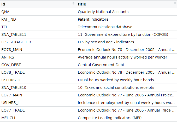
We can look at the all the datasets that we can download from the website via the package with the following get_datasets() function:
titles <- OECD::get_datasets()This gives us a data.frame with the ID and title for all the OECD datasets we can download into the R console, as we can see below.
In total there are 1662 datasets that we can download.
These datasets all have different variable types, countries, year spans and measurement values. So it is important to check each dataset carefully when we download them.
We can filter key phrases to subset datasets:
titles %>%
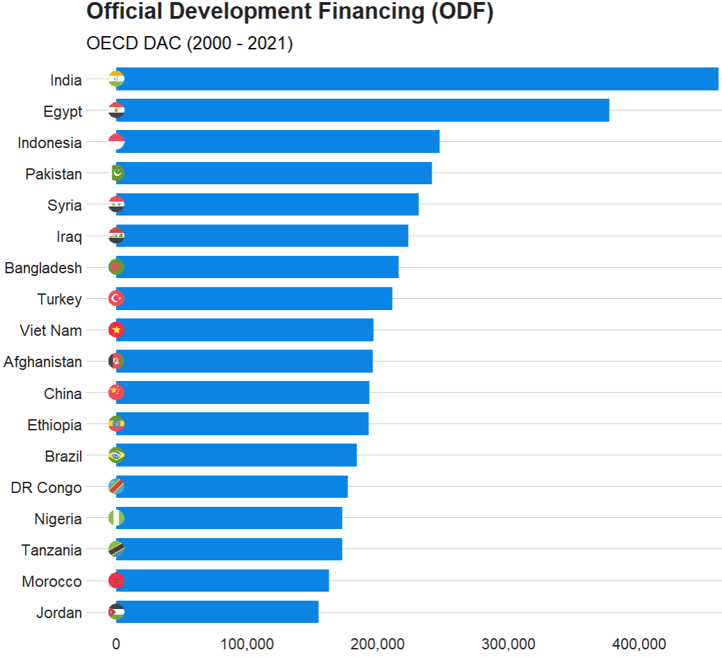
filter(grepl("oda", title, ignore.case = TRUE)) %>% ViewIn this blog, we will graph out the Official Development Financing (ODF) for each country.
Official Development Financing measures the sum of RECEIVED (NOT DONATED) aid such as:
- bilateral ODA aid
- concessional and non-concessional resources from multilateral sources
- bilateral other official flows made available for reasons unrelated to trade
Before we can charge into downloading any dataset, it is best to check out the variables it has. We can do that with the get_data_structure() function:
get_data_structure("REF_TOTAL_ODF") %>%
       str(., max.level = 2)
 $ VAR_DESC       :'data.frame':	10 obs. of  2 variables:
  ..$ id         : chr [1:10] "RECIPIENT" "PART" "AMOUNTTYPE" "TIME" ...
  ..$ description: chr [1:10] "Recipient" "Part" "Amount type" "Year" ...

 $ RECIPIENT      :'data.frame':	301 obs. of  2 variables:
  ..$ id   : chr [1:301] "10200" "10100" "10010" "71" ...
  ..$ label: chr [1:301] "All Recipients, Total" "Developing Countries, Total" "Europe, Total" "Albania" ...

 $ PART           :'data.frame':	2 obs. of  2 variables:
  ..$ id   : chr [1:2] "1" "2"
  ..$ label: chr [1:2] "1 : Part I - Developing Countries" "2 : Part II - Countries in Transition"

 $ AMOUNTTYPE     :'data.frame':	2 obs. of  2 variables:
  ..$ id   : chr [1:2] "A" "D"
  ..$ label: chr [1:2] "Current Prices" "Constant Prices"

 $ TIME           :'data.frame':	62 obs. of  2 variables:
  ..$ id   : chr [1:62] "1960" "1961" "1962" "1963" ...
  ..$ label: chr [1:62] "1960" "1961" "1962" "1963" ...
We will clean up the ODF dataset with the clean_names() function from janitor package.
aid <- get_dataset("REF_TOTAL_ODF")  %>%
  janitor::clean_names()  %>%
  select(recipient, aid = obs_value, time)
One problem with this dataset is that we only have the DAC country codes in this dataset.
We will need to read in and merge the country code variables into the aid dataset.
dac_code <- readxl::read_excel(file.choose())
We can then clean up the DAC codes to merge with the aid data.
dac_code %<>%
    janitor::clean_names()  %>%
    mutate(cown = countrycode(recipient_name_e, "country.name", "cown")) %>%
    select(recipient_code,
         year,
         cown,
         country = recipient_name_e,
         group_id,
         dev_group = group_name_e,
         p_group = group_name_f,
         wb_group)
And merge with left_join()
aid %<>%
  mutate(recipient_code = parse_number(recipient)) %>%
  left_join(dac_code, by = c("recipient_code" = "recipient_code"))
Next we can sum up the aid that each country received since 2000.
aid %>%
  filter(year > 1999) %>%
  filter(!is.na(country)) %>%
  mutate(aid = parse_number(aid)) %>%
  mutate(country = case_when(country == "Syrian Arab Republic" ~ "Syria",
                             country == "T?rkiye" ~ "Turkey",
                             country == "China (People's Republic of)" ~ "China",
                             country == "Democratic Republic of the Congo" ~ "DR Congo",
                             TRUE ~ as.character(country))) %>%
  group_by(country) %>%
  summarise(total_aid = sum(aid, na.rm = TRUE)) %>%
  ungroup() %>%
  mutate(iso2 = tolower(countrycode(country, "country.name", "iso2c"))) %>%
  filter(total_aid > 150000) %>%
  ggplot(aes(x = reorder(country, total_aid),
             y = total_aid)) +
  geom_bar(stat = "identity",
           width = 0.7,
           color = "#0a85e5",
           fill = "#0a85e5") +
  ggflags::geom_flag(aes(x = country, y = -1, country = iso2), size = 8) +
  bbplot::bbc_style() +
  scale_y_continuous(labels = scales::comma_format()) +
  coord_flip() +
  labs(x = "ODA received", y = "", title = "Official Development Financing (ODF)", subtitle = "OECD DAC (2000 - 2021)")

The TIME_FORMAT can be any of the following types:
- ‘P1Y’ for annual
- ‘P6M’ for bi-annual
- ‘P3M’ for quarterly
- ‘P1M’ for monthly data.
To access each countries in the datasets, we can use the following codes
oecd_ios3 <- c("AUS", "AUT", "BEL", "CAN", "CHL", "COL", "CZE",
               "DNK", "EST", "FIN", "FRA", "DEU", "GRC", "HUN",
               "ISL", "IRL", "ISR", "ITA", "JPN", "KOR", "LVA",
               "LTU", "LUX", "MEX", "NLD", "NZL", "NOR", "POL",
               "PRT", "SVK", "SVN", "ESP", "SWE", "CHE", "TUR",
               "GBR", "USA")
Alternatively, we can use only the EU countries that are in the OECD.
eu_oecd_iso3 <- c("AUT", "BEL", "CZE", "DNK", "EST", "FIN",
                  "FRA", "DEU", "GRC", "HUN", "IRL", "ITA",
                  "LVA", "LTU", "LUX", "NLD", "POL", "PRT",
                  "SVK", "SVN", "ESP", "SWE")
sal_raw %>%
  janitor::clean_names() %>%
  filter(age == "Y25T64") %>%
  filter(grade == "TE") %>%
  filter(indicator == "NAT_ACTL_YR") %>%
  filter(isc11 == "L1") %>%
  filter(sex == "T") %>%
  select(country, year = time, obs_value) -> sal