Packages we will need:
library(tidyverse)
library(democracyData)
library(magrittr)
library(ggrepel)
library(ggthemes)
library(countrycode)
In this post, we will look at easy ways to graph data from the democracyData package.
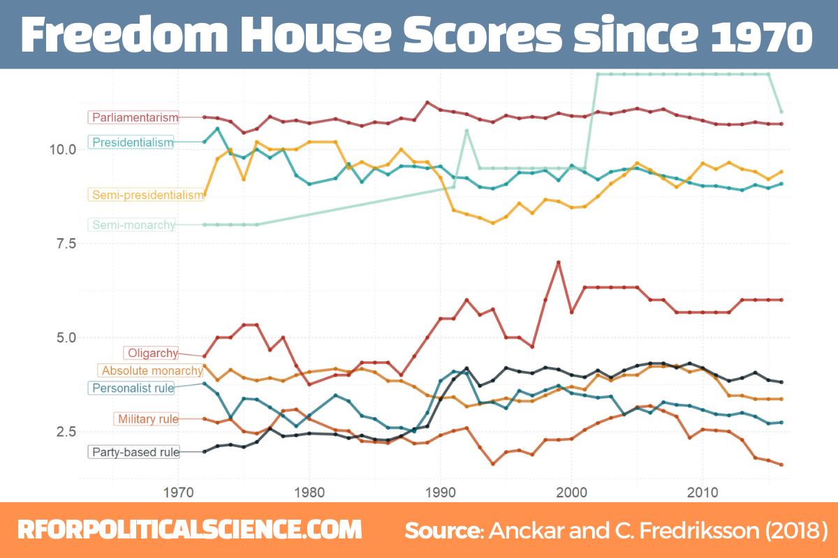
The two datasets we will look at are the Anckar-Fredriksson dataset of political regimes and Freedom House Scores.
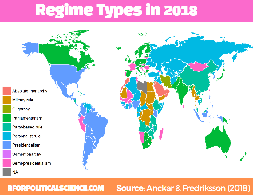
Regarding democracies, Anckar and Fredriksson (2018) distinguish between republics and monarchies. Republics can be presidential, semi-presidential, or parliamentary systems.
Within the category of monarchies, almost all systems are parliamentary, but a few countries are conferred to the category semi-monarchies.

Autocratic countries can be in the following main categories: absolute monarchy, military rule, party-based rule, personalist rule, and oligarchy.
anckar <- democracyData::redownload_anckar()
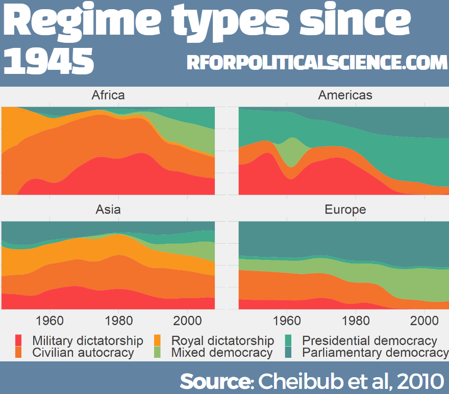
fh <- download_fh()We will see which regime types have been free or not since 1970.
We join the fh dataset to the anckar dataset with inner_join(). Luckily, both the datasets have the cown and year variables with which we can merge.
Then we sumamrise the mean Freedom House level for each regime type.
anckar %>%
  inner_join(fh, by = c("cown", "year")) %>%
  filter(!is.na(regimebroadcat)) %>%
  group_by(regimebroadcat, year) %>%
  summarise(mean_fh = mean(fh_total_reversed, na.rm = TRUE)) -> anckar_sum
We want to place a label for each regime line in the graph, so create a small dataframe with regime score information only about the first year.
anckar_start <- anckar_sum %>%
  group_by(regimebroadcat) %>%
  filter(year == 1972) %>%
  ungroup()
And we pick some more jewel toned colours for the graph and put them in a vector.
my_palette <- c("#ca6702", "#bb3e03", "#ae2012", "#9b2226", "#001219", "#005f73", "#0a9396", "#94d2bd", "#ee9b00")And we graph it out
anckar_sum %>%
  ggplot(aes(x = year, y = mean_fh, groups = as.factor(regimebroadcat))) +
  geom_point(aes(color = regimebroadcat), alpha = 0.7, size = 2) +
  geom_line(aes(color = regimebroadcat), alpha = 0.7, size = 2) +
  ggrepel::geom_label_repel(data = anckar_start, hjust = 1.5,
            aes(x = year,
                y = mean_fh,
                color = regimebroadcat,
                label = regimebroadcat),
            alpha = 0.7,
            show.legend = FALSE,
            size = 9) +
  scale_color_manual(values = my_palette) +
  expand_limits(x = 1965) +
  ggthemes::theme_pander() +
  theme(legend.position = "none",
        axis.text = element_text(size = 30, colour ="grey40"))

We can also use map data that comes with the tidyverse() package.
To merge the countries easily, I add a cown variable to this data.frame
world_map <- map_data("world")

world_map %<>%
  mutate(cown = countrycode::countrycode(region, "country.name", "cown"))
I want to only look at regimes types in the final year in the dataset – which is 2018 – so we filter only one year before we merge with the map data.frame.
The geom_polygon() part is where we indiciate the variable we want to plot. In our case it is the regime category
anckar %>%
 filter(year == max(year)) %>%
  inner_join(world_map, by = c("cown")) %>%
  mutate(regimebroadcat = ifelse(region == "Libya", 'Military rule', regimebroadcat)) %>%
  ggplot(aes(x = long, y = lat, group = group)) +
geom_polygon(aes(fill = regimebroadcat), color = "white", size = 1) 

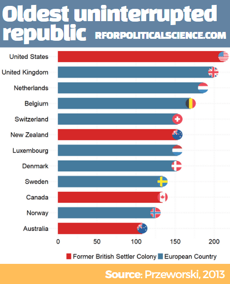
We can next look at the PIPE dataset and see which countries have been uninterrupted republics over time.
pipe <- democracyData::redownload_pipe()
We graph out the max_republic_age variable with geom_bar()
pipe %>%
  mutate(iso_lower = tolower(countrycode::countrycode(PIPE_cowcodes, "cown", "iso2c"))) %>%
  mutate(country_name = countrycode::countrycode(PIPE_cowcodes, "cown", "country.name")) %>%
  filter(year == max(year)) %>%
  filter(max_republic_age > 100) %>%
  ggplot(aes(x = reorder(country_name, max_republic_age), y = max_republic_age)) +
  geom_bar(stat = "identity", width = 0.7, aes(fill = as.factor(europe))) +
  ggflags::geom_flag(aes(y = max_republic_age, x = country_name,
                         country = iso_lower), size = 15) +
  coord_flip() +  ggthemes::theme_pander() -> pipe_plot
And fix up some aesthetics:
pipe_plot +
  theme(axis.text = element_text(size = 30),
        legend.text = element_text(size = 30),
        legend.title = element_blank(),
        axis.title = element_blank(),
        legend.position = "bottom") +
  labs(y= "", x = "") +
scale_fill_manual(values =  c("#d62828", "#457b9d"),
 labels = c("Former British Settler Colony", "European Country"))
I added the header and footer in Canva.com


