library(tidytext)
library(wordcloud)
library(knitr)
library(kableExtra)
How to make wordclouds in R!
First, download stop words (such as and, the, of) to filter out of the dataset
data("stop_words")Then we will will unnest tokens and count the occurences of each word in each decade.
tokens <- democracy_aid %>%
  select(description, year) %>%
  mutate(decade = substr(year, 1, 3)) %>%
  mutate(decade = paste0(decade, "0s")) %>%
  group_by(decade) %>%
  unnest_tokens(word, activity_description) %>%
  count(word, sort = TRUE) %>%
  ungroup() %>%
  anti_join(stop_words)

nums <- tokens %>% filter(str_detect(word, "^[0-9]")) %>% select(word) %>% unique()

tokens %<>%
  anti_join(nums, by = "word")
And with the kable() function we can make a HTML table that I copy and paste to this blog. Below I rewrite the HTML to change the headings
tokens %>%
    group_by(decade) %>%
    top_n(n = 10,
          wt = n)  %>%
    arrange(decade, desc(n)) %>%
    arrange(desc(n)) %>%
knitr::kable("html")| decade | word | n |
|---|---|---|
| 2010s | rights | 4541 |
| 2010s | local | 3981 |
| 2010s | youth | 3778 |
| 2010s | promote | 3679 |
| 2010s | democratic | 3618 |
| 2010s | public | 3444 |
| 2010s | national | 3060 |
| 2010s | political | 3020 |
| 2010s | human | 3009 |
| 2010s | organization | 2711 |
| 2000s | rights | 2548 |
| 2000s | human | 1745 |
| 2000s | local | 1544 |
| 2000s | conduct | 1381 |
| 2000s | political | 1257 |
| 2000s | training | 1217 |
| 2000s | promote | 1142 |
| 2000s | public | 1121 |
| 2000s | democratic | 1071 |
| 2000s | national | 988 |
Create a vector of colors:
my_colors <- c("#0450b4", "#046dc8", "#1184a7","#15a2a2", "#6fb1a0",
               "#b4418e", "#d94a8c", "#ea515f", "#fe7434", "#fea802")
tokens %<>%
  mutate(word = ifelse(grepl("democr", word), "democracy",
                ifelse(grepl("politi", word), "politics",
                ifelse(grepl("institut", word), "institution",
                ifelse(grepl("govern", word), "government",
                ifelse(grepl("organiz", word), "organization",
                ifelse(grepl("elect", word), "election", word)))))))

wordcloud(tokens$word, tokens$n, random.order = FALSE, max.words = 50, colors = my_colors)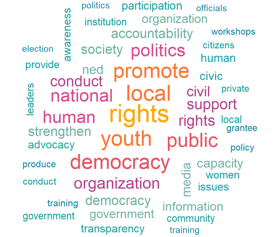
| 2010s Decade | Word | Count |
|---|---|---|
| 2010s | rights | 4541 |
| 2010s | local | 3981 |
| 2010s | youth | 3778 |
| 2010s | promote | 3679 |
| 2010s | democratic | 3618 |
| 2010s | public | 3444 |
| 2010s | national | 3060 |
| 2010s | political | 3020 |
| 2010s | human | 3009 |
| 2010s | organization | 2711 |
| 2000s Decade | Word | Count |
| 2000s | rights | 2548 |
| 2000s | human | 1745 |
| 2000s | local | 1544 |
| 2000s | conduct | 1381 |
| 2000s | political | 1257 |
| 2000s | training | 1217 |
| 2000s | promote | 1142 |
| 2000s | public | 1121 |
| 2000s | democratic | 1071 |
| 2000s | national | 988 |
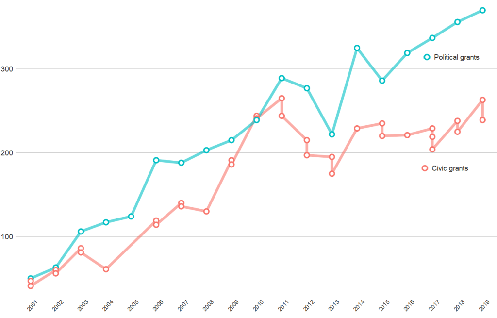
And if we compare civic versus politically-oriented aid, we can see that more money goes towards projects that have political or electoral aims rather than civic or civil society education goals
tokens %>%
  group_by(year) %>%
  top_n(n = 20,
        wt = n) %>%
  mutate(word = case_when(word == "party" ~ "political",
                          word == "parties" ~ "political",
                          word == "election" ~ "political",
                          word == "electoral" ~ "political",
                          word == "civil" ~ "civic",
                          word == "civic" ~ "civic",
                          word == "social" ~ "civic",
                          word == "education" ~ "civic",
                          word == "society" ~ "civic",
                          TRUE ~ as.character(word))) %>%
  filter(word == "political" | word == "civic") %>%
  ggplot(aes(x = year, y = n, group = word)) +
  geom_line(aes(color = word ), size = 2.5,alpha = 0.6)  +
  geom_point(aes(color = word ), fill = "white",
             shape = 21, size = 3, stroke = 2) +
  bbplot::bbc_style() +
  scale_x_discrete(limits = c(2001:2019)) +
  theme(axis.text.x= element_text(size = 15,
                                  angle = 45)) +
  scale_color_discrete(name = "Aid type", labels = c("Civic grants", "Political grants"))