The loess method in ggplot2 fits a smoothing line to our data.
We can do this with the method = "loess" in the geom_smooth() layer.
LOESS stands “Locally Weighted Scatterplot Smoothing.” (I am not sure why it is not called LOWESS … ?)
The loess line can help show non-linear relationships in the scatterplot data, while taking care of stopping the over-influence of outliers.
Loess gives more weight to nearby data points and less weight to distant ones. This means that nearby points have a greater influence on the squiggly-ness of the line.
The degree of smoothing is controlled by the span parameter in the geom_smooth() layer.
When we set the span, we can choose how many nearby data points are considered when estimating the local regression line.
A smaller span (e.g. span = 0.5) results in more local (flexible) smoothing, while a larger span (e.g. span = 1.5) produces more global (smooth) smoothing.
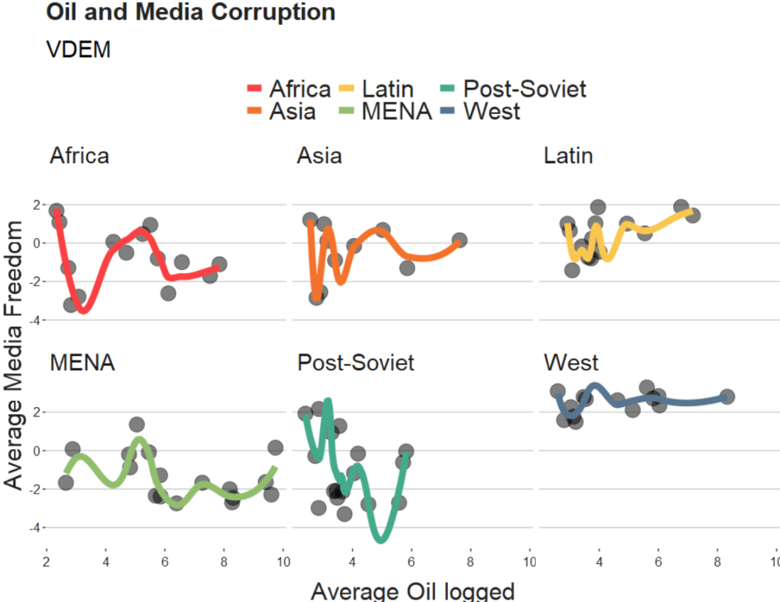
We will take the variables from the Varieties of Democracy dataset and plot the relationship between oil produciton and media freedoms across different regions.
df %>%
  ggplot(aes(x = log_avg_oil,
             y = avg_media)) +
  geom_point(size = 6, alpha = 0.5) +
  geom_smooth(aes(color = region),
              method = "loess",
              span = 2,
              se = FALSE,
              size = 3,
              alpha = 0.6) +
  facet_wrap(~region) +
  labs(title = "Oil and Media Corruption", subtitle = "VDEM",
       x = "Average Oil logged",
       y = "Average Media Freedom") +
  scale_color_manual(values = my_pal) +
  my_theme()
If we change the span to 0.5, we get the following graph:
span = 0.5
When examining the connection between oil production and media freedoms across various regions, there are many ways to draw the line.
If we think the relationship is linear, it is no problem to add method = "lm" to the graph.
However, if outliers might overly distort the linear relationship, method = "rlm" (robust linear model” can help to take away the power from these outliers.
Linear and robust linear models (lm and rlm) can also accommodate parametric non-linear relationships, such as quadratic or cubic, when used with a proper formula specification.
For example, “geom_smooth(method=’lm’, formula = y ~ x + I(x^2))” can be used for estimating a quadratic relationship using lm.
If the outcome variable is binary (such as “is democracy” versus “is not democracy” or “is oil producing” versus “is not oil producing”) we can use method = “glm” (which is generalised linear model). It models the log odds of a oil producing as a linear function of a predictor variable, like age.
If the relationship between age and log odds is non-linear, the gam method is preferred over glm. Both glm and gam can handle outcome variables with more than two categories, count variables, and other complexities.
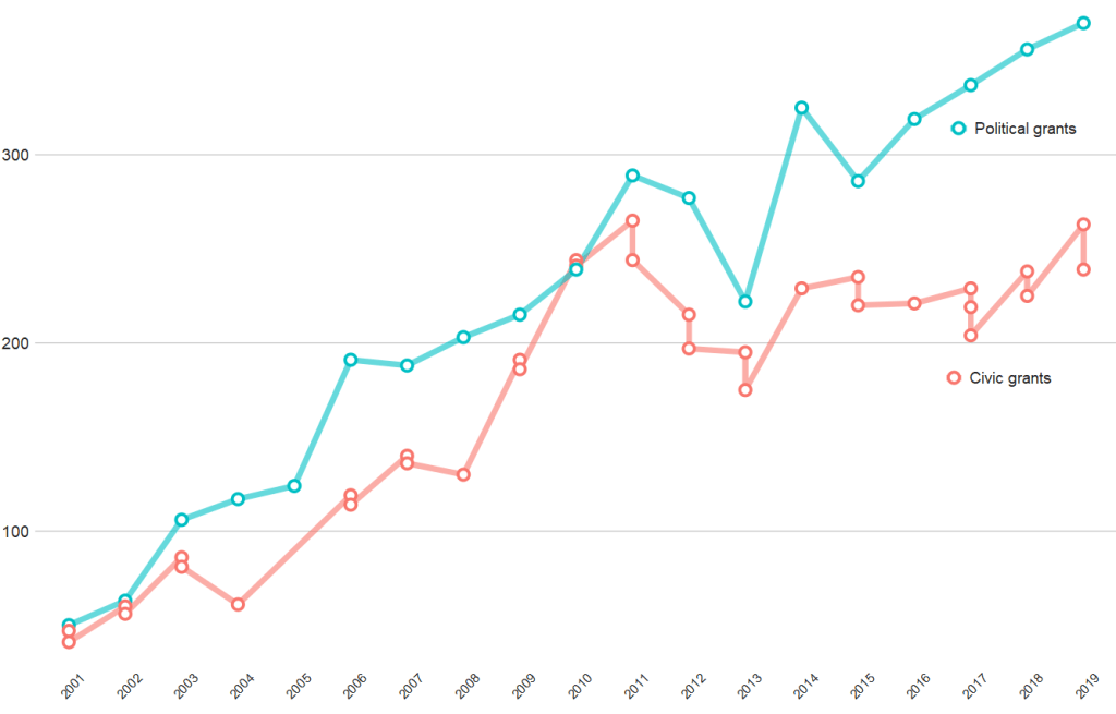
And if we compare civic versus politically-oriented aid, we can see that more money goes towards projects that have political or electoral aims rather than civic or civil society education goals
tokens %>%
  group_by(year) %>%
  top_n(n = 20,
        wt = n) %>%
  mutate(word = case_when(word == "party" ~ "political",
                          word == "parties" ~ "political",
                          word == "election" ~ "political",
                          word == "electoral" ~ "political",
                          word == "civil" ~ "civic",
                          word == "civic" ~ "civic",
                          word == "social" ~ "civic",
                          word == "education" ~ "civic",
                          word == "society" ~ "civic",
                          TRUE ~ as.character(word))) %>%
  filter(word == "political" | word == "civic") %>%
  ggplot(aes(x = year, y = n, group = word)) +
  geom_line(aes(color = word ), size = 2.5,alpha = 0.6)  +
  geom_point(aes(color = word ), fill = "white",
             shape = 21, size = 3, stroke = 2) +
  bbplot::bbc_style() +
  scale_x_discrete(limits = c(2001:2019)) +
  theme(axis.text.x= element_text(size = 15,
                                  angle = 45)) +
  scale_color_discrete(name = "Aid type", labels = c("Civic grants", "Political grants"))
With the European Social Survey (ESS), we will examine the different variables that are related to levels of trust in politicians across Europe in the latest round 9 (conducted in 2018).
Click here to learn about downloading ESS data into R with the essurvey package.
Packages we will need:
library(survey)
library(srvyr)
The survey package was created by Thomas Lumley, a professor from Auckland. The srvyr package is a wrapper packages that allows us to use survey functions with tidyverse.
Why do we need to add weights to the data when we analyse surveys?
When we import our survey data file, R will assume the data are independent of each other and will analyse this survey data as if it were collected using simple random sampling.
However, the reality is that almost no surveys use a simple random sample to collect data (the one exception being Iceland in ESS!)
Rather, survey institutions choose complex sampling designs to reduce the time and costs of ultimately getting responses from the public.
Their choice of sampling design can lead to different estimates and the standard errors of the sample they collect.
For example, the sampling weight may affect the sample estimate, and choice of stratification and/or clustering may mean (most likely underestimated) standard errors.
As a result, our analysis of the survey responses will be wrong and not representative to the population we want to understand. The most problematic result is that we would arrive at statistical significance, when in reality there is no significant relationship between our variables of interest.
Therefore it is essential we don’t skip this step of correcting to account for weighting / stratification / clustering and we can make our sample estimates and confidence intervals more reliable.
This table comes from round 8 of the ESS, carried out in 2016. Each of the 23 countries has an institution in charge of carrying out their own survey, but they must do so in a way that meets the ESS standard for scientifically sound survey design (See Table 1).
Sampling weights aim to capture and correct for the differing probabilities that a given individual will be selected and complete the ESS interview.
For example, the population of Lithuania is far smaller than the UK. So the probability of being selected to participate is higher for a random Lithuanian person than it is for a random British person.
Additionally, within each country, if the survey institution chooses households as a sampling element, rather than persons, this will mean that individuals living alone will have a higher probability of being chosen than people in households with many people.
Click here to read in detail the sampling process in each country from round 1 in 2002. For example, if we take my country – Ireland – we can see the many steps involved in the country’s three-stage probability sampling design.
The Primary Sampling Unit (PSU) is electoral districts. The institute then takes addresses from the Irish Electoral Register. From each electoral district, around 20 addresses are chosen (based on how spread out they are from each other). This is the second stage of clustering. Finally, one person is randomly chosen in each house to answer the survey, chosen as the person who will have the next birthday (third cluster stage).
Click here for more information about Design Effects (DEFF) and click here to read how ESS calculates design effects.
DEFF p refers to the design effect due to unequal selection probabilities (e.g. a person is more likely to be chosen to participate if they live alone)
DEFF c refers to the design effect due to clustering
According to Gabler et al. (1999), if we multiply these together, we get the overall design effect. The Irish design that was chosen means that the data’s variance is 1.6 times as large as you would expect with simple random sampling design. This 1.6 design effects figure can then help to decide the optimal sample size for the number of survey participants needed to ensure more accurate standard errors.
So, we can use the functions from the survey package to account for these different probabilities of selection and correct for the biases they can cause to our analysis.
In this example, we will look at demographic variables that are related to levels of trust in politicians. But there are hundreds of variables to choose from in the ESS data.
Click here for a list of all the variables in the European Social Survey and in which rounds they were asked. Not all questions are asked every year and there are a bunch of country-specific questions.
We can look at the last few columns in the data.frame for some of Ireland respondents (since we’ve already looked at the sampling design method above).
The dweight is the design weight and it is essentially the inverse of the probability that person would be included in the survey.
The pspwght is the post-stratification weight and it takes into account the probability of an individual being sampled to answer the survey AND ALSO other factors such as non-response error and sampling error. This post-stratificiation weight can be considered a more sophisticated weight as it contains more additional information about the realities survey design.
The pweight is the population size weight and it is the same for everyone in the Irish population.
When we are considering the appropriate weights, we must know the type of analysis we are carrying out. Different types of analyses require different combinations of weights. According to the ESS weighting documentation:
when analysing data for one country alone – we only need the design weight or the poststratification weight.
when comparing data from two or more countries but without reference to statistics that combine data from more than one country – we only need the design weight or the poststratification weight
when comparing data of two or more countries and with reference to the average (or combined total) of those countries – we need BOTH design or post-stratification weight AND population size weights together.
when combining different countries to describe a group of countries or a region, such as “EU accession countries” or “EU member states” = we need BOTH design or post-stratification weights AND population size weights.
ESS warn that their survey design was not created to make statistically accurate region-level analysis, so they say to carry out this type of analysis with an abundance of caution about the results.
ESS has a table in their documentation that summarises the types of weights that are suitable for different types of analysis:
Since we are comparing the countries, the optimal weight is a combination of post-stratification weights AND population weights together.
Click here to read Part 2 and run the regression on the ESS data with the survey package weighting design
Below is the code I use to graph the differences in mean level of trust in politicians across the different countries.
library(ggimage) # to add flags
library(countrycode) # to add ISO country codes

# r_agg is the aggregated mean of political trust for each countries' respondents.

r_agg %>%
  dplyr::mutate(country, EU_member = ifelse(country == "BE" | country == "BG" | country == "CZ" | country == "DK" | country == "DE" | country == "EE" | country == "IE" | country == "EL" | country == "ES" | country == "FR" | country == "HR" | country == "IT" | country == "CY" | country == "LV" | country == "LT" | country == "LU" | country == "HU" | country == "MT" | country == "NL" | country == "AT" | country == "AT" | country == "PL" | country == "PT" | country == "RO" | country == "SI" | country == "SK" | country == "FI" | country == "SE","EU member", "Non EU member")) -> r_agg


r_agg %>%
  filter(EU_member == "EU member") %>%
  dplyr::summarize(eu_average = mean(mean_trust_pol))


r_agg$country_name <- countrycode(r_agg$country, "iso2c", "country.name")


#eu_average <- r_agg %>%
 # summarise_if(is.numeric, mean, na.rm = TRUE)


eu_avg <- data.frame(country = "EU average",
                     mean_trust_pol = 3.55,
                     EU_member =  "EU average",
                     country_name = "EU average")

r_agg <- rbind(r_agg, eu_avg)


my_palette <- c("EU average" = "#ef476f",
                "Non EU member" = "#06d6a0",
                "EU member" = "#118ab2")

r_agg <- r_agg %>%
  dplyr::mutate(ordered_country = fct_reorder(country, mean_trust_pol))


r_graph <- r_agg %>%
  ggplot(aes(x = ordered_country, y = mean_trust_pol, group = country, fill = EU_member)) +
  geom_col() +
  ggimage::geom_flag(aes(y = -0.4, image = country), size = 0.04) +
  geom_text(aes(y = -0.15 , label = mean_trust_pol)) +
  scale_fill_manual(values = my_palette) + coord_flip()

r_graph
“Nodes” designate the vertices of a network, and “edges” designate its ties. Vertices are accessed using the V() function while edges are accessed with the E(). This igraph object has 232 edges and 16 vertices over the four years.
Furthermore, the igraph object has a name attribute as one of its vertices properties. To access, type:
V(countries_ig)$name
Which prints off all the countries in the ww1 dataset; this is all the countries that engaged in militarized interstate disputes between the years 1914 to 1918.
Next we can fit an algorithm to modify the graph distances. According to our pal Wikipedia, force-directed graph drawing algorithms are a class of algorithms for drawing graphs in an aesthetically-pleasing way. Their purpose is to position the nodes of a graph in two-dimensional or three-dimensional space so that all the edges are of more or less equal length and there are as few crossing edges as possible, by assigning forces among the set of edges and the set of nodes, based on their relative positions!
We can do this in one simple step by feeding the igraph into the algorithm function.
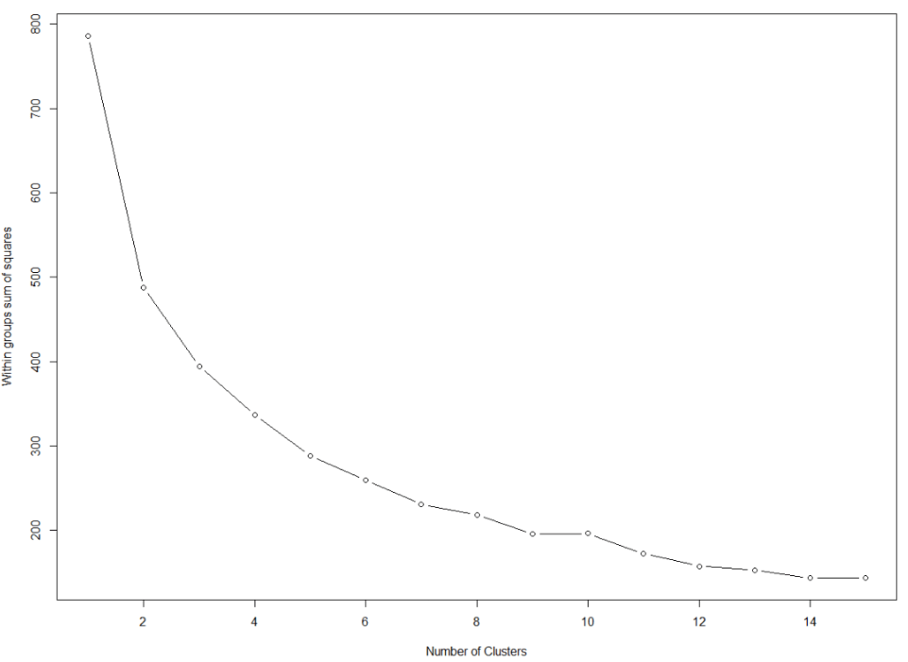
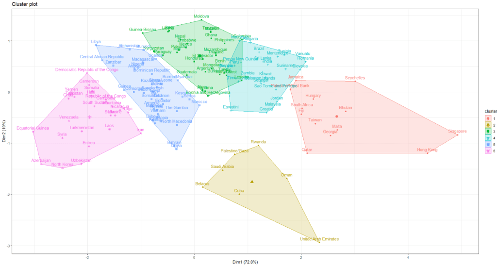
I am looking at 127 non-democracies on seeing how the cluster on measures of state capacity (variables that capture ability of the state to control its territory, collect taxes and avoid corruption in the executive).
We want to minimise the total within sums of squares error from the cluster mean when determining the clusters.
First, we need to find the optimal number of clusters. We set the max number of clusters at k = 15.
This blog will create dendogram to examine whether Asian countries cluster together when it comes to extent of judicial compliance. I’m examining Asian countries with populations over 1 million and data comes from the year 2019.
Judicial compliance measure how often a government complies with important decisions by courts with which it disagrees.
Higher scores indicate that the government often or always complies, even when they are unhappy with the decision. Lower scores indicate the government rarely or never complies with decisions that it doesn’t like.
It is important to make sure there are no NA values. So I will impute any missing variables.
Next we can scale the dataset. This step is for when you are clustering on more than one variable and the variable units are not necessarily equivalent. The distance value is related to the scale on which the different variables are made.
Therefore, it’s good to scale all to a common unit of analysis before measuring any inter-observation dissimilarities.
asia_scale <- scale(asia_df)
Next we calculate the distance between the countries (i.e. different rows) on the variables of interest and create a dist object.
There are many different methods you can use to calculate the distances. Click here for a description of the main formulae you can use to calculate distances. In the linked article, they provide a helpful table to summarise all the common methods such as “euclidean“, “manhattan” or “canberra” formulae.
I will go with the “euclidean” method. but make sure your method suits the data type (binary, continuous, categorical etc.)
We now have a dist object we can feed into the hclust() function.
With this function, we will need to make another decision regarding the method we will use.
The possible methods we can use are "ward.D", "ward.D2", "single", "complete", "average" (= UPGMA), "mcquitty" (= WPGMA), "median" (= WPGMC) or "centroid" (= UPGMC).
Again I will choose a common "ward.D2" method, which chooses the best clusters based on calculating: at each stage, which two clusters merge that provide the smallest increase in the combined error sum of squares.
When we plot the different clusters, there are many options to change the color, size and dimensions of the dendrogram. To do this we use the set() function.
asia_judicial_dend %>%
set("branches_k_color", k=5) %>%    # five clustered groups of different colors
set("branches_lwd", 2) %>%          # size of the lines (thick or thin)
set("labels_colors", k=5) %>%       # color the country labels, also five groups
plot(horiz = TRUE)                  # plot the dendrogram horizontally
I choose to divide the countries into five clusters by color:
And if I zoom in on the ends of the branches, we can examine the groups.
The top branches appear to be less democratic countries. We can see that North Korea is its own cluster with no other countries sharing similar judicial compliance scores.
The bottom branches appear to be more democratic with more judicial independence. However, when we have our final dendrogram, it is our job now to research and investigate the characteristics that each countries shares regarding the role of the judiciary and its relationship with executive compliance.
Singapore, even though it is not a democratic country in the way that Japan is, shows a highly similar level of respect by the executive for judicial decisions.
Also South Korean executive compliance with the judiciary appears to be more similar to India and Sri Lanka than it does to Japan and Singapore.
So we can see that dendrograms are helpful for exploratory research and show us a starting place to begin grouping different countries together regarding a concept.
A really quick way to complete all steps in one go, is the following code. However, you must use the default methods for the dist and hclust functions. So if you want to fine tune your methods to suit your data, this quicker option may be too brute.