Packages we will be using:
library(tidyverse)
library(geojsonio)
library(sf)
In this blog, we will make maps! Mapppsss!!!
Go to this website and find the country GeoJSON you want to download:
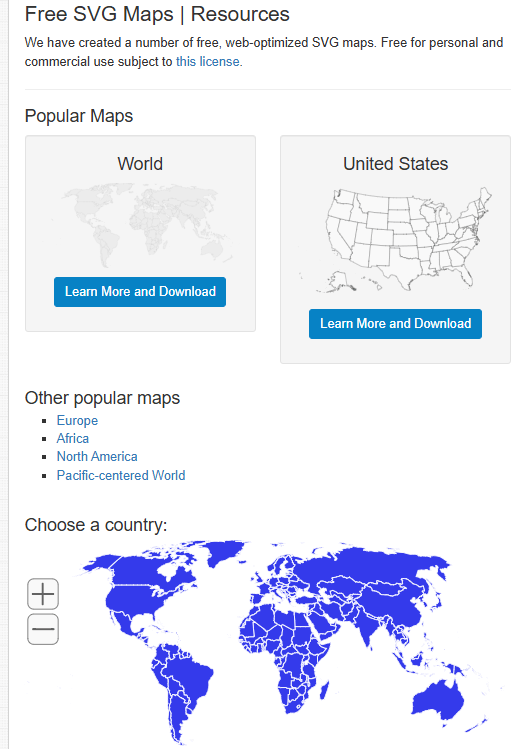
We can choose the country we want.
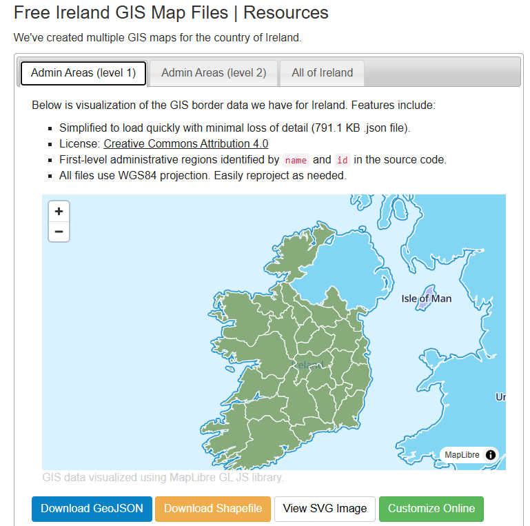
For example, Ireland
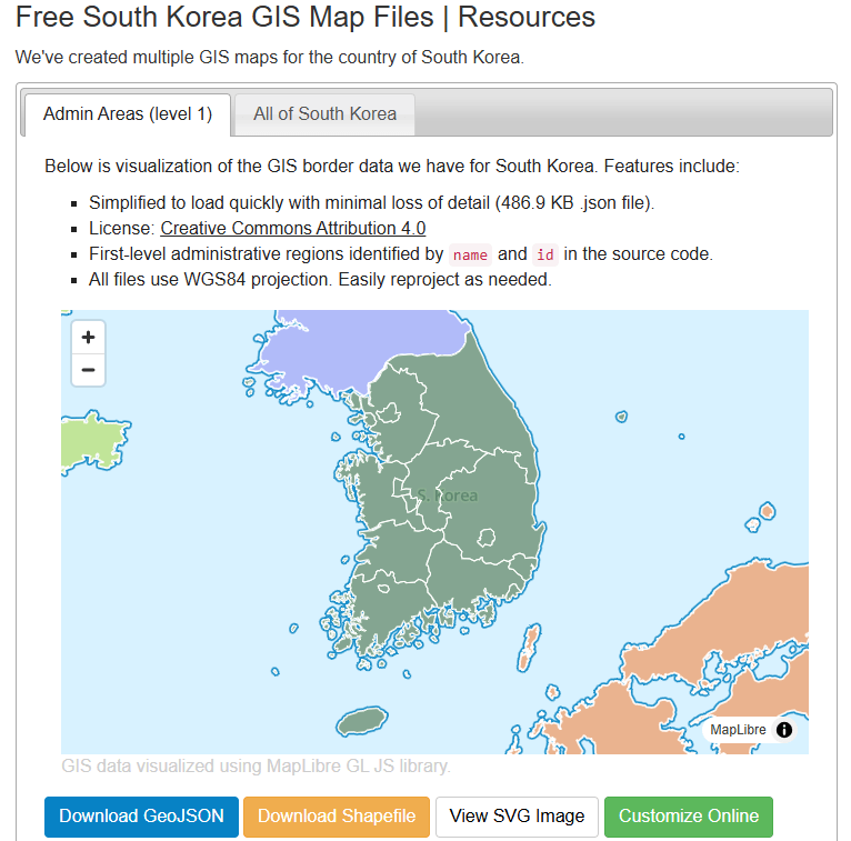
Or South Korea, maybe~
Click the blue button to download the file.
I saved it on my desktop so it’s easy to read in~
ireland_map <- geojson_read("ie.json", what = "sp")Next we need to convert a spatial object into an sf (Simple Features) object
ireland_sf <- st_as_sf(ireland_map)I will be working on the Irish dataset and make a simple map
geojson_read() reads a GeoJSON file (from the geojsonio package).
A GeoJSON file is a file format for map data using JavaScript Object Notation (JSON).
It’s an open standard used a lot to represent points, lines, and polygonzzz.
"ie.json" will be our GeoJSON file containing Ireland’s geographic data. That will be the 26 counties.
The argument what = "sp" makes it so that the output should be a spatial object (from the sp package).
We can add data for the four provinces of Ireland
leinster <- c("Carlow", "Dublin", "Kildare", "Kilkenny", "Laois", "Longford", "Louth", "Meath", "Offaly", "Westmeath", "Wexford", "Wicklow")

munster <- c("Clare", "Cork", "Kerry", "Limerick", "Tipperary", "Waterford")

connacht <- c("Galway", "Leitrim", "Mayo", "Roscommon", "Sligo")

ulster <- c("Cavan", "Donegal", "Monaghan", "Antrim", "Armagh", "Derry", "Down", "Fermanagh", "Tyrone")
And some hex colours for the palette
province_pal <- c(
  "Leinster" = "#122229",
  "Munster" = "#0a9396",
  "Connacht" = "#ee9b00",
  "Ulster" = "#991226")
And we can add all this data with the geom_sf() to the graph:
ireland_sf %>%
  mutate(county = name) %>%
  mutate(county = ifelse(county == "Laoighis", "Laois", county)) %>%
  mutate(province = ifelse(county %in% leinster, "Leinster",
                    ifelse(county %in% munster, "Munster",
                    ifelse(county %in% connacht, "Connacht",
                    ifelse(county %in% ulster, "Ulster", NA))))) %>%
  ggplot() +
  geom_sf(aes(fill = province),
          linewidth = 1, color = "white") +
  bbplot::bbc_style() +
  scale_fill_manual(values = province_pal)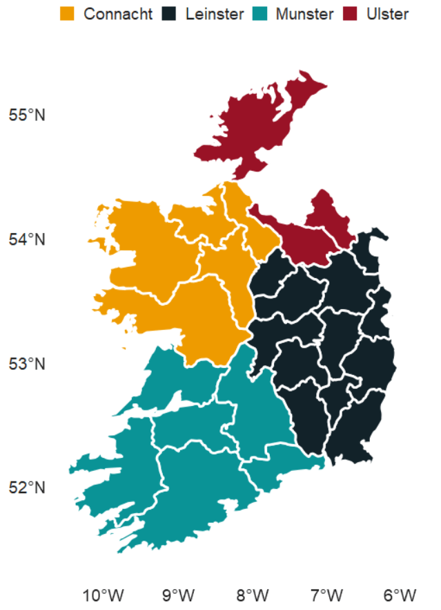
We can also make interactive maps that look like Google maps with the leaflet package!
Click here to read the cran PDF on the leaflet package.
It’s super easy but different from ggplot in many ways.
Instead of all the ifelse() statements and mutate(), we can alternatively use a case_when() function!
ireland_sf %<>%
  mutate(county = name,
         county = recode(county, "Laoighis" = "Laois"),
         province = case_when(
           county %in% leinster ~ "Leinster",
           county %in% munster  ~ "Munster",
           county %in% connacht ~ "Connacht",
           county %in% ulster   ~ "Ulster",
           TRUE ~ NA_character_))
We can add colours using the colorFactor() function from the leaflet package.
In colorFactor() specifies the set of possible input values that will be mapped to colours.
province_colorFactor <- colorFactor(
  palette = c("Leinster" = "#122229",
              "Munster"  = "#0a9396",
              "Connacht" = "#ee9b00",
              "Ulster"   = "#991226"),
  domain = ireland_sf$province)
We can now use the leaflet() function with the input of our SF data.frame.
With the addProviderTiles(), we can choose a map style.
providers$CartoDB.Positron refers to the “Positron” tile set from CartoDB.
When we use the leaflet.extra package, the CartoDB means we can use a clean map style
Next, we add the addPolygons() function adds polygon shapes to the map. For us. these polygons are for each Irish county.
fillColor = ~province_colorFactor(province) sets the fill color of each of the fours province polygon!
Finally, we can add the thickness of the map border lines, color and opacity to make it all pretty!
leaflet(ireland_sf) %>%
  addProviderTiles(providers$CartoDB.Positron) %>%
  addPolygons(fillColor = ~province_colorFactor(province),
              weight = 2,
              color = "black",
              opacity = 1)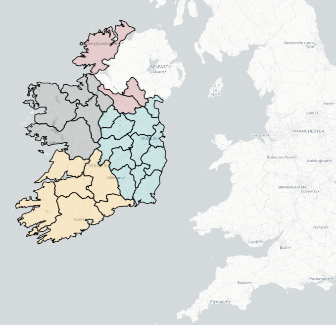
Here are some commonly used provider tiles that we can feed into the addProviderTiles()
- OpenStreetMap
providers$OpenStreetMap.Mapnikproviders$OpenStreetMap.DEproviders$OpenStreetMap.France
- Stamen
providers$Stamen.Tonerproviders$Stamen.Watercolorproviders$Stamen.Terrain
- CartoDB
providers$CartoDB.Positronproviders$CartoDB.DarkMatter
- Esri
providers$Esri.WorldStreetMapproviders$Esri.WorldImageryproviders$Esri.NatGeoWorldMap
- Hike & Bike
providers$HikeBike.HikeBike
- Thunderforest
providers$Thunderforest.Landscapeproviders$Thunderforest.Outdoors
- NASAGIBS
providers$NASAGIBS.ModisTerraTrueColorCR
ireland_leaflet %>%
  addProviderTiles(providers$Esri.WorldImagery)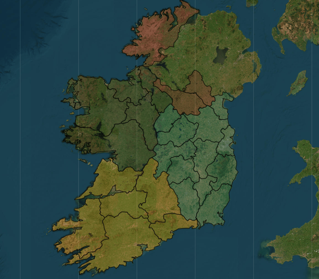
The watercolour style is pretty!
leaflet(ireland_pop_sf) %>%
  addProviderTiles(providers$Stadia.StamenWatercolor) %>%
  addPolygons(fillColor = ~province_colorFactor(province),
              weight = 2,
              color = "white",
opacity = 1) 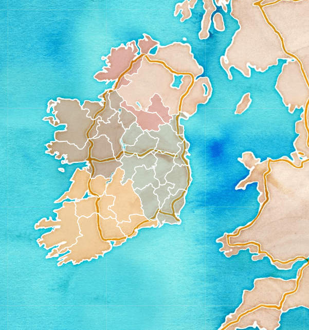
leaflet(ireland_pop_sf) %>%
  addPolygons(fillColor = ~province_colorFactor(province),
              weight = 2,
              color = "white",
              opacity = 1) %>%
addProviderTiles(providers$SafeCast) 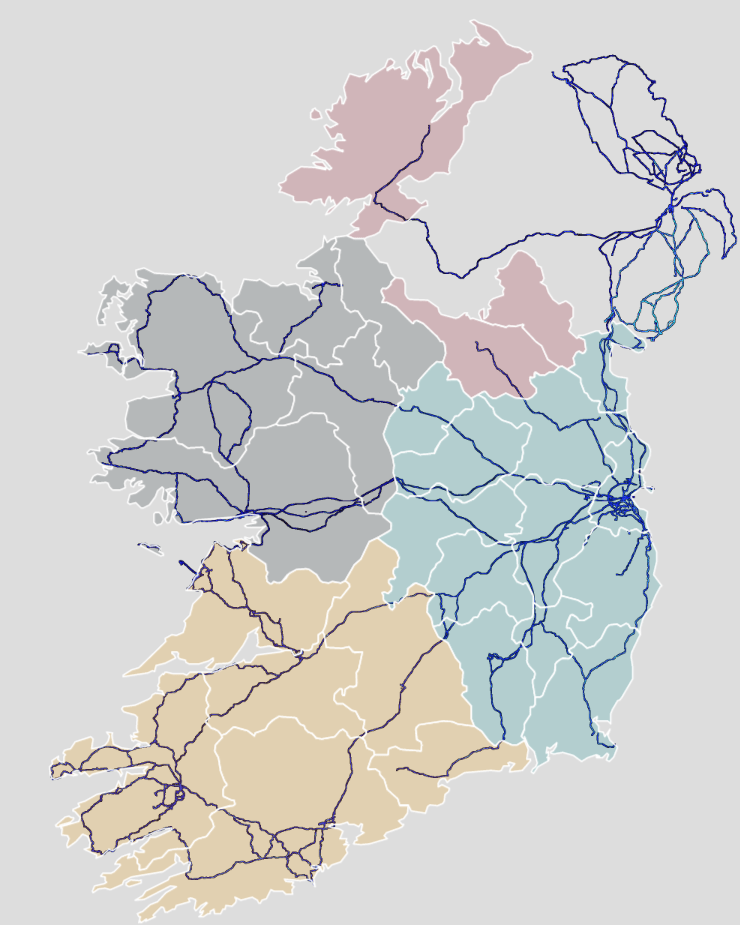
And we can add the towns and cities with the Stadia as the map provider.
leaflet(ireland_pop_sf) %>%
  addPolygons(fillColor = ~province_colorFactor(province),
              weight = 2,
              color = "white",
              opacity = 1) %>%
addProviderTiles(providers$Stadia) 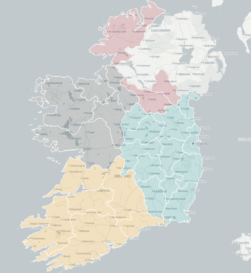
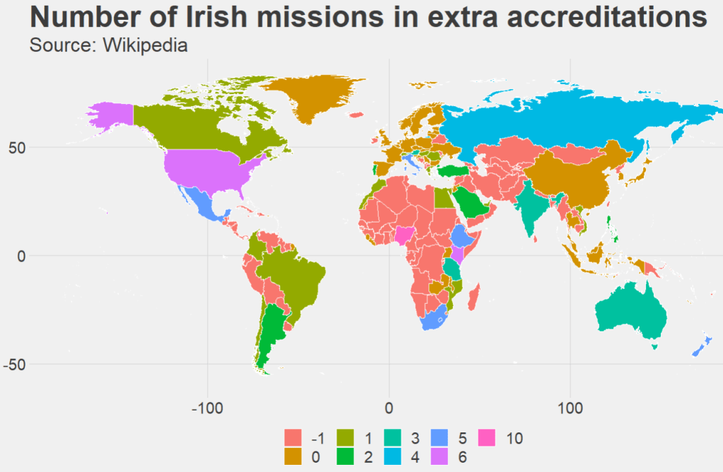
Next we can take 2023 population data for each county from Wikipedia (using rvest's read_html()
read_html("https://en.wikipedia.org/wiki/List_of_Irish_counties_by_population") %>%
  html_table(header = TRUE, fill = TRUE) %>%
  `[[`(1) %>%
  janitor::row_to_names(row_number = 1) %>%
  janitor::clean_names() %>%
  mutate(population = as.numeric(gsub(",", "", population)) %>%
  select(county, population) -> ireland_pop
Add join the population data to the SF map data with the county variable.
ireland_sf %>%
  inner_join(ireland_pop, by = "county") -> ireland_pop_sf
First, we can prepare a colour palette
pop_pal <- colorNumeric(
  palette = "RdYlBu",
  domain = ireland_pop_sf$population)
We can create a leaflet map object …
leaflet(ireland_pop_sf) %>%
  addProviderTiles(providers$CartoDB.Positron) -> ireland_leaflet
… and use this to add population data with a legend in the corner
ireland_leaflet %>%
  addPolygons(fillColor = ~pop_pal(population),  # Color by population
              weight = 1,
              color = "white",
              fillOpacity = 0.7,
              popup = ~paste0("<b>", county, "</b><br>Population: ", population)) %>%
  addLegend(pal = pop_pal,
            values = ireland_pop_sf$population,
            title = legend_title,
            position = "bottomright")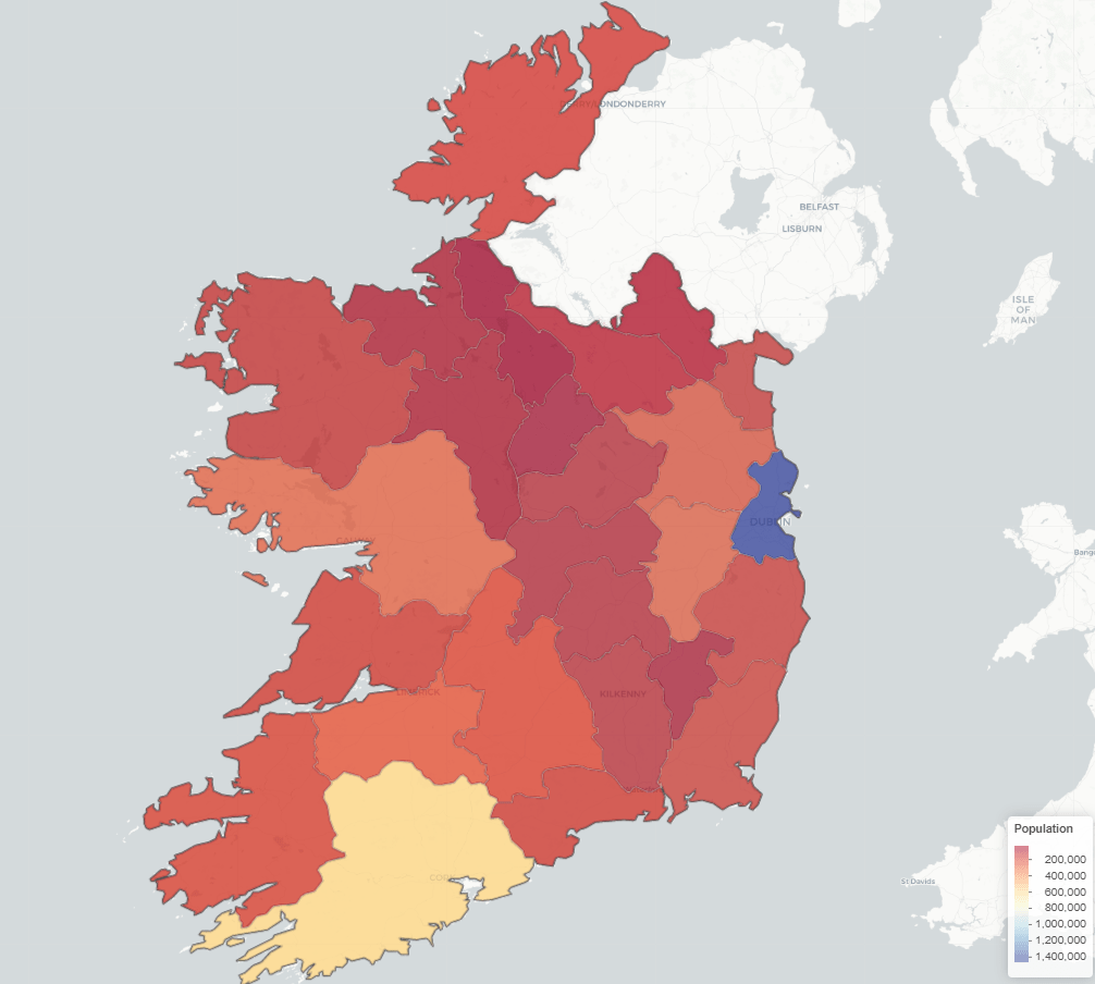


