Packages we will need:
library(tidyverse)
library(haven) # import SPSS data
library(rnaturalearth) # download map data
library(countrycode) # add country codes for merging
library(gt) # create HTML tables
library(gtExtras) # customise HTML tables
In this blog, we will look at calculating a variation of the Herfindahl-Hirschman Index (HHI) for languages. This will give us a figure that tells us how diverse / how concentrated the languages are in a given country.
We will continue using the Afrobarometer survey in the post!
Click here to read more about downloading the Afrobarometer survey data in part one of the series.
You can use the file.choose() to import the Afrobarometer survey round you downloaded. It is an SPSS file, so we need to use the read_sav() function from have package
ab <- read_sav(file.choose())First, we can quickly add the country names to the data.frame with the case_when() function
ab %>%
  mutate(country_name = case_when(
    COUNTRY == 2 ~ "Angola",
    COUNTRY == 3 ~ "Benin",
    COUNTRY == 4 ~ "Botswana",
    COUNTRY == 5 ~ "Burkina Faso",
    COUNTRY == 6 ~ "Cabo Verde",
    COUNTRY == 7 ~ "Cameroon",
    COUNTRY == 8 ~ "Côte d'Ivoire",
    COUNTRY == 9 ~ "Eswatini",
    COUNTRY == 10 ~ "Ethiopia",
    COUNTRY == 11 ~ "Gabon",
    COUNTRY == 12 ~ "Gambia",
    COUNTRY == 13 ~ "Ghana",
    COUNTRY == 14 ~ "Guinea",
    COUNTRY == 15 ~ "Kenya",
    COUNTRY == 16 ~ "Lesotho",
    COUNTRY == 17 ~ "Liberia",
    COUNTRY == 19 ~ "Malawi",
    COUNTRY == 20 ~ "Mali",
    COUNTRY == 21 ~ "Mauritius",
    COUNTRY == 22 ~ "Morocco",
    COUNTRY == 23 ~ "Mozambique",
    COUNTRY == 24 ~ "Namibia",
    COUNTRY == 25 ~ "Niger",
    COUNTRY == 26 ~ "Nigeria",
    COUNTRY == 28 ~ "Senegal",
    COUNTRY == 29 ~ "Sierra Leone",
    COUNTRY == 30 ~ "South Africa",
    COUNTRY == 31 ~ "Sudan",
    COUNTRY == 32 ~ "Tanzania",
    COUNTRY == 33 ~ "Togo",
    COUNTRY == 34 ~ "Tunisia",
    COUNTRY == 35 ~ "Uganda",
    COUNTRY == 36 ~ "Zambia",
    COUNTRY == 37 ~ "Zimbabwe")) -> ab
If we consult the Afrobarometer codebook (check out the previous blog post to access), Q2 asks the survey respondents what is their primary langugage. We will count the responses to see a preview of the languages we will be working with
ab %>%
   count(Q2) %>%
   arrange(desc(n))
# A tibble: 445 x 2
       Q2              n
   <dbl+lbl>      <int>
 1      3 [Portuguese]   2508
 2      2 [French]       2238
 3      4 [Swahili]      2223
 4   1540 [Sudanese Arabic]  1779
 5      1 [English]      1549
 6    260 [Akan]          1368
 7    220 [Crioulo]      1197
 8    340 [Sesotho]     1160
 9   1620 [siSwati]     1156
10    900 [Créole]      1143
# ... with 435 more rows
Most people use Portuguese. This is because Portugese-speaking Angola had twice the number of surveys administered than most other countries. We will try remedy this oversampling later on.
We can start off my mapping the languages of the survey respondents.
We download a map dataset with the geometry data we will need to print out a map
ne_countries(scale = "medium", returnclass = "sf") %>%
  filter(region_un == "Africa") %>%
  select(geometry, name_long) %>%
  mutate(cown = countrycode(name_long, "country.name", "cown")) -> map

map
Simple feature collection with 57 features and 2 fields
Geometry type: MULTIPOLYGON
Dimension:     XY
Bounding box:  xmin: -25.34155 ymin: -46.96289 xmax: 57.79199 ymax: 37.34038
Geodetic CRS:  +proj=longlat +datum=WGS84 +no_defs +ellps=WGS84 +towgs84=0,0,0
First 10 features:
                          name_long                       geometry cown
1                            Angola MULTIPOLYGON (((14.19082 -5...  540
2                           Burundi MULTIPOLYGON (((30.55361 -2...  516
3                             Benin MULTIPOLYGON (((3.59541 11....  434
4                      Burkina Faso MULTIPOLYGON (((0.2174805 1...  439
5                          Botswana MULTIPOLYGON (((25.25879 -1...  571
6          Central African Republic MULTIPOLYGON (((22.86006 10...  482
7                     Côte d'Ivoire MULTIPOLYGON (((-3.086719 5...  437
8                          Cameroon MULTIPOLYGON (((15.48008 7....  471
9  Democratic Republic of the Congo MULTIPOLYGON (((27.40332 5....  490
10                Republic of Congo MULTIPOLYGON (((18.61035 3....  484
We then calculate the number of languages that respondents used in each country
ab %>%
  dplyr::select(country_name, lang = Q2) %>%
  mutate(lang = labelled::to_factor(lang)) %>%
  group_by(country_name) %>%
  distinct(lang) %>%
  count() %>%
  ungroup() %>%
  arrange(desc(n)) -> ab_number_languages
We use right_join() to merge the map to the ab_number_languages dataset
ab_number_languages %>%
  mutate(cown = countrycode::countrycode(country_name, "country.name", "cown")) %>%
  right_join(map , by = "cown") %>%
  ggplot() +
  geom_sf(aes(geometry = geometry, fill = n),
          position = "identity", color = "grey", linewidth = 0.5) +
  scale_fill_gradient2(midpoint = 20, low = "#457b9d", mid = "white",
                       high = "#780000", space = "Lab") +
  theme_minimal() + labs(title = "Total number of languages of respondents")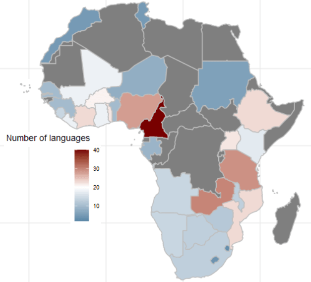
ab %>% group_by(country_name) %>% count() %>%
  arrange(n)
There is an uneven number of respondents across the 34 countries. Angola has the most with 2400 and Mozambique has the fewest with 1110.
One way we can deal with that is to sample the data and run the analyse multiple times. We can the graph out the distribution of Herfindahl Index results.
set.seed(111)
sample_ab <- ab %>%
group_by(country_name) %>%
sample_n(500, replace = TRUE)
First we will look at just one country, Nigeria.
The Herfindahl-Hirschman Index (HHI) is a measure of market concentration often used in economics and competition analysis. The formula for the HHI is as follows:
HHI = (s1^2 + s2^2 + s3^2 + … + sn^2)
Where:
- “s1,” “s2,” “s3,” and so on represent the market shares (expressed as percentages) of individual firms or entities within a given market.
- “n” represents the total number of firms or entities in that market.
Each firm’s market share is squared and then summed to calculate the Herfindahl-Hirschman Index. The result is a number that quantifies the concentration of market share within a specific industry or market. A higher HHI indicates greater market concentration, while a lower HHI suggests more competition.
sample_ab %>%
filter(country_name == "Nigeria") %>%
dplyr::select(country_name, lang = Q2) %>%
group_by(lang) %>%
summarise(percentage_lang = n() / nrow(.) * 100,
number_speakers = n()) %>%
ungroup() %>%
mutate(square_per_lang = (percentage_lang / 100) ^ 2) %>%
summarise(lang_hhi = sum(square_per_lang))
And we see that the linguistic Herfindahl index is 16.4%
lang_hhi
     <dbl>
1    0.164
The Herfindahl Index ranges from 0% (perfect diversity) to 100% (perfect concentration).
16% indicates a moderate level of diversity or variation within the sample of 500 survey respondents. It’s not extremely concentrated (e.g., one dominant category) and highlight tht even in a small sample of 500 people, there are many languages spoken in Nigeria.
We can repeat this sampling a number of times and see a distribution of sample index scores.
We can also compare the Herfindahl score between all countries in the survey.
First step, we will create a function to calculate lang_hhi for a single sample, according to the HHI above.
calculate_lang_hhi <- function(sample_data) {
sample_data %>%
dplyr::select(country_name, lang = Q2) %>%
group_by(country_name, lang) %>%
summarise(count = n()) %>%
mutate(percent_lang = count / sum(count) * 100) %>%
ungroup() %>%
group_by(country_name) %>%
mutate(square_per_lang = (percent_lang / 100) ^ 2) %>%
summarise(lang_hhi = sum(square_per_lang))
}
The next step, we run the code 100 times and calculate a lang_hhi index for each country_name
results <- replicate(100, { ab %>%
group_by(country_name) %>%
sample_n(100, replace = TRUE) %>%
calculate_lang_hhi()
}, simplify = FALSE)
simplify = FALSE is used in the replicate() function.
This guarantees that output will not be simplified into a more convenient format. Instead, the results will be returned in a list.
If we want to extract the 11th iteration of the HHI scores from the list of 100:
results[11] %>% as.data.frame() %>%
   mutate(lang_hhi = round(lang_hhi *100, 2)) %>%
   arrange(desc(lang_hhi)) %>%
   gt() %>%
  gt_theme_guardian() %>%
  gt_color_rows(lang_hhi) %>% as_raw_html()
We can see the most concentrated to least concentrated in this sample (Cabo Verde, Sudan) to the most liguistically diverse (Uganda)
| country_name | lang_hhi |
|---|---|
| Cabo Verde | 100.00 |
| Sudan | 100.00 |
| Lesotho | 96.08 |
| Mauritius | 92.32 |
| Eswatini | 88.72 |
| Morocco | 76.94 |
| Gabon | 66.24 |
| Botswana | 65.18 |
| Angola | 63.72 |
| Zimbabwe | 54.40 |
| Malawi | 54.16 |
| Tunisia | 52.00 |
| Tanzania | 48.58 |
| Niger | 41.84 |
| Senegal | 41.72 |
| Ghana | 35.10 |
| Burkina Faso | 30.80 |
| Mali | 28.48 |
| Namibia | 28.12 |
| Guinea | 28.08 |
| Benin | 26.70 |
| Ethiopia | 26.60 |
| Gambia | 26.40 |
| Sierra Leone | 25.52 |
| Mozambique | 24.66 |
| Togo | 20.52 |
| Cameroon | 19.84 |
| Zambia | 17.56 |
| Liberia | 17.02 |
| South Africa | 16.92 |
| Nigeria | 16.52 |
| Kenya | 15.22 |
| Côte d’Ivoire | 15.06 |
| Uganda | 10.58 |
This gives us the average across all the 100 samples
average_lang_hhi <- results %>%
bind_rows(.id = "sample_iteration") %>%
group_by(country_name) %>%
summarise(avg_lang_hhi = mean(lang_hhi))
After that, we just need to combine all 100 results lists into a single tibble. We add an ID for each sample from 1 to 100 with .id = "sample"
combined_results <- bind_rows(results, .id = "sample")And finally, we graph:
combined_results %>%
  ggplot(aes(x = lang_hhi)) +
  geom_histogram(binwidth = 0.01,
                 fill = "#3498db",
                 alpha = 0.6, color = "#708090") +
  facet_wrap(~factor(country_name), scales = "free_y") +
  labs(title = "Distribution of Linguistic HHI", x = "HHI") +
  theme_minimal()

From the graphs, we can see that the average HHI score in the samples is pretty narrow in countries such as Sudan, Tunisia (we often see that most respondents speak the same language so there is more linguistic concentration) and in countries such as Liberia and Uganda (we often see that the diversity in languages is high and it is rare that we have a sample of 500 survey respondents that speak the same language). Countries such as Zimbabwe and Gabon are in the middle in terms of linguistic diversity and there is relatively more variation (sometimes more of the random survey respondents speak the same langage, sometimes fewer!)