Create a correlation matrix with GGally package in R

We can create very informative correlation matrix graphs with one function.

Packages we will need:

library(GGally)
library(bbplot) #for pretty themes

First, choose some nice hex colors.

my_palette <- c("#005D8F", "#F2A202")
Happy Friends GIF by netflixlat - Find & Share on GIPHY

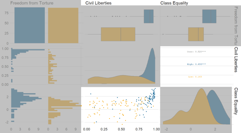
Next, we can go create a dichotomous factor variable and divide the continuous “freedom from torture scale” variable into either above the median or below the median score. It’s a crude measurement but it serves to highlight trends.

Blue means the country enjoys high freedom from torture. Yellow means the county suffers from low freedom from torture and people are more likely to be tortured by their government.

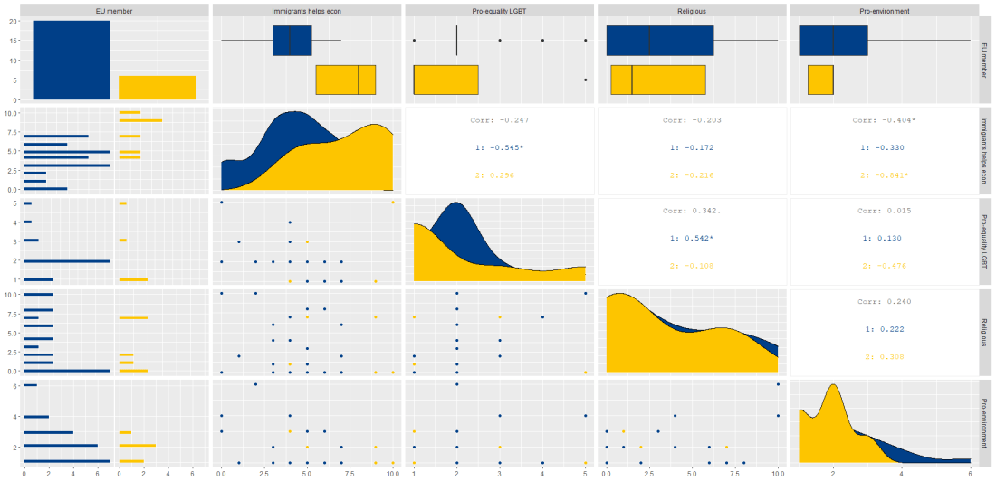
Then we feed our variables into the ggpairs() function from the GGally package.

I use the columnLabels to label the graphs with their full names and the mapping argument to choose my own color palette.

I add the bbc_style() format to the corr_matrix object because I like the font and size of this theme. And voila, we have our basic correlation matrix (Figure 1).

corr_matrix <- vdem90 %>% 
  dplyr::mutate(
    freedom_torture = ifelse(torture >= 0.65, "High", "Low"),
    freedom_torture = as.factor(freedom_t))
  dplyr::select(freedom_torture, civil_lib, class_eq) %>% 
  ggpairs(columnLabels = c('Freedom from Torture', 'Civil Liberties', 'Class Equality'), 
    mapping = ggplot2::aes(colour = freedom_torture)) +
  scale_fill_manual(values = my_palette) +
  scale_color_manual(values = my_palette)

corr_matrix + bbplot::bbc_style()
Figure 1.
Excited Season 4 GIF by Friends - Find & Share on GIPHY

First off, in Figure 2 we can see the centre plots in the diagonal are the distribution plots of each variable in the matrix

Figure 2.

In Figure 3, we can look at the box plot for the ‘civil liberties index’ score for both high (blue) and low (yellow) ‘freedom from torture’ categories.

The median civil liberties score for countries in the high ‘freedom from torture’ countries is far higher than in countries with low ‘freedom from torture’ (i.e. citizens in these countries are more likely to suffer from state torture). The spread / variance is also far great in states with more torture.

Figure 3.

In Figur 4, we can focus below the diagonal and see the scatterplot between the two continuous variables – civil liberties index score and class equality index scores.

We see that there is a positive relationship between civil liberties and class equality. It looks like a slightly U shaped, quadratic relationship but a clear relationship trend is not very clear with the countries with higher torture prevalence (yellow) showing more randomness than the countries with high freedom from torture scores (blue).

Saying that, however, there are a few errant blue points as outliers to the trend in the plot.

The correlation score is also provided between the two categorical variables and the correlation score between civil liberties and class equality scores is 0.52.

Examining at the scatterplot, if we looked only at countries with high freedom from torture, this correlation score could be higher!

Figure 4.

Excited Season 4 GIF by Friends - Find & Share on GIPHY
Advertisement

Scrape NATO defense expenditure data from Wikipedia with the rvest package in R

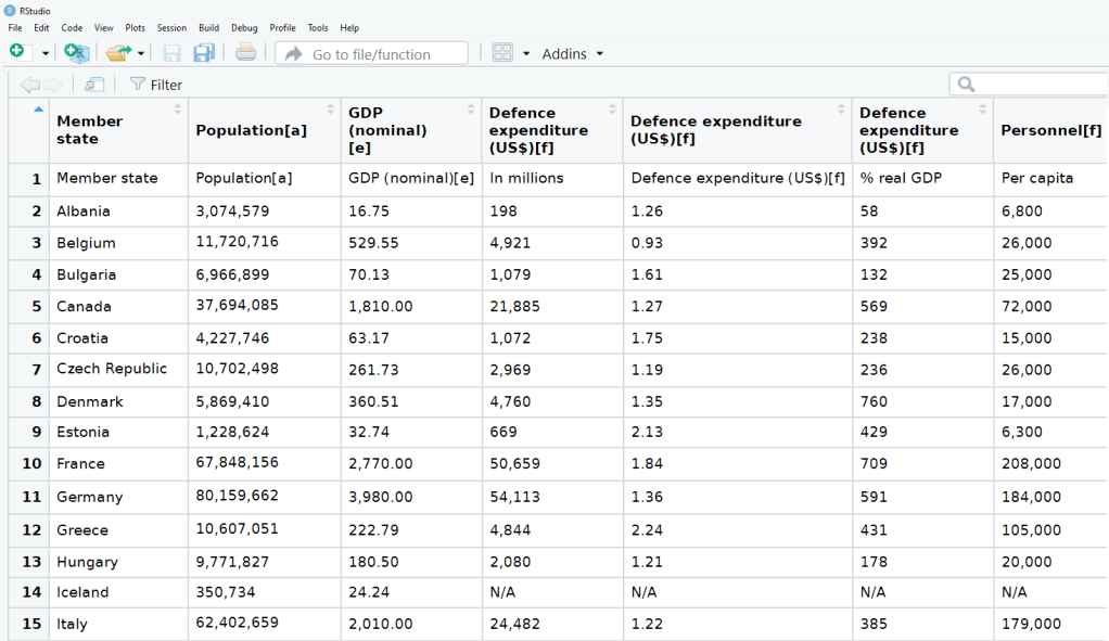
We can all agree that Wikipedia is often our go-to site when we want to get information quick. When we’re doing IR or Poli Sci reesarch, Wikipedia will most likely have the most up-to-date data compared to other databases on the web that can quickly become out of date.

Jennifers Body Truth GIF - Find & Share on GIPHY

So in R, we can scrape a table from Wikipedia and turn into a database with the rvest package .

First, we copy and paste the Wikipedia page we want to scrape into the read_html() function as a string:

nato_members <- read_html("https://en.wikipedia.org/wiki/Member_states_of_NATO")

Next we save all the tables on the Wikipedia page as a list. Turn the header = TRUE.

nato_tables <- nato_members %>% html_table(header = TRUE, fill = TRUE)

The table that I want is the third table on the page, so use [[two brackets]] to access the third list.

nato_exp <- nato_tables[[3]]

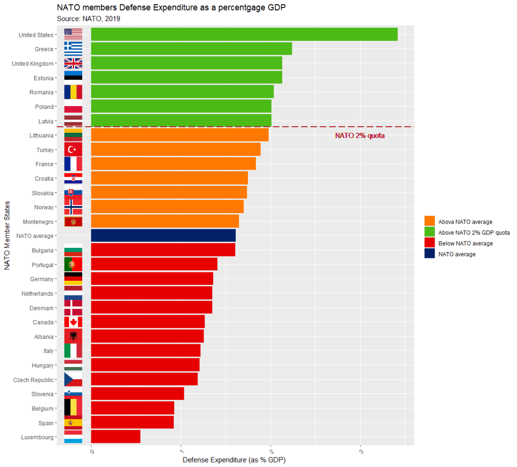
The dataset is not perfect, but it is handy to have access to data this up-to-date. It comes from the most recent NATO report, published in 2019.

Some problems we will have to fix.

  1. The first row is a messy replication of the header / more information across two cells in Wikipedia.
  2. The headers are long and convoluted.
  3. There are a few values in as N/A in the dataset, which R thinks is a string.
  4. All the numbers have commas, so R thinks all the numeric values are all strings.

There are a few NA values that I would not want to impute because they are probably zero. Iceland has no armed forces and manages only a small coast guard. North Macedonia joined NATO in March 2020, so it doesn’t have all the data completely.

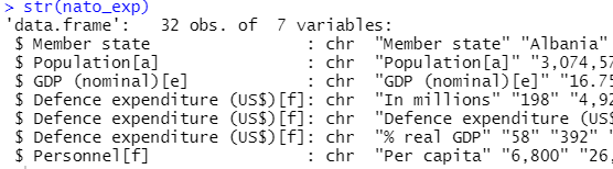
So first, let’s do some quick data cleaning:

Clean the variable names to remove symbols and adds underscores with a function from the janitor package

library(janitor)
nato_exp  <- nato_exp %>% clean_names()

Delete the first row. which contains some extra header text:

nato_exp <- nato_exp[-c(1),]

Rename the headers to better reflect the original Wikipedia table headings In this rename() function,

  • the first string in the variable name we want and
  • the second string is the original heading as it was cleaned from the above clean_names() function:
nato_exp <- nato_exp %>%
 rename("def_exp_millions" = "defence_expenditure_us_f",
 "def_exp_gdp" = "defence_expenditure_us_f_2",
 "def_exp_per_capita" = "defence_expenditure_us_f_3",
 "population" = "population_a",
 "gdp" = "gdp_nominal_e",
 "personnel" = "personnel_f")

Next turn all the N/A value strings to NULL. The na_strings object we create can be used with other instances of pesky missing data varieties, other than just N/A string.

na_strings <- c("N A", "N / A", "N/A", "N/ A", "Not Available", "Not available")

nato_exp <- nato_exp %>% replace_with_na_all(condition = ~.x %in% na_strings)

Remove all the commas from the number columns and convert the character strings to numeric values with a quick function we apply to all numeric columns in the data.frame.

remove_comma <- function(x) {as.numeric(gsub(",", "", x, fixed = TRUE))}

nato_exp[2:7] <- sapply(nato_exp[2:7], remove_comma)   

Next, we can calculate the average NATO score of all the countries (excluding the member_state variable, which is a character string).

We’ll exclude the NATO total column (as it is not a member_state but an aggregate of them all) and the data about Iceland and North Macedonia, which have missing values.

nato_average <- nato_exp %>%
filter(member_state != 'NATO' & member_state != 'Iceland' & member_state != 'North Macedonia') %>%
summarise_if(is.numeric, mean, na.rm = TRUE)

Re-arrange the columns so the two data.frames match:

nato_average$member_state = "NATO average"
nato_average <- nato_average %>% select(member_state, everything())

Bind the two data.frames together

nato_exp <- rbind(nato_exp, nato_average)

Create a new factor variable that categorises countries into either above or below the NATO average defense spending.

Also we can specify a category to distinguish those countries that have reached the NATO target of their defense spending equal to 2% of their GDP.

nato_exp <- nato_exp %>% 
filter(member_state != 'NATO' & member_state!= "North Macedonia" & member_state!= "Iceland") %>% 
dplyr::mutate(difference = case_when(def_exp_gdp >= 2 ~ "Above NATO 2% GDP quota", between(def_exp_gdp, 1.6143, 2) ~ "Above NATO average", between(def_exp_gdp, 1.61427, 1.61429) ~ "NATO average", def_exp_gdp <= 1.613 ~ "Below NATO average"))

Create a vector of hex colours to correspond to the different categories. I choose traffic light colors to indicate the

  • green countries (those who have reached the NATO 2% quota),
  • orange countries (above the NATO average but below the spending target) and
  • red countries (below the NATO spending average).

The blue colour is for the NATO average bar,

my_palette <- c( "Below NATO average" = "#E60000", "NATO average" = "#012169", "Above NATO average" = "#FF7800", "Above NATO 2% GDP quota" = "#4CBB17")

Finally, we create a graph with ggplot, and use the reorder() function to arrange the bars in ascending order.

NATO allies are encouraged to hit the target of 2% of gross domestic product. So, we add a geom_vline() to demarcate the NATO 2% quota.

nato_bar <- nato_exp %>% 
  filter(member_state != 'NATO' & member_state!= "North Macedonia" & member_state!= "Iceland") %>%
  ggplot(aes(x= reorder(member_state, def_exp_gdp), y = def_exp_gdp, 
fill=factor(difference))) + 
  geom_bar(stat = "identity") +
  geom_vline(xintercept = 22.55, colour="firebrick", linetype = "longdash", size = 1) +
  geom_text(aes(x=22, label="NATO 2% quota", y=3), colour="firebrick", text=element_text(size=20)) +
  labs(title = "NATO members Defense Expenditure as a percentage GDP ",
       subtitle = "Source: NATO, 2019",
       x = "NATO Member States",
       y = "Defense Expenditure (as % GDP) ")
  

Click here to read about adding flags to graphs with the ggimage package.

library(countrycode)
library(ggimage)

nato_exp$iso2 <- countrycode(nato_exp$member_state, "country.name", "iso2c")

Finally, we can print out the nato_bar graph!

nato_bar + 
geom_flag(y = -0.2, aes(image = nato_exp$iso2)) +
coord_flip() +
expand_limits(y = -0.2) +
theme(legend.title = element_blank(), axis.text.x=element_text(angle=45, hjust=1)) + scale_fill_manual(values = my_palette)

Pushing Donald Trump GIF - Find & Share on GIPHY